10,000 search results
(0.041 seconds)
- Magret by Maulana Creative,
$13.00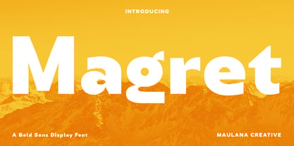 Magret is a unique eye-catchy sans serif font. With bold stroke, fun character with a bit of ligatures. To give you an extra creative work. Magret font support multilingual more than 100+ language. This font is good for logo design, Social media, Movie Titles, Books Titles, a short text even a long text letter and good for your secondary text font with sans or serif. Make a stunning work with Magret font. Cheers, Maulana Creative
 - Malto by Maulana Creative,
$15.00 Malto is a condensed sans serif font. With semi bold soft edge stroke, fun character with a bit of ligatures and alternates. To give you an extra creative work. Malto font support multilingual more than 100+ language. This font is good for logo design, Social media, Movie Titles, Books Titles, a short text even a long text letter and good for your secondary text font with sans or serif. Make a stunning work with Malto font. Cheers, Maulana Creative
 - Gabton Malgora by Letterena Studios,
$17.00 Gabton Malgora is a bold and stylish serif font. This font is PUA encoded which means you can access all of the glyphs and swashes with ease!
 - Grosfer by Typeskets,
$17.00 Grosfer is a cool, bold and thick lettered display font. This font reads as strong, confident, and dynamic and can add a fierce character to your designs.
 - Not My Type by It's me Simon,
$14.00 If you want your design to have that nostalgic typewriter effect, Not my Type would be perfect. It's old-fashioned and retro—letters are worn and grungy like it needs a new ink ribbon. Some of the letters are misaligned—just like a real old typewriter. It is best used at smaller sizes, perfect for logos, headlines, covers and any design where you want that vintage look and feel. Each letter has two alternatives, making three in total. Using the alternative letters, you can make your type layouts look more random, like a real typewriter. You can manually set the alternatives via the glyphs panel in your design software or you can enable them automatically. If you enable contextual alternatives in your design application, the letters will change automatically as you type.
 - Coben by cretype,
$20.00 Coben is a modern and futuristic san-serif font family. Simple and modern shapes with a tall x-height make the text legible and the spaces between individual letter forms are precisely adjusted to create the perfect typesetting. Coben Family consists of 2 widths (Condensed, Normal), 4 weights (Light, Regular, Medium, Bold), and Italics for each format. Coben provides a Central European character set. Each font includes support for Tabular numbers, Old-style Figures and Opentype Features such as Proportional Figures, Numerators, Denominators, Superscript, Scientific Inferiors, Subscript, Fractions and Standard Ligatures. We highly recommend it for use in books, web pages, screen displays, and so on.
 - Segaon by cretype,
$20.00 Segaon Family is a humanist sans-serif typeface that is clean, simple and highly readable. The spaces between individual letter forms are precisely adjusted to create the perfect typesetting. Segaon is versatile type family of 18 fonts. Segaon family consists of 9 weights (Thin, ExtraLight, Light, Regular, Medium, Bold, ExtraBold, Heavy & Black) with their corresponding italics. The Open Type fonts contain complete Latin 1252, Cyrillic, Central European 1250, Turkish 1254 character sets. Each font includes old-style figures, proportional figures, tabular figures, numerators, denominators, superscript, scientific inferiors, subscript, fractions and case features. We highly recommend it for use in books, web pages, screen displays, and so on.
 - FC Basic Font - Unknown license

- Halcion - Unknown license

- Vertical by Alias,
$60.00 Alias Vertical is a sans serif typeface with a vertical cut-off point for letter endings. The vertical cut-offs bend round characters (b, c, o, etc) into a squarish, high-shouldered shape, suggesting Roger Excoffon’s Antique Olive. In mid-weights, the typeface mixes Antique Olive with typefaces such as Gill or Johnston, for example the shape of the t, the l borrowing Johnston’s flick. Vertical has the same minimal difference in weight between verticals and horizontals as Gill and Johnston, and the same sharp connection point where curves meet straight lines. Like Antique Olive, Vertical has a narrow connection point here, adding contrast and definition. The overall effect feels austere at lighter weights and strident and graphic at bolder weights, and sharp and incised throughout. In the Bold and Black weights, the squarish and top heavy shape of Antique Olive is most noticeable. For example the wide uppercase, with the B having almost-even width between top and bottom curves, and the almost-overhang of the top curve of the G. But Vertical does not have as extreme an aesthetic or square shape as Antique Olive. As well as its wide design, the upper case is given extra authority by being a slightly heavier weight than the lower case. This is a device borrowed from Gill, and other ‘old’ typefaces, where the upper case is presented as a titling design. Modern sensibilities are more focussed on an even colour between upper and lower case. Vertical was originally intended as a sister typeface to Ano, like AnoAngular or AnoStencil. Vertical developed into a similar but separate design. Ano was designed for use in Another Man — in its modular, circle-base design, and the way there aren’t the amendments usually made in bolder weights to ensure letter clarity. This is for layouts where different weights are used together in different sizes so that the overall letter weight is the same, a feature of the magazine. Where Ano is simple and graphic, Vertical has nuance and texture. It is a pragmatic, utility design. In the balance between graphic and typographic, its focus is the latter.
 - VVDS Fifties by Vintage Voyage Design Supply,
$15.00Fifties is a mix of classic geometric and a bit of humanistic grotesque. The goal was to create the font for present with look to the past. In other words, I tried to came back the Modernism aesthetics of XX century into nowadays. The result gives you 60 styles including Italic (Slanted). Your typography may be airy and elegant with Expanded Thin, catchy and expressive with Condensed Bold or dynamic and sharp with Expanded Bold Italic. You will find your way to use this family certainly. Theatre posters or party flyers, vintage t-shirt or modern web service, movie titles or magazine header and even infographic – Fifties will suit you everywhere. You may use the completed styles or may use a Variable Font. To make it as you want to. Weights: Thin / Light / Regular / Medium / Semi Bold / Bold. Widths: Condensed / SemiCondensed / Medium / SemiExpanded / Expanded OTF and Variable Font (TTF) OpenType features: Stylistic alternates for A, G, K, M, N, R, W, a, e, g, j, m, n, r, t, u, w, y; Fraction figures; Subscript and Superscript figures; Tabular figures; Typographic spaces: Em / En / Third / Quarter / Thin / Sixth / Hair - Eveningnews by Wiescher Design,
$39.50 Since many years I live in Munich and read the daily newspaper Abendzeitung. One morning they had redesigned the paper, using Eric Gill's Joanna for the body copy and a tweaked version of Franklin Gothic for the headlines. Since both typefaces are my all-time favorites, I was very pleased. The old hand-lettered title lettering designed by in-house designer Ernst Friedrich Adler around 1947 or 48 was untouched as it always was. Adler had worked for the newspaper an incredible 47 years! Ernst Friedrich Adler celebrated his 100th birthday in the summer of 2007 looking very healthy. But someone had adapted his title lettering for use in the chapter headings, and I did not like the way that was done. Every morning I saw those letters and thought "one day I have to clean that up". About 15 years later I finally did it! Being at it, I designed the whole typeface and added a second fancy cut. And, what do you know, the people at the Abendzeitung called me up and said they liked what I did and started using it. So since that day in 2005 I can read my morning paper without having to wonder about the chapter headings. Well maybe one day they will do another redesign and maybe they will use another one of my fonts. Your editorial typeface designer, Gert
 - OBITRUK by Twinletter,
$17.00 Meet Obitruk, a powerful display font with a superhero style that will take your projects to a new level. Whether you’re working on a movie, a game, or a design with a strong and bold theme, Obitruk is the perfect solution. With its strong, bold appearance, this font exudes confidence and draws attention. Distinctive superhero style adds fun and adventure to your creations, making them stand out from the crowd. Obitruck not only looks amazing but is also packed with features that will enhance your designs. Ligature and alternative characters provide flexibility and creative possibilities, allowing you to customize and add unique touches to your typography. Plus, multilingual support ensures your message is accessible to a global audience. Show the power of Obitruk and bring your projects to life. Get ready to make a bold statement with this dynamic font that embodies strength, thickness, and a fearless spirit. Improve your designs with Obitruk and leave a lasting impression on your audience. What’s Included : File font All glyphs Iso Latin 1 Alternate, Ligature Simple installations We highly recommend using a program that supports OpenType features and Glyphs panels like many Adobe apps and Corel Draw so that you can see and access all Glyph variations. PUA Encoded Characters – Fully accessible without additional design software. Fonts include Multilingual support
 - Yolk by Monotype,
$31.99 Yolk is an Eggcentric Sans Serif Typeface consisting of nine weights in both roman and italic. Essentially, this is a geometric sans typeface that has been inspired by the shape and proportions of an egg. With its bottom-heavy glyphs, Yolk has an unusual personality – it’s not too awkward to be off-putting, and it’s not too uniform to be associated with the myriad of generic geometric sans fonts that are available. Yolk has a distinctive presence in its upright form, while the italics exude a more flamboyant nature. When combined, your typographic results will be pleasing and perhaps a little quirky too. This 18-font type family achieves a good balance of personality, versatility, and usability. Small Caps are available at the click of a button, then add Stylistic Set 1 to achieve Petite Caps. The petite caps harmonise with the regular lowercase forms, so that you can create unicase-style typography too. All Latin-based languages are covered within the 1000+ glyphs of each Yolk font. Key Features: • 18 font family – 9 weights in Roman and Italic • Small Caps, Petite Caps, with Proportional, Old Style, and Small Cap figures, plus Fractions, Numerators, Denominators, Superiors, and Inferiors • Full European character set (Latin Extended) • 1,000+ glyphs per font.
 - Branlerst by Uncurve,
$25.00 Branlerst is an aesthetic vintage typography font, inspired from the past, elegant signage, gold leaf , sign painting and old label product. Branlerst comes with alternates characters to make more eye cacthy . It is suitable for authentic logos, headings, sign painting, posters, letterhead, branding, magazines, album covers, book covers, movies, apparel design, flyers, greeting cards, product packaging, and more. You just cobine with the another font like script , serif or san serif font and adding some effect finally BOOM..!! you get a great design for your project.
 - Yemeyi by AukimVisuel,
$9.00 Yemeyi family is a modern and daring display font. No matter the topic, this font will be an incredibly asset to your fonts’ library, as it has the potential to elevate any creation. Yemeyi is a simple and neat lettered sans serif font. Add this font to your creative ideas and notice how it will make them stand out!
 - Naville by Letterhend,
$16.00 Introducing, Naville Sans, the all caps font family. This family has 6 weights - extra light, light, reguler, medium, semibold and bold. The clean and simplicity look of the font suitable for wide range of graphic needs especially for headline, title, sign board, information board, billboard and for UI/UX design.
 - Barbaros by MoodyType,
$49.00 An Art Deco condensed display sans font with 8 styles, +800 glyphs, +100 ligatures, +30 languages and many opentype features. It is perfect for poster designs, magazines, book covers, logotypes, headlines, newspapers and press. It's bold, daring, modern, geometric and covers a good range of weights from light to block.
 - Folty by Degarism Studio,
$15.00 Folty Typeface is a display based an a geometric sans serif with unique characters and has a sharp vertex. Folty was inspired by Modern graphic design and contemporary typeface. The family contains 6 weights from Thin to Bold good for advertising, packaging, editorial and publishing, logo, branding, music software, etc.
 - Lieur by inkstypia,
$3.00 Lieur is a minimalist, geometric, sans serif font suitable for logos, label designs, or even just plain body text. It comes with 2 styles, Normal and Italic, and includes Light, Regular, Medium, Bold, and Black weights to give you great possibility to harmonize the look and feel of your text.
 - Singularity Type by Davide Mascioli,
$15.00 Singularity Type is a Modern sans-serif Geometric font with homogeneous thickness, based on essential geometric shapes. Built around 4 different widths, ranging from Extra Light up to Bold, the font contains 744 glyphs and supports more than 30 Latin alphabet languages. Singularity Type is Designed by Davide Mascioli ©2021
 - Letrinth by Ingrimayne Type,
$9.95 Letrinth is a bold, informal sans-serif face. Its lower case is unusual in design; some of the characters are scaled versions of the upper-case letters. It was developed from a special alphabet I used to construct a maze and its name (LETters for a labyRINTH) reflects that origin.
 - GS Franklin Ave. by Great Scott,
$18.00 Franklin Ave. is a condensed sans serif in the style of the classics Franklin Gothic and News Gothic. Nostalgic and gives a great vintage feel. It's bold and comes in two styles: Regular and Oblique. Franklin Ave. is best used in headlines and large formats or in logos or branding.
 - Top Tune JNL by Jeff Levine,
$29.00 The 1955 British edition of the sheet music for Frank Sinatra's hit "I'm Walking Behind You" had its title hand lettered in a sans serif design straight out of the Art Deco era. This bold, condensed type style is now available as Top Tune JNL; in both regular and oblique versions.
 - Mary Goods by Hishand Studio,
$15.00 Introducing MARY GOODS, the sans-serif bold font that's perfect for making your brand, product, and design shine. MARY GOODS isn't just a font it's a branding powerhouse. Incorporate it into your design to instantly enhance your brand's visual identity. Complete with ligatures alternates regular hollow icon kerning multilingual support
 - Evening Walk JNL by Jeff Levine,
$29.00 The cover of the sheet music for 1930's "Walkin' My Baby Back Home" features the title hand lettered in a bold sans serif with the slightest flair of Art Nouveau styling. This design is now available as Evening Walk JNL, which is available in both regular and oblique versions.
 - Minimal by Kmaz,
$10.00 Minimal is a distinguished sans serif display family with minimalistic modern edges, designed by Khalid Al-Mazrouei and published by Kmaz. Minimal packs a complete set of uppercase and lowercase letters, numbers and punctuation and comes in 3 weights (Thin, Regular, and Bold). Perfect for headlines, magazines, and much more.
 - Retail Price JNL by Jeff Levine,
$29.00 Redrawn from lettering found on a British publication circa the 1930s, Retail Price JNL is an extra bold display inline sans that’s great for catchy headlines, price cards, banners or any other attention-getters. Retail Price JNL is offered in regular, oblique, solid and solid oblique versions. Caps only Fonts.
 - Garden Script by Alpha Bento,
$10.00 Garden Script is a calligraphy font. This is a modern bold font style. Here you will get a beautiful modern font. This font is available in several modern swirls that can make your work look elegant, sweet and perfect. With this style, this font will be suitable for logos, branding projects, design of household appliances, product packaging, mugs, quotes, posters, shopping bags, logos, book covers, business cards, invitation cards, greeting cards, and all your other beautiful projects. Garden Script has 420+ glyphs included alternative, ligatures characters and various language support. You can use this font for your work very easily. Because there are many features in it. Contains a complete set of upper and lowercase letters, punctuation, numbers, ligatures, alternates and multilingual support. This font also includes several ligatures and alternative styles Set Stylistic For those of you who have software that is able to work OpenType (Corel Draw / Photoshop / Illustrator / InDesign). Thanks & Happy Designing!
 - Flying Saucer by Hanoded,
$15.00 My 7 year old son is reading a book called ‘Spees De Ruimtewees’ (Spees, the Galactic Orphan), so when I needed a name for this font family, I didn’t have to think a lot! Flying Saucer is a family of 2 fonts: a rough(ish) sans serif and a script font. Both fonts come with Italics. Use Flying Saucer for anything space related (or whatever you feel like using it for).
 - Ka Gaytan by Karandash,
$26.00 Gaytan (Bulgarian for braid) is a fresh new insight on archaic letterforms. A family of two unicase typefaces - a modern looking sans and more classic looking serif, equipped with many alternates, so they can suit any typographic taste. Gaytan's unique design was inspired by Old Church Slavonic Cyrillic, Bulgarian Ustav and the Russian Vyaz stiles, as well as the avant-garde works of Bulgarian type designers in late 1970s.
 - Levy by Lithographe,
$36.00 Good for typography, good for close paragraphs, good for titles logo, markers, use with numbers, Capitals and Cases. use Special symbols as design elements. One can be used for others. Good for closed groups. Limbos, good to go with Serif, Sans serif or old english. use it with variety and any design light or heavy. the weight is black, so it wont matter. hope you enjoy the font and use it.
 - English Grotesque by Device,
$39.00 English Grotesque is based on the proportions of an early 20th century signwriter’s sans, emphasising the characteristic idiosyncrasies of type of the period. Sharing a similar Roman circle-and-square construction as Gill Sans or Johnston Railway, it has a wide T and W, a narrow S, and a long-tailed R. The Roman alphabet did not include a lower-case, and therefore early sans-serifs tended to base theirs on handwritten or cursive models, resulting in more even character widths. English Grotesque, by contrast, carries the more characterful proportions of the capitals through to the lower case. Available in six weights, with optional alternative versions for the Q, &, £ and J.
 - Stanley Union by Ironbird Creative,
$15.00 Stanley Union is a font bundle consisting of serif, sans serif, extended sans and dingbats which is organic and hand-drawn and comes with regular and stamp styles. This typefaces is perfect for people looking for vintage aesthetic and organic feel. What Will You Get : Stanley Union Serif Regular & Stamp Stanley Union Sans Regular & Stamp Stanley Union Extended Sans Regular & Stamp Stanley Union Dingbats We hope you enjoy the font, please feel free to comment if you have any thoughts or feedback. Thanks for purchasing and have fun!
 - Sigma by Wiescher Design,
$30.00 »SIGMA« is the name for the Greek voiceless »S«. It is also called the »Lunar Sigma«, in Hellenistic times the letter was simplified to »C«. I thought SIGMA was a nice name for my new, very readable and friendly Sans typeface. »SIGMA« has that classical Sans beauty with friendly touches that make it unique. You will love this font. It is a great everyday workhorse with seven weights from Thin to Bold and all the necessary weights in between. Great for body copy and headlines! With 875 Glyphs it is a truly European font designed for all Central European and Latin using countries. »SIGMA« has a set of Cyrillic that is – besides Russia – also good for Serbia, Macedonia and Ukraine. It has oldstyle- and lining-, tabular- and tabular-oldstyle-figures, many ligatures. »SIGMA« comes in Normal and Oblique, I made it Oblique instead of Italic which would have been too playful for this friendly font. Enjoy!
 - Sigma Condensed by Wiescher Design,
$30.00 »SIGMA« is the name for the Greek voiceless »S«. It is also called the »Lunar Sigma«, in Hellenistic times the letter was simplified to »C«. I thought SIGMA was a nice name for my new, very readable and friendly Sans typeface. »SIGMA« has that classical Sans beauty with friendly touches that make it unique. You will love this font. It is a great everyday workhorse with seven weights from Thin to Bold and all the necessary weights in between. Great for body copy and headlines! With 875 Glyphs it is a truly European font designed for all Central European and Latin using countries. »SIGMA« has a set of Cyrillic that is – besides Russia – also good for Serbia, Macedonia and Ukraine. It has oldstyle- and lining-, tabular- and tabular-oldstyle-figures, many ligatures. »SIGMA« comes in Normal and Oblique, I made it Oblique instead of Italic which would have been too playful for this friendly font. Enjoy!
 - Voltexa by Ardyanatypes,
$10.00 Voltexa is a sans-serif font that offers 10 thickness levels, ranging from thin to extra black. Designed with a bold and firm style, it aims to provide a broad range of options for every designer. What sets Voltexa apart are its sharp curves in each letter, creating an elegant and modern yet strong impression. Tailored to meet diverse design needs, Voltexa can adapt to various contexts. With 10 available thickness levels, designers have the freedom to express their creativity limitlessly. This font also comes with OpenType features for ease of use and flexibility. Voltexa also supports multilingual use, allowing it to be utilized in various languages. Let's bring forth inspiring and powerful designs using the Voltexa font. With its 10 available thickness levels, this font offers designers the opportunity to create unique and standout works. The distinctiveness of each letter will enhance the aesthetic value of every design project. Use Voltexa to add an elegant, modern, and assertive touch to your creative works. With its comprehensive features and multilingual capabilities, this font will be a loyal partner in expressing your design ideas and visions into extraordinary works. Features: A – Z Character Set a – z Characters set Numerals & Punctuations Ligatures & Alternates Multilingual
 - Coffee First by Epiclinez,
$18.00 Coffee First is a bold handwritten font, carefully handcrafted to become a true favorite. Its casual charm makes it appear wonderfully down-to-earth, readable, and ultimately, incredibly versatile. Coffee First will look outstanding in any context, whether it’s being used on busy backgrounds or as a standalone headline!
 - Hanya Wilde by madeDeduk,
$16.00 Really excited to introduce Hanya Wilde is a bold brush script! Hanya Wilde will be perfect for all your designs project. Hanya Wilde Included: Uppercase Lowercase Number & Symbol International Glyphs Alternative Ligature If you need anything else just shoot me on email at: dedukvic@gmail.com Hope you enjoy it.
 - Createland by Awan Senja,
$14.00 Createland is a bold display font, carefully handcrafted to become a true favorite. Its casual charm makes it appear wonderfully down-to-earth, readable and, ultimately, incredibly versatile. Createland will look outstanding in any context, whether it�s being used on busy backgrounds or as a standalone headline!

