10,000 search results
(0.022 seconds)
- Girl Mermaid by Ake,
$12.00 Girl is a cool, incredibly detailed and chic duo font (script and dingbats). This font is PUA encoded which means you can access all of the glyphs and swashes with ease! Fall in love with its incredibly versatile style and use it to create spectacular designs!
 - Kill Me by Octopi,
$13.00 I have terrible and messy handwriting so I thought it would be a good idea to make a twisted version into an horrific font. In that respect I think it is quite successful, plus, Hallowe'en is nigh.
 - Mill Valley by Letterhend,
$19.00 Mill Valley is a monoline script with a casual and fun theme. This type of font perfectly made to be applied especially in logo, headline, signage and the other various formal forms such as invitations, labels, logos, magazines, books, greeting / wedding cards, packaging, fashion, make up, stationery, novels, labels or any type of advertising purpose. Features : uppercase & lowercase numbers and punctuation multilingual alternates / swashes and ligatures PUA encoded We highly recommend using a program that supports OpenType features and Glyphs panels like many of Adobe apps and Corel Draw, so you can see and access all Glyph variations.
 - Roller Girl by Surplus Type Co,
$9.00 Roller Girl is a bubbly ligature filled 70's inspired retro font. Roller Girl has easy going curves and a laid back aesthetic. It has a ton of ligatures in both upper and lower case that can help you create unique designs that stand out.
 - Sweet Girls by Haksen,
$12.00 Hello all, I will introduce my new font with the name “Sweet Girls” “Sweet Girls” is the form of letters that many variation and look very beautiful. available over than 50 glyphs for alternative letters that will make this font look so cute, funny, beautiful and fascinating. What's Included : Sweet Girls OTF Sweet Girls Slant OTF Sweet Girls Icons OTF Thanks so much for checking out my shop! Hope You enjoy it so much All the best, Haksen
 - Gone Hills by Twinletter,
$14.00 Gone Hills is a whimsical display typeface that’s perfect for a variety of creative projects. Your project will appear natural and attractive in the eyes of onlookers if you use this typeface. Let’s use this typeface to increase the quality of your graphics. This typeface is ideal for use in games, sporting events, branding, banners, posters, movie titles, book titles, quotations, logotypes, and other applications. Naturally, your varied design projects will be excellent and extraordinary if you use this font because it comes with a complimentary font family, which can be used for titles, subtitles, and sentence text. Start utilizing our fonts for your great projects today.
 - Samo Sans Pro by CarnokyType,
$46.00 Samo Sans Pro is a contemporary sans-serif typeface with a slight contrast of strokes, balancing between technical design and dynamic feeling. The Pro Version is based on the Samo Sans basic typeface, and it is extended by more styles, more glyphs, and other features required for professional typesetting. Beside the complete set of Latin, Samo Sans Pro includes Cyrillic and Greek glyphs as well. Each font includes alternate glyphs, small capitals, standard and discretionary ligatures, oldstyle/lining and tabular numerals, fractions, superiors/inferiors figures, set of arrows, dingbats and a wide range of typographic options applied by the Opentype features. The complete typeface family consists of 16 styles in 8 weights and their Italics. The type has a reduced height of caps and numerals and it has an optimal x-height, which makes it suitable for the typesetting of more extensive texts. It can be effectively applied in corporate identities or in a display typesetting.
 - Modern MT for Dior CS by Monotype,
$29.99Cut by Monotype between 1900 and 1902, the Monotype Modern font family was based on Miller & Richards News 23 and 28; slightly condensed news text types of the 1890s. Monotype Modern is a lively typeface, with long, fine hairlines and well rounded letterforms, representing the best of nineteenth century modern face design. A classic text face, and typical of the moderns that were produced in the United Kingdom at that time, being less extreme in its rendering than some of the models of purer form being produced elsewhere. Monotype Modern is an excellent text face for magazines, newspapers and books, the heavier and more condensed versions are useful in headlines and display. - Modern MT for Dior JP by Monotype,
$29.99Cut by Monotype between 1900 and 1902, the Monotype Modern font family was based on Miller & Richards News 23 and 28; slightly condensed news text types of the 1890s. Monotype Modern is a lively typeface, with long, fine hairlines and well rounded letterforms, representing the best of nineteenth century modern face design. A classic text face, and typical of the moderns that were produced in the United Kingdom at that time, being less extreme in its rendering than some of the models of purer form being produced elsewhere. Monotype Modern is an excellent text face for magazines, newspapers and books, the heavier and more condensed versions are useful in headlines and display. - Modern MT for Dior KO by Monotype,
$29.99Cut by Monotype between 1900 and 1902, the Monotype Modern font family was based on Miller & Richards News 23 and 28; slightly condensed news text types of the 1890s. Monotype Modern is a lively typeface, with long, fine hairlines and well rounded letterforms, representing the best of nineteenth century modern face design. A classic text face, and typical of the moderns that were produced in the United Kingdom at that time, being less extreme in its rendering than some of the models of purer form being produced elsewhere. Monotype Modern is an excellent text face for magazines, newspapers and books, the heavier and more condensed versions are useful in headlines and display. - ILL oCtoBer - Unknown license

- ILL oMen - Unknown license

- Gil MF by Masterfont,
$59.00 This geometric typeface makes it very useful for headlines, signs and short texts. The variety of 8 weights makes it ideal for signage and captions.
 - Sunny Sam by Mans Greback,
$39.00 Sunny Sam is a fun handwritten typeface. It was drawn and created by Måns Grebäck during 2019 and 2020. The movements of this happy script font represents optimism and vivacity. Sunny Sam comes in three high-quality styles: Thin, Medium and Bold. The three weights works great as complements to one another. It has an extensive lingual support, covering European Latin scripts. Sunny Sam contains all characters you'll ever need, including all punctuation and numbers.
 - Sam Suliman by K-Type,
$20.00 Sam Suliman is a condensed display face supplied in three weights – Regular, Medium and Bold – plus a set of handy italics (obliques). All six fonts are included in the value family pack. The fonts are inspired by lowercase lettering on a Sarah Vaughan album cover designed by Sam Suliman in 1962, a style which contrasts sharp tight outer corners with soft rounded counters. The letters were perhaps influenced by a Solotype font called Herald Square, but without that font’s aversion to diagonals, and adding distinctive perky ascenders/descenders on the lowercase r, a, u, g and n. The Sam Suliman fonts also add the nubs to d, m, p, and q. Suliman was born in Manchester, England in 1927. After working for McCann Erikson in London, he moved to New York where he took on freelance work designing album covers, particularly celebrated are his striking minimalist designs for jazz records. He moved back to England in the early 1960s, designing many book jackets, film titles and fabrics, also working in Spain and India before settling in Oxford in the 1980s.
 - Sam Pro by Throndsen,
$10.00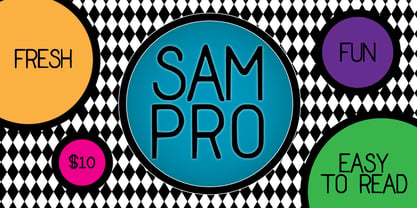
- Am Sans light - Unknown license

- Sans I Am - 100% free

- AM Sans One by URW Type Foundry,
$39.99 When designing AM Sans One, it was a great challenge for me to develop a modern sans serif, which despite the large number of existing fonts in this sector has its own unique character. Starting point for the design concept was the cap O, designed as a rectangle with rounded corners, and not as usual as a circle or oval. The O should form the basis for the whole alphabet. Another feature are the characters with oblique starting and end strokes such as "A, V, W". These have not exactly straight, diagonal lines, but have a slight curvature. Thus, these letters do not look too geometric. Also the cap K deviates slightly from the usual shape which makes AM Sans One different from other already existing fonts. I could well imagine applying this font for areas such as engineering or architecture.
 - oakland hills 1991 - Personal use only

- Girls are Weird - Unknown license

- Savia Filled Shadow - Personal use only

- MAWNS' Graffiti Filled - Personal use only

- Silent Hill Nightmares - Unknown license

- Teenage Girl 2 - Unknown license

- Crushed Out Girl - Unknown license

- Pea Happy Girl - Unknown license

- Political Graft Fill - Unknown license

- MND Pinballer Fill - Unknown license

- Kill your darlings - Unknown license

- pills are good - Unknown license

- Jackrabbit's Bar & Grill - Unknown license

- BN Cosmic Girl - Unknown license

- SL Runaway Girl - Unknown license

- Pea Glo-Girl - Unknown license

- Hula Skirt Girl - Unknown license

- Girl Next Door2 - Unknown license

- Dennis Hill Speeding - Unknown license

- They Killed Kenny! - Unknown license

- MGT Vallery Hills by Magetype,
$15.00 When I was surfing the internet, with rock n 'roll music. I accidentally found a picture of a hotel sign with a very unique style, namely: Mid-century Modern (MCM). It looks very pretty and charming to me. And inspired me to create Font Family. And I am proud to present the Vallery Hills Font Family. This font is in the Retro style of the 50s to 60s. Okay, here are the specifications. 1. Vallery Hills Schrift There is one unique thing about this font. Usually, script fonts with Retro style always have an angled anatomical shape, but I made this font upright. The goal is to make a difference with other script fonts I've seen. By the way, this font comes in two styles, namely: Regular and Bouncy. Why do I make it like that? Because I want to make this font into two different functions, namely: If you want to make it a Display Font, which is usually used for Headings, then use the Bouncy style. And if you want to use it as Bodytext, then use Regular. 2. Vallery Hills Sherift This second font is a font that is very synonymous with the Mid-century Modern (MCM) era. A very distinctive form of the serif font of that era. Similar to the first font, this font also has 2 styles, namely: Regular and Bouncy. You can combine this font with the other two fonts in Vallery Hills. It could be Title, or Bodytext. And you can also combine two styles, namely: Regular and Bouncy. Try! 3. Vallery Hills Suns Sherift This last font is Sans Serif. Also has 2 styles like his two brothers, namely: Regular and Bouncy. The goal is actually the same. I am sure you are cooler to create a design that uses this font family. Well, there is one advantage of this font from its two siblings, which is that it has a feature, namely: SMALLCAPS. Which will be an option when you are bored with the mediocre shape or style of Lowercase. Try combining the Smallcaps with Uppercase or Lowercase. Must be cool! : D Oops, almost forgot. This font consists of several font formats, namely: OTF, TTF, and Webfonts. And of course everything is MULTILANGUAGE. OK, friends. That's all I can describe about the Vallery Hills Family. Hopefully it will please all of you. Cheers!


