10,000 search results
(0.095 seconds)
- Grammatik by Letterhead Studio-VG,
$15.00 Grammatik was made in the end of 2004. This typeface is clear and simple hybrid between sans and serif styles, which was so popular late 90s. Use Grammatik as a display face for best results.
 - OBO Regular by Wilton Foundry,
$29.00 OBO is a modern interpretation of the classical Italian letterforms with the readability of contemporary sans typefaces. OBO is ideally suited for creating identities for branding, posters, book covers, headlines, logotypes, restaurant menus, beer labels.
 - JH Oleph by JH Fonts,
$9.00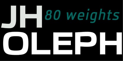 JH Oleph is a modern neo sans humanist Typeface. It includes eight weights and five widths, total of forty weights and another forty italics. JH Oleph may be used as screen display and text type.
 - Lucida Fax by Monotype,
$40.99Lucida is a family of fonts with one basic design, but offered in two variations. It has both serif and sans serif characters. Lucida is suitable for books/text, documentation/business reports, posters, advertisement, multimedia. - Flyer by Linotype,
$40.99The Flyer font family consists of two very heavy condensed sans serif faces, Black Condensed and Extra Black Condensed. Excellent for headlines or packaging, Flyer font is geometric and quite similar to Tempo Heavy Condensed. - Anchora by TFA,
$7.00 Anchora is a contemporary sans serif font. Its characteristic feature is that it provides clear text at smaller sizes besides has a stulistic stance on screen sizes. The font contains Latin Characters support many languages.
 - Hello Jones by Typefactory,
$14.00 Hello Jones is a unique Vintage Sans font. It can easily be matched to an incredibly large set of projects, so add it to your creative ideas and notice how it makes them stand out!
 - Rileyson by Club Type,
$36.99 Crisp contemporary Sans-serif family useful for clear, clean corporates, stylish branding letterforms or friendly, casual messaging too, with use of its capital and lower case ligatures, swash capitals, old style numerals and many ornaments.
 - Handmade Gothic JNL by Jeff Levine,
$29.00 Handmade Gothic JNL is one of many typefaces inspired by lettering samples in a 1941 Speedball® Lettering Pen instructional booklet. The bold, Deco-style sans is perfect for many attention-getting headlines and titles.
 - Granola by Wilton Foundry,
$29.00Granola a completely hand-drawn font, when you need more than a regular sans serif to express random granularity. When used in smaller sizes from 14pt down, it works extremely well for book text too. - Stencil Set JNL by Jeff Levine,
$29.00 Stencil Set JNL takes the 2011 release of Stencil Mark JNL (a spur-serif letter based on a vintage set of brass stencils) and transitions it to the design of a clean, bold sans typeface.
 - Euro Travel JNL by Jeff Levine,
$29.00 A German travel poster from 1927 became the design inspiration for a type revival because of its pleasantly hand lettered sans serif type style. Euro Travel JNL is available in both regular and oblique versions.
 - Conqueror Slab by Letterhead Studio-YG,
$45.00 Conqueror Slab consists of 12 faces and is part of the Conqueror superfamily. The font is intended for headings and logos. Conqueror Slab — an intermediate link between the sharp Conqueror Display and quiet Conqueror Sans.
 - Blout by Greater Albion Typefounders,
$14.50 Blout is the typeface for those who want to shout their message, but to do so with subtlety. It brings together elements of sans serif and late blackletter design, and is ideal for poster work.
 - Suisside by MendozaVergara,
$19.00 Suisside is a sans-serif unicase font design inspired by international style and the new typography. Works great when set in simple, clean and minimal type layouts is recommended for short texts, logos and posters.
 - TF Opicular by Tyfomono,
$20.00 OPICULAR is a Starter Series of modern sans serif with a geometric typical characters, Inspired by minimalism typography and functionalities, digital or print. Opicular comes in 3 weights and 6 styles from Book to Bold.
 - Charterhouse by Device,
$29.00 A heavy obround sans with a high x-height and unusual lower-case spurs that flow up and into the bowl. This curve is mirrored in the ascenders. The alternates provide for closer, denser setting.
 - Short Subject JNL by Jeff Levine,
$29.00 Loosely based on some hand-lettered title cards from various vintage Columbia Pictures two-reel comedies, Short Subject JNL is a pleasant sans serif typeface that is aptly suited for titling and other similar applications.
 - Lucida Schoolbook by Monotype,
$29.99Lucida is a family of fonts with one basic design, but offered in two variations. It has both serif and sans serif characters. Lucida is suitable for books/text, documentation/business reports, posters, advertisement, multimedia. - Butterfly MF by Masterfont,
$59.00 A practical font family with 3 weights for all your day by day design needs: headlines, web, signage etc. An extended sans serif typeface with rounded endings that provides unique softness appearance without losing legibility.
 - Lucida Casual by Monotype,
$29.99Lucida is a family of fonts with one basic design, but offered in two variations. It has both serif and sans serif characters. Lucida is suitable for books/text, documentation/business reports, posters, advertisement, multimedia. - SK Akropol by Salih Kizilkaya,
$9.99 SK Akropol is a sans serif and condensed font. Designed by Salih Kizilkaya in 2020. There are six different options: Regular, Italic, Medium, Medium Italic, Bold and Bold Italic. Includes 6 fonts and 1122 glyphs.
 - Lucida Blackletter by Monotype,
$40.99Lucida is a family of fonts with one basic design, but offered in two variations. It has both serif and sans serif characters. Lucida is suitable for books/text, documentation/business reports, posters, advertisement, multimedia. - Auster Slab by Resistenza,
$39.00 Auster Slab, is a new slab version of our reversed contrast sans serif font Auster. This font family works very well on packagings, branding and editorial purposes. More About Opentype Features: https://bit.ly/opentype-rsz
 - Magle by Konstantine Studio,
$10.00 Please welcome, Magle - Homebrew Fonts. Freshly baked double fonts, straight from human’s hand. Done with click by click for your satisfaction as our goal. Comes in Script and Sans Serif, perfect for your branding needs.
 - Volianchy by MJType,
$25.00 Introducing Volianchy is a modern sans serif font designed for the discerning user in mind. This typeface draws inspiration from contemporary design trends, while retaining a timeless essence that ensures its relevance in any era.
 - Acumin by Adobe,
$35.00Acumin is a versatile sans serif intended for a balanced and rational quality. Solidly neo-grotesque, it not only performs beautifully at display sizes, but also maintains an exceptional degree of sensitivity for text sizes. - Lucida Bright by Monotype,
$29.99Lucida is a family of fonts with one basic design, but offered in two variations. It has both serif and sans serif characters. Lucida is suitable for books/text, documentation/business reports, posters, advertisement, multimedia. - Text Book by ParaType,
$30.00 Designed at Polygraphmash in 1958 by Elena Tsaregorodtseva; Latin characters and italic were added in 1987 by Emma Zakharova. An early sans serif ('Grotesque'), it was developed for primers and the first level school textbooks.
 - Peperoncino Vintage by Resistenza,
$29.00 Peperoncino is a sans serif font. Designed first with a marker, the irregular strokes create a fresh handmade feeling. After the big success of Peperoncino Family, we create its vintage version adding some "rusted" elements.
 - Sweet Square by Sweet,
$39.00The Engraver’s Square Gothic—like its rounder cousin, the engraver’s sans serif, Sweet® Sans,has been one of the more widely used stationer’s lettering styles since about 1900. Its minimal forms, made without curves, were popularized long ago by bankers and others seeking a serious, established feel to their stationery. One might argue that the design is a possible precursor to Morris Fuller Benton’s Bank Gothic® typeface. Sweet® Square is based on antique engraver’s lettering templates called “masterplates.” Professional stationers use a pantograph to manually transfer letters from these masterplates to a piece of copper or steel that is then etched to serve as a plate or die. This demanding technique is rare today given that most engravers now use a photographic process to make plates, where just about any font will do. But the lettering styles engravers popularized during the first half of the twentieth century remain both familiar and appealing. Referencing various masterplates, Mark van Bronkhorst has drawn Sweet Square in nine weights. The sources offered just uppercase, small caps, and figures, yet similar, condensed examples had a lowercase, making it possible to interpret a full character set for Sweet Square. Italics were also added to give the family greater versatility. The fonts are available as basic, “Standard” character sets, and as “Pro” character sets offering special characters, a variety of typographic features, and full support for Western and Central European languages. Sweet Square gives new life to an uncommon class of typeface: an early twentieth-century commercial invention that brings a singular verve to modern design. Its unique style is as useful as it is novel. Bank Gothic is a registered trademark of Grosse Pointe Group LLC. - Zeitung Pro by Underware,
$50.00 Zeitung is a sans serif family which works equally well on print and web. First of all: Zeitung is a sans serif made according to contemporary standards: 8 weights, romans and italics, all equipped with small caps. Lots of OpenType features, like uppercase punctuation or 5 figure styles to make sure any of your mathematical or financial charts, tables and diagrams look cool. Zeitung’s typographic palette focuses on utility and legibility, but in the farthest corners you’ll discover a rich array of flavours: punchy black weights, fashionable thin styles, carefully hand crafted true italics, distinct small caps. But Zeitung has more to offer. Its optical sizes offer the best style for each size of your text. Zeitung fonts are devided to two optical families: Zeitung Standard and Zeitung Micro. Zeitung Standard works great in most sizes, while Zeitung Micro fonts are specially made for very small sizes in print and web. Zeitung Micro fonts are perfectly legible in web, where the same technical font styles have to survive in many environments, from older browsers to most up to date mobile screens. Next to that: the lightest weights also function as grades, because they share the same metrics. This can be very handy for selecting the optimal weight for your specific situation, especially on screens or when type is printed by a newspaper press. Letters are rendered in many various ways on different screens. Maybe the interface of your next app requires a different grade than your latest website? Zeitung allows you to change the weight of your text without any further consequence for the design. That is a welcome relief during the design process. Zeitung will help to bring your message across in many different circumstances, from large text in print to small type on screens.
 - Sweet Square Pro by Sweet,
$59.00 The Engraver’s Square Gothic—like its rounder cousin, the engraver’s sans serif, Sweet® Sans,has been one of the more widely used stationer’s lettering styles since about 1900. Its minimal forms, made without curves, were popularized long ago by bankers and others seeking a serious, established feel to their stationery. One might argue that the design is a possible precursor to Morris Fuller Benton’s Bank Gothic® typeface. Sweet® Square is based on antique engraver’s lettering templates called “masterplates.” Professional stationers use a pantograph to manually transfer letters from these masterplates to a piece of copper or steel that is then etched to serve as a plate or die. This demanding technique is rare today given that most engravers now use a photographic process to make plates, where just about any font will do. But the lettering styles engravers popularized during the first half of the twentieth century remain both familiar and appealing. Referencing various masterplates, Mark van Bronkhorst has drawn Sweet Square in nine weights. The sources offered just uppercase, small caps, and figures, yet similar, condensed examples had a lowercase, making it possible to interpret a full character set for Sweet Square. Italics were also added to give the family greater versatility. The fonts are available as basic, “/fonts/sweet/square/” character sets, and as “Pro” character sets offering special characters, a variety of typographic features, and full support for Western and Central European languages. Sweet Square gives new life to an uncommon class of typeface: an early twentieth-century commercial invention that brings a singular verve to modern design. Its unique style is as useful as it is novel. Bank Gothic is a registered trademark of Grosse Pointe Group LLC.
 - Geometria by Brownfox,
$44.99 Although geometric Sans Serifs have been in vogue for nearly a century, they have never been as ubiquitous. It is not improbable that the old adage would be phrased: “When in doubt, set it in geometric sans”, had it been composed today. Have we not had enough? We think, not. Postmodern times demand a variety of expressions. The vision behind Geometria was to revisit the perennial favorite to lend subtle individuality to its tried and true forms. Geometria stands out in the crowd of similar fonts thanks to its complicated nature. It combines dynamic elements with a certain degree of stability. A slightly higher waistline of the capitals contributes to their distinctive appearance. If the upper case refers to the American grotesques of the 19th century, the lower case tends toward the forms of the Renaissance in its proportions. Geometria is a typeface of clean shapes that is well-suited for continuous reading, and it sets remarkably well. At the same time, it can be friendly, even flirtatious. Its distinct personality combines seeming opposites. At times it may appear serious, at times playful. On occasion, it may be deliberate, other times dynamic. It could seem rigid, then elegant. It is a typeface that could be perceived either as cutting-edge, or as nostalgic. A careful and discerning typographer will bring out and emphasize those aspects of its multifaceted personality that are needed to solve the problem at hand. Geometria consists of 24 fonts — eight weights with matching italics and narrow styles. The font includes multiple sets of figures and currency signs, alternate glyphs, a variety of experimental ligatures, and punctuation marks for the two cases. The 835 glyphs support 72 languages. Granshan 2013 award.
 - Poacher by Sean Johnson,
$12.99 Poacher is a hand-drawn font inspired by the popular Hand Of Sean font, by the same designer. It has a looser, fun feel and is great for applications aimed at children. Great for kid’s books, classroom hand-outs, annotating sketches and notebooks. Great for use on natural, organic food / product packaging.
 - Black Vosten by Pandanwangi,
$19.00 Black Vosten is a textured brush font with a contemporary design style. Made with a brush on paper, then scanned and carefully drawn into vector format. It has a charming, authentic and relaxed feeling and is perfect for adding a natural touch to your design. Fall in love with unique and authentic letters!
 - Lausanne - Personal use only

- LAZYTOWN - Personal use only

- Valium - Unknown license

- Wolves, Lower - Unknown license


