10,000 search results
(0.078 seconds)
- Pinky Juice by Olivetype,
$18.00 Pinky Juice is the perfect way to add some fun and personality to your work. It's a bold, playful font that will make your work stand out. Plus, it's very cute! Thank You!
 - SDGlitch by Sudezine,
$10.00 SDGlitch is a futuristic cyber-style font. You can use this font for logos, quotes, invitations, greeting cards, journals, posters, clothing, and more. This font will infuse your designs with playfulness and fun!
 - Bethari by Studio Sun,
$20.00 Bethari Font Display is Deco's inspired font with swashes combinations, comes with 2 versions, fill and outlined, also 3 optional optical contrast. The font was created with fully crafted and smooth curve swashes.
 - Meghan by Akrtype Studio,
$15.00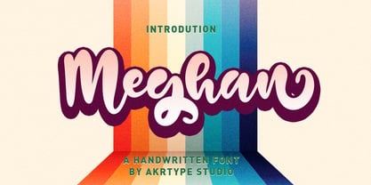 Meghan Smooth Handwritten Font is a casual and elegant handwritten font. Meghan Smooth Handwritten Font will look outstanding in any context, whether it’s being used on busy backgrounds or as a standalone headline!
 - Good Vision by Seemly Fonts,
$12.00 Good Vision is an adaptable and casual handwritten font that can be used for all chalkboard quotes or teaching material! Its authentic look will add a personal and realistic feel to your designs.
 - Pleasant Feelings by Seemly Fonts,
$14.00 Pleasant Feelings is a simple and friendly display font, featuring the perfect amount of trendiness. This original look will appeal to a wide range of crafty ideas, from letterheads and titles to stationery
 - Trainbridge by Curvature Creations,
$10.00 My font Trainbridge is created by Power Point shapes, Block Arc and flowchart. It resembles a train and bridge, which gives it a unique look that will be eye catching and out standing.
 - Positive Attitude by Seemly Fonts,
$12.00 Positive Attitude is a simple and thin lettered font. Dainty and joyful, this font will be ideal for writing wedding invitations, cards, or any other design that may need a romantic, personalized touch!
 - Argufy by Ali Hamidi,
$10.00 Argufy is a cool, vintage styled and organic display font. It will look stunning on any food menu, poster flyer or print. Use this font for your designs and explore its endless possibilities.
 - Wake Up Now by Seemly Fonts,
$12.00 Wake Up Now is a cute and simple lettered handwritten font that can be used for all chalkboard quotes or teaching material! Its authentic look will add a realistic feel to your designs.
 - Dastin toxic Graffiti by Sipanji21,
$15.00 Dastin Toxic Graffiti is a spectacular display font, It will elevate a wide range of design projects to the highest level, be it branding, headings, wall art illustration, apparel, labels, and much more!
 - Street Of Zeus by Sipanji21,
$15.00 Street Of Zeus is an urban styled display font. It will elevate a wide range of design projects to the highest level, be it branding, headings, invitations, signatures, logos, labels, and much more.
 - Enthalpy 298 by Grigorij Gushchin,
$15.00 Enthalpy 298 - the thermal effect of a chemical reaction measured at a standard temperature (298 K). This retro display font will give your projects a unique atmosphere of american posters from the 60s.
 - Christmas Happiness by Seemly Fonts,
$14.00 Christmas Happiness is a simple and friendly handwritten font, featuring the perfect amount of trendiness. This original look will appeal to a wide range of crafty ideas, from letterheads and titles to stationery.
 - Stackyard by Mans Greback,
$59.00 An original, high-quality, handwritten typeface. Brings thoughts to a traditional and classy storefront. The font is filled with stylistic and contextual alternates, which give it both variation and a naturally handwritten look.
 - Comic Candy by Beast Designer,
$15.99 Comic Candy is a fun script font. It will elevate a wide range of design projects to the highest level, be it wedding designs, branding, headings, invitations, signatures, logos, labels, and much more!
 - Voklea by Sakha Design,
$12.00 Voklea is a cool, bold and trendy looking display font. Whatever the topic, this font will be a wonderful asset to your font library, as it has the potential to enhance any creation.
 - Micholas by Rockboys Studio,
$19.00 Micholas is a simple and casual serif font with an undeniably clean feel. With its neat and beautiful arrangement of letters, this typeface will look outstanding in both formal and non-formal designs.
 - Kayane by Differentialtype,
$10.00 Kayane is a splendid script font that can be used for branding, greeting cards, wedding invitations, and many other projects. It will add luxury to any design project that you wish to create.
 - Tropical Love by Tigade Std,
$30.00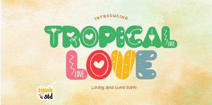 Tropical Love is a cute, quirky, friendly decorative font. It is suitable for cartoon designs, book cover or just any creation that requires a lovely touch, this font will be an fabulous choice.
 - Honeywelly Modern Calligraphy by IbeyDesign,
$17.00 Honeywelly Modern Calligraphy Font is a beautiful light handwritten font with a unique feel and a stunning impact. It will add a luxury spark to any design project that you wish to create.
 - Mafieso by Rometheme,
$6.00 Mafieso is a fun, playful display font created for a large range of different designs. It features a sweet, cute style with bold letters, that will help you with getting your message across.
 - Faqro Pro by ffeeaarr,
$9.00 Faqro is a cool and casual looking display font. No matter the topic, this font will be an incredible asset to your fonts’ library, as it has the potential to elevate any creation.
 - Allista by Typefactory,
$14.00 Allista is a fancy handwritten font, carefully handcrafted to become a true favorite. This font will look outstanding in any context, whether it’s being used on busy backgrounds or as a standalone headline!
 - Home Decor by Goodigital13,
$20.00 great for any projects including : branding, logo, stationery, business card, signage, flyer, brochure etc. Almost all industries will be match for this typeface: comic, events, florist, gardening, makeup artist, travel, cartoon, musician etc
 - SK One Block by Salih Kizilkaya,
$3.50 SK One Block was designed by Salih Kızılkaya in 2020. Inspired by Kufic typeface, this font includes many typographic material you will need. SK One consists of 8 different fonts and 2696 glyphs.
 - Diamond Lake by Rillatype,
$15.00 Introducing, Diamond lake! This font have strong and bold charasteristics that will make your design more standout from the others. this font is perfect for magazine, headline, packaging, branding, logotype, badge,book, etc.
 - New Year Poster by FontaZY,
$10.00 This display font is perfect choice for the whole variety of New Year greeting cards, advertisements, posters and banners. It has alternative graphic symbols, that fills any word or line with holiday spirit.
 - Ah, the Edo font by Vic Fieger, you say? Imagine if a brush, after a night out drinking with its inky pals, decided to take a stroll across the canvas, leaving behind a trail filled with personality,...
- Ah, "Prodotto In Cina"! If fonts were cocktails, this one would be a mix of quirky charm with a bold, unapologetic twist, served in a glass that's slightly off-center but delightful to behold. Create...
- Vemoly Display by Arterfak Project,
$18.00 Vemoly Display - Modern Sans - Unique Loopy Sans Vemoly Display is a minimalist sans that is perfect for your upcoming aesthetic project. This font provides a combination of basic sans serif and loopy style. You can make fun by mixing and matching the upper and lowercase to get a unique, simple, and charming typographic design. Vemoly Display is a perfect choice for logo, social media, branding, poster, flyer, magazine, websites, fashion, mobile apps, decoration, wedding, and many more! Features : Uppercase : Basic Sans Lowercase : Display Numbers & punctuations Symbols Stylistic alternates Multilingual support Thank you and enjoy your Vemoly Display!
 - Mello by J Foundry,
$25.00 Mello is a bold, easy going Grotesque. It was designed for display, branding, advertising, packaging or anywhere a strong but friendly voice is needed. Mello features soft curves and rounded corners; set in 4 widths and 8 weights. The character set is robust, covering extended Latin. The default forms are contemporary with alternates including: single-story a, two-story g, rounded top A, traditional G, rounded leg R, rounded K, and rounded form y in both uppercase and lowercase, all separated into individual style sets for control and customization. A set of icons rounds out the character set, with hand signs and shapes.
 - Mrs Eaves XL Serif by Emigre,
$59.00 Originally designed in 1996, Mrs Eaves was Zuzana Licko’s first attempt at the design of a traditional typeface. It was styled after Baskerville, the famous transitional serif typeface designed in 1757 by John Baskerville in Birmingham, England. Mrs Eaves was named after Baskerville’s live in housekeeper, Sarah Eaves, whom he later married. One of Baskerville’s intents was to develop typefaces that pushed the contrast between thick and thin strokes, partially to show off the new printing and paper making techniques of his time. As a result his types were often criticized for being too perfect, stark, and difficult to read. Licko noticed that subsequent interpretations and revivals of Baskerville had continued along the same path of perfection, using as a model the qualities of the lead type itself, not the printed specimens. Upon studying books printed by Baskerville at the Bancroft Library in Berkeley, Licko decided to base her design on the printed samples which were heavier and had more character due to the imprint of lead type into paper and the resulting ink spread. She reduced the contrast while retaining the overall openness and lightness of Baskerville by giving the lower case characters a wider proportion. She then reduced the x-height relative to the cap height to avoid increasing the set width. There is something unique about Mrs Eaves and it’s difficult to define. Its individual characters are at times awkward looking—the W being narrow, the L uncommonly wide, the flare of the strokes leading into the serifs unusually pronounced. Taken individually, at first sight some of the characters don’t seem to fit together. The spacing is generally too loose for large bodies of text, it sort of rambles along. Yet when used in the right circumstance it imparts a very particular feel that sets it clearly apart from many likeminded types. It has an undefined quality that resonates with people. This paradox (imperfect yet pleasing) is perhaps best illustrated by design critic and historian Robin Kinross who has pointed out the limitation of the “loose” spacing that Licko employed, among other things, yet simultaneously designated the Mrs Eaves type specimen with an honorable mention in the 1999 American Center for Design competition. Proof, perhaps, that type is best judged in the context of its usage. Even with all its shortcomings, Mrs Eaves has outsold all Emigre fonts by twofold. On MyFonts, one of the largest on-line type sellers, Mrs Eaves has been among the 20 best selling types for years, listed among such classics as Helvetica, Univers, Bodoni and Franklin Gothic. Due to its commercial and popular success it has come to define the Emigre type foundry. While Licko initially set out to design a traditional text face, we never specified how Mrs Eaves could be best used. Typefaces will find their own way. But if there’s one particular common usage that stands out, it must be literary—Mrs Eaves loves to adorn book covers and relishes short blurbs on the flaps and backs of dust covers. Trips to bookstores are always a treat for us as we find our Mrs Eaves staring out at us from dozens of book covers in the most elegant compositions, each time surprising us with her many talents. And Mrs Eaves feels just as comfortable in a wide variety of other locales such as CD covers (Radiohead’s Hail to the Thief being our favorite), restaurant menus, logos, and poetry books, where it gives elegant presence to short texts. One area where Mrs Eaves seems less comfortable is in the setting of long texts, particularly in environments such as the interiors of books, magazines, and newspapers. It seems to handle long texts well only if there is ample space. A good example is the book /CD/DVD release The Band: A Musical History published by Capitol Records. Here, Mrs Eaves was given appropriate set width and generous line spacing. In such cases its wide proportions provide a luxurious feel which invites reading. Economy of space was not one of the goals behind the original Mrs Eaves design. With the introduction of Mrs Eaves XL, Licko addresses this issue. Since Mrs Eaves is one of our most popular typefaces, it’s not surprising that over the years we've received many suggestions for additions to the family. The predominant top three wishes are: greater space economy; the addition of a bold italic style; and the desire to pair it with a sans design. The XL series answers these requests with a comprehensive set of new fonts including a narrow, and a companion series of Mrs Eaves Sans styles to be released soon. The main distinguishing features of Mrs Eaves XL are its larger x-height with shorter ascenders and descenders and overall tighter spacing. These additional fonts expand the Mrs Eaves family for a larger variety of uses, specifically those requiring space economy. The larger x-height also allows a smaller point size to be used while maintaining readability. Mrs Eaves XL also has a narrow counterpart to the regular, with a set width of about 92 percent which fulfills even more compact uses. At first, this may not seem particularly narrow, but the goal was to provide an alternative to the regular that would work well as a compact text face while maintaining the full characteristics of the regular, rather than an extreme narrow which would be more suitable for headline use. Four years in the making, we're excited to finally let Mrs Eaves XL find its way into the world and see where and how it will pop up next.
 - Colarino by Luxfont,
$18.00 Introducing the incredible, multicolored Colarino family. They are a unique family with perfect color transitions. Modern color combination was used. Letters do not just have a banal linear gradient, here the colors are randomly mixed in a different order, which resembles a watercolor paint or a complex vector mesh. Some variants resemble a sunset, others a sea wave and a cote d'azur. Color in the letters is complemented by transparency, which allows them to perfectly fit into both light and dark backgrounds - the letters take on the background color and do not look superfluous. Unique multi-colored design. Perfect for trending covers and headlines. Looks great in advertising and attracts attention. Very original and versatile family. This font family is based on the Regular font Pacardo - which means that if necessary you can combine these two families and they will be absolutely stylistically identical and complement each other. Check the quality before purchasing and try the FREE DEMO version of the font to make sure your software supports color fonts. P.s. Have suggestions for color combinations? Write me an email with the subject "Colarino Color" on: ld.luxfont@gmail.com Features: · Free Demo font to check it works. · Uppercase and lowercase the same size but different colors. · Transparency in letters. · Mega high-quality coloring of letters. · Kerning. IMPORTANT: - Multicolor version of this font will show up only in apps that are compatible with color fonts, like Adobe Photoshop CC 2017.0.1 and above, Illustrator CC 2018. Learn more about color fonts & their support in third-party apps on www.colorfonts.wtf -Don't worry about what you can't see the preview of the font in the tab "Individual Styles" - all fonts are working and have passed technical inspection, but not displayed, they just because the website MyFonts is not yet able to show a preview of colored fonts. Then if you have software with support colored fonts - you can be sure that after installing fonts into the system you will be able to use them like every other classic font. Question/answer: How to install a font? The procedure for installing the font in the system has not changed. Install the font as you would install the other classic fonts. How can I change the font color to my color? · Adobe Illustrator: Convert text to outline and easily change color to your taste as if you were repainting a simple vector shape. · Adobe Photoshop: You can easily repaint text layer with Layer effects and color overlay. ld.luxfont@gmail.com
 - Mati by Sudtipos,
$19.00 Father's Day, or June 17 of this year, is in the middle of Argentinian winter. And like people do on wintery Sunday mornings, I was bundled up in bed with too many covers, pillows and comforters. Feeling good and not thinking about anything in particular, Father's Day was nowhere in the vicinity of my mind. My eleven year old son, Matías, came into the room with a handmade present for me. Up to this point, my Father's Day gift history was nothing unusual. Books, socks, hand-painted wooden spoons, the kind of thing any father would expect from his pre-teen son. So you can understand when I say I was bracing myself to fake excitement at my son's present. But this Father's Day was special. I didn't have to fake excitement. I was in fact excited beyond my own belief. Matí's handmade present was a complete alphabet drawn on an A4 paper. Grungy, childish, and sweeter than a ton of honey. He'd spent days making it, three-dimensioning the letters, wiggle-shadowing them. Incredible. A common annoyance for graphic designers is explaining to people, even those close to them, what they do for a living. You have to somehow make it understandable that you are a visual communicator, not an artist. Part of the problem is the fact that "graphic designer" and "visual communicator" are just not in the dictionary of standard professions out there. If you're a plumber, you can wrap all the duties of your job with 3.5 words: I'm a plumber. If you're a graphic designer, no wrapper, 3.5 or 300 words, will ever cover it. I've spent many hours throughout the years explaining to my own family and friends what I do for a living, but most of them still come back and ask what it is exactly that I do for dough. When you're a type designer, that problem magnifies itself considerably. When someone asks you what you do for a living, you start looking for the nearest exit, but none of the ones you can find is any good. All the one-line descriptions are vague, and every single one of them queues a long, one-sided conversation that usually ends with someone getting too drunk listening, or too tired of talking. Now imagine being a type designer, with a curious eleven year old son. The kid is curious as to why daddy keeps writing huge letters on the computer screen. Let's go play some ball, dad. As soon as I finish working, son. He looks over my shoulder and sees a big twirly H on the screen. To him it looks like a game, like I'm not working. And I have to explain it to him again. This Father's Day, my son gave me the one present that tells me he finally understands what I do for a living. Perhaps he is even comfortable with it, or curious enough about that he wants to try it out himself. Either way, it was the happiest Father's Day I've ever had, and I'm prouder of my son than of everything else I've done in my life. This is Matí's font. I hope you find it useful.
 - PGF Caprina Pro by PeGGO Fonts,
$24.00 "PGF Caprina Pro" is an audacious and rough geometric sans-serif font inspired by the wild and untamed personality of mountain goats (the word "caprina"‘ in Spanish is related to or resembling ‘goats’)—amazing animals which can skilfully climb up slopes and withstand very cold temperatures. Was originally developed under the Latinotype team supervision and is now upgraded to this Pro version that comes in 20 font styles, with 739 glyphs each, supports now more than 200 Latin-based languages and includes a wider OpenType features range like: Stylistic Alternates ‘set 01’ for b, d, g, p, q, i, j, t, y, &, I, G, M Stylistic Alternates ‘set 02’ for d, g, j 4 Stylistic Alternate from ‘set 01’ to ‘set 04’ for Enclosed Numbers (circles and squares) Stylistic Alternate ‘set 05’ for curved 3 and ‘Zero with dot inside’ Contextual alternates automatically turns ‘zero’ into a ‘slashed zero’ in alphanumeric contexts Contextual alternates automatically turns “Il” into a serif for improve its legibility Case Sensitive when "All Caps" is activated for ß, ¡, ¿, () [] {}, ‹› «», •(bullet), *(asterisk), -(hyphen) Standard Ligatures for fi, fj, fl Discretionary Ligatures for tt, tr, www, LL, TT Lining Numbers Old Style Numbers Tabular Lining Tabular Old Style Numbers Slashed zero on every number figures Numerators and Denominators from 0 to 9 for any Fraction expression Superiors and Inferiors from 0 to 9 for any scientific notation Ordinal forms for ‘a’ and ‘o’ Localized language customization for German, Dutch, Polish, Catalan, Romanian, Moldavian, Turkish, etc. Every OpenType option is also accessible via Character Map allowing users and designers to choose an alternate design for a particular character. “PGF Caprina Pro” is well-suited for high-impact action publishing and advertising as well related with adrenalynic and extreme sport design stuff.
 - Proprietor by Sudtipos,
$59.00 The great value of something crafted thoroughly by hand has been observed for years by Guille Vizzari throughout a wide spectrum of clients and projects developed at «Yani & Guille» —the studio he runs cheek by jowl with Yani Arabena—, and they both noticed that recently it has been taking on a new meaning. From barbers at their shops, to a barista that passionately prepares coffee every morning, or a bartender that deeply enjoys diving towards unknown ingredients, and even Guille’s admiration for sign painters worldwide that keep spreading their passion for the perfectly constructed letter. This wide trades universe, where craftsmanship represents a huge difference, is where «Proprietor» lives, and it’s the reason why it exists. «Proprietor» was born in a Moleskine notebook —just pencil, paper and ink— as a tribute to those crafts, and to regain the art behind Type Design that involves the fusion between tools, materials and the action of the hand. Fed by these principles, every single glyph within the whole «Proprietor» Family has been fully designed and illustrated by hand by its author (including all the ornaments, frames and crafts icons that can be seen along this specimen), showcasing Vizzari’s solid formation in the drawing field. Proprietor can be described as a compact type family system illustrated by hand, intended and designed to be able to create solid —but beautifully ornamented— paragraphs, and elaborate compositions. For this purpose, Proprietor Roman and Open displays a notorious x-height which goes perfectly with plenty of ornaments that unfold along the ascenders and descenders, but always containing its swashes inside the text line. The icing on the cake, Proprietor Script, a copperplate-based font unbelievably flooded with ornamented capitals, flourishes and endings to break through the coarse feeling of the Proprietor non-script sets, with a huge load of delicate and warm letterforms. Proprietor Wide and Wide Open hand a complete font set to complement the family for composing extended words in uppercase, matching in style and adding a striking personality. And as being part of Sudtipos’ catalogue «Proprietor» comes packed with full Open Type support —thanks to Ale Paul, fearless to tame this hand–drawn beast, supported by his vast knowledge in programming and optimization—. 7 imperfectly elegant and completely handmade fonts join the «Proprietor» system, bringing life to designs that are meant to represent the spirit of the genuine and skilled craftsmen, showing respect for their trade, and at the same time being part of it.
 - Bellwether Antique NF by Nick's Fonts,
$10.00This quaint charmer is based on the original, 1913 antique version of Georg Belwe's eponymous classic. Equally suitable for headlines and text, this face is welcome in any setting. All versions of this font include the Unicode 1250 Central European character set in addition to the standard Unicode 1252 Latin set. - Babble by Comicraft,
$19.00 Babble go gaga? Babble a liddle baba aba dittle boo-boo? Babble gotta Owie? Babble wanna see dada go bonk? See dada go WAAHHH?! Babble wanna bockle? Babble wanna see mama? Babble wanna have milky milky num-nums? Ahhh... Babble id soooooooo cuuuuuute! Dada and Mama love Babble. Big Hug, babble!
 - OBITRUK by Twinletter,
$17.00 Meet Obitruk, a powerful display font with a superhero style that will take your projects to a new level. Whether you’re working on a movie, a game, or a design with a strong and bold theme, Obitruk is the perfect solution. With its strong, bold appearance, this font exudes confidence and draws attention. Distinctive superhero style adds fun and adventure to your creations, making them stand out from the crowd. Obitruck not only looks amazing but is also packed with features that will enhance your designs. Ligature and alternative characters provide flexibility and creative possibilities, allowing you to customize and add unique touches to your typography. Plus, multilingual support ensures your message is accessible to a global audience. Show the power of Obitruk and bring your projects to life. Get ready to make a bold statement with this dynamic font that embodies strength, thickness, and a fearless spirit. Improve your designs with Obitruk and leave a lasting impression on your audience. What’s Included : File font All glyphs Iso Latin 1 Alternate, Ligature Simple installations We highly recommend using a program that supports OpenType features and Glyphs panels like many Adobe apps and Corel Draw so that you can see and access all Glyph variations. PUA Encoded Characters – Fully accessible without additional design software. Fonts include Multilingual support