10,000 search results
(0.082 seconds)
- Rigid Display by Studio Fat Cat,
$20.00 Rigid Display is a sans serif font designed for display needs such as titles, logos, etc. with a different touch. Rigid Display provides 5 weights for its users to have freedom in handling. This fresh font is an alternative that will refresh your font library and also the viewers so feel free to choose it as the main pawn for your project
 - TS Kirt by Vitaliy Tsygankov,
$19.00 TS Kirt - variable sans-serif typeface with narrowed proportions. The font is suitable for titles, packaging, printing, websites, infographics, and advertising. The TS Kirt font family consists of 6 faces and as well as a variable version. The advantage of the font - the same width character in any style. When switching the face, the length of the line will not change.
 - Tropican by Letteralle,
$23.00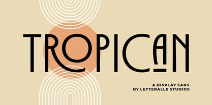 Tropican is an uppercase sans serif font with a vintage and minimal style. Tropican brings many ligatures that will make this font even more interesting and different. Tropican is a versatile font, perfect for display, editorial projects, Logo design, Wedding, Clothing Branding, product packaging, magazine headers, or simply as a stylish text overlay to any background image. I hope you enjoy! Letteralle Studios
 - Bit Part JNL by Jeff Levine,
$29.00 Bit Part JNL is an extra condensed monoline sans serif typeface that's well suited for movie credits, disclaimers and other forms of tight-fit word copy. Inspired by just the numbers "65" on the cover of a 1965 high school yearbook, this retro font will fit a lot of copy into a small area. The typeface is available in regular and oblique versions.
 - Garked by Linecreative,
$16.00 Garked is a font typeface inspired by ancient nordic runes, you want to customize a logo, brand or other design with ethnic or tribal style, this font is perfect for your choice. What you get, you will get: 1. Garked – Clean San serif font including Uppercase & Lowercase (ALL CAPS) characters, 2. Numbers and Punctuation 3. Support Multi language (Western Europe Latin)
 - Mango Vintage by Zeenesia Studio,
$16.00 Introducing Vintage Mango Vintage Mango is a modern and elegant sans serif font. Vintage Mango is well-suited for advertising, branding, logotypes, packaging, titles, headlines and editorial design. I created more much alternates variant and much natural ligatures to make this font very classy and look so beauty. Vintage Mango was built with open type features make your project will be perfect.
 - Suprema by Artegra,
$29.00 Suprema is a modern sans serif family that will bring supreme geometric perfection to any piece of typography. It has 7 weights with matching true italics. When it comes to Opentype it has lots of features such as tabular lining, proportional oldstyle, tabular oldstyle, ligatures, superscript, subscript, fractions and language localisations for languages such as Polish, Dutch, Romanian, Moldovian and Catalan.
 - Enovella by Wontenart,
$25.00 Enovella is a cool and modern Sans Serif font. writing for a magazine that requires a lot of text is the strength of this font. easy to read, and not tired on the eyes. No matter the topic, this font will be an incredible asset to your fonts’ library, as it has the potential to elevate any creation. Thank You
 - David Hadash Script by Monotype,
$50.99Monotype Imaging is pleased to present David Hadash (New" David), the full family of typefaces by Ismar David, in its intended authentic form. The Estate of Ismar David has sought to revive this jewel of Twentieth-Century design by granting an exclusive license to Monotype Imaging to implement it in industry-standard format. Never before has the typeface in its full set of sub-styles been made available to the design community. David Hadash consists of three style families, Formal, Script, and Sans. Each of these appears in three weigths: regular, medium, and bold. Originally devised as a companion to the upright Formal style, the Script style has a beauty and grace all its own that allows it to be used for full-page settings also. While it is forward-leaning and dynamic, it does not match any of the existing cursive styles of Hebrew script. Ismar David created an eminently readable hybrid style which is like no other by inclining the forms of the upright while blending in some features of Rashi style softened with gentle curves. One can say that the Script style is the first truly italic, not just oblique, typeface for Hebrew script. Although the proportions of the Sans style are very similar to those of the Formal style, its visual impression is stunningly different. If the Formal style is believably written with a broad-point pen, the Sans is chiseled in stone. Rounded angles turn angular and stark. The end result is an informal style that evokes both ancient and contemporary impressions. David Hadash (Modern) supports the writing conventions of Modern Hebrew (including fully vocalized text) in addition to Yiddish and Ladino. David Hadash Biblical is a version of the Formal style that supports all the complexities of Biblical Hebrew, including vocalization and cantillation marks. " - David Hadash Biblical by Monotype,
$50.99Monotype Imaging is pleased to present David Hadash (New" David), the full family of typefaces by Ismar David, in its intended authentic form. The Estate of Ismar David has sought to revive this jewel of Twentieth-Century design by granting an exclusive license to Monotype Imaging to implement it in industry-standard format. Never before has the typeface in its full set of sub-styles been made available to the design community. David Hadash consists of three style families, Formal, Script, and Sans. Each of these appears in three weigths: regular, medium, and bold. Originally devised as a companion to the upright Formal style, the Script style has a beauty and grace all its own that allows it to be used for full-page settings also. While it is forward-leaning and dynamic, it does not match any of the existing cursive styles of Hebrew script. Ismar David created an eminently readable hybrid style which is like no other by inclining the forms of the upright while blending in some features of Rashi style softened with gentle curves. One can say that the Script style is the first truly italic, not just oblique, typeface for Hebrew script. Although the proportions of the Sans style are very similar to those of the Formal style, its visual impression is stunningly different. If the Formal style is believably written with a broad-point pen, the Sans is chiseled in stone. Rounded angles turn angular and stark. The end result is an informal style that evokes both ancient and contemporary impressions. David Hadash (Modern) supports the writing conventions of Modern Hebrew (including fully vocalized text) in addition to Yiddish and Ladino. David Hadash Biblical is a version of the Formal style that supports all the complexities of Biblical Hebrew, including vocalization and cantillation marks. " - David Hadash Formal by Monotype,
$50.99Monotype Imaging is pleased to present David Hadash (New" David), the full family of typefaces by Ismar David, in its intended authentic form. The Estate of Ismar David has sought to revive this jewel of Twentieth-Century design by granting an exclusive license to Monotype Imaging to implement it in industry-standard format. Never before has the typeface in its full set of sub-styles been made available to the design community. David Hadash consists of three style families, Formal, Script, and Sans. Each of these appears in three weigths: regular, medium, and bold. Originally devised as a companion to the upright Formal style, the Script style has a beauty and grace all its own that allows it to be used for full-page settings also. While it is forward-leaning and dynamic, it does not match any of the existing cursive styles of Hebrew script. Ismar David created an eminently readable hybrid style which is like no other by inclining the forms of the upright while blending in some features of Rashi style softened with gentle curves. One can say that the Script style is the first truly italic, not just oblique, typeface for Hebrew script. Although the proportions of the Sans style are very similar to those of the Formal style, its visual impression is stunningly different. If the Formal style is believably written with a broad-point pen, the Sans is chiseled in stone. Rounded angles turn angular and stark. The end result is an informal style that evokes both ancient and contemporary impressions. David Hadash (Modern) supports the writing conventions of Modern Hebrew (including fully vocalized text) in addition to Yiddish and Ladino. David Hadash Biblical is a version of the Formal style that supports all the complexities of Biblical Hebrew, including vocalization and cantillation marks. " - J Scott Campbell Sketchbook by Comicraft,
$29.00 Created for J. SCOTT CAMPBELL'S DANGER GIRL SKETCHBOOK, this slick and stylish font is perfect for architectural drawings, marker comps or, um, sketchbooks! Artwork from Elephantmen: Man and Elephantman by J. Scott Campbell
 - SDGlitch by Sudezine,
$10.00 SDGlitch is a futuristic cyber-style font. You can use this font for logos, quotes, invitations, greeting cards, journals, posters, clothing, and more. This font will infuse your designs with playfulness and fun!
 - Good Vision by Seemly Fonts,
$12.00 Good Vision is an adaptable and casual handwritten font that can be used for all chalkboard quotes or teaching material! Its authentic look will add a personal and realistic feel to your designs.
 - Wake Up Now by Seemly Fonts,
$12.00 Wake Up Now is a cute and simple lettered handwritten font that can be used for all chalkboard quotes or teaching material! Its authentic look will add a realistic feel to your designs.
 - Kayane by Differentialtype,
$10.00 Kayane is a splendid script font that can be used for branding, greeting cards, wedding invitations, and many other projects. It will add luxury to any design project that you wish to create.
 - Wedge Gothic by HiH,
$12.00 Bold, muscular, vaguely oriental, Wedge Gothic ML is the original name of this font released by Barnhart Bros. and Spindler of Chicago in 1893. The straight-forward, no-nonsense name tells us exactly what to expect: sans-serif letterforms based on wedge-shaped vertical strokes. The typeface was dropped for awhile -- it does not appear in the 1907 catalog for example -- but reappeared in 1925 as Japanette. What is the opposite of "straight-forward" anyway? According to McGrew, Wedge Gothic was originally created for the Chicago Herald newspaper. The designer is unknown. A distinctive display face, useful when a strong and unusual statement is desired. Wedge Gothic ML features: 1. Glyphs for the 1250 Central Europe, the 1252 Western Europe, the 1254 Turkish and the 1257 Baltic Code Pages. Total of 335 glyphs. 2. OpenType GSUB layout features: pnum, ornm, hist & salt. 3. 66 kerning pairs. 4. Both tabular & proportional numbers. 5. Alternate bullets. The zip package includes two versions of the font at no extra charge. There is an OTF version which is in Open PS (Post Script Type 1) format and a TTF version which is in Open TT (True Type)format. Use whichever works best for your applications.
 - Monvar by Flavortype,
$15.00 Monvar, A new Cooper with layered typefaces. It’s Simple, Bold, Versatile, and Friendly feel that you get in Monvar Typefaces. Monvar comes with 5 Layers : (that you can mix and match the looks as you like) Base Inset Outline Shadow 1 Shadow 2 Monvar Created with an All Caps that the uppercase are using an initial swashes. Perfect fitted layer to give you a more contrast, more bold look of the title. Every glyphs including the alternate characters are curated for the best and possible without eliminate characteristic of this fonts. Our creation on the display to give you a reference what it looks like on your project. such as Branding, Header, Logotype, Poster, Magazine, Packaging, Food Menus, and etc. It shows that Monvar clearly can accommodate various design style.
 - Minuet by Canada Type,
$24.95 Minuet, an informal script with crossover deco elements giving it an unmistakable 1940s flavor, is a revival and expansion of the Rondo family, the last typeface drawn by Stefan Schlesinger before his death. This family was initially supposed to be a typeface based on the strong, flowing script Schlesinger liked to use in the ads he designed, particularly the ones he did for Van Houten’s cocoa products. But for technical reasons the Lettergieterij Amsterdam mandated the face to be made from unattached letters, rather than the original connected script. Schlesinger and Dooijes finished the lowercase and the first drawings of the uppercase just before Schlesinger was sent to a prison camp in 1942. Dooijes completed the design on his own, and drew the bold according to Schlesigner’s instructions. The typeface family was finished in February of 1944, and Schlesinger was killed in October of that same year. Though he did see and approve the final proofs, he never actually saw his letters in use. It took almost four more years for the Lettergieterij Amsterdam to produce the fonts. The typeface was officially announced in November of 1948, and immediately became a bestseller. By 1966, according to a memo from the foundry, the typeface had become “almost too popular”. This digital version of Schlesigner’s and Dooijes’s work greatly expands on the metal fonts. Both weights include a complete set of lowercase alternates — based on Schlesinger’s own drawings, as well as alternative variations for some of the capitals, a few ligatures, and extended language support covering Western, Eastern and Central European languages, plus Baltic, Celtic/Welsh, Esperanto, Maltese and Turkish. Minuet is available in all popular formats. The OpenType version, Minuet Pro, takes advantage of internal font programming to combine the main and alternate fonts into a single file per weight, making all alternates and ligatures automatically available at the push of a button in OpenType supporting programs.
 - Bradley by Oddsorts,
$29.00 Oddsorts is delighted to present Bradley Wayside and Bradley Chicopee as its début offerings. Begun in 2000 as a wedding gift for the designer’s wife and used privately for years, they’re finally available to the public. The fonts were inspired by the masterful art nouveau lettering of Will H. Bradley, whose posters for Ault & Wiborg printing inks and Victor Bicycles continue to draw collectors after more than a century. Wayside and Chicopee expand the twenty-odd characters Bradley drew into a comprehensive multiscript system that includes modern Greek and extended Cyrillic alphabets, ordinals, automatic fractions, and ornaments. Bradley Wayside and Chicopee derive much of their charm from an organic mix of shape and spacing intrinsic to hand drawings. Mimicking that spirit in type used to mean painstaking substitution and adjustment of characters. The Bradley fonts make imaginative use of OpenType’s power to achieve the same effect — minus all the work. Wayside and Chicopee contain alternate forms for every letter — up to seven for some characters. Part of what makes these Bradley types delightfully “smart” fonts is that the fonts themselves actually choose the variation best suited to a letter’s place in a word. All you need to do is turn on your software’s “Ligatures” or “Contextual Alternates” option and the Bradleys do the rest. The alternates even work in most word processors. Bradley Wayside and Chicopee are available in “Standard” and “Pro” editions. The Pro editions sport all the bells and whistles, including the alternates. They support over one hundred forty languages and include localized forms especially for setting Bulgarian, Serbian, Polish, Romanian, and Turkish. The Standard editions are geared toward casual use and are ideal for license as webfonts, where streamlined character sets mean faster load times.
 - Showcard - Unknown license

- Achone by Jadatype,
$15.00 Achone is a sans serif font with a stylish alternative. Achone is able to show a serious impression, and can also be elegant. Achone has regular & italic versions. contains standard English letters and some letters that support multilingualism. Achone can be installed easily on applications such as the adobe family, affinity, or similar applications.
 - Ayosmonika - Unknown license

- LumineSign - Unknown license

- Larabiefont - Unknown license

- QuickGreek - Unknown license

- Angle - Unknown license

- Alien - Unknown license

- Lettering1 Weird - Unknown license

- Arbeka - Unknown license

- Bankoli - Unknown license

- Zoloft - Unknown license

- MStKrufruf - Unknown license

- Climora Duo by XdCreative,
$29.00 Introducing Climora Duo CLIMORA SERIF is a typeface with a feminine taste, with a touch of old style paired with an elegant Climora Script its a perfect combination for your various design needs. CLIMORA Serif has 14 style and 7 weights, - from Thin to Bold and Matching oblique. and 1 Elegant Climora Script that supports multiple languages. Hope you enjoy with Climora Family Thank you
 - India Ink by CounterPoint Type Studio,
$29.99 A heavy, bold font based on two hand lettered type specimens from the 1920s. Original designer unknown. The font has a unique combination of both Old World and Asian influences, while still maintaining a fun, upbeat casual feel. Contains a full set of Alternate Caps found under the "Stylistic Alternates" OpenType feature. Contains language support for both Latin-based and most Eastern European languages.
 - Elmcourt by Greater Albion Typefounders,
$20.00 Elmcourt is a clear and simple display slab-serif typeface family. It's offered in two weights and regular and italic forms. An extensive range of opentype features are included in all typefaces, including small capitals, ligatures, and old-style numerals. It's an ideal family for bold headlines and eye catching poster work. The simplicity of its outlines make it ideal for carved and cutout work.
 - AT Carterwood by Amera Type,
$20.00 Inspired by the old style serifs of 19th century print labels that have a classic touch in this modern era Carefully crafted with lowercase and uppercase to complement this font as well as using variable bold and thin shapes to give a sense of beauty and strength to the letterforms Carterwood is great for designing posters, labels, sign paintings and other media to enhance your visual appearance
 - Normies by Gassstype,
$25.00 Introducing NORMIES It's Sans Display Typeface is a Textured Natural Style and Authentic Classy Style, this font is great for your creative projects such as watermark on photography, You can activate 9 Alternate glyphs OpenType panel.
 - Deuglas by Sealoung,
$10.00 Deuglas is a minimal and neat sans serif font. It can easily be matched to an incredibly large set of projects, so add it to your creative ideas and notice how it makes them stand out!
 - Skeina by MJType,
$25.00 Skeina is an elegant sans serif font that fuses contemporary flair with classic undertones. Designed to offer versatility and sophistication, this typeface can adapt to a multitude of projects, bringing clarity and style wherever it’s applied.


