10,000 search results
(0.06 seconds)
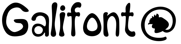
- galifont - Personal use only

- Buckwheat TC by Tom Chalky,
$12.00 Introducing the Buckwheat Font Collection; Each and every font within the Buckwheat Collection was carefully created to be timeless, super versatile, and effortlessly cohesive. An essential kit to come back to time and time again for any number of design projects; from clean and modern, to rough and organic. What's Inside? - Buckwheat TC Regular: A condensed heading/titling font boasting real small caps (along with numerals, currency glyphs and more to match the small caps). - Buckwheat TC Sans: A rounded sans-serif font with several stylistic alternatives for various capitals (A, B, G, H, J, K, P, and R). - Buckwheat TC Script: Tying everything together, a simple yet effective monoline script font designed to look great big or small. - Rough and Smooth Styles: All of the aforementioned fonts are available in both smooth and textured styles. The textures are consistent throughout the collection, improving the cohesion of the fonts and eliminating the need to texture them yourself. - All of the typefaces within this collection include multilingual support and a full western character glyph range.
 - Syncopate Pro by Stiggy & Sands,
$29.00 The Syncopate Pro Family is a unicase design where the traditional lowercase x-height has been abandoned and a single uppercase height rules the design of all of the alpha and numeric glyphs. Some uppercase glyphs are copied to their lowercase slots, where other lowercase glyphs such as the a, e, and r, are scaled up to uppercase heights. This motif allows for a vast array of typesetting possibilities. A modern and stylish sans inspired by the many trendy sans serif typefaces that are prevalent today, the Syncopate Pro Family, primarily intended for display and headline use, also works well for limited text runs. The thin and regular weights and wide body impart a certain level of elegance, while the unicase approach keeps the look lively and fresh. The bold weight imparts a powerful substantiality, lending a strong corporate presence to any design. Opentype features include: - Stylistic Alternates for a collection of alternate Small Caps - Full set of Inferiors and Superiors for limitless fractions - Lining and Proportional figure sets
 - Frambuesa by Sudtipos,
$39.00 Organic versus geometric are two different universes that converges on nature systems and has its reflection on this new sans serif typeface. Frambuesa is a half humanist-half geometric sans that merges decorative curves with straight lines looking for a balance. The result: a solid but somewhat romantic, nostalgic type program that go ahead harmoniously, dancing to the rhythm of a naturally imperfect melody. Frambuesa can’t hide its family genetics. Structure and proportions come from Elisetta, her older sister they so both have a really good text performance. Regular variables and italics feel comfortable in a lot of contexts and are useful for little words or big title compositions. All seven weights are carefully adjusted to achieve soft transitions between one and the other resulting in high readability levels on program combinations and complex uses. This new font family name is a tribute to Lucia’s childhood, a very happy one. Frambuesa honors this sweet intense red fruit that her grandpa’s Coco gave to his grandchildren every Sunday in the summer.
 - Antipol VF by phospho,
$75.00 With Antipol Variable, the reversed stress font was supplemented with Wide and Extended cuts in the Hairline weight. The ability to stretch single letters extremely wide is an exclusive goodie of the Variable version. Antipol is a Sans Serif design that reverses the conventions of a regular Latin Sans Serif. With a weight emphasis on the horizontals and its vertical terminals Antipol radiates a 1970s charisma known from the like of Antique Olive. Its modern and avantgardistic attributes are most pronounced in the Hairline weight, where ultra thin lines meet distinctive arrowhead-corners. This particular weight is meant for display settings, think full-page magazine titles or posters. Antipol Wide and Antipol Extended are a generous statement for graphic design with enough space to let the type breathe: art catalogs, lead texts, invitations, letterheads or brand identity. Any style comes with a wide range of OpenType features that goes beyond a standard display font: Small Caps, Proportional and Tabular Oldstyle Figures and Lining Figures, Fractions, and much more.
 - Enamela by K-Type,
$20.00 Enamela (rhymes with Pamela) is a monoline square sans that is available in normal width and condensed versions. Although rooted in the early years of sans serif type, the Enamela fonts have a timeless quality that is practical and unpretentious. The letterforms derive from vitreous enamel signage dating from the Victorian era and widely used in Britain for street nameplates, Post Office signs, the plates on James Ludlow wall postboxes, railway signs and direction signs, as well as for circular Automobile Association wayfinding plaques throughout the first half of the twentieth century. The quirky terminals, stemming from the compression of geometric type, invite comparison with the Charles Wright fonts used for UK vehicle registration plates. Enamela and Enamela Condensed are both available in three weights – regular, medium and bold – and as italics (optically corrected obliques). A commonly used alternative M with a vertex that touches the baseline is provided at the Alt-M (µ) keystroke on a Mac, or Alt-0181 on Windows. A commonly used G with a plain vertical throat, no crosspiece, is assigned Unicode FF27 (full width capital G).
 - Relato by Emtype Foundry,
$69.00 Relato has a low contrast and “a muscular” structure that makes it useful for setting longer text. In display sizes it has a variety of details that lends it a unique and personal expression. The formal principle of the serif, the variety of terminal strokes and the combination of curves and semi-straight lines gives the Relato a more “human” flavor. The inspiration for the design comes from different traditional calligraphic styles. The upper case letter, for example, is based on roman capitals from the Rennaissance, whereas the lower case relates to humanist handwriting. Even so, Relato is a decidedly contemporary typeface, proposing individual ideas on the design of type. The italic has a distinct typographic color thanks to the construction principle of broken lines. The bold weights have an increased contrast in the union of the strokes which helps improve legibility in small sizes and reinforce their personality in display sizes. The family consists of a Regular version, Italic, Small caps, Semibold and Bold. For a sans serif version of Relato, please see Relato Sans.
 - Vulpa by Eclectotype,
$36.00 Vulpa is a charming serif family in regular, italic and bold, informed by the proportions of a personal favorite, Plantin. The quirky foxtail terminals (inspired in part by my script font, Gelato Script) can be seen across all three styles. These little details make the typeface very expressive at display sizes, but practically disappear at text sizes, making for a very versatile face. Across the three styles there are a number of useful OpenType features which make Vulpa capable of demanding typographic work, even though there are only three styles. Regular, italic and bold are all you really need anyway! The regular and bold weights both include small caps, and the italic features swash capitals for most letters. The italic also features quaint discretionary ligatures, and all styles include standard ligatures, automatic fractions, proportional and tabular, lining and oldstyle figures. If this isn't enough, the Vulpa family also includes Ornaments and Drop-Cap fonts. There is an ornament for A to B, a to b and 0 to 9. These have been carefully designed to match the feel of the text fonts, and many are influenced by ornaments and fleurons from the ATF 1912 Type Specimen book. The drop-caps have an engraved look, and two color versions can be made by overlaying upper and lower case. Despite the lack of weights compared to ‘workhorse’ faces, the charm and versatility of Vulpa make it a really useful typeface, that I hope you'll enjoy using as much as I enjoyed making.
 - ATHEWE by Twinletter,
$17.00 Athewe is a display font with a strong and courageous superhero theme. Created specifically for projects that require a bold, impressive impression, this font is the perfect solution for creating bold and bold designs. With Athewe, you can bring an awesome superhero feel to any of your projects. This font brings strength and boldness to your designs, creating a look that is both impressive and full of character. Each letter expresses a strong and daring style, delivering a memorable message to your audience. With features such as ligature and alternate, Athewe provides unlimited flexibility and creativity. You can combine these font elements to create unique and interesting variations of the style. In addition, multilingual support allows you to use Athewe in multiple languages, so your project can reach a global audience. If you’re looking for an alluring, powerful, and superhero-themed font, Athewe is the right choice. With a striking style and features that allow for creative experimentation, this font will catch the eye and inspire your potential customers. What’s Included : - File font - All glyphs Iso Latin 1 - Alternate, Ligature - Simple installations - We highly recommend using a program that supports OpenType features and Glyphs panels like many Adobe apps and Corel Draw so that you can see and access all Glyph variations. - PUA Encoded Characters – Fully accessible without additional design software. - Fonts include Multilingual support
 - Desphalia Pro by Ingo,
$42.00 A classic “American” sans serif with a kink Desphalia belongs to the kind of sans serif fonts that were created in the 19th century. You could also name it “American Gothic”, a sans serif in the style of fonts like Franklin Gothic, News Gothic and similar. Above all, the high x-height characterizes this typeface style, as do the identical heights of uppercase and ascenders. However, I allowed myself a few peculiarities ;-) On the one hand, there is the gently sloping horizontal middle line on letters such as H, E, F, A and e. The M also got gently slanted sides. Some of the lower-case letters have an up- or down-stroke: a d m n p u. This "kink" on the shaft also serves to better distinguish the small l from the capital I — as can be seen clearly with the term »Illinois«. In keeping with the tradition of American typefaces, Desphalia does not have a true italic. Rather, the letters of the “Italic” have the same character forms as the normal upright variant, but in oblique — and so it is not called “Italic” but “Oblique”. Style Set 01: Another American peculiarity is the capital I with dashes above and below. It is included in the Desphalia as an alternate character form. An alternative small l with the “kink” in the ascender is also included — as is a y with the “kink” in the descender. Style Set 02: The corresponding “straight” forms a d l m n p u without the break are included as alternatives in a separate style set. Small caps are uppercase letters that are optically the same size as lowercase letters. They offer a very classy way of emphasis. Desphalia is available in the widths Condensed, Normal and Expanded, the weights include Thin, Light, Book, Bold, Black. Using the variable font, all intermediate levels can be freely selected. The figures are optionally available as tabular figures, proportional lining figures or old style figures.
 - Jacine by Eurotypo,
$28.00 Jacine Family includes four handwritten fonts. In addition it includes very useful extra elements. Jacine Script and Jacine Script Inline are informal and youthful fonts with many stylistic variations, swashes and ligatures. Jacine Sans and Jacine Sans Inline add a little seriousness. Both of them are designed to play together but they also work great on their own. Jacine Ornaments has a lot of beautiful ornaments that work very well with the two styles of fonts. With all this, Jacine Family Font will allow you to create elegant works. Remember that to access to all additional characters, you must use software that is truly compatible with OpenType, such as Adobe CS applications, or we recommend using the Glyphs palette. Jacine Family is created for any project from logos, magazines and book covers, children's material, fashion, headlines, cards, posters, websites, packaging and, basically, anywhere you want
 - Grandecort by Ingrimayne Type,
$9.95Grandecort is derived from the OakPark family. It has lost the serifs, and has moved to a more traditional look. The upper case letters are a bit heavier than the lower case letters, but overall the letter shapes are fairly conventional for a bold, display face. In later 2018 the family was expanded to 9 fonts. GrancMitStripes was reworked to make four new faces: GrancAllStripes, GrancTopStripes, GrancBottomStripes, and GrancCaps. The last can be used as a background layer for the others. Also, The interior of GrandecortShadow was separated out to form GrandecortShadowInside. It has the same shapes as Grandecort-Regular but the spacing of GrandecortShadow and can be layered with the shadowed style to easily create bi-colored letters. - Mermer by Jana Orsolic,
$35.00 Mermer font family is a contemporary take on Roman capitals in six weights. The font name is the Serbian word for marble, and the inspiration for its creation comes from chiseled street signs in Istria. With lowercase and Cyrillic added, it gets a broader range of usages. Mermer is bold and versatile, can be both sporty and high fashion, looking sharp in more than 40 languages. Thin is thorny and Heavy feels like a block of concrete. Make it LOUD by setting it in large sizes and choosing Mermer Heavy for posters, magazine headings or logos, or you can make it cosy and friendly setting it smaller in Mermer Regular for menus, book covers, invitations or business cards.
 - Roque by Kaer,
$19.00 Hey, friends! I’m here for you with my new colored font Roque. All the letters in this font were colored brightly and vividly with colors overlay. You can use it in your corporate identity, in magazines, posters, clothes design, and others. --- *You can use color fonts in PS since CC 2017, AI since CC 2018, ID since CC 2019, QuarkXPress since 2018, Pixelmator, Sketch, Affinity Designer Since macOS 10.14 Mojave, Paint.NET Windows only.* *Please note that the Canva doesn't support color fonts!* --- What's included? * Colored and regular B&W styles * Numbers * Symbols * Punctuation * All symbols in one AI file If you have any questions or issues, please contact me: kaer.pro@gmail.com Best, Roman.
 - Protagonice by Invasi Studio,
$17.00 Designed by hand-drawn slab serif style font, Protagonice font comes in two varieties of regular and dotted textures. You can enhance your project with a retro-style using Protagonice Font. Ensuring carefully crafted styles result from the use of this font. Its imperfections keep it casual but allow it to still be legible. There is an incredibly wide range of uses for it, so give it a try and see how it inspires your creativity! It's ideal for headlines, flyers, posters, greeting cards, product packaging, book covers, printed quotes, logotype, and album covers, among other applications. Because this font is PUA encoded, you can easily access all of the glyphs and swashes!
 - New Land Contour - Unknown license

- Brigitta by Autographis,
$39.50 Brigitta is the complementary joining script that can be mixed with Annabella. Also written with a Japanese brush on rough paper, first scanned and then carefully finished by hand on screen.
 - Decipher by Mans Greback,
$69.00 Decipher, designed by Mans Greback, is an edgy graffiti-inspired font that captures the essence of street art and hip-hop culture. With its cool, calligraphic and marker-style handwriting, Decipher brings the energy and speed of urban life into your designs. Perfect for projects that require a touch of street-smart attitude, this font will take your creations to the next level. The typeface comes in four styles: the Regular style and the Symbols style, both provided in Bold. The Symbols style is a unique addition, offering a variety of tag elements such as swashes, arrows, stars, and crowns to enhance your designs further and unleash your creativity. The font is built with advanced OpenType functionality and has a guaranteed top-notch quality, containing stylistic and contextual alternates, ligatures, and more features; all to give you full control and customizability. It has extensive lingual support, covering all Latin-based languages, from Northern Europe to South Africa, from America to South-East Asia. It contains all characters and symbols you'll ever need, including all punctuation and numbers. Mans Greback is a Swedish typeface designer dedicated to crafting diverse and versatile fonts. With a passion for a wide range of typographic styles, he has developed a range of fonts that are appreciated and utilized by designers around the world.
 - Milgran by Kulokale,
$25.00 Milgran is a modern and elegant sans-serif font. Milgran is well-suited for advertising, branding, logotypes, packaging, titles, headlines and editorial design. We highly recommend using a program that supports OpenType features and Glyphs panels such as Adobe Illustrator, Adobe Photoshop CC, Adobe InDesign, or CorelDraw, so you can see and access all Glyph variations. This font is encoded with Unicode PUA, which allows full access to all additional characters without having special design software. Mac users can use Font Book, and Windows users can use Character Map to view and copy one of the extra characters to paste into your favorite text editor / application. Thanks for purchasing and have fun!
 - Novalion by Letterhend,
$17.00 Novalion s a condensed variable sans serif font with with many weight you can choose. It has 8 weight styles which you can play around to match your project, whether for a standout headline, or for a tagline, you name it. Perfect to be applied to the other various formal forms such as invitations, labels, logos, magazines, books, greeting / wedding cards, packaging, fashion, make up, stationery, novels, labels or any type of advertising purpose. Features : variable font with 8 weight style uppercase & lowercase numbers and punctuation multilingual PUA encoded We highly recommend using a program that supports OpenType features and Glyphs panels like many of Adobe apps and Corel Draw, so you can see and access all Glyph variations.
 - 99 Names of ALLAH Spiral by Islamic Calligraphy75,
$12.00 We have transformed the “99 names of ALLAH” into a font. That means each key on your keyboard represents 1 of the 99 names of ALLAH Aaza Wajal. The fonts work with both the English and Arabic Keyboards. We call this Calligraphy "Spiral" because of the spiral like design. The first "Alef" has a "hamzit wasel", this indicates that you can pronounce the names both ways, "AR-RAHMAAN" or "R-RAHMAN". (in the zip file you will find a pdf file explaining the differences in the "harakat", pronunciation and spelling according to the Holy Quran). The "Ye" doesn't have 2 dots at the end of a name, instead we chose to include a small "ye" on the letter "ye". Also, we used the traditional "soukoun" instead of the Quranic "soukoun". Decorative letters used in this calligraphy: "Mim, Aain, Sin, HHe, He, Kaf, Alef & Ye". Purpose & use: - Writers: Highlight the names in your texts in beautiful Islamic calligraphy. - Editors: Use with kinetic typography templates (AE) & editing software. - Designers: The very small details in the names does not affect the quality. Rest assured it is flawless. The MOST IMPORTANT THING about this list is that all the names are 100% ERROR FREE, and you can USE THEM WITH YOUR EYES CLOSED. All the “Tachkilat” are 100% ERROR FREE, all the "Spelling" is 100% ERROR FREE, and they all have been written in accordance with the Holy Quran. No names are missing and no names are duplicated. The list is complete "99 names +1". The +1 is the name “ALLAH” 'Aza wajal. Another important thing is how we use the decorative letters. In every font you will see small decorative letters, these letters are used only in accordance with their respective letters to indicate pronunciation & we don't include them randomly. That means "mim" on top or below the letter "mim", "sin" on top or below the letter "sin", and so on and so forth. Included: Pdf file telling you which key is associated with which name. In that same file we have included the transliteration and explication of all 99 names. Pdf file explaining the differences in the harakat and pronunciation according to the Holy Quran. --------------------------------------------------------------------------------------------------------------------------- Here is a link to all the extra files you will need: https://drive.google.com/drive/folders/1Xj2Q8hhmfKD7stY6RILhKPiPfePpI9U4?usp=sharing ---------------------------------------------------------------------------------------------------------------------------
 - 99 Names of ALLAH Clear by Islamic Calligraphy75,
$12.00 We have transformed the “99 names of ALLAH” into a font. That means each key on your keyboard represents 1 of the 99 names of ALLAH Aaza Wajal. The fonts work with both the English and Arabic Keyboards. We call this Calligraphy "Clear" because of how clear and easy to read the design is. The first "Alef" has a "hamzit wasel", this indicates that you can pronounce it as both "AR-RAHMAAN" or "R-RAHMAAN" (in the zip file you will find a pdf file explaining the differences in the "harakat", pronunciation and spelling according to the Holy Quran). The "Ye" in this calligraphy doesn't have the two dots, nor does it have a decorative "Ye", just like the Holy Quran. Also, we went for the traditional "soukoun" instead of the Quranic "soukoun" & decorative symbols are at a minimum. Decorative letters used in this calligraphy: "Mim, Aain, Sin, HHe, He, Kaf, Tah & Saad". Purpose & use: - Writers: Highlight the names in your texts in beautiful Islamic calligraphy. - Editors: Use with kinetic typography templates (AE) & editing software. - Designers: The very small details in the names does not affect the quality. Rest assured it is flawless. The MOST IMPORTANT THING about this list is that all the names are 100% ERROR FREE, and you can USED THEM WITH YOUR EYES CLOSED. All the “Tachkilat” are 100% ERROR FREE, all the "Spelling" is 100% ERROR, and they all have been written in accordance with the Holy Quran. No names are missing and no names are duplicated. The list is complete "99 names +1". The +1 is the name “ALLAH” 'Aza wajal. Another important thing is how we use the decorative letters. In every font you will see small decorative letters, these letters are used only in accordance with their respective letters to indicate pronunciation & we don't include them randomly. That means "mim" on top or below the letter "mim", "sin" on top or below the letter "sin", and so on and so forth. Included: Pdf file telling you which key is associated with which name. In that same file we have included the transliteration and explication of all 99 names. Pdf file explaining the differences in the harakat and pronunciation according to the Holy Quran. --------------------------------------------------------------------------------------------------------------------------- Here is a link to all the extra files you will need: https://drive.google.com/drive/folders/1Xj2Q8hhmfKD7stY6RILhKPiPfePpI9U4?usp=sharing ---------------------------------------------------------------------------------------------------------------------------
 - Luzern by Gumpita Rahayu,
$- Inspired by the most common grotesque heights and boxed sans serif typefaces, Luzern Typefaces was built with low-mid contrast sans serif and was designed in quite tall caps height and lower x-height which represents the flavor of the dynamic typefaces and is subtle for the display typefaces. The typefaces comes with five weights, from light to extra bold, plus matching italics in each weights. And Luzern Typefaces is loaded with OpenType features such as some stylistic alternates in uppercase, case-sensitive forms, fractions, and another numerals features such as super and subscript characters, tabular figures, numerator-denominator, etc. It’s highly usable for display text titles such as editorial magazine headline, websites heading, poster, advertising, logo, also it works well for medium body text. It comes with more 400+ glyph support including more latin european diacritics language.
 - Hutton by Fettle Foundry,
$10.00 Hutton is a sans-serif typeface with flattened overshoots, such as shoulders, arms, and bowls. There are seven weights, from light to bold, with matching oblique italics. Inspired by using a ruler to write straight lines, and offering additional horizontality to characters, Hutton’s flattened bowls are intended to evoke a sense of flatness and retro influence – as if drawn at a drafting table. Featuring closed counters and low-contrast, Hutton is closely related to grotesque sans serif designs of the 20th Century, but with something a little different. Included is comprehensive European language support with contextual kerning on common diacritic combinations – as well as localised alternatives for languages such as Polish. Also included are two stylistic sets, which feature characters with a more geometric quality or a more humanistic quality, depending on which you would like to bring to your design.
 - BDRmono 2021 by Typedifferent,
$15.00 Büro Destruct’s «BDR mono» typeface has a long tradition in the font library of typedifferent. Initially designed by Lopetz as a single weight, monospaced Mac PostScript Type 1 font way back in 1999, it got a first update as a little family with light, regular and bold weights, plus an extended glyphs set in Opentype format during 2006. With this 2021 update the typeface received a second rounded family and a complete glyphs set with all needed characters used in the north, east, south and west of Europe. The «BDR mono 2021» serves great in signage, routing people, architecture, technical plans, manuals, or even science and fiction related communications.
 - Simpatico by The Words Face,
$9.00 Simpatico is a clean and fresh looking font, with a … nice character! (Simpatico in Italian language is a nice and funny behavior). Designed in two ways: standard and italic; each of which is divided into four weights: light, regular, semi-bold and bold. Simpatico is a versatile font! It has 595 glyphs including: letters that have been drawn with different accents for particular languages; ligatures between characters (eg fl, fi etc …); mathematical symbols and signs; differentiation between capital “i” and lowercase “l”; alternatives for characters like “a”; and much more. Simpatico is a multi-ethnic font! In addition to the glyphs commonly used, Simpatico is also in Greek and Cyrillic.
 - Elogium Pro by Naghi Naghachian,
$48.00 Elogium Pro is designed by Naghi Naghashian. It is a modern interpretation of classic Roman characters in 3 weight: Light, Regular and Bold. The character set of this Font family supports most western languages including: Afrikaans, Basque, Breton, Catalan, Danish, Dutch, English, Finnish, French, Gaelic, German, Icelandic, Indonesian, Irish, Italian, Norwegian, Portuguese, Sami, Spanish, Swahili and Swedish. There are 17 additional symbol characters: euro, litre, estimated, omega, pi, partialdiff, delta, product, summation, radical, infinity, integral, approxequal, notequal, lessequal, greaterequal, and lozenge. It also includes the characters necessary to support the following central European languages: Croatian, Czech, Estonian, Hungarian, Latvian, Lithuanian, Polish, Romanian, Serbian (Latin), Slovak, Slovenian and Turkish.
 - TT Slabs Condensed by TypeType,
$29.00 TT Slabs Condensed update 1.110 What’s new. • Case Sensitive Forms • Tabular Figures • Fractions • Numerators • Denominators • Superiors • Scientific Inferiors TT Slabs Condensed it is a condensed version of our TT Slabs font family. This new version is designed for strong headlines and design presentations. Very well suited for designers who create Identity and logos, as well as for interior design and navigation. The special features of the typefaces include the classic formula: Thin, Light, Regular, Bold & Black. Scope: food packaging, packaging of household appliances, newspapers, magazines, headers, signs, theatrical scenery, logos, interior design, decoration of shops. Optimized for the websites, mobile applications, and printing materials.
 - M Elle PRC by Monotype HK,
$523.99 The concept of M Elle comes from M Hei and M Yuen, with a sense of contemporary graphic design, aims to accomplish a refreshing, harmonious balance of softness and toughness. The combination of regular crossbars (橫) and stems (豎), rounded hooks (勾) and angles (折), as well as dots (點), ticks (剔) and downstrokes (撇、捺) that are ended sharply, makes it a classy but contemporary, clean and affectionate typeface. The font family consists of 3 essential weights to cater for different needs. Xbold appears elegant and magnificent, Medium weight is practical and affectionate, while the Light style is especially clear, legible and flexible in use.
 - Fossa by PushPrinciple,
$29.99 Fossa is an unconventional serif designed primarily as a display typeface. Its splayed, pinched vertical strokes and pointy wedge serifs give it a distinct flavour. The style for Fossa was initially conceived while studying the forms of Optima – in particular, the subtle taper towards the midpoint of the stems and strokes. Taking the idea of vertical strokes with a nipped waist to the extreme, Fossa was born. The sharper style created by these vertical strokes is echoed within the serifs, resulting in a contemporary wedge serif with an elegant but dramatic character. Available in five weights: ExtraLight, Light, Regular, Medium and Bold. OpenType features including ligatures and fractions.
 - Binario Soft by Tarallo Design,
$14.99 Binario Soft is a friendly typeface with rounded edges, offering a warm and soft impression. It comes in three weights with matching obliques. Drawn with subtle references to Art Deco, this type is ideal for a clean, warm, and modern look in branding, posters, magazines, and screen-based projects. The light weight is good for short body text. The regular weight exudes confidence, making it suitable for both body and heading text. For impactful headlines, the bold weight is excellent. The clear weight distinction make it easy to create organized text. Binario Soft is a gently rounded version of Binario, which is also available on this vendor’s website.
 - PF Hellenica Pro by Parachute,
$69.00 The Golden Age of the Greek Civilization. The world’s history carved on stone. Hellenica Pro was created based on numerous photos from archaeological sites and several other historical references dating back to 1100 B.C. In order to capture the essence of this writing, there are a few alternate forms used at lowercase, uppercase and/or accented positions. These alternates come from different regions in Greece. For instance, uppercase Theta was used by the Cretans and the Korinthians, whereas uppercase Delta by the Ionians. PF Hellenica Pro comes in 3 versions: Light, regular and bold. The new ‘Pro’ version has been expanded to include 3 major scripts: Latin, Greek and Cyrillic.
 - Quimbly by Magpie Paper Works,
$18.00 Quimbly was designed to shine! This hand-drawn font family comes in three weights (light, regular and bold) and was carefully created with coordination in mind. Warm, balanced letters pair very well with just about every modern calligraphy typeface. And unlike many other hand drawn fonts, Quimbly's thoughtful kerning means your text is easy to read at all point sizes! You'll find this versatile family is equally at home in everything from large-scale signage to wedding invitations. Rich Opentype features include decorative swashed capital letters, stylish proper titles, old-style numerals and a full set (uppercase & lowercase) of small caps. Multi-language support is also included in the font.
 - Alpineo by Soneri Type,
$32.00 Alpineo is a display type family, optical mono linear and a bit squarish in nature. It has a distinct stroke-joint style, which is a prominent feature of its design. It has been designed to be a little eye-catching yet legible. It has clear and distinguishable letterforms, which helps to elaborate and emphasis the message. It is graphically strong and command viewer’s attention. The overall appearance of type is suitable in setting it as logotype, punchline, title, headline, etc. The type family consists of six weights viz. Thin, ExLight, Light, Regular, Medium and Bold. Alpineo is designed by Aakash Soneri, founder Soneritype in the year 2017.
 - Flinscher by Greater Albion Typefounders,
$16.00 The Flinscher family contains twenty display typefaces, in weights that vary from light to black, and widths that extend from condensed to expanded. The family’s design inspiration traces its roots to the early portion of the twentieth century. In essence, it is a calligraphic script typeface family with blackletter influences. The letter forms are decorative and distinctive, yet clear and easy to read, and in use set up a regular rhythm that leads the eye from character to character. The Flinscher typefaces are well suited to design work that needs to combine formality with fun. Just the thing for a certificate or a book cover!
 - Lubeck by FoxType,
$15.00 Introducing Lubeck Display, new generation Typeface with 3 Weights. Lubeck Typeface created with the vision of to attract the audience to your brand . The finest details of this typeface are methodically and mathematically created. Lubeck is created with all the tasks of a corporate font and also for the usage in a variety of projects, including branding, logos, titles, headlines, servers, screens, display, digital ads, and everything else. We are putting a lot of effort on this font as a long-term project. The Typeface includes Three Weights. Light, Regular and Medium Features: Numerals, extended punctuation & Basic Symbols(200+ Glyphs). Expert kerning and quality crafting. Uppercase Letters & Lowercase Letters.
 - Vintage Fonta by Assami Studio,
$12.00 Introducing Vintage Fonta Hi Designer, Come again to complete your script font collection ...! Vintage Fonta is a classic calligraphy font. Here you will get a beautiful classic font. This font is available in several modern swirls that can make your work look elegant, sweet and perfect. With this style, this font will be suitable for logos, branding projects, design of household appliances, product packaging, mugs, quotes, posters, shopping bags, logos, t-shirts, book covers, business cards, invitation cards, greeting cards, and all your other beautiful projects. You can use this font for your work very easily. Because there are many features in it. Contains a complete set of upper and lowercase letters, punctuation, numbers and multilingual support. This font also includes several alternative styles Set Stylistic For those of you who have software that is able to work OpenType (Corel Draw / Photoshop / Illustrator / InDesign). Thanks & Happy Designing!
 - Malovely Script by FadeLine Studio,
$10.00 Introduce Malovely Font! This is a beautiful script font made with love. This font comes in a bold, upright style. With this style you can create an attractive, cute, sweet and firm design. So that it will make your work even more fun! With a style like this, this font will be suitable in use for logo's, branding projects, homeware designs, product packaging, mugs, quotes, posters, shopping bags, logo's, t-shirts, book covers, name card, invitation cards, greeting cards, and all your other lovely projects. You can use this font for your job very easily. Because there are many features in it. Contains the complete set of lower and uppercase letters, punctuation, numbers, web fonts, and multilingual support. This font also includes several ligatures and alternative style Stylistic Set For those of you who have software that is capable of working OpenType (Corel Draw / Photoshop / Illustrator / InDesign).
 - Galitha Script by Letterfreshstudio,
$13.00 Hello everyone, I would like to introduce my newest font Galitha Script is a beautiful modern calligraphy typeface, I hope you will be interested in this font, if you want to use it for your work. This font can be used easily and simply because there are many features in it. contains a complete set of lowercase and uppercase letters, assorted punctuation, numbers, and multilingual support. font also contains multiple ligatures and many contain alternative Style Stylistic Sets such as a heart swash alternative. Galitha Script is very suitable for market designs being developed today, this font has a stylish, trendy, natural and soft font, with this font you can take advantage of opportunities every moment is a great way to highlight the celebration of the best of the party, because this font will be an advocate for the purposes such as wedding invitations, branding, parties, graduations, birthdays, gatherings, etc.
 - Maldini Script by Max.co Studio,
$12.00 Maldini Script is a classic calligraphy font. This is a classic thin font with an italic style. Here you will get a beautiful classic font. This font is available in several modern swirls that can make your work look elegant, sweet and perfect. With this style, this font will be suitable for logos, branding projects, design of household appliances, product packaging, mugs, quotes, posters, shopping bags, logos, t-shirts, book covers, business cards, invitation cards, greeting cards, and all your other beautiful projects. You can use this font for your work very easily. Because there are many features in it. Contains a complete set of upper and lowercase letters, punctuation, numbers and multilingual support. This font also includes several ligatures and alternative styles Set Stylistic For those of you who have software that is able to work OpenType (Corel Draw / Photoshop / Illustrator / InDesign). Thanks & Happy Designing!