10,000 search results
(0.177 seconds)
- Barney Script by Mans Greback,
$59.00 Barney Script is a cool baseball typeface. A sporty calligraphy, this retro lettering will be your go-to style for a fresh team logotype or a vintage headline. Drawn and created by Mans Greback in 2022, it has a competitive style and a bold personality. The Barney Script family consists of three professional styles: Regular, Bold and Rounded, complimenting each other for greater design opportunities. Use underscore _ to make a swash. Example: Letter_ Use multiple underscores to make longer swashes. Example: Football____ The font is built with advanced OpenType functionality and has a guaranteed top-notch quality, containing stylistic and contextual alternates, ligatures and more features; all to give you full control and customizability. It has extensive lingual support, covering all Latin-based languages, from Northern Europe to South Africa, from America to South-East Asia. It contains all characters and symbols you'll ever need, including all punctuation and numbers.
 - Castello by Almeera Studio,
$17.00 Introducing our newest typeface called Castello - Retro Bold Serif with ligature & alternates. Comes in 2 styles regular & italic, this typeface has many alternates with swashes that can make your lettering / logotype become more interesting. The clean and neat of a serif combined with the swirl swashes makes this font very attractive. This font perfectly made to be applied especially in logo, and the other various formal forms such as invitations, labels, logos, magazine headers, books, greeting / wedding cards, Clothing Branding, product packaging, fashion, make up, quotes, stationery, novels,cutting, labels or any type of advertising purpose. No special software is required to type out the standard characters of the Typeface. To access the Opentype Ligatures, you will need software that supports Opentype features in fonts. Current Language Support : Danish, English, Finnish, French, German, German (Switzerland), Norwegian Bokmål, Norwegian Nynorsk, Portuguese, Spanish, Swedish, Swiss German.
 - Melkslijter by PintassilgoPrints,
$29.00 With a stylish Dutch accent, this font draws inspiration from a 1935 brochure by the talented graphic designer and artist Dirk Hart. Carrying different hand-drawn lettershapes on upper and lower case slots despite being a unicase typeface, this font also brings a nice set of ornaments and complete sets of initial and terminal swash forms. When working with OpenType savvy applications these can conveniently be applied at the click of a button, thanks to the smart swashes programming, which will change the first and last letters in words with its corresponding initial or terminal forms. There are also some stylistic alternates for a (yet) more decorated look. The black version, with a somewhat art-deco feeling with added boldness, is also very decorative and contains the same features as the regular cut: smart swashes, different letterforms on upper and lowercase slots, ornaments and stylistic alternates.
 - Kerney Script by Mans Greback,
$59.00 Kerney Script is a cool baseball typeface. A sporty calligraphy, this retro lettering will be your go-to style for a fresh team logotype or a vintage headline. Drawn and created by Mans Greback in 2022, it has a competitive style and a bold personality. The Kerney Script family consists of three professional styles: Regular, Bold and Rounded, complimenting each other for greater design opportunities. Use underscore _ to make a swash. Example: Letter_ Use multiple underscores to make longer swashes. Example: Football____ The font is built with advanced OpenType functionality and has a guaranteed top-notch quality, containing stylistic and contextual alternates, ligatures and more features; all to give you full control and customizability. It has extensive lingual support, covering all Latin-based languages, from Northern Europe to South Africa, from America to South-East Asia. It contains all characters and symbols you'll ever need, including all punctuation and numbers.
 - Aztec Initials by Kaer,
$19.00 Hey guys! Do you know this guys from ancient America? I'm happy to present you Aztec Initials Colored font! Each uppercase character made with unique illustration. Native American symbols with warrior, conqueror, skull, vulture, and leopard faces. Perfect for ethnic labels, sport emblem, tattoo design and tribal identity, etc. What you will get: * Colored and regular style * Uppercase only (lowercase glyphs are same) I hope you enjoy this font. Follow my shop to receive updates of products and the very hottest news! If you have any question or issue, please contact me: kaer.pro@gmail.com Please request to add additional characters and glyphs if you need! Thank you! --- *You can use color fonts in PS since CC 2017, AI since CC 2018, ID since CC 2019, QuarkXPress since 2018, Pixelmator, Sketch, Affinity Designer Since macOS 10.14 Mojave, Paint.NET Windows only.* *Please note that the Canva do not support color fonts!*
 - Samman by Eyad Al-Samman,
$- Samman is a Kufic simple Arabic typeface. It can be used to decorate public signs in streets, airports, hospitals, schools, malls, hotels, mosques, and other public places. My family's surname is "Samman" which stands for the person who sells fat especially the one produced by cows ("Samn" in Arabic). Consequently, "Samman" Typeface was designed for eternizing the memory of my family. The main characteristic of "Samman" Typeface is the leaf-shaped style for some of its Arabic characters such as "Dad", "Sad", "Faa", "Meem" and others. The distinguishing artistic design of its "Haa" character adds a unique feature to this typeface especially when connected with other characters. The shape of the characters' "dot", "dots", and "point" is innovative; a triangle with a semi-circle shape. "Samman" Typeface is suitable for books' covers, advertisement light boards, and titles in magazines and newspapers. Its characters' modern Kufic styles give the typeface more distinction when it is used also in posters, greeting cards, covers, exhibitions' signboards and external or internal walls of malls or metro's exits and entrances. It can also be used in titles for Arabic news and advertisements appeared in different Arabic and foreign satellite channels.
 - Moldiv by ATK Studio,
$15.00 Moldiv is a sans serif display typeface with geometric appearance. Its clean and angular shapes provide a futuristic and robust design. Moldiv consists of a single weight, an extended European character set, and kerning and symbols were manually edited. It has a timeless style which is great for display purposes, especially for headlines, posters, magazines, book covers, logos, and much more.
 - Occidental by Ryan Corey,
$35.00 The Occidental family is a geometric, sans-serif text face marked by its angular construction. Occidental is suitable and economical enough to set large blocks of copy, but at display sizes Occidental's inherent character takes over making it useful for headline setting as well. The family includes four weights, each with corresponding italics (excepting Display) for a total of seven fonts.
 - Coil by Brownfox,
$44.99 Coil feels comfortable like a well-worn pair of shoes. It could easily pass for an assertive industrial European sans serif of the early 1960s with its slight reverse contrast, monotonous proportions, and squared-off curves, if not for its less predictable side. What appears initially as ellipses upon closer inspection turns out to be irregular shapes, closer to an inverted egg than an oval. The s looks topsy-turvy with its higher curve that is larger than the lower. Some terminal strokes overhang the bowl (as in the a), others open flat (as in the Q, the f, the j, and the t). The resulting effect shakes up this seemingly “retro” face just to make it new. Our midcentury recollections are slightly distorted and reinterpreted by this ironic typeface making it fresh while deceptively cozy and familiar. Coil’s high x-height and even texture make it readable even in small sizes despite its tight apertures. Available in four weights with their italics, with two sets of figures, fractions, and alternates for Extended Latin and Cyrillic scripts. Designed by Vyacheslav Kirilenko and Gayaneh Bagdasaryan, 2020-21.
 - PR8 London Ads - Unknown license

- Foncy by Cooldesignlab,
$10.00 Foncy Serif features open, ligature and alternative types that are packaged in 3 fonts: Regular, Italic and Bold. Foncy fonts include uppercase, lowercase, numbers, punctuation and multilingual support. Foncy Serif is an elegant and unique serif font, thin yet impressive. Expertly designed to make your creations look amazing, this font will look beautiful and impressive with a variety of characters to display and is perfect for use on various ideas such as Editorial Projects, Logo Designs, Weddings, Clothing Branding, Product Packaging, Magazine Headers or simply as a stylish text overlay for any background image which will make your presentation more stunning and stand out. Foncy Serif also supports Multi Language and is PUA encoded !! Give us "likes" and support our work. Thank you very much. Have a nice day and Enjoy!!!
 - Bjorn by Monotype,
$50.99 Meet Bjorn. A super usable, digital-device ready type design, refreshingly unburdened by today’s pre-conceived notions of ‘digital neutrality’. This is a typeface driven by the notion that today’s ‘digital’ shouldn’t automatically mean the devolution of typographic personality, Bjorn brings a softer-side to the idea of pixel perfect brand comms. Solid digital typography can also convey a warm tone of voice, radiate a softness, a human emotive charm whilst still maintaining all of the functional on-screen requirements of crisp easy reading fonts across viewports. Bjorn is a distinctive type design that combines a unique blend of flattened round stems (to take the edge-off), levelled inner terminals (pixel friendly) and pointed ears and feet (creating an distinct rhythm and dynamic with bowled letters). Bjorn is not a typeface following a tried and tested pattern, it’s a typeface designed to make digital brands feel special, enabling speech in a voice that brings viewers closer to their words. Bjorn is warm, yet clinical, flat and curved, elliptical and pointy. The font’s strong sense of ‘straightness’, the letter proportions and features build up its versatility across digital environments, not too wide, not too narrow, not too pointy, not too round — just right. Bjorn is available in 4 Roman styles — Light, Regular, Medium and Bold.
 - Italiko by Luca Bolognese,
$11.00 Italiko is a calligraphic font. The letters have been hand-drawn individually to extract the common strokes. The strokes have then been re-composed to give the font a more unified appearance. It comes in Black, Bold, Regular, and Thin. The Thin version is different as the extreme contrast in the font makes the thinner lines disappear. It is likely best used as a display font. There are ligatures for the combination of letters that can be written more quickly by using a single stroke and letters that are slightly different from the ‘Italic canon.’ You can select which one to use in your application (i.e., Word) using combinations of italic/bold: No selection -> Regular Bold -> Bold Italic -> Thin Bold Italic -> Black If you end up using the font, get in touch at https://github.com/lucabol/Italiko. Feel free to suggest improvements or let me know if you encounter problems.
 - Sweet Rosetia by Runsell Type,
$9.00 Sweet Rosetia font family consists of a script, a sans style and a set of dingbats. The handwritten modern script works perfectly together with the sans serif and 190+ cute illustrations. Sweet Rosetia Script includes a full set of lowercase letters with beginning swashes , a full set of lowercase letters with ending swashes, contextual alternates, stylistic alternates and ligatures features that makes the font look more natural. Sweet Rosetia is perfect in designs such as logotypes, brand, magazines, websites or blog headlines, packaging, branding, quotes, invitation cards, greeting cards, business cards, wedding invites, and more. Sweet Rosetia Includes: - Ligatures, Contextual alternates, Stylistic alternates, and Swash (Beginning and Ending Swashes) Uppercase, lowercase, numeral and punctuation - Sweet Rosetia Regular and Sweet Rosetia Sans - 190+ cute illustrations - PUA Encoded Characters - Fully accessible without additional design software - Multilingual support for English, French, Italian, Spanish, Portuguese, German, Swedish, Norwegian, Danish, Dutch, Finnish, Indonesian, Malay, Hungarian, Polish, Croatian, Turkish, Romanian, Czech, Latvian, Lithuanian, Slovak, Slovenian. How to get access alternate glyphs with designing software to OpenType fonts, check this link : http: //adobe.ly/1m1fn4Y
 - ITC Styleboy by ITC,
$29.99 Although ITC Styleboy has a retro feel, it isn't based on any earlier typeface. As far as inspiration goes," says designer Chester Wajda, "I'd have to say comic strips of the '20s and '30s, and silent-film marquee lettering from the '20s - with a hint of a Chinese brush?" He originally created the typeface for a children's book he was working on. "I wanted it to be fun, but still somewhat formal in its underlying structure," he says. "It's largely based on right and 45-degree angles, with slight tucks inward on the stems and bowls, and a few flourishes here and there." Styleboy's top-heavy look is most noticeable in the caps, but it's exaggerated too in the "8" and the lowercase "g." Styleboy is Wajda's first typeface design."
 - ITC Aftershock by ITC,
$29.99Bob Alonso’s Aftershock was designed to resemble woodcut or linocut lettering; its irregular shapes make it stand out from its background. Dominant features of this typeface are its generally square forms and its emphasized horizontal strokes. The strong, heavy alphabet makes an overall regular impression in spite of the idiosyncracies of its individual characters. To emphasize the unique contours of the forms, it is best to use Aftershock in larger point sizes and exclusively in headlines. - PLatinum by Letterhead Studio-IG,
$35.00 The pLatinum family was created in 1998. Ink, scanner, Fontographer and as a result Regular and Italic styles of pLatinum typeface. Kyrillitsa'99 International type design competition Award winning typeface. The design style is “Irregular Serif”. The glyphs of pLatinum roman are reminiscent of the Russian types of early eighteenth century—especially in the smaller point sizes. An Italic, surprisingly close to the handwriting copybooks of mid-eighteenth century, is a later addition to the design.
 - Crucial by Jehoo Creative,
$17.00 Sharp and bold are the right words to describe Crucial Typeface. Crucial is a serif typeface that has a pointed tip so that each piece of character gives a bold and elegant impression. Having 8 weights and each weight packaged in an elegant Italic set, this typeface will add boldness and elegance to your designs. Crucial can be used for a variety of design styles. It is suitable for strong-spirited designs as well as for a more striking and classy editorial look. ?There are many useful features in this typeface including aalt, frac, league, lnum, locl, onum, ordn, salt, sinf, ss01, ss02, ss03, subs, sups, kern.
 - Rosiana Script by Arterfak Project,
$24.00 Say hello to “Rosiana Script”. This font is bold, fun, and cheerful which visualizes slightly bouncy and elegant looks that are sure to bring your design projects to life. This font is designed with a fun, exciting, and dynamic shape, so it is perfect for use on headlines, storefronts, flyers, stickers, logotypes, storefronts, merchandise, quotes, and more! This font is the perfect choice for you. With so many unique options available, such as stylistic alternates, ligatures & multilingual support. This is the right style that will give your project a professional look and feel. Font featured : Uppercase Lowercase Numbers & symbols Stylistic alternates Stylistic set Ligatures Accented characters Thanks for supporting us!
 - Swath Trees by Twinletter,
$15.00 Introducing Swath Trees, our newest font, a beautiful and appealing graffiti font with a modern and phenomenal style, designed with attention to each letter so that when used, it can create a blend of words that contain charming and striking artwork. Don’t hesitate to use this font for various project needs. This graffiti font is great for product logos, poster titles, headlines, packaging, film titles, logotypes, gorgeous writing, and trendy graffiti designs, among other things. Of course, if you utilize this font in your numerous creative projects, they will be perfect and outstanding. Use this typeface right away for your one-of-a-kind and remarkable projects.
 - Holigan Style by Sensatype Studio,
$15.00 Holigan is a Modern Sport font that created special for Branding, Title and more stand out typography needs, with extra alternative styles that make your design more memorable. It's so perfect to add your style and headline overview for sport, technology, actions, and fighting theme. And specially for this font, we crafted for bold action style and modern feels so enjoy to create any project that will show your main idea out. Holigan Modern Sport font ready with: 4 Font variation characters prepared to get creative alternatives Preview as a inspirations that you can do with Holigan font Ready with All Uppercase characters Wish you enjoy our font. :)
 - Morvem by Burntilldead,
$18.00 Proudley Presents Morvem font family. Inspired by hi contrast bold retro typeface on early 70's-80's. Had experiment adding fluid shape to make it more modern and dynamic, the idea is make a balance blend of something old, something new. This font is powered with opentype features, such as; 100 ligatures, 2 characters will automatically changed into special characters. Easy to use right, no need magic skill. 105 alternates characters to use (uppercase & lowercase). All characters are available through Glyph panel, even more each of the alternate letter has it’s own unicode (PUA) so you can copy/paste from Apple Font Book or Windows Character Map.
 - Avega SS by Sensatype Studio,
$15.00 AVEGA is a Modern Sport font that created special for Branding, Title and more stand out typography needs, with extra alternative styles that make your design more memorable. It's so perfect to add your style and headline overview for sport, technology, actions, and fighting theme. And specially for this font, we crafted for bold action style and modern feels so enjoy to create any project that will show your main idea out. AVEGA Modern Sport font ready with: 4 Font variation characters prepared to get creative alternatives Preview as a inspirations that you can do with AVEGA font Ready with All Uppercase characters Wish you enjoy our font. :)
 - Layer by Sensatype Studio,
$15.00 Layer is a Layered Logo Modern Font that created special for Branding, Title and more stand out typography needs, with extra alternative styles that make your design more memorable. It's so perfect to add your style and headline overview for sport, technology, actions, and fighting theme. And specially for this font, we crafted for bold action style and modern feels so enjoy to create any project that will show your main idea out. Layer - Layered Logo Modern Font ready with: Font variation characters prepared to get creative alternatives Preview as a inspirations that you can do with Layer font Ready with All Uppercase characters Wish you enjoy our font. :)
 - Neue Aachen by ITC,
$40.99 Impressed by the quality of the Aachen typeface that was originally designed for Letraset in 1969 and extended to include Aachen Medium in 1977, Jim Wasco of Monotype Imaging has extended this robust display design to create an entire family. Derived from the serif-accented Egyptienne fonts dating to the early 20th century, Aachen has serifs that are very solid but considerably shorter than those of its precursor. The incorporated geometrical elements, such as right angles and straight lines, provide the slender letters of Aachen with a slightly technological, stencil-like quality. Despite this, the effect of Aachen is by no means static; its dynamism means that this typeface, originally designed for use in headlines, has come to be used with particular frequency in sport- and fitness-related contexts. Jim Wasco, for many years a type designer at Monotype Imaging, recognized the potential of Aachen and decided to extend the typeface to create an entire typeface family. He appropriated the existing Aachen Bold in unchanged form and first created the less heavy cuts, Thin and Regular. Wasco admits that he found designing the forms for Thin a particular challenge. It took him several attempts before he was able to achieve consistency within the glyphs for Thin and, at the same time, retain sufficient affinity with the original Aachen Bold. But he finally managed to adapt the short serifs and the condensed and slightly geometrical quality of the letters to the needs of Thin. The weights Light, Book, Medium and Semibold were generated by means of interpolation. Supplemented by Extralight and Extrabold, the new Neue Aachen can now boast a total of nine different weights. Wasco initially relied on his predilection for genuine cursives in his designs for the Italic cuts. But it became apparent with these first trial runs that the soft curves of cursives did not suit Aachen and led to the loss of too much of its original character. Wasco thus decided to compromise by using both inclined and cursive letters. Neue Aachen Italic is somewhat narrower than its upright counterparts; the lower case 'a' has a closed form while the 'f' has been given a descender, but the letters have otherwise not been given additional adornments. The range of glyphs available for Neue Aachen has been significantly extended, so that the typeface can now be used to set texts not only in Western but also Central European languages. Wasco has also added a double-counter lowercase 'g' while relying on the availability of alternative letters in the format sets for the enhancement of the legibility of Neue Aachen when used to set texts. The seven new weights and completely new Italic variants have enormously increased the potential applications of Aachen and the range of creative options for the designer. While the Bold weights have proved their worth as display fonts, the new Book and Regular cuts are ideal for setting text. And the subtlety of Ultra Light will provide your projects with a quite unique flair. The new possibilities and opportunities in terms of design and applications that Neue Aachen offers you are not restricted to print production; you can also create internet pages thanks to its availability as a web font.
 - Align Vertical Mono by Mom,
$89.00 Align Vertical Mono has an innovator construction which gives to the designer the ability to align the letters creating beautiful patterns on the page. It was design by the Tyner (typography Designer) Pedro Mascarenhas to fill a gap in type design. With Align Mono Family type will be the leading role of the design. The final result of the art work depends of the choices designer makes for each glyph.
 - Starfighter by Tilde,
$29.75 This font is for gamers, game titles, for science fiction books and movies. Like hexagons fill and take space, in this font we attempted to employ hexagonal spatial typography. Sometimes it requires more rapid stroke direction change than in traditional typography. The same for Starfighter and for space quests – the competition and adventure will often require quick and sudden change of direction to succeed and survive. Have fun!
 - Tom's New Roman - Unknown license

- Alvia by Zane Studio,
$12.00 Alvia is a clean, modern script font that is carefully crafted with a touch of elegance. This font can be used to write letters, invitations, food products, headlines and more. It will turn any creative idea into a true work of art!
 - Lovely Dream by Yumna Type,
$16.00 Lovely Dream is a beautiful script font with a natural and unique design will make your project more beautiful. The font is suitable for your branding project, printing, logos dan wedding. Features: Multilingual Support PUA encoded Set Stylistics Many Swashes Beautiful Ligatures
 - Honey Sky by Yumna Type,
$16.00 Honey Sky is a handwritten font with a natural and unique design will make your project more beautiful. The font is suitable for your branding project, printing, logos dan wedding. Features: Standard Ligatures Alternates Multilingual Support PUA encoded Numeral and Punctuation by Yumnatype
 - Ladies by Creaditive Design,
$12.00 Ladies is a gorgeous yet thin and simple handwritten font. Ladies will add a luxury spark to design project that you wish to create! This font is PUA encoded which means you can access all of the glyphs and swashes with ease!
 - Pointer by Larin Type Co,
$12.00 Pointer - a handwritten script font. This fonts are ideal for branding and will decorate any of your projects. You can also use it to create a logo or use for small businesses, t-shirts, book covers, stationery, marketing, blogs, magazines, and more.
 - YT Play Latin by Yangtype,
$9.00 The concept of this letter is health. Eat well, sleep well, exercise comfortably, have strong muscles and endurance. It makes people feel quite positive. It will give great strength to sentences that have meaning that people can understand, rather than inflammatory messages.
 - Hello Miracle by Letterafandi Studio,
$16.00 Hello Miracle is a cool and interestingly designed display font. It will elevate a wide range of crafting ideas, from cards, to branding, labels and much more. This font is PUA encoded which means you can access all of the glyphs with ease!
 - Millik by Zealab Fonts Division,
$12.00 Millik is multipurpose and unique display font, you can use it in modern and vintage design. This font will suitable for any project, like branding, print template, logo and etc. Millik include uppercase and lowercase, ligature and alternate style,and also multilingual support.
 - Rooling Candy by Yumna Type,
$16.00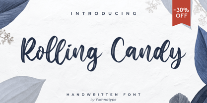 Rolling Candy is a beautiful handwritten font with a natural and unique design will make your project more beautiful. The font is suitable for your branding project, printing, logos dan wedding. Features: Beautiful Ligatures Multilingual Support PUA encoded Numeral and Punctuation by Yumnatype
 - Valkids by Letterara,
$12.00 Valkids is a cute and sweet handwritten font with an incredibly friendly feel. This font will turn any creative idea into a true piece of art! This font is PUA encoded which means you can access all of the cute glyphs with ease!
 - Kralken by ahweproject,
$9.00 Kralken is a cool, modern and detailed serif font. It will add a luxury spark to any design project that you wish to create! This font is PUA encoded which means you can access all of the amazing glyphs and ligatures with ease!
 - Rigeko by Zealab Fonts Division,
$10.00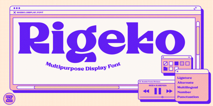 Rigeko is multipurpose and unique display font, you can use it in modern and vintage design. This font will suitable for any project, like branding, print template, logo and etc. Rigeko include uppercase and lowercase, ligature and alternate style, and also multilingual support.

