10,000 search results
(0.054 seconds)
- Snooker by Fenotype,
$35.00 Snooker is a playful and rounded low contrast type family with sans and script styles. The styles work great together or alone, making Snooker a versatile typographic tool. There are four weights in both sans and script, from the elegant Extra Light to the attention grabbing Bold weight. The exceptionally long ascenders and descenders give Snooker it’s distinct personality which helps your designs to stand out from the crowd. The script styles are packed with opentype alternates for customising your design. The family is perfect for branding, packaging and advertising purposes.
 - Salda by Hurufatfont,
$19.00 Salda; It is a modern sans serif family that blends old and new generation sans serif fonts in the same body. It has a wide usage area with its light narrow structure, sharp and clean lines, humanist touches. It provides clean and smooth visuals in vertical screens, mobile applications and block texts. With two different x heights (xL-xS), the body offers richness in text and headings. It consists of a total of 40 styles. Ideal for all kinds of editorial design, packaging, corporate identity, brand, application, web and desktop.
 - Arbus by Popskraft,
$18.00 When we think of a child's font, random scribbles often come to mind, but I thought, why not make a child's font fun, spontaneous, and at the same time simple and readable. This is how the Arbus font was born. This font is perfect for anyone looking for a light, free-style font that will last a long time. In addition, the font has a number of undeniable advantages: The Arbus font is perfectly balanced, which allows you to use it both in headings and for large amounts of text. Thus, you can completely design your products with one font family. The Arbus font family has nine font weights. The font supports all European languages and of course the Latin alphabet. Works on PC & Mac This beautiful Arbus font can be installed on any operating system, it can also be used in professional programs like Figma or Addobe Crative Cloud, as well as in other simpler software like Canva.
 - Unytour by NicolassFonts,
$25.00 Unytour is a modern sans serif font family of 54 fonts. It includes nine weights with italics from Extra Light to Heavy. Each weight includes alternatives (A,G,I,R,a,l) and OpenType features. Unytour is easy to read and perfect for logotypes, advertising, packaging, book covers and magazines, headings, corporate identities, and more.
 - Bayamo by Monotype,
$29.99 Emil Bertell's Bayamo is a contemporary, digital take on the brush script tradition. It echoes the loose forms and energetic personality of sign painted letters, tapping into the current nostalgia for hand-drawn type. “I think most script fonts nowadays are either some kind of modern calligraphy, or synthetic/mechanical scripts,” says Bertell. “This one leans more towards a classic American sign painting tradition.” Contextual alternates ensure that lowercase characters change depending what's next to them, mimicking the more varied word shapes created by sign writers. Well suited for branding projects, packaging and headlines, Bayamo also pairs well with strong sans serif, and other typefaces with angular forms.
 - Nusaibah by Eyad Al-Samman,
$20.00 “Nusaibah” is the first name of an early convert woman to Islam, and the first female to fight in defense of the Islamic religion. Her full name is Nusaibah bint Kaíab Al-Maziniyyah and she took part in the Battles of Uhud, Hunain, Yamama and the Treaty of Hudaibiyah with Islam’s prophet Muhammad (pbuh). Nusaibah is best known for her brave and heroic feat during the Battle of Uhud - fought on March 19, 625 - when she entered the battle carrying a sword and a shield to protect the prophet Muhammad (pbuh) from the arrows of the enemy, and she accordingly received several wounds while fighting and these wounds were not healed until the following year. The prophet Muhammad (pbuh) mentioned her distinct courage by saying that in whichever direction he turned in the battlefield, he could see her defending and protecting him. "Nusaibah" is a modern, geometric, and headline Arabic display typeface. The main trait of this typeface is the novel symmetrical design of its letters which renders it as one of the modern stylish typefaces used for headlines and titles. This is can be noticed in its letters such as “Theh”, “Jeem”, “Ain”, “Sheen”, and others. Moreover, “Nusaibah” font has a character set which supports Arabic, Persian, Urdu, and Latin letters and numerals with a limited range of specific Arabic and Latin ligatures. This font comes in two weights (i.e., regular and bold) with nearly 643 distinctive glyphs. Due to its geometric and linear design, “Nusaibah” typeface is appropriate for heading and titling in Arabic, Persian, and Urdu magazines, posters, and surfaces of different equipment. It is also elegantly suitable for signs, books’ covers, advertisement light boards, products’ and services’ names, and titles of flyers, pamphlets, novels, and books of children. “Nusaibah” typeface is one of the Arabic typefaces that has a novel and modern-day design which can be used in versatile graphic, typographic, and artistic works in different languages for diverse cultures.
 - Pink by ITC,
$29.00Pink is the work of British designer Timothy Donaldson, a sans serif in a style typical of the 1990s. Capitals are slightly condensed and feature unusual variations in stroke widths and the lowercase has an even more irregular stroke pattern, yet an even texture is produced when used in word settings. - ITC Astro by ITC,
$29.99ITC Astro is the typeface that proves you can get your work done while watching cartoons. “It all started as a series of doodles while I was watching The Jetsons,” recalls Sasa Petricic. “The show's impossibly simplistic vision of the twenty-first century cried out for a font that fit into that world -- a world where everyday objects can carry far more fun and personality than they should.” ITC Astro is the first commercial typeface design from Petricic, whose “day job” is working as a reporter for the Canadian Broadcasting Corporation. Petricic has filed stories from across Canada and around the world for CBC's flagship evening newscast, The National. His reports have also appeared on CNN and BBC Television. Petricic's work as a correspondent and video journalist have taken him to six continents, covering everything from famine and genocide in Africa to the war in Iraq. With such serious matters filling the hours of Petricic's day as a journalist, it's not hard to see why he conceived Astro as a welcome blast of whimsy. “As I began to draw the design,” he says, “I decided that every part of Astro should be a cartoon character unto itself.” Each character has its own baseline shadow (or coaster, or circular antigravity generator, depending on how you look at things). The angular caps dance jauntily, rocking from left to right, while a suite of companion small caps provide backup. The end result is a design quite unlike any other, with surprising charm and versatility. ITC Astro comes in a two-weight family of White and Black. - Bradley Type by ITC,
$40.99The details that work for ITC Bradley Hand™ at smaller sizes, might be a little too distracting for some at larger, display sizes. Bradley Type™, is a little softer, more refined, and a touch more condensed - especially useful if space is an issue. It can be used as a compliment or counterpart to Bradley Hand, or on its own for short bursts of text or headlines. Richard Bradley explains, I designed the family for casual home computer users as well as professional graphic communicators. For anyone who's looking for a handwriting typeface, Bradley Type can be used at a variety of sizes for diverse projects." For added versatility, it's available in three weights, from the lean Regular, through Bold, and Heavy; and a number of ligatures and alternates for variety, and that little added flair." - Vectis by Greater Albion Typefounders,
$14.95 Vectis, named in honor of the Roman settlement of Britain's south coast on the Isle of Wight, brings a fresh approach to the classic simple elegance of ancient Roman faces. Vectis is offered as a small caps face designed to add a fresh hint of character to this style of classical design. Vectis can lend a note of formal dignity to any design project or poster and is ideal for clear headings and titles with a traditional feel. Two basic weights are offered, regular and bold, as well as a range of alternate letterforms and ligatures. This popular family has now been expanded with the incised 'Monumental' display face, and well as 'miniscule' lower case forms and condensed widths. Vectis and our Anavio families compliment each other perfectly, and can also be purchased together in a value pack.
 - Perron by Fontforecast,
$39.00 Meet the successor of our bestselling design kit 'Chameleon': Perron. The concept of designing multiple contrasting designs under the same name was first introduced by Fontforecast in TyfoonSans and TyfoonScript. Two font families that were designed to complement each other. And that's exactly what this new release does. With the three designs in Perron, which means 'platform' in dutch, you will be able to take your design projects where ever you want them to go. This flexible kit consists of 7 fonts in three basic designs, and when combined Perron No1, No2 and No3 reïnforce each others charm. This offers great potential for creating lively layouts for many different projects, e.g. invites, menu's, magazines, brochures, packaging, greeting cards, T-shirts, etc. Perron No1 is a serif display font with large and small Caps. This font requires an Opentype savvy application to reach its full potential. Turn on contextual alternates and beginning and ending characters are replaced by their alternative versions, as you type. Stylistic sets and swashes offer even more variations. Perron No1 comes in two versions: No1 and No1 Shade. They can be used separate or layered for a colorful or shaded effect (if your application allows you to stack text frames). Perron No2 is a charming handwritten font, with slightly rough contours, that was added for an extra personal touch. It comes in regular and Italic. Perron No3 is a clean, tall and very skinny font family. It has large and small Caps and comes in three weights: Light, Regular and Bold. Because of its clean appearance No3 adds a modern touch to the design kit.
 - PTx Flowers by Pedro Teixeira,
$15.00 PTx Flowers Font Family 2 fonts: regular and silhouette each font - 6 glyphs TTF format Bear in mind that each glyph of the font PTx Flowers Regular is close to the maximum limit of points possible in ttf, which means that despite being tested in several programs, illustrator, photoshop, among others including word, some bugs may occur, depending on the rendering capability of the program you are working on. I found however that most of the time, that by the way the bugs, when tested, were only verified in word, that changing the size of the letter/glyph or even the zoom of the document, the letter/glyph was rendered correctly. These fonts have a very limited number of glyphs because, due to the glyphs having too many points, it can take some time to render. This will depend on the capacity of the machine's graphics card (computer, tablet, mobile phone). Hence a low number to take as little time as possible. See at work in word: https://youtu.be/PIMBlja2I5k See ar work in illustrator: https://youtu.be/RJp9X9TQ4so See at work in photoshop: https://youtu.be/yvrBmCJ80pc
 - Callisto by Groteskly Yours,
$8.00 Callisto is a classic serif stencil fonts that is a stencil font like no others. Elegant curves are paired with great legibility and wide range of available glyphs. While stencil fonts are generally thought of as too masculine and rough, Callisto is very feminine and soft, which makes it perfect as a logo font for those who seek to further emphasise their brand's identity. Despite being a display font, Callisto looks great at smaller sizes, so short headlines and headers will look natural and email legible even in smaller sizes. Callisto comes in two styles —Regular and Half —which can easily be combined within the same body of text. Regular is a more minimal style, with wider and more open apertures, while Half is a hybrid between a serif and stencil font that still has longer strokes and stems. Each style consists of 415 glyphs, ranging from fractions to diacritics. There are a number of glyphs with cool stylistic alternatives (which is awesome for branding), lots of punctuation and OpenType features. Callisto is a great font for designers and artists who need a feminine font with a really strong character.
 - Natura by Resistenza,
$39.00 Inspired by old nature field notebooks, Natura was born out of the passion for new modern hand-calligraphy, designed first with a flexible fountain pen and then digitalized glyph by glyph to get the natural feeling of the dry ink on smooth paper. This family includes five different fonts. Natura regular is an upright script with lots of swashes and ligatures and offers a wide range of flexibility with its many Opentype features. You will also find that its initial and terminal letters can enhance your designs in new and creative ways. Natura Slanted font offers the same functionality than Natura Regular but we changed the angle 16 degrees, creating an elegant feeling. Natura Notebook, is a narrow serif font with a stylised grunge effect with strong, legible vertical height. Natura Icons and Natura Stamps complete the whole family with incredible flourished elements and capital letters inspired by nature. Hand-drawn leaves, plants, flowers, as well as large and small animals add original detail while complementing the font perfectly. Natura is ideal to use for event invitations, special purpose cards, signatures, labels and packages. Check out also ‘Modern Love Slanted’ Turquoise Nautica
 - Jackalope LP by LetterPerfect,
$39.00 Jackalope is a new original script font from LetterPerfect Fonts. The design is a hybrid of pressure-pen calligraphy infused with whimsy and curlicue terminals. Letterforms are free-spirited and edges are rough, simulating spontaneous writing on rough paper. In addition to the full ANSI western character set, Jackalope includes a full set of small capitals, both lining and old-style numbers, and swash lowercase alternate characters that can be used as terminal letters at the ends of words for additional flourish. The genesis and realization of Jackalope was also a hybrid process. In 1996, LetterPerfect commissioned type designer Kathy Schinhofen to provide pen-written source material based on her commercial handwriting style and specifically on a logo she had designed for its "Viva la Fonts" line of script fonts. This work was digitized by LetterPerfect’s Garrett Boge and later fonticized by former Hallmark Cards type maven Myron McVay who unified the design and contributed additional characters. The design sat unfinished for over 12 years until Garrett Boge revived the project in 2010 filling out the extended character set. Jackalope is released in two versions: Jackalope LP Regular, which is the base font for continuous text setting; and Jackalope LP Expert, which includes swash variants, small capitals, and old-style numerals which can be swapped into text for extra flourish and effect.
 - Rigid Display by Studio Fat Cat,
$20.00 Rigid Display is a sans serif font designed for display needs such as titles, logos, etc. with a different touch. Rigid Display provides 5 weights for its users to have freedom in handling. This fresh font is an alternative that will refresh your font library and also the viewers so feel free to choose it as the main pawn for your project
 - TS Kirt by Vitaliy Tsygankov,
$19.00 TS Kirt - variable sans-serif typeface with narrowed proportions. The font is suitable for titles, packaging, printing, websites, infographics, and advertising. The TS Kirt font family consists of 6 faces and as well as a variable version. The advantage of the font - the same width character in any style. When switching the face, the length of the line will not change.
 - Tropican by Letteralle,
$23.00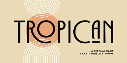 Tropican is an uppercase sans serif font with a vintage and minimal style. Tropican brings many ligatures that will make this font even more interesting and different. Tropican is a versatile font, perfect for display, editorial projects, Logo design, Wedding, Clothing Branding, product packaging, magazine headers, or simply as a stylish text overlay to any background image. I hope you enjoy! Letteralle Studios
 - Gayatri by Océane Moutot,
$32.90 Gayatri is sans serif font with high contrast and smooth lines. Its large variety of glyphs, including accents, old-style numbers, ligatures,... will give you freedom for all of your projects. It offers a large choice of uses such as magazine, branding, edition and so on. Gayatri is available in 16 styles from thin to black, in roman and italic.
 - Garked by Linecreative,
$16.00 Garked is a font typeface inspired by ancient nordic runes, you want to customize a logo, brand or other design with ethnic or tribal style, this font is perfect for your choice. What you get, you will get: 1. Garked – Clean San serif font including Uppercase & Lowercase (ALL CAPS) characters, 2. Numbers and Punctuation 3. Support Multi language (Western Europe Latin)
 - Habana Vieja by Letters&Numbers,
$16.00 Habana Vieja is inspired by hand-painted signage in Havana’s old town. Letters are defined by their drop-shadow and worn outlines; suggestive of a sunny environment. This playful sans-serif, bold font, will work well used for headings and short paragraphs especially for posters or signage. Habana Vieja is extended, containing West European diacritics, making it suitable for multilingual environments and publications.
 - Mango Vintage by Zeenesia Studio,
$16.00 Introducing Vintage Mango Vintage Mango is a modern and elegant sans serif font. Vintage Mango is well-suited for advertising, branding, logotypes, packaging, titles, headlines and editorial design. I created more much alternates variant and much natural ligatures to make this font very classy and look so beauty. Vintage Mango was built with open type features make your project will be perfect.
 - Suprema by Artegra,
$29.00 Suprema is a modern sans serif family that will bring supreme geometric perfection to any piece of typography. It has 7 weights with matching true italics. When it comes to Opentype it has lots of features such as tabular lining, proportional oldstyle, tabular oldstyle, ligatures, superscript, subscript, fractions and language localisations for languages such as Polish, Dutch, Romanian, Moldovian and Catalan.
 - Enovella by Wontenart,
$25.00 Enovella is a cool and modern Sans Serif font. writing for a magazine that requires a lot of text is the strength of this font. easy to read, and not tired on the eyes. No matter the topic, this font will be an incredible asset to your fonts’ library, as it has the potential to elevate any creation. Thank You
 - Swonderful by The Ampersand Forest,
$19.00 Everyone loves an Art Deco typeface. And there are hundreds of similarly-designed deco faces out there! But not one of them seems to have every form of every character that you want or need at any given moment. That’s why Swonderful was created! It has more letterform variations than you can shake a stick at (if you're inclined to shake sticks at things). With four variations of every uppercase form, two variations of every lowercase form (plus diacritical characters for the standard set), you’re bound to find the character you need for any given project, whether the style is French Art Deco, American Streamline Moderne, or Jazzy Midcentury Gaspipe. Just switch between stylistic sets! And you’ll find all those characters in three standard weights: Light, Regular, and Bold. They’re designed as a unicase, so they’re all height-compatible, and every set works with every other set, so you can mix and match to your heart’s delight!
 - Syntax Next Paneuropean by Linotype,
$103.99Syntax was designed by Swiss typographer Hans Eduard Meier, and issued in 1968 by the D. Stempel AG type foundry as their last hot metal type family. Meier used an unusual rationale in the design of this sans serif typeface; it has the shapes of humanist letters or oldstyle types (such as Sabon), but with a modified monoline treatment. The original drawings were done in 1954; first by writing the letters with a brush, then redrawing their essential linear forms, and finally adding balanced amounts of weight to the skeletons to produce optically monoline letterforms. Meier wanted to subtly express the rhythmical dynamism of written letters and at the same time produce a legible sans serif typeface. This theme was supported by using a very slight slope in the roman, tall ascenders, terminals at right angles to stroke direction, caps with classical proportions, and the humanist style a and g. The original foundry metal type was digitized in 1989 to make this family of four romans and one italic. Meier completely reworked Syntax in 2000, completing an expanded and improved font family that is available exclusively from Linotype GmbH as Linotype Syntax. In 2009 the typeface family was renamed into a more logical naming of "Syntax Next" to fit better in the Platinum Collection naming." - J Scott Campbell Sketchbook by Comicraft,
$29.00 Created for J. SCOTT CAMPBELL'S DANGER GIRL SKETCHBOOK, this slick and stylish font is perfect for architectural drawings, marker comps or, um, sketchbooks! Artwork from Elephantmen: Man and Elephantman by J. Scott Campbell
 - SDGlitch by Sudezine,
$10.00 SDGlitch is a futuristic cyber-style font. You can use this font for logos, quotes, invitations, greeting cards, journals, posters, clothing, and more. This font will infuse your designs with playfulness and fun!
 - Good Vision by Seemly Fonts,
$12.00 Good Vision is an adaptable and casual handwritten font that can be used for all chalkboard quotes or teaching material! Its authentic look will add a personal and realistic feel to your designs.
 - Wake Up Now by Seemly Fonts,
$12.00 Wake Up Now is a cute and simple lettered handwritten font that can be used for all chalkboard quotes or teaching material! Its authentic look will add a realistic feel to your designs.
 - Kayane by Differentialtype,
$10.00 Kayane is a splendid script font that can be used for branding, greeting cards, wedding invitations, and many other projects. It will add luxury to any design project that you wish to create.
 - Red October - Personal use only

- Zin Display by CarnokyType,
$46.00 Zin Display is a contemporary typeface designed for various situations of typographic usage. Characteristic feature is a large x-height and balance between neutral construction of letters (strictly vertical axis), dynamic open forms (opened terminals) and sharp instrokes, outstrokes and serifs. Another typical feature is a visually narrower connection between stems and strokes. The complete font family consist of three width proportions (Normal, Condensed and Extended). Every sub-family has 5 weights, ranging from Light to Black with matching Italics. Zin Display can be effectively used especially for display typesetting but works for longer text as well. It can be used especialy in magazine layouts and editorial design, as well in advertising typography, orientation systems, corporate identities and many other situations. Zin Display is a member of the Zin super family, which also includes Zin Sans, Zin Slab and Zin Serif fonts.
 - Brushability by My Creative Land,
$29.00The Brushability is a brush-written font family that contains 9 fonts, all united by a brushy look. All fonts compliment each other perfectly and can be used either together or with many other brush-looking fonts on the market. The script contains a lot of alternates, swashes, ligatures, arrows etc. while the Extras font has quite a few design elements with the same brush look - such as arrows, frames and swashes - to add more personality to the design. The 5 sans serif fonts (ranging from Light to Black) also contain alternate glyphs for certain letters - just to make your design process even more fun. All fonts, as usual, are fully unicode mapped so you can use them in any application. Just be aware that if your application doesn’t support OpenType features, you’ll have to choose the glyphs you need manually. - Jessica - Unknown license

- Christa - Unknown license

- Almagro - Unknown license

- Janet - Unknown license

- Lizard - Unknown license

- Aljo - Unknown license


