10,000 search results
(0.296 seconds)
- Curtain Up JNL by Jeff Levine,
$29.00 The 1937 sheet music for the tune "Sweet Stranger" has the title hand lettered in a round cornered Art Deco sans with an inline featuring square corners. Now available as Curtain Up JNL, it is available in regular, oblique, solid and solid oblique versions (for those who prefer a version without the inline).
 - Art Materials JNL by Jeff Levine,
$29.00 The cover of the 1930s-era “Catalog of Artists’ Materials” from Ernst H. Friedrichs, Inc. (New York) has the words “Artists’ Materials” hand lettered in a stylized Art Deco sans serif type style. This unique design is now the digital font Art Materials JNL, which is available in both regular and oblique versions.
 - Counter Service JNL by Jeff Levine,
$29.00 The hand lettered name “Chickland” from a 1958 restaurant menu cover was actually a throwback to the Art Deco style with its condensed thick and thin sans serif design. With just a few available letters to work with, it has been turned into Counter Service JNL; available in both regular and oblique versions.
 - Escato by Sayurihuynh,
$8.00 Escato is a modern sans serif font family with a simple design and a little break-rule, consisting of 5 styles ranging from Regular, Bold, Round, Bold Round, and Outline. Escato is suitable for products with simple but sophisticated and equally creative designs, such as magazine, book look, business card, logo, branding, etc.
 - Calling Cards by Ana's Fonts,
$12.00 Calling Cards is simple and clear, slightly condensed sans serif font family in 3 styles: Regular, Italic and Bold. Each font includes ligatures and stylistic alternates. Calling Cards looks great in quotes, logos, print, and social media, and is perfect for both short and long texts, at small and large font sizes.
 - Tabloid Edition JNL by Jeff Levine,
$29.00 The headline across the October 7, 1918 edition of the UK’s Daily Mail stated: "Germany Asks the Allies for Peace". Set in extrabold sans serif lettering, it’s now available digitally as Tabloid Edition JNL in both regular and oblique versions. This is another “redrawn from the headlines” typeface from Jeff Levine Fonts.
 - Varino by Arterfak Project,
$15.00 Varino is a futuristic font. A font family inspired by the visual of technology that we can find in logos, Sci-Fi movies, games, and the present gadgets. Designed with minimalist style and unique letterforms, Varino is a perfect choice to use for logos, labels, posters, packaging, books, movies, presentations, games, and much more! Varino, complete with some elegant ligatures, will make your design look more futuristic and dynamic. Varino comes in Light, Normal, Bold, Outline and Extrude.
 - Almost Perfect by Sensatype Studio,
$15.00 A Nostalgic Elegant Serif font that we created special for elegant branding needs, with unique shape will be ready to add value of your brand. It so nice to leverage designer or product owner that need solutions to make their design look more stylish and modern. And specially for Almost font, We prepared any characters to help you create unlimited variations for your creative needs. Almost Nostalgic Serif font ready with: Ready with Regular and Italic version Preview as a inspirations that you can do with Almost font Ready with Lowercase and Uppercase characters Wish you enjoy our font. :)
 - Filarion by Locomotype,
$15.00 Filarion is inspired by a bit of 60s typography. At first glance it looks contrasting but is executed in a different way. The lines are drawn irregularly so that it looks casual and not stiff. From a clean basic form (Regular), Filarion was developed into three different variants, namely Bulbous, Noetic and Print. Each of them has an oblique style. So you will get 8 fonts from Filarion family. This font is suitable for use as a title in broadcast videos, movies or poster designs. It can also be used on quotes and other promotional materials that require extra attention.
 - HollaBear by Designova,
$9.00 A cute and funny kid-friendly typeface inspired from bears and handmade with passion and joy. Will you believe if we say, HollaBear is made by bear cubs. The typeface is essentially simple but very uniquely expressive when it comes to the design of posters, flyers, cartoons graphics, logotype, web and display usage. Please see the examples shown above to get an idea about the capability of this typeface. HollaBear comes with Extended Latin character sets including Western European, Central European and South Eastern European character sets. The typeface comes in 6 variants (Regular, Italic, Outline, Outline Italic, 3D and 3D Italic).
 - Rumley Moon by Letterhend,
$17.00 Rumley Moon is a versatile bold font with unique letterform. This font will bring you back to retro feel.This font perfectly made to be applied especially in logo, and the other various formal forms such as invitations, labels, logos, magazines, books, greeting / wedding cards, packaging, fashion, make up, stationery, novels, labels or any type of advertising purpose. Features : Regular & outline version Uppercase & lowercase Numbers and punctuation Multilingual PUA encoded We highly recommend using a program that supports OpenType features and Glyphs panels like many of Adobe apps and Corel Draw, so you can see and access all Glyph variations.
 - Naomi Style by Sensatype Studio,
$15.00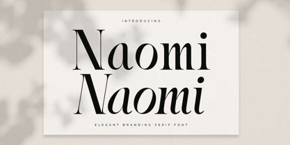 A Serif font that we created special for elegant branding needs, with extra ligature and alternates in unique shape will be ready to add value of your brand. It so nice to leverage designer or product owner that need solutions to make their design look more stylish and modern. And specially for Naomi font, We prepared any ligatures characters to help you create unlimited variations for your creative needs. Naomi Serif font ready with: Ready with Regular and Italic version Preview as a inspirations that you can do with Naomi font Ready with Lowercase and Uppercase characters Wish you enjoy our font. :)
 - Stephen Gillion by Sarid Ezra,
$13.00 Stephen & Gillion is signature script with three style that contain stylistic alternate, swash, etc to create your own customized signature or logo design. Stephen & Gillion is a signature font that you can use to make a logo for branding, beautiful fashion design, suitable for wedding invitation, or handwritten quote. Come with heart-shaped connector! Also already PUA Encoded. Foreign Languages Support: ÀÁÂÃÄÅÇÈÉÊËÌÍÎÏÐÑÒÓÔÕÖØÙÚÛÜÝßàáâãäåæçèéêëìíîïðñòóôõöøùúûüýÿ What Will You Get: Stephen & Gillion Regular (OTF & TTF) Stephen & Gillion Bold (OTF & TTF) Stephen & Gillion Italic (OTF & TTF) Instruction PS: Type underscore + number (from 1 to 5). Or copy Some_5thing in preview bellow..
 - Starting Linup by Sensatype Studio,
$15.00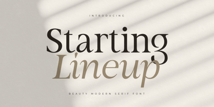 A Modern Beauty Serif font that we created special for elegant branding needs, with unique shape will be ready to add value of your brand. It so nice to leverage designer or product owner that need solutions to make their design look more stylish and modern. And specially for Almost font, We prepared any characters to help you create unlimited variations for your creative needs. Starting Lineup Beauty Modern Serif Font Family ready with: Ready with Regular and Italic version Preview as a inspirations that you can do with Starting Lineup font Ready with Lowercase and Uppercase characters Wish you enjoy our font. :)
 - Kagomechan by Allouse Studio,
$14.00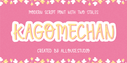 Proudly Presenting, Kagomechan a Modern Script Font With Two Styles Regular and Textured which will you give an a stamp effect. Kagomechan come along with multi-Lingual Support to fulfill your need. We highly recommend using a program that supports OpenType features and Glyphs panels like many of Adobe apps and Corel Draw, so you can see and access all Glyph variations. Kagomechan is perfect for any title, logo, product packaging, branding project, megazine, social media, wedding, or just used to express words above the background. Enjoy the font, feel free to comment or feedback, send me PM or email. Thank You!
 - Strategist by Sensatype Studio,
$15.00 An Unique Contemporary Branding Font that we created special for elegant branding needs, with unique shape will be ready to add value of your brand. It so nice to leverage designer or product owner that need solutions to make their design look more stylish and modern. And specially for Strategist font, We prepared any characters to help you create unlimited variations for your creative needs. Strategist Unique Contemporary Branding Font ready with: Ready with Regular and Bold version Preview as a inspirations that you can do with Strategist font Ready with Lowercase and Uppercase characters Wish you enjoy our font. :)
 - Falling Style by Sensatype Studio,
$15.00 A Modern font that we created special for unique branding needs, with extra ligatures in unique shape will be ready to add value of your brand. It so nice to leverage designer or product owner that need solutions to make their design look more unique and modern. And specially for this font, We prepared any ligatures characters to help you create unlimited variations with outline font style for your creative needs. Falling Modern Logo Font ready with: Regular and Outline Versions Preview as a inspirations that you can do with Falling font Ready with Lowercase and Uppercase characters Wish you enjoy our font. :)
 - Glatic by Yukita Creative,
$14.00 Introducing Glatic Typeface, a fancy bold font. Its unique construction is inspired by nature and all things beautiful. It's meant for graphic designers and typography professionals to get more done with style in mind! This font will go well with logos, headlines, titles, and minimal layouts. Features. - Fonts can be read from a much larger distance than regular fonts - Elegant letters give the impression of luxury - Smooth curves for elegant typography - Supports all languages in the world (37) - Versatile Single Font. - One font for all needs. Recommended use Play with your letter spacing to add more class to your designs.
 - GreenCherry by Vishwakarma Studio,
$10.00 GreenCherry typeface is for regular texts. I have designed every glyph with kept perfection in mind. I also retained symmetry throughout all glyphs. They look very premium when placed together. The typeface has 3 fonts - Thin, Normal & Bold. Every font has 210 glyphs and supports Western European languages. It has essential OpenType features like Kerning and Hinting. Hence you can use it wherever you want. It works very well with print media and web media as well. This typeface is suitable for Websites, Apps, Blogs, Book Publication, Stationery, Signage, and other Printing media. I am sure you will enjoy this typeface.
 - Alien UFO by Gravitype,
$16.90 Alien UFO is a particular display font born from the fusion between raptor claws and an alien appearance. The standard characters have been conceived to look more aggressive, to wonderfully fit the atmosphere when tension is needed, to highlight the sense of unknown, mystery, fear. A lot of alternative glyphs are included to give you more aesthetic options and cover a wider spectrum of emotions to convey to the situation. The outline version can be mixed with the regular one to create contrast with the filled glyphs. It results particularly eye-catching after applying a mesmerizing neon effect. Multiple languages are supported.
 - Chofines by Viaction Type.Co,
$18.00 Chofines is a serif font with a retro style that is suitable for a variety of design purposes. Has a very soft curve, looks elegant and attractive when applied to the design. Equipped with opentype features such as Stylistic Alternate and rich Standard Ligature. It can be used in various countries because it supports Multilingual, adding to the maximum power of this font. You will get including: This font includes 2 styles, regular & oblique. It is very profitable to buy the Chofines font. Get it Now ! I hope you enjoy it and thank you. Viaction Type
 - Bandaneira Style by Sensatype Studio,
$15.00 A Modern Stylish Duo Font that we created special for elegant branding needs, with unique shape will be ready to add value of your brand. It so nice to leverage designer or product owner that need solutions to make their design look more stylish and modern. And specially for Bandaneira font, We prepared any characters to help you create unlimited variations for your creative needs. Bandaneira Modern Stylish Duo Font ready with: Unique Beauty Characters Bandaneira (Regular and Italic) Preview as a inspirations that you can do with Bandaneira font Ready with Lowercase and Uppercase characters Wish you enjoy our font. :)
 - Bodrum Stencil by Bülent Yüksel,
$19.00 Bodrum Collection: 1- Bodrum Sans 2- Bodrum Sweet 3- Bodrum Stencil 4- Bodrum Slab 5- Bodrum Styte 6- Bodrum Soft Bodrum Stencil is a stencil serif type family. Designed by Bülent Yüksel in 2018/19. The font, influenced by style serifs, popular in the 1920s and 30s, is based on optically corrected geometric forms for better readability. Bodrum Stencil is not purely geometric; it has vertical strokes that are thicker than the horizontals, an “o” that is not a perfect circle, and shortened ascenders. These nuances aid in legibility and give "Bodrum Stencil" a harmonious and sensible appearance for both texts and headlines. Bodrum Stencil provides advanced typographical support for Latin-based languages. An extended character set, supporting Central, Western and Eastern European languages, rounds up the family. The designation “Bodrum Stencil 14 Regular” forms the central point. "Bodrum Stencil" is available in 10 weights (Hair, Thin, Extra-Light, Light, Regular, Meduim, Bold, Extra-Bold, Heavy and Black) and 10 matching italics. The family contains a set of 650+ characters. Case-Sensitive Forms, Classes and Features, Small Caps from Letter Cases, Fractions, Superior, Inferior, Denominator, Numerator, Old Style Figures just one touch easy In all graphic programs. Bodrum Stencil is the perfect font for web use.
 - If This Be Doomsday by Comicraft,
$19.00 THE END IS NIGH! Judgment Day has come and this planet has been CONDEMNED! Do not conspire to hide what remains of your paltry world from my eyes! Know you not that NONE may thwart my will? Of what import are brief, nameless lives -- to DOOMSDAY?? Death is Certain! Apocalypse is UNAVOIDABLE. At last, my cosmic hunger will be sated, if only briefly! This planet shall SUSTAIN me until it has been drained of all elemental life! SO SPEAKS DOOMSDAY! But do not fret. Even if the Domesday Book has been closed on your planet... your utter destruction is being made available in Font form, I call it IF THIS BE DOOMSDAY, and I will deliver it to you via comicbookfonts.com in Regular, (Roach) Chew and Outline weights. Never let it be said that DOOMSDAY is without mercy. Features: Three weights (Regular, Chew & Outline) with small cap characters and Western & Central European international characters.
 - Street Scribe by Vozzy,
$10.00 Introducing hand made label font named Street Scribe. This font family has an additional characters and multilungual support (check out all available characters on previews). Typeface has two styles Regular and Italic. This font will look good on any sport styled designs like a poster, T-shirt, label, logo, etc.
 - Space Journey by Vozzy,
$10.00 Introducing retro sci-fi label font duo named Space Journey. This display font is inspired by movie posters from the 60s and 70s. Font family has two styles: Regular and Rough. This font will look good on any retro sci-fi styled designs like a poster, T-shirt, label, logo, etc.
 - Catalpa by TypeTogether,
$35.00 The Catalpa font family is José Scaglione and Veronika Burian’s wood type inspired design for an overwhelming headline presence. It has no regular weights, only four slender and four hulking weights. Catalpa wasn’t made to be normal; it was made to overwhelm, to stand out, to bellow. Catalpa is the first font family within a trilogy that will be released through 2020. Each of the three have a distinct purpose and their own look, but they serve a common goal: to act as a complete family covering an editorial’s wide array of needs. As the first of the three, Catalpa is the bookend font family with a headlining purpose. What requirements are there for a great headline typeface? Distinction, weight, and cohesiveness are a good start. Its distinctiveness must catch attention, it must have a range of weights applicable to its purpose, and its internal consistency and external look must create a cohesive family. Catalpa is a distinct and unified family whose weights are attuned to its single-minded purpose — headlines and large text. Catalpa has only eight styles that are divided into two ranges of weights — four very light weights (Hairline, Thin, Extralight, and Light ) and four very bold ones (Extrabold, Heavy, Black, and Extrablack). The thin and heavy ends of the spectrum also have their own variable fonts, each with one axis of weight so designers can fine-tune their work. The geometric influence of the design is more obvious in the light range, with their line thickness increasing in the classical manner. The bold weights increase more in width and substance to serve well in websites, mobile apps, posters, advertisements, and magazines that aim for impact more than spreading information. As a family, Catalpa gels in big headlines, short sentences, and isolated words. The family has many recognizable features, in the bolder weights especially, like the reversed contrast ‘S, s’ or the angular design of ‘Q, M, W, w, a, f, 2, 3’. Catalpa’s headlining mixture of geometry and quirkiness leaves an impression that is so characteristic of wood type, but designed for substrates and screens.
 - Gravity Well by Hanoded,
$15.00 I seem to be in my astronomical phase right now. I recently released several fonts with names relating to space! Don’t worry, it is just a phase and this too will pass… Gravity Well is a handmade brush font, ideally suited for product packaging or book covers. Gravity Well comes with all the diacritics you can ask for and a set of double letter ligatures to boot!
 - Superline by Kavoon,
$14.00 SuperLine Typeface. A striking modern display font in three styles. SuperLine is a modern, all caps display font. Specifically developed for contemporary design styles and applications, it is supplied in three styles; regular, lined and outline. Although it can be used at smaller sizes, it has been designed primarily for use at larger scales. Perfect for branding projects, striking posters and as a unique display font for web or app development, you can make a statement with SuperLine. Extensions shape backgrounds are included. Designed to compliment the angles in the SuperLine typeface, these shapes are perfect for using as masks, image overlays or solid color background fills. They are supplied in Illustrator (ai and eps) vector format. Whats Include: Meticulously designed All uppercase display Comes in 3 styles, Regular, Lined and Outlined Allows for a vast range visual styles Webfont kit included (created via fontsquirrel) Licensed for Personal or Commercial use (OFL) Vector Extensions included (In Illustrator vector format) As ever, drop me a message if you have any questions.
 - Entendre Rough by Wordshape,
$30.00 Entendre Rough defies the conventions of most distressed typefaces, as it is an actual text typeface family. Sure, you can use it for your big display type, but you can also use it for body text. Entendre Rough is a stately, commanding and handsome distressed sans serif typeface family that pulls reference from Trajan capitals, the history of English calligraphy, and a variety of other sources to summon a sense of warmth, consideration, trust and authority. Entendre Rough spans 22 weights and styles including Regular and Condensed versions. The large x-height and refined characteristics of the family lend the family a sober and sophisticated appearance that is suitable for both print design and on-screen use. Entendre Rough includes Central and Eastern European language support as well as Western European language support, including Greek and Cyrillic. Entendre Rough’s generous x-height and medium-length ascenders and descenders offer pronounced readability, making the family useful for text typesetting both in print and on screen. Within, humanist elements are tempered with monumental construction, making the heavier weights go-tos for display design work. All of the Entendre Rough family of typefaces feature Western, Eastern and Central European language support alongside nuanced Greek and Cyrillic. Entendre Rough pairs well with our non-distressed Entendre family and our rounded sans serif family Elpy, sharing similar proportions and spacing.
 - Bosan by Twinletter,
$12.00 Introducing Bosan, our newest san serif that offers beautiful typography for your project needs. type of font that is relaxed and elegant when used both for title words, sentences and other writing. will seem comfortable to look at when reading the contents of the message you want to convey. This font is very suitable as text with displays for various kinds of branding, advertisements, posters, banners, packaging, news headlines, magazines, websites, logo design, banners, social media design and of course you can use a lot more.
 - Brighty by SSI.Scraps,
$15.00 Brighty is a fun and friendly sans serif font with a beautiful alternates. Fall in love with its timeless elegance. it is suitable for heading and outline. you will love it. Support multilingual. it is consist of Basic Multilingual Plane, Basic Latin, Latin-1 Supplement, Latin Extended-A & B, general punctuation, super and subscripts, currency symbols, letterlike symbols and Alternate characters on PUA. The file includes OTF, plus bonus editable SVG Papercut and template can be downloaded here: https://www.dropbox.com/s/xen5i6h2o3f6oz6/Brighty%20MF.zip?dl=0
 - Nordeco by Leksen Design,
$29.00 Inspired by her Scandinavian heritage, Andrea Leksen created this modern geometric sans serif reminiscent of Scandinavian design and typography. With its tall x-height and monoweight strokes, Nordeco will be best showcased at large sizes, in headlines and other display uses. It contains 100 alternates with ornamental letters, borders, paragraph separators and seamless wallpapers for your designing pleasure. Designs include stripes, dots, art deco and leopard print. See some of the creative ways Nordeco can be used in this YouTube clip. Check out its cousin, Nordique!
 - Almanach by Dada Studio,
$29.00 Almanach is a multifunctional, sans-serif font, suitable for a wide range of applications. The universality is it’s strength, but it is not impersonal. It’s character can be felt in the delicately softened endings of letters and in the dancing numbers. The italics is designed in compliance with the rules adequate to the italian sherif typefaces. This is particularly evident in the Cyrillic script, where a lot of characters have a different form than their upright counterparts. Almanach looks familiar. You will surely hit it off.
 - Bruta Global by Ndiscover,
$59.00Bruta is a contemporary sans-serif grotesque typeface, conceived to become the Swiss army knife of your font library. Inheriting the modernist approach of the grotesque fonts, Bruta aims to be a rational and neutral typeface suitable for a wide range of applications. Whether it’s used for print or screen, in large or small sizes, for magazines or branding, Bruta will stay on your font library for long time. Loaded with Opentype Features, +100 emojis, Greek and Cyrillic support, Bruta can easily become your new default font. - Geometrix by d[esign],
$17.38 The handprinted Geometrix font family is an alternative to the usual distressed typeface. Rather than drawing on a sans-serif style and tearing it to shreds, Geometrix provides an intresting and compelling set of shapes which ties into a nice worn effect. The Geometrix font family consists of two fonts; Geometrix and Geometrix Nero. Geometrix and Geometrix Nero can be used together to create a fill for Geometrix's letters, by layering Geometrix above a differently coloured Geometrix Nero in your image editor of choice.
 - Gilmore Fahrenheit by Red Rooster Collection,
$45.00 Gilmore Fahrenheit is a glyphic, sans serif typeface that was inspired from early designs by the renowned English typographer Eric Gill. It was designed in 1992 by A. Pat Hickson (P&P Hickson) and Steve Jackaman (ITF) exclusively for the Red Rooster Collection. It was designed with true small caps, has an italicized geometric look, and possesses legibility reminiscent of Swiss typefaces.
 - ITC Gema by ITC,
$29.99ITC Gema is the work of Brazilian graphic designer Claudio Rocha. It was first written in a small size to keep the surface irregularity of a non-coated paper when enlarged for use as a display font," says Rocha. Many strokes do not quite join, giving Gema the visual effect of a stencil typeface, the distinguishing characteristic of the font. "Some characters have my own handwriting gestures," says Rocha, like elongated endings and angular shapes. Gema comes complete with an unusual variety of ligatures and alternate characters." - Artemon - Unknown license

- Caslon Calligraphic Initials - Unknown license


