10,000 search results
(0.013 seconds)
- Agudal MF by Masterfont,
$59.00 Fresh text font that will serve as title, signage etc.
 - Bank MF by Masterfont,
$59.00 You will distinguish these elegant strokes from a mile away.
 - Sylar Stencil - Unknown license

- TE Banner by Tharwat Emara,
$49.00 This font may be conservative and classic, but also may be more playful and modern. It is good for theater or art posters and for modern music, web-pictures or vinyl covers. Of course it also will be good for coffee shops, cafe's, restaurants, magazine's headers, signs or gift/post cards and weddings. Try to use it in your beauty or travel blogs, you will see how many options you will have with stylish Banner Font.
 - Triat by Cuda Wianki,
$20.00 Triat is modern font suitable for sport and game related themes. It is perfect for headliners, titles etc. Thanks to its variations - full, fill and shadow you can create many color combinations. Triat fill and Triat shadow contains the same metrics so using them is so simple – just copy and paste in place in different layers and then play with colors, gradients, outlines as You like :) Triat full is combination of fill and outline in one color.
 - Exterminate by Comicraft,
$19.00 THIS FONT IS ONLY THE BEGINNING... WE WILL PREPARE MORE. WE WILL GROW STRONGER. WHEN THE TIME IS RIGHT EXTERMINATE WILL EMERGE AND TAKE ITS RIGHTFUL PLACE AS THE SUPREME FONT IN THE UNIVERSE! This ragged & worn font is great for titles, sound effects, and the speech of certain genetically engineered universe-conquering sci-fi supervillains. Remastered Exterminate includes Western & Central European language support, automatic alternates, stylistic alternates & Crossbar I Technology™, improved spacing & kerning, and a Color Font
 - Capella by Larin Type Co,
$15.00 Capella is a beautiful and charismatic hand drawn font, it will emit your individuality in any project. It will draw attention to itself and highlight the main thing in your design. Ligatures and alternates will help create an impression of integrity. You can also use Capella to create a logo or templates, invitations, blog, branding, marketing, book covers, magazines, advertising, stationery, logo design and much more. This font is easy to use and has OpenType features.
 - Smokin Hot by Olivetype,
$21.00 Make a statement that will set your design on fire with the "Smokin' Hot" font! Get ready to turn up the heat and create designs that will make an unforgettable impact. With playful, vibrant characters that will turn any project up a notch, this font is sure to add some positive energy to any project. Whether you are creating posters, flyers, or other marketing materials, "Smokin' Hot" is here to get your message noticed. Thank You.
 - Oldblend by Zealab Fonts Division,
$11.00 Oldblend is a playful and elegant retro font and was designed as a display type for titles, headlines, and posters and will work well with any retro execution. It is characterized primarily by a modern look with straight shapes, but on closer view, you will notice its subtle connection to retro type design. Oldblend includes uppercase, lowercase, ligature and also Multiple Language Supported I can’t wait to see what you guys will come up with with using this font!
 - The Story So by Comicraft,
$19.00 Trapped in a world they never made, the characters in our Story So Far have been engaged in final battle with their Arch Enemies... the characters known only as ToBeContinued. One of our characters will win, one will die, at least two of them will be engaged in a Clash of Titans. Face Front, True Believer, This One's Got it All! The Story So Far & Near complete family includes eight weights with support for Western & Central Europe.
 - Steak Muroh by Attype Studio,
$12.00 Steak Muroh is a layered display font with grill effect. This font perfect for steak & grilled food promotion . Combine it with steak muroh regular & display style to make grill effects better! Steak Muroh perfect for steak restaurant & cafe promotion, branding, logo, invitation, stationery, social media post, product packaging, merchandise, blog design, game titles, cute style design, Book/Cover Title and more. What's Included : - Steak Muroh Family Font - Layered Font - Multilingual Support --- Hope you enjoy with our font! Attype Studio
 - Bassy by ErlosDesign,
$15.00 Bassy is an incredibly stylish script font which will look stunning in a wide variety of contexts. Created with the help of an outstanding brush pen, this font will elevate your projects to the highest level. This font is PUA encoded which means you can access all of the glyphs and swashes with ease! The file you will get is: • Works on PC & Mac • Simple installation • Encoded PUA Character - Can be accessed completely without additional design software. Enjoy!
 - Sheepman by Dharma Type,
$19.99 Sheepman inspired by and based on retro William Page’s No.506 typeface which is popular wooden type fonts of the 19th century. To make soft and natural impressions, the original polygonal design was changed to rounded design. All glyphs had been designed carefully to be retro-looking of the old time and to fill all with nostalgia. This modern wood type includes 3 weights and their matching slanted style and all style have sprayed ends(beginning) alternates for F, H, L, M, N, P, U, f, h, j, m, n, p, q, and u which can be accessed by using OpenType Stylistic alternates or swash alts. Sheepman will be the best solution for posters, titles and anywhere you need vintage lettering.
 - Rama Gothic by Dharma Type,
$19.99 Rama Gothic is an antiqued sans serif, the design inspired by 1800s-style wood type. All glyphs have been designed carefully to be retro-looking of the old time and to fill all with nostalgia. This condensed font family with 18 styles will be the best solution for posters, titles and anywhere you need impact. To complete your work perfectly, Gothic Extras family is ready for free. They include borders, ornaments and frames designed using vintage catalog of Hamilton in 1800s as a model. Incidentally, -r- has its alternative glyph that can be used with OpenType salt feature. Be sure to check out the slab serif style of this Rama series named Rama Slab. When you need more modern gothic, please try our Kaneda Gothic and Fairweather
 - Jheronimus by Aronetiv,
$9.99 Jheronimus is a neo-humanistic grotesque. A font with an open aperture. It has straight terminals and a moderated height of the lowercase characters. Jheronimus is a font with a uniform ordered rhythm. Well readable on the screen in small size. Consistent letter proportions. The rounded elements are pill shaped and the font has pronounced connections strokes. Punctuation marks are well decorated. Jheronimus will satisfy the demanding typographer. There are oldstyle figures in the best traditions of humanism. The bright recognizable character is combined with a clear form. This creates a sharp, crystal impression. Jheronimus is suitable for the design of an ambitious, temperamental text. It is stylistically similar to the paintings of the Dutch artist Hieronymus Bosch. From this comes its name.
 - Dharma Slab by Dharma Type,
$19.99 Dharma Slab is an antiqued slab serif designed inspired by 1800s-style wood type. All glyphs had been designed carefully to be retro-looking of the old time and to fill all with nostalgia. This condensed font family with 42 styles will be the best solution for posters, titles and anywhere you need impact. To complete your work perfectly, Gothic Extras family is ready for free. They include borders, ornaments and frames designed using vintage catalog of Hamilton in 1800s as a model. Incidentally, g, r and y has their alternative glyphs that can be available with OpenType salt feature and tabular figures can be available with tnum feature. Be sure to check out the sans serif style of this Dharma series named Dharma Gothic.
 - Love Notes JNL by Jeff Levine,
$29.00 Love Notes JNL is a total reworking of one of Jeff Levine's old freeware fonts. This revised version has an alphabet set jogged left and right in different upper and lower case variations. Playing around with the shift key will bring you the optimum results. On the left and right parenthesis keys are blank hearts logged left and right, and the corresponding fill fonts are on the bracket keys. (NOTE: You may have to do some manual adjustments, as the overlay placement can vary slightly in some programs.) There are numerals as well, and scattered around the keyboard are classic "message hearts" - just like in the boxes of candy. A backfill glyph for the numerals and message hearts is on the backslash key.
 - GS Candy Melt by GalaStudio,
$15.00 Our intention was to create a font with rounded melted-like shapes, like sucking candy, to make it "tasty" and playful. The CANDY MELT font is rather bold. This feature lets the graphic designer play with the letters, filling them with a variety of textures and patterns. The CANDY MELT is ideal for children' books titles, textbooks, notebooks, different brochures and advertising. We hope that GalaStudio fonts will add attractiveness and efficiency to your product. INCLUDED: GS_CandyMelt.otf GS_CandyMelt.ttf Numbers, additional glyphs & basic punctuation are included. PERFECT FOR: using in branding projects, children' books titles, textbooks, notebooks, different brochures and advertising, homeware design, packaging design; magazines, posters and flyers titles; logos design, books design, fashion design, slogans etc. Multilingual support included for the languages based on Latin alphabet.
 - House Of Cards by Dharma Type,
$19.99 House of Cards is inspired by and based on retro Hamilton’s Teniers typeface which is popular wooden type fonts of the 19th century. To make natural and contemporary impressions, the original lowercase design was slightly changed from the original but all glyphs had been designed carefully to be retro-looking of the old time and to fill all with nostalgia. This modern wood type includes 2 weights and their matching italic style and all style have sprayed ends(beginning) alternates for F, H, P, U, f, h, m, n, t, u, and w which can be accessed by using OpenType Stylistic alternates or swash alts. House of Cards will be the best solution for posters, titles and anywhere you need vintage lettering.
 - Celestial Planet by Kufic Studio,
$15.00 Celestial Planet, a truly stylized and minimalist font. Perfect placements of glyphs and ascenders/descenders. This font includes all characters and glyph alternates (Included) to bring more charm and style into your designs. The idea of generating this font was for storytelling purposes, each character brings an individual impact in a story & posts. The complete font bucket includes; Regular, Italic, Light, Light Italic, Bold, Bold Italic, Ultra Bold & Ultra Bold Italic which will confidently bring a chic style touch to your designs and websites, the font is designed so easily be read & bring the minimalist effect to any kind of design. Kufic Studio is a platform that provides professional and high-quality designs & fonts to fill the gap that has been missing in the market.
 - Roloi by Mayfield Type Foundry,
$15.00 Originally inspired by the numerals on a vintage clock face, Roloi is a layered numbers font in the deco lettering style, and includes a full set of automatic clock symbols. Its geometric forms are typical of the deco style, but stop well-short of pure geometry. The irregular stroke and character widths work together to give the forms a warm and energetic, yet cohesive, feel. Roloi offers two layering styles—the personable Fill and the more dynamic Inline. Designed to be layered over the background Regular style, they both lend the forms an added level of interest. Roloi also includes a clock symbol for any and every time of day, rounded to the nearest five-minutes. The regular weight provides the circular clock background, while the Fill and Inline styles produce the clock hands. If ligatures are activated in your text-editing program, type out any time—such as 9:32, 12:05, etc.—and the proper clock symbol will be automatically substituted. Go ahead, type any time out below! To stop the automatic clock symbol substitution, simply deactivate ligatures. Because the clock symbols are standard ligatures, every major modern browser will support their use on the web. With some programing they could even be used to make a lightweight, text-only clock. In addition to the clock symbols and basic numerals, Roloi’s glyph range covers numeric superiors and inferiors, standard and arbitrary fractions, currency symbols, all of the punctuation and symbols commonly associated with currency, unicode clock Face symbols, the A M P / a m p letters, and alternates of the 1, 2, and 4, accessible by selecting Stylistic Set 1.
 - Grufy by Stefani Letter,
$12.00 Grufy is an awesome bold and fun display font that will look stunning on any poster flyer or print. It will put a modern twist on any design project with its urban charm. Use this font for your designs and explore its endless possibilities.
 - Cat Paw by Beary,
$14.00 Cat Paw embodies fun, quirkiness and authenticity. It features gorgeous and fun characters that will brighten up your crafting projects. It will elevate a wide range of design projects to the highest level, be it branding, headings, invitations, signatures, logos, labels, and much more!
 - Alamanda by Goodigital13,
$20.00 Alamanda will be great for any projects including : branding, logo, stationery, business card, signage, flyer, brochure, and more. Almost all industries will be fall for this typeface: wedding, events, real estate, architect, law firm, florist, gardening, makeup artist, travel, hotel, musician, and many more .
 - Jarkids by Raditya Type,
$12.00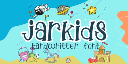 Jarkids is a picture of fun, uniqueness, and authenticity. This eye-catching handwritten font will turn your creative ideas into a standout. It will take your various design projects to the highest level, be it branding, headings, wedding designs, invitations, signatures, logos, labels, and more!
 - Tahta by JprintStudio,
$28.00 The Tatha font is a very welcoming and stunning modern script font that will elevate any design project to the highest level and will add luxury to any design project you want to create, be it branding, wedding designs, invitations, signatures, logos, labels and more!
 - The Rivers by Deeezy,
$14.00 Trendy or modern style sans font for your fancy projects. Elegant, thin and fashion style on The Rivers font will be great for any branding project. Lot of alternates and ligatures will help you to create unique and original logo design or website header! Enjoy :)
 - Designors by Sarid Ezra,
$15.00 Designors is a freestyle font that will make your project more stylish and free! You can use this font for any project. Suitable for quotes and your tees design. This font also support multilingual. With different lowercase and uppercase will make your design more natural!
 - Beautifull Weakness by Sarid Ezra,
$15.00 Beautiful Weakness is a free-styled handwritten font that will make all your project more unique. With brush touch, this font will make your artwork feels more natural. Comes with ligatures and underline that you can access it from opentype feature. Also support multi language!
 - Explore Wonders by Sarid Ezra,
$15.00 Explore Wonders is a bold handwritten font that will make all your project more unique and handy. With bold touch, this font will make your artwork feels more natural. This font is suitable for quotes & instagram post. Comes with number & symbol! Also support multi language!
 - Granbury by Deeezy,
$14.00 Trendy or modern style sans font for your fancy projects. Bold, elegant and retro style on Granbury font will be great for any branding project. Lot of alternates and ligatures will help you to create unique and original logo design or website header! Enjoy :)
 - Begadul by Differentialtype,
$10.00 Begadul is an elegant serif font with a contrasting thickness, very suitable for displays such as titles, greeting cards, magazine covers, and many more. This font will be a great addition to your library, as it will make every design a true piece of art.
 - Hermine by Raditya Type,
$12.00 Hermine is a picture of fun, uniqueness, and authenticity. This eye-catching handwritten font will turn your creative ideas into a standout. It will take your various design projects to the highest level, be it branding, headings, wedding designs, invitations, signatures, logos, labels, and more!
 - Anca by DizajnDesign,
$49.00 Anca typeface started as a comission work for Fest Anca, an international animation festival. They needed something to complement the corporate identity of the festival. Inspiration came from a sketch made by my friend long time ago, which had a tremendous potential. As letters were digitized and the basic alphabet was completed, a very practical and universal typeface resulted. The whole type family has a playful and simple look with rounded stroke endings as well as long ascenders. The construction skeleton uses the minimum number of strokes and as a consequence, some original letter shapes (Q, w, j, &, A, §) were produced. Despite the fact that most letter shapes are based on geometry, some strokes are intentionally irregular, which creates a very natural feeling. Anca is appropriate for setting short paragraphs, headings and big inscriptions.
 - Overnight Oats by Hanoded,
$11.00 I recently walked part of the South West Coast Path in the UK. A couple of days in the hike, I came across a small cafe and I decided to have an oat latte (I am lactose intolerant). Since it was early in the morning, the breakfast menu was out and one of the items I noticed was ‘Overnight Oats’. I normally cook my oats with some lactose free milk and water, but apparently you can soak them overnight, add fruit and nuts and eat it like that. I tried it, it’s ok, but I think I prefer the cooked version. Overnight Oats is a bit of an odd font: it is very higgledy piggledy, yet legible and unique. If you want something out of the ordinary, then this may be your font!
 - Bauhaus Bugler by Breauhare,
$35.00 Bauhaus Bugler’s design never appeared in Harry Warren’s 6th grade class newsletter The Broadwater Bugler but its design came about during that same period in 1975. Because of this, it has been officially designated an honorary Bugler font! Its theme of broad curves that leap over and under conjure visions of fashion and high-end department stores with their dress boxes and shopping bags, plus hair products, cosmetics, couture, and other stylish personal merchandise of the highest caliber. Bauhaus Bugler also has an art deco flavor, especially when all capitals are used. It comes with two alternate versions of the upper and lower Y to give users more freedom of choice. Put Bauhaus Bugler in your “haus” today! Be sure to check out Bauhaus Bugler Soft also! Digitized by John Bomparte.
 - Breughel by Linotype,
$29.99Adrian Frutiger came up with this unusually purposeful and strong design in 1981 for Linotype. Early humanistic typefaces of the sixteenth century, especially Jenson, served as models for Breughel. The right sides of the stems are vertical and at right angles to the baseline while the left sides of the stem curve into the serifs, making the typeface look as though it slants to the right, and giving it a sense of movement and liveliness. The ductus of the broad-edged pen is reflected in the flow, rhythm, and texture of text set in Breughel, but at the same time this design has a regularity of form that is typographically solid. Breughel is an ideal typeface for the designer with skill and vision. Use it to create innovative publications, posters, and advertisements. - Albrecht Durer Gothic by Scriptorium,
$18.00While browsing through a sourcebook on historic calligraphy and antique type I came on an interesting sample of a gothic style attributed to the legendary artist Albrecht Durer. I had previously seen fonts based on the peculiar style of lettering Durer used on prints for his signature and some captions, but this style was radically different and much more characteristic of the lettering and early printed types of the 'Northern Renaissance' which Durer was a big part of. Whether it's authentically Durer's work or not is up in the air, but it's a very nice example of early gothic type. We've called the resulting font Albrecht Durer Gothic and it's a very striking face well suited to titles and other contemporary uses where you need something heavy and eye catching. - Museo by exljbris,
$- Museo... it all started with my love for the letter ‘U’. This uppercase letter just came to me as an image in a daydream. The top of both stems bent into semi-slab serifs. From this principle I worked out the rest of the uppercase letters. My first intention was to make it an all-caps display font, but after a while, I changed my mind. I wanted it to be a bit more versatile, so I decided to add lowercase and adjust spacing and kerning to increase legibility. This OpenType font family comes in five weights, and each weight comes with support for CE languages, even Esperanto. Besides ligatures, contextual alternatives, stylistic alternates, fractions and proportional/tabular figures, Museo has a ‘case’ feature for case-sensitive forms.
 - Kestia by Valentino Vergan,
$17.00 Kestia is a modern and elegant typeface, which leans towards the Neue Nouveau type style. The inspiration for the Kestia typeface came from the early Art Nouveau typographic designs. I wanted to combine type styles from different eras, to create a typeface that is strong yet modern and unique. I designed the typeface with creative letters and ligatures, which makes it perfect for creating nostalgic and retro designs such as: posters, magazines, logos, wedding invitations, Instagram posts, websites, blog posts, pull quotes, social media posts and much more. If you are looking for something modern and retro for you next project, Kestia is the font for you. KESTIA INCLUDES A FULL SET OF: Uppercase and lowercase letters. Numbers. Punctuation. Ligatures. Multilingual symbols. I hope you enjoy using the Kestia typeface.
