10,000 search results (0.041 seconds)
  1. yum - 100% free
  2. Doris PP - 100% free
  3. TaitDemo - Unknown license
  4. Holitter Hollow - 100% free
  5. DJ Autocar - Personal use only
  6. Commando - Unknown license
  7. JunebugStompNF - 100% free
  8. SelznickNormal - 100% free
  9. 404error - Unknown license
  10. BPpong - Unknown license
  11. RussianQuality - Unknown license
  12. the american flag - Unknown license
  13. Lady Starlight - Unknown license
  14. Turok - Unknown license
  15. RaveParty Oblique - Unknown license
  16. Eclipse - Unknown license
  17. CODE3X - Unknown license
  18. Baumarkt - Unknown license
  19. Kalenderblatt Grotesk - Personal use only
  20. Blocked Off - Personal use only
  21. Jelek - 100% free
  22. Jumbo - 100% free
  23. Induction - Unknown license
  24. Quadaptor - Unknown license
  25. Moby - Unknown license
  26. Ben Brown - Unknown license
  27. GUNBATS - Unknown license
  28. Big Blocko - Unknown license
  29. Interval Next by Mostardesign, $25.00
    Interval Next is a modern sans serif font family that is the successor of the successful Interval Sans Pro. Designed by Olivier Gourvat, Interval Next typeface consists of 16 fonts in 8 weights — Ultra Light, Light, Book, Regular, Medium, Semi Bold, Bold, Black— and has 4 styles. This super family combines a humanist mind with its contrasted shapes and a modern look with its open counters. With its four versatile styles (Condensed, Narrow, Roman and Wide) Interval Next has a creative palette able to meet the modern typographic demands. Its OpenType features will provide you almost unlimited multilingual support as well as small caps, case sensitive forms, proportional and tabular figures, slashed zero, numerators, superscripts, denominators, scientific inferiors, circled figures, subscript, ordinals, fractions, arrows and f-ligatures. Also extremely functional for professional editorial design, Interval Next has a pro kerning and would be extremely suitable for mobile applications, e-books, web sites, headlines, posters, signage and many more. Interval Next covers a large spectrum of languages such as West European, East European and the Cyrillic.
  30. Refinery Stencil JNL by Jeff Levine, $29.00
    A vintage brass stencil used for marking oil drum lids for the Standard Oil Company of Kentucky served as the model for Refinery Stencil JNL, which is available in both regular and oblique versions.
  31. Draetha by Hackberry Font Foundry, $24.95
    Draetha is the 6-font companion to Biblia and Biblia Serif. But it is definitely designed to be used with Biblia Serif for book design and production. It is a nearly monoline sans with a clean style which contrast beautifully with Biblia serif. The Black versions push monoline to the extreme of boldness. It has the same font metrics as Biblia and Biblia Serif. The only compromise is that Ultra is too extreme to be able to provide small caps or oldstyle figures. It is designed with text spacing, to work in text with Biblia and Biblia Serif. For heads and subheads, you will need to adjust the tracking. But it tracks well.
  32. Tall Skinny Condensed by Outside the Line, $19.00
    This is the tallest, skinniest, most condensed, non serif font I know of. I designed this because I felt a serious need for that one big, thin word to fit in a narrow space. It is great for ‘SALE!’ in a one column ad. Also is a life saver for several long words in a narrow space like Merry Christmas... If you need a full character set take a look at the new Ultra Condensed 3 font family. Ultra Condensed was based on Tall Skinny Condensed with some changes and a full character set. Ultra Condensed Lettered is a hand lettered version and Ultra Condensed Line is a lighter hand drawn version
  33. Ms Kitty NB by No Bodoni, $35.00
    Some scribbles on a bar napkin, a note from a cute girl passed in history class, what is there to say but why not a typeface? Actually it's that late night, �let's get this typeface done� madness that causes these flights of fancy. Anything to relieve the boredom of doing all those kerning pairs. Or maybe it's sunspots? Ms Kitty is all uppercase letterforms so there are two versions of each letter, one in the cap position, another in the lowercase position. Besides the regular weight and bold, there�s a bolder and much bolder in the works. And perhaps there will be a "too bold to be believed" version. Depends on the sunspots.
  34. Daisy by Ludwig Type, $45.00
    Daisy is an ultra-fat serif typeface with very fine counters.
  35. Chive Turkey JNL by Jeff Levine, $29.00
    Chive Turkey JNL is a solid version of Jeff Levine's inline font, Toucan Tango JNL. This bold and sassy sans serif has the great retro look of hand lettering and can really add some punch to ad copy.
  36. Alight Slab by Eclectotype, $40.00
    Alight Slab is, wait for it... A light slab! Designed to be set large, in headlines or subheads and (very) short paragraphs of running text. It has slightly super-eliptical forms and crisp details, giving it a contemporary look. Alight Slab features automatic fractions, a discretionary ct ligature, and a capital sharp s. Anultra Slab is an ultra bold accompanying typeface.
  37. Saddle Tramp JNL by Jeff Levine, $29.00
    The designers of wood type in the 1880s did not lack for inspiration or imagination. From extremely ornate designs to ultra compressed or condensed alphabets, there was no shortage of variety. Saddle Tramp JNL is one such compressed font. Its wide, bold design coupled with its squat appearance allows for multiple words in a headline without overuse of page space.
  38. Sugar Magic by Zeenesia Studio, $15.00
    ntroducing Sugar Magic Sugar Magic is a modern and elegant sans serif font. Sugar Magic is well-suited for advertising, branding, logotypes, packaging, titles, headlines and editorial design. I created more much alternates variant and much natural ligatures to make this font very classy and look so beauty. Sugar Magic was built with openType features make your project wil be perfect.
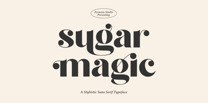
  39. Gilmore Fahrenheit by Red Rooster Collection, $45.00
    Gilmore Fahrenheit is a glyphic, sans serif typeface that was inspired from early designs by the renowned English typographer Eric Gill. It was designed in 1992 by A. Pat Hickson (P&P Hickson) and Steve Jackaman (ITF) exclusively for the Red Rooster Collection. It was designed with true small caps, has an italicized geometric look, and possesses legibility reminiscent of Swiss typefaces.
  40. Urban Sketch - Personal use only
Looking for more fonts? Check out our New, Sans, Script, Handwriting fonts or Categories
abstract fontscontact usprivacy policyweb font generator
Processing