10,000 search results
(0.026 seconds)
- Spiffily NF by Nick's Fonts,
$10.00Here's a workmanlike interpretation of John Pistilli's eponymous extreme Didone, originally designed for VGC in the 1970s. The typeface's strong contrasts and graceful nuances guarantee that your headlines will get noticed. Both versions of this font include the complete Unicode Latin 1252, Central European 1250 and Turkish 1254 character sets. - Florania by Eko Bimantara,
$18.00 Florania is an elegant yet versatile font that shown beauty and classy look. It have lot of alternates and ligature choices with standard latin language coverage. Florania is fit for display, title, large sizes, and short text. Also fit for broad design project such as brand, web, logo, and others.
 - Sarttori by Franklin Veiga,
$16.00 Sarttori is a display font with the perfect balance between classic and modern, mixing serif and sans serif styles in a unique way. Its timeless appeal makes Sarttori a great choice for stylish and impactful designs. The font family includes 6 different weights, uppercase, lowercase, punctuation, ligatures and multilingual support.
 - Engram Pro by Borutta Group,
$35.00 Engram (2015-2020) designed by Mateusz Machalski is a classical sans geometric family. This typeface is characterised by a lot of details, which gives it a friendly character. Scalable x height, rounded corners makes Engram good choice for many purposes. All family consist 22 styles with italics from Hairline to Black.
 - Gollder Vintage by Jinan Studio,
$12.00 Introducing, Gollder Vintage Font Duo is an excellent choice for logo design, branding, packaging, business cards, and adventure-themed designs. Its combination of script and sans serif styles, along with the textured and solid options, provides ample creative opportunities for designers to explore and create stunning visual identities and marketing materials.
 - Catrina by Latinotype,
$26.00 Catrina, designed by Eli Hernández, is an expressive typeface whose curves and straight lines meet each other in harmonious synchrony. Catrina comes in 6 weights, ranging from Thin to Black, plus a Handmade version and includes Dingbats and Catchwords which make it the perfect choice for packaging, branding, titles and advertising.
 - Pink Blue by Rometheme,
$25.00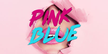 Pink Blue is a modern handdrawn font, this font looks elegant, classy, readable, stylish, catchy and easy to use. Pink Blue Font is the best choice for your professional design projects, including : quotes, album cover, business card, logo, branding, magazines, social media, advertisements, product designs, and many other design project.
 - Original Script by Monotype,
$29.99This script collection is used in advertising, invitations, greeting cards, and wherever a formal hand-lettered or engraving look is desired. Original Script has an elegant connecting alphabet based on formal handwriting. The Original Script font is a safe choice for invitations to weddings and formal occasions, and personal stationery. - Sadi Slab by Koray Özbey,
$19.00 Sadi Slab is designed to be used on small scales like book texts, newspapers, magazines etc. Also its large counters make the font suitable for digital screens. The anatomy of the typeface gives a formal appearance which is a more fitting choice for subjects like law, finance, medical science etc.
 - Consuelo by Latinotype,
$29.00 Consuelo a font inspired by brush strokes. The family consists of a set of 4 variants, with their respective italics, plus a set of ornaments that will give the designer multiple choices when composing texts. Consuelo is ideal to be used in decorative titles, short phrases, magazines, logotypes and advertising.
 - Beautiful Victoria by Letterena Studios,
$9.00 Beautiful Victoria is a lovely script font featuring charming, playful characters that seem to dance along the baseline. Add this font to your most creative ideas, and notice how it makes them stand out! Beautiful Victoria is PUA encoded which means you can access all glyphs and swashes with ease!
 - Lexikos by ITC,
$29.00Lexikos was designed by Vince Whitlock and based on the design of the typeface Corinthian. It is a condensed sans serif typestyle with heavier horizontal weights as vertical. Lexikos is best used with close letter and word spacing and is an excellent choice for applications requiring a clean, contemporary look. - Balcon Round by Tour De Force,
$25.00 Balcon is condensed sans family designed to be your first web font choice. Contains 5 weights: Light, Regular, Bold, ExtraBold and Black, it fits perfect into any project, from editorial editions to packages, labels, posters. If you're looking for "sharp" version of this family, feel free to check Balcon sans family.
 - Irrlicht by Aarhaus,
$30.00 Irrlicht is based on C. H. Kleukens’ 1923 typeface Judith Type . Whilst Dunkle Irrlicht is a fairly faithful rendition and extension of Kleukens’ typeface, the Licht style was initially added as a stand-alone stencil version; yet, the two styles work perfectly together – for different nuances, for emphasis or simply stacked/layered. Irrlicht is equipped with upper- and lowercase ligatures, contextual and stylistic alternates, fractions, superior and inferior figures, extended language support and a few extra goodies. Additional information – How Irrlicht came to life Christian Heinrich Kleukens cut his Judith Type in 1923, at the peak of German expressionism, exclusively for publications with the Ernst-Ludwig-Press, such as a limited series of biblical prints – the first being the Book of Judith , hence the original’s name. I stumbled upon this typeface a couple of years ago in a nice little 1930 booklet of the Gutenberg-Gesellschaft and was struck by its forceful darkness on paper and its seemingly simple, crude letterforms. The lack of a long-ſ in the final version of Judith Type – quite unusual for a German typeface of that time – adds to this feel of crudeness and spontaneity*. Judith Type seemed to me like a semi-blackletter cousin of Rudolf Koch’s typeface Neuland (cast in the same year). Besides its apparent affinity with expressionism, it reflects a lot of that deeply spiritual craftsmanship of the era – much like Neuland. A few months later, when I was working on a stencil project and looking for a typeface that could be cut into thin wooden plates easily, I remembered those dark, sharp letters that seemed to be lacking any curves at all. After enlarging a few letters and tracing them by hand, the whole set was redrawn digitally, using only straight lines. As for spacing, the goal was to keep the letters tight but to avoid touching characters – without ironing out all the original’s tension and rhythm. Deliberate kerning, subtle contextual alternates and ligatures help to deal with critical glyph combinations. Two additional versions were developed: a stencil version with open counters and, in reference to a popular style of the 1920s and inspired by dry, cracked wood, an inline version. These two additional styles were later merged into one font – Lichte** Irrlicht was born. — AARHAUS * Consequently, the original typeface’s German eszett is simply a ligature of the “round s” and standard z . In some of his publications, Kleukens dispenses with using eszett altogether and sets double s instead. Irrlicht , however, does feature a more common eszett (ß); the original, among other more faithful letter forms, can be accessed via the stylistic sets feature ** licht – literally bright – being the German term for inline typefaces – not to be confused with leicht ( light )
 - Evoque Text by Monotype,
$40.00 Evoque Text is a humanist serif type family specifically designed for a comfortable reading experience. This has been achieved by optically adjusting the regular weights from my original Evoque family (released November 2021). You will notice a significantly reduced x-height and longer ascenders and descenders, complemented by adjustments to weight and spacing. This makes Evoque Text a perfect choice for any long passages of text. All OpenType features have been retained from Evoque. A plethora of swash alternates and discretionary ligatures enhance Evoque Text, giving you the opportunity to embellish your typography. Simply activate Stylistic Sets to start adding these flourishes to your text. Other useful features include Small Caps at the click of a button, and Old Style Figures are an option to the default proportional figure style. There are 14 fonts altogether over 7 weights in roman and italic, you can also avail of two variable fonts which allow you to fine tune the weight to your exact liking. Evoque Text has an extensive character set (900+ glyphs) that covers every Latin European language. Key features: 7 weights in both roman and italic 80 Alternates 26 Ligatures Small Caps Variable fonts included with full family Full European character set (Latin only) 900+ glyphs per font.
 - Merside by Putracetol,
$28.00 Merside - Premium Serif Font Merside - Premium Serif Font is a stunning typeface that exudes sophistication and elegance. The font's clean and crisp lines make it a versatile choice for various design projects, from high-end branding to classic book covers and posters. The font was crafted with the utmost care and attention to detail, resulting in a timeless typeface that will elevate any design. Merside - Premium Serif Font is the perfect choice for designers who want to convey a sense of luxury and exclusivity in their work. The font's classic serif style adds a touch of refinement, while the clean lines give it a modern twist. Whether you are designing a logo for a luxury brand, creating marketing materials for a high-end fashion label, or designing a product packaging, Merside will add a touch of elegance and sophistication to your project. One of the standout features of Merside - Premium Serif Font is its OpenType features, which include alternates and ligatures. These features give designers more creative freedom, allowing them to customize the font and create unique and eye-catching designs. The font also includes uppercase and lowercase letters, as well as number, punctuation, and symbol glyphs. Additionally, Merside supports multiple languages, making it an excellent choice for global brands. The font is compatible with a wide range of design software and platforms. You can easily install and use Merside - Premium Serif Font on your computer or device, making it a convenient and accessible choice for designers. If you are looking for a premium serif font that will make your design stand out, Merside - Premium Serif Font is an excellent choice. With its elegant and refined style, it is perfect for creating luxury branding, elegant design, and high-end fashion. This font will give your project a timeless and classic look that will never go out of style. In summary, Merside - Premium Serif Font is a stunning and versatile font that is perfect for designers who want to create high-end and sophisticated designs. With its classic serif style, OpenType features, and multilanguage support, it is a font that will elevate any design project.
 - Quire Sans by Monotype,
$155.99 My goal was to make a design that might fit in anywhere,” says Jim Ford about his Quire Sans™ typeface. “I wanted it to be highly functional and sexy at the same time.” With one foot comfortably in the realm of oldstyle design and traditional book typography, and the other in evolving electronic media, the Quire Sans family does, indeed, fit in just about anywhere. As for sexy, someone once quotably wrote, “A great figure or physique is nice, but it's self-confidence that makes someone really sexy.” Yes, Quire Sans is sexy, performing confidently in virtually any setting. 2014-06-26 00:00:00.000 57.9900 F43063-S193385 42831 Neue Frutiger World Monotype https://www.myfonts.com/collections/neue-frutiger-world-font-monotype-imaging https://cdn.myfonts.net/cdn-cgi/image/width=417,height=208,fit=contain,format=auto/images/pim/10000/279026_ed8c8093fe1ac59ebe9e3ee1d9262c8e.png Neue Frutiger World is designed for global use with an impressive range of 10 weights, from Ultra Light to Extra Black, with matching italics. It embodies the same warmth and clarity as Adrian Frutiger’s original design, but allows brands to maintain their visual identity, and communicate with a consistent tone of voice, regardless of the language. Neue Frutiger World supports more than 150 languages and scripts including Latin, Greek, Cyrillic, Georgian, Armenian, Hebrew, Arabic, Thai and Vietnamese. “Before Neue Frutiger World it was not an easy task for western brands to find families in Arabic, Hebrew, Thai and Vietnamese which match with their Latin,” says Monotype type director Akira Kobayashi, who led the Neue Frutiger World project. “They may find a type with closer expression, but there was no guarantee if the bold version in the non-Latin family matches the bold in their Latin. Neue Frutiger World offers a better solution.” In addition to Neue Frutiger World’s linguistic versatility, it works hard across environments – suited to branding and corporate identity, advertising, signage, wayfinding, print, and digital environments. The Neue Frutiger World fonts can be paired with Monotype’s CJK fonts: M XiangHe Hei (Chinese), Tazugane Gothic (Japanese), Tazugane Info (Japanese), and Seol Sans (Korean). These were all designed to address brands’ needs to expand into Asian cultures and solve for global typographic challenges.
 - Groundage by Mofr24,
$11.00 Groundage is a Gothic Blackletter font that offers three styles: Outline, Regular, and Shadow. With its bold and clean calligraphic strokes, this typeface boasts a modern-vintage look that exudes elegance and masculinity. Its Y2K-inspired design makes it perfect for stylish posters, marketing materials, logotypes, and headlines. Additionally, it is great for art and craft projects, y2k-streetwear designs, and much more. What sets Groundage apart from other Gothic Blackletter fonts is its unique combination of traditional and modern design elements. Its clean lines and bold strokes give it a contemporary feel while its Blackletter roots pay homage to its historical origins. Groundage also includes both Latin and Cyrillic character sets, making it a versatile option for a range of projects. This font pairs well with other modern-vintage fonts and looks great alongside sans-serif fonts for contrast. Its three styles allow for versatility in design and can be used for a variety of creative projects. Groundage was designed with the intention of creating a stylish, masculine font that could be used in a variety of contexts. Its Y2K-inspired design concept was chosen to evoke nostalgia while still feeling fresh and modern. The combination of traditional Blackletter elements with a contemporary twist creates a unique aesthetic that stands out from other fonts in its category. Groundage is not based on any historical design, but its Blackletter roots pay homage to centuries of typographical tradition. Its modern twist on the classic Gothic style creates a unique and versatile font that can be used in a range of creative projects.
 - Madriz by SilverStag,
$14.00 Introducing Madriz, a slab serif font with a retro feel that's perfect for any project that needs a touch of old-school charm. With over 32 fonts in one font family, Madriz offers a wide range of styles to suit any need. You can choose from Thin to Black weights and Regular to Extra Expanded widths to create your perfect look. Madriz is inspired by the old-school signage of Madrid, Spain. The name "Madriz" is actually the affectionate nickname that Madrileños, the people of Madrid, gave to their city. The font's bold, blocky letters capture the essence of Madrid's vibrant and historic streets. Madriz's versatile nature makes it a great choice for a wide range of projects. Its bold, retro style is perfect for showcasing heritage brands or giving a modern touch to classic designs. Madriz can also be used to create a sense of nostalgia, making it ideal for retro-themed projects or campaigns. Here are some of the ways you can use Madriz: Titles and headings: Madriz's bold, eye-catching style is perfect for titles and headings. Text blocks: Madriz's wide range of weights and widths makes it suitable for text blocks, from body copy to large paragraphs. Logos and branding: Madriz's retro charm makes it a great choice for logos and branding. With its 32 font styles and support for over 90 languages, Madriz is an incredibly powerful tool for any designer. It can be used to create a variety of looks, from classic and elegant to modern and edgy. Whether you're working on a print project, a web design, or an app, Madriz has the potential to make a lasting impression. Madriz is the perfect font for anyone who wants to add a touch of old-school charm to their designs. With its wide range of styles and features, Madriz is sure to make a statement in any project. Would you like to get 5 completely free fonts worth over $75? No tricks, no hidden words, terms or anything. Just subscribe to my newsletter, make sure to check your email to approve the subscription, add me to your contacts so that the emails don't end up in spam folder and you will get 5 fonts for free. The fonts are packed with alternates, ligatures and some even come with extra goodies. Happy creating everyone!
 - Rahere Sans by ULGA Type,
$18.98 Rahere is a humanist sans with subtle features that give the typeface a distinctive, warm appearance without distracting the reader. Legible at large and small sizes, Rahere is a versatile family suitable for a wide range of applications such as annual reports, advertising, brochures, catalogues, information signage, screen text and visual identities. For projects that need to convey a sense of authority or credibility, this is the ideal sans serif to use. The family consists of six weights ranging from light to extra bold with corresponding italics and the character set covers most of the major European languages. Each weight contains lining & non-aligning numerals in both proportional & tabular spacing. The tabular numerals share the same width across all weights and styles – a must for financial tables in annual reports. Spirited and lively, the italic lowercase is more cursive and calligraphic than the roman, although it harmonises perfectly, displaying enough character to create emphasis without looking out of place. When used on its own, for pull-out quotes or poetry, the italic exudes a charm that draws attention to the text. The typeface is named after Rahere, a 12th-century Anglo-Norman priest, who founded St Bartholomew's Hospital, London in 1123. I will always be indebted to Barts (as it is now commonly known) because in 2007 I was successfully treated for relapsed testicular cancer. Way back in 1992 I designed my first sans serif, Charlotte Sans, and although it was relatively successful, I was never really satisfied with the end result: not enough weights & italics, a small character set, lack of accented characters, and my design skills were still in their infancy. Whilst Rahere shares many common elements with Charlotte Sans, it is much more than just a reworking; it represents over 20 years of accumulated knowledge and experience as a designer.
 - Gravesend Sans by Device,
$39.00 Smart, legible and elegant, Gravesend Sans is a based on the unique typeface used for the iconic grass-green signage for the Southern Railway. In existence from 1923 to 1948, when the network was nationalised, the Southern Railway linked London with the Channel ports, South West England, the South coast resorts and Kent. The same design was also used for the ‘hawkeye’ signs on the London, Midland and Scottish Railway, differentiated by black letters on a yellow background. Reference for each letter was taken from vintage ‘target’ station nameplates and other platform signage. The rarest letters were the Q, seen in Queens Road Battersea, the X, seen in East Brixton, and the Z, used in Maze Hill, site of an infamous train crash in 1958. Being hand-made, the letters often differ in width and thickness. There was no lower case. The Bluebell Railway, a heritage steam line, runs over part of the old Southern Railway network and uses a very similar type. The design of the numbers differed considerably, but here have been taken from the Device 112 Hours font Smokebox. As well identifying platforms, they were used on the front of the steam engine’s smokebox, hence the name, and stylistically are more in keeping with the letters than some of the squarer versions that can be seen in old photographs. William Caslon IV is credited with the first Latin sans-serif type, shown in a 1816 Caslon specimen book. ‘Two Lines English Egyptian’, as it was called, was caps-only, and there are several other correlations between that type design and this one. Includes a selection of authentic arrows and manicules, plus abbreviated ligatures such as ‘St.’ (Saint or Street) ‘Rd.’ (Road) and ‘Jn.’ (Junction). The Cameo version includes many graphic banner elements that can be freely combined.
 - Givens Antiqua by Monotype,
$29.99Drawn by George Ryan and named after Robert Givens, the co-founder and first president of Monotype Imaging, the Givens Antiqua™ typeface speaks with elegance and subtle authority. The design's open proportions, generous x-height and soft serifs lend Givens Antiqua a gracious quality that invites reading. I didn't work from any single design model," Ryan recalls. "The face grew out of my experimenting with several characters from a hand-lettered headline in a magazine. I worked on the shapes and forms for some time before I put the drawings in a drawer." At that point Ryan had finished the basic alphabet in two weights, but had not yet tackled the italics. A new project came along that demanded his full attention, and it was two years before he revisited the drawings. He liked what he saw and decided to finish the job. "The italics were the most problematic designs in the family," says Ryan, "but once I had their basic shapes and proportions, the rest was basically a production project." Another year of sketching, testing, editing and reworking characters ensued before Givens Antiqua was ready for release. The result is a four-weight family of roman designs and small caps, with complementary italics for the lightest three weights and a suite of swash caps for the italic designs. Givens Antiqua and Givens Antiqua Light show a modest stroke weight stress and a light, even text color. Givens Antiqua Bold is an effective emphasizer for text copy and an authoritative communicator at display sizes. The Black weight performs best at large sizes and makes a powerful statement without shouting, while the italic swash capitals possess enough vitality to serve as standalone initial letters." - Ardena by Julien Fincker,
$34.99 About the design: Ardena is a modern sans-serif typeface family. While neutral and clear at first glance, it can be characterized as both pleasant and confident due to its open, rounded forms and vertical terminals. It can be used in both a restrained and expressive way. The thinner and thicker weights are particularly suitable for strong headlines, while the middle weights can be used for typographic challenges and body text. Completed with an extensive character collection, it becomes a real workhorse. A versatile allrounder that is up to all challenges – for Corporate Identity, Editorial, Branding, Orientation and Guidance systems and much more. Features: The Ardena family has a total of 20 styles, from thin to heavy with matching italics. With over 1064 characters, it covers over 200 Latin-based languages. It has an extended set of currency symbols and a whole range of Open Type Features. There are alternative characters as stylistic sets, small caps, automatic fractions – just to name a few. Arrows and numbers: In particular, the extensive range of arrows and numbers should be highlighted, which are perfectly suited for use in orientation and guidance systems. Thanks to Open Type Features and an easy system, the various designs of arrows and numbers can also be simply "written" without first having to select them in a glyph palette. The principle is easily explained: If a number is placed in round or square brackets, it will automatically be displayed in an outlined circle or square. If you add a period to the number, it is displayed in a full circle or square. The same principle also applies to the arrows. The arrows themselves are combinations of greater/less symbols with the various slashes or hyphens. Get the Variable Font here: https://www.myfonts.com/fonts/julien-fincker/ardena-variable/
 - Atocha by Sudtipos,
$49.00 It was expected that Joluvian’s third type font would be inspired by the city where he currently resides: Madrid, Spain. His previous creations had originated in Venezuela (Zulia) and The Philippines (Salamat), both, places where he had once lived. Joluvian believes “now is the time to pay tribute and show gratitude towards a city that has bestowed me with so many fortunes.” He considers that Madrid’s people, streets, scents, flavor and sounds are gift enough to awaken the creative urgency in any artist. This time around, it is being expressed through the crafts of the Typographic industry. Since his arrival in Spain, Joluvian has been attached to the city’s central area, specifically to the renowned Atocha Street and its railroad station. It was precisely on that street that Joluvian and Mauco Sosa, his friend and partner, decided to establish the Patera Studio: a charming creative space that birthed the concept for this new font which they proudly named Atocha Script. The artists where still in the final phases of their previous script, Salamat, when the idea for Atocha came about. This dynamic is actually very typical of the artistic process, in which every finished product spawns the need to create its next level offspring. “Working on Atocha and Atocha Caps has been a very pleasant journey. We have given our best efforts, for we wanted to offer a typeface that was both versatile and user-friendly on a number of applications, showing a wide scope of alternatives in our glyphs,” says the artist. The illustrations were created by Mauco, to ensure visual integration that would showcase the work of both members of the Patera Studio and their complementing aesthetic voices. Atocha, as Salamat and Zulia before, was digitized by Alejandro Paul.
 - Gator by Canada Type,
$24.95 Cooper Black's second coming to American design in the mid-sixties, after almost four decades of slumber, can arguably be credited with (or, depending on design ideology, blamed for) the domino effect that triggered the whole art nouveau pop poster jam of the 1960s and 1970s. By the early 1970s, though Cooper Black still held its popular status (and, for better or for worse, still does), countless so-called hippie and funk faces were competing for packaging and paper space. The American evolution of the genre would trip deeper into psychedelia, drawing on a rich history of flared, flourished and rounded design until it all dwindled and came to a halt a few years into the 1980s. But the European (particularly German) response to that whole display type trend remained for the most part cool and reserved, drawing more on traditional art nouveau and art deco sources rather than the bottomless jug of new ideas being poured on the other side of the pond. One of the humorous responses to the "hamburgering" of typography was Friedrich Poppl's Poppl Heavy, done in 1972, when Cooper Black was celebrating its 50th anniversary. It is presented here in a fresh digitization under the name Gator (a tongue-in-cheek reference to Ray Kroc, the father of the fast food chain). To borrow the title of a classic rock album, Gator is meaty, beaty, big and bouncy. It is one of the finest examples of how expressively animated a thick brush can be, and one of the better substitutes to the much overused Cooper Black. Gator comes in all popular font formats, and sports an extended character set covering the majority of Latin-based languages. Many alternates and ligatures are included in the font.
 - Clear Sans by Positype,
$29.00 Clear Sans™ is a… wait for it… rational geometric sans serif. It is intended to fill a niche… to provide an alternative to the somewhat based-on-vernacular signage, somewhat geometric sans. I hear the word vernacular thrown around too much and too loosely. If a typeface is based in the vernacular, based on hand-painted or hand-crafted signage, then it should be based on the movements of the hand, retain that warmth and not on a pretty geometric model. For me, clean, geometric and precise doesn't have to be cold and expressionless. The original skeleton was hand-painted in 2008 to help determine and inform my decisions going forward. The typeface was completed shortly afterwards at the behest of an old friend for their identity. As usual, I expanded it, but considered retiring it since there were so many things similar out there. Years later, I had a chance to rediscover it and came to the conclusion that it could be improved, expanded in a logical and useful way, and introduced. I would be lying if I didn't admit that the rise of webfonts and embedded type in applications influenced many of the decisions I made about reworking Clear Sans™. Completely new Text and Screen fonts were developed that utitlize larger x-heights, space-saving widths, logical (and simplified) weight offerings… to name a few alterations. Even the pricing of each variant was considered to produce a more reasonable and simple solution for the developer, designer, professional and novice. Clear Sans™ is a departure from my previous sans serifs, but the influences of Aaux Next, Akagi Pro and Halogen are evident. Enjoy a light-hearted mini-site devoted to Clear Sans™
 - Clear Sans Text by Positype,
$25.00 Clear Sans™ is a… wait for it… rational geometric sans serif. It is intended to fill a niche… to provide an alternative to the somewhat based-on-vernacular signage, somewhat geometric sans. I hear the word vernacular thrown around too much and too loosely. If a typeface is based in the vernacular, based on hand-painted or hand-crafted signage, then it should be based on the movements of the hand, retain that warmth and not on a pretty geometric model. For me, clean, geometric and precise doesn't have to be cold and expressionless. The original skeleton was hand-painted in 2008 to help determine and inform my decisions going forward. The typeface was completed shortly afterwards at the behest of an old friend for their identity. As usual, I expanded it, but considered retiring it since there were so many things similar out there. Years later, I had a chance to rediscover it and came to the conclusion that it could be improved, expanded in a logical and useful way, and introduced. I would be lying if I didn't admit that the rise of webfonts and embedded type in applications influenced many of the decisions I made about reworking Clear Sans™. Completely new Text and Screen fonts were developed that utitlize larger x-heights, space-saving widths, logical (and simplified) weight offerings… to name a few alterations. Even the pricing of each variant was considered to produce a more reasonable and simple solution for the developer, designer, professional and novice. Clear Sans™ is a departure from my previous sans serifs, but the influences of Aaux Next, Akagi Pro and Halogen are evident. Enjoy a light-hearted mini-site devoted to Clear Sans™
 - ITC Aram by ITC,
$29.99Jana Nikolic was finishing her degree program at the Faculty of Applied Arts, in Belgrade, with a final project that would combine her two majors: type and book design. Three stories from William Saroyan's My Name Is Aram would provide the text for the book, to be set in a typeface that Nikolic would design. Nikolic knew something special was happening the moment she put pen to paper. The letters just emerged," she recalls. "I started to explore a few new pens and found one I loved. I was able to make its tip bend with pressure." Like the family Saroyan writes about, the design flowing from Nikolic's pen would be simple but a little quirky. "When there were a whole bunch of little black letters around me," continues Nikolic, "I saw that this was going to be a very interesting typeface family." Nikolic drew Latin and Cyrillic letters, lowercase and capital letters, wide letters and narrow letters. She was surprised at how quickly and easily the design came. "There were no badly written letters," she says. "I hardly had to rework them and they fit together remarkably well." ITC Aram's standard character complement consists of one set of lowercase letters and two sets of capitals: one narrow and the other wide. The wide caps can be used with the standard lowercase, or mixed with the narrow caps for a variation on "cap and small cap" copy. The ITC Aram create the opportunity to mix and combine the letters into playful typographic expressions. Words and sentences that twinkle; text that seems light and alive - one runs the risk of creating work that is both delightful and charming when setting copy in ITC Aram." - Clear Sans Screen by Positype,
$21.00 Clear Sans™ is a… wait for it… rational geometric sans serif. It is intended to fill a niche… to provide an alternative to the somewhat based-on-vernacular signage, somewhat geometric sans. I hear the word vernacular thrown around too much and too loosely. If a typeface is based in the vernacular, based on hand-painted or hand-crafted signage, then it should be based on the movements of the hand, retain that warmth and not on a pretty geometric model. For me, clean, geometric and precise doesn't have to be cold and expressionless. The original skeleton was hand-painted in 2008 to help determine and inform my decisions going forward. The typeface was completed shortly afterwards at the behest of an old friend for their identity. As usual, I expanded it, but considered retiring it since there were so many things similar out there. Years later, I had a chance to rediscover it and came to the conclusion that it could be improved, expanded in a logical and useful way, and introduced. I would be lying if I didn't admit that the rise of webfonts and embedded type in applications influenced many of the decisions I made about reworking Clear Sans™. Completely new Text and Screen fonts were developed that utitlize larger x-heights, space-saving widths, logical (and simplified) weight offerings… to name a few alterations. Even the pricing of each variant was considered to produce a more reasonable and simple solution for the developer, designer, professional and novice. Clear Sans™ is a departure from my previous sans serifs, but the influences of Aaux Next, Akagi Pro and Halogen are evident. Enjoy a light-hearted mini-site devoted to Clear Sans™
 - Ardena Variable by Julien Fincker,
$185.00 About Ardena: Ardena is a modern sans-serif typeface family. While neutral and clear at first glance, it can be characterized as both pleasant and confident due to its open, rounded forms and vertical terminals. It can be used in both a restrained and expressive way. The thinner and thicker weights are particularly suitable for strong headlines, while the middle weights can be used for typographic challenges and body text. Completed with an extensive character collection, it becomes a real workhorse. A versatile allrounder that is up to all challenges – for Corporate Identity, Editorial, Branding, Orientation and Guidance systems and much more. Variable Font The Variable Font contains 2 axes: weight and oblique – all in just one file. Features: With over 1064 characters, it covers over 200 Latin-based languages. It has an extended set of currency symbols and a whole range of Open Type Features. There are alternative characters as stylistic sets, small caps, automatic fractions – just to name a few. Arrows and numbers: In particular, the extensive range of arrows and numbers should be highlighted, which are perfectly suited for use in orientation and guidance systems. Thanks to Open Type Features and an easy system, the various designs of arrows and numbers can also be simply "written" without first having to select them in a glyph palette. The principle is easily explained: If a number is placed in round or square brackets, it will automatically be displayed in an outlined circle or square. If you add a period to the number, it is displayed in a full circle or square. The same principle also applies to the arrows. The arrows themselves are combinations of greater/less symbols with the various slashes or hyphens. Get the static version of the Ardena family here: https://www.myfonts.com/fonts/julien-fincker/ardena/
 - PykesPeakZero - 100% free

- Telenovela NF by Nick's Fonts,
$10.00Here's a retooling of the Art Deco classic Novel Gothic, designed by Morris Fuller Benton and Charles H. Becker for American Type Founders in 1929. We've added a little sparkle to this classic with a reflected-highlight treatment, to help create attractive and commanding headlines. Both versions include the complete Latin 1252, Central European 1250 and Turkish 1254 character sets, as well as localization for Moldovan and Romanian. - Pontifica by Scriptorium,
$18.00Pontifica is based on ‘protogothic’ calligraphy, a style developed at the monastery of St. Gall in the 12th century to replace Carolingian minuscule with a more efficient and compact system of lettering. Ultimately it became the progenitor of the gothic lettering styles of the late Medieval period. Also available to go with this font is a special swash version with a very different style, but compatible overall appearance. - Rheson by Twinletter,
$15.00 RHESON is the ideal font for any project that requires a small amount of gothic flair. Its various lovely and harmonious shapes let you select the perfect word for your project. The best part is that this font is of a high caliber, so you can be sure that your logo, label, badge, the newest music or movie videos, old-fashioned posters, and other items will all look their best.
 - Mothman Legend by Mvmet,
$9.00 Mothman Legend is a grunge spooky font, inspired by 90s horror movies. It will be perfect for your horror and Halloween-themed needs! You can use it for anything ranging from t-shirts and clothing, to your book designs, Halloween party needs, greeting cards, stickers, posters, banners, or anything that needs a cool touch. Try it to create fabulous designs and feel the gothic and Halloween vibes with it!
 - Brody Rawk by Inumocca,
$25.00 Brody Rawk is modern gothic font. inspired by a traditional carved wooden Powerfull and has a very distinct and unique Character The Typeface comes with Stylistic Set Features Exellent Font to use for covering your Project, like Branding, Movie Title, Headline Letter, Bookcover or Book Content, Magazine cover, Poster, Quotes Lettering, Logos, and more your project design. - Multilingual Characters Support - UPPERCASE - Lowercase - Numeric - Symbol - Punctuation Character - Stylistic Set (ss01) inumoccatype
 - Shearshank by Arendxstudio,
$16.00 Shearshank is a gothic font that is very elegant and has unique characteristics for each character so it is suitable for your design needs and will add an elegant and frightening atmospheres. Shearshank comes with OpenType features such stylistic alternates, stylistic sets, and ligatures, which makes this great for logotype, posters, badges, book covers, t-shirt designs, packaging and any more. Features: -Uppercase & Lowercase -Multilingual support -Numbers -Symbols -Punctuation
 - Angars Runes by Mans Greback,
$59.00 Angars Runes is a Middle Age style rune typeface. With engraved letterforms and gothic curves, this font is the perfect addition to a medieval project. The font was drawn and created by Måns Grebäck in 2019. Use the symbols plus + period . multiply × colon : for decorative separators. Angars Runes contains all characters you will ever need, as well as numerals and alternate letters. This is a font with multilingual support.
 - Ledbury by Greater Albion Typefounders,
$19.00 Ledbury is a calligraphic display face, inspired by hand lettered specimens and combining Roman and Blackletter elements. It is designed with an extensive range of ligatures and stylistic alternate forms to preserve that hand written look. Use Ledbury for posters and banners, whether you need an Elizabethan touch or a hint of the Victorian Gothic Revival. A typeface Mr Augustus Welby Northmore Pugin would be proud to employ!
 - Library Book Initials JNL by Jeff Levine,
$29.00 Library Book Initials JNL was modeled from examples of Sidney Gaunt's Publicity Initials; originally sold in metal type by Barnhart Brothers and Spindler as a companion to the Publicity Gothic typeface. The smoothed-down lines of the original characters allow for these initials to balace better when set against complementary type faces. A regular version is on the upper case keys, with an oblique version on the lower case keys.
