10,000 search results
(0.041 seconds)
- Haritta by IbeyDesign,
$17.00 Haritta Handwritten Script Font is a cursive, paint-brushed script font, featuring characters that seem to dance along the baseline. Add this font to your most creative ideas, and notice how it makes them stand out.
 - Deuglas by Sealoung,
$10.00 Deuglas is a minimal and neat sans serif font. It can easily be matched to an incredibly large set of projects, so add it to your creative ideas and notice how it makes them stand out!
 - Heartway by ARToni,
$19.00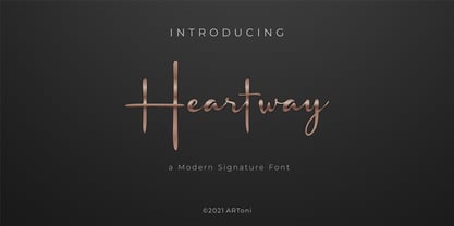 Heartway is a lovely and timeless handwritten font. It is the best choice for creating eye catching logos, branding and quotes. Every letter has a unique and beautiful touch, which will make your design come alive!
 - Geotrica by Rockboys Studio,
$15.00 Geotrica is a minimal and neat sans serif font. It can easily be matched to an incredibly large set of projects, so add it to your creative ideas and notice how it makes them stand out!
 - Billa Summer by Lafitte 58,
$16.00 Billa summer is a thin and clean handwritten font. It can easily be matched to an incredibly large set of projects, so add it to your creative ideas and notice how it makes them stand out!
 - Next Time by Seemly Fonts,
$14.00 Next Time is an incomparable and simple handwritten font. It can easily be matched to an incredibly large set of projects, so add it to your creative ideas and notice how it makes them stand out!
 - Big Dreamer by Seemly Fonts,
$12.00 Big Dreamer is a thin and tall display font. It can easily be matched to an incredibly large set of projects, so add it to your creative ideas and notice how it makes them stand out!
 - FractalCaps by Haiku Monkey,
$10.00FractalCaps was inspired by the self-similar nature of fractal geometry. It's a strictly decorative font, without accented characters. FractalCaps shines at large point sizes, and would be a good choice for wild and wooly posters. - Cheristone by Rockboys Studio,
$23.00 Christine is a minimal and neat sans serif font. It can easily be matched to an incredibly large set of projects, so add it to your creative ideas and notice how it makes them stand out!
 - Murisa Mariana by Murisa Studio,
$10.00 Mariana is a minimal and neat sans serif font. It can easily be matched to an incredibly large set of projects, so add it to your creative ideas and notice how it makes them stand out!
 - Funny Holiday by Muksal Creatives,
$12.00 Funny Holiday is a thin and clean handwritten font. It can easily be matched to an incredibly large set of projects, so add it to your creative ideas and notice how it makes them stand out!
 - Religiosity by Seemly Fonts,
$12.00 Religiosity is a cute and casual handwritten font. Its friendly feel makes this font incredibly versatile, fitting a wide range of contexts. Add it to your creative ideas and notice how it makes them stand out!
 - Fatin Gengky by Stringlabs Creative Studio,
$15.00 Fatin Gengky is an authentic and neat serif font. It can easily be matched to an incredibly large set of projects, so add it to your creative ideas and notice how it makes them stand out!
 - Helinda Rook by Monotype,
$29.99The Helinda Rook font is a popular choice in advertising, invitations, greeting cards, and wherever a formal hand-lettered or engraved look is desired. Helinda Rook is an elegant connecting alphabet font based on formal handwriting. - Winterlust by Epiclinez,
$20.00 Winterlust is a lovely and timeless handwritten font. It is the best choice for creating eye catching logos, branding and quotes. Every letter has a unique and beautiful touch, which will make your design come alive!
 - Handy Organizer by Ali Hamidi,
$10.00 Handy Organizer is a fun and friendly display font. It can easily be matched to an incredibly large set of projects, so add it to your creative ideas and notice how it makes them stand out!
 - Alveru by Sakha Design,
$12.00 Alveru is a minimal and neat sans serif font. It can easily be matched to an incredibly large set of projects, so add it to your creative ideas and notice how it makes them stand out!
 - Oabestira by Mabhal Studio,
$15.00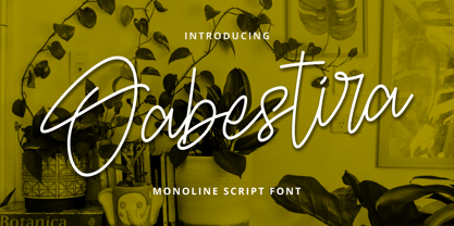 Oabestira is an asymmetrical and timeless handwritten font. It is the best choice for creating eye-catching logos, branding and quotes. Every letter has a unique and beautiful touch, which will make your design come alive!
 - Seaside Charm by Seemly Fonts,
$12.00 Seaside Charm is an incomparable and simple handwritten font. It can easily be matched to an incredibly large set of projects, so add it to your creative ideas and notice how it makes them stand out!
 - New Goal by Seemly Fonts,
$14.00 New Goal is a fun and quirky handwritten font. It can easily be matched to an incredibly large set of projects, so add it to your creative ideas and notice how it makes them stand out!
 - Aulya Westeria by Lafitte 58,
$16.00 Aulya Westeria is a thin and clean handwritten font. It can easily be matched to an incredibly large set of projects, so add it to your creative ideas and notice how it makes them stand out!
 - Melatea by San Studio,
$9.99 Melatea is a minimal and neat sans serif font. It can easily be matched to an incredibly large set of projects, so add it to your creative ideas and notice how it makes them stand out!
 - Reymond by Rockboys Studio,
$18.00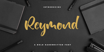 Reymond is a lovely and timeless handwritten font. It is the best choice for creating eye catching logos, branding and quotes. Every letter has a unique and beautiful touch, which will make your design come alive!
 - Conmersa by AEN Creative Studio,
$16.00 Conmersa is a minimal and neat sans serif font. It can easily be matched to an incredibly large set of projects, so add it to your creative ideas and notice how it makes them stand out!
 - Billa Brush by Lafitte 58,
$16.00 Billa Brush is a thin and clean handwritten font. It can easily be matched to an incredibly large set of projects, so add it to your creative ideas and notice how it makes them stand out!
 - Dolphinero by Murisa Studio,
$10.00 Dolphinero is a modern and adaptable sans serif font. It can easily be matched to an incredibly large set of projects, so add it to your creative ideas and notice how it makes them stand out!
 - TXT Personality by Illustration Ink,
$3.00You'll find this the best font to inspire your creativity. It's simple and clever, with tons of personality. It's a good choice for school newsletters, kids' party invitations, and scrapbook pages emphasizing your children's great accomplishments. - Minnak by Esintype,
$18.00 Minnak, as a whole geometric display type is our take on Square Kufic (Makili) style Latin script fonts, comes in eleven weights with linear progression. It is an Uniwidth typeface at the core. From Hairline to Black, all multiplexed weights take up the same space in width and can be used interchangeably. Supports wide range of Open Type features, with many stylistic alternates in 12 context. Minnak is also have a close relation with pixel fonts, because in spite of its based on Makili forms, it all started as a pixel font in the drawing stage before further steps came into play. The key difference between Minnak and Makili style is that the latter must have the exact square counters with no diagonal strokes, and any other components of a letterform must conform to be proportional. Such style-specific requirements determine the overall dimensions of the glyphs and therefore, there can be only minor differences between the typefaces. In Minnak, counters are rectangular because of its narrow and condensed proportions, but the Makili form influence is still manifest. This impression is best confirmed with Medium weight where negative spaces and stem thickness are equal. Contrast and virtually no optical correction were presented, as characteristic of its genre had to have equal horizontal and vertical line thicknesses. As per the minimal and authentic look of the type, all glyphs are drawn as straight or only as 45-degree diagonal strokes. The representation of the ‘diagonalless’ approach is preserved by stylistic alternatives, making its similarity in visual aesthetics clearly visible. Marks and punctuation is another feature that doesn’t follow the strict rules of the origin style. Although not a pixel font, all building parts of the glyphs in Minnak share the same unit precision as they are designed with pixel equivalents in mind. Even space characters are designed to match glyph widths, meeting the demands of certain typesetting or multi-line lettering compositions. With its Pseudo Ancient and Runic alternates, extention parts and ornaments included in all weights, Minnak is suitable for branding, logo and monogram designs, the screen titles and headlines, packaging, posters, book covers and more, where it shines at big sizes. Its pixel font-like appearance makes it a significant choice for the modern compositions. Thanks to mostly uniform width design, it is possible to use Minnak also as a system for lettering. This feature can be used as vertical fitting of the letters between the lines. As a casual expression in Turkish, “Minnak” is one of the seven typeface designs in Esintype's ancient scripts of Anatolia project, Tituli Anatolian series — representing Seljuk period in the medieval Anatolia and their tradition of architectural stone ornamentation.
 - Jelly Ball by Yumna Type,
$15.00 Finding a perfect font for your project which always looks good in different display types can be a complicated task. Furthermore, the right font choice determines the success and the failure of your project. Unfortunately, if you fail to find the perfect one, you will waste your time, money and energy. Therefore, we would like to introduce you to Jelly Ball, a perfect font for any different display types without decreasing the legibility. Jelly Ball is a display font in round shapes on the letters’ edges to produce different effects on different applications. Generally, such a display font shows amazing, fresh, modern expressions to highlight important messages, to attract readers’ attention, and to beautify the display as well. The letters’ forms and proportions are relatively consistent enough to be legible. An extra bonus given is the clipart. You can also enjoy the available features here. Features: Multilingual Supports PUA Encoded Numerals and Punctuations Jelly Ball fits best for various design projects, such as brandings, posters, banners, headings, magazine covers, quotes, invitations, name cards, printed products, merchandise, social media, etc. Find out more ways to use this font by taking a look at the font preview. Thanks for purchasing our fonts. Hopefully, you have a great time using our font. Feel free to contact us anytime for further information or when you have trouble with the font. Thanks a lot and happy designing.
 - Fibra One by Los Andes,
$26.00 Fibra One looks like a “soft” version of the Fibra font, but it is actually more than that—the second part of its name suggests that it is a reinterpretation of the original typeface. While this new version maintains the overall structure of Fibra and influence of the Avant Garde font, its shapes are different from those found in its predecessor—Fibra One features both soft corners and smooth transition between curved and straight sections. This gives the font a more dynamic and playful personality. Fibra One keeps the original contrast between curves and straight lines in glyphs such as ’n’ and ‘h’ (not found in rounded glyphs such as ‘a’ and ‘d’); details of display characters (e.g. three upper terminals in ‘W’ and projection off the stem in ‘A’); and exaggerated terminal in ‘R’. All these features give Fibra One a strong personality—a typeface that ‘gives you the chills’. Fibra One was specially designed for display use. The font has a very generous x-height that allows for use in corporate text, thanks to its good readability. Fibra One comes with 2 subfamilies—a more ’normal’ Basic family, with a smaller amount of stylistic features, for use in subheadings or any other type of text that requires formality, and an Alt family that shows off the true potential of the font, making it the perfect choice for magazine headlines, posters and logotypes.
 - Distefano Slab by Tipo,
$60.00 Designed from the perspective of a multi-purpose font family, comprehending the slab-serif and humanist-sans subtypes, the Distéfano typefaces were specifically developed and subsequently tested considering the needs of editorial products, for both print and digital media. Includes a comprehensive program where formal, style, thickness and slant attributes are especially indicated for the composition of text and headings in newspapers, journals and magazines. For that reason, in addition to the more traditional weights, others, ranging from Light to Black were added. The identity and systemic criteria of this font family doesn’t fall short on diversity of specific solutions, flair and quirks for each variant, especially noticeable in the contrast of the italics to the roman styles. The original drawings of Distéfano date back to 1983; embodied in pencil on paper, provided only the alphabetical characters and punctuation signs for Spanish, and the Sans Serif family. By digitalizing them, their possibilities of use were widened, the set of characters of each typeface were considerably completed considering the current requirements for the majority of the latin and germanic languages, and the slab-serif family was developed. This type family bears the name of the most notable argentinian designer, and it is a homage to his work, that influenced the youth of the 50’s decade of the 20th century, and especially to him, whom I have always recognized as a friend, and a teacher.
 - Distefano Sans by Tipo,
$60.00 Designed from the perspective of a multi-purpose font family, comprehending the slab-serif and humanist-sans subtypes, the Distéfano typefaces were specifically developed and subsequently tested considering the needs of editorial products, for both print and digital media. Includes a comprehensive program where formal, style, thickness and slant attributes are especially indicated for the composition of text and headings in newspapers, journals and magazines. For that reason, in addition to the more traditional weights, others, ranging from Light to Black were added. The identity and systemic criteria of this font family doesn’t fall short on diversity of specific solutions, flair and quirks for each variant, especially noticeable in the contrast of the italics to the roman styles. The original drawings of Distéfano date back to 1983; embodied in pencil on paper, provided only the alphabetical characters and punctuation signs for Spanish, and the Sans Serif family. By digitalizing them, their possibilities of use were widened, the set of characters of each typeface were considerably completed considering the current requirements for the majority of the latin and germanic languages, and the slab-serif family was developed. This type family bears the name of the most notable argentinian designer, and it is a homage to his work, that influenced the youth of the 50’s decade of the 20th century, and especially to him, whom I have always recognized as a friend, and a teacher.
 - Zhang QA - Unknown license

- Marcus Traianus by Eurotypo,
$48.00 The famous lettering “Capital Trajana” (inscription at the bottom of the column that bears its name erected in the year114 A.D.) is usually identified as the classic example that defines Imperial Capital forms. However, much earlier, there were already countless examples of Greco-Roman epigraphy of excellent execution, as evidenced by the monumental inscriptions from year 2 b.C. sculpted in the Portico di Gaio e Lucio Cesari in front of the facade of the Basilica Emilia, in the Roman Forum, erected by Augustus, dedicated to his two grandchildren for propaganda and dynastic needs. It has been more than two thousand years and the forms of these letters are still part of our daily life, product of their qualities of readability and beauty. It is probably the added semantic value that have made them an icon full of symbolism that expresses majesty, monumentality, order and universal power. Numerous authors, calligraphers and designers have studied this legacy such as Giovanni Francesco Cresci, Edward Catich, L.C. Evetts, Armando Petrucci, Carol Twombly, John Stevens, Claude Mediavilla, just to name a few. Marcus Traianus font is a fitted version of the two models mentioned, which is accompanied by Small Caps, lowercase (carolingas) and a set of numbers (Indo-Arabics) in addition to the Romans figures and diacritics for Central European languages Marcus Traianus is presented in two weight: Regular, Italic, Bold and ExtraBold.
 - Rivanna NF Pro by CheapProFonts,
$10.00 This font has a charming mix of the organic forms of the Art Nouveau style and the geometric forms of the Art Deco style - and it makes it work! Nick Curtis says: "A general-purpose Art Nouveau font that has been kicking around for a while under various names. As usual, redrawn for consistency and economy of line. Named, for no good reason, after the river that flows near Thomas Jefferson’s home, Monticello." ALL fonts from CheapProFonts have very extensive language support: They contain some unusual diacritic letters (some of which are contained in the Latin Extended-B Unicode block) supporting: Cornish, Filipino (Tagalog), Guarani, Luxembourgian, Malagasy, Romanian, Ulithian and Welsh. They also contain all glyphs in the Latin Extended-A Unicode block (which among others cover the Central European and Baltic areas) supporting: Afrikaans, Belarusian (Lacinka), Bosnian, Catalan, Chichewa, Croatian, Czech, Dutch, Esperanto, Greenlandic, Hungarian, Kashubian, Kurdish (Kurmanji), Latvian, Lithuanian, Maltese, Maori, Polish, Saami (Inari), Saami (North), Serbian (latin), Slovak(ian), Slovene, Sorbian (Lower), Sorbian (Upper), Turkish and Turkmen. And they of course contain all the usual "western" glyphs supporting: Albanian, Basque, Breton, Chamorro, Danish, Estonian, Faroese, Finnish, French, Frisian, Galican, German, Icelandic, Indonesian, Irish (Gaelic), Italian, Northern Sotho, Norwegian, Occitan, Portuguese, Rhaeto-Romance, Sami (Lule), Sami (South), Scots (Gaelic), Spanish, Swedish, Tswana, Walloon and Yapese.
 - Agatized Formal by ULGA Type,
$25.00 Agatized Formal is a chunky stencil typeface with slightly condensed letterforms and tight spacing. Designed primarily for display use, it’s ideal for posters, logos, advertising, book cover designs or small chunks of text such as pull-out quotes. It exudes authority without taking itself seriously, like a plump jolly uncle in charge of a brass band. Agatized Formal is a big, bold typeface with a charismatic presence that commands attention – in a friendly way, of course. But what really makes this typeface come alive is its arsenal of alternative characters and ligatures. There is a saying: Use sparingly. Whoa! Not here, no, no, no. Make your Glyphs palette earn its money. Flex your OpenType muscles: get stylized, contextualized, indulge in some ligaddiction. This typeface is a peacock that likes to put on a show, spread its plumage and strut around in all its blazing glory. Agatized, according to Wiktionary, means: A living thing converted into the form of agate; fossilized. I felt the name suited the solid, almost rock-like letterforms, but most of all I just wanted a typeface name that began with the letter A. Although Agatized Formal is a single-weight typeface it has a sibling, Agatized Informal, an older, more casual brother, rougher round the edges with craggy good looks and an altogether more jaunty style.
 - Arturo by Hackberry Font Foundry,
$24.95 Arturo is a brand new font family drawn from the original inspiration of an old alphabet in one of Dan Solo 's Dover Clip Art books. It has moved far away from those raw roots, however. Every character has been redrawn. For example, I had a light version that I never could get working. Arturo is based on that light style and called Arturo Book. The name comes from a good friend of mine in El Paso. He was the guinea pig upon whom I foisted off the beginnings of this style so many years ago. I did several marketing pieces for him using the raw drawings. I figured that he deserved to have the family named after him, at the very least. This is a normal font family for me in that it has caps, lowercase, small caps with the appropriate figures for each case. This font has all the OpenType features in the set for 2009. There are several ligatures for your fun and enjoyment: bb gg ff fi fl ffi ffl ffy fj ft tt ty Wh Th and more. Like all of my fonts, there are: caps, lowercase, small caps, proportional lining figures, proportional oldstyle figures, & small cap figures, plus numerators, denominators, superiors, inferiors, and a complete set of ordinals 1st through infinity. Enjoy!
 - X Ruffian by ThoroughBR&,
$9.00 X RUFFIAN Ruffian was a champion thoroughbred horse who won 10 consecutive races. A feat worth mentioning & repeating. Her tenacity & steadfast approach established the basis for this variable based font. The X represents both the Roman numeral 10, but also the X-factor for creating bespoke works of art. It is quite befitting that this font be named after a legendary champion. Which begs the question...Do you champion variety? X Ruffian's design motif uses a broad tipped chiseled marker that was set at an angle for that extra bit of vigor. Identical letter forms defeat that truly "hand rendered" look that we ultimately strive for. Each uppercase letter offers 10 (X) or more stylistic alternatives, the lowercase and number sets have 3+ options and an over under for those special characters that yield a long bottom or top (see images). Ligatures & bonus characters can add that unique offering to your already individual style & can easily be found via the glyphs panel in any open type program. With a gigantic glyph count of 688, you'll never run out of options. As a right of passage, we felt obliged to include a roman numeral set as the name beckons, which differs from the standard letter form in which you would use to create. This is a variable winner. See you at the races!
 - Beachwood by Swell Type,
$25.00 Los Angeles’ distinctive “shotgun” style street signs were last produced over sixty years ago, but these durable porcelain and steel signs are still in use all over the city, by both humans and birds, who like to build their nests between the panels. The street names were drawn at wildly different widths to fit on panels which were manufactured in only one size. Beachwood faithfully re-creates the extreme range of widths & weights on these vintage signs, and adds a new matching lowercase. Use the Beachwood Variable font file to access any width, weight or italic angle between the presets — a technology 20th Century sign painters could only dream of! Each weight of Beachwood includes numbers based on the street signs, plus four alternate number sets based on the jerseys of Los Angeles' pro football teams. Beachwood is named for Beachwood Drive, the street which leads to the famous HOLLYWOOD sign, so we just had to include a bouncy HOLLYWOOD mode! FAMILY FEATURES: Five widths (from XTall to XWide), with eight Weights (from ExtraLight to UltraBold), each with matching italics Variable font to access any width, weight or italic slant EACH WEIGHT INCLUDES: 584 glyphs to support 223 languages in Western Europe, Central Europe, Vietnam and Oceania, plus Cyrillics Five styles of numbers, plus Tabular Lining for screen display Ordinals, Fractions and Arrows Hollywood mode!
 - Artis Sans by Wiescher Design,
$30.00 »Artis« is the name for my latest art-project-font. Obviously I just chopped off the last »t«. Then I looked it up on Wikipedia and what do you know, it is of latin descent. »Ars Gratia Artis« which means »art for arts sake« or in French »l’art pour l’art«, a perfect font name. If I would cut off the »s« as well it would mean disambiguation and that in turn is, what I just did here. Enough disambiguation! »Artis« is a modern classical beauty with extreme contrast between up- and downstrokes that make it unique with a touch of art deco and showing Renaissance roots. But – »Artis« is a twin-font that has an elegantly decorated twin sister »Artis-Swing«. Between the 2 fonts you have endless possibilities for combination. I love these twins! It is a great everyday workhorse with seven weights from ExtraLight to Bold and all the necessary weights in between. Great for short copy and elegant headlines! With 879 Glyphs it is a truly European font designed for all Central European and Latin using countries. »Artis« has a set of Cyrillic that is – besides Russia – also good for Serbia, Macedonia and Ukraine. It has oldstyle- and lining-, tabular- and tabular-oldstyle-figures and many ligatures. »Artis« comes in Sans and Swing and is an elegant, playful and friendly font. Enjoy!
