10,000 search results
(0.068 seconds)
- Lady Ice - Condensed - Unknown license

- Lady Ice - Extra Light - Unknown license

- Lady Ice - Light - Unknown license

- Lady Ice - Expanded - Unknown license

- Mallaire by Rochart,
$20.00 Mallaire is a calligraphy font with an exclusive style and a touch of classic, inspired by the handwriting of ancient manuscripts. Carefully designed to work together in harmony that makes it very suitable for wedding media, book covers, greeting cards, logos, branding, business cards and certificates, even for any design work that requires a classic, formal or luxurious.
 - Art Exhibit JNL by Jeff Levine,
$29.00 In the 1930s the WPA (Works Progress Administration) was involved with getting a number of Americans back to work during the Great Depression. One faction of the WPA's efforts was the Federal Art Project. Thin, condensed hand lettering on a poster for an Art Exhibition at the New Bedford Free Public Library is the inspiration for Art Exhibit JNL.
 - Rasputia by Putracetol,
$16.00 Rasputia is a luxury, elegant, and beautiful calligraphy font. It is full featured with tons of alternate characters and OpenType features. This font designed to work together in harmony that makes it very suitable for wedding media, book covers, greeting cards, logos, branding, business cards and certificates, even for any design work that requires an elegant or luxurious style.
 - Notelia by Gatype,
$14.00 Notelia The elegant font I work with is creative in mood and perfect in shape, inspired by today's beautiful serif look. bold, balanced and varied, born for luxury and beauty. includes uppercase letters, numbers, and a wide variety of punctuation marks. Serif font with a modern style. Made for posters, web design, branding, illustrations, badges and many other works.
 - Blop11 by osialus,
$15.00 Blop11 is a geometric sans-serif type family, consisting of 3 weights. Blop11 Bold is inspired by 1800s-style wood, poster typeface. Owing to its rounded terminals, Blop preserves natural organic quality of wood typeface. The Regular and Light versions are contemporary original projects. Blop11 is well-suited to headlines and short text. See also Blop77
 - Trackpad by ITC,
$29.00Trackpad is the work of British designer Timothy Donaldson, an easy, free-spirited typeface. Don't let the undisciplined style fool you. Despite its casual appearance, it has been carefully worked to ensure legibility even in small sizes and retain its handwritten appearance. The jagged features of Trackpad give text a pleasing texture and produce an informal yet striking appearance. - Goodfellow by Solotype,
$19.95Our font (circa 1895) of this old wood type was made by Hamilton of Two Rivers, Wisconsin, but we have been told that another identical font was made earlier by W. H. Page, Greeneville, Connecticut. Hamilton became the final home of many of the old wood type patterns as the early companies went out of business. - Visual Arts JNL by Jeff Levine,
$29.00 Visual Arts JNL is a classic Art Deco typeface based on the hand lettering found on a 1930s-era WPA (Works Progress Administration) poster for Women Artists. The exhibit took place in the Federal Art Gallery in Boston, and was part of the arts project underwritten by the WPA to keep many creative people working during the Depression years.
 - Up and Down by HIRO.std,
$22.00 Up and Down is a Display Font. This font describes about fun, dynamic, rough, headline, pleasure, humanist, easy going, and easy to use. FEATURES - Uppercase and Lowercase letters - Support Ligatures - Numbering and Punctuations - PUA Encoded Characters - Multilingual Support - Works on PC or Mac USE Up and Down works great in any branding materials, logotype, poster, print etc.
 - Melion by Owl king project,
$29.00 Melion is a typeface that comes with a family and ligatures, this font is very easy to apply and works very well for short letters or logo-based fonts, highly recommended for use with large print, or headlines for magazines, and products logo. Melion is very beautiful and good for working on a design that looks minimalist and elegant
 - NEON Love by Qaratype,
$16.00 NEON love is a typeface inspired by real world neon light signs. You can create wall art prints, greeting cards, snapchat geofilter designs, invitation designs, t-shirts, and more. This font is perfect for adding your own glowing light effects or can be used to actually design real world neon signs. … Main Features: Uppercase & Lowercase letters Numbering and Punctuation
 - ASTRALYS by Cerri Antonio,
$37.00 Astralys is a linear decorative font, works very well as a type of identity logo, poster and 3d works. It continues the tradition of precedent Xova but with a hard linear impact. Its interesting to note that with it its possible to play with straight corners to create endless couplings geometric styles and beyond. Caps only fonts.
 - Royal Kevino by Hanzel Space,
$25.00 This modern serif typeface features serifs. Perfect for gorgeous logos & titles, Royal Kevino will pair beautifully with many fonts and work well with whatever project you're working on. That's it! If you have any questions at all , feel free to pop me a private message , I'm always more than happy to help you along :) Happy creating! Hanzel Studio
 - Bareback by Solotype,
$19.95The devil does indeed find work for idle hands. This was designed by Dan X. Solo about with no excuse whatsoever. The name comes from the fact that a circus that we regularly did work for used it in one of their programs, the only time it was ever used as far as we can recall. - Woodbranch JNL by Jeff Levine,
$29.00 Woodbranch JNL is a solid version of the 2013 font release Woodlawn JNL. The design was originally based on examples of an outline (open face) wood type. This interpretation takes on newer, stronger characteristics as a bold typeface when the "inner letters" of the original alphabet were removed, yet the imperfection of the wood type pieces are still maintained.
 - Radugo by Twinletter,
$10.00 Radugo is a san serif font family designed with light strokes that make up a vintage style with a rustic touch and a stamp with 2 fonts, as the ribs in your design work, and able to beautify and strengthen your work in the form of logotypes, typography, hand lettering, packaging, t-shirts, labels, and many more.
 - Sovage by Mainelli,
$17.00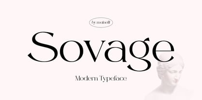 Sovage is a modern minimalist font style and clean feel. To help your creative work, Sovage comes with a regular version and an italic version and is perfect for mixing and matching your creative works harmoniously such as for magazine pictures, for wedding invitations, for branding, poster design, and many others. Sovage Features: Multilanguange PUA Encoded Alternates Ligatures.
 - PR Swirlies 01 by PR Fonts,
$10.10 This font is a collection of simple calligraphic ornaments suitable for invitations, gift tags, and anything that can benifit from a “spoonful of sugar” visually. The "Sand Drift" version combines well with: PR Bramble Wood 1, PR Bramble Wood 2, PR Hallow Doodles 01, PR Hallow Doodles 02, PR Cauldron, PR Swirlies 01], PR Swirlies 05.
 - Sabinard by Greater Albion Typefounders,
$12.95 Sabinard offers a distinctive form of 'Swash' lettering. It is excellent for poster work, or for headings and titles. Its distinguishing feature is the combination of long ascenders and descenders with a small cap height. It has been designed to compliment Greater Albion's Sabio, but also works splendidly as a 'feature' type alongside any Roman Face.
 - Master by Jure Kožuh,
$29.00 Master of the World was included on the front page of a novel in several parts, The Count of Monte Christo (mid 20th century). Typeface characters show design guidelines of the pre-war era (2nd world war). The idea of development origins from a wish to evolve traditional forms of typefaces which were used in Slovenia.
 - Naturale by Good Java Studio,
$21.00 Naturale born from natural and original style handdrawing font. With many glyphs you need for the great work ever. That's available on other file from letter A-Z and a-z. Versatile for design poster, logo, branding, label, quote, headline profil, banner, t-shirt design, packaging, magazine, brochure, and many more your amazing work with this fonts.
 - Telegram by ITC,
$29.00Telegram is the work of British designer Timothy Donaldson, a casual style influenced by the ball and rod, or atomic, imagery popular during the 1950s. Donaldson called the typeface Telegram because it reminds him of dots and dashes. Telegram is a play alphabet which communicates an almost childlike innocence and is ideal for work directed at younger people. - Liga Sans by Linotype,
$29.99The German designer Alexander Dosiehn developed the Liga Sans type family as part of his graduate thesis at the Fachhochschule Düsseldorf in 2001. Liga Sans is a sans serif typeface that acts as a bridge between classical modern styles. Traces of pen forms and brush strokes can be seen mixed together with the most legible elements from grotesk-style faces in the alphabet’s letterforms. These features work together to create a style that works very in many sizes, including smaller ones! Liga Sans is an original, lively addition to the porfolio from Linotype suitable for text, magazines, and corporate identity work. - Hammer and Tongs by Komet & Flicker,
$10.00 Hammer & Tongs works great for all kinds of branding projects, advertising, websites, packaging, and posters – essentially anywhere you need bold, strong communication. Inspired by the lettering found on military vehicles, this font works great for headlines and is effective for short blocks of body copy. H&T also has a strong retro industrial/athletic vibe and works well for modern-vintage style designs. This font is available in two styles: a Hard version with sharp, crisp edges and a Soft version with rounded corners. Both styles include a complete set of numbers, punctuation marks, and extended characters.
 - Crystania by RGB Studio,
$17.00 Crystania is a must-have signature script that has a diverse. This collection fills a void and separates itself from other scripts available. Crystania is a handwritten signature script with a natural & stylish flow. This collection of scripts is perfect for personal branding. But, this works well for many applications. Everything from personal branding & wedding invitations to advertising could benefit from this collection of signature fonts. These typefaces work well for many different aesthetics. They work well with something like 'cosmetics' for example but would also work well with Liquor Labels, Signage, & any type of signature-styled logo. Files Include : Basic Latin A-Z and a-z Numbers Symbols PUA Encode Multilanguage Support Thanks and have a wonderful day, If you have any questions, please get in touch with us Don't forget to check out our other products.
 - Expedition One by Gustav & Brun,
$6.00 To be independent or to be dependent? The formula “one plus one is one” is here essential for this to work. The different cases, upper and lower is dependent on one another. To give us clarity they have to work together, to be like one the upper and lower cases must work together. Expedition One works best in InDesign or equivalent software. How to use it: write your text in lower case, copy the text frame and ”Paste in Place”, change your lower case text to upper case (you do that under top menu->type->change case). Change colour if you want to and maybe change the blending mode in the effects window to “multiply” makes it even more sparkling. On numbers and ampersand for example, you have to use the glyph window in InDesign to find their second half.
 - Gerd - Personal use only

- Chellovek - Unknown license

- Wynwood JNL by Jeff Levine,
$29.00Wynwood JNL is a wider treatment of the same vintage wood type source used for Broadletter JNL. - Northfork JNL by Jeff Levine,
$29.00Northfork JNL is based on a William H. Page wood type alphabet called Parisian, circa 1857-58. - Range Gothic by BA Graphics,
$45.00A new gothic with the look for today. Available in 3 weights, universal, works for all applications. - Mayville JNL by Jeff Levine,
$29.00Mayville JNL is a re-drawing of an all-caps Clarendon Wood Type font from the 1800s. - KG Makes You Stronger by Kimberly Geswein,
$5.00 Crayon-style script handwriting. Can also work as a colored pencil or chalk handwriting. Perfect for teachers!
 - Allaina by Creativemedialab,
$22.00 Allaina is a stylish and elegant Serif family consisting of three styles, Regular, Medium and Bold with matching italics. It has many alternates and some unique attractive ligatures. This pretty serif family could be used for fashion, label packaging or elegant vintage style lettering. Combining standard letters with alternative letters wil give you beautiful and unique words.
 - Kobajeon by Majestype,
$15.00 Kobajeon is a fun handwritten font with a touch of Japanese style. This font is suitable for both display and title. Equipped with 200+ Glyphs that will give the impression of a good handwriting style. It is perfect for product packaging, cartoon, magazine covers, social media, wedding, or just used to express words above the background. Enjoy!
 - Dingocitta by Erwin Krump,
$32.00 Dingocittà with its 12 fonts, contains a large amount of features like small capitals, different figure sets, automated fractions, ordinals, standard ligatures, contextual alternates (generates letter combinations to avoid form collisions by simultaneous maintaining word fugue) and discretionary ligatures. Dingocittà is suitable for a wide range of applications and can be readily combined with other fonts.


