4,911 search results
(0.009 seconds)
- Bank Statement AOE by Astigmatic,
$19.95 - Apollon by Umka Type,
$15.00
- Magneta by Volcano Type,
$19.00 - Nightbird by Hanoded,
$15.00
- Mister Dorky by PizzaDude.dk,
$20.00 - Ballpoint Signature by Viswell,
$18.00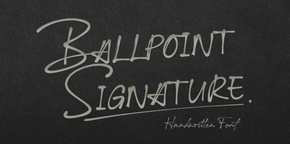
- Overdrawn Account AOE by Astigmatic,
$19.95 - Office Memorandum AOE by Astigmatic,
$19.95 - Mulkshake by PizzaDude.dk,
$20.00 - Urgent Telegram AOE by Astigmatic,
$19.95 - Paunchy by Mirco Zett,
$15.00
- Military Document AOE by Astigmatic,
$19.95 - Mongoose by Kostic,
$40.00
- AmazObitaemOstrovV.2 - 100% free

- Sand - Unknown license

- Meloneads 2 by PizzaDude.dk,
$20.00 - Wedding Text by Bitstream,
$29.99 - Buddy Slam by PizzaDude.dk,
$15.00 - Blackwood by Fonts of Chaos,
$10.00
- Atlantic Avenue by Fonts of Chaos,
$10.00
- Ryden by Graphicfresh,
$18.00
- Avegas Royale by Java Pep,
$15.00
- Goodfellow by Solotype,
$19.95 - Gildan by Sign Studio,
$15.00
- Amerio by Subectype,
$15.00
- Halliday JNL by Jeff Levine,
$29.00
- Hullabaloo by Solotype,
$19.95 - Attention Seeker by Hanoded,
$15.00
- Delivery Note by Hanoded,
$15.00
- Photina by Monotype,
$29.99 - Nyanyamu by Youngretro®,
$3.00
- Grimpt by Typesketchbook,
$45.00
- Bad Cake Recipe by Bogstav,
$15.00
- AhnbergHand - Unknown license

- Plattmask - Unknown license

- Skrotfont - Unknown license

- dUBBEL - Unknown license

- Daggmask - Unknown license

- Off - Unknown license

- Kerberos Fang by Hanoded,
$15.00


