10,000 search results
(0.029 seconds)
- Ed McGuinness by Comicraft,
$39.00 Fighting American and all around Superman Ed McGuinness joins our Masters of Comic Book Art with a font inspired by his gamma ray saturated handwriting! Ed is officially a friend of Comicraft and a big smile in Hulk form! Now a small slice of this Jolly Green Giant is available as an alphabet waiting for puny humans to arrange in words of no more than two syllables.
 - Rude ExtraCondensed by DSType,
$50.00 Rude was designed as a dichotomy between the Grotesque and Humanistic typographic shapes: a no-nonsense Sans and a very muscular Slab Serif companion. Showing the historically demanded consistency for such kind of typefaces, this is one of DSType's most wide-ranging and flexible type systems, introducing seven weights across seven widths, from Thin to Black and ExtraCondensed to ExtraWide, along with a wonderful set of Icons.
 - Gawain's Hand by Just My Type,
$25.00 Gawain Douglas was my co-worker and eventually my boss when I worked for the Tucson Citizen. He’s director of production and design for a children’s book publisher now, a very talented and creative guy and Gawain’s Hand is what his writing looks like. A shame, isn’t it? Just kidding, Gawain; I wouldn’t have featured it, if I hadn’t liked it. Really. No, really. :-)
 - Rude Icons by DSType,
$50.00 Rude was designed as a dichotomy between the Grotesque and Humanistic typographic shapes: a no-nonsense Sans and a very muscular Slab Serif companion. Showing the historically demanded consistency for such kind of typefaces, this is one of DSType's most wide-ranging and flexible type systems, introducing seven weights across seven widths, from Thin to Black and ExtraCondensed to ExtraWide, along with a wonderful set of Icons.
 - Rude SemiCondensed by DSType,
$50.00 Rude was designed as a dichotomy between the Grotesque and Humanistic typographic shapes: a no-nonsense Sans and a very muscular Slab Serif companion. Showing the historically demanded consistency for such kind of typefaces, this is one of DSType's most wide-ranging and flexible type systems, introducing seven weights across seven widths, from Thin to Black and ExtraCondensed to ExtraWide, along with a wonderful set of Icons.
 - Mongondow by Letterena Studios,
$10.00 Mongondow is a unique, modern, and classic display font perfect for elegant and luxury logos, book or movie title designs, fashion brands, magazines, clothes, lettering, quotes, and so much more. . Add it to your fonts library, and it will become your favorite in no time at all! This font is PUA encoded, which means you can access all of the glyphs and swashes with ease!
 - Rawles by Balpirick,
$15.00 RAWLES is a Playful Handdrawn Font. Rawles is a bold and playful display font. Add this vintage style font to your creation. No matter the topic, this font will be an incredible asset to your fonts’ library, as it has the potential to elevate any creation. RAWLES also multilingual support. Enjoy the font, feel free to comment or feedback, send me PM or email. Thank you!
 - Quick Meal by Jeff Levine,
$29.00 Quick Meal JNL is a ‘hand lettered’ interpretation of Morris Fuller Benton’s 1905 design “Miehle Extra Condensed Title”, no doubt named for [or on behalf of] the manufacturer of printing and die cutting presses that were used for years within the printing industry. The type face is available in both regular and oblique versions. Quick Meal JNL is a pun on the pronunciation of ‘Miehle’.
 - Sukkergris by Bogstav,
$15.00 Need a catchy headline font with a clear handmade and organic look? Look no further, because Sukkergris is here to do the job! Each letter is handmade and manually cleaned up, but keeping the original quirky curves. I have added 6 different versions of each letter, which automatically cycle as you type. I also added a set of small caps, just because I think they look awesome!
 - Piano Music JNL by Jeff Levine,
$29.00 A 1910 collection of piano sheet music called “Presser’s Economy Group” had that name hand lettered in a fancy serif lettering style that could fall somewhere between Art Nouveau and semi-calligraphic. No matter the label you attach to the style, it makes for a wonderful digital type revival. The end result is Piano Music JNL, which is available in both regular and oblique versions.
 - Rude Slab SemiWide by DSType,
$50.00 Rude was designed as a dichotomy between the Grotesque and Humanistic typographic shapes: a no-nonsense Sans and a very muscular Slab Serif companion. Showing the historically demanded consistency for such kind of typefaces, this is one of DSType's most wide-ranging and flexible type systems, introducing seven weights across seven widths, from Thin to Black and ExtraCondensed to ExtraWide, along with a wonderful set of Icons.
 - Ongunkan Tifinagh Berber by Runic World Tamgacı,
$45.00 It is necessary to keep the memories of our ancestors alive. Although the languages and cultures of the past societies were different, in my eyes the ancestor of our humanity is. Having to experience everything in that world, no matter where in the world it is. This font is a Runic member. It is a kind of variety that belongs to different geographical regions.
 - Rude SemiWide by DSType,
$50.00 Rude was designed as a dichotomy between the Grotesque and Humanistic typographic shapes: a no-nonsense Sans and a very muscular Slab Serif companion. Showing the historically demanded consistency for such kind of typefaces, this is one of DSType's most wide-ranging and flexible type systems, introducing seven weights across seven widths, from Thin to Black and ExtraCondensed to ExtraWide, along with a wonderful set of Icons.
 - Cassandra by Wiescher Design,
$49.50 Cassandra has two kinds of letters, wide Capitals on the (shift) capitals and narrow ones on the (no shift) lowercase. You can match them as you like. Take one narrow S and a wide one or two wide ones, whatever turns you on. It will almost always look good. Cassandra is my "bow" to Adolphe Mouron Cassandre. Yours sincerely mixing things up for you Gert Wiescher
 - Rude Slab Wide by DSType,
$50.00 Rude was designed as a dichotomy between the Grotesque and Humanistic typographic shapes: a no-nonsense Sans and a very muscular Slab Serif companion. Showing the historically demanded consistency for such kind of typefaces, this is one of DSType's most wide-ranging and flexible type systems, introducing seven weights across seven widths, from Thin to Black and ExtraCondensed to ExtraWide, along with a wonderful set of Icons.
 - Yuko by Thinkdust,
$10.00 Big, bold and with attitude to spare, no-one better get in the way of Yuko when it’s got something to say. Although it’s a gentle giant really, Yuko has a lot of opinions and it won’t go without being heard. Yuko is most effective when you need to say something loudly and with attitude to get people’s attention, especially if you’re competing for space.
 - HighJinkies by Comicraft,
$19.00 It’s jaunty and flaunty and up to no good! It’s a child born of fairly odd parents and always looking for the good kind of trouble. It'll get you out of the red and into the pink like a panther pawning diamonds! Comicraft’s John Roshell has slipped his hands into the gloves of the Phantom Font Finagler and there’s HighJinks ahead to be sure!
 - Bonehead JNL by Jeff Levine,
$29.00 Thematic fonts aren't always big sellers, but they do serve a purpose for specialty projects and applications. Bonehead JNL is a novelty typeface that is constructed out of bones. Whether the need is for a pirate theme, Halloween, horror movies or for things that go bump in the night, this font will fill the bill – no bones about it. Oh, wait! Yes there are!
 - City Spark by Olivetype,
$18.00 Looking for a font that's fun and expressive? Look no further than City Park! This playful hand-lettered font is a good option for posters, headlines, logotypes, product packaging, movie titles, and more. With its unique character and charm, City Park can make your next project stand out from the crowd. City Park font includes : Standard Latin Uppercase and Lowercase Numbers, symbols, and punctuations Multilingual Support. Cheers
 - Something Fishy by Kate Brankin,
$17.00 A recent walk down memory lane through old college sketchbooks revealed a collection of caricature fish doodles. Then the sketches were discovered by my son who, being a marine life enthusiast, promptly demanded that I draw more fish. Thus, a collection of 71 fish-inspired drawings and bubbly numbers was born. There is even a lemon, since no fish is really complete without one.
 - Black Stage by RagamKata,
$16.00 Black Stage - Retro Serif Font Black Stage is a charming and eye-catching retro serif font. With a combination of an elegant serif style and a classic vintage touch, this font conveys a feel reminiscent of a bygone era but retains a timeless elegance. Features : - Ligatures & Alternates - Letters, numbers, symbols, and punctuation - No special software is required to use this typeface even work in Canva - Multilingual Support
 - Wahoobomex by Alit Design,
$22.00 Introducing the Wahoobomex Dynamic Blackletter Font - A Modern and Strong Typeface with 785 Characters, Ligatures, and Alternates! Are you looking for a font that combines the timeless charm of blackletter typefaces with a modern twist? Look no further than the Wahoobomex Dynamic Blackletter Font. This remarkable typeface strikes the perfect balance between tradition and contemporary design, making it ideal for a wide range of creative projects.
 - Pekin by HiH,
$15.00 Pekin is an unusual design with an oriental flavor. It was originally designed by Ernst Lauschke and released by The Great Western Type Foundry of Chicago as “Dormer,” which is similar to the French verb ‘to sleep,’ not exactly a marketing triumph. Barnhart Bros. And Spindler (independently-operated subsidiary of ATF since 1911) bought Great Western in 1918. According to McGrew, AMERICAN METAL TYPEFACES of the TWENTIETH CENTURY, BB&S renamed the typeface prior printing their 1925 specimen book — guess they wanted something just a tad more exciting. Quirky, distinctive and fun. Pekin ML represents a major extension of the original release, with the following changes: 1. Added glyphs for the 1250 Central Europe, the 1252 Turkish and the 1257 Baltic Code Pages. Added glyphs to complete standard 1252 Western Europe Code Page. Special glyphs relocated and assigned Unicode codepoints, some in Private Use area. Total of 415 glyphs (compared to 218 glyphs in the original release). 2. 652 Kerning Pairs. Note: Ag, Aj and gj will cross unless kerned. Alternative A may also be used. 3. Added OpenType GSUB layout features: onum, salt, liga, dlig, hist, ornm and kern. 4. Revised vertical metrics for improved cross-platform line spacing. 5. Refined various glyph outlines, based on improved scans. 6. Added set of Tabular Numbers at cap height, based on original design; added Old-Style Numbers based on default design. 7. Added a bunch of alternative characters: 18 upper case letters, 10 lower case letters, 1 ampersand and 1 bullet. The alternate c is actually the original design, but I don't like it - easily confused with e. Alt E H M h m n r t are from the original design. I added the rest. 8. 7 Ligatures, 4 Ornaments, 18 Geometric Shapes, 6 Arrows and 12 Misc. Symbols. The zip package includes two versions of the font at no extra charge. There is an OTF version which is in Open PS (Post Script Type 1) format and a TTF version which is in Open TT (True Type)format. Use whichever works best for your applications.
 - Blank Manuscript by Aah Yes,
$14.95Blank Manuscript allows you to produce sophisticated musical scoresheets even on basic Word Processors - anything from simple plain staves to complex full-page orchestral scores of your own design, to write in the notation yourself. The basic stuff is really easy and straightforward, but there's some quite advanced things you can do as well. So Copy and Save these Instructions. • The main stuff is simple and tends to follow the initial letter. Treble, Bass and Alto clefs are on upper case T B A (there are more clefs, below). The 5 Lines for the clefs are on L or l. • A small v will give a small vertical line (like a bar line) and a Big U will give a Big Upright - these can start or end a line or piece. • Time Signatures - type the following letters: Think of W for Waltz and it's easy to remember that 3/4 time is on W. Then from that they go up or down together like this: V=2/4 W=3/4 X=4/4 Y=5/4 Z=6/4 Compound Times are on H I J K like this: H=3/8 I=6/8 J=9/8 K=12/8 Common Time and Cut Common symbols can be found on semi-colon and colon respectively (all begin with Co- ). 2/2 3/2 are on lower case a and b, 7/4 and 7/8 are on lower case c and d, 5/8 is on small k (think POL-k-A) • Flat signs are on the numbers. Flat signs on LINES 1 to 5 are on numbers 1 to 5. Flat signs on SPACES 1 to 5 are on numbers 6 to 0 (space 1 being above line 1, space 5 being above the top line of the stave). Sharp signs are on the letters BELOW the long-row numbers. Which is q w e r t for the sharp signs on Lines 1 to 5, and y u i o p for sharp signs on spaces 1 to 5. Doing it this way means it works the same for all clefs, whether Treble, Bass, Alto, Tenor or any other. Sharp and Flat Signs always go in this order, depending on how many sharps or flats your key signature requires: Treble Clef Sharps t i p r u o e Flats 3 9 7 4 2 8 6 Bass Clef Sharps r u o e t i w Flats 2 8 6 3 1 7 = Alto Clef Sharps o e t i w r u Flats 7 4 2 8 6 3 1 • Guitar Chord Boxes are on G and g (G for Guitar) Upper Case G has a thick line across the top Lower case g has an open top, for chords up the fretboard TAB symbols are available: Six-string Tablature is on s & S for Six. Four-string Tablature is on f & F for Four. (Lower case has the "TAB" symbol on it, Upper Case has just the lines to continue.) Five-string tablature, is on lower case "j" (as in BAN-j-O) and of course L or l will continue the 5 lines. •RARE CLEF SIGNS including Tenor Clef, are on various punctuation marks, i.e. dollar, percent, circumflex, ampersand & asterisk, above the numbers 4 to 8. NOTE: The important symbols were kept on the letter and number keys, which are fairly standard all over, but some of the less important symbols are on various punctuation keys, which in different countries are not the same as on my keyboard. If it comes out wrong on your system, all I can say is it's right on the systems we've tried, and they'll be in here somewhere, probably on a different key. CLOSING THE ENDS OF THE LINES and BAR-LINES is done with the 3 varieties of brackets - brackets, brace and parentheses - Left/Right for the Left/Right end of the line. Parentheses L/R () which are above 9, 0 give a clef with a small vertical upright (the same as a bar line). Brace L/R and Brackets L/R (both on the 2 keys to the right of P on my keyboard) will close off a staff line with tall upright bars. Brace gives a double upright - one thick, one thin. Brackets give a single tall upright. A Big Upright is on Big U, (Big U for Big Upright) and a small vertical line is on small v (small v for small vertical). The Big Upright is the maximum height, and the small vertical is exactly the same height as a stave. And there's a tall upright Bar, on Bar (which is to the left of z on my keyboard, with Shift,) which is the same height as the bar on upper case U but twice as broad. • There's a staff intended for writing melodies, which is a little bit higher up than an ordinary treble clef giving a space underneath to put lyrics in - on m and M for Melody line. Lower case has the Treble Clef on, Upper case M has just the higher-up staff lines with no clef. (Use mMMMMMMM etc.) However this clef will be in the wrong place to put in sharp and flat signs, key signatures and so on, so if you use this clef you'll have to write the sharps, flats and key signature yourself. There's also a clef that's smaller (less tall) than the ordinary clef, but with the same horizontal spacing so it will align with other standard-sized clefs - on slash (a plain clef) and backslash (with a Treble Clef). • There are some large brackets for enclosing groups of staves, such as you'd use on large orchestral scores, on Upper Case N O P Q R, which can aid clarity. N and O on the left, Q and R on the right. P is a Perpendicular line to be used on both sides to increase the height of the enclosure, in this way but with the staff lines in between: N Q P P P P P P O R OTHERS —————————————— • Repeat marks are on comma (left) and period/full stop (right). • Hyphen is left as a sort of hyphen - it's a thin line like a single staff line, with the same horizontal spacing as ordinary staff lines - in case you want to draw a line across for a Percussion Instrument, or a Title or Lyric Line. • Space is a Space, but with HALF the width or horizontal spacing as ordinary staff lines, so 2 space symbols will be the same width as a clef symbol or line. • Grave (to the left of 1 on the long row, or hold down Alt and type 0096 then let go) gives a staff line that is one eighth the width of an ordinary staff line. • If you want manuscript in a clef and key which requires a flat or sharp sign in the space underneath the 5 lines, they’re on = equals and + plus . SYMBOLS • Many of these symbols will only be useful if you have worked out in advance which bars will need them, but they are here in case you've done that and wish to include them. • Symbols for p and f (piano and forte) are on 'less than' and 'greater than' < > (above comma and full stop) and m for mezzo is on Question, next to them. They can be combined to make mp, mf, ff, pp, etc. These signs -- and other signs and symbols like Pedal Sign, Coda Sign and so on -- can be found on various punctuation mark keys, including above 1, 2, 3 in the long row, and others around the keyboard. There's a sort of logic to their layout, but in different countries the keys are likely to give different results to what is stated here, so it's probably best to just try the punctuation and see if there's any you might want to use. (But on my keyboard a Coda sign is on circumflex - because of the visual similarity. Pedal sign is on underscore. A "Sign" symbol is on exclamation mark.) They were only included in case you really need them to be printed rather than handwritten. • However, a Copyright symbol is deemed necessary, and also included are a "Registered" symbol and a TradeMark symbol. They are found in the conventional places, and can be accessed by holding down ALT and typing 0169, 0174 or 0153 respectively in the numberpad section and letting go. • Staff lines with arco and pizz. above are on capital C and D respectively ---C for ar-C-o. • An empty circle above a staff line (to indicate sections by writing letters A, B, C or 1,2,3 inside for rehearsal marks) is on n. The actual signs for an A, B, C and D in a circle above the staff line can be produced by holding down ALT and typing 0188, 0189, 0190 and 0191 respectively and letting go. • The word "Page", for indicating page numbers, is on the numbersign key. • The two quotes keys, (quote single and quote double) have symbols representing "Tempo is", and "play as triplets", respectively. • INSTRUMENT NAMES There's a whole lot of Instrument Names built in (over a hundred) which can be printed out above the clef, and you do it like this. Hold down Alt and type in the given number in the numberpad section, then let go. For Piccolo it's 0130, for Flute it's 0131, Cornet is on 0154, Violin is on 0193, and the numbers go up to over 0250, it's a fairly complete set. There's also a blank which is used to align un-named clefs on 0096. Put them at the very beginning of the line for the best results. Here they are: WOODWIND Piccolo 0130 Flute 0131 Oboe 0132 Clarinet 0133 Eng Horn 0134 Bassoon 0135 Soprano Sax 0137 Alto Sax 0138 Tenor Sax 0139 Baritone Sax 0140 Saxophone 0142 Contrabassoon 0145 Recorder 0146 Alto Flute 0147 Bass Flute 0148 Oboe d'Amore 0149 Cor anglais 0152 Pipes 0241 Whistle 0242 BRASS Cornet 0154 Trumpet 0155 Flugelhorn 0156 Trombone 0158 Euphonium 0159 Tuba 0161 French Horn 0162 Horn 0163 Tenor Trombone 0164 Bass Trombone 0165 Alto Trombone 0166 Piccolo Cornet 0167 Piccolo Trumpet 0168 Bass Trumpet 0170 Bass Tuba 0171 Brass 0172 VOICES Vocal 0175 Melody 0176 Solo 0177 Harmony 0178 Soprano 0179 Alto 0180 Tenor 0181 Baritone 0182 Treble 0183 Bass 0197 (see also PLUCKED STRINGS) Descant 0184 Mezzo Soprano 0185 Contralto 0186 Counter Tenor 0187 Lead 0206 BOWED STRINGS Strings 0192 Violin 0193 Viola 0194 Cello 0195 Contrabass 0196 Bass 0197 Double Bass 0198 Violoncello 0199 Violin 1 0200 Violin 2 0201 Fiddle 0252 PLUCKED STRINGS Harp 0202 Guitar 0203 Ac. Gtr 0204 El. Gtr 0205 Lead 0206 Bass 0197 Ac. Bass 0207 El. Bass 0208 Slide Gtr 0209 Mandolin 0210 Banjo 0211 Ukelele 0212 Zither 0213 Sitar 0214 Lute 0215 Pedal Steel 0216 Nylon Gtr. 0238 Koto 0239 Fretless 0244 KEYBOARDS + ORGAN Piano 0217 El. Piano 0218 Organ 0219 El. Organ 0220 Harpsichord 0221 Celesta 0222 Accordion 0223 Clavinet 0224 Harmonium 0225 Synth 0226 Synth Bass 0227 Keyboards 0228 Sampler 0249 PERCUSSION and TUNED PERCUSSION Percussion 0229 Drums 0230 Vibes 0231 Marimba 0232 Glockenspiel 0233 Xylophone 0234 Bass marimba 0235 Tubular Bells 0236 Steel Drums 0237 Kalimba 0240 OTHERS Harmonica 0246 Mouth Organ 0247 FX 0251 Intro 0243 Verse 0245 Refrain 0248 Chorus 0250 un-named 0096 (this is a small spacer stave for aligning clefs without a name) ALSO copyright 0169 registered 0174 TradeMark 0153 Rehearsal marks 0188-0191 (giving A, B, C, D in a circle, an empty circle is on n ) Clef signs for Treble Bass Alto without any staff lines 0253-0255 An Alphabetic List of all signs: a 2/2 time b 3/2 time c 7/4 time d 7/8 time e sharp sign, centre line f Tab sign for 4-string tab g Guitar Chord Box, no nut h half-width stave I sharp sign, third space up j Tab sign for 5-string tab k 5/8 time l Lines - 5 horizontal lines for a stave m Melody Clef - a standard clef but placed higher up, with Treble sign n Stave with an empty circle above o sharp sign, fourth space up p sharp sign, space above stave q sharp sign, bottom line r sharp sign, fourth line up s Tab sign for 6-string tab t sharp sign, top line (fifth line up) u sharp sign, second space up v vertical line (bar-line) w sharp sign, second line up x Fretboard, four strings y sharp sign, first space up z Fretboard, five strings A Alto Clef B Bass Clef C “arco” above stave D “pizz.” above stave E Double Vertical Lines F Four Horizontal lines (for 4-string tab) G Guitar Chord Box with nut H 3/8 time I 6/8 time J 9/8 time K 12/8 time L Lines - 5 horizontal lines for a stave M Melody Clef - a standard clef but placed higher up, plain N Bounding Line for grouping clefs - top left O Bounding Line for grouping clefs - bottom left P Bounding Line for grouping clefs - Perpendicular Q Bounding Line for grouping clefs - top right R Bounding Line for grouping clefs - bottom right S Six Horizontal lines (for 6-string tab) T Treble Clef U tall, thin Upright line V 2/4 time W 3 / 4 time X 4/4 time Y 5/4 time Z 6/4 time 1 flat sign, first line up (the lowest line) 2 flat sign, second line up 3 flat sign, third line up 4 flat sign, fourth line up 5 flat sign, fifth line up (the top line) 6 flat sign, first space up (the lowest space) 7 flat sign, second space up 8 flat sign, third space up 9 flat sign, fourth space up 0 flat sign, space above stave - Psychofun by Alit Design,
$15.00 Introducing Psychofun Typeface Psychofun Typeface is designed with a retro style concept that has a unique and cool shape. It is suitable for header text fonts, book covers and designs that have a retro and groovy concept, besides that Psychofun Typeface is also very good when used for body text. Psychofun Typeface has 5 families from Regular to Heavy. Display Serif typefaces such as “Psychofun Typeface” are very easy to apply to any design, especially those with an retro, groovy and classic concept, besides that this font is very easy to use both in design and non-design programs because everything changes and glyphs are supported by Unicode (PUA). The Psychofun Typeface contains 530 glyphs with many unique and interesting alternative options. Plus, there's a cool display serif font family for header and description text from regular to heavy. In the poster preview all the letters are in the Psychofun Typeface.
 - Whillys by Maulana Creative,
$15.00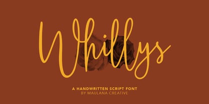 Whillys Handwritten Script Font Give your designs an authentic handcrafted feel. Whillys Handwritten Script Font is perfectly suited to logo, stationery, branding, typography quotes, magazine or book cover, website header, clothing, branding, packaging design, restaurant and more. Thanks for use this font ~ Maulana
 - Banana by Dharma Type,
$19.99 This font is a modern urban script. Very impressive because of its heavy and rounded shape. Upright stems and wide width of their shape gives easy and slow impression. There is one more script designed by in the same concept. -Nothing -Banana
 - Jattestor by Sabrcreative,
$25.00 Elevate your creative projects with the enchanting allure of the Jattestor Script Font. This typeface seamlessly melds the fluidity of handwritten script with a touch of artistic charm, making it an excellent choice for designs seeking a blend of authenticity and creativity.
 - Winola by Typefactory,
$14.00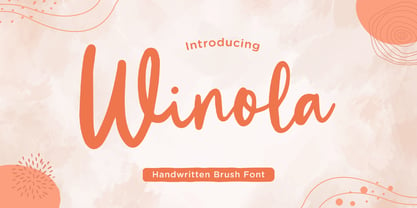 Winola is a brush script font. It has an authentic modern brush script look making it perfect for branding and digital designs. Use this font for logos, wedding decor, invitations, home decor, websites, blogs, instagram, business cards, branding, social media, and more!
 - Leelawadee by Microsoft Corporation,
$49.00Leelawadee is a Thai font licensed from Microsoft Corporation. The Leelawadee font is a legible sans serif that is good for User Interface design and on-screen applications. Leelawadee is a Thai script font and requires an application program that supports Thai scripts. - Prestly Signature by Letterhend,
$14.00 Signature Script, Monoline Script, Monoline Signature, Wedding Font, Ballpoint Font, Wedding Font, Wedding Invitation, Romantic Font, Feminine Font, Signature Font, Beautiful Font, Pretty Font, Stylish Font, Modern Font, Chic Font, Feminine Font, Wedding Font, Romantic Font, Romance Font, Handwriting Font, Hand Written Font,
 - AngloAngkor by Parquillian Design,
$39.00 AngloAngkor is a display face of Western characters inspired by the elegant “round script” style of the Khmer alphabet of Cambodia. It is the first of a projected series inspired by some of the beautiful lesser-known native scripts of Southeast Asia.
 - Mandalykha by TSA Creative,
$12.00 Mandalykha is a very unique script font, inspired by a tourist spot located in Central Lombok Regency. Mandalykha a stylish script which is guaranteed to add an eye-catching appeal to your logo designs, brand imagery, quotes, product packaging, merchandise & social media posts
 - Kanaggawa by Letterara,
$10.00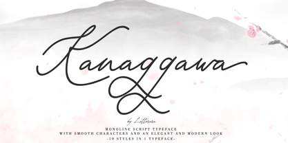 Kanaggawa font is Monoline script typeface with smooth characters and an elegant and modern look. Kanaggawa is suitable for logos, signatures, taglines, T-shirts, handwritten quotes, product packaging, posters, and much more! Add Kanaggawa, a beautiful script font, to your collection today.
 - Belle Amour by Craft Supply Co,
$15.00 Belle Amour – Modern Calligraphy is an handwritten script font based on the expression of real handwriting. Cattus – Modern Casual Script will work perfectly for fashion, e-commerce brands, trend blogs, wedding boutiques or any business that wants to appear upscale and chic.
 - Backline by Subectype,
$13.00 Backline is a monoline script font with an cute style. It has good readability and is perfect for logos, invitations, wedding, signatures, and much more! What's Included : - Kind Heart Font Script - Multilingual Support - Alternates I hope you enjoy this font. Thank You, Subectype
 - After Death by Fauzistudio,
$20.00 After Death is a script typeface. It is inspired by brush lettering and has a soft and welcoming look. After Death can be used for branding, packaging, and anywhere else you need a script font that is easy to read and smooth.
 - Moonlight Shadow - Personal use only

- HWT Slab by Hamilton Wood Type Collection,
$24.95 These two extra bold fonts are classic slab serif wood type styles with one detail of difference. Columbian is an extra bold Clarendon wood type that was manufactured by many of the wood type manufacturers in the late 19th century. "Clarendons" feature bracketed or rounded serif joins whereas "Antique" was a class of typefaces that features squared off slab serifs. Some type designs have only minor differences from others. The Columbian design is essentially identical to Wm. Page & Co.'s "Antique no. 4", with the difference being the bracketed serifs. In researching material for the digitization of Columbian, we started with a 15 line font identified as "Columbian" shown in the Angelica Press wood type portfolio (printed in 1976). This font is in fact "Page Antique no. 4". Comparing Antique #4 to Columbian specimens from Hamilton and other manufacturers confirms the only real difference is the serif treatments. Therefore, both fonts are presented as a pair. Each font features a full Western & Central European character set.
 - Sickle by Eclectotype,
$20.00 The Wild West meets Russia and India in this heavy duty display face. Although it's uppercase only, most of the characters vary between the uppercase and lowercase alphabets, so it's easy to give your text a hand-made feel by mixing up your cases. OpenType savvy applications can really exploit the extra features of this font. Engage contextual alternates, and G, C, L and alternate form of E will change when placed before a letter with a crossbar to create some cool effects (see the CK and LE combinations in the poster). There are standard ligatures for ff and FF combinations, and discretionary ligatures for 'and', 'the', 'No', 'Mc' and 'Co'. Engage stylistic alternates for a reversed 3 version of E, and the obligatory backwards R for that faux-Russian effect. Also included in the font is a host of ornaments. This font is perfect for wanted posters, heavy metal band logos, Communist propaganda leaflets and no doubt a load of other things too.
