10,000 search results
(0.018 seconds)
- Armalite Rifle Pro by CheapProFonts,
$10.00 Military style stencil type, badly bruised by shotgun fire, wear and tear. Now ready for action in more languages! Vic Fieger says: "The original letterforms were not the famous military stencil, but were drawn freehand then scanned into Photoshop. Next, they were altered using a series of brushes before being imported into a font. This font has been used in the Flash games Pandemic and Artillery." ALL fonts from CheapProFonts have very extensive language support: They contain some unusual diacritic letters (some of which are contained in the Latin Extended-B Unicode block) supporting: Cornish, Filipino (Tagalog), Guarani, Luxembourgian, Malagasy, Romanian, Ulithian and Welsh. They also contain all glyphs in the Latin Extended-A Unicode block (which among others cover the Central European and Baltic areas) supporting: Afrikaans, Belarusian (Lacinka), Bosnian, Catalan, Chichewa, Croatian, Czech, Dutch, Esperanto, Greenlandic, Hungarian, Kashubian, Kurdish (Kurmanji), Latvian, Lithuanian, Maltese, Maori, Polish, Saami (Inari), Saami (North), Serbian (latin), Slovak(ian), Slovene, Sorbian (Lower), Sorbian (Upper), Turkish and Turkmen. And they of course contain all the usual "Western" glyphs supporting: Albanian, Basque, Breton, Chamorro, Danish, Estonian, Faroese, Finnish, French, Frisian, Galican, German, Icelandic, Indonesian, Irish (Gaelic), Italian, Northern Sotho, Norwegian, Occitan, Portuguese, Rhaeto-Romance, Sami (Lule), Sami (South), Scots (Gaelic), Spanish, Swedish, Tswana, Walloon and Yapese.
 - Ardour GM - Personal use only

- Therock by MlkWsn,
$15.00 The Rock is a supercharged, street-wise brush font bursting with energy. With extra attention to quick strokes and sharp details, The Rock is ideal for logos, apparel,T-shirts, Hoodie, quotes, product packaging, or anything which needs a typographic turbo-boost. The Rock Regular is the standard version of the font. Perfect for titles and logos. The Rock Swash is if you need a cool underline under your text or a splash of paint. This font set has you covered. Type any letter a-z using this font, and you'll get a unique swash to accompany the font. Language Support - We've added in a great deal of extra characters to support many different languages. Commercial/Extended License - This is in your design arsenal for life! Use on end products for sale is permitted with the standard license. Ligatures - Even though this is a capital letter, it is equipped with Ligatures.
 - Le Havre by insigne,
$24.99 Le Havre is a geometric sans serif inspired by the golden era of the passenger ship, when getting to your destination was a delight in and of itself. Compressed capitals, a low x-height and geometric construction give this art deco inspired sans a unique look that looks to the past for inspiration, but is a new contemporary design usable in a wide range of graphic settings. Le Havre features eighteen art deco titling alternates, ligatures and old style figures. Le Havre is named for the port where many a famous luxury cruise liner was launched in the 1930s. One of the best examples of art deco luxury cruise liner advertising can seen in the famous poster advertising the SS Normandie by the French designer Adolphe Mouron Cassandre. In 2009 the Le Havre series was updated with a new thin weight and Le Havre Rounded.
 - Shoika by Tropical Type Foundry,
$29.99 Shoika is a celebration of geometry. It’s a typographic quest for purity with a touch of hidden gems in the form of unique details and characters. Shoika is perfect for the modern designer who needs a solid, refined and versatile font family for branding, UX, web, packaging and editorial jobs. Shoika presents a wide range of weights (18 fonts), supports an extensive variety of Latin alphabet-based languages (over 200), and it has been manually kerned and auto-hinted for enhanced performance on screen. It includes several OpenType features like case diacritics, tabular figures, arrows, ordinals, inferior and superior figures, numerator and denominator figures, fractions, circled figures, black circled figures, outline dingbats and solid dingbats. All typefaces from Tropical Type Foundry include free updates and free technical support. For custom enquiries don’t hesitate to get in touch: tropicaltypefoundry@gmail.com Imagery credits: Unsplash (Photo), DrawKit and RawPixel (Illustrations).
 - Sticker by DonyaDesign,
$14.00 Special creative products for you, our products will give you an extraordinary experience that will not be forgotten. A popular and professional script font. Modern and elegant, this typeface is made of beautiful creative strokes. This font is perfect for your creative ideas, both formal and informal. It has a modern style with a touch of creative ideas that is very suitable to be applied anywhere that requires creative ideas such as invitation cards, letterheads, website logos, social media, banners, advertisements, brochures, packaging products, leather products, and any product that requires writing. By using this font, all of your products will look luxurious, elegant, and attractive, please try and see the results. This font includes a complete set of beautiful upper and lowercase letters, numbers, a wide variety of punctuation marks, and ligatures. All lowercase letters include a start and end, providing a realistic style. everything you get.
 - Katarine by Suitcase Type Foundry,
$75.00From today's point of view Katarine has a rather unusual origin. Initially an all-caps display face, what was to become the Medium weight of the family was augmented with a lower case, then the character set was completed by adding all the missing glyphs. The next step was the creation of the Light and the Bold weights with matching Italics. This working method compromised the relationships between the characters across the different weights After some consideration the decision was made to start over and draw the complete family from scratch. This time the "conventional" process was followed — first the Light and Bold weights were designed. Those extremes were used to interpolate the Regular, Medium and Semibold weights. When compared to the original, the glyphs of the new fonts are slightly wider. The construction of the letters is sturdy, with an x-height that varies from the heaviest to the lightest weights. The relationship of the stem weight between the horizontal and vertical strokes is carefully balanced. Characters are open and firm; the italics have room to breathe. The original fonts included two sets of small caps — Small Caps and Petite Caps. However neither set were suited for emphasis, with the Small Caps being too tall and the Petite Caps too short. We decided to replace them both with one set of traditional small caps, slightly taller than the x-height, perfectly suited for emphasis in text usage. The original version of Katarine was partly incorporated into the new OpenType versions. Thus most of the original arrows, frames and boxes can be found in the new Katarine. Each individual weight now contains 830 glyphs, nine sets of numerals, small caps, numerous ligatures and fractions. An additional font named Numbers contains numerals in circles and squares, and is now augmented with accented caps and a number of terminal alternatives, which can easily be accessed through stylistic sets. We also added two extra variants, Experts Regular and Experts Black (in inverted form). Katarine Std preserves the solid construction and excellent legibility of the original family, but has now become a fully featured OpenType typeface. Katarine is suited for a broad range of applications, from simple layouts to intricate corporate systems. It is the typeface of choice where the cold, austere character of modern sans serifs are inappropriate, yet simple shapes and good legibility are required. - PB Capitalis Rustica IVc by Paweł Burgiel,
$32.00 PB Capitalis Rustica IVc is a font face designed for imitate latin writing style found in manuscripts from 1st to 9th century. All characters are handwritten by use ink and reed pen (calamus), scanned, digitized and optimized for best quality without lost its handwritten visual appearance. Character set support codepages: 1250 Central (Eastern) European, 1252 Western (ANSI), 1254 Turkish, 1257 Baltic. Include also additional characters for Cornish, Danish, Dutch and Welsh language, spaces (M/1, M/2, M/3, M/4, M/6, thin, hair, zero width space etc.) and historical characters (overlined Roman numerals, I-longa, historical ligatures for "nomina sacra" and "notae communes"). OpenType TrueType TTF (.ttf) font file include installed OpenType features: Access All Alternates, Localized Forms, Fractions, Ordinals, Superscript, Tabular Figures, Proportional Figures, Stylistic Alternates, Stylistic Set 1, Historical Forms, Historical Ligatures. Include also kerning as single 'kern' table for maximum possible backwards compatibility with older software. Historical ligatures for "nomina sacra" and "notae communes" are mapped to Private Use Area codepoints. Use of OpenType features to get historical characters: ïTo get "I-longa" use Stylistic Alternates for: "I"(U+0049), "i"(U+0069), "dotless i"(U+0131). ïTo get "nomina sacra" use Historical Ligatures and write uppercase letters: DS for: "Deus", DMS or DNS for: "Dominus" EPS for: "Episcopus", IHS for: "Iesus", PBR for: "Presbiter", SCS for: "Sanctus", SPS for: "Spiritus", XPS for: "Christus". ïTo get "notae communes" use Historical Ligatures and write: B(U+0042) + "middle dot"(U+00B7) for: "-BUS", Q(U+0051) + "middle dot"(U+00B7) for: "-QUE". ïTo get "scriptio continua" (writing without words separation) use Historical Forms (regular spaces are replaced by zero width spaces between words). ïTo get "middle dot" for separate words use Stylistic Set 1 (regular spaces are replaced by middle dot between words).
 - Sign and Display JNL by Jeff Levine,
$29.00 Sign and Display JNL is a long-overdue companion font to 2009’s Sign and Poster JNL. The original design models were Art Deco influenced die-cut cardboard letters and numbers manufactured by the Duro Decal Company of Chicago. Square in shape with rounded corners, the thick cardboard letters were used for making show-cards and other display signage. Subsequently, Duro used the same style of lettering to manufacture water-applied decals for boat identification and other uses. It was a set of these decals (with a black outline and yellow interior) that inspired the outline typeface Sign and Display JNL, which is available in both regular and oblique versions.
 - Cord by Roland Hüse Design,
$20.00 Cord (Zsinór in Hungarian) was originally a commissioned work for a tablecloth pattern with a thread like frame decoration that is actually consist of letters. The lettershapes were being created based on Rovas characters, which were reinterpreted without decreasing legibility. Therefore, the Rovas alphabet was designed in the first place followed by its matching Latin company. The full character set contains: Western, Central and South Eastern European Latin characters basic symbols and punctuation Rovas alphabet Rovas number symbols and punctuation Display font, best fit in larger sizes for souvenirs, folk art theme, embroidery, ribbon like decorative texts and signages. Good luck and Happy Creating! Roland
 - FT Drobbs by Foxys Forest Foundry,
$9.00 FT Drobbs is inspired by the Didot font group, known for its neoclassical style reminiscent of the Age of Enlightenment. The font includes a combination of very narrow and very wide lines. FT Drobbs features increased contrast between wide and narrow lines and includes rich teardrop endings. I love to watch how the lines bend, how they move, expanding or going into the thickness of the hair. I love their graceful beauty. FT Drobbs is not alphabetic, but it contains numbers, a set of basic currency symbols, and a few typographic characters. It is suitable for use as accents in labels, posters and infographics.
 - DBXLNightfever by VetteLetters,
$- DBXL Nightfever was originally designed by Donald Beekman in 2001 for the disco-techno-house record label of the same name, an imprint of United Recordings. Geometric and gridded, with a solid sci-fi techno feel, Nightfever still contains a lot of soul. Three additional wider weights were added for more design flexibility, as well as italics for all widths. After the record label was terminated the Nightfever fonts were used for many other DBXL design projects. It was put online for free download first in 2008, this year (2019) the design got more refined with additional accurate kerning and spacing. All fresh and new, ready for a new space age!
 - Kudryashev Display by ParaType,
$30.00 Kudryashev Display is a set of light and high-contrast faces based on Kudryashev text typeface . In addition to Kudryashev Display and Kudryashev Headline faces, the type family includes also two sans-serif faces of the same weight and contrast, with some alternates. The graceful nature of the typeface, along with carefully designed details, allows to use it in large point sizes, for example in magazine layouts, packaging design and in many other ways. The serif styles were designed by Olga Umpeleva in 2011, the sans styles were created by Isabella Chaeva in 2015 with the participation of Alexandra Korolkova. The typeface was released by ParaType in 2015.
 - Delphi by Positype,
$22.00 Delphi grew from a logotype Lily Feinberg produced using Greek-column-inspired letterforms. As that concept expanded to include more and more letters, the typeface had its beginnings. Intertwined, kinetic, and deliberate, Delphi carves itself onto the page and screen, encouraging variation and experimentation. The letterforms’ unique construction and predispostion for experimentation inspired two varying sets: Delphi Dio, comprised of two-line strokes, and Delphi Tria, built of both 2- and 3-line strokes. With a design as elaborate, yet tightly tuned as this, the desire to add more and more was irresistible—you'll see a number of stylistic, swash, and titling alternates (and even more hidden away in further stylistic sets). Because Dio and Tria could only hold so much, alternate cuts were produced to better organize your options: the Delphi Alt fonts feature certain letter styles and stylistic alternate sets distinct from those in Delphi. Delphi’s sophisticated, striking letterforms make it an ideal display face for use at large sizes, and with so many unique details and alternate letterforms, it’s simply fun to use.
 - Rawhide by Canada Type,
$29.95 Rawhide is a fresh digitization and expansion of a very popular (yet uncredited) early 1970s film type called Yippie, which was commonly used in wild west cartoons and comics. Publishers of Lucky Luke, the famous Belgian comic by Morris, used these bouncy letters for the titling on a few of their soft cover editions, and different variations of it were used throughout the 1970s and 1980s by cartoon classic Looney Tunes and a variety of wild west animations and comics. It slowly disappeared without fanfare when desktop publishing became the norm. Here it is again now for the computer age, available as a high quality font with a complete character set that accommodates more than 20 Latin-based languages. In short, Rawhide comes with an impressive track record, and is a must for any funny cowboy design or off the wall wild west layout. This set of fonts contains a very expanded character set that includes full support for Central, Eastern and Western European languages, as well as Baltic, Turkish, Esperanto, Greek, Cyrillic and Vietnamese.
 - Kallilu NF by Nick's Fonts,
$10.00This extrabold display face takes its design cues from the typeface Thomac, designed by George Piscitelle in the 1960s. Its semiscript styling makes for headlines that get attention. Both versions of the font contain the complete Unicode Latin 1252 and Central European 1250 character sets. - Caskier by Hustle Supply Co,
$18.00 CASKIER Caskier is a whiskey inspired layered typeface. With 10 font files, you get access to a variety of potential aesthetics ranging from clean, layered or roughened. What's Included? Regular, Bold, Outlined, Shadow, Roughened + Oblique Versions Western European Character Set A variety of ligatures
 - Monarqy by Alit Design,
$20.00 Discover Monarqy - The Funky Retro Font with Dynamic Flair Get ready to transport your projects back to the rad era of the 1980s with Monarqy, a font that encapsulates the funky, retro style of the era while adding a contemporary twist. This font will infuse your designs with a vibrant, nostalgic energy that captures the essence of the 80s like no other. Why Monarqy Stands Out: Cool Dynamic Characteristics: Monarqy oozes character with its funky, dynamic design. Each letter exudes a sense of movement and excitement, making it the perfect choice for projects that demand a playful and energetic vibe. Ligatures for That Perfect Flow: Monarqy offers an extensive range of ligatures, ensuring that your text flows seamlessly, delivering a polished and professional appearance. This feature is a game-changer for designers who demand precision in their typography. Rich Character Set: With an impressive repertoire of 610 characters, Monarqy accommodates a wide array of design applications. Whether you're crafting headlines, branding, or body text, you'll find all the characters you need to bring your vision to life. Alternatives for Creative Freedom: Monarqy doesn't hold back when it comes to creative freedom. The font provides alternative characters that let you experiment and find the perfect fit for your design. Customize your text to match your unique style and vision effortlessly. Multilingual Support: Monarqy is your passport to the global design landscape. With comprehensive multilingual support, it effortlessly adapts to various languages and ensures your message resonates across borders. PUA Unicode: Monarqy is PUA (Private Use Area) encoded, allowing you to unlock even more creative potential. Access special characters and ornaments that will set your designs apart from the rest. Monarqy is Perfect for: Retro-themed designs 80s-inspired branding Party invitations and posters Apparel design Album covers Packaging and labels Editorial layouts And so much more! Reignite the spirit of the 80s with Monarqy and let your creativity shine. Whether you're working on a fun project or a professional design, this font will add that extra touch of style and nostalgia. Get your copy of Monarqy today and embark on a typographic journey back to the funky, retro world of the 80s!
 - Victorian Silhouette by Monotype,
$29.99Victorian Silhouette is a decorative all-capitals face made up of small silhouettes of people engaged in different activities. Before photographs were readily available, portraits were commissioned in the form of silhouettes, and these were extremely popular during the Victorian era. The Victorian Silhouette font is ideal for initial caps. - Revla Sans Text by Eclectotype,
$30.00 Fun. Fun isn't it? But sometimes you can have too much fun, and things can get out of hand. Revla Sans is, in certain situations, too much fun. So, without further ado, let me introduce the straight man to Revla Sans's buffoon - Revla Sans Text. It represents a complete overhaul of Revla Sans. The bounciness has been removed and details reined in, all for the purpose of optimizing the fonts for use in longer runs of text. 'Text' is perhaps a strong word here; you're not going to be setting novels in this typeface. It still retains the charm of the original, and could well be used in display settings. Think of it like this - Revla Sans would be a great choice for the logo and branding of a board game, no? Revla Sans Text, then, would be good for setting the instructions, or body copy on the website. Revla Sans Text is not as feature-rich as Revla Sans, and is priced accordingly. Enjoy!
 - Ivory by FaceType,
$24.00 Ivory is inspired by a beautiful typeface used in an illustrated compendium about pomology from 1882. We separated the elegant “Swashes” from the letters – use it together with “NoSwashes” to get two-colored initials. Please note that the kerning of NoSwashes works only together with Swashes. To achieve the two tone effect shown in the samples, you need to use an application that supports layers. For example, Adobe Illustrator, Adobe InDesign, Adobe PhotoShop, CorelDRAW, and Quark. Some of the preview images were made by Arina Karen Renata Palilingan.
 - Saturator FA by Fontarte,
$39.00 Inspired by hand lettering and vernacular typography. Its informal and friendly character allows for different creative ways of usage. It is recommended for publishing, advertising and branding to get fresh handmade feeling. First version of Saturator FA Regular was designed by Magdalena Frankowska in 2007 and used successfully by many graphic designers all over the world. New version of Saturator FA is broadened with more diacritic characters for most of Latin languages. In 2016 new styles: Italic, Serif and Serif Italic were designed to enrich the Saturator FA family.
 - Crop by Thinkdust,
$10.00 Crop is the guy who works till 3am, striving for greatness. Crop is the one in the gym at six in the morning, pushing harder every time. Taking no for an answer, just isn't part of the deal. Crop is the one with fire in his heart and eye intense enough to achieve the unthinkable. If you've never stopped pushing boundaries, if you think second place isn't worth getting out of bed for, if you can stand on the top of the world and ask, 'What's next?' - Crop might just be the one for you!
 - GHEA Granshan by Edik Ghabuzyan,
$40.00 GHEA Granshan is a super font family. It has 9 upright weights and their Italics. It supports Latin Pro, Armenian, Greek, Cyrillic, Bulgarian & Ukrainian alternatives alphabet systems. The weights from Regular to Bold and their Italics can be used as text fonts. The weights thinner than Regular and thicker than Bold can be used as Display fonts. It is an easily readable fond and the eyes don't get tired while reading. GHEA Granshan has a slight contrast style and at the same time is quite bright and clear.
 - Cubista Geometrica by Deniart Systems,
$15.00 Make an impact with geometric cubes! The Cubista Geometrica typeface is a monospaced design created to form repeated patterns, either individually (single symbol) or mix and matched with partner charaters. Each image is accessed through the standard keyboard—instead of letters, you'll get an image or glyph. This monospaced typeface is designed proportionately high as it it wide making it easy to form multi-line patchworks. The combination possibilities are enormous—this font comes with a PDF guide showing many of the assembly options, the rest we leave to your own imagination!
 - Claudius by RMU,
$25.00 A blackletter font tending towards the gothic which was released by Klingspor, Offenbach am Main, in 1937. Claudius can be used for clerical as well as for secular purposes and shows a strong character of its own. The original esthetic atrocities of placing the dieresis within the letters A and O - due to former German industry standards - were abolished. Allow the font's beauty spread by giving it enough leading between the lines. This font contains various useful ligatures, and by activating the Ordinals feature and typing 'N', 'o' and period you get an oldstyle numbersign.
 - Sintesi Sans by FSdesign-Salmina,
$39.00 Sintesi Sans. Sans meets serif. Are you looking for a robust, contemporary but nonetheless an elegant font? Sintesi Sans might be exactly what you are looking for. Sintesi Sans builds together with Sintesi (SemiSerif) and Sintesi Semi an extended family. However each of the three member of the Sintesi-family accomplish the «synthesis» between Sans and Serif on its own way. Sintesi Sans scores because of its readability, robustness and contemporary style. It is a true Sans Serif and therefore really flexible, universally applicable especially as a body text font and in a broad number of other applications. Worth mentioning is the particularly slim «Extrathin» style, which elegance is not to be outbalanced. Thanks to the good readability and the wide set of styles and glyphs, Sintesi Sans suits to a wide spectrum of applications. Download a free trial package of the extended family with a reduced character set – check it out! Download a free trial version of Sintesi Sans with a reduced character set. Check it out!
 - Volta by Linotype,
$29.99Volta is a robust typeface from the 1950s. A revisit to styles that were en vogue at the turn of the century, Bauer type foundry designers Walter Baum and Konrad Bauer designed this type family in1955. The form of Volta's letters are similar to those in New Transitional Serif typefaces, like Cheltenham and Century. Developed after the Didone (i.e., Bodoni) style types, New Transitional Serifs speak more to the zeitgeist of the late 19th Cntury, and were typographic adaptations to it's newer technologies. Already in the period of mass production, typographers and printers at the dawn of the 20th Century had to cope with larger print runs on cheaper materials. The robust letterforms of New Transitional Serifs were designed to compensate for this, but they were also ingenious little inventions in their own right. Form the beginning, the new, peculiar forms of New Transitional Serif letters were adopted for use by advertisers. Their robustness also allowed them to be used in virtually all sizes. Volta was designed especially with advertising display usage in mind. The x-height of Volta's letters is higher than average for serif faces. It is recommended that Volta be used exclusively for shorter tracks of text, above 12 point. Headlines look dashing set in Volta. Four different font styles are available for the Volta typeface: Regular, Medium, Medium Italic, and Bold." - Hexxes by astroluxtype,
$15.00 Bold mutant light typography. Futuristic astroluxtype. Digital pixels and hex head wrenches from the toolbox were the influence for this font. Hexxes Light and Hexxes Bold are a minimal font set that includes upper and lowercase letterforms which can be used at various sizes but, we consider it to be a headline/display font, best applied larger than 24 points in size.
 - Blackbarry NF by Nick's Fonts,
$10.00Deutsch Black, designed by Barry Deutsch for VGC in 1966, provided the inspiration for this extrabold exercise in heavy ink coverage. A number of variants, in lowercase slots, were added to offer flexibility to your headline designs. Both versions include the complete Latin 1252, Central European 1250 and Turkish 1254 character sets, as well as localization for Moldovan and Romanian. - Corinthia by TypeSETit,
$24.95 A festive, elegant script, Corinthia flows with perfect connections and beautiful curves. It’s a delightful design that offers wide usage... Available in OpenType format, this award winning font comes with over 500 glyphs, and character sets for European languages. All three weights are perfect for creating elegant design work from packaging and romance novels, to invitations and social expression products.
 - Moldiv by ATK Studio,
$15.00 Moldiv is a sans serif display typeface with geometric appearance. Its clean and angular shapes provide a futuristic and robust design. Moldiv consists of a single weight, an extended European character set, and kerning and symbols were manually edited. It has a timeless style which is great for display purposes, especially for headlines, posters, magazines, book covers, logos, and much more.
 - Mister Golden by Nathatype,
$29.00 Mister Golden is a beautiful handwritten font. It brings an attractive typeface. Made for any professional projects. The font is suitable for any project like logo, t-shirt printing, wedding invitations, and greeting cards to social media quotes, branding, and more! Outstanding in a wide range of contexts. Featured : Standard Ligatures Stylistic Sets Multilingual Support PUA Encoded Numerals and Punctuation
 - Sweeper by Gustav & Brun,
$12.00 Sweeper is a font with several personalities; it’s friendly and scary at the same time, almost like Santa Claus, but nicer. Sweeper has got a handy touch with a lot of different possibilities. You can use it in several occasions. Sweeper is suitable in any environment: the business district in London or the shores of Oxelösund. It’s hella wide and hella fun!
 - Rainbow Lemonade by Nathatype,
$29.00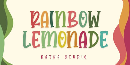 Rainbow Lemonade is a beautiful handwritten font. It brings an attractive typeface. Made for any professional projects. The font is suitable for any project like logo, t-shirt printing, wedding invitations, and greeting cards to social media quotes, branding, and more! Outstanding in a wide range of contexts. Featured : Standard Ligatures Stylistic Sets Multilingual Support PUA Encoded Numerals and Punctuation
 - P22 Lucilee by IHOF,
$39.95 Lucilee is a full featured, OpenType script font from Michael Clark. It is a sweeping italic with many alternates, including ligatures, beginning and ending swashes, and a full Central European character set. It is a joining script that is fluid and also suitable for titling. Lucilee was designed with packaging in mind, but can be used for a wide variety of uses.
 - Fractura ND by Neufville Digital,
$29.60 Fractura ND is a stencil typeface designed by José María Cerezo. It includes, in addition to four fonts of different weights, an outline font, a pair of fonts to make bicolor sets and a dripped font. A geometric sans serif that, with the particularity of being a stencil, provides personality and wide compositional possibilities. Fractura is a Trademark of BauerTypes SL
 - Statue Of Liberty's Underwear by Vic Fieger,
$6.99Inspired by a handwritten Cyrillic placard seen in a book about the Soviet Union, Statue of Liberty's Underwear was envisioned as having been written with a very thick pen with a flat tip held horizontally. Additionally, the letterforms were sculpted to resemble lettering common in early 20th-century Russian constructivism pieces. A Cyrillic alphabet, or "azbuka", set was included in the font. - Jealous Radio by Bogstav,
$14.00 Each letter is handmade and drawn with a “blobbly” pen, leaving a wobbly and grungyline. The corners are rounded which adds a blurry look to the rough lines. All in all, Jealous Radio is kind-looking,soft, yet rough and really organic looking! Useful for a wide range of things: from kids products, comics, posters, invitations or even protest banners!
 - Broline Script by Tebaltipis Studio,
$15.00 Introducing, Broline Bold Script is a typeface with personality. You can use it as a logo, badge, insignia, packaging, headline, poster, etc The alternative characters in this font were divided into several OpenType features such as Stylistic Alternates, Stylistic Sets, and Ligature. The OpenType features can be accessed by using OpenType program such as Adobe Illustrator, Adobe Photoshop, and Adobe InDesign. Thank you!
