10,000 search results
(0.028 seconds)
- Vintage Fonts Collection by GRIN3 (Nowak),
$15.00 Vintage Fonts Collection is a set of 18 hand-drawn fonts inspired by vintage ads, old newspapers and retro sign painting. Every lowercase letter has three variations. When the font is used in OpenType-savvy applications, the 3 variants of glyphs are automatically alternated to achieve a random-like effect. Language support includes Western, Central and Eastern European character sets, as well as Baltic and Turkish languages.
 - Putney Junction NF by Nick's Fonts,
$10.00This elegant offering is based on a typeface originally called "Design", from Barnhart Brothers & Spindler’s Specimen Catalog Number 9, published in the first decade of the twentieth century. This version has been fine-tuned to set tight, and is suitable for headlines, subheads, and limited amounts of body copy. Both versions of this font include the complete Unicode Latin 1252 and Central European 1250 character sets. - Creamy Dreams by Timurtype,
$14.00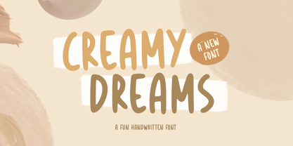 Introducing by Timur type Proudly Present, Creamy Dreams Creamy Dreams A Handwritten Script Font Creamy Dreams is perfect for product packaging, branding project, megazine, social media, wedding, or just used to express words above the background. This Creamy Dreams font includes: -Full Set of standard alphabet and punctuation & symbol -Extra set Alternate ending lowercase -multilingual support. Embelish your designs with our original fonts.Enjoy the font,Thank you!
 - Amateur Stencil JNL by Jeff Levine,
$29.00With all of the stencil fonts created by Jeff Levine from various vintage sources, you would think everything had already been covered. Not so. Along comes Amateur Stencil JNL. Modeled from a child's stencil set from the late 1950's or early 1960's, it vaguely resembles Futura, but its irregular widths and semi-stencil appearance sets it off greatly from that classic typeface. - Haarlem Nights NF by Nick's Fonts,
$10.00A 1920 Dutch poster for Public Placement Services by Johan Dijsktra provided the inspiration for this crisp geometric typeface. Instead of the normal underscore (_), this font features a set of parallel lines flush to the tops of the caps and small caps, which offers some intriguing design possibilities. Both versions of this font include the complete Unicode 1252 Latin and Unicode 1250 Central European character sets. - Mulberry Script by Cultivated Mind,
$27.00 Mulberry is a beautiful handwritten calligraphy script that comes with lovely alternates, ligatures, extras and ornaments. Choose between Mulberry Script or Mulberry Script Pro and two font weights (Regular/Bold). Mulberry Script comes with a basic set of alternates. Mulberry Script Pro comes with four sets of alternates including ligatures. This typeface can be used for fashion, apparel, stationery, magazines, letterpress, film, books and marketing.
 - Bakersfield by Arendxstudio,
$19.00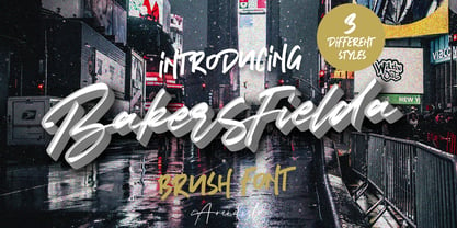 Bakersfield is a combination font with 3 different style variations that will make you feel easy to apply in your various design projects. Bakersfield comes with OpenType features such as stylistic alternates, stylistic sets and ligatures. Bakersfield is perfect for logotypes, posters, badges, book covers, tshirt designs, packaging and much more. Features : • Character Set A-Z • Numerals & Punctuations (OpenType Standard) • Accents (Multilingual characters) • Ligature • Alternate
 - Nabataean 50 by Archaica,
$30.00This font provides a typical set of characters for the ancient Nabataean language, used in what is now Jordan and adjoining regions during the period of the Roman Empire, based on lapidary letter-forms of the first century of the present era. It includes a full set of alphabetic characters as well as the ancient numeral forms, with ligatures and variant shapes for some numerals. - FH Getto Funky by FHFont,
$23.00 Getto Funky is a display font with a fun retro style, getto funky includes six (6) stylistic sets (ss) there are ss01, ss02, ss03, ss04, ss05, ss06, and also Standard Ligatures. In every Stylistic Set, this font has unique swashes, and a unique style, like a retro style. This font basically is in display style, suitable for titling, logotype, and font for a poster.
 - Heroism Theory by Arendxstudio,
$15.00 Heroism Theory - Cute Handwritten Font with sharp and beautiful letters that create fonts that are modern, trendy and elegant. Came with opentype features such stylistic alternates, stylistic sets & ligatures good for logotype, poster, badge, book cover, tshirt design, packaging and any more. Features : • Character Set A-Z • Numerals & Punctuations (OpenType Standard) • Accents (Multilingual characters) • Ligature • Alternate There it is! I really hope you enjoy it
 - SugarBoo by Inumocca,
$20.00 SugarBoo is A Reverse-Contrast letterform , Modern look, Fresh, eyecatching, strong character and power full. The Typeface comes with Stylistic Set Combinations Exellent typeface to use for covering your Project, like Branding, Movie Title, Headline Letter, Bookcover or Book Content, Magazine cover, Poster, Quotes Lettering, Logos, and more your project design. - Unique glyphs - Multilingual Characters Support - UPPERCASE - Lowercase - Numeric - Symbol - Punctuation Character - Stylistic Set inumocca type Studio
 - CA Mechano by Cape Arcona Type Foundry,
$19.00 CA Mechano is quite what the name suggests – A mechanical typeface. Pretty straight forward and all-caps as long as you don’t activate the stylistic set "disorder". You will see what happens then: a lot of fun for the typographic eye. A more consumable distraction is offered by the other stylistic set. You will discover peacefully rounded letters in the neighborhood of strictly mechanically constructed glyphs.
 - Jazzfest NF by Nick's Fonts,
$10.00Based on the 1932 typeface Newport, designed by Willard T. Sniffin for ATF, this Art Deco standard packs a lot into multi-line heads and subheads due to its very short descenders, cleverly accomplished by “fudging the baseline” on the g, p, q, and y. All versions of this font include the Unicode 1250 Central European character set in addition to the standard Unicode 1252 Latin set. - Montez Pro by Stiggy & Sands,
$39.00 Straight from the beauty product ads of the 1960's comes Montez Pro, full of sweeping strokes which lend to a feeling of joy and elegance throughout its letterforms. It is the ideal font for display uses that require a little drama, "joie de vivre" or Joy of Life. The stylings of the standard typeset Montez Pro lend itself to holiday and celebration designs most effectively. And while it is usually a typographic no-no to set a script in all capitals, Montez Pro contains a small caps feature that has specially redesigned capitals that allow an appealing all capitals setting. Montez Pro is loaded with features to give you plenty of customisation options: - Stylistic Alternates offer variations of the L, t, and w-smallcap characters - Small Caps offer tailored back and normalized short capitals - 44 Ligatures to make typesetting more interesting - A Full set of Inferiors and Superiors for Limitless Fractions - Proportional and Oldstyle numeral sets
 - Hexonu by Ingrimayne Type,
$6.95 Hexonu is a weird, awkward, monospaced font family. In place of true lower-case letters, it has a second set of capitals that, through the magic of the OpenType contextual alternatives (calt) feature, automatically alternates with the set on the upper-case keys. If one wants to use only one set of letters, the contextual alternatives must be turned off and character spacing adjusted. Hexonu is another effort to create a font with alternating sets of letters (see PoultySign, Lentzers, and Caltic for others). The base shape for forming the letters is a lopsided hexagon that resembles an old coffin. In four of the six family members, the alternating shape is a distorted hour-glass. In the other two, coffin shapes heads-up alternate with coffin shapes heads-down. The family was created as an experiment with the calt feature and not for any particular use. It does not work as text but its bizarreness makes it appropriate for some poster and signage applications.
 - Queen Kelly Sword Regular by Julia Visht,
$21.00 “Queen Kelly’s Sword” - new elegant luxury bold serif from Julia Visht. Classical font serif with stylish decorative elements! Romantic and elegant, “Queen Kelly’s Sword” – is a luxury bold serif with both modern and vintage curves. “Queen Kelly’s Sword” is a must-have for your collection of fonts. Main features: Ligatures. Set of OpenType ligatures allows to make your design truly unique. Alternates. Set of stylistic alternates allows you to create even more authentic custom-feel text. OpenType Style Set. Open Type Style Sets allow to create many perfect styles of your text. Multyfunctionality. It's perfect for: elegant modern branding, web-design, posters, headers, advertising, wedding stationery, book cover designs, classy packaging, album covers, greeting cards, wall art, websites, photos, and so much more. Multylangual support. English, German, Italian, French, Danish, Norwegian, Swedish, Italian, Spanish, Filipino, Scottish Gaelic, Indonesian, Irish, Swiss German, Portuguese. Stylish font for your stylish projects! Happy creating! Designers: Julia Kruk Publisher: Julia Visht
 - La Belle Zabriella by Julia Visht,
$19.00 “La Belle Zabriella” - new elegant luxury font family from Julia Visht. Classical font collection: luxury modern Serif (Bold, Regular, Light) with stylish decorative elements and classy authentic Script! La Belle Zabriella is a must-have for your collection of fonts. Main features: -Ligatures. Set of opentype ligatures allows to make your design truly unique. -Alternates. Set of lowercase alternates allows you to create even more authentic custom-feel text. - OpenType Style Set. Open Type Style Sets allow to create many perfect styles of your text. -Multyfunctionality. It's perfect for: elegant modern branding, web-design, logo creating, posters, headers, advertising, wedding stationery, book cover designs, classy packaging, album covers, handwritten quotes, greeting cards, wall art, websites, photos, and so much more. -Multylangual support. English, German, Italian, French, Danish, Norwegian, Swedish, Italian, Spanish, Filipino, Scottish Gaelic, Indonesian, Irish, Swiss German, Portuguese. Stylish font family for stylish projects! Happy creating! Designers: Julia Kruk Publisher: Julia Visht
 - MVB Dovetail by MVB,
$79.00 MVB Dovetail is an editorially focused text serif designed by David Sudweeks. The working idea for the typeface came from a design school letter-making exercise: Take a pair of scissors and a few large sheets of paper, and start cutting. The resulting letters and the action itself of cutting them out of paper informed the type design process, producing strong, simple shapes and an open, inviting texture. Dovetail’s tone is crisp and straightforward. Its classic letterforms, set off with a touch of playfulness, give the design both a practical and spontaneous personality. The text weights capably set copy at a variety of sizes for print and render crisply on screen. Its lightest and heaviest weights perform best at display sizes. Care has been taken to save the typographer’s time with OpenType features including contextual punctuation and symbols to fit mixed-case, small-caps, and all-caps settings, as well as figure sets tuned to each use.
 - Sales Pitch JNL by Jeff Levine,
$29.00 Have you ever wanted to set a headline within a burst, but found the drawing of all of those angles was a bit too tedious? Sales Pitch JNL solves that problem by setting letters, numbers and punctuation inside individual sections which, when typed out, generates an extended burst pattern. For a flat sided pair of end caps, use the left or right bracket keys. For burst ends, use the left or right brace keys. A blank space is located on the equal sign keystroke, and a wider blank space is on the plus sign. Keep in mind the optical illusion in some program that shows line gaps between characters on the screen. All characters have equal sidebar settings, and are flush with each other. Sales Pitch JNL contains the basic A-Z and 0-9 characters as well as numerous punctuation. For a companion font with a more complete character set, use Prankster JNL, the same type design, but without the burst pattern.
 - Open TECH Neue by TypoGraphicDesign,
$9.00 The typeface Open TECH Neue is designed from 2018—2021 for the font foundry Typo Graphic Design by Manuel Viergutz. 6 font-styles (Sans Serif, Invert, Outline, Slab Serif, Stretch, Box Puzzle) + 1 icon-style with 1097 glyphs (Adobe Latin 3) incl. 400+ decorative extras like icons, arrows, dingbats, emojis, symbols, geometric shapes, catchwords, decorative ligatures (type the word #LOVE for ♥︎ or #SMILE for ☺ as OpenType-Feature dlig) and stylistic alternates (6 stylistic sets). For use in logos, magazines, posters, advertisement plus as webfont for decorative headlines. The font works best for display size. Have fun with this font & use the DEMO-FONT (with reduced glyph-set) FOR FREE! ■ Font Name: Open TECH Neue ■ Font Styles: 6 (Sans Serif, Invert, Outline, Slab Serif, Stretch, Box Puzzle) + Icons + DEMO (with reduced glyph-set) ■ Font Category: Display for headline size ■ Glyph Set: 1097 glyphs (Adobe Latin 3) incl. 400+ icons (decorative extras like arrows, catch words, dingbats, emojis, symbols) ■ Design Date: 2018—2021
 - Sassoon Infant Pro by Sassoon-Williams,
$66.00 An upright typeface family developed to meet the demand for letters to produce pupil material for handwriting as well as for reading. Upright letters with extended ascenders and descenders are ideal on screen. They facilitate word recognition. The exit strokes link words together visually, and in handwriting they lead to spontaneous joins along the baseline leading logically to a joined-up hand. Teachers can print desk strips, charts of letter families and alphabet friezes, as well as consistent material across the curriculum. Together these typefaces provide a valuable resource for special needs teachers. Typefaces developed to meet demand for letters that can be used to produce pupil material for reading as well as handwriting. Regular and Bold typefaces covering pan-European languages: 9 Latin, 6 Cyrillic, Greek, Turkish, 13 Baltic, 8 Rusyn, 6 Nordic, Vietnamese. How to access Stylistic Sets of alternative letters in these fonts Cyrillic Stylistic Sets examples Greek Stylistic Sets examples Vietnamese Stylistic Sets examples
 - Swonderful by The Ampersand Forest,
$19.00 Everyone loves an Art Deco typeface. And there are hundreds of similarly-designed deco faces out there! But not one of them seems to have every form of every character that you want or need at any given moment. That’s why Swonderful was created! It has more letterform variations than you can shake a stick at (if you're inclined to shake sticks at things). With four variations of every uppercase form, two variations of every lowercase form (plus diacritical characters for the standard set), you’re bound to find the character you need for any given project, whether the style is French Art Deco, American Streamline Moderne, or Jazzy Midcentury Gaspipe. Just switch between stylistic sets! And you’ll find all those characters in three standard weights: Light, Regular, and Bold. They’re designed as a unicase, so they’re all height-compatible, and every set works with every other set, so you can mix and match to your heart’s delight!
 - Croft by Stiggy & Sands,
$24.00 Historical typography makes a comeback. A revival of one of the most popular of a number of rugged typefaces used around the turn of the century, Croft revives the creation of Lewis Buddy III, known as "Roycroft" in 1912 ATF catalogs. It also, according to ATF, was designed "partly" by Morris Benton, around 1898. The original typeface might be considered an early form of grunge fonts. This typestyle maintains historical flavor, while also being relevant today. It has been expanded to have more discretionary ligatures and numerals sets for versatility, and maintains the original stylistic alternates and standard ligatures. See the 5th graphic for a comprehensive character map preview. Opentype features include: Full set of Inferiors and Superiors for limitless fractions. Tabular, Proportional, and Oldstyle figure sets. A small collection of Discretionary & Standard Ligatures. Stylistic Alternates for variations of several characters such as R, u, t, etc. Approx. 482 Character Glyph Set: Croft comes with a glyphset that includes standard & punctuation, international language support, and additional features.
 - Modulate by Stiggy & Sands,
$24.00 A Blocky Geometric Techical typestyle Modulate began as a digitization of a film typeface from LetterGraphics in the early 70's known as "Cadence". The original specimen included standard Capitals and Lowercase, Numerals and minimal Punctuation, a bare bones character set, previous only available on film and only in an upright stance. We've fleshed out the Modulate typeface to include a full standard character set, an extended international set, and a handful of alternate character styles. We've also added an oblique style that suits its techno design. Both vintage and modern feeling, with a dynamic techno presence, Modulate draws attention without being outlandish. See the 5th graphic for a comprehensive character map preview. Bare Bones Opentype features include: - Standard fi and fl ligatures - Stylistic Alternates Letterforms for: EFLTZ and ftz characters - Approx. 411 Character Glyph Set: Modulate comes with a glyphset that includes standard & punctuation, international language support, and minimal additional features.
 - Quandor by Stiggy & Sands,
$29.00 The Quandor Family began as a digitization of a film typeface from LetterGraphics known simply as "Impacta". The original specimen included standard Capitals and Lowercase, as well as a Biform character set. We've fleshed out the original style and added an Oblique to the family, but we just couldn't leave it alone at that, and beefed it up to include an Ultra Black and Ultra Black Oblique style as well, because uber heavyweight font styles are the bees knees. Chocked full of features, including Biform alternates, SmallCaps, and SmallCaps Biform alternates, this family is built to perform. See the 5th graphic for a comprehensive character map preview. Opentype features include: - Full set of Inferiors and Superiors for limitless fractions. - SmallCaps feature. - Tabular and Proportional figure sets. - A small collection of Standard Ligatures. - Stylistic Alternates for Biform alternates and SmallCaps Biform alternates. Approx. 818 Character Glyph Set: Each style of Quandor comes with a glyphset that includes standard & punctuation, international language support, and additional features.
 - Publica Play by FaceType,
$- Publica Play is Publica Sans’ and Publica Slab’s playful sister. It comes with loads of subtle open type features, tabular options, rare currencies signs and symbols and arrows – ‘Publica Play’ has everything you need for playful design tasks. Take a close look at our gallery (especially ‘OpenType Features 1–7’) to discover the versatility of Publica Play. Alternates and Stylistic Sets Give your typography a certain spin with the variety of alternate letters provided. Explore the Stylistic Sets provided. Currency You need to set prices in exotic countries? No problem: Publica Play gives you loads of rare currency symbols. Case Sensitive Forms Sometimes you write in all caps and there are some symbols (e.g. brackets) that need some extra treatment to make it look perfect – that’s what case sensitive forms are for. Figures Publica Play provides 6 sets of figures, like lining, tabular, oldstyle, numerators ... Discretionary Ligatures Ligatures can make your logo or headline look spicy. So there are plenty of them.
 - Neutraface Condensed by House Industries,
$33.00 Richard J. Neutra became an icon of Modern architecture as an artistic visionary, social commentator and outspoken defender of the environment. He refined his unique approach to design, for which he coined the term biorealism, over half a century ago. Regarding humankind and its surroundings as two inseparable halves to a greater whole, Neutra created habitats with the welfare of man and nature as his utmost concern. His ideas of evolutionary growth and adaptability compelled House Industries to develop Neutraface Condensed, built upon the original typeface and driven by the enduring spirit of the revolutionary who inspired it. “I have tried to be a feeling observer of life in all its manifestations, not a cold rationalist.” House Industries adopted this precept of Neutra as the guiding principle when the foundry commissioned Christian Schwartz to draw Neutraface Condensed. Instead of being exactingly compressed, the new companion fonts were composed around a complementary structural framework in order to better reflect the sensibilities of their predecessor. The result is an individualistic design with a restrained exuberance that shuns stylistically ersatz imitation. This compact yet lively presence allows Neutraface Condensed to lend flexibility and economy to headlines without sacrificing the simplicity and charm of the original. Like all good subversives, House Industries hides in plain sight while amplifying the look, feel and style of the world’s most interesting brands, products and people. Based in Delaware, visually influencing the world.
 - Dear Sarah Pro by Betatype,
$119.00 Carefully considered letters written long-hand, sealed in an envelope and sent across continents were once the only connection for distant friends and lovers. Dear Sarah is a type that evokes the emotion of those handwritten messages. Using alternates, ligatures and a complex system for randomization and natural connected characters, Dear Sarah seeks to push the boundaries of digital type. The guiding question that drove the design of Dear Sarah was whether it was possible to create a natural looking script that worked well in running text. Hand-written types often work for two or three words, but as soon you you look at them in a paragraph, their unnatural textures make them feel contrived. As one of the first serious types to explore OpenType for a connected script, Dear Sarah uses a unique system to create natural connections. Often script types rely on one connecting point to make sure that all their characters fit together properly. Characters that naturally connect much higher, such as the ‘o’ or ‘v’ are distorted to connect at the same point as an ‘a’ or a ‘c’. Dear Sarah uses multiple sets of lower-case characters to connect at multiple points, creating a much more natural looking script. OpenType is also used to create variety, by using randomization techniques to insert disconnected characters as well as alternates, ligatures, swashes and ink blots to create a natural rhythm across multiple lines.
 - Citrus Shore by SilverStag,
$19.00 Introducing "Citrus Shore," a cool and chic modern handwritten marker font that embodies a refreshing and vibrant aesthetic. With its lively brush strokes and contemporary style, Citrus Shore brings a burst of energy to any design project. Whether you're creating invitations, branding materials, or social media graphics, this font's playful and dynamic character adds a delightful touch of modernity. Its versatility and undeniable charm make Citrus Shore the perfect choice for those seeking a trendy and captivating typeface that leaves a lasting impression. With its expressive and authentic appeal, Citrus Shore ensures flawless communication across borders. Supporting a wide range of languages, from English to Spanish, French, and more, this font guarantees your message is effectively conveyed. What sets Citrus Shore apart is its inclusion of over 400 alternate letters and ligatures, offering endless creative possibilities for stunning and original typography. From captivating logos to distinctive headlines, this font breaks free from the ordinary, infusing your designs with a touch of individuality. If you end up publishing your designs on Instagram, tag me - @silverstagco and I will make sure to showcase your design and work to my audience as well! Citrus Shore - Playful Marker Font Includes: Over 400 ligatures and alternate letters Numerals & Punctuation Language Support Web Font Kit is included as well Detailed instructions on how to use alternates in most of the apps on your computer as well for Canva Happy creating everyone!
 - Christmas Carol by Mans Greback,
$79.00 Christmas Carol is a classic typeface that embraces the holiday spirit. The flowing script's formal nuances evoke the joyful melody of your favorite festive tunes, making it an ideal choice for capturing the essence of familiar warmth and merriment. Infused with a touch of nostalgia, Christmas Carol brings a traditional yet beautiful aesthetic to your seasonal greetings and designs. Whether you're crafting invitations for a celebratory dinner or creating a banner for a winter wonderland event, this typeface wraps your words in the comfort of yuletide cheer. Using the Star version, use parenthesis characters ( ) [ ] { } to make surrounding stars. Example: (reindeer) [sleigh] Use underscore _ to make a swash, or multiple underscores to make them longer. Example: Santa Claus______ The Christmas Carol font family consists of four styles: Regular Script, the decorated Star 1 and Star 2, as well as a Xmas symbol version. Beyond its seasonal charm, Christmas Carol is crafted with precision and quality, offering a suite of OpenType features that include stylistic alternates, contextual ligatures, and additional flourishes, ensuring your creations are as unique as a snowflake. It supports a wide range of languages, covering the all Latin-based scripts, from the frosty tips of Scandinavia to the diverse cultures of Southeast Asia. Designed by Mans Greback, a designer renowned for his dedication to craftsmanship and detail, Christmas Carol is more than a font—it's a celebration of the birth of Jesus Christ.
 - Quercus 10 by Storm Type Foundry,
$69.00 Quercus is characterised by open, yet a little bit condensed drawing with sufficient spacing so that the neighbouring letters never touch. It has eight interpolated weights with respective italics. Their fine gradation allows to find an exact valeur for any kind of design, especially on the web. Quercus serif styles took inspiration from classicistic typefaces with vertical shadows, ball terminals and thin serifs. The italics have the same width proportion as upright styles. This “modern” attitude is applied to both families and calls for use on the same page, e g in dictionaries and cultural programmes. Serif styles marked by “10” are dedicated to textual point sizes and long reading. The sans-serif principle is rather minimalistic, with subtle shadows and thinned joints between curved shapes and stems. Quercus family comprises of the usual functionality such as Small Caps, Cyrillics, diacritics, ligatures, scientific and aesthetic variants, swashes, and other bells & whistles. It excels in informational and magazine design, corporate identity and branding, but it’s very well suited for book covers, catalogues and posters as well. When choosing a name for this typeface I've been staring out from my studio window, thinking helplessly without any idea in sight. Suddenly I realised that all I can see is a spectacular alley of oaks (Quercus in Latin) surrounding my house. These oaks were planted by the builders of local ponds under the leadership of Jakub Krčín in the fifteenth century.
 - Quercus Whiteline by Storm Type Foundry,
$69.00 Quercus is characterised by open, yet a little bit condensed drawing with sufficient spacing so that the neighbouring letters never touch. It has eight interpolated weights with respective italics. Their fine gradation allows to find an exact valeur for any kind of design, especially on the web. Quercus serif styles took inspiration from classicistic typefaces with vertical shadows, ball terminals and thin serifs. The italics have the same width proportion as upright styles. This “modern” attitude is applied to both families and calls for use on the same page, e g in dictionaries and cultural programmes. Serif styles marked by “10” are dedicated to textual point sizes and long reading. The sans-serif principle is rather minimalistic, with subtle shadows and thinned joints between curved shapes and stems. Quercus family comprises of the usual functionality such as Small Caps, Cyrillics, diacritics, ligatures, scientific and aesthetic variants, swashes, and other bells & whistles. It excels in informational and magazine design, corporate identity and branding, but it’s very well suited for book covers, catalogues and posters as well. When choosing a name for this typeface I've been staring out from my studio window, thinking helplessly without any idea in sight. Suddenly I realised that all I can see is a spectacular alley of oaks (Quercus in Latin) surrounding my house. These oaks were planted by the builders of local ponds under the leadership of Jakub Krčín in the fifteenth century.
 - Sirba by TypeTogether,
$49.00 Sirba, a serif typeface family with a friendly personality, was conceived especially for the demands in complex text environments like dictionaries, academic texts, annual reports, novels and magazines. It has many design features that were particularly designed with Sirba’s purpose in mind. Because of its open counters, the large x-height and its short ascenders and descenders, this typeface conveys a pleasant reading experience and high legibility even in small sizes. Sirba is a low-contrast typeface, contemporary but with a classical touch, revealing its beauty in design details, such as the asymmetrical bottom serifs, curved bracketing and calligraphically reminiscent terminals. Furthermore, the capitals appear integrated into the text, thanks to the low cap height, and the constant width of all tabular numbers between the weights make this typeface very usable in annual reports and tables. Sirba is available in the four classic styles plus a special heavy (Black) version, which is particular in that its proportions are designed so the counters remain big enough when set in very small text sizes. This means that Sirba Black’s spacing and letter width are rather generous in comparison to other typefaces of that colour. This ensures excellent legibility. During the design of the typeface family, much attention was given to the italic and regular as counterparts of each other. The italic distinguishes itself just enough while reading without creating strange spots within the text when looking at the text as a whole.
 - Capitolium 2 by TypeTogether,
$58.00 Capitolium was designed in 1998 at the request of the Agenzia romana per la preparatione del Giubileo for the Jubilee of the Roman Catholic Church in 2000. This type design was the central part of the project for a wayfinding and information system to guide pilgrims and tourists through Rome. Capitolium also continues Rome’s almost uninterrupted two-thousand-year-old tradition of public lettering . It is a modern typeface for the twenty-first century and strongly related to the traditions of Rome. Soon after the completion of this project Unger began contemplating the possibility of bringing the atmosphere of this design to newspapers. Though Capitolium works well in most modern production processes and also on screens, it is too fragile for newsprint. For newspapers sturdier shapes were required as well as more characters to a line of text, and Capitolium News has a bigger x-height than Capitolium. Capitolium News is a thoroughly modern newsface, with classic letterforms linked to a strong tradition. Capitolium News for running text comes in the variations regular, italic, semibold, semibold italic, bold and bold italic. As is possible with most of Unger’s type designs, Capitolium News can be condensed and expanded without any harm to the letterforms. The update to this beautiful font family, Capitolium News, includes the addition of over 250 glyphs featuring full Latin A language support, new ligatures, 4 sets of numerals, arbitrary fractions and superiors/inferiors. Furthermore, kerning was added and fine tuned for better performance.
 - Megaverse VF by jpFonts,
$249.00 Megaverse VF Design 2023, Volker Schnebel JP-Fonts GmbH, Hamburg, Germany Megaverse VF opens up a universe that is beyond others. Not only its style is mega and the scope of the supported languages is beyond others, but the variety of variants opens up a design space that is unique. The complete family includes at least 90 fonts in 5 width levels from UltraCondensed to ExtraExpanded, each in 9 weights from Thin to Black, both upright and italic. It is a universal font that can be used for almost anything. From the official announcement or the informal letter to the letterpress and to the screen display as a corporate font: Megaverse is always convincing. Her character is quite graceful, but also neutral. She seems likeable, but also serious. She impresses with sharpness and precision and yet remains down-to-earth. Her wide range of variants is unique, both in terms of boldness and width. The very different forms of appearance fit together harmoniously as a whole, which gives the user an enormous freedom of design. Megaverse VF is a must-have for anyone who wants to keep adapting a typeface to different circumstances and who enjoys using variants that make the layout more colorful and perfect. All the advantages of the new variable font technology can be optimally applied with Megaverse VF, including optical scaling. Kerning, hinting and other technical requirements are carefully implemented so that the fonts work perfectly under any condition.
 - Benguiat Caslon by House Industries,
$33.00 Designed to be set in big, large and huge sizes in classic TNT (tight-not-touching) style, Benguiat Caslon is dynamite for a wide range of display demands. We also included outline and drop-shadow versions as well as numerous swash caps, ligatures, contextual alternates and automatically-shifting punctuation. Ed Benguiat originally designed this alphabet for the Photo-Lettering library during his tenure as the legendary type house’s art director. When we purchased Photo-Lettering in 2003, one of the first things we did was start picking some of our favorite films to digitize as fonts. Photo-Lettering partner Christian Schwartz chose this expressive serif specimen for its high contrast strokes that stand up to the most vigorous display typography demands without withering against pesky design limitations like screen resolution, ink spread and dot gain. FEATURES: Alternate characters, ligatures and contextual substitutions add an unexpected flair to words and phrases. We also provided a drop shadow to add depth and dimension. Shifting punctuation marks take care of those optical tricks so you don't have to. A delicately expressive outline version adds color even in black and white. BENGUIAT CASLON CREDITS: Typeface Design: Ed Benguiat Typeface Digitization: Christian Schwartz, Bas Smidt Typeface Production: Ben Kiel, Jason Campbell Like all good subversives, House Industries hides in plain sight while amplifying the look, feel and style of the world’s most interesting brands, products and people. Based in Delaware, visually influencing the world.
 - FS Lola by Fontsmith,
$80.00 L-O-L-A Like the subject of the Kinks’ song, FS Lola is a little bit of both – a font with a rare combination of masculine and feminine. The font was inspired by the song, which itself was inspired by the night the Kinks’ manager spent dancing drunkenly in a Soho club with a beautiful woman... Or so he’d thought, until her stubble started to show halfway through the evening. Masculine/feminin Phil Garnham’s experience in designing FS Lola was similar to the one related by Ray Davies. Setting out to create a sans serif font, he realised along the way that he was actually dealing with a semi-serif. He went with it, though, and produced a font with the best masculine and feminine qualities: hard edges and corners tempered by shapes of softness and generosity, the outcome of what Phil calls an “organic” design process. “Initially, my designs were very graphic and hard but not very distinctive. By printing and redrawing the letters in pencil I achieved a softer and friendlier alphabet with a strong personality.” Broad Lola, as you’d expect, is very broad-minded. Available in five weights with italics – and fluent in central European languages – FS Lola offers a confident combination of feminine softness and male steeliness to any kind of design. As the song says, “It’s a mixed-up, muddled-up, shook-up world... except for Lola.
 - Ongunkan France Glozel Runic by Runic World Tamgacı,
$100.00 In March 2010, Émile Fradin, a modest peasant farmer from central France, died at the age of 103. To his grave he took the secret behind one of the most controversial archaeological discoveries of the 20th century. A discovery which put into question the very origins of the written word and the paternity of European culture. It was the uncovering of peculiar artefacts would come to be known as the Glozel runes. The discovery of the Glozel runes On the first day of March 1924, a not yet 18-year-old Fradin was ploughing his family’s field in the hamlet of Glozel, when his cow stumbled into a hole. When he and his grandfather, Claude, looked closer, they discovered a mass of broken stone, under which lay an underground chamber. Within, they discovered pottery fragments, carved bones, and a peculiar clay tablet covered in bizarre characters that neither of the two could decipher. The family requested a subsidy for excavation works to be carried out, but were refused by the regional authority. With that disappointment, it seemed as though the discovery would fade into obscurity. However, the following year, news of Fradin’s unusual clay tablet reached the ears of the physician and amateur archeologist, Antonin Morlet. By the end of May 1925, Morlet began the first of his excavations.4 Within the first two years alone, he had amassed some 3,000 finds.
 - Rotis Sans Serif by Monotype,
$45.99 Rotis is a comprehensive family group with Sans Serif, Semi Sans, Serif, and Semi Serif styles, for a total of 17 weights including italics. The four families have similar weights, heights and proportions; though the Sans is primarily monotone, the Semi Sans has swelling strokes, the Semi Serif has just a few serifs, and the Serif has serifs and strokes with mostly vertical axes. Designed by Otl Aicher for Agfa in 1989, Rotis has become something of a European zeitgeist. This highly rationalized yet intriguing type is seen everywhere, from book text to billboards. The blending of sans with serif was almost revolutionary when Aicher first started working on the idea. Traditionalists felt that discarding serifs from some forms and giving unusual curves and edges to others might be something new, but not something better. But Rotis was based on those principles, and has proven itself not only highly legible, but also remarkably successful on a wide scale. Rotis is easily identifiable in all its styles by the cap C and lowercase c and e: note the hooked tops, serifless bottoms, and underslung body curves. Aicher is a long-time teacher of design and has many years of practical experience as a graphic designer. He named Rotis after the small village in southern German where he lives. Rotis is suitable for just about any use: book text, documentation, business reports, business correspondence, magazines, newspapers, posters, advertisements, multimedia, and corporate design.
 - DynaGrotesk by Storm Type Foundry,
$55.00 The most exciting new feature of DynaGotesk is the Vintage Italics stylistic set, which activates the decorative forms. It includes the looped "w", curved ascenders and descenders of many lowercase letters. These can significantly change the feel of a poster or invitation. DynaGrotesk may look like a revival of an old typeface, but it is not. It uses only some historical reminiscences, sharp edges and curved shapes, but it’s completely original design aimed at ease of use. The bigger the size, the more evident and pronounced are the spicy details. In smaller and even smallest sizes it’s appearance is qieter, very well suited even for long portions of text. DynaGrotesk was created in 1995 with the use of Multiple Master interpolation. But the MM fonts never achieved the desired application in industry, so designers returned back to single fonts. Over the following decades, the font was modified several times as an old house, and the present re-animation includes the Variable font format. Since its first release in the mid-nineties, it is widely used in all areas of graphic industry from small publishing to international corporate identity. The warm character of DynaGrotesk derives from early sans-serif typefaces, those which appeared before Helvetica. All 60 styles contain common OTF features like Small Caps, various sorts of figures, ligatures, Cyrillics, Greek, and full Latin diacritics. Perfect for branding systems and corporate identities, lettering, as well as cultural posters and catalogs.