10,000 search results
(0.028 seconds)
- Roti Brown by Alcode,
$19.00 Roti Brown is an realistic handwritten font inspired by natural brush typography. Written in rapid motion using a slightly dry brush pen. This will give you a fresh and elegant design. Roti Brown comes with uppercase and lowercase letters, large sets and small sets, numbers, alternative styles for several lowercase characters are also available that make your text and design more attractive.
 - Alfonsina by Eduardo Dulin,
$20.00 Alfonsina is a high contrast condensed didone typeface well-suited to classy magazines, short text, branding design, packaging and advertising. With a great set of alternates and swashes, allowing for more stylized designs. This font of thin serifs includes italic, strengthening the concept of its design. Alfonsina contains a set of more than 500 characters and supports a variety of languages.
 - Jane Plain NF by Nick's Fonts,
$10.00Here's a clean, simple architectural-blueprint style, eminently suitable for subheads and text blocks. Inspired by and named for a gentlewoman who gave up a career as an architect in Bolivia to care for the elderly in the United States. All versions of this font include the Unicode 1250 Central European character set in addition to the standard Unicode 1252 Latin set. - Sport Numbers by Gerald Gallo,
$20.00 Sport Numbers contains classic sport number designs, similar to those that appear on sport uniforms and competition vehicles, in the proportions of 6 x 10, 8 x 10, 10 x 10, and 12 x 10, both vertical and oblique. The vertical numbers are located under the character set and the oblique numbers are located under the respective keys of the shift + character set.
 - Wanwan by Jipatype,
$30.00 ฟอนต์วันวาน อักษรแบบตัวเขียนอ้างอิงจากสไตล์การเขียนแบบพู่กันให้ความรู้สึกพริ้วไหว มีสไตล์ให้เลือกใช้ 9 สไตล์ตเป็นตัวเอียงทั้งหมด และเพิ่มความน่าสนใจด้วยการไฮไลท์ตัวอักษรที่ต้องการจากนั้นเปิดใช้งาน Stylistic Set 01-09 (ss01-09) หรือ Access All Alternates (aalt) จะมีป็อปอัพเด่งขึ้นมาให้เลือกอักษรทางเลือกอื่นๆ ฟอนต์วันวาน เหมาะสำหรับการผาดหัว ข้อความสั่นๆ หรือจัดวางเป็นกลุ่มคำสั่นๆ - Wanwan, a calligraphy font based on a brush writing style. There are 9 styles with italic. Comes with Stylistic Set 01-09 (ss01-09) or Access All Alternates (aalt). Wanwan suitable for headline wedding cards and other graphic work.
 - Maylane by Raditya Type,
$13.00 Maylane is a beautiful, loving elegant typeface. It is suitable for wedding invitation, quote, greeting and many more. “Maylane” includes the full set of upper and lower case letters, multilingual symbols, numbers, punctuation, stylistic set, and ligature. This font has a smooth texture, so it will be perfect for all types of printing techniques. You can do embroidery, laser cut, gold foil etc.
 - Beagle Sign by Attype Studio,
$14.00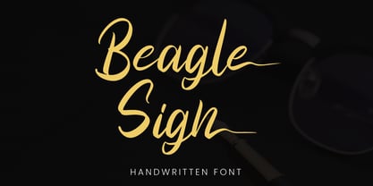 Beagle Sign is a stylish signature font with ending stylistic set that make amazing combination. perfect for any product like branding, invitation, stationery, wedding designs, social media posts, advertisements, product packaging, product designs, label, photography, watermark, special events or anything. Features: - Beagle Sign.otf - Multilingual Support - ligature - Ending stylistic set - Support Opentype features --- Hope you enjoy with our font! Attype Studio
 - Derailer by Aerotype,
$29.00 Derailer’s eclectic character set is comprised mainly of disparate sans serif characters that claim to play well together. OpenType users also benefit from 52 ligature features that automatically substitute a unique pairing of letters when any upper or lower case character is keyed twice in a row. Derailer Pro extends the character set to support Eastern European Latin, Baltic, Greek and Turkish.
 - Henares Street by Arendxstudio,
$15.00 Heares Street - Brush Font inspired by urban fonts with sharp and beautiful letters that create fonts that are modern, trendy and elegant. Heares Street came with opentype features such stylistic alternates, stylistic sets & ligatures good for logotype, poster, badge, book cover, tshirt design, packaging and any more. Features : • Character Set A-Z • Numerals & Punctuations (OpenType Standard) • Accents (Multilingual characters) • Ligature • Alternate
 - Ballistone by Timurtype,
$14.00 Introducing by Timur type Proudly Present, Ballistone Ballistone A Handwritten Script Font Ballistone is perfect for product packaging, branding project, megazine, social media, wedding, or just used to express words above the background. This Ballistone font includes: -Full Set of standard alphabet and punctuation & symbol -Extra set ligature & underline -multilingual support. Embelish your designs with our original fonts.Enjoy the font,Thank you!
 - Churchward Maori by BluHead Studio,
$25.00Churchward Maori is the second of a series of eight Maori style typefaces designed by New Zealand type designer Joseph Churchward, and released by BluHead Studio, LLC. Churchward Maori infuses standard Latin glyph forms with traditional Maori decorative elements to create a wildly organic design. BluHead Studio expanded the character set to support standard Latin character sets. BluHead previously released Churchward Ta Tiki. - Libertad Mono by ATK Studio,
$15.00 A new dynamic and industrial display font with octagonal shape and rounded inner contours. Constructed with a modular system. It includes a full set of letters (uppercase), numerals, and symbols. Libertad Mono family comes with 6 weights, from Thin to Black. Designed by Radinal Riki Mutaqin. This type features a Latin Pro character set, covering multiple languages written with the Latin script.
 - Shohibul by Arendxstudio,
$15.00 Shohibul - Brush Font with sharp and beautiful letters that create fonts that are modern, trendy and elegant. Came with opentype features such stylistic alternates, stylistic sets & ligatures good for logotype, poster, badge, book cover, tshirt design, packaging and any more. Features : • Character Set A-Z • Numerals & Punctuations (OpenType Standard) • Accents (Multilingual characters) • Ligature • Alternate There it is! I really hope you enjoy it
 - Printers Plant Ornaments by Gerald Gallo,
$20.00 Printers Plant Ornaments was inspired by the decorative motifs used to fill in page space that have been around since moveable type printing commenced in the 15th century. All the ornaments are representations of plants. There is an assortment of 47 ornaments located under the character set keys. Under their respective shift + character set keys are the same 47 ornaments flopped.
 - Plottage by Arendxstudio,
$14.00 Introducing a new font called Pottage - Handwritten Font inspired by urban fonts with sharp and beautiful letters that create fonts that are modern, trendy and elegant. Pottage came with opentype features such stylistic alternates, stylistic sets & ligatures good for logotype, poster, badge, book cover, tshirt design, packaging and any more. Features : • Character Set A-Z • Numerals & Punctuations (OpenType Standard) • Accents (Multilingual characters) • Ligature
 - Niathory by Attype Studio,
$18.00 Niathory is a Modern Calligraphy Font perfect for your wedding dream. Combine Niathory with stylistic set to create amazing script font for wedding! Niathory is perfect for branding, logo, invitation, quotes, apparel design, product packaging, merchandise, game titles, cute style design, Book/Cover Title and more. What's Included : - Ligature - Stylistic Set character - Multilingual Support --- Hope you enjoy with our font! Attype Studio
 - Bix Metric by S6 Foundry,
$20.00 Bix Metric is a stylistic display font developed within a set grid. The mono-spaced first set of the family comes in 3 styles in both upper and lowercase glyphs allowing mixing of infinite combinations. Perfectly suited for headlines, large-format prints, brand identities, social media, advertising, editorial design, posters, magazines, logos, headings, digital and more. With multi-language support.
 - Arum Sans by Australian Type Foundry,
$40.00 A humanist sans-serif family which displays subtle influences of the edged writing tool. Inspired by modern faces such as Chaparral and Enigma, Arum Sans is versatile enough to be used for high-end text setting as well as display purposes. A full international glyph set, extended for European use, allows Arum Sans to play on the field with the big boys.
 - Culoare v.2 by Luxfont,
$19.00 Introducing Culoare V2.0 is the second version of the space bright color gradient font. (The first version is here - Culoare) This is a new set with completely new color combinations, bright and saturated like neon. 3 types of stylization in 9 different color gradient combinations with soft transitions. Letters seem to be backlit and it looks very original in addition to stylish minimalist glyphs. Lots of design use cases. Ideal for promotional illustrations, headlines and covers. Font family is based on the Regular font Boldini - which means that if necessary you can combine these two families and they will be absolutely stylistically identical and complement each other. Check the quality before purchasing and try the FREE DEMO version of the font to make sure your software supports color fonts. P.s. Have suggestions for color combinations? Write me an email with the subject "Culoare V2 Color" on: ld.luxfont@gmail.com Features: - Free Demo font to check it works. - Uppercase and lowercase the same size but different colors. - Transparency in letters. - Kerning. IMPORTANT: - Multicolor version of this font will show up only in apps that are compatible with color fonts, like Adobe Photoshop CC 2017.0.1 and above, Illustrator CC 2018. Learn more about color fonts & their support in third-party apps on www.colorfonts.wtf -Don't worry about what you can't see the preview of the font in the tab "Individual Styles" - all fonts are working and have passed technical inspection, but not displayed, they just because the website MyFonts is not yet able to show a preview of colored fonts. Then if you have software with support colored fonts - you can be sure that after installing fonts into the system you will be able to use them like every other classic font. Question/answer: How to install a font? The procedure for installing the font in the system has not changed. Install the font as you would install the classic fonts. How can I change the font color to my color? · Adobe Illustrator: Convert text to outline and easily change color to your taste as if you were repainting a simple vector shape. · Adobe Photoshop: You can easily repaint text layer with Layer effects and color overlay. ld.luxfont@gmail.com
 - Autoradiographic by Typodermic,
$11.95 Ahoy there, folks! Have we got a typeface for you! It’s called Autoradiographic, and it’s inspired by those trusty old warning signs from back in the day. You know the ones…“Inflammable! Stay away!” And boy oh boy, does it have personality! Back in the post-WWII era, low waistlines were all the rage—but let me tell you, strict waistline alignment was not. No, sir! That’s where Autoradiographic comes in. It’s informational, sure, but it’s also neat as a pin and chock full of personality. And listen to this—Autoradiographic has everything you need to crunch those numbers like a pro. Mathematical symbols? Check. Fractions? Check. Currency symbols? Check, check, and check. And for those times when you really want to make an impact, Autoradiographic’s italics are narrow and loosely spaced. Now that’s what I call a typeface with some serious sass! So what are you waiting for? Grab a copy of Autoradiographic today—it comes in five weights and italics, so you’re sure to find just the right fit for your project. Don’t miss out on the chance to add some mid-century flair to your work—you won’t regret it! Most Latin-based European, and some Cyrillic-based writing systems are supported, including the following languages. A Afaan Oromo, Afar, Afrikaans, Albanian, Alsatian, Aromanian, Aymara, Bashkir (Latin), Basque, Belarusian (Latin), Bemba, Bikol, Bosnian, Breton, Bulgarian, Cape Verdean, Creole, Catalan, Cebuano, Chamorro, Chavacano, Chichewa, Crimean Tatar (Latin), Croatian, Czech, Danish, Dawan, Dholuo, Dutch, English, Estonian, Faroese, Fijian, Filipino, Finnish, French, Frisian, Friulian, Gagauz (Latin), Galician, Ganda, Genoese, German, Greenlandic, Guadeloupean Creole, Haitian Creole, Hawaiian, Hiligaynon, Hungarian, Icelandic, Ilocano, Indonesian, Irish, Italian, Jamaican, Kaqchikel, Karakalpak (Latin), Kashubian, Kikongo, Kinyarwanda, Kirundi, Komi-Permyak, Kurdish (Latin), Latvian, Lithuanian, Lombard, Low Saxon, Luxembourgish, Maasai, Macedonian, Makhuwa, Malay, Maltese, Māori, Moldovan, Montenegrin, Ndebele, Neapolitan, Norwegian, Novial, Occitan, Ossetian, Ossetian (Latin), Papiamento, Piedmontese, Polish, Portuguese, Quechua, Rarotongan, Romanian, Romansh, Russian, Sami, Sango, Saramaccan, Sardinian, Scottish Gaelic, Serbian, Serbian (Latin), Shona, Sicilian, Silesian, Slovak, Slovenian, Somali, Sorbian, Sotho, Spanish, Swahili, Swazi, Swedish, Tagalog, Tahitian, Tetum, Tongan, Tshiluba, Tsonga, Tswana, Tumbuka, Turkish, Turkmen (Latin), Tuvaluan, Uzbek (Latin), Venetian, Vepsian, Võro, Walloon, Waray-Waray, Wayuu, Welsh, Wolof, Xhosa, Yapese, Zapotec Zulu and Zuni.
 - Ohitashi by Typodermic,
$11.95 Attention all design enthusiasts! Are you tired of the same dull typefaces dominating the design world? Look no further than Ohitashi, the daring and unconventional creation by Typodermic principal Raymond Larabie. In a world where twentieth-century sans-serif typefaces reign supreme, Ohitashi breaks the mold and blazes its own trail. Larabie has masterfully infused this typeface with a unique blend of humanistic stroke contrast, spontaneous licks and curls, and incised detail, resulting in a one-of-a-kind design that defies convention. But don’t let the unconventional nature of Ohitashi fool you. This typeface offers a practical range of three weights—standard, semi-bold, and bold—making it an incredibly versatile option for any design project. Whether you’re looking to add a touch of personality to a marketing campaign, or looking to revamp your brand identity with something fresh and new, Ohitashi has got you covered. So why settle for the same boring old typefaces when you can break free from the rut favored by reductive competitors? Embrace the unconventional with Ohitashi and see your designs come to life like never before. Trust us, your audience will thank you. Most Latin-based European writing systems are supported, including the following languages. Afaan Oromo, Afar, Afrikaans, Albanian, Alsatian, Aromanian, Aymara, Bashkir (Latin), Basque, Belarusian (Latin), Bemba, Bikol, Bosnian, Breton, Cape Verdean, Creole, Catalan, Cebuano, Chamorro, Chavacano, Chichewa, Crimean Tatar (Latin), Croatian, Czech, Danish, Dawan, Dholuo, Dutch, English, Estonian, Faroese, Fijian, Filipino, Finnish, French, Frisian, Friulian, Gagauz (Latin), Galician, Ganda, Genoese, German, Greenlandic, Guadeloupean Creole, Haitian Creole, Hawaiian, Hiligaynon, Hungarian, Icelandic, Ilocano, Indonesian, Irish, Italian, Jamaican, Kaqchikel, Karakalpak (Latin), Kashubian, Kikongo, Kinyarwanda, Kirundi, Kurdish (Latin), Latvian, Lithuanian, Lombard, Low Saxon, Luxembourgish, Maasai, Makhuwa, Malay, Maltese, Māori, Moldovan, Montenegrin, Ndebele, Neapolitan, Norwegian, Novial, Occitan, Ossetian (Latin), Papiamento, Piedmontese, Polish, Portuguese, Quechua, Rarotongan, Romanian, Romansh, Sami, Sango, Saramaccan, Sardinian, Scottish Gaelic, Serbian (Latin), Shona, Sicilian, Silesian, Slovak, Slovenian, Somali, Sorbian, Sotho, Spanish, Swahili, Swazi, Swedish, Tagalog, Tahitian, Tetum, Tongan, Tshiluba, Tsonga, Tswana, Tumbuka, Turkish, Turkmen (Latin), Tuvaluan, Uzbek (Latin), Venetian, Vepsian, Võro, Walloon, Waray-Waray, Wayuu, Welsh, Wolof, Xhosa, Yapese, Zapotec Zulu and Zuni.
 - Echowarp by Luxfont,
$18.00 Introducing Echowarp is an unusual COLORED font family. Main idea of this font is that a colored echo spreads and fades from minimalistic letters to the sides. Distorted letters give the effect of temporary refraction. The originality of this family is primarily suitable for a bold design. And if you add a random distortion in a graphics program to the finished heading written in this font, the inscription will turn into an absolutely unique and inimitable one. Futuristic set has 23 fonts in the family! Do not limit your imagination, because the font opens up a huge space for creative experiments. Check the quality before purchasing and try the FREE DEMO version of the font to make sure your software supports color fonts. Features: Free Demo font to check it works Letters with color echo & distortion 23 OTF SVG color fonts in the family Gradient and hologram fonts Kerning IMPORTANT: - OTF SVG fonts contain vector letters with gradients and transparency. - Multicolor OTF version of this font will show up only in apps that are compatible with color fonts, like Adobe Photoshop CC 2017.0.1 and above, Illustrator CC 2018. Learn more about color fonts & their support in third-party apps on www.colorfonts.wtf - Don't worry about what you can't see the preview of the font in the tab "Individual Styles" - all fonts are working and have passed technical inspection, but not displayed, they just because the website MyFonts is not yet able to show a preview of colored fonts. Then if you have software with support colored fonts - you can be sure that after installing fonts into the system you will be able to use them like every other classic font. Question/answer: How to install a font? The procedure for installing the font in the system has not changed. Install the font as you would install the classic OTF | TTF fonts. How can I change the font color to my color? Adobe Illustrator: Convert text to outline and easily change color to your taste as if you were repainting a simple vector shape. Adobe Photoshop: You can easily repaint text layer with Layer effects and color overlay. ld.luxfont@gmail.com
 - Ruthyne by DM Studio,
$25.00 The Ruthyne Handwritten Font is a captivating and versatile typeface that embodies the beauty and warmth of human handwriting. With its flowing strokes and authentic character, this font adds a personal and elegant touch to your designs, making it perfect for greeting cards, invitations, branding, and various creative projects. Features: 1. Authentic Handwritten Style: The Ruthyne Font captures the authenticity and charm of natural handwriting. Its flowing strokes and genuine character lend an intimate and genuine feel to your text, making it suitable for projects that require a personal and human touch. 2. Versatile Application: This font is versatile and well-suited for a wide range of design projects. Use it in greeting cards, invitations, social media graphics, branding materials, and more to add a touch of personal elegance to your designs. 3. Uppercase and Lowercase Letters: The font includes both uppercase and lowercase letters, providing flexibility and creative freedom in your designs. Mix and match the cases to create visually appealing and balanced typography. 4. Punctuation and Symbols: In addition to the alphabet, the Ruthyne Font includes a comprehensive set of punctuation marks, numerals, and common symbols. This ensures consistency and ease of use when incorporating the font into your design projects. 5. Ligatures and Special Characters: The font offers a variety of ligatures and special characters that add character and uniqueness to your text. These unique glyphs create interesting connections between letters and decorative elements, allowing you to create personalized and visually appealing typography. 6. Easy to Use: Installing and utilizing the Ruthyne Handwritten Font is user-friendly. It's compatible with both Windows and Mac operating systems and seamlessly integrates into popular design software such as Adobe Photoshop, Illustrator, and InDesign. This ensures a smooth and efficient design workflow. Elevate your designs with the authentic and personal touch of the Ruthyne Handwritten Font. Let its flowing strokes and genuine character add a touch of elegance and human warmth to your greeting cards, invitations, and branding materials. Embrace the natural beauty of this font and create designs that resonate with sincerity and authenticity.
 - Doris by Fontsphere,
$16.00 Introducing DORIS: A Sweet Handwritten Font Family. DORIS is a stunning new font designed to add a touch of sweetness and charm to your designs. It was originally created for a series of children's books, then it was expanded with additional glyphs and additional thicknesses were added.. --- Key Features:. Handwritten Charm: DORIS captures the beauty and warmth of handwritten lettering, bringing a personal and intimate feel to your designs. Its imperfect lines and organic shapes radiate authenticity and evoke a sense of genuine connection. . Versatile Usage: Whether you're designing coloring books, creating beautiful illustrations, making invitations, or crafting nicely-made quotes, DORIS adapts beautifully to various applications, providing endless creative possibilities. . Feminine and Playful: With its soft curves and whimsical strokes, DORIS exudes a feminine and playful essence. It is a font that effortlessly brings a touch of joy to any design, making it perfect for creating illustrations, invitations, and other projects aimed at capturing a sense of happiness. . Multiple Thickness Options: The availability of five different thicknesses in the DORIS font family allows you to choose the perfect stroke weight for each project. Whether you need a delicate touch or a bold statement, DORIS has you covered. . --- Usage Recommendations:. Children's Books and Illustrations: DORIS is an excellent choice for children's books, illustrations, or any other project targeting a young audience. Its playful and friendly aesthetics will capture the hearts of kids and adults alike. . Invitations and Greeting Cards: Create stunning invitations and charming greeting cards with DORIS. Its sweet and friendly style sets the right tone for special events, celebrations, or heartfelt messages. . Nicely-Made Quotes: Give your quotes a personal and endearing touch with DORIS. Whether it's motivational quotes, lovely sayings, or inspiring messages, DORIS will add warmth and authenticity to every word. . Personal Branding: Incorporate DORIS into your personal branding materials, such as business cards, logos, or website headers, to showcase your unique personality and create a lasting impression. . --- Let DORIS bring a touch of sweetness and handwritten charm to your designs. With its delightful handwritten style, multiple thickness options, and endless usage possibilities, DORIS is the perfect companion for creating projects that are full of happiness and joy.
 - Baluno by Luxfont,
$22.00 Introducing is a fun and playful pouty Baluno font. Font has embodied the graphic trend of cartoon flat illustrations and will successfully complement modern designs. The font has 2 types of faces, which can be used both independently and together by alternating letters in one word to avoid repeating letters, creating a unique heading. Family is ideal for children's themes, because the font resembles inflated balloons. Creates a relaxed mood and has fun. Set comes in many different carefully selected colors and gradient color options. Check the quality before purchasing and try the FREE DEMO version of the font to make sure your software supports color fonts. P.s. Have suggestions for color combinations? Write me an email with the subject "Baluno Color" on: ld.luxfont@gmail.com Features: Free Demo font to check it works. 2 types of faces. Lots of ready-made matched colors. Gradient color variants. Kerning. IMPORTANT: - Multicolor OTF version of this font will show up only in apps that are compatible with color fonts, like Adobe Photoshop CC 2017.0.1 and above, Illustrator CC 2018. Learn more about color fonts & their support in third-party apps on www.colorfonts.wtf -Don't worry about what you can't see the preview of the font in the tab "Individual Styles" - all fonts are working and have passed technical inspection, but not displayed, they just because the website MyFonts is not yet able to show a preview of colored fonts. Then if you have software with support colored fonts - you can be sure that after installing fonts into the system you will be able to use them like every other classic font. Question/answer: How to install a font? The procedure for installing the font in the system has not changed. Install the font as you would install the other fonts. How can I change the font color to my color? · Adobe Illustrator: Convert text to outline and easily change color to your taste as if you were repainting a simple vector shape. · Adobe Photoshop: You can easily repaint text layer with Layer effects and color overlay. ld.luxfont@gmail.com
 - Ysobel by Monotype,
$29.99 The Ysobel™ typeface family is not only elegant; it is also exceptionally legible and space economical. A collaborative design effort between Robin Nicholas, as lead designer and project director, Delve Withrington and Alice Savoie of Monotype Imaging, the project had the primary design goal of creating a typeface family for setting text in newspapers and periodicals. The result, however, is also ideal for any application that requires quick and easy assimilation of text. According to Nicholas, “The idea for the design started when I was asked to develop a custom version of Century Schoolbook. I wanted to give the design a more contemporary feel, although the client ultimately decided to keep their typeface closer to the original. The project nevertheless gave me ideas for a new design. Since designing Nimrod, some 30 years ago, I had wanted to make a more modern typeface family for newspapers and magazines – this seemed the ideal candidate.” Ysobel (pronounced “Isabel”) has the soft, inviting letter shapes of Century Schoolbook but contrasts these with more incised serifs and terminals. Its capitals are also narrower than those of Century Schoolbook, and care was taken to ensure that they harmonize perfectly with the lowercase. Ysobel’s x-height is full-bodied without disrupting lowercase proportions. In addition, curved terminals, such as those in the “C,” “c” and “e,” were drawn more open as an aid to legibility and readability in text copy. Weight stress is near vertical, and hairlines are robust to ensure character fidelity in small point sizes. Development began with the text version of the family, which has four weights, each with an italic companion. All weights feature lining and old style numerals, fractions, superiors and extended Latin language coverage. Small caps are also available in the Roman Regular design. Ysobel Display is a completely redrawn version of the typeface; it is narrower, and has a slightly smaller x-height, thinner hairlines and subtle design changes to improve its appearance when set at large sizes. The Display Italic received particular attention to make it ideal for setting headlines, subheads and short blocks of copy. Changes include a slightly greater italic angle and more cursive treatment of some letter shapes. Alternative styles of capital “J” and “Q,” to provide variation, are available in all weights.
 - Bunyan Pro by Canada Type,
$39.95 Bunyan Pro is the synthesis of Bunyan, the last face Eric Gill designed for hand setting in 1934 and Pilgrim, the machine face based on it, issued by British Linotype in the early 1950s — the most popular Gill text face in Britain from its release until well into the 1980s. Gill’s last face doesn't date itself anywhere near as obviously as Gill’s other serif faces, which were all really products of their time, heavily influenced by the richly ornamental and constantly changing aesthetic trends of the interwar period. When compared to Gill’s previous work, Bunyan seems like a revolution in the way he thought and drew. It’s as if he was shrugging off all heavy burden of what was popular, and going back to the basics of older standards. Bunyan had no bells and whistles, doesn't risk functionality with contrasts that are too high or too low, and didn't venture far outside the comfortable oldstyle rhythm Gill grew up with. By interbellum standards, this was utter austerity, a veritable denial of deco excess. Surprisingly, even without all the cloying trivialities, Bunyan still stood indisputably as an aesthetically pleasing, space saving design that could have been made only by Eric Gill. Bunyan Pro comes in three weights and their italics. The main font is intended for use between 8 and 14 points. The medium and the bold are great for emphasis but also have good merit in larger sizes, so can make effective display types as well. All six fonts include small caps, ligatures, alternates, six sets of figures, and three original Gill manicules. We tried to keep the best features of the handset (Bunyan) and machine (Pilgrim) versions while building a text face that can function in today’s immersive reading media. Deciding on which useful letterpress features to preserve for aesthetic importance was hell on our eyeballs — which lead to complex and painstaking ways of ironing out irregularities and inconsistencies related to metal technologies, in order to provide something with authenticity. The result is a unique typeface based on a Gill design that, to a much greater extent than any of his other faces, works well as a text face that can be used for entire books and magazines. For more information on Bunyan Pro’s character set, features, development process and some print tests, please consult the PDF in the gallery section of this page.
 - Lubaline by Lián Types,
$39.00 Who haven't heard the phrase that ‘any past time was better’?. Although I sometimes find this phrase a little too pessimistic (because I try to think that the best is yet to come), it may be true regarding my passion, typography. I'm too young (29) unfortunately, and this means I did not have the pleasure of being contemporary with maybe the man who has influenced my work the most (1). The man that showed that letters are more than just letters to be read. Herb Lubalin (1918-1981), also called sometimes as ‘the rule basher’ (2), smashed the taboos and sacred rules of type design and gave it personality. He rejected the functionalist philosophy of europeans in favor of an eclectic and exuberant style. To him, letters were not merely vessels of form, they were objects of meaning. (3). Nowadays, when looking at his portfolio, who dares to deny that the term ‘typography’ and ‘beauty’ may go hand-in-hand without any problem? Ed Benguiat, one of Herb’s partners, still likes making jokes with the phrase “screw legibility, type should be beautiful” and what I understand of this is not to forget the rules, but to know and break them carefully. In an era of pure eclecticism, we, the lovers of flourishes and swashes, can't do nothing but admire all the legacy that Lubalin, this wonderful type-guru, left. My font Lubaline read as “the line of Lubalin” is my humble tribute to him. Those who know his work, may see the influences easily like in his ‘Beards’ (1976) and ‘The Sound of Music’ (1965) posters; the art-deco forms in many of his amazing logos and practically in all his creations where letters seem to be alive just like you and me. I really hope that the future finds me still learning more and more about type-design and letterforms, and like him, always willing to make innovations in my field: Because letters are not just letters to be read. NOTES (1) These are some of my fonts in which some of Lubalin’s influences can be seen (in order of creation): Reina, Aire, Erotica, String, Beatle, Heroe, Selfie, Model, Seventies, and many others that are still in progress. (2) (3) Steven Heller. Herb Lubalin: Rule Basher. U&lc (1998) http://www.printmag.com/imprint/my-favorite-lubalin/
 - FF Real Text by FontFont,
$50.99 FF Real is a convincing re-interpretation of the German grotesque style from between 1998 and 1908, but with much more warmth and improved legibility as well as a hint towards the warmer American grotesques. Later on, not just slanted styles, but a “proper” italic version was added inspired by the way Roman and Italic are distinguished in traditional serif faces. NEW: a specially created set of obliques were added in 2018 to give designers more design flexibility, for those looking for a less calligraphic look. In 2020 the family was extended with matching condensed weights. FF Real was originally conceived by Erik Spiekermann as one text weight and one headline weight to be used as the only faces in his biography ‘Hello I am Erik’, edited by Johannes Erler, published in 2014. While Spiekermann drew the alphabets, he passed on the font data to Ralph du Carrois and Anja Meiners who cleaned it up and completed it. In the meantime, FF Real has been extended to a family of two styles and 65 weights each. The design of FF Real is rooted in early static grotesques from the turn of the century. Several German type foundries – among them the Berlin-based foundries Theinhardt and H. Berthold AG – released such designs between 1898 and 1908. The semi-bold weight of a poster-size typeface that was lighter than most of the according semi-bolds in metal type at the time, gave the impetus to FF Real’s regular weight. In the words of Spiekermann, the historical example is “the real, non-fake version, as it were, the royal sans serif face“, thus giving his new typeface the name “Real” (which is also in keeping with his four-letter names, i.e. FF Meta, FF Unit). FF Real is a convincing re-interpretation of the German grotesque style, but with much more warmth and improved legibility. With a hint towards the warmer American grotesques, Spiekermann added those typical Anglo-American features such as a three-story ‘g’ and an ‘8’ with a more defined loop. To better distinguish characters in small text sizes, FF Real Text comes in old style figures, ‘f’ and ‘t’ are wider, the capital ‘I’ is equipped with serifs, as is the lowercase ‘l’. What’s more, i-dots and all punctuation are round.
 - FF Real Head by FontFont,
$50.99 FF Real is a convincing re-interpretation of the German grotesque style from between 1998 and 1908, but with much more warmth and improved legibility as well as a hint towards the warmer American grotesques. Later on, not just slanted styles, but a “proper” italic version was added inspired by the way Roman and Italic are distinguished in traditional serif faces. NEW: a specially created set of obliques were added in 2018 to give designers more design flexibility, for those looking for a less calligraphic look. In 2020 the family was extended with matching condensed weights. FF Real was originally conceived by Erik Spiekermann as one text weight and one headline weight to be used as the only faces in his biography ‘Hello I am Erik’, edited by Johannes Erler, published in 2014. While Spiekermann drew the alphabets, he passed on the font data to Ralph du Carrois and Anja Meiners who cleaned it up and completed it. In the meantime, FF Real has been extended to a family of two styles and 65 weights each. The design of FF Real is rooted in early static grotesques from the turn of the century. Several German type foundries – among them the Berlin-based foundries Theinhardt and H. Berthold AG – released such designs between 1898 and 1908. The semi-bold weight of a poster-size typeface that was lighter than most of the according semi-bolds in metal type at the time, gave the impetus to FF Real’s regular weight. In the words of Spiekermann, the historical example is “the real, non-fake version, as it were, the royal sans serif face“, thus giving his new typeface the name “Real” (which is also in keeping with his four-letter names, i.e. FF Meta, FF Unit). FF Real is a convincing re-interpretation of the German grotesque style, but with much more warmth and improved legibility. With a hint towards the warmer American grotesques, Spiekermann added those typical Anglo-American features such as a three-story ‘g’ and an ‘8’ with a more defined loop. To better distinguish characters in small text sizes, FF Real Text comes in old style figures, ‘f’ and ‘t’ are wider, the capital ‘I’ is equipped with serifs, as is the lowercase ‘l’. What’s more, i-dots and all punctuation are round.
 - Wilhelm Klingspor Schrift by Alter Littera,
$25.00 A comprehensive and faithful rendition of one of the finest metal typefaces of the 20th century. Rudolf Koch designed Wilhelm Klingspor Schrift (initially conceived as “Missal Schrift”, and later referred to also as “Wilhelm Klingspor Gotisch”) between 1919 and 1925 for the Gebr. Klingspor Type Foundry in Offenbach am Main. It is an impressive textura typeface, being sharp, elegant, spiky, sensitive and noble at the same time. Some of its most notable features have to do with the delicate decorations, the thin but subtly swelling lines that parallel or bridge strokes in the capitals, the hairline endings that terminate each stroke in both the capitals and the lowercase letters, the subtle joining of hairlines to thicker strokes, and the tension of some of the transitional curves. Koch’s original design included two sets of capitals (normal and condensed); alternates for a, d, e, r, s and z, plus long s; short and long flourished finial forms for f and t; thirty-five ligatures; and eighteen decorative pieces (Zierstücke). All of these features, plus several additional ones for modern use (including the usual standard characters for typesetting in modern Western languages, additional alternates and ligatures, plus carefully coded Opentype features), have been thoroughly implemented to the highest and most lively level of detail in the present font, in the hope that the past greatness of Wilhelm Klingspor Schrift will finally step into the modern OpenType realm. The main sources used during the font design process were several pages from a specimen book issued by the Gebr. Klingspor Type Foundry in 1927. Other sources were as follows: Bain, P., and Shaw, P. (Eds.) (1998), Blackletter: Type and National Identity, New York: Princeton Architectural Press (p. 43); Hendlmeier, W. (1994), Kunstwerke der Schrift, Hannover: Bund für Deutsche Schrift und Sprache (pp. 56-7); Kapr, A. (1983), Schriftkunst, Dresden: VEB Verlag der Kunst (p. 453); Kapr, A. (1993), Fraktur - Form und Geschichte der gebrochenen Schriften, Mainz: Verlag Hermann Schmidt (pp. 124-5); and Klingspor, K. (1949), Über Schönheit von Schrift und Druck, Frankfurt am Main: Georg Kurt Schauer (pp. 136-7). Some public and private comments by renowned designer and design historian Paul Shaw have also influenced both the design and the description of the present font. Specimen, detailed character map, OpenType features, and font samples available at Alter Littera’s The Oldtype “Wilhelm Klingspor Schrift” Font Page.
 - Toisy by Letrizmo,
$21.00When the right late seventies / early eighties message is needed, Toisy comes to the rescue. Founded on a mix of references from letterforms of the time, this new original nods to a style that defined an era. A sexy theme font that conveys a clear image of what was truly chic thirty years ago, this alphabet is deeply rooted in sultry memories of soft, endless nights. Exaggerate contrast between strokes and angular lines combine with rounded corners to provide a unique character and a look that sharply differs when set in all caps or lower case, thanks to an uncommon treatment of density and proportions. Set it real tight, as was typographically in fashion circa 1981. Toisy and Toisy Greek include a set of 13 matching images inspired in leisure stuff and the clothing of the last days of disco. They are different from the set included with Toisy Alt. - NO culture no SOUL by TypoGraphicDesign,
$9.00 The typeface No Culture No Soul is designed from 2021–2022 for the font foundry Typo Graphic Design by Luise Herke × Manuel Viergutz as a project for support the culture. Special THX to Michael Rütten of soulpatrol.de The display font with 254 glyphs incl. numbers, punctation, marks & symbols is inspired in the past and present. Extras like OpenType-features and 7 sylistic sets. For use in logos, magazines, posters, advertisement plus as webfont for decorative headlines. The font works best for display size. Have fun with this font & use the DEMO-FONT (with reduced glyph-set) FOR FREE! Font Specifications ■ Font Name: No Culture No Soul ■ Font Styles: 1 (Rough) + DEMO (with reduced glyph-set) ■ Font Category: Display for headline size ■ Glyph Set: 254 glyphs incl. extras like icons (decorative extras like dingbats, emojis, symbols) ■ Design Date: 2021–2022 ■ Type Designer: Luise Herke, Manuel Viergutz, THX to Michael Rütten (Soulpatrol)
 - Structorator by Furiosum,
$15.00 Structorator is a grid-based, experimental display font. This typeface emerged from experiments with generative type design. It evolved from a piece of code into a fully usable opentype font. The two main features are its rigid but playful design and a multitude of alternate glyphs. These features make it possible to create interesting lettering when using the default spacing. The glyphs are constructed from a limited set of patterns which are arranged within a predefined grid. The line thickness corresponds to the different cuts. Due to the rather complex shape this font will look best in larger sizes and resolutions. Its best suited for headline, display or illustrative work. - 3 weights: light, medium and heavy - 5 character sets - 3 number sets - Basic punctuation - Seperate diacrits - Ornamental glyphs - Access via stylistic sets *OT feature - Random access from the whole range of chars *OT feature - Total of 1062 Glyps
 - Hand Print Stamp Rough by TypoGraphicDesign,
$29.00 The typeface Hand Print Stamp Rough is designed in 2018 for the font foundry Typo Graphic Design by Manuel Viergutz. The rough hand-printed typeface based on old wood letters, rubber-stamps and plastic stamps. 7 font styles (Reg + Mix, Circle, Diamond, Square Star + Icons) each with 1350+ glyphs incl. 200+ decorative extras like icons, arrows, dingbats, emojis, symbols, geometric shapes, catchwords, decorative ligatures (type the word LOVE for ♥ or SMILE for ☻ as OpenType-Feature dlig) and stylistic alternates (9+ stylistic sets). For use in logos, magazines, posters, advertisement and packaging plus as webfont for decorative headlines. The font works best for display size. Character Set: Latin Extended (Adobe Latin 3). 1350+ glyphs with 200+ extra icons like arrows, dingbats, symbols, geomatric shapes, catchwords and many alternative letters. (9× A–Z, 9× a–z, 9× 0–9) For use in magazines, posters, headlines and advertisement, plus as webfont for decorative headlines. Have fun with this font & try-before-buy the DEMO-FONT (with reduced glyph-set) FOR FREE! ■ Font Name: Hand Print Stamp Rough ■ Font Weights: Regular + Mix, Circle, Diamond, Square, Star + Icons + DEMO (with reduced glyph-set) ■ Font Category: Sans Serif + Slab Serif Display for Headline Size ■ Font-Format: .otf (OpenType Font for Mac + Win) + .ttf (TrueType Font) ■ Glyph Set: 1350 glyphs ■ Language Support: 27+ for Latin Extended (Adobe Latin 3). Afrikaans, Albanian, Catalan, Croatian, Czech, Danish, Dutch, English, Estonian, Finnish, French, German, Hungarian, Icelandic, Italian, Latvian, Lithuanian, Norwegian, Polish, Portugese, Romanian, Slovak, Slovenian, Spanisch, Swedish, Turkish, Zulu ■ Specials: 200+ decorative extras like icons for arrows, dingbats, emojis, symbols, geometric shapes, catchwords + German Capital Eszett. Open Type Features: Kerning (kern), Stylistic Set 1 (ss01) … Stylistic Set 16 (ss16), Localized Forms (locl), Superscript (sups), Ordinals (ordn), Slashed Zero (zero), Fractions (frac), Standard Ligatures (liga), Contextual Alternates (calt) e. g. Stylistic Set-Loop and Decorative Ligatures (dlig) e. g. type the word “LOVE” for ❤ or “SMILE” for ☺ ■ Design Date: 2018 ■ Type Designer: Manuel Viergutz
 - Minotte by Park Street Studio,
$35.00 Originally conceived while sketching outline typefaces for a client, Minotte Pro has blossomed into a font one thousand glyphs strong and is chock full of alternates and contextual swashes! By enabling swashes, style sets, and contextual alternates in your OpenType savvy application, headlines and text set with Minotte Pro will transform into unique combinations of initial, middle and final swash forms! There’s also an alternate Cap set with a partial fill for even greater variety! Perfect for travel ad headlines, Minotte Pro adds a light, carefree touch. If your app doesn't support OpenType, then check out the split out versions, Minotte, Minotte Swash, Minotte Fil and Minotte Swash Fil. Minotte Pro Minotte Solid Pro contain these OpenType features: Contextual Swashes, Stylistic Alternates, Standard & Discretionary Ligatures, 6 Style Sets, Superiors & Inferiors, Fractions and Ornaments. The Minotte Extras Pro Pak includes three chromatic effects fonts, Minotte Center, Minotte Gradient and Minotte Shadow. These Extras fonts are intended to be used with Minotte Pro and Minotte Solid Pro, allowing colorizing and 3-D shadow effects. There are numerous combinations when using all three together! The three Extras fonts support the entire Pro character set and all OpenType features! Intended for users that do not own or use OpenType savvy apps, the four alternative fonts capture the best of the Pro version and will provide you with the glyphs needed to duplicate some of Minotte Pro’s typographic richness. Minotte and Minotte Fil are fully usable, whereas the Minotte Swash and Minotte Swash Fil are intended to work in tandem with the basic Minotte fonts. Set your headlines and text in Minotte, then switch to Minotte Swash and manually select the appropriate swash glyphs. Switch to either of the Fil fonts for full sets of Cap alternates sporting a partial fill. Minotte Pro, Minotte, Minotte Fil, Minotte Swash and Minotte Swash Fil support an extended European character set.
 - TA Film Fiction Semi X by Tural Alisoy,
$25.00 Film Fiction Semi Expanded has been updated and will now beautify your designs under the name TA Film Fiction Semi-X. We've already updated and revitalized TA Film Fiction Semi-X to ensure it perfectly matches your evolving creative vision. The inclusion of tabular figures, old-style figures and alternative glyphs expands your design palette and allows you to adapt the font to your unique style. TA Film Fiction Semi-X has been updated experience the appeal – this can be your font of choice to enhance your brand identity, cinematic efforts and editorial design. This brilliant typeface is not just a typographic tool, but a creative catalyst for headlines, logos, web elements, signage, posters and fashion apparel, packaging. TA Film Fiction Semi-X does not follow trends, it defines them, imbuing each project with a true modern essence. Embrace the possibilities with 9 different styles, each boasting a large set of 758 glyphs. Discover OpenType features: Access All Alternates, Case-Sensitive Forms, Glyph Composition / Decomposition, Denominators, Fractions, Kerning, Standard Ligatures, Lining Figures, Localized Forms, Mark Positioning, Mark to Mark Positioning, Numerators, Oldstyle Figures, Ordinals, Proportional Figures, Stylistic Alternates, Scientific Inferiors, Stylistic Set 1, Stylistic Set 2, Stylistic Set 3, Stylistic Set 4, Stylistic Set 5, Stylistic Set 6, Stylistic Set 7, Subscript, Superscript, Tabular Figures TA Film Fiction Semi-X supports Khinalyg (Xınalıq) alphabet Test your alphabet, explore the nuances and witness the transformation. And if you're at any creative crossroads, I'm here for you. If you want to customize TA Film Fiction Semi-X, need font files or have any other questions, please reach out to me at t@taft.work. TA Film Fiction Semi-X be the cornerstone of your creative journey. Elevate your designs, embrace innovation and redefine possibilities with TA Film Fiction Semi-X, where each character tells a story. Questions? Contact us at t@taft.work Instagram @taft.work or @tural_a Visit us https://taft.work/
 - Rothenburg Decorative - Personal use only

- Marketing Script - Personal use only

- Prince Valiant - Personal use only


