10,000 search results
(0.047 seconds)
- BOnuts by BOtype,
$29.00 BOnuts is a modern rounded sans built in 8 styles and crafted for you by BOtype. It's clean and minimal and modern rounded design gives you a wide array of uses such as branding, editorial & print, and also makes it perfect for UI & digital applications. We designed Bonuts to have the most legibility to give you a very versatile font family you use for any use you want. It includes Alternate Characters, Ligatures, Tabular Figures, Fractions, Numerators, Denominators, Superiors and Inferiors. It supports Central and Eastern European languages, basic Cyrillic and Greek. The type family consists of 8 weights (Thin, Light, Normal, Regular, Medium, Bold, Black and Heavy).
 - Aeternus by Unio Creative Solutions,
$4.50 “Aeternus”, a new geometric Sans Serif typeface, with matching italics. The combination of several weights, provides versatility in any text usage. Developed in a range of nine weights from thin to heavy, with a matching set of italics, Aeternus has been designed to optimize the space and preserve the legibility in any text size. Use effortlessly this typeface for titling, contemporary branding, web design, UI/ UX design, clothing, large print formats. Specifications. - Files included: Aeternus Thin, Aeternus ExtraLight, Aeternus Light, Aeternus Regular, Aeternus Medium, Aeternus SemiBold, Aeternus Bold, Aeternus ExtraBold, Aeternus Heavy with corresponding italics - Formats:.otf - Multi language support (Central, Eastern, Western European Languages)
 - LD Cherries by Dikas Studio,
$15.00 Hello... this is Cherries, a cute and bounch hand drawn font family. Cherries have 5 weight: light, regular, medium, semibold and bold with 2 styles: regular and slanted also included with pairing font Cherries Display. Cherries included with some alternate character and ligature to make your design awesome. Cherries is fun and very suitable for cute or girly design needs such as cover design, typography, sticker, greetings card, logo, merchandise and many more. Cherries also easy for read and you can use it for quote or caption. Add this beautiful handwritten font to each of your creative ideas and notice how it makes them stand out!
 - M Elle PRC by Monotype HK,
$523.99 The concept of M Elle comes from M Hei and M Yuen, with a sense of contemporary graphic design, aims to accomplish a refreshing, harmonious balance of softness and toughness. The combination of regular crossbars (橫) and stems (豎), rounded hooks (勾) and angles (折), as well as dots (點), ticks (剔) and downstrokes (撇、捺) that are ended sharply, makes it a classy but contemporary, clean and affectionate typeface. The font family consists of 3 essential weights to cater for different needs. Xbold appears elegant and magnificent, Medium weight is practical and affectionate, while the Light style is especially clear, legible and flexible in use.
 - Basic Sans Cnd by Latinotype,
$29.00 Basic Sans Cnd: A new sans. Designed by Daniel Hernández Basic Sans Cnd is a narrower version of Basic Sans. It is a family of Grotesque features with a functional, neutral and seeming clean style that looks to keep a neutral (or basic) appearance on paper, but including lots of details that give it a unique personality. Basic Sans Cnd is a sans-serif typeface well-suited for publishing projects, medium-sized text, branding, posters, headlines and more! This font family comes in 7 weights—ranging from Thin to Black—plus matching italics and it has a set of 416 characters that support 206 different languages.
 - Boegelle by IbraCreative,
$17.00 Boegelle, a modern and stylish serif typeface, epitomizes sophistication with its sleek design and distinctive character. The font seamlessly marries traditional serif elements with contemporary aesthetics, resulting in a typeface that exudes elegance and versatility. Boegelle’s letterforms boast a balanced combination of sharp serifs and smooth curves, creating a visual harmony that is both timeless and contemporary. The typeface’s clean lines and thoughtful spacing contribute to its readability across various mediums, making it an ideal choice for both digital and print applications. Whether used for editorial design, branding, or web interfaces, Boegelle stands as a testament to the seamless integration of classic typographic principles with a modern, stylish sensibility.
 - Makeshift by Create Big Supply,
$25.00 Elevate your designs with the captivating allure of Makeshift Font. This extraordinary display typeface brings a bold and fun look, infusing your creations with a powerful and distinctive touch. Perfect for designers seeking originality, Makeshift Font is poised to make a lasting impression on logos, headlines, posters, product packaging, and more. Its versatility shines through in both digital and print mediums, making it a must-have for innovative projects. Makeshift Font boasts an extensive range of features, including uppercase and lowercase letters, numbers, punctuations, and comprehensive multilingual support. With PUA encoding, accessing the wide array of glyphs and swashes becomes effortless, empowering you to effortlessly customize your designs.
 - Enfluence by Thera Type,
$9.00 Enfluence is a modern typeface perfect for titles and short texts. It could worked in print and digital mediums. It depicts a fresh and modern image but with some winks to older typefaces. About the shape of the letter, it was built with a wide “x” height, short ascendants and descendants, a high contrast, angular serif, and some round terminals. Some letters such as “m, n, h” show a light inclination in the right stem. These characteristics give this typeface great readability with a strong attraction to the eye for its cool forms. Not enough? Also includes a set of ornamental capital letters perfect for the creation of awesome designs.
 - Gimana by Hazztype,
$20.00 Introducing gimana sans serif display font, meticulously designed with deep inktrap details. Crafted for optimal legibility and aesthetic appeal, this font seamlessly blends modernity and tradition. Its generous proportions and balanced letterforms provide exceptional clarity and readability across various digital and print mediums. With its deep inktraps, this font showcases subtle details that enhance its overall visual texture, adding a touch of sophistication to your projects. Its humanist characteristics ensure legibility and readability, making it an ideal choice for a wide range of applications. The deep experimental inktraps add an intriguing element to the font, creating an interplay of light and shadow that captures attention.
 - Lite On by Factory738,
$15.00 LiteOn is a lovely sans serif font family with a contemporary feel. The elegant design was achieved by combining modern and minimalist elements. When it comes to choosing the right typographic color for your project, the different weights give you a lot of options. The available Ligatures and alternate glyphs provide a diverse range of characters to make your project design stand out. 6 Weights (Thin, Light, Regular, Medium, Bold, Black) Basic Latin A-Z and a-z Numerals & Punctuation Stylistic Ligatures and Alternate glyphs Multilingual Support for ä ö ü Ä Ö Ü ... Free updates and feature additions Thanks for looking, and I hope you enjoy it.
 - Alpineo by Soneri Type,
$32.00 Alpineo is a display type family, optical mono linear and a bit squarish in nature. It has a distinct stroke-joint style, which is a prominent feature of its design. It has been designed to be a little eye-catching yet legible. It has clear and distinguishable letterforms, which helps to elaborate and emphasis the message. It is graphically strong and command viewer’s attention. The overall appearance of type is suitable in setting it as logotype, punchline, title, headline, etc. The type family consists of six weights viz. Thin, ExLight, Light, Regular, Medium and Bold. Alpineo is designed by Aakash Soneri, founder Soneritype in the year 2017.
 - Lubeck by FoxType,
$15.00 Introducing Lubeck Display, new generation Typeface with 3 Weights. Lubeck Typeface created with the vision of to attract the audience to your brand . The finest details of this typeface are methodically and mathematically created. Lubeck is created with all the tasks of a corporate font and also for the usage in a variety of projects, including branding, logos, titles, headlines, servers, screens, display, digital ads, and everything else. We are putting a lot of effort on this font as a long-term project. The Typeface includes Three Weights. Light, Regular and Medium Features: Numerals, extended punctuation & Basic Symbols(200+ Glyphs). Expert kerning and quality crafting. Uppercase Letters & Lowercase Letters.
 - Schmale Mediaeval by RMU,
$30.00 This narrow neoclassical font is based upon Schelter & Giesecke’s Schmale Mediäval which was originally released in 1840. By typing [alt] + [shift] + p respectively [alt] + p you have access to the framing elements as seen on the posters.
 - P22 Amelia by IHOF,
$24.95 An alphabet of initials and ornaments in the William Morris style. Perfect drop caps to evoke historical tales and medieval manuscripts. Please note: This font is only 30 characters A-Z plus 4 empty decorative initials borders.
 - Typist Slab Mono by VanderKeur,
$25.00 The typeface Typist originated during an extensive research on the origin and development of typewriter typestyles. The first commercially manufactured typewriter came on the market in 1878 by Remington. The typestyles on these machines were only possible in capitals, the combination of capitals and lowercase came available around the end of the nineteenth century. Apart from a few exceptions, most typestyles had a fixed letter width and a more or less unambiguous design that resembled a thread-like structure. A lot of this mechanical structure was due to the method the typestyles were produced. Looking at type-specimens for print before the first typewriters were good enough to came on the market we can see that in 1853 and in 1882 Bruce’s Type Foundry already had printing type that had a structure of the typewriter typestyles. Of course printing types were proportional designed as typewriter typestyles had a fixed width. So it is possible that except from the method of production for typewriter typestyles, the design of printing types were copied. In the design of the Typist, the purpose was – next to the monospace feature – to include some of the features of the early typewriter typestyles. Features such as the ball terminals and the remarkable design of the letter Q. This new typeface lacks the mechanical and cold look of the early typewriter typestyles. The Typist comes in six weights with matching italics in two versions. One that resembled the early typewriter typestyles (Typist Slab) and a version designed with coding programmers in mind (Typist Code).
 - Typist Code Mono by VanderKeur,
$25.00 The typeface Typist originated during an extensive research on the origin and development of typewriter typestyles. The first commercially manufactured typewriter came on the market in 1878 by Remington. The typestyles on these machines were only possible in capitals, the combination of capitals and lowercase came available around the end of the nineteenth century. Apart from a few exceptions, most typestyles had a fixed letter width and a more or less unambiguous design that resembled a thread-like structure. A lot of this mechanical structure was due to the method the typestyles were produced. Looking at type-specimens for print before the first typewriters were good enough to came on the market we can see that in 1853 and in 1882 Bruce’s Type Foundry already had printing type that had a structure of the typewriter typestyles. Of course printing types were proportional designed as typewriter typestyles had a fixed width. So it is possible that except from the method of production for typewriter typestyles, the design of printing types were copied. In the design of the Typist, the purpose was – next to the monospace feature – to include some of the features of the early typewriter typestyles. Features such as the ball terminals and the remarkable design of the letter Q. This new typeface laks the mechanical and cold look of the early typewriter typestyles. The Typist comes in six weights with matching italics in two versions. One that resembled the early typewriter typestyles (Typist Slab) and a version designed with coding programmers in mind (Typist Code).
 - Elido by Kontour Type,
$50.00 Elido (Odile in reverse) is the sans counterpart to the Odile type. Together they form a sans/serif superfamily with a wide range of variations for editorial use. Elido follows Odile’s proportions and matches the weight and typographic color of its serif twin. Elido is a sans with classical proportions. A slight geometric hint and open counters convey an airy feel. Elido’s family structure and relations within echo the conceptual approach of Odile. The arched stroke low off the stem reveals a script characteristic most pronounced in the Elido Upright Italic. This particular interpretation is gradually diminished in the Italic and becomes even less emphasized in the Regular. Six balanced weights, from an elegant Light to a pronounced Black, are in tune with three display solutions and a set of beautiful Ornaments. These variants allow for a diverse and multifaceted typography for the discerning type user. Sans serif initials amount to a rare finding. The charming monolinear Elido Initials come in two flavors, elaborate and rational, designed to hold their own in editorial and headline sizes. This type design boasts an extensive character set, many OpenType features including roman and italic Small Caps, five sets of numerals, beautiful ligatures, and many more. OT stylistic variants (with accents) offer a one-story “a” for the roman weights, alternate “g” and “s” designs for the italics, and a variant glyph “s” for the Upright Italic. These distinct qualities with its versatile and sincere traits make Elido an excellent choice for text and display use.
 - Ventnor by Lemonthe,
$14.00 Ventnor is a all caps futuristic sans serif font. It was created to help you designing makes gorgeous logos, posters, blog posts, social media, and more!
 - Quat by Ani Dimitrova,
$29.00 Quat is a sans serif type family designed by Ani Dimitrova. The family comes in 22 weights, ranging from Hairline to Black with extra drawn italics and small caps versions, and each style contains more than 700 glyphs. The Regular and Medium weights are perfect for body text while the extra drawn Italic gives an interesting texture to the text. The lightest weights work well in subtle headlines while the heaviest ones are perfect for posters, short texts, web, branding and screen design. All weights contain ligatures, proportional figures, tabular figures, old style figure, numerals and arrows, matching currency symbols and fraction. The range of styles give a good flexibility to this family.
 - Givonic by Letterhend,
$17.00 Givonic is a new geometric sans serif and clean variable font. The typeface is versatile to blend in your design- with 6 weight, ranging from regular, medium, thin, bold, semibold, extrabold, light, extralight and black & 18 styles + variable type to touch a lot of personality. Perfect anywhere you need a right finas touches for branding, publishing, titles, book, magazine , and use on UI/UX design. Features: Variable Font uppercase & lowercase numbers and punctuation multilingual 9 weight & 18 Style PUA encoded More about variable fonts : https://creativemarket.com/blog/what-is-a-variable-font if you have any questions don't hesitate to send our email at letterhend.com/tutorials/using-opentype-feature-in-any-software/
 - Stucco by Loshaj Foundry,
$20.00 Stucco is a construction material that is used as a decorative coating for walls, ceilings, exteriors, and as a sculptural and artistic material in architecture. Stucco can be applied on construction materials such as metal, concrete, cinderblock, or clay brick and adobe for decorative and structural purposes. In similar fashion, the Stucco font is designed to be a decorative piece and is intended to support a wide variety of mediums. The font is intended to be used as a header or headline font, but a creative designer will find other uses for it. The font contains 300+ glyphs which includes uppercase letters, lowercase alternates, numbers, symbols, accented characters for multiple language support.
 - Birthstone by TypeSETit,
$80.00 The Birthstone Family is a set of fonts that are not only diverse but perfectly compatible to interchange styles in a single block of text. There are 3 precious gems: Script, Casual, and Formal. Plus for added luster, there's Bounce (both Medium and Light weights) plus a Titling font— A truncated version that includes caps and ending swashed forms. You won't believe your eyes. All 4 styles are uniquely compatible to one another, but distinctly different. See how easily the fonts may change according to the needs of the look. The Pro version contains the three main styles: Script, Casual and Formal plus the lighter weight version of Bounce. You will also have lots of Opentype feature options.
 - Bream by Hackberry Font Foundry,
$24.95 This is the display version of Librum. Librum means “book” in Latin, which I thought was appropriate. Bream is Latin for proclaim—appropriate for display work. The fonts are very close to Librum-Book and Librum-Italic, with the same OpenType features. The glyphs are modified a bit to make them a little more elegant, but that’s not very noticeable. Mainly, the letterspacing and kerning is tighter and more carefully fit to large point sizes. As for classification, I like oldstyle, Venetian, geralde, English oldstyle. There’s discrete modulation, slanted crossbars, full brackets serifs of medium thickness and sharp cut ends. For a great deal, see Librum Book Design Group, for a package containing all fifteen fonts!
 - Roclette Pro by FoxType,
$25.00 Roclette Pro Display is a Brand Elegant Typeface from Roclette powerful font family. It has a dependable and uncompromising style, with controlled letterforms and modern touches. It looks amazing in logos, magazines, and movies. Roclette Font would be perfect for branding, headlines, Captions, paragraphs, and posters. The various weights allow you to experiment with a wide range of applications. It's created to make an impression without sacrificing its beauty and readability. It's shown a clean, minimalist, warmth, quirky, yet still purposed to be versatile The Typeface includes Eight Weights - Thin, ExtraLight, Light, Regular, Medium, SemiBold, Bold and ExtraBold Numerals and extended punctuation (200+ Glyphs). Expert kerning and quality crafting. Normal, Italics, Outline and Outline Italics Included.
 - De Bambeet by Zamjump,
$17.00 De Bambeet is a serif font that has a little style compared to other serifs, with multiple languages, alternate and also ligature is quite cool and suitable to be paired in various media like a posters, wedding invitations, craft products, book covers, photography, t-shirts , product packaging and other media. By using De Bambeet, I am sure that your products will look elegant, classic and luxurious. Font Featured : Uppercase Lowercase Numbers Symbols Punctuations Sylistic alternates Discretionary Ligatures
 - Bangkok Restless by Roland Hüse Design,
$25.00 I have been walking around the streets of Bangkok with my good old film camera taking photos the way like back in the day. I think there is something magical and authentic in it. Guess what, the first day I went out with that camera I stumbled upon a place is called Fotoclub BKK they develop film rolls how cool is that! I shoot all the 36 photos at the Silom area, taking random photos most came out off centred subject, wrong settings, blurry just like the way I wanted! Soon after I was working on a handwritten script that is a perfect match to the overall topic of my stay in Bangkok so I named it after this exceptional adventure I have had here. The font contains all European diacritics and special characters, some double letter ligatures and stylistic alternates for better flow and more organic and natural look. I hope you guys like it and it will add some spiciness to your next creative project! Any feedback or questions, character request please don't hesitate to contact me either in email or on social.
 - Organic Pro by Positype,
$29.00 When I released the original Organic in 2009, I was satisfied with it. It was what was possible from me and the technology at the time. The Organic Pro of 2021 takes those original desires of delivering a highly legible and friendly sans serif, and doubles down on those notions, while exploring what further infusing warmth in a highly structured sans serif can really do for a client. Free of distracting and potentially dating visual traits and cues that could be seen as endemic of a specific time period or ‘type trend’, Organic Pro is its own person—take it or leave it. Inviting warmth, assured reliability, and a head nod of confidence is what you walk away with—a stark contrast to the cold, impersonal geometrics and grotesques proliferating the design annuals currently. Releasing this typeface now, completely redrawing the masters, as well as expanding the weight and language options, should be seen as a laid back challenge that we need to do less with type, let it communicate confidently and warmly when it needs to, and stop forcing one-size-fits-all type trends on everyone.
 - KAPITAL by Superfried,
$32.00 KAPITAL is an elegant, geometric uppercase sans. It is available in standard and stencil style across four weights – light | regular | medium | demi – covering 346 glyphs. It is based on the capital character set from a previous release – Basik. Continuing the clean, geometric aesthetics, KAPITAL was refined further to create a more minimal style. This enabled the characters to discreetly perform their role – to simply convey the message of the writer without distraction. To achieve this, special attention was applied to the form consistency of the glyphs across the weights and negative space throughout. In many typefaces as the weight is increased the form and style can deviate significantly from the original design. With regards to negative space – although inevitable – wherever possible key letterforms were adjusted to alleviate this.
 - ringey - Unknown license

- Digital Sans Now by Elsner+Flake,
$59.00 Digital Sans Now combines and completes the many diverse requests and requirements by users of the past years. By now, 36 versions for over 70 Latin and Cyrillic languages have become available, including Small Caps. Digital Sans Now is also available as a webfont and reflects, with its simplified and geometric construction and its consciously maintained poster-like forms as well as with its ornamental character, the spirit of the decorative serif-less headline typefaces of the 1970s. The basic severity of other grotesque typefaces is here repressed by means of targeted rounds. Exactly these formal breaks allow the impression that it could be used in a variety of visual applications. Short texts, headlines and logos of all descriptions are its domain. It is because of this versatility that the typeface has become a desirable stylistic element, especially in such design provinces as technology, games and sports, and that, for many years now, it appears to be timeless. Additional weights designed on the basis of the original, from Thin to Ultra, the Italics, Small Caps and alternative characters allow for differentiated “looks and feels”, and, with deliberate usage, give the “Digital Sans Now” expanded possibilities for expression. The basis for the design of Digital Sans Now is a headline typeface created in 1973 by Marty Goldstein and the Digital Sans family which has been available from Elsner+Flake since the mid-1990s under a license agreement. The four weights designed by Marty Goldstein, Thin, Plain, Heavy and Fat, were originally sold by the American company Visual Graphics Corporation (VGC) under the name of “Sol”. Similarly, the company Fotostar International offered film fonts for 2” phototypesetting machines, these however under the name “Sun”. The first digital adaptation had already been ordered in the mid 1970s in Germany by Walter Brendel for the phototypesetting system Unitype used by the TypeShop Group, in three widths and under the name “Digital Part of the Serial Collection.” Based on the versions by VGC, Thin, Plain, Heavy and Fat, new versions were then created with appropriate stroke and width adaptations for data sets for the fonts Light, Medium and Bold as well as for the corresponding italics
 - Winter Airs by Maulana Creative,
$13.00 Winter Airs is a natural feel script font. With rough stroke, fun character with a bit of ligatures and has a two files lowercase alternates. To give you an extra creative work. Winter Airs font support multilingual more than 100+ language. This font is good for logo design, Social media, Movie Titles, Books Titles, a short text even a long text letter and good for your secondary text font with sans or serif. Make a stunning work with Winter Airs font. Cheers, MaulanaCreative
 - Adamslor by Maulana Creative,
$13.00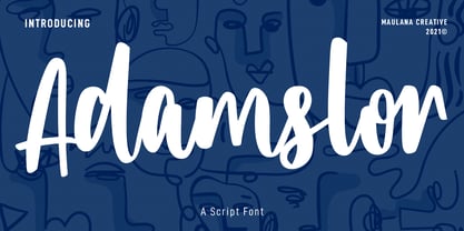 Adamslor is a handwritten script font. With high contrast bold stroke, fun character with a bit of ligatures and has a two files lowercase alternates. To give you an extra creative work. Adamslor font support multilingual more than 100+ language. This font is good for logo design, Social media, Movie Titles, Books Titles, a short text even a long text letter and good for your secondary text font with sans or serif. Make a stunning work with Adamslor font. Cheers, Maulana Creative
 - Greastly by Maulana Creative,
$12.00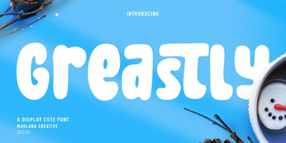 Greastly is a cute handwritten display font. With bold stroke, fun character with a bit of ligatures and has a two files lowercase alternates. To give you an extra creative work. Greastly font support multilingual more than 100+ language. This font is good for logo design, Social media, Movie Titles, Books Titles, a short text even a long text letter and good for your secondary text font with sans or serif. Make a stunning work with Greastly font. Cheers, Maulana Creative
 - MC Inversa by Maulana Creative,
$14.00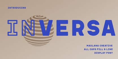 Inversa is a Display sans font with two style. Regular Fill and Outline stroke, fun character with a bit of ligatures and alternates. To give you an extra creative work. Inversa font support multilingual more than 100+ language. This font is good for logo design, Social media, Movie Titles, Books Titles, a short text even a long text letter and good for your secondary text font with script or serif. Make a stunning work with Inversa font. Cheers, Maulana Creative
 - Shadyspeed by Maulana Creative,
$13.00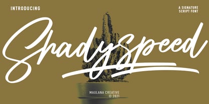 Shadyspeed is a signature script font. With contrast regular stroke, fun character with a bit of ligatures and has a two files lowercase alternates and swashes. To give you an extra creative work. Shadyspeed font support multilingual more than 100+ language. This font is good for logo design, Social media, Movie Titles, Books Titles, a short text even a long text letter and good for your secondary text font with sans or serif. Make a stunning work with Shadyspeed font. Cheers, MaulanaCreative
 - Sobiah Written by Maulana Creative,
$14.00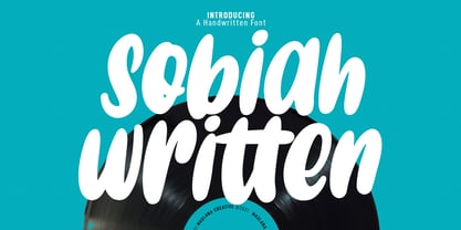 Sobiah Written is a bulb handwritten display font. With bold stroke, fun character with a bit of ligatures and has a two files lowercase alternates. To give you an extra creative work. Sobiah Written font support multilingual more than 100+ language. This font is good for logo design, Social media, Movie Titles, Books Titles, a short text even a long text letter and good for your secondary text font with sans or serif. Make a stunning work with Sobiah Written font. Cheers, MaulanaCreative
 - FRIESKA by Unitype Studio,
$19.00 FRIESKA is a modern serif typeface. It is consist two styles : Regular and Slant. This gorgeous font will engage your audience and make your promotions and projects stand out. Bring your branding to life and add a touch of modernity and style with this font. It’s the perfect fit for all luxury projects, such as wedding invitation, signatures, luxury logos, printed quotes, grettings cards, social media headers, product packaging and many more! Thanks for downloading, and I hope you enjoy it!
 - Nastyflashy by Maulana Creative,
$11.00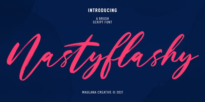 "Nastyflashy" is an expressive brush script font. With regular brush stroke, fun character with a bit of ligatures and has a two files lowercase alternates and swashes. To give you an extra creative work. "Nastyflashy "font support multilingual more than 100+ language. This font is good for logo design, Social media, Movie Titles, Books Titles, a short text even a long text letter and good for your secondary text font with sans or serif. Make a stunning work with "Nastyflashy" font. Cheers, MaulanaCreative
 - Merchons by Maulana Creative,
$16.00 Merchons is a fancy line style Display sans serif font. With two line soft stroke, fun character with a bit of ligatures and alternates. To give you an extra creative work. Merchons font support multilingual more than 100+ language. This font is good for logo design, Social media, Movie Titles, Books Titles, a short text even a long text letter and good for your secondary text font with sans or serif. Make a stunning work with Merchons font. Cheers, Maulana Creative
 - Thrillington by Rochart,
$15.00 Thrillington is font duo with modern vintage look design styles, available on script and Display Sans serif typeface. These two lovely fonts would be perfect to combine in your design. Brand new stylish textured fonts and Make it easy for made logotype hand lettering Style. It will be great for Logotypes, Posters, Digital Lettering Arts, Clean Design, Branding Design, Sign, Merchandise and Social Media Posts. This font contain of Uppercase, Lowercase, Number, Symbol, Punctuation, also support multilingual and already PUA encoded.
