10,000 search results
(0.054 seconds)
- Angellyne by Haksen,
$13.00 Angelline Script Font! If you are needing a touch of casual chic calligraphy for your designs, this font was created for you! Angellyne was built with OpenType features and includes beginning and ending swashes, alternate characters for both lowercase and uppercase letters, loads of different swash alternates for lowercase letters, numbers, punctuation, alternates, ligatures and it also supports other languages :) with many glyphs! Accessing the swashes / opentype features / glyphs: This font works best in a program that supports OpenType features such as Adobe Indesign, Adobe Illustrator CS, or Adobe Photoshop CC. You can access the swashes and alternates from the 'Glyphs Panel' in these programs. More Questions? Here are some (potential) answers! You are not permitted to resell this font in any way. Multilingual Support is included for Western European Languages Also, the sans-serif font used in the preview images is Gotham :) Cheers!
 - Jingo by Canada Type,
$39.95 This is the digital makeover and major expansion of a one-of-a-kind melting pot experiment done by VGC and released under the name Mardi Gras in the early 1960s. It is an unexpected jambalaya of Art Nouveau, Tuscan, wedge serifs, curlycues, ball endings, wood type spurs and swashes, geometry and ornamental elements that on the surface seem to be completely unrelated. But the totality works in a surprisingly loud and playful way that really defies categorization. Jingo is really five fonts in one: Over 1000 glyphs, four character sets, ornaments, swashes and ligatures. The forms are interchangeable in uppercase, lowercase and unicase settings. There is nothing low-key about this typeface. It is well suited for use on posters and book covers that require happy weirdness. But most of all it's great for those who like to fiddle with their type setting until amazingly conicidental pleasantnesses ensue. If you're that kind of designer and you know what you're doing, get Jingo, start up that glyph palette, and play away.
 - Portuguesa by Sudtipos,
$49.00 Inspired by the graphic spirit of old packaging and store signs of Portugal, this font seeks to transmit the warm and sunny sound of Portuguese language in a visual way. Portuguesa has 3 partners, designed to work nicely together and to complement one with each other. Portuguesa Script, with friendly and rhythmic personality, great for titles and short text, Portuguesa Caps, with small caps and ligatures that perfectly match (and contrast) with the script version. And Portuguesa Icons, that recalls the legendary blue tiles. This last version was specially designed to mix signs up with delightful combinations for creating patterns, borders, stationary, tableware and all kind of commercial products and projects that needs a memorable strike. The possibilities are numberless. As a mantra, Portuguesa is always in a positive mood, spreading the “Portuguese art of welcoming people”. Seja Bem-Vindo!
 - Gianduja by Resistenza,
$39.00 This delicious font family takes its name from the tastiest of Piemonte’s specialities. It has been designed in collaboration with Turin-based calligrapher and artisan Andrea Tardivo. Piemonte soil provides the most delectable hazelnuts, which are the key to creating a mouth-watering chocolate spread called Gianduja. This popular delicacy has a rich graphic history, with lavishly designed packaging. We sought to infuse the sweetness and tradition of Turin’s confectionary into a new font family, reinterpreting Italian models from the first quarter of the last century. All fonts were crafted by hand on paper first and then digitised in a way that retains the handmade quality and aesthetic. This family blends the Turinese touch from the old chocolatiers and the beautifully printed foils they use to wrap each exquisite creation. The extensive display family contains; Gianduja Sans a geometric font based on examples found in Italian art deco era artworks. Gianduja Script has been handwritten with a speedball pen following the standards of “Bella Scrittura” and Gianduja Capitals is a decorative font inspired by the “liberty” lettering signs from Piemonte. To complete the suite we developed an inline Capitals version, a set of icons and decorative elements all with the same handmade characters to perfect partner with each character set.
 - Circulo by MMD Fonts,
$6.29 Bound to rules, unbound in the usage. Hyper geometric, and minimal contrast. Circulo V1 is based on a font project I originally started because of a client I had. I wanted to create a display and text font for their product design brand, which is all about reducing the amount of necessary materials and production steps. Before I started the course at tipo-g it was called -“REDUCE“ and was more or less finished. The concept was based on the name. How far can letter shapes be reduced to their core geometric concepts and still be identified as letters? But in a way, it lacked a unique approach and was just a generic geometric Sans Serif with a lack of finesse. There was already a glimpse of characteristics visible which would later define Circulo V1. The high focus on geometric shapes was not of the same severity, and the angle on the stems was less intense. Those, as I call them, fake serifs turned out to be a significant factor in legibility and the characteristic of the font. Besides those changes and improvements, I decided to implicate a new feature to the concept, a condensed style. I quickly realised that it is impossible to keep my perfect circles and half-circles in this style without breaking my rules for the font. This „problem“ turned out to be the most crucial feature of the condensed set. Circular-based Letters will ignore the rules and boundaries of the condensed style and stay as they are. This feature allows the user to create a unique rhythm in their texts, and if you use the variable font, you can decide how intense this rhythm will be. In this situation, the user can choose which letters are allowed to keep their shapes and which will be put in their condensed corset. All, some or none of them, you decide.
 - Poultry And Fish JNL by Jeff Levine,
$29.00 The image of an old enamel sign advertising poultry inspired Poultry and Fish JNL, which is available in both regular and oblique versions. Horizontal cut-through lines within the Art Deco-era hand lettering adds to the uniqueness of this type design.
 - Boho A Gogo NF by Nick's Fonts,
$10.00 Letterforms from the 30s, inspired by Bauhaus Bold, combine with super 70s styling to create this disco-era delight. The bold characters, rendered by prismatic multilines, create striking headlines with a strong architectural feel. Both versions of this Pro Series font contain the complete Unicode Latin A character complement, along with extended ligatures and fractions.
 - Bold Fashion by Mans Greback,
$59.00 Bold Fashion is a heavy slab-serif font of the disco era. Its funk-style design, coupled with soft, rounded serifs, embodies the soul of retro, bringing forth memories of neon lights, bell-bottoms, and roller discos. Each letter is profoundly heavy, yet they prance with a bouncy, comfy rhythm, akin to catchy 70s beats. The swashes adorning the uppercase letters add flair, reminiscent of iconic burger joint signs and groovy vinyl covers.
 - Brother Bear - 100% free

- Rosetta Tones - Unknown license

- Vila Morena - Unknown license

- Zoning Department JNL by Jeff Levine,
$29.00 A 1930s-era sign lettering template set manufactured for the National Carbon Company by Wrico (The Wright-Regan Instrument Company) yielded the familiar lettering that comprises Zoning Department JNL. This rounded-end typestyle was also widely used on architectural drawings, signage, blueprints and the like.
 - Chet by East end,
$22.00 Chet was inspired by the lettering on the signs of American diners and gas stations in the 1950s and 60s. It is not a mere reprint of nostalgic signage letters, however. This typeface retains the boldness, uniqueness, and strength of this era, while adding a modern touch that makes it feel comfortable to use today. It is highly readable even from a distance, making it perfect for signs, posters, and website headers. Chet can also be used as a base for creating logotypes because of the unique forms of the a, n, and r. The typeface is named after Chet Baker, the jazz trumpeter who was active between the 1950s and 1970s.
 - Crescent by TrendGFX Design Studios,
$20.00 The most sensational design of the decade is now at large. These high-definition fonts can be used for titles, banners, tattooing, logotypes and many more places. Be it domestic or industrial, formal or informal, it can be used in every field imaginable. It has a sensational, funky style and remarks the current youth's style. Such a font style has never been seen by the world, until today. These designs are 100% original and handmade. I searched a million miles but found this as the most appropriate idea for the world of font types at this time. It's the coolest, funkiest and the best font ever made. It's the era of graffiti and 3D, and we've combined both to give you CRESCENT.. So, use it, love it, buy it!
 - Classic Grotesque by Monotype,
$40.99 Classic Grotesque by Rod McDonald: a traditional font with a modern face. The growing popularity of grotesque typefaces meant that many new sans serif analogues were published in the early 20th century. Setting machines were not compatible with each other but all foundries wanted to offer up-to-date fonts, and as a result numerous different typeface families appeared that seem almost identical at first glance and yet go their separate ways with regard to details. One of the first fonts created with automatic typesetting in mind was Monotype Grotesque®. Although this typeface that was designed and published by Frank Hinman Pierpont in 1926 has since been digitalised, it has never achieved the status of other grotesque fonts of this period. But Monotype Grotesque was always one of designer Rod McDonald’s favourites, and he was overjoyed when he finally got the go-ahead from Monotype in 2008 to update this “hidden treasure”. The design process lasted four years, with regular interruptions due to the need to complete projects for other clients. In retrospect, McDonald admits that he had no idea at the beginning of just how challenging and complex a task it would be to create Classic Grotesque™. It took him considerable time before he found the right approach. In his initial drafts, he tried to develop Monotype Grotesque only to find that the result was almost identical with Arial®, a typeface that is also derived in many respects from Monotype Grotesque. It was only when he went back a stage, and incorporated elements of Bauer Font’s Venus™ and Ideal Grotesk by the Julius Klinkhardt foundry into the design process, that he found the way forward. Both these typefaces had served as the original inspiration for Monotype Grotesque. The name says it all: Classic Grotesque has all the attributes of the early grotesque fonts of the 20th century: The slightly artificial nature gives the characters a formal appearance. There are very few and only minor variations in line width. The tittles of the ‘i’ and ‘j’, the umlaut diacritic and other diacritic marks are rectangular. Interestingly, it is among the uppercase letters that certain variations from the standard pattern can be found, and it is these that enliven the typeface. Hence the horizontal bars of the “E”, “F” and “L” have bevelled terminals. The chamfered terminal of the bow of the “J” has a particular flamboyance, while the slightly curved descender of the “Q” provides for additional dynamism. The character alternatives available through the OpenType option provide the designer with a wealth of opportunities. These include a closed “a”, a double-counter “g” and an “e” in which the transverse bar deviates slightly from the horizontal. The seven different weights also extend the scope of uses of Classic Grotesque. These range from the delicate Light to the super thick Extrabold. There are genuine italic versions of each weight; these are not only slightly narrower than their counterparts, but also have variant shapes. The “a” is closed, the “f” has a semi-descender while the “e” is rounded. Its neutral appearance and excellent features mean that Classic Grotesque is suitable for use in nearly all imaginable applications. Even during the design phase, McDonald used his new font to set books and in promotional projects. However, he would be pleased to learn of possible applications that he himself has not yet considered. Classic Grotesque, which has its own individual character despite its neutral and restrained appearance, is the ideal partner for your print and web project.
 - Heinz by Wiescher Design,
$39.50 Heinz is inspired by the poster design of Heinz Schulz-Neudamm for Fritz Lang’s famous silent movie Metropolis. Heinz Schulz-Neudamm did quite a lot of work for the German branches of big American movie companies like 20th Century Fox or MGM. His most famous work is probably the title lettering for the Metropolis movie. The original drawing for that poster sold in 2005 in London for 398.000 Pound Sterling (approx. US $ 600.000). I designed a completely new font in the feeling of Heinz’s lettering. Enjoy. Yours historically, Gert Wiescher
 - Mina by Resistenza,
$39.00 Go back to a time when the Mediterranean coastline was truly glamorous, when stylish women and men in wire-framed glasses listened to Domenico Modugno songs on the radio while sipping wine in sidewalk cafes. A relaxing summer’s day, a gentle sea breeze, taking the time to write a postcard to your loved ones in your best handwriting. The 1950’s may have come and gone, but the elegance and simplicity of that classic style has not, Mina keeps the feel of calligraphy, the long connections between letters is elastic, the clean, thin lines, it is a relaxed cursive ideal for logotypes, titles, and lettering. There are eleven Mina font styles and many loops to choose from to customize any letter. Bring the seaside glamour of a bygone era to your projects of today with Mina. Ranging from light to heavy, Mina Calligraphic, and Mina Shadow, this family of fonts work perfectly separately but you can also achieve beautiful results when combining them. Check out also Mina Chic We recommend to combine Mina with: PestoFresco Turquoise
 - Benchmark2 by Alphabet Agency,
$30.00 Benchmark2 is a super cool serif font developed from the popular original Benchmark font. This version has been remastered in the latest font developing software and now the new version includes a lot of additional characters that are not available in the original. The original font has been used worldwide, used in Hollywood films and in products in popular clothing lines. The font works well in a variety of themes including tattoo, rebellious, street, western and vintage, to name some. The font was initially designed for use on Baseball jerseys in an effort to developed ways of creating new looks in the field of sports related graphic design.
 - Maxima Now Pro by Elsner+Flake,
$59.00 The sans serif linear antiqua Maxima which was created in the beginning of the sixties by Prof. Gert Wunderlich for Typoart Dresden, was newly actualized in 2007 after more than 45 years. Many hands and heads were involved in the successful re-design of Maxima Now over a period of two years to assist the designers of the Elsner+Flake Design Studios in Hamburg, and the typeface family is now available. The re-design happened in close cooperation with Wunderlich who has given support to numerous projects in Elsner+Flake’s studio in Hamburg. A great deal of care was given to the necessary preliminary tasks such as the viewing of the original designs and print tests, the analysis of the digital Typoart data which had been in the possession of Elsner+Flake since 1985 and 1989, and a design conceptualization based on detail correlations, as well as the extension of the character complement. It had been Elsner+Flake’s goal to include as many of the existing Maxima cuts into the re-design program as possible. The result is an extended font family with 25 weights in EuropaPlus layout.
 - Badjigoer by Gatra Std,
$10.00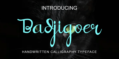 Introducing a cute handwriting "Badjigoer" Handwritten Calligraphy Typeface! If you are needing a touch of casual modern display for your designs, this font was created for you! What's Included: Uppercase and Lowercase Number and Punctuation Support Language This font works best in a program that supports OpenType features such as Adobe Indesign, Adobe Illustrator CC and CS, or Adobe Photoshop CC and CS also CorelDraw More Questions? Here are some (potential) answers! Do not to resell this font in any way. Multilingual Support is included for Western European Languages Have a Wonderful Day, Gatra Std
 - Capolista by Gatra Std,
$10.00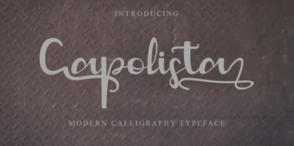 Introducing a cute handwriting "Capolista" Modern Calligraphy Typeface If you are needing a touch of casual modern Calligraphy for your designs, this font was created for you! What's Included: Uppercase and Lowercase Number and Punctuation Support Language This font works best in a program that supports OpenType features such as Adobe Indesign, Adobe Illustrator CC and CS, or Adobe Photoshop CC and CS also CorelDraw More Questions? Here are some (potential) answers! Do not to resell this font in any way. Multilingual Support is included for Western European Languages Have a Wonderful Day, Gatra Std
 - Congyang by Gatra Std,
$10.00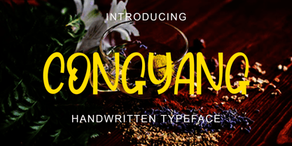 Introducing a cute handwriting "CONGYANG" Handwritten Typeface! If you are needing a touch of casual modern display for your designs, this font was created for you! What's Included: Uppercase and Lowercase Number and Punctuation Support Language This font works best in a program that supports OpenType features such as Adobe Indesign, Adobe Illustrator CC and CS, or Adobe Photoshop CC and CS also CorelDraw More Questions? Here are some (potential) answers! Do not to resell this font in any way. Multilingual Support is included for Western European Languages Have a Wonderful Day, Gatra Std
 - Rantang by Gatra Std,
$12.00 Introducing a modern&elegant "Rantang" signature script If you are needing a touch of casual elegant signature script for your designs, this font was created for you! What's Included: Uppercase and Lowercase Ligatures Alternates Number and Punctuation Support Language This font works best in a program that supports OpenType features such as Adobe Indesign, Adobe Illustrator CC and CS, or Adobe Photoshop CC and CS also CorelDraw More Questions? Here are some (potential) answers! Do not to resell this font in any way. Multilingual Support is included for Western European Languages
 - Club Lunch JNL by Jeff Levine,
$29.00 A 1930s-era hand-lettered sign advertising a club lunch (consisting of soup, salad, dessert and coffee for 35 cents) provided not only the Art Deco lettering style but the name for Club Lunch JNL.
 - Gresua by Konstantine Studio,
$19.00 Looking to infuse your brand with a burst of retro charm and a dash of pop culture pizzazz? Say hello to our Gresua Fonts! Designed to make your brand stand out in the realms of pop culture, lifestyle, and food and beverage branding, these fonts are an absolute game-changer. Gresua transports you to the golden era of the past, evoking a sense of nostalgia that resonates with pop culture enthusiasts. Seamlessly blending boldness and authenticity, they captivate the hearts of your audience, adding a unique and irresistible touch to your brand identity. In the ever-evolving world of pop culture, lifestyle, and food and beverage branding, it's essential to stay ahead of the curve. Our Gresua Fonts combine vintage aesthetics with a contemporary twist, allowing your brand to shine as a trendsetter. Embrace the bold and unexpected, and watch as your brand becomes the talk of the town. Are you ready to take your brand on an unforgettable journey through the realms of pop culture, lifestyle, and food and beverage branding? Embrace the captivating allure of our Gresua Fonts today and unleash a world of endless possibilities!
 - Contype by Wiescher Design,
$39.50 Once I had a young, very eager and interested designer in my employ. We got into talking about where our letterforms come from and the habits in perception we are used to. He did not quite believe me. So I said, let's try to design a typeface where everything is just the opposite of what we are used to. We really had a hard time, our habits crept up on us all the time. But after a couple of weeks we finally finished this typeface and wanted to call it crazytype, but my young apprentice who did most of the manual labor said Contype sounded crazier. So it became Contype and it's really crazy, with a small asian touch to it. Yours very crazy Gert Wiescher
 - Yard Goods JNL by Jeff Levine,
$29.00 Yard Goods JNL is another typeface derived from a sign making outfit consisting of a series of stencils manufactured by the Display Material Company of St. Paul Minnesota. This clean and casual sans design embodies the hand-lettering of 1920s and 30s era show cards, price tickets and display signs.
 - Paradigm by Shinntype,
$9.00 Originally released in 1995 as a three font family, Paradigm forcefully addressed the emaciating effect that digitization was then exerting upon traditional serifed typography. Investigating the new media of a much previous era, Nick Shinn deconstructed the first roman type, designed by Sweynheym and Pannartz in 1467, and gleaned, from its minuscules, the low contrast and discreet serif treatment (portrayed by a novel convex effect), which he subsequently applied to both capitals and lower case of a classically proportioned Venetian invention. Now in 2008, the glyphs, metrics and hinting of the 1995 fonts have been refined, Extra Bold and Light weights added, a full range of OpenType features instituted, and the number of characters per style increased almost threefold. It is a major upgrade to a unique typeface.
 - Red Border Labels JNL by Jeff Levine,
$29.00 In the pre-computer, pre self-adhesive label era of office supplies a number of companies (including Dennison, Maco and Denny-Reyburn) manufactured a wide variety of gummed labels for just about any use or purpose. Blank labels, specialty labels and decorative holiday seals were just a part of this line. One popular style was that of labels with parallel thick-and-thin borders of red lines and corners chamfered, rounded or straight cut. Occasionally, one could find similar labels with blue, green or gold borders but red was the mainstay, hence naming this typeface Red Border Labels JNL. Presented in this font is a collection of twenty-six standard and specialty shape label borders on the capital (A-Z keys) and twenty-six solid panel versions on the lower case (a-z) keys which can be used as backfills for the borders or as stand-alone labels.
 - AT Carterwood by Amera Type,
$20.00 Inspired by the old style serifs of 19th century print labels that have a classic touch in this modern era Carefully crafted with lowercase and uppercase to complement this font as well as using variable bold and thin shapes to give a sense of beauty and strength to the letterforms Carterwood is great for designing posters, labels, sign paintings and other media to enhance your visual appearance
 - Leonore by ArimaType,
$15.00 Leonore is a strong and elegant family font display. Inspired by the style of design that is currently popular, and this is the answer to all the needs of every idea that you will pour in this modern era, with a thick and solid style in each letter as if this font has a soul in it. Features: *Uppercase & Lowercase *Number & Symbol *Multi-language *Regular, Italic, and Outline Happy Creating! ArimaType@gmail.com #1266576
 - Marxis by Juru Rancang Studio,
$15.00 Introducing a retro condensed font called "Marxis". Best font to use as a headline to bring back the propaganda era inspired by Soviet posters, movie titles and book covers. The letterforms are straight and condensed and come in 2 styles: uppercase and small caps with the ligatures. This font will suited well for titles, poster design, web design, branding and packaging works, illustrations, badges and other typography works. Thank you, I hope you like it as I do!
 - Futura Classic by Wiescher Design,
$39.50 FuturaClassic is a recut of Paul Renners original Futura. This version was what Mr. Renner wanted the Futura to look like. He had to change his very stringent design because the market wanted a more pleasing typeface. I think the original design is worth saving because it is much more typical and has a personal and distinguished touch. I have also designed Geometra Rounded with rounded endings that looks more interesting than your usual DIN type Yours trying to save the typographical past Gert Wiescher
 - Salacious by PizzaDude.dk,
$18.00 Salacious is my soft/rough all-caps font, inspired by both comics and grafitti. The weight and width of the letters varies a bit. Not in a disturbing way, but more in a lively and organic way. I've added 5 (slightly) different versions of each letter (which automatically cycles as you type!) The letter shapes are a bit rough, due to the fact that they are handmade, and all corners are rounded, which gives a nice soft look!
 - Condensed Stencil JNL by Jeff Levine,
$29.00 Browsing online auctions is a wonderful way to pick up ideas for font designs. Take Condensed Stencil JNL for example. This font was modeled from a set of vintage brass interlocking stencils.
 - Arthur Ornaments by SIAS,
$44.90 Arthur Ornaments offers a range of about 70 unique ornaments and pictographs in the sophisticated style of the Art Deco era: lavish floral compositions and leaves, borderpieces and geometric elements – and a stunning set of period lifestyle, sports and travel pics. Arthur Ornaments lend a breath of elegance and exclusivity to your designs. Arthur Ornaments is the perfect compagnon to all fonts of the Arthur Sans, Arthur Cabinet, Ardagh and Artemis font series. Use Arthur Ornaments to create posters, banners, menus, invitations and title pages of distinctive noblesse and beauty. Combine them with other Arthur fonts for a perfect match. The Arthur Ornaments set of characters is the very same as the respective part of Arthur Sans Regular (if you already have Arthur Sans Regular you don’t need this one!). Technical remark: Many of the characters in this font are encoded in the 26xx, 27xx and 1Fxxx ranges. However, for the ease of use most of the glyphs are doubled to the a–z, A–Z and 1–9 positions. _________________________________________________________________________________ If you like fine ornaments you should also have a look at Behrens Ornaments, Andron Ornaments and Leipziger Ornamente.
 - Fleurious by Proportional Lime,
$9.95 This font was inspired by the many changes in printing habits over the last half millennium. Every book has a story and sometimes the printing itself can be its own story. Every era has its own tendencies in decorative elements and these practices were observed and included such that the font contains over 200 hundred glyphs with which to add variety to your documents. It is provided with a complete character map.
 - Baraboo Banner by Solotype,
$19.95This was put together by Dan X. Solo to provide a quick way to set headings for a circus brochure. The name was given in recognition of the Baraboo Circus Museum. The end pieces are in pairs on the uppercase keys A-B, C-D, etc. The alphabet itself is in the lowercase position. - Dumper by LetterStock,
$25.00 Introducing "Dumper" - Your Original Hand-Drawn 60's Retro Bold Font Step into the bold and vibrant world of "Dumper," a font that seamlessly blends original hand-drawn craftsmanship with the iconic style of the 60's retro era. Ideal for posters, headlines, and vintage-themed branding projects, this font exudes a dynamic energy that adds a bold statement to your designs. Key Features: Original Hand-Drawn Craftsmanship: Each character in "Dumper" is crafted by hand, bringing a unique and authentic touch to your creations. 60's Retro Bold Vibes: Immerse your designs in the bold and lively spirit of the 60's, making "Dumper" a perfect choice for projects seeking a retro aesthetic. Why Choose "Dumper": Craft posters and headlines that command attention with bold and dynamic lettering. Design branding materials that transport your audience back to the vibrant 60's era. Establish a brand presence with a font that effortlessly captures the essence of retro boldness. Download "Dumper" Now and Let Your Designs Boldly Embrace the 60's Retro Vibe!
 - P22 Constructivist by P22 Type Foundry,
$24.95 Font mavens of the world unite! Constructivist recreates the bold graphic design of early Soviet Era Russian Artists such as Rodchenko and Popova. The Constructivist family contains 5 fonts plus a set of decorative extras. Constructivist Pro is an Opentype adaptation of the P22 Constructivist Set font system which combines the 5 font styles and adds Opentype features such as alternate Latin and Cyrillic letterforms, full Central European Language support and changes in line spacing and optical sizing of some characters for improved harmony. In all over 1200 Glyphs for maximum flexibility and design choices. Seize control of the means of desktop production with this revolutionary font collective!


