10,000 search results
(0.135 seconds)
- Chocolatte by Hanoded,
$15.00 Chocolatte font is a yummy, creamy script font, made entirely with chocolate.. No, sorry, that’s not true. It was made with a pen, but I thought I’d create a nice urban myth. Chocolatte is a pretty useful font: you can stick it on your X-mas cards, write a little poem with it and surprise the love of your life with an enormous amount of chocolate, decorate your cake with it (preferably a chocolate cake) or use it for your… well, whatever. Just remember that this delicious font cannot be eaten, but it does come with copious amounts of diacritics for all you chocoholics out there!
 - Vialog Signs by Linotype,
$29.99The 14 symbol and arrow fonts in Vialog Signs were designed to accompany Vialog, a specially developed font family for the transportation industry and information systems typography. These functional and clever signs harmonize with the Vialog alphabets perfectly and they can also be used on their own or with other fonts. The extensive sets have not only the symbols for common transportation industry requirements, but also symbols for the numerous electronic and sporting devices of modern life. Included are four weights of arrows (to match the weights of the Vialog fonts), Sport Signs, Conduct Signs, Communication Signs, Community Signs, Direction Signs, and Transport Signs. - Kathmandu by Volcano Type,
$19.00Kathmandu, the Nepalese capital in the foothills of the Himalayas, is not like any other city. That's why Kathmandu Bold is not like any other font going by the name of a town, either: This font is not as digital as Chicago but not as solid as Aachen. Kathmandu Bold's capital letters are slightly irregular, giving the font its unique character, which is extended and more black than bold. Everyone who has hitherto regarded "naïve" and "cool" as being an oppositional pair should check out this font by Ingo Juergens. For special needs, such as foreign languages, there is a host of special characters. - Badora by Twinletter,
$15.00 BADORA, a display font with a Japanese flair, is now available. We created this typeface using natural handwriting that has been modified in visual form so that it may be used in a variety of applications. This font will enhance any of your projects, particularly those with a casual and fun theme. Logotypes, food banners, branding, brochure, posters, movie titles, book titles, quotes, and more may all benefit from this font. Of course, using this font in your various design projects will make them excellent and outstanding; many viewers are drawn to the striking and unusual graphic display. Start utilizing this typeface in your projects to make them stand out.
 - Jandys by Alit Design,
$10.00 Introducing Jandys Typeface which has a fast dry brush and elegant style. So it looks natural, like handwritten. This font is best used for your design project that has the concept of elegant, cool and fun. Can also be applied to the design of a logotype, header website, make some lettering a quote, t-shirt design, wedding card design etc. Jandys has two font styles that are similar but different, namely Jandys Dua and Jandys Swash, a dry brush formatted like a used font. Jandys Typeface deserve to be in your fonts collections, because it is unique, elegant and has many options of alternative glyphs.
 - Monten by Gatype,
$14.00 Monten is a script font whose letters are designed a bit bold, almost similar to the Sans Serif font. A great choice if you want to add a retro look to your designs. Perfect for titles, logos, or anything your creative brain can think of. This customizable font will look great on a variety of design ideas such as Christmas themes, valentines, posters, invitations, weddings, branding projects, social media posts, magazines, book covers and more! This will add a fun and friendly touch to any of your projects! This font is PUA encoded which means you can access all the glyphs and sweeps easily.
 - Lovers Pro by Scholtz Fonts,
$35.00 Lovers is a romantic, elegant handwritten calligraphic script, with well over 300 additional characters, including standard and discretionary ligatures, swashes and stylistic alternatives. Use of its extensive OpenType features enable the designer to create text that constantly changes, giving the impression of genuine handwriting, but handwriting that has all the flair and styling of hand-done calligraphy produced towards the end of the twentieth century. Lovers is based on traditional calligraphic ideals, but I've combined these with my own brand of relaxed, handwritten spontaneity, to design a font that is formal yet free and accidental, traditional yet contemporary. The font’s extravagant curves and swashes make it perfect for valentine’s day and wedding media, book covers, greeting cards, and certificates, in fact for any design work that requires a romantic or opulently elegant look. The range of stylistic alternatives and swashes enable users to create a wide range of moods in their work. In many ways it is a calligraphy toolkit. Lovers contains the accented characters used in the major European languages. What sets it apart from most other calligraphic fonts is that it appears so genuinely handwritten and avoids the uptight formality that characterizes so many of the fonts in this genre. Try Lovers, enjoy its wealth of OpenType features and let its vigorous yet elegant exuberance delight you and enhance your creativity!
 - Microbrew Soft by Albatross,
$19.00 Microbrew Soft is the latest addition to the Microbrew family. Microbrew Soft includes a wide variety of textures while retaining soft edges and clean outlines. With 27 individual styles plus an eclectic set of ornaments and catchwords, the possibilities are limitless when it comes to how many faces the font family can wear in your design. Microbrew Soft sports a nice mix between wood type poster style and vintage letterpress. The more detailed styles work well at large sizes, and the cleaner styles add legibility at smaller sizes. Microbrew Soft is an all caps display font, but the lowercase act as alternates so adding variety to your letterforms is as easy as mixing uppercase and lowercase letters. To add to the realism, Microbrew Soft includes double-letter ligatures. Opentype features include automatic fractions, subscript numbers, superscript numbers, and double-letter ligatures. Don't let the name fool you, Microbrew Soft is very versatile and works great for almost any subject matter, including weddings, birthdays, restaurants, coffee shops, music, and many more.
 - ITC Tactile by ITC,
$29.99ITC Tactile is a puzzle of subtle typographic contradictions. Capitals have traditional epigraphic proportions, but the lowercase has a uniform optical width. Light weights are stately and elegant, but bold designs are almost jolly. This paradoxical alphabet even combines two distinctively different serif designs. Designer Joe Stitzlein says, “I wanted to create a modern and dynamic serif face that draws its forms from antiquity. I also wanted to have as much fun as possible with the drawing and architecture of each letter. Hopefully I've created a very legible typeface that grabs the reader's eye in a nice, 'tactile' way.” The apparent inconsistencies of the design are the result of careful consideration. Of the seemingly odd serif design, Stitzlein explains, “The transitional serif is an entry point for the eye into the letterform, and the long slab is an exit, leading to the next letter.” The result is a typeface that's easy to read at text sizes but offers surprising details when enlarged to display sizes, setting ITC Tactile apart from more traditional designs. While this is his first commercial typeface design, Stitzlein has ample experience creating custom typefaces for corporate branding, including companies such as Silicon Graphics and Sempra Energy. His graphic design business has served a wide range of clients, including Apple Computer and the 2002 Salt Lake City Olympics. The ITC Tactile family is available in three weights, with complementary italic designs and a suite of small caps for each of the roman designs. Stitzlein drew the small caps to match the height of the lowercase x-height, which enables “bi-form” or “unicase” setting in display copy. - 1540 Mercator Script by GLC,
$38.00 This font was inspired by the so-called Litterarum latinarum, quas italicas, cursoriasque vocant, scribendum Ratio (Louvain 1540), a manual intended for calligraphers by the well known scientist Gerhard Mercator. It was a magnificent “Cancellaresca corsiva” design, enriched with many alternates, final loops and ligatures. We have added a lot of accented and other characters required for modern use that did not exist in the original.
 - FeggoliteMono by Ingrimayne Type,
$6.95 FeggoliteMono is a decorative, monospaced typeface family with a small x-height and long descenders. Two styles (plain and bold but renamed in 2020 as light and regular) were created in 1994 and revised in 2010. In 2020 a bolder bold was added along with italics versions for each of the three weights. The design was an attempt to create a decorative typewriter font.
 - VLNL TpLlum by VetteLetters,
$35.00 TpLlum is a typeface designed by TwoPoints for a festival in Barcelona called ‘Montjuïc de Nit’. Llum means light in Catalan. In the Montjuïc de Nit project the font was used in white over a dark grey background, letting the light of a backlit poster shine through. For this purpose the typeface had to be very bright, which was made possible by its heavy cut.
 - Boscribe by Monotype,
$29.99Bo Berndal's handwriting was terrible in his younger days, and he could not even read his own notes. When he started out as an apprentice in a printing shop, he started to copy Garamond italic and formed his own style of writing. Later he was inspired by both Alfred Fairbanks and his reform-writing and by Paul Standard in the U.S.A and created the Boscribe font. - Aure Nox by Aure Font Design,
$23.00 Aure Nox inspires the chill whimsy of a haunted forest. The roughhewn forms of this decorative, sans-serif font engage the reader with a subtext of rakish charm. Surprisingly legible, Nox adds a bit of rebelious sass to text and titles, and a daring stance to astrological expressions and chartwheels. Nox is an original design developed by Aurora Isaac. After more than a decade in development, 2018 marks the first release of the CJ and KB glyphsets in regular, italic, bold, and bold-italic. The CJ glyphset is a full text font supporting a variety of European languages. A matching set of small-caps complements the extended lowercase and uppercase glyphsets. Supporting glyphs include standard ligatures, four variations of the ampersand, and check-mark and happy-face with their companions x-mark and grumpy-face. Numbers are available in lining, oldstyle, and small versions with numerators and denominators for forming fractions. Companion glyphs include Roman numerals, specialized glyphs for indicating ordinals, and a variety of mathematical symbols and operators. The CJ glyphset also includes an extended set of glyphs for typesetting Western Astrology. These glyphs are also available separately in the KB glyphset: a symbol font re-coded to allow easy keyboard access for the most commonly used glyphs. Though Nox stands well on its own as a text font, the more traditional sans-serif forms of Aure Jane pair well as an innocuous foil to Nox's brazen presence. Give Aure Nox a trial run! You may discover a permanent place for this font family in your typographic palette. AureFontDesign.com
 - Grandis by Eimantas Paškonis,
$- Grandis ("chainlink") was initially intended for a first person shooter’s UI, so this guided the design. The font had to be readable while maintaining sci-fi feel and also to not rely on kerning (most video games don’t support it). This meant a large x-height, steep diagonals and squared bowls to reduce the amount of white space between letters. Tabular numbers as default facilitate UI design where timers or tables are involved. What makes the font stand out from similar grotesks is the letters’ classical proportions with wide bowls and narrow rectangles. The result is a readable, versatile workhorse with an interesting dynamic rhythm and where extreme weights/widths can also be used for display purposes. Supports multilingual Latin and Cyrillic, including Bulgarian and Serbian alternates.
 - Agatha Bergman by PeachCreme,
$22.00 Introducing our new modern signature font "Agatha Bergman". We would say that "Agatha Bergman" is a result of our latest experiment since a few new things have been done: "Agatha Bergman" is a voguish sophisticated signature-style script with three different uppercase alternatives for each letter and a unique short swash for each lowercase letter. We usually used to make long and wavy swashes, however, that's not the case this time. Also, the stylistic alternates were coded as both ligatures and swashes so that turning on the “Standard ligatures” was enough to access them. The font includes 152 fancy standard ligatures and 6 discretionary ligatures, and while working on them we tried to consider those letter combinations that are often met in surnames, e.g. -ovsky.
 - Bodiam by Hanoded,
$15.00 Two years ago I went on a camping holiday in England with my wife and (then two) small children. The first stop was a nature campsite near the village of Bodiam in East Sussex. My son wanted to see a real castle, so I figured Bodiam Castle was the 'realest' of them all! He loved it, as the castle had a moat, crenellated walls, a bunch of towers and a guy dressed up as a knight. Bodiam font is a rough didone-ish affair. It is all caps, but you can freely mix upper and lower case. It would be ideal for book covers, posters and maybe even for castles. Comes with a treasure chest of diacritics.
 - Rens Gazet by Ingrimayne Type,
$9.50 RensGazet is a decorative blackletter typeface with elaborate upper-case letters and condensed lower-case characters. It was inspired by the masthead of a short-lived weekly newspaper, The Rensselaer Gazette, which was published from 1857 until 1860. I could not find any existing digitized fonts that replicated this old typeface, so I decided to create an interpretation of it. I had samples of few letters in large point sizes and a number of others at a small point size, though these were blurry and not sharply defined. As a result, this typeface is undoubtedly considerably different from the original. Also, my spacing is much tighter than that in the source samples.
 - Titling Stencil JNL by Jeff Levine,
$29.00 Titling Stencil JNL is an extra bold stencil treatment of R. Hunter Middleton’s ‘Karnak’ (produced in 1936 for Ludlow) and is a companion font to both Bookkeeping JNL and Bookkeeper JNL (a lightweight version of the type design). Middleton based his ‘Karnak’ family of typefaces on the geometric slab-serif ‘Memphis’, which was designed in 1929 by Dr. Rudolf Wolf and released originally by the Stempel Type Foundry of Germany. According to Wikipedia, ‘Karnak’ was named after the Karnak Temple Complex in Egypt, in reference to the fact that early slab serifs were often called “Egyptians” as an exoticism by nineteenth-century type founders.” Titling Stencil JNL is available in both regular and oblique versions.
 - Old Miami Beach JNL by Jeff Levine,
$29.00 The grandeur of what was Miami Beach had its golden years peak in the 1940s. One of the grande dame hotels that stood at Collins Avenue and 23rd Street was the Roney Plaza; built in the 1920s and demolished around 1969. An online auction offered a pair of gummed labels provided by the hotel to be used by their guests for shipping souvenir packages back home, thus also giving the hotel a promotional plug. Jeff Levine not only created two typefaces from this hand-lettered label - Old Miami Beach JNL and Old Miami Beach Nights JNL (a solid black version), but painstakingly recreated the look of the label for the promotional flag and banner for the fonts.
 - Sideroad by Melvastype,
$22.00 Sideroad is an intensive hand-drawn brush script font. It comes in two versions, Textured and Smooth. Textured version has this rough effect that comes when letters are drawn with pointed-brush on rugged surface. The Smooth version is, like the name says, smooth as silk with polished edges and properly drawn forms. Sideroad includes two sets of lower case letters to give variation and more imperfect hand-drawn effect. You can cycle these two sets by enabling Contextual Alternates OpenType feature. It also has set of lower cases without connector strokes. And a set of lower cases with end swashes. On top of these there are also a few underlines to give that final punch to your design.
 - Fuse V.2 by W Type Foundry,
$25.00 Fuse Vol 2 is an extension to our popular Fuse type family. All of the corners of the typeface’s character are rounded, making Fuse Vol 2 friendlier and more amiable variant of the original Fuse. Designed with a powerful OpenType features in mind. Each weight includes alternate characters, ligatures, fractions, special numbers, arrows, extended language support , small caps and many more.. Perfectly suited for graphic design and any display / text use. The 32 fonts are part of the larger Fuse super family. We’re proud to introduce: Fuse Vol 2. Learn about upcoming releases, work in progress and get to know us better! On Instagram W Type Foundry On facebook W Type Foundry wtypefoundry.com
 - Stencil Patterns JNL by Jeff Levine,
$29.00Stencil Patterns JNL collects into one digital file a number of decorative stencil patterns from decades past. These charming illustrations were re-drawn by Jeff Levine using images of vintage oilboard stencils made over fifty years ago. While these are useful as stand-alone embellishments for any print projects, they can also be scaled and printed out onto card or acetate stock for hand-cutting as new stencil templates. A special note of thanks goes to fellow type designer and author, Leslie Cabarga. He supplied the bulk of the images used in designing this font file. There are left and right pointing hands on the parenthesis keys, and a decorative ampersand on its respective key. - Augsburger2009 by Proportional Lime,
$24.95 This typeface was inspired strongly by one of Ernhardt Ratdolt’s (1442-1528?) many beautiful typefaces. Mr. Ratdolt was a printer from the city of Augsburg, who had also worked for several years as a printer in Venice. He made many advances in printing technique and technology, including the decorated title page. Early books have a mysterious rhythm to the appearance of the text, due to small variances in letters caused by casting irregularities and ink transfer from the press. This supposed defect, which is present in this typeface, gives a pleasing effect when compared to the sterile regularity of modern printing technology. This font has been released as version 2.0 with over two hundred additional characters and improved metrics.
 - Cairlinn by Fontdation,
$15.00 New year, new font. Let us introduce our first font on 2019: Cairlinn. A clean serif that is forged with the spirit of vintage typography. It is heavily inspired by the old letters that are used in classic advertisements. This 300+ glyphs monster is packed with wide variation of letters, accessible via OpenType features. If you're a fan of vintage/classic typography (like me), this font is a precious addition to your design arsenal. Suits best for any project that requires a vintage touch, such as: labels, t-shirt design, typographic quotes, packaging, wedding invitations, and many more. THANKS AND ENJOY!
 - Monstice by Seventh Imperium,
$25.00 Monstice Family is an elegant, playful and decorative family which includes five separate styles. There is a base serif design that was expanded to Engraved, Inline, Hatched, and Emboss styles. There is also a set of decorative elements to assist in adding details and flourishes. The font is well suited for display typography for posters, book covers, packaging and many other uses where one might need a splash of detail. All fonts have OpenType features including swash, ligatures, and alternates. This font is easy to use and will allow the designer plenty of exploratory features to create their own combinations.
 - TT Compotes by TypeType,
$25.00 Fontfamily “Compotes” was created with love and with care about small collections of "hand-made" fonts. We have created a perfect product for the decoration of home design, small barber’s shops, cafes and bakeries. This fonts is ideally combined with any type of design, for example, you can use them on labels homemade jams and pickles and “Compotes” perfectly can be used in logos and in the press. We did 5 main main typefaces by alphabetical list: A - Apple, B - Basilic, C - Citro, D - Dew, E - Espresso In addition, we have developed five “supplements” for each font!
 - Librum by Hackberry Font Foundry,
$24.95 This is the serif text family for the book design group of font families which David designed in the process of writing "Practical Font Design With FontLab 5". The letterspacing is set wide for body copy use. The main purpose is readability and reading comfort. There are several whimsical graphics, plenty of OpenType features: oldstyle figures [tabular and not], small cap figures, lining figures [tabular and not], discretionary ligatures, small caps, and so on. The feature set is limited for the italic and bold versions. It produces an exceptional book. See Librum Book Design Group for a package containing all fifteen fonts,
 - Noir by Mindburger Studio,
$39.00 Noir is a sans serif font family of 12 fonts with contemporary aesthetics heavily influenced by early 20th century geometric typefaces. While having its geometric structure it carries organic personality with touch of warmth injected to each form. Noir font family ranges from light and elegant weights perfect for small text, to extremely heavy and masculine weights suited for large display sizes. Noir has a rich arsenal of Open Type features for highly professional use and extended Latin, Cyrillic and Greek language support. Noir is delivered as Std and Pro version. Cyrillic and Greek are available in Pro package only.
 - Endgame by Hanoded,
$15.00 Endgame font was made using a very, VERY bad brush and Chinese ink. I had bought a bunch of brushes some time ago and I discovered that the hairs had been treated with some goo to keep them from sticking out. The goo didn’t really come off, so when I started to draw the glyphs for this font, the brush strokes were kind of wild. In the end, I really liked it (even though I will never again buy that particular brand of brushes). Endgame is a wild brush font. Comes with the works: diacritics, ligatures and alternates.
 - Bergie Seltzer by Hanoded,
$15.00 It could be you’ve never heard of Bergie Seltzer - and neither had I. Basically, Bergie Seltzer is the fizzing sound an iceberg makes when it melts. We are having a bit of a heat wave right now, so I needed to give this font a ‘cool’ name! Bergie Seltzer font is a cool, all caps display font. It has a slightly eroded look (like a melting iceberg if you will) and a laid back attitude. Use it for your summer magazines, your ultra-cool websites and your bottles of fizzy drink! Just don’t melt the polar cap!
 - Camy by Scholtz Fonts,
$9.50 I wanted to create a "handwriting" font which could be used professionally. I have often needed such a font with a variety of weights and styles for a particular project and have had to resort to mixing fonts, creating a rather messy, amateur job. Camy is named for a little village in South West France where I did much of the initial work on this font. Camy is ideal for contemporary display work, comes in ten styles, and has a contemporary appeal with its casual, easy to read letters. Camy was designed as a total professional package for designers looking for a handwritten font suitable for all kinds of contemporary display work: the idea being that once you have the Camy Professional Pack you don't have to waste time searching for other handwritten fonts. The Family: LIGHT -- NARROW - light weight, condensed width, delicate line -- MEDIUM - light weight, delicate line -- WIDE - light weight, expanded width, delicate line NORMAL WEIGHT -- NARROW - of medium weight and condensed width - perfect for limited space -- MEDIUM - of medium weight -- WIDE - of medium weight and expanded width BLACK - for best readability -- NARROW - condensed width for bolder statements in small areas without losing legibility -- MEDIUM - for bolder statements -- WIDE - expanded width for bolder statements FAT -- WIDE - for maximum impact Use a combination of styles for product branding, book covers, invitations, greeting cards. The Camy combination works well for both headings and body text. Camy contains over 250 characters - (upper and lower case characters, punctuation, numerals, symbols and accented characters are present). It has all the accented characters used in the major European languages.
 - Fightever by Ditatype,
$29.00 Fightever is an expressive script font that embodies the boldness and energy of a brushstroke. With its interconnected letters and dynamic design, this typeface brings a sense of movement and liveliness to your projects. The defining feature of Fightever lies in its connected brush style, where each letter flows seamlessly into the next. This interconnectedness creates a sense of continuity and fluidity, resembling the strokes of a brush gliding effortlessly across the canvas. The result is a script font that feels organic and natural, with each letter forming a harmonious composition. Fightever captures the essence of artistic expression. The font exudes a sense of raw energy and passion, as if every letter is infused with the brushstroke's vibrant movement. This dynamic style adds a touch of personality and uniqueness to your designs. Enjoy the various features available in this font. Features: Alternates Multilingual Supports PUA Encoded Numerals and Punctuations Fightever perfect for logos, branding materials, invitations, or any design project that calls for a touch of handcrafted charm. This font will also work on designs related to art, fashion, hand-lettering, or any project that requires a personal touch, this font will bring an authentic and expressive feel. Find out more ways to use this font by taking a look at the font preview. Thanks for purchasing our fonts. Hopefully, you have a great time using our font. Feel free to contact us anytime for further information or when you have trouble with the font. Thanks a lot and happy designing.
 - Music Nouveau JNL by Jeff Levine,
$29.00 The interesting hand lettered sans design of Music Nouveau JNL was found as the title of a vintage piece of early 20th Century sheet music for a song written by famed composer Irving Berlin and called "They Were All Out of Step but Jim". Judging by the cover art, it was a novelty song about a soldier.
 - Byrning Bridgez by Cyberian Khatru,
$20.00 This font is created specifically for the purpose of creating logos for Progressive Rock bands. Such bands oftentimes have their logos designed by Fantasy artists such as Roger Dean and Rodney Matthews. The capitals and lower case are distinct enough from each other to be completely separate fonts. I decided, however, to combined them as one font. http://homepage.mac.com/baronvoncruzer/cyberiankhatru/byrningbridgez.htm
 - Kirani by Nirmalagraphics,
$14.00 Kirani is a beautiful fonts that I made with the aim to meet the needs of the industry in the creative world for those who are bored with ordinary script fonts. You can also use Kirani for your promotional needs, whether it's for logos, flyers, magazines, brochures or even for advertising. Oh yes, and this font also has multilingual support.
 - Vince by Sign Studio,
$15.00 Vince was created to be a display font. Each side of the character is carefully crafted so that this font has a premium quality. The curve that has an extrema point will be kept geometric and smooth. Ligatures and Stylistic Alternate work well to provide design variations. Versatile for building branding, invitations, logotypes, magazine headings and posters. Supporting font in preview : Hexi
 - Daretro Mandra by Letterena Studios,
$10.00 Daretro Mandra is elegant serif font. Made for any professional project branding. It is the best for branding, printing, wedding and quotes. Every letter has a unique and beautiful touch. Our fonts are inspired from the country of paris exquisite places according to this font. Includes: Daretro Mandra (OTF) Features: Beautiful Ligatures Beautiful Alternates PUA Encoded Multilingual Support Numerals and Punctuation
 - Ultimate Battle by Letterara,
$12.00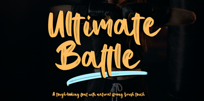 Ultimate Battle is a stylish and incredibly natural elegant handwritten font. This font was particularly crafted for those who need a strong and looks like a natural brush to their designs. Add it confidently to your projects, and you will love the results. This font is PUA encoded which means you can access all of the glyphs and swashes with ease!
 - Basketto by Mike Zuidgeest,
$12.50 Basketto is a carefully crafted, handmade sans serif font. Completely built from scratch in Adobe Illustrator. The glyphs are nice and bold, with sharp corners. Use Basketto for your product packaging, out of home adverting, food truck posters, festivals or the travel industry. This is my official font debut, I would love to hear from you to see my font on your product!