10,000 search results
(0.354 seconds)
- We Love Nature Leaves by kapitza,
$79.00 We Love Nature Leaves is an extensive and versatile collection of foliage illustrations. This font consists of 52 highly detailed drawings of twigs and leaves which can be used on their own or in combination with the other illustrations in the ‘We Love Nature’ font collection. All illustrations are drawn by hand and of the highest quality.
 - Red Ring by Letterhead Studio-YG,
$45.00 Red Ring and Red Square - the super-family of two families of fonts. The super-family includes sanserif Red Ring and geometric font Red Square. Families are synchronized by the number and weight of the typefaces and can be used either separately or together. Together Ring and Square produce a cumulative effect of Art Deco and Constructivism.
 - TE Dr. Mohammed by Tharwat Emara,
$50.00 Dr. Mohamed Font Combines the originality and modernity characterized by the strength of the letters and settings of theModulation marks used in the writing of newspapers, magazines, books, children's books and billboards easy to read and also features new combinations of letters make it was handwritten and this font contains the letters (Arabic - Farsi - Urdu - Latin).
 - Cats by Celebrity Fontz,
$24.99 Cats is a whimsical font made up of two different sets of cat alphabets in upper and lower cases. Happy cats are pictured in a variety of poses forming the letters they represent. If you love cats, you will not want to miss having the Cats font in your collection. Includes full set of accented characters.
 - ITC Fenice by ITC,
$29.99 ITC Fenice font (pronounced fe-nee-chay) is the work of designer Aldo Novarese and was influenced by the traditional designs of Didot, Bodoni, and Ibarra. It displays the fine serifs of a Bodoni but blends such characteristics with a contemporary structural style. ITC Fenice font is perfect for applications requiring the economical use of space.
 - Red Square by Letterhead Studio-YG,
$40.00 Red Ring and Red Square - the super-family of two families of fonts. The super-family includes sanserif Red Ring and geometric font Red Square. Families are synchronized by the number and weight of the typefaces and can be used either separately or together. Together Ring and Square produce a cumulative effect of Art Deco and Constructivism.
 - Art Deco Neue by Mom,
$49.00 ArtDeco Neue was design to give a strong characteristic to the titles of the Portuguese Art Magazine. From classic sans fonts (usual used by artists and galleries) this font developed with the double geometric lines of Art Deco architecture creating a contemporary design. The final result of each word depends of the choices the designer makes for each glyph.
 - ITC Don't Panic by ITC,
$29.99ITC Don't Panic's distressed shapes and craggy outlines evoke the feeling you get when you're just barely in control of a situation. This is type design on the edge. ITC Panic is further down the emotional track, when you've actually lost control and there is no hope in sight. Thompson says the inspiration for these faces arrived one day in the mail. I received an envelope that looked like it had a rough trip; the type that was stamped on it had a tired, ragged appearance. Ironically, the haggard envelope woke me up. I got excited and wanted to replicate the look as a font of type." Thompson designed ITC Don't Panic, then stood back and looked at it and decided it cried out for a more agitated companion. ITC Don't Panic gave birth to the positively psychotic offspring, ITC Panic. Both are all-cap designs with alternate characters in the unshift position. Creating an authentically disturbed appearance proved to be a challenge for Thompson. "I tried to design agitated characters, but they looked staged. So I tried multiple photocopies, but that didn't work. Eventually, I laser-printed the basic characters, wadded up the lasers, then flattened them out and stomped on them with heavy boots. The end result was scanned and used as the basis for the rest of the design." Thompson's work on web sites and multimedia has influenced his interest in type and typography that transcends the cool, unemotional nature of the computer." - ITC Panic by ITC,
$29.99ITC Don't Panic 's distressed shapes and craggy outlines evoke the feeling you get when you're just barely in control of a situation. This is type design on the edge. ITC Panic is further down the emotional track, when you've actually lost control and there is no hope in sight. Thompson says the inspiration for these faces arrived one day in the mail. I received an envelope that looked like it had a rough trip; the type that was stamped on it had a tired, ragged appearance. Ironically, the haggard envelope woke me up. I got excited and wanted to replicate the look as a font of type." Thompson designed ITC Don't Panic, then stood back and looked at it and decided it cried out for a more agitated companion. ITC Don't Panic gave birth to the positively psychotic offspring, ITC Panic. Both are all-cap designs with alternate characters in the unshift position. Creating an authentically disturbed appearance proved to be a challenge for Thompson. "I tried to design agitated characters, but they looked staged. So I tried multiple photocopies, but that didn't work. Eventually, I laser-printed the basic characters, wadded up the lasers, then flattened them out and stomped on them with heavy boots. The end result was scanned and used as the basis for the rest of the design." Thompson's work on web sites and multimedia has influenced his interest in type and typography that transcends the cool, unemotional nature of the computer." - Ayaha by Pedro Teixeira,
$18.00 Ayaha was inspired by brush lettering and has a friendly look. This beautiful script font is not conneted, that way you can letter spacing more or less without resulting in weird design. Ayaha, with alternate stylistic sets to add value to your projects. Good for branding, magazine, header, poster, logotype, packaging and so on.
 - Maree by Ashton,
$5.00 If you want to write something sincere and genuine but not too formal then this is the font for you. It is based on real handwriting, not some artificial calligraphy made to be either too haphazard or spiky or have loads of elegant flourishes but an ordinary person's writing, and designed to look as natural and as close to the original lettering as possible. Like any person's writing it is individual and distinctive, but so easy going on the eye those differences sit comfortably with you. It is friendly and open with easy to read glyphs both as lowercase and uppercase. The letters are relatively wide with clearly shaped distinct outlines. This font may be ideal for projects where you expect a wide readership with different reading abilities from young to old. When you are using this font a slightly bigger point size usually gives a better result so for a standard letter or similar you should size up to 15 points or more. Maree has been individually crafted to the smallest detail. To create a realistic handwriting font that looks relatively simple but works in a wide variety of languages requires a complexity and attention to detail most fonts will never require. This font in any ordinary business environment would never have been made, the effort required to make it too great, the length of time too long. There have been no shortcuts in this font, no automatic scanning or tracing, no automatic generation, no class kerning. Not only is each glyph individual but the width of letters, the height, the accents and the positions of the accents are all different. Even the line weight of the letters is designed to have natural variation but yet similar enough that the font appears as though it were written effortlessly in the same pen. And in order to keep the spacing consistent even though the letters have different widths, heights, lengths of descenders and so on, there are a vast number of kerning pairs, letter to letter, number to number, letter to number... All kerning has been individually assessed with an eye to proportionality taking in character shape, size and weight. For instance if you write a telephone number the numbers all sit close together but if you write a number before a letter such as in a UK post code or before a unit of measurement an extra little bit of space has been added which makes the number more distinct and therefore readable. That space is so natural to the eye that you don’t even know it is there. However even in the spacing allowance has been made for the fact it can’t be too perfect because when you write by hand the spacing is inconsistent. There have to be some letters which are too close or far apart otherwise the font would look artificial. For similar reasons if you are going to print out this font for a letter, etc, check the print version before you make any letter spacing changes because with the zoom functions in modern applications that uneven spacing and lettering can seem more pronounced than it actually is. When this font is printed out you will find it is surprisingly neat. This font is what it is, simple clear handwriting. You will not go wow. But if you want something unique and different and looks good on the page you won’t be disappointed. This font is not a work of art but it is a work of love. This font has a soul. How many fonts can you say that about?
 - First March by Nathatype,
$29.00 First March is a captivating display serif font designed with elegance and a touch of modernity. This typeface combines classic serif elements with a contemporary twist, offering a unique and refined look to your creative projects. The elegant letterforms with clean lines and balanced proportions adding a sense of sophistication and grace to your typography. The serif details provide a timeless appeal, while the modern twist brings a fresh and current vibe to the font. This combination creates a harmonious balance between tradition and innovation. What sets First March apart are its swinging endings in select letters. These graceful and subtle flourishes add a touch of dynamism and playfulness to the font, creating an engaging visual experience. The swinging endings bring a sense of movement and fluidity to the letterforms, enhancing the overall elegance of the typeface. Because of its legibility you can use this font in a variation of text sizes. Enjoy the available features here. Features: Ligatures Stylistic Sets Multilingual Supports PUA Encoded Numerals and Punctuations First March fits in headlines, logos, posters, titles, invitations, branding materials, print media, editorial layouts, website headers, and many more. Find out more ways to use this font by taking a look at the font preview. Thanks for purchasing our fonts. Hopefully, you have a great time using our font. Feel free to contact us anytime for further information or when you have trouble with the font. Thanks a lot and happy designing.
 - Glypster by Ardyanatypes,
$15.00 Glypster - Bold Aesthetic Serif Fonts is a font that has boldness in every line. This font's robust and bold style conveys a luxurious, elegant, retro, and aggressive feel. The serenity afforded by this font's blend of boldness and subtlety makes Glypster suitable for a wide variety of design choices. Apart from that, the strengths of Glypster are its ability to support multiple languages and additional features that can add interest to every design you make. In terms of marketing, Glypster is very suitable for purposes such as logos, posters, business cards, and many more, so you can explore the potential of this font for various designs. Glypster's simplicity, but still elegant and luxurious, makes it the right choice for all procedures.
 - Clown Alley JNL by Jeff Levine,
$29.00In the beginning of his typographic design work, Jeff Levine produced a large number of freeware dingbat fonts utilizing very rudimentary font creation software. Although popular in the world of home crafts, there were many issues inherent with those early font files. Jeff has chosen to clean up and update some of these fonts and make them commercially available. PLEASE NOTE: Refer to the license agreement regarding use of Jeff Levine's art-based fonts. Logos and derivative works made from these fonts are not allowed. - Floor Tiles JNL by Jeff Levine,
$29.00In the beginning of his typographic design work, Jeff Levine produced a large number of freeware dingbat fonts utilizing very rudimentary font creation software. Although popular in the world of home crafts, there were many issues inherent with those early font files. Jeff has chosen to clean up and update some of these fonts and make them commercially available. PLEASE NOTE: Refer to the license agreement regarding use of Jeff Levine's art-based fonts. Logos and derivative works made from these fonts are not allowed. - Dingits JNL by Jeff Levine,
$29.00In the beginning of his typographic design work, Jeff Levine produced a large number of freeware dingbat fonts utilizing very rudimentary font creation software. Although popular in the world of home crafts, there were many issues inherent with those early font files. Jeff has chosen to clean up and update some of these fonts and make them commercially available. PLEASE NOTE: Refer to the license agreement regarding use of Jeff Levine's art-based fonts. Logos and derivative works made from these fonts are not allowed. - Corleone by FontMesa,
$- Corleone was originally designed as a two font family in 2001 and offered for free. This year we've expanded the font family to twelve fonts including small caps and italics. While the new Corleone has been greatly refined and is a much more professional quality font we've decided to still offer the original two fonts for free. Corleone is the perfect font for t-shirts and other merch, the new small caps make this font stand out and bring attention to whatever you use it on. Corleone is the font you can't refuse. Tech notes: Corleone was designed after a famous movie logo in the 1970's with a title name that sounds a lot like The Grandfather if you know what I mean. The movies had three installments, my original font was patterned after the logo for the third movie, the new Corleone Primo and Secondo versions are patterned after the logos of the first two movies. The differences are noticed mostly in the lowercase letters. One thing you will not find in this font family is the puppeteer or puppet master hand because it's been registered as a separate trademark of Paramount Pictures. If you're using an application that works in layers then you'll be interested in the four extra over score glyphs included in some of the versions of this font. Sorry, MS Word does not work in layers so this feature will not work in MS Word. When you open up the glyph map in Adobe Creative Suite you should see the over score glyphs when you scroll down to the bottom. These extra over score glyphs allow you to extend the top line of a single capital letter, with four different lengths you should be able to mix and match to achieve the length that you desire. When using the over score glyphs it's best to divide your word or headline into separate text objects, the cap being one object and the remaining letters being the second. If you try using the over score glyphs on a single text object then with each over score that you add the text after it will get pushed down the line.
 - Manihot by PintassilgoPrints,
$26.00 Manihot is a cool display sans-serif font, loaded with interlocks, ligatures and alternates to render your message in a nice eye-catching way, topped off with the usual je-ne-sais-quoi of PintassilgoPrints fonts. The family brings rough and clean styles and yet a very useful dingbat font with dozens of tiny graphics to complement your words. It’s up, witty, honest and just impossible to ignore. Give it a go!
 - Victorian by ITC,
$39.00Freda Sack and Colin Brignall collaborated to produce the Victorian typeface. Their work was inspired by late 19th century display letterforms, and they sought to create a new ornate font in the same style. Victorian superbly reflects the refinement of the late 19th Century. Victorian Inline Shaded was designed by Nick Belshaw. He was inspired by late 19th century display letterforms, and sought to create a new ornate font in the same style. Victorian Inline Shaded superbly reflects the refinement of the late 19th Century. - Neue Latein by Spirit & Bones,
$33.00 This sans serif font carries the flair and mood our Schneidler Latein font family. The calligraphic appearance and the human sound are evident thanks to the preservation of some significant broad edged pen elements. The forms are reduced to the subtle level where they are simplified, but the essence still remains. The expressive and artistic expression of the Schneidler Latein continues to work like a background melody. Together they build a superfamily that works perfectly in combination with each other. More weights will follow soon.
 - ITC Founder's Caslon by ITC,
$40.99The Englishman William Caslon punchcut many roman, italic, and non-Latin typefaces from 1720 until his death in 1766. At that time most types were being imported to England from Dutch sources, so Caslon was influenced by the characteristics of Dutch types. He did, however, achieve a level of craft that enabled his recognition as the first great English punchcutter. Caslon's roman became so popular that it was known as the script of kings, although on the other side of the political spectrum (and the ocean), the Americans used it for their Declaration of Independence in 1776. The original Caslon specimen sheets and punches have long provided a fertile source for the range of types bearing his name. Identifying characteristics of most Caslons include a cap A with a scooped-out apex; a cap C with two full serifs; and in the italic, a swashed lowercase v and w. Caslon's types have achieved legendary status among printers and typographers, and are considered safe, solid, and dependable. ITC Founder's Caslon® was created in 1998 by Justin Howes, an English designer who used the resources of the St. Bride Printing Library in London to thoroughly research William Caslon and his types. As was common in the eighteenth century, Caslon had punchcut several different sizes of his types, and each size had a slightly different design. Howes digitized every size of type that Caslon cast, keeping their peculiarities and irregularities and reproducing them as they appeared on the printed page. This family has the 12 point, 30 point, 42 point, and Poster styles, as well as a full set of bona fide ornaments. In keeping with the original Caslon types, none of the sizes have bold weights, the numerals are all old style figures, and a full set of ligatures (some with quaint forms) are included. ITC Founder's Caslon® is a remarkable revival in the true sense of the word, and works beautifully in graphic designs or texts that require an authentic English or historical flavor. - Sharung by Twinletter,
$14.00 Sharung, our newest font family, is now available! This font family is opulent and one-of-a-kind. This collection includes 18 various styles, making it ideal for a wide range of projects. Each style was built from the ground up to optimize beauty and personality. This font was created specifically for a wide range of display design and branding requirements. Sharung has everything you’ll need to create stunning graphics, including titles, texts, banners, posters, and more. Get a unique design look with this font right now! of course, your various design projects will be perfect and extraordinary if you use this font because this font is equipped with a font family, both for titles and subtitles and sentence text, start using our fonts for your extraordinary projects.
 - Ring by Ochakov,
$9.00 First of all, Ring font has a little story. It was created as an example for Typography Exhibition in Moscow. And the font was immediately awarded! 10 years later, I decided to continue working on it and improve this font. Ring - really circular typeface. I felt inspired by Bauhaus. I've always wanted to design something similar. Ring is a cool and geometric-styled font. Expertly designed to make your creation look out of this world, this font will look gorgeous on a variety of ideas. This font is ideal for writing web designs, business cards, or pretty much anything else that requires a unique touch. Ring font comes in 8 weights and 16 styles and this is just the beginning. The beginning of a further big font family called Ring!
 - P22 Declaration by P22 Type Foundry,
$24.95 The new Declaration font set from P22 features two lettering fonts based on the Declaration of Independence of the United States of America. A script font that features the look of classic 18th Century penmanship, with a slightly irregular edge, as found on documents made with ink quill pens on vellum or parchment. The accompanying Blackletter font is also derived from the Declaration of Independence as it was used for emphasis and of course the famous document title itself. A third font, which features the signatures of the signers of the Declaration of Independence, is also included.
 - Leipziger Antiqua by profonts,
$41.99 The original typeface was designed by Albert Kapr between 1971 and 1973 for Typoart in Dresden. Kapr was the font designer and teacher as well as book author on type design of former East Germany. He also was an expert on this kind of type design, and thus, it is no surprise that he created Leipziger Antiqua, a design combining features of both Latin and broken scripts. The result is a stunning and unique gem from earlier times although it does not come along too distinguished or artsy. The digital version of Leipziger Antiqua was developed by Ralph M. Unger exclusively for profonts in 2005. During the work, Unger fell so deeply in love with this typeface that he couldn't help but add an expert font with small caps etc.
 - String by Lián Types,
$45.00 Inspired by the sound of acoustic guitars, delicacy of harps and elegance of the engrossers script, String is a trendy monoline font which will for sure make unique layouts for your pieces of design. Combining String with String Hole in the same word is a good idea when a more playful rhythm is needed. The font works particularly well when standing on photographs, so be ready to use it in magazines with food, landscapes or super models. I like thinking of String as a distilled version of Erotica. A more “pure” relative of hers. When I designed Erotica, I was so in love with the spencerian style that I knew it'd be hard to just abandon it. With that in mind, this time my aim was to take the subtlety of it to the limit. So, in order to do that I had to find out what was actually the secret of its beauty. I found that the essence of Erotica, in other words, its ductus was the most responsible. The result is a font made of hairlines with a lot of emphasis on the pureness of the form and, (with a lot of inspiration in music) the sensation of continuity between its letters as if they were written with a string. Try String and its flowing melody.
 - Kremlin Pro by ParaType,
$30.00 The first version of Kremlin was designed at ParaType (ParaGraph) in 1995 by Tagir Safayev. Based on an informal handwriting. Kremlin is a Russian word for a fortress or a citadel. The reason why the author selected this word for the font name is not quite clear even for him. Probably the appearance of the text line set in this font resembled a tight fence. Later the font was expanded in character set and got two style variations with extended proportions. The suffix "Pro" in the name was added to distinguish the new version from the previous one. The derivative work was done by Dmitry Kirsanov and Gennady Fridman in 2010. The font is recommended for advertising and display typography.
 - 1510 Nancy by GLC,
$20.00 This set of decorated initial letters was inspired by those used in 1510 in Nancy (France, Lorraine) for printing of "Recueil ou croniques des hystoires des royaulmes d'Austrasie ou France orientale[...]" Author Symphorien Champion, unknown printer. There were three sorts of initials family, but only one complete and clear, except a very few characters. The printer used some letters to represent others, as V, turned over to make a A, D to make a Q, M for E, So, the reconstruction was a little less difficult. Thorn, Eth, L slash and O slash were also added. The original font's letters was only drawn in white on a black background only, but it was tempting to propose a negative version in black on white. A few letters have multiple appearance, but only the A was clear enough to be reproduced. It can be used as variously as web-site titles, posters and flyer design, publishing texts looking like ancient ones, or greeting cards, all various sorts of presentations, as a very decorative, elegant and luxurious additional font... This font supports strong enlargements revealing its fine details and remaining very smart. Its original medieval height is about one inch equivalent to about three to four lines of characters. This font may be used with all our blackletter fonts, but as well with "1543 Humane Jenson", "1557 Italic" and "1742 Civilite", without any fear about anachronism.
 - Cat e Poultry by Proportional Lime,
$19.99 Love them or hate them Cats are one of the most successful animals on the planet. If they had thumbs we would all be in trouble. Fortunately for us these four legged sharks have managed to domesticate us and we are able to coexist peacefully. So this font is to share the joy of being blessed with the presence of such noble animals be it those of the Pantherinae Felidae or the not so humble Felis Catus (Domestic Cat). Why the Turkey? Well... you will have to buy the font to find out.
 - SK Pangramma by Shriftovik,
$48.00 SK Pangramma is a modern universal geometric typeface. For greater universality, it was developed in two stylistic variations: sans serif and slab serif. The uniqueness of the typeface is supported by stylistic alternatives that give the character set the spirit of modern typeface design. The SK Pangramma typeface is named this way because it supports more than 200 languages, including the Extended Latin Alphabet, Cyrillic, and even Greek. Thanks to a wide range of characters, alternatives, and two stylistic variations, the typeface is great for design projects of any complexity, no matter whether it is printed products or web design.
 - Quenda by Marc Lohner,
$25.00 Quenda is a small sans-serif family comprising six weights: thin to heavy. Due to its rounded terminals and a slight handwritten look, Quenda has a friendly and warm appearance. Its main purposes are for advertising and branding projects. You will find lots of ligatures and a total of 593 glyphs in each style. With extensive language support, lining-, old-style- and tabular-figures, a slashed zero, self-building fractions, superscript and subscript digits, a set of arrows as well as thousands of kerning pairs, Quenda is ready to contribute to your next design project. Designed by Marc Lohner in 2015.
 - Cherily Blussom by PizzaDude.dk,
$15.00 Cherily Blussom was made with an inky pen, and little was done to correct the blurry edges. That's why Cherry Blussom stands out in such an authentic way! Comes with both ligatures and alternates - combine them and spice up your text!
 - Speedy by 4RM Font,
$26.00 Inspired by high speed, this font is made in only black in an italic style, giving this font an aura full of energy. Speedy fonts are suitable for use in futuristic themed graphic designs
 - Blanket by Eclectotype,
$30.00 Blanket is a friendly, baby-soft typeface with a gentle slant. With the warmth of an italic but less of the speed, it is designed primarily for use on child oriented material. The ‘schoolbook’ a and g are default, but the more adult double storey versions are available through stylistic sets / stylistic alternates. Blanket is child friendly without being childish. Typographically sophisticated, it features a wealth of figure styles, automatic fractions, ligatures, alternates, case sensitive forms and a small spattering of swashes. Although the intent was to make a typeface fit for children’s books, the finished product works well anywhere a casual (but not sloppy) look is desired.
 - Louisa by Julia Hanft,
$30.00 Louisa is a monospaced font-family designed and optimized specifically for small font sizes. But even as headline font it looks good. It has a very good distinguishability of letter forms and legibility even in longer text paragraphs. The character of Louisa is a combination of strong elements and warm, friendly forms. The font family is not only designed for coding and tabular layout, but can be used in different fields of communication design. Therefore it provides two stylistic sets with different letter forms: one with the look of serious modern typewriter font, the second with more soft letter forms and elements of a real italic. Additionally it consists oldstyle numbers (and of course tabular numbers) and a set arrows. The font is available in four styles: regular, italic, bold and bold italic.
 - Tomoli by PizzaDude.dk,
$20.00Tomoli is short for "things of more or less importance". In this dingbat font you'll find 52 stylized drawings of animals, food and lots of different stuff - that is of more or less importance! :) Furthermore, the drawings are made of remarkbly steady lines! - Go have a look! - Teutonia by HiH,
$10.00 How can Teutonia be called “Art Nouveau” with all those straight lines? It seems like a contradiction. In fact, however, Art Nouveau embraces a rather wide variety of stylistic approaches. Five well-known examples in the field of architecture serve to illustrate the range of diversity in Art Nouveau: Saarinen’s Helsinki Railroad Station, Hoffman’s Palais Stocklet in Brussels, Lechner’s Museum of Applied Arts on Budapest, Mackintosh’s Glasgow School of Art and Gaudi’s Sagrada Familia in Barcelona. Only the last fits comfortably within the common perception of Art Nouveau. Whereas Gaudi would avoid the straight line as much as possible, Macintosh seemed to employ it as much as possible. The uniting factor is that they all represent “new art” -- an attempt to look things differently than the previous generation. Even when they draw on the past -- e.g. Lechner in the use of traditional Hungarian folk art -- the totality of the expression in new. Teutonia clearly shows its blackletter roots in the ‘D’ and the ‘M.’ Roos & Junge of Offenbach am Main in Germany produced Teutonia in a "back-to-basics" effort that has seen many quite similar attempts in the field of topography. In 1883, Baltimore Type Foundry released its Geometric series. In 1910, Geza Farago in Budapest used a similar letter design on a Tungsram light bulb poster. In 1919 Theo van Doesburg, a founder with Mondrian and others of the De Stijl movement, designed an alphabet using rectangles only -- no diagonals. In 1923 Joost Schmidt at Bauhaus in Weimer took the same approach for a Constructivist exhibit poster. The 1996 Agfatype Collection catalog lists a Geometric in light, bold and italic that is very close to the old Baltimore version. Even though none of these designs took the world by storm, they all made a contribution to our understanding of letterforms and how we use them. Teutonia is compact and surprisingly readable at 12 points in print, but does not do as well on the screen. Extra leading is suggested. Four ligatures are supplied: ch, ck, sch and tz. The numerals are tabular.
 - Christmas Peachy by Yoga Letter,
$20.00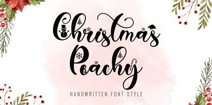 Christmas Peachy is a charming and festive handwritten font adorned with delightful Christmas ornaments. Its elegant strokes and decorative accents bring a touch of holiday magic to your design projects, making it perfect for creating warm and inviting Christmas-themed materials.
 - Dortmunder Ecke by Hanoded,
$15.00 Dortmunder Ecke ("Dortmund Corner") is a clean, all caps font inspired by Cubism. It really has nothing to do with the city in Germany, but the name stuck and I kept it that way. Comes with a square amount of diacritics.
 - Chieftain NF by Nick's Fonts,
$10.00 The American Typefounders 1893 specimen book included the pattern for this face, originally called Pontiac. Its subtle idiosyncrasies make it warm and inviting. Both versions of this font support the Latin 1252, Central European 1250, Turkish 1254 and Baltic 1257 codepages.