10,000 search results
(0.124 seconds)
- Thorfin by Mans Greback,
$39.00 Thorfin is a sharp serif typeface. Drawn and created between 2020 to 2022, this modern lettering has a distinct personality while maintaining a regularity of a body text. Thorfin gives any project a smart character with its geometric shapes and crisp edges. The Thorfin family consist of 14 fonts, such as Thin, Light, Regular, Medium, Bold, Black and Italic. Also includes a variable font! Only one font file, but the file contains multiple styles. Use the sliders in Illustrator, Photoshop or InDesign to manually set any weight and width. This gives you not only the predefined styles, but instead more than a thousand ways to customize the type to the exact look your project requires. More info about Variable Fonts: https://mansgreback.com/variable-fonts The font is built with advanced OpenType functionality and has a guaranteed top-notch quality, containing stylistic and contextual alternates, ligatures and more features; all to give you full control and customizability. It has extensive lingual support, covering all Latin-based languages, from Northern Europe to South Africa, from America to South-East Asia. It contains all characters and symbols you'll ever need, including all punctuation and numbers.
 - Live Grotesk by Matt Chansky,
$18.00 An exquisite neutral body copy and memorable modern headline font – all under one pixel-perfect font family. Live Grotesk is no ordinary font, in fact it's two fonts in one, seamlessly working together. When big messaging requires a charismatic headline font to activate layout designs, amplify attention, and delight audiences with brand retention – turn on "FM," Live Grotesk's headline font. When you need a body copy font that is space-efficient, a highly refined neutral with a high x-height to help with readability, particularly on screens – Live Grotesk is for you. Stylish simplicity and neutrality are key components of the signature body copy look. This is why Live Grotesk is a uniquely crafted modern font for today's modern creatives. With a variety of weights, from light to bold, you'll also enjoy the robust offering of multilingual glyphs, plus a handful of extras like the estimated symbol, directional arrows, and helpful UX characters. When the creative direction calls for memorable, approachable, and consumable typography, consider Live Grotesk to elevate your marketing tactics. It's a font alive with versatility, that's why it's called Live Grotesk.
 - Bueno by FolkCraft Studio,
$21.42 Elevate your design game with the Bueno Font Family, a stunning creation by the talented team at FolkCraft Studio. From extra light to extra bold, each style boasts a unique, detailed, and handmade look that sets it apart. Dive into the world of possibilities with Bueno Font. Experience its captivating allure in all caps with wide spacing for a classy aesthetic, or let it shine in a mix of capital and lowercase letters for a timeless appeal that transcends trends. Envision the Bueno Font Family as the centerpiece of your creative projects. Its versatility makes it perfect for gorgeous logos, captivating displays, elegant headers, enchanting invitations, memorable save-the-dates, and timeless wedding designs. Imagine the impact it can have on titles, web layouts, and comprehensive branding strategies. Don't miss out on the opportunity to enhance your designs with the Bueno Font Family! Ideal for online uses and printing, this font collection is your ticket to creating sophisticated and stylish visuals that leave a lasting impression. Perfect for a wide range of applications, from logos to web layouts, this font family is a must-have for designers seeking to make a statement.
 - Behtab by Naghi Naghachian,
$108.00 Behtab is a sans-serif font family designed by Naghi Naghashian in tree weights. Behtab Light, Behtab Regular and Behtab Bold. It is extremely legible even in very small size. This font family is a contribution to modernisation the Arabic typography, gives the font design of Arabic letters real typographic arrangement und provides more typographic flexibility. Behtab supports Arabic, Persian ( Farsi ) and Urdu. It also includes proportional and tabular numerals for the supported languages. Behtab design fulfills the following needs: A Explicitly crafted for use in electronic media fulfills the demands of electronic communication. B Suitability for multiple applications. Gives the widest potential acceptability. C Extreme legibility not only in small sizes, but also when the type is filtered or skewed, e.g., in Photoshop or Illustrator. Bauhaus Arabic’s simplified forms may be artificial obliqued in InDesign or Illustrator, without any loss in quality for the effected text. D An attractive typographic image. Behtab was developed for multiple languages and writing conventions. Behtab Arabic supports Arabic, Persian and Urdu. It also includes proportional and tabular numerals for the supported languages. E The highest degree of calligraphic grace and the clarity of geometric typography.
 - Giom Mod by Ardyanatypes,
$15.00 Giom Mod is a unique and elegant display font with a distinctive serif style. This font offers nine different thickness options, ranging from Thin to Black, providing a wide range of choices for various applications. Each thickness of Giom Mod has its own unique characteristics, allowing you to select the one that best suits your design aesthetics. For example, Thin may be suitable for light and elegant designs, while Black can be used for more dramatic and bold appearances. Furthermore, Giom Mod comes equipped with various OpenType features. These include features such as ligatures, which allow specific characters to combine beautifully, and alternative letterforms that provide more design options. With these features, you can create more engaging and unique text elements in your designs. Additionally, Giom Mod is designed to support multiple languages, making it suitable for use in many countries. This makes it highly versatile and appropriate for a wide range of multilingual design projects. So, if you are looking for a font that combines the beauty of serif with various thickness options, useful OpenType features, and multilingual support, Giom Mod is the perfect choice to meet your design needs.
 - Fulgate by Flavortype,
$15.00 “Luxury in simplicity”. A Family of Luxury Fonts called Fulgate. A Hype of summer themed bring us to expressing a thirsty of creating a product that can help you to choosing a fonts to your creations. Like as we are on the preview above, how the fonts can "stands" within your design. Since Fulgate are created on a 6 weight from Thin, Light, Regular, Medium, Semibold, Bold. You won’t be worried which one to fit to your creative design. Also, You can Mix it up all of it without worrying design collision. Fulgate also comes with opentype features. The one was stand out was Capital Swash, it’s replacing the First letter that typed on Capital. even if you are type with all caps, it still stand out. If you think that all caps are not quite fit, write on with lowercase and turn on the features of Small Caps, a shape of capital but with lower heights. Lowercase also have a few make up with Alternate Characters, just to be noted, not all lowercase characters have an alternates, to keep a luxury feel and avoiding messy. The last are a feature on the numerical, Ordinals, Subscript, Superscript, and Fraction.
 - Core Sans NR by S-Core,
$15.00 The Core Sans NR Family is a part of the Core Sans Series, such as Core Sans N, Core Sans N SC, Core Sans M, and Core Sans G. This family is the rounded version of Core Sans N family. Letters in the Core Sans NR Family are designed with genuine neo-grotesque and neutral shapes without any decorative distractions. The spaces between individual letter forms are precisely adjusted to create the perfect typesetting. The Core Sans NR Family consists of 3 widths (Condensed, Normal, Extended), 9 weights (Thin, ExtraLight, Light, Regular, Medium, Bold, ExtraBold, Heavy, Black), and Italics for each format. It also supports WGL4, which provides a wide range of character sets (CE, Greek, Cyrillic and Eastern European characters). Each font includes support for Tabular numbers, Arrows, Box drawings, Geometric shapes, Block elements, Mathematical operators, Miscellaneous symbols and Opentype Features such as Proportional Figures, Numerators, Denominators, Superscript, Scientific Inferiors, Subscript, Fractions and Standard Ligatures. The Core Sans NR Family provides both OpenType (.OTF) and TrueType (.TTF) versions in the same package. We highly recommend it for use in books, web pages, screen displays, and so on.
 - Core Sans WHH Head NR by S-Core,
$15.00The Core Sans NR Family is a part of the Core Sans Series, such as Core Sans N, Core Sans N SC, Core Sans M, and Core Sans G. This family is the rounded version of Core Sans N family. Letters in the Core Sans NR Family are designed with genuine neo-grotesque and neutral shapes without any decorative distractions. The spaces between individual letter forms are precisely adjusted to create the perfect typesetting. The Core Sans NR Family consists of 3 widths (Condensed, Normal, Extended), 9 weights (Thin, ExtraLight, Light, Regular, Medium, Bold, ExtraBold, Heavy, Black), and Italics for each format. It also supports WGL4, which provides a wide range of character sets (CE, Greek, Cyrillic and Eastern European characters). Each font includes support for Tabular numbers, Arrows, Box drawings, Geometric shapes, Block elements, Mathematical operators, Miscellaneous symbols and Opentype Features such as Proportional Figures, Numerators, Denominators, Superscript, Scientific Inferiors, Subscript, Fractions and Standard Ligatures. The Core Sans NR Family provides both OpenType (.OTF) and TrueType (.TTF) versions in the same package. We highly recommend it for use in books, web pages, screen displays, and so on. - ITC New Rennie Mackintosh by ITC,
$50.99 Looking to add a little Arts & Crafts flavor to your next project? Perhaps you just need a distinctive, new sans serif design? And one with a large international character set. In either case, ITC New Rennie Mackintosh™ may be the typeface for you. Its narrow proportions saves space, and the design shines at large sizes. While it can be an excellent typeface for Art Nouveau flavored labels, name tags and chapter call-outs, this is a suite of fonts that you can also turn to for a bevy of print and on screen uses. Games and apps, as well as print headlines and menus all benefit from ITC New Rennie Mackintosh’s vintage vibe. Based on Phill Grimshaw’s original 1996 design, Monotype Studio designers reimagined the iconic family, added lowercase characters, a new weight structure of light, regular and a more robust bold design; each with an italic counterpart. In addition, a large international character set that include support for many Western and Eastern European languages – including Cyrillic and Greek – give the family a deep typographic bench. An added benefit: the new designs can also be combined with Grimshaw’s original ornament and initial character fonts.
 - Gilan by Naghi Naghachian,
$105.00 Gilan is a sans-serif font family designed by Naghi Naghashian in tree weights, Gilan Light, Gilan Medium and Gilan Bold. It is extremely legible even in very small size. This font family is a contribution to modernisation the Arabic typography, gives the font design of Arabic letters real typographic arrangement und provides more typographic flexibility. Gilan supports Arabic, Persian ( Farsi ) and Urdu. It also includes proportional and tabular numerals for the supported languages. Gilan design fulfills the following needs: A Explicitly crafted for use in electronic media fulfills the demands of electronic communication. B Suitability for multiple applications. Gives the widest potential acceptability. C Extreme legibility not only in small sizes, but also when the type is filtered or skewed, e.g., in Photoshop or Illustrator. Gilan’s simplified forms may be artificial obliqued in InDesign or Illustrator, without any loss in quality for the effected text. D An attractive typographic image. Gilan was developed for multiple languages and writing conventions. Jaleh supports Arabic, Persian and Urdu. It also includes proportional and tabular numerals for the supported languages. E The highest degree of calligraphic grace and the clarity of geometric typography.
 - Ravensara Sans by NaumType,
$19.00 Ravensara Sans — fashionable, high-contrast humanist sans. Ravensara family was born from the idea of taking the concept of Didone to weight extremes. Ravensara Sans is available in 7 weights, including Thin, Light, Regular, Medium, SemiBold, Bold and Black. Depending on weight, Ravensara Sans, like the other members of this font family, show quite different behavior. Heavy weights function above all as display fonts and work particularly great in all-caps. Medium weights of Ravensara Sans represent humanist grotesque, descended from the pages of fashion magazines. Thin weight perfectly complements the others if you need an especially wide choice of weights. Also, all the weights work great in all-caps. Ravensara Sans is a part of the Ravensara superfamily, united by the same anatomy, which currently also includes Ravensara Serif and Ravensara Stencil. If you need to achieve classic Haute Couture look — Ravensara Sans is a great choice. It’s a perfect choice for fashion logos, headlines, short texts, magazines, due to its simplicity looks great in oversize typography, branding, identity, website design, album art, covers, posters, advertising, etc. Ravensara Sans extends multilingual support to Basic Latin, Western European, Euro, Catalan, Baltic, Turkish, Central European, Pan African Latin and Afrikaans.
 - Presley Slab by Sudtipos,
$49.00 The lightest weight of Presley Slab takes inspiration from a late nineteenth-century type specimen, but what began as a decorative and delicate contrasted serif stirred Alejandro Paul’s imagination to conjure voluptuous reverse contrasted letterforms. These became the heaviest weight of Presley Slab, which nods to the lacquered hairstyles from the birth of rock ’n roll with its idiosyncratic ball terminals. Its playful allure and swagger remains visible in the weights that stand between these two extremes but as the curls loosened, many things happened in the design process including the appearance of swashes and alternates. Presley Slab’s personality has breadth; it is a fun, confident and contemporary palette of letters that will perfectly perform for any job, from editorial design to branding. The Extra Bold and Black weights are a powerful option at large sizes for use on posters and billboards; the graceful Thin and Extra Light weights are delicate options for packaging design or fashion branding. Despite it conjuring images of mid-century music halls, Presley Slab is also staunchly European in it’s aesthetic, offering everything from good-humour to elegance with its unique touches.
 - Neue Frutiger Tamil by Linotype,
$99.00 Neue Frutiger Tamil was created by Pria Ravichandran and a team of designers and font engineers from the Monotype Studio, under the direction of Monotype type director Akira Kobayashi. The family is available in 5 weights from Light to Bold to support the Tamil script. The typographic forms of Neue Frutiger Tamil are familiar and friendly. The Tamil shows traces of elements that is reminiscent of the calligraphic influences found in the 20th-century designs. Reflecting the modern typographic needs of the Tamil script, this type family is in the upright style. These two factors ensure that the two scripts, Tamil, and Latin pair elegantly. The result, Neue Frutiger Tamil, is an eclectic contemporary type family that bridges the past and the present. Neue Frutiger Tamil embodies the same warmth and clarity as Adrian Frutiger's original design, but allows brands to maintain their visual identity, and communicate with a consistent tone of voice, regardless of the language. It is part of the Neue Frutiger World collection, offering linguistic versatility across environments – suited to branding and corporate identity, advertising, signage, wayfinding, print, and digital environments.
 - Core Sans M by S-Core,
$25.00 The Core Sans M Family is a part of the Core Sans Series, such as Core Sans N, Core Sans N Rounded, Core Sans N SC, and Core Sans G. This font family has open and square letter shapes, and overall rounded finishes provide a soft and friendly appearance. Simple and modern shapes with a tall x-height make the text legible and the spaces between individual letter forms are precisely adjusted to create the perfect typesetting. The Core Sans M Family consists of 2 widths (Condensed, Normal), 7 weights (ExtraLight, Light, Regular, Medium, Bold, ExtraBold, Heavy), and Italics for each format. Small Caps versions are also available. It supports WGL4, which provides a wide range of character sets (CE, Greek, Cyrillic and Eastern European characters). Each font includes support for Tabular numbers, Arrows, Box drawings, Geometric shapes, Block elements, Mathematical operators, Miscellaneous symbols and Opentype Features such as Proportional Figures, Numerators, Denominators, Superscript, Scientific Inferiors, Subscript, Fractions and Standard Ligatures. The Core Sans M Family provides both OpenType (.OTF) and TrueType (.TTF) versions in the same package. We highly recommend it for use in books, web pages, screen displays, and so on.
 - Respondent by Mans Greback,
$49.00 Respondent is a flowing and handwritten font. Drawn, created and published by Mans Greback in 2021, this script family has a genuine and empathic personality, while being wild and vivid. Respondent can be used in a product or company logo, or in any digital design where you want the appearance of true, released handwriting. Originally inspired by the lettering on the cover of GTA Vice City, over the design process is has evolved to a very diverse typeface that can be used in a wide variety of contexts, much more than a Grand Theft Auto font. The Respondent Family is provided in five weights: Thin, Light, Medium, Bold and Black The different styles supplies a flexibility in both character and size. The font is built with advanced OpenType functionality and has a guaranteed top-notch quality, containing stylistic and contextual alternates, ligatures and more features; all to give you full control and customizability. It has extensive lingual support, covering all Latin-based languages, from North Europe to South Africa, from America to South-East Asia. It contains all characters and symbols you'll ever need, including all punctuation and numbers.
 - NaNa Arabic by Naghi Naghachian,
$75.00 NaNa Arabic is a new creation of Naghi Naghashian. It was developed in 2012/2013 on the basis of specific research and analysis of Arabic characters and definition of their structure. This innovation is a contribution to the modernisation of Arabic typography, giving the font design of Arabic letters real typographic arrangement and providing greater typographic flexibility. This step was necessary after more than two hundred years of relative stagnation in Arabic font design. NaNa Arabic supports Arabic, Persian and Urdu. It also includes proportional and tabular numerals for the supported languages. The NaNa Arabic Font Family is available in four weights: Thin, Light, Regular and Bold. The design of this font family is inspired by two classic scripts: Kufic and Naskh. The quasi-geometric character of Kofic melds with the calligraphic grace of Naskh, which was invented by Iben Moghleh, an Iranian savant of the ninth century. He lived in Baghdad and was assassinated at the instigation of an Abbasid caliph. He was a polymath and a renowned scholar. I dedicate the design of this font family to the memory of this great man.
 - Aviano Sans by insigne,
$24.99 insigne returns to Aviano’s classically inspired forms with this sans serif variant. Wide and geometric, Aviano Sans is perfect for any job that calls for a chic and dignified sans serif as seen in this demonstration video. Aviano Sans has consistently topped insigne’s best-seller chart for more than seven years, earning its stripes as an expressive and versatile typeface that belongs in any designer’s tool chest. Aviano Sans' five weights of Regular, Thin, Light, Bold, and Black include 42 Art Deco-inspired alternate characters that can turn you and your project into a force to be reckoned with. The typeface family also includes 40 unique ligatures that add a bit of swagger to this serious sans. insigne released the first Aviano in early 2007. Its beautifully drawn extended letterforms were a hit with designers, and Aviano quickly became one of insigne’s most popular offerings. The simplified variant of Aviano Sans followed soon after, paring down the structure around the core concept. The Aviano series continues to develop further today with new variants on this classic form. Be sure to check out the rest of the Aviano series, including Aviano, Aviano Serif, Aviano Flare, and Aviano Contrast.
 - Kamane by Naghi Naghachian,
$108.00 Kamane is a new font family, designed by Naghi Naghashian. It is based on classic calligraphic “Naskh” with the modern typographic metric. It is a Font family, in 3 weights, Light, Regular and Bold. This font is a contribution to modernisation of Arabic typography, gives the font design of Arabic letters real typographic arrangement und provides more typographic flexibility. Kamane supports Arabic, Persian and Urdu. It also includes proportional and tabular numerals for the supported languages. Kamane design fulfils the following needs: A Explicitly crafted for use in electronic media fulfills the demands of electronic communication. B Suitability for multiple applications. Gives the widest potential acceptability. C Extreme legibility not only in small sizes, but also when the type is filtered or skewed, e.g., in Photoshop or Illustrator. Nima’s simplified forms may be artificial obliqued in InDesign or Illustrator, without any loss in quality for the effected text. D An attractive typographic image. Kamane was developed for multiple languages and writing conventions. Kamane supports Arabic, Persian and Urdu. It also includes proportional and tabular numerals for the supported languages. E The highest degree of calligraphic grace and the clarity of geometric typography.
 - Anger & Wrath by Omaikraf Studio,
$10.00 Introducing "Anger Style": Unleash the Power of Emotion Are you ready to harness the raw energy of emotions and bring them to life in your designs? Look no further than "Anger Style," an electrifying and dynamic font that will leave a lasting impact on your audience. Designed by our team of expert font designers, "Anger Style" is a captivating blend of intensity, power, and expressiveness. Possible Design Uses: "Anger Style" is a font that excels in making a bold statement. Its commanding presence and fiery nature make it perfect for various design applications, including: Headlines and Titles: Grab your audience's attention and make a lasting impression with powerful headlines that demand to be noticed. Logos and Branding: Infuse your brand identity with passion and intensity, creating a memorable and distinct visual presence. Posters and Flyers: Advertise events, concerts, or special promotions with eye-catching designs that embody rebelliousness and energy. Book Covers: Create striking covers that captivate readers and convey the emotional depth of your story or message. Apparel and Merchandise: Add an edgy touch to your clothing designs, making a statement that resonates with your target audience. Unique Qualities: What sets "Anger Style" apart from other fonts is its ability to evoke a wide range of emotions, not just anger. It transcends its name, allowing you to express passion, determination, and rebellion through your designs. Its versatility lies in its bold strokes and sharp edges, which convey a sense of intensity and power. By choosing "Anger Style," you gain access to a font that embodies the very essence of raw human emotion. Font Pairing: "Anger Style" pairs exceptionally well with other fonts that complement its intensity and create harmonious combinations. Consider combining it with: "Bold Sans Serifs": The clean lines and strong presence of a bold sans serif font can enhance the impact of "Anger Style," creating a balanced and eye-catching composition. "Elegant Script Fonts": To add a touch of contrast and sophistication, pairing "Anger Style" with an elegant script font can create a visually engaging and dynamic design. Functional Aspects: "Anger Style" offers a range of functional aspects designed to enhance your creative possibilities: Styles: "Anger Style" is available in bold and regular styles, allowing you to emphasize different levels of intensity within your designs. Character Sets: The font includes an extensive character set, covering uppercase and lowercase letters, numbers, punctuation marks, and special characters. This ensures versatility and legibility across various design projects. Special Features: "Anger Style" includes stylistic alternates and ligatures, providing you with additional design options and allowing you to create a truly customized and unique look.
 - Birth Of A Hero Pro by CheapProFonts,
$10.00 A grunged-up variant of a classic font – with ultra-tight spacing (uppercase letters are mostly overlapping). Perfect for that worn but stylish look, now with hugely extended language support. ALL fonts from CheapProFonts have very extensive language support: They contain some unusual diacritic letters (some of which are contained in the Latin Extended-B Unicode block) supporting: Cornish, Filipino (Tagalog), Guarani, Luxembourgian, Malagasy, Romanian, Ulithian and Welsh. They also contain all glyphs in the Latin Extended-A Unicode block (which among others cover the Central European and Baltic areas) supporting: Afrikaans, Belarusian (Lacinka), Bosnian, Catalan, Chichewa, Croatian, Czech, Dutch, Esperanto, Greenlandic, Hungarian, Kashubian, Kurdish (Kurmanji), Latvian, Lithuanian, Maltese, Maori, Polish, Saami (Inari), Saami (North), Serbian (latin), Slovak(ian), Slovene, Sorbian (Lower), Sorbian (Upper), Turkish and Turkmen. And they of course contain all the usual “western” glyphs supporting: Albanian, Basque, Breton, Chamorro, Danish, Estonian, Faroese, Finnish, French, Frisian, Galican, German, Icelandic, Indonesian, Irish (Gaelic), Italian, Northern Sotho, Norwegian, Occitan, Portuguese, Rhaeto-Romance, Sami (Lule), Sami (South), Scots (Gaelic), Spanish, Swedish, Tswana, Walloon and Yapese.
 - Aeroport by Brownfox,
$45.00 Aeroport is a new typeface in the spirit of both German geometric sans serifs and Swiss neogrotesques. Its deliberately wide proportions and relatively short capitals account for the excellent way the type carries the line. Its short ascenders and descenders allow for very tight leading. When used in large point sizes, Aeroport reveals its industrial ancestry and its unconventional design: the somewhat unbalanced top of the lowercase a, the capital B that has deliberately not been compensated optically, the overly wide capital M. In smaller sizes the type creates a starkly different effect: its measured widths and low contrast make a text setting appear neutral and homogenous. This versatility is what makes Aeroport a multipurpose sans serif suitable for a wide variety of typographic applications. The family includes four weights with their italics and a monospased style. Character set includes an alternate lowercase a, two sets of figures and currency symbols, uppercase punctuation, and a set of arrows. Includes Latin and Cyrillic sets supporting over forty languages. Designed by Gayaneh Bagdasaryan & Vyacheslav Kirilenko, 2017.
 - Secession by HiH,
$14.00 Secession is a very readable typeface, suitable for short blocks of text. If you have grown weary of the standard sans-serif faces one sees all the time, you may want to use Secession as a fresh and distinctive substitute. Like Kunstler Grotesk, Secession is one of a number of typeface designs that attempts to reconcile Germany’s blackletter tradition with the international familiarity of roman letterforms in a simple, robust design suitable for meeting the demands of a modern industrial economy, while rejecting the extraneous ornamentation of the departing Victorian era. Unlike Kunstler Grotesk, Secession was designed with a lower case. Secession Bold was originally jointly released as Halbfette Secession by Bauer & Company of Stuttgart and H. Berthold AG of Berlin around 1898. The rest of the family was designed by HiH. The basic family of four: Text, Oblique, Bold and BoldOblique are available in two versions: one set with the standard contemporary lining or ranging numerals for spreadsheets and tables and one set of old-style figures (with OSF in font name) for use with text. The two versions of the basic family, Secession and Secession OSF were released in July 2006. Cousins include ExtraBold, SCOSF Text, and two multi-lingual versions of the text weight. Secession ML includes the Latin Extended-A character set in unicode format plus 17 ligatures and a few strays. Secession GreekML has all the characters of the ML version plus the unicode Greek set and 17 Greek ligatures. Release of the cousins took place in August and October of 2006. Click on BUYING CHOICES. Click on GLYPHS and use drop-down menus and slider to see the all the glyphs for the various fonts. Similar: Birmingham (Ref 100 Ornamental Alphabets, Solo); Spartana (Art Nouveau Display Alphabets, Solo)
 - Woodball by Intellecta Design,
$25.90a vintage remastered typeface, from the olds penmancraft booklets - LD Santa Fe by Illustration Ink,
$3.00Celebrate the old American West with LD Santa Fe. - As an imaginative exploration of the font named "End of Path," let's embark on a journey into its design and character attributes. Although it's essential to acknowledge that this specific font might...
- Actium by Type Mafia,
$45.00 Actium is a contemporary multilingual sans serif typeface developed to help perfect typography automatically. Type Mafia has focussed on words with odd combinations of capital letters and numbers, such as product names and postal codes such as WD40 and H1N5, jump out of the text. They sit awkwardly together as the numerals have been designed to work with the lowercase, not the uppercase letters – affecting readability.To fix this Type Mafia invented Smart Capo™. Smart Capo™ Smart Capo is a feature that automatically activates once you type an uppercase letter together with a number. When a capital letter is sat next to a numeral, Smart Capo converts the letter to a mid-cap — a contemporary alternative to small caps — and the default old-style numeral to a lining numeral. Actium’s mid-caps and lining numerals have been designed with the same height (between cap and x-height) so they sit comfortably next to each other and fit more harmoniously into text. Smart Capo applies equal attention to capitalised words without any numbers, such as NAVO and USA, and are also automatically set into mid-capitals. Working on its own, Smart Capo saves time and money for the typographer — taking the pain out of text formatting — and makes it a more pleasurable experience for the reader. This feature is made possible by the use of ‘contextual alternates’, an OpenType feature used in modern font software, working with a set of characters specially designed at mid-cap height. By default these changes automatically take place so it doesn't need to be switched on, it will just work. Actium Actium’s design has an unusual diagonal contrast — much more common in a serifed face than in a sans serif — giving it more bite. The typeface looks elegant when set in large sizes and remains very legible when shown in small sizes. The family consists of six weights in two styles, making a dozen fonts. Weights range from light to black in roman and true italic. All fonts are fully loaded with functional elements. Actium boasts an extended Latin character set and with Greek. This means a wide range of Western languages are supported: perfect for use in bilingual publications and packaging. For numerals, each font includes old-style and lining figures in both proportional and tabular widths, with superiors and inferiors. These allow you to select the right set of numbers for the right task.
 - Plinc Swiss Interlock by House Industries,
$33.00 Swiss Interlock represents the extraordinary meeting of two disparate cultural phenomena of the mid-twentieth century. Its compact frame combines the International Style of the late 50s, which championed the clarity of sans serif, with the interlocking lettering characteristic of 60s counterculture aesthetics. The remarkable result is a tightly woven face with unexpected letter pairs that warm an otherwise cold industrial appearance. Swiss Interlock’s unusual origins make it comfortable on everything from album cover artwork and snack food packaging, to home improvement applications and automotive-themed advertsing. Like all good subversives, House Industries hides in plain sight while amplifying the look, feel and style of the world’s most interesting brands, products and people. Based in Delaware, visually influencing the world.
 - Mirola by Nathatype,
$29.00 Looking make your brand unique and memorable? Maybe you wish to create advertisements that draw attention? If you can say “yes” to any of these then hold on to your seats and get ready for a modern, fun, and delightful experience! Mirola-Serif Font Mirola is a serif that is aimed to be used in modern style. It fits right in with your designs. It’s beautiful without trying too hard, it’s gorgeous without being apologetic, it’s brave in the face of uncertainty, these all represent you. Go ahead and use it on your website, for your social media branding, Pinterest banners, printed invitations, and more! Features: Stylistic Set Alternates Swashes PUA Encoded Numerals and Punctuation Thank you for downloading premium fonts from Nathatype
 - MB Grotesk by NWRS KHRS,
$28.50 While uniqueness might be considered the main goal among type designers, our goal in this project was to be as far away from that uniqueness as possible. We designed MB Grotesk with strictest typography standards, holding fast to the type axioms long understood from the beginning of modern typography. After more than 600 hours of work — creation, production & release — the whole typeface family the MB Grotesk is a flawless branching away from the original Grotesque category. Included are 351 standard glyphs designed with geometric rules and grotesque type theories. MB Grotesk has 7 weights & their italics. It supports many languages including most languages which use both Latin and Cyrillic alphabets. We are looking toward extending this family to include condensed, extended & Arabic versions as soon as possible.
 - Odisean SC - Personal use only

- Hexenhammer by Hanoded,
$15.00 The ‘Hammer of Witches’, ‘Malleus Maleficarum’ or ‘Hexenhammer’ in German is the best know and most important treatise on witchcraft. It was composed by Heinrich Kramer in 1487. I thought it was a rather apt name for my latest fairytale font! Hexenhammer is a rough, handwritten typeface with an attitude. It can be used for book covers, posters and even spells. Comes with a bunch of end ligatures and a pandemonium of diacritics.
 - Adeston by Sealoung,
$25.00 Adeston is a modern multilingual serif enhanced by ligatures & alternates. Adeston is a very versatile font - with it's classic forms and modern features it will cover a wide range of design projects starting from greeting cards to magazines, wedding invitations, websites etc. The amount of alternates is tremendous, from simple stylistic alternates to ligatures and their alternates. Languages supported: English, German, French, Italian, Spanish, Swedish, Portuguese, Irish, Norwegian, Luxembourgish, Basque, Breton, Corsican, Faroese, Galician, Icelandic.
 - Jawbreak by BoxTube Labs,
$24.00 A modern sports font with classic roots. Jawbreak's three distinct styles and alternate cuts makes it incredibly versatile and perfect for logotypes, sports branding, posters, apparel design, magazine headlines, labels and so much more. Jawbreak features a full Adobe Latin 1 character set, with support for most western languages including: Afrikaants, Basque, Breton, Catalan, Danish, Dutch, English, Finnish, French, Gaelic, German, Icelandic, Indonesian, Irish, Italian, Norwegian, Portuguese, Sami, Spanish, Swahili and Swedish.
 - Luftayah by Popkern,
$20.00 Luftayah is a modern display typeface, designed by Anna Seslavinskaya in 2018. The typeface was inspired by the sociological concept of the “melting pot”, by a fusion of different cultures, isolated in a geometric form. Two traditions, Kufic script and German fraktur blend into a new symbiotic form. Luftayah adapt it for use in display contexts, as headings and book blurbs, through the use of a range of unusual combined characters and ligatures.
 - FF Antithesis by FontFont,
$62.99 German type designer Yanone created this FontFont in 2013. The family has 3 weights and is ideally suited for advertising, packaging, logo, and branding as well as web and screen design. FF Antithesis provides advanced typographical support with features such as ligatures, small capitals, alternate characters, case-sensitive forms, fractions, and super- and subscript characters. It comes with a complete range of figure set options – oldstyle and lining figures, each in tabular and proportional widths.
 - Little Love by Attype Studio,
$14.00 Little love is lovely display font, including stylistic alternates that perfect for any combination for your design. Little love perfectly match for design with valentine theme, any product like book cover, t-shirt, branding, promotion, social media post, quotes, wedding, photography and more. What's included: - Beginning & Ending Swash - Multilingual Support (Afrikaans, Albanian, Catalan, Danish, Dutch, English, Estonian, Finnish, French, German, Icelandic, Italian, Norwegian, Portugese, Spanisch, Swedish, Zulu) --- Hope you enjoy with our font! Attype Studio
 - Calligra by Fo Da,
$16.00 Calligra is a single weight display font derived from a serif roman. It works well for headlines and can be used also well in text. It supports English, Spanish, French, German, Extended Latin, Greek and more. The name Calligra came from calligraphy which was the main style we followed during creating this font. Main Features: • 813 glyphs • 622 ligatures • 29 “Number” ligatures • Support for many languages • Perfect for logos and headlines • Latin support expanded
 - Soulfunk by Olivetype,
$18.00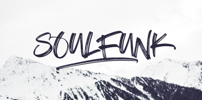 Soulfunk is a stunning and authentic hand brush font with a graffiti style feel. Get inspired by its unique charm, and turn any design project into a true stand out. This brush typeface is supporting Multi-Languages, which include: Afrikaans Albanian Catalan Danish Dutch English Estonian Finnish French German Italian Norwegian Portuguese Spanish Swedish Zulu. So what's included: Basic Latin A-Z & a-z. Numbers, symbols, and punctuations. Multilingual Support. Accented Characters : ÀÁÂÃÄÅÆÇÈÉÊËÌÍÎÏÑÒÓÔÕÖØŒŠÙÚÛÜŸÝŽàáâãäåæçèéêëìíîïñòóôõöøœšùúûüýÿžß Thank You.
 - Linotype Boundaround by Linotype,
$29.99Linotype Boundaround is part of the Take Type Library, selected from the contestants of Linotype’s International Digital Type Design Contests from 1994 and 1997. German artist Christina Sachse gave her font a mystical feel. The vertical strokes meet the base line at a point and the strokes vary in their width. The lively Linotype Boundaround is suitable for shorter texts in point sizes 12 or larger and for headlines in larger point sizes. - FF Typestar OCR by FontFont,
$62.99 German type designer Steffen Sauerteig created this slab FontFont in 1999. The font is ideally suited for logo, branding and creative industries and software and gaming. FF Typestar OCR provides advanced typographical support with features such as ligatures, alternate characters, case-sensitive forms, super- and subscript characters, and stylistic alternates. It comes with tabular lining figures. This FontFont is a member of the FF Typestar super family, which also includes FF Typestar.
