10,000 search results
(0.027 seconds)
- Lord Rat AOE by Astigmatic,
$19.95 LordRat is a rugged unicase typestyle built for childish and off kilter purposes. A mix of heavy and light with quickcut appearance makes this typestyle offbeat and even festive. Put some dignified childish offbeat flavor into your designs today with LordRat. If you've been looking for a playful yet bold typestyle with papercut looks, LordRat is what you've been looking for. Get it today!
 - Commander by Red Rooster Collection,
$45.00 Commander is a compressed serif font family and is an original creation of Steve Jackaman (ITF). It was designed in 1994 exclusively for the Red Rooster Collection. The family excels at display sizes and in headlines, and its masculine nature lends itself well to projects about sports, science fiction, and academia. Wherever Commander ends up in your project, it is guaranteed to draw attention!
 - Jazzfest NF by Nick's Fonts,
$10.00Based on the 1932 typeface Newport, designed by Willard T. Sniffin for ATF, this Art Deco standard packs a lot into multi-line heads and subheads due to its very short descenders, cleverly accomplished by “fudging the baseline” on the g, p, q, and y. All versions of this font include the Unicode 1250 Central European character set in addition to the standard Unicode 1252 Latin set. - ITC New Veljovic by ITC,
$57.99 Thirty years after its first appearance, Jovica Veljović has produced ITC New Veljovic Pro, a completely revised edition of his first typeface, ITC Veljovic (1984). Prof. Veljović has tapped into all the experience he has garnered over the past decades; by carefully adjusting the proportions of the characters he has provided the new typeface with a more harmonious presence. The serifs have been subtly curtailed and the letters made slightly more condensed. Some new features of ITC New Veljovic are the double-story “g” with its completely closed loop and the more open forms of the “c” and “e”. In the italic variants, the latter is much rounder. Thanks to Veljović’s outstanding work, the optimized ITC New Veljovic can now be used in all contemporary applications. The new Condensed style saves considerable space when it comes to setting longer texts. The Display versions show off the striking, crystal-clear shapes of the design at their best in larger point sizes.
 - Giambattista by Wiescher Design,
$39.50 Giambattista is a long-time project of mine finally come to an end. After redesigning all of Giambattista Bodoni's work and then some additional cuts I started a long time ago with this Non-Bodoni Bodoni. The idea came to me while redesigning the original Chancellerosa (chancery). I thought Bodoni just didn't have the right approach to a chancery, this was just not his cup of tea! Maybe that is why he never used the Chancellerosa very much for his own printshop in Parma. So I thought someone has to design a script, that looks like Bodoni could have designed it but is more lively than his. Over the years I have been working on and off on the face and it turned out to become three typefaces which can be freely mixed. Here is my modern version of a script in the style of Giambattista, meant as an hommage, I called it Giambattista. Your modern scribe Gert Wiescher
 - Billiboldy by Gie Studio,
$10.00 Are you planning to do an amazing piece of work to make lots of people smile happily while taking your hat off every time? If so, this is the right time to give your work a little touch with a sincere and elegant writing. Introducing Billiboldy- A New Bold Script Font Billiboldy is a cursive and thick lettered handwritten bold script font, crafted to give your headlines and logotype projects a stylish touch. This font reads as strong, dynamic and can add tons of nostalgic character to your designs. This font includes Multilingual Options to make your branding globally acceptable. Features: - Ligatures - Stylistic Sets - Multilingual Support - PUA Encoded - Numerals and Punctuation - Special underscore character 7 style - Special doodles for front and back of letters or sentences Thank you for your visit and downloading premium fonts from Gie Studio
 - Golem by Comicraft,
$19.00 Trolls are lurking under each and every river crossing. The earth is shaking as Ogres stomp across the land, spiked clubs in hand. Swordsmen and Sorcerers are waging war on one another even as the pure and young and stout of heart search for the talisman which will restore harmony once more. Are you under the spell of some wizard's magickal incantation or are you just looking for exactly the right typestyle for your J.R.R. Tolkien Convention newsletter? Regardless, an ancient curse has been lifted and the Talmudic Legend of the Clay Beast they call GOLEM has been restored to his former majesty. The shapeless mass is no longer one of unfinished substance, no longer a body without a soul. The Homunculus that was once Comicraft's Golem has had a spiritual awakening and is now available with the crinkly bits smoothed off.
 - VLNL Duct by VetteLetters,
$35.00 Duct tape is one of the most versatile adhesive materials known today. From fixing the bumper of your car that keeps falling off, to creating a sturdy wallet. From alternative wrapping to sticking a friend to the wall, Duct tape is there. And it will stay there. It will stick to anything and hold for a very darn long time too! The cloth-backed tape was invented some time during World War II, and also proved itself useful as a base material for lettering. VLNL Duct was originally designed by DBXL as a logo for temporary Amsterdam restaurant BAUT. DBXL imagined an owner taping the name on the window of his shop using Duct tape. The font was used for all communication of the restaurant. Duct is a sturdy, rough all-caps typeface that will stick to anything.
 - Robson by TypeUnion,
$20.00 Robson is a fluid, condensed, uppercase font made up of eight weights, as well as a variable, that will provide instant visual impact to your projects. The font is made up of 486 glyphs which features extensive language support & stylistic alternates to give your designs the versatility they require. The font has a retro edge to it by using rounded structures on the A, M, N, W and Y glyphs that are reminiscent of posters and promos from the 70s and 80s. The ultra tight thin weight is made to be used at super sizes to bring a focal point to your designs. Robson is meant to be seen big (well, he's a bit of a show-off) Robson is perfect for your digital, print or branding projects. Or, for a poster on your fridge that says "You rock".
 - Pipeline by URW Type Foundry,
$39.99 Pipeline is a futuristic and technical looking typeface. But as the name suggest it’s also earthly, (literally). Deep down underneath villages, city’s everywhere and even oceans there’s a network of pipelines. Providing us all sorts of supplies, like water and oil. Sewers wash fluid waste away. They are never to be looked upon as pretty or beautiful but purely functional. The soil peeled off and looked upon from above, a greater industrial infrastructure is revealed, cluttered like spaghetti, complex as the maze of corridors of termite colonies. I present two pipelines to you; one naked and one dressed. This typeface is very suitable for graphic, logo and poster design. It is quadratic shaped with round curves. It is modern and classic at the same time. It could be appealing for young, technical, digital, inventive and urban (sub) culture (at any age).
 - Psychotropic Experience by Mysterylab,
$12.00 Here's a unique and unusual font pack in the tradition of late 1960s psychedelic poster and album cover styles. Perfect for that flaming psychedelia vibe from the Haight-Ashbury scene in the Summer of Love era. Combine Regular and Fill versions to create a two-toned design for a super offbeat and eye-catching look. Once loaded on your system, the three versions of the font show in your menu as the following three "weights": Psychotropic Experience Regular, Psychotropic Experience Fill, and Psychotropic Experience Solid. The 3-alphabet collection works together seamlessly to allow you to assign one color to the body of the letter, and a second color to the inset fill areas. Just copy your text block, paste in place, reassign the font to the Fill version, choose a complimentary color, and off you go. All caps Fonts.
 - ITC Seven Treasures Ornaments by ITC,
$29.99Akira Kobayashi's ITC Seven Treasures is a symbol font for use in patterns and textures. The interlocking patterns, usually circular or oval, are taken primarily from motifs used in Japanese textiles. Most of these designs are known as komon, or tiny patterns," and they are often applied to kimono and other textiles, although their use is not limited to fabrics. They also appear carved in wood in traditional architecture, and painted in pictures as background patterns. Each of the individual designs in ITC Seven Treasures Ornaments is carefully sized and spaced so that it will fit together into a continuous pattern. Most overlap slightly but precisely, so that when you type a row of them you can't tell where one leaves off and the next begins. They may be combined or alternated to vary the texture of a background pattern." - Madera by Monotype,
$57.99 Malou Verlomme designed Madera with graphic designers in mind – drawing on his decade of experience designing bespoke type to create a versatile, easy-to-use geometric sans serif that ticks off a long list of branding requirements. Its sharp apexes add some flavour to the design, which offers an honest, trustworthy tone of voice – but with a twist. “The design doesn’t go out of its way to attract attention, but is still very solid,” explains Verlomme. “It still has a fair amount of warmth and personality, in a very understated manner. If you’re a large corporation, with a typeface being used in many different environments, you want something that’s easy to use but can sustain such a large amount of visibility.” The Madera typeface family has 32 fonts: Upright, Condensed and Italics. Each typeface contains over 650 glyphs with extensive Western, Central and Eastern European language support. It also supports OpenType typographic features like alternatives, ligatures and fractions. Madera Variables are font files which are featuring two axis and have a preset instance from Hairline to Extra Black.
 - Bousni Ronde by Linotype,
$29.99The Bousni family's six faces display links unexpected by most readers of western alphabets. Inspired by both by Arabic calligraphy, and contemporary bitmap design, Bachir Soussi Chiadmi created this playful series of faces. Letters in each of the six typefaces link together, but not in the ways normally expected from script fonts. Suited for a wide array of fun functions, Bousni Carre and Bousni Ronde (each available in Light, Medium, and Bold weights) bring new a style and flavor to your collection. All six fonts in the Bousni family are included in the Take Type 5 collection from Linotype GmbH. The Bousni family espouses similar construction traits with other fonts from Linotype. Specifically, the straight lines and joints in the three Bousni Carre fonts are based off of a grid system similar to Anlinear, another member of the Take Type 5 collection from Linotype GmbH. The letter connections throughout the Bousni family are similar to Arabic kashidas, a typographic feature found recently in many non-Arabic typefaces, such as Linotype Atomatic." - Urge Text by Eclectotype,
$30.00 It started with an italic, or to be more precise, half an italic. The slanted styles of Urge Text exhibit a certain bipolarity, the tops of glyphs having a standard italic form, the bottoms of glyphs being more Roman in their construction. This sturdy footing really locks the italics to the baseline, making them very legible while still being distinct from the uprights. The same bipolar approach didn't work very well in upright styles, so the Romans are more toned down. Ranging from the almost monoline, Egyptian style light weights to higher contrast ‘Modern’ bolds, there is much potential for use in typographically demanding scenarios. The family consists of six weights, normal and condensed widths, all with italics, making a total of 24 fonts; it’s a highly usable text typeface with an array of OpenType features. All styles include small caps, multiple figure styles (proportional- and tabular-, oldstyle and lining, small cap proportional figures, numerators, denominators, superscript and subscript), standard ligatures, alternate forms (stylistic sets), automatic fractions, case sensitive forms, and a handy (perhaps!) ‘percent off’ ligature in the discretionary ligatures feature.
 - Bousni Carre by Linotype,
$29.99The Bousni family's six faces display links unexpected by most readers of western alphabets. Inspired by both by Arabic calligraphy, and contemporary bitmap design, Bachir Soussi Chiadmi created this playful series of faces. Letters in each of the six typefaces link together, but not in the ways normally expected from script fonts. Suited for a wide array of fun functions, Bousni Carre and Bousni Ronde (each available in Light, Medium, and Bold weights) bring new a style and flavor to your collection. All six fonts in the Bousni family are included in the Take Type 5 collection from Linotype GmbH. The Bousni family espouses similar construction traits with other fonts from Linotype. Specifically, the straight lines and joints in the three Bousni Carre fonts are based off of a grid system similar to Anlinear, another member of the Take Type 5 collection from Linotype GmbH. The letter connections throughout the Bousni family are similar to Arabic kashidas, a typographic feature found recently in many non-Arabic typefaces, such as Linotype Atomatic." - Rawhide by Canada Type,
$29.95 Rawhide is a fresh digitization and expansion of a very popular (yet uncredited) early 1970s film type called Yippie, which was commonly used in wild west cartoons and comics. Publishers of Lucky Luke, the famous Belgian comic by Morris, used these bouncy letters for the titling on a few of their soft cover editions, and different variations of it were used throughout the 1970s and 1980s by cartoon classic Looney Tunes and a variety of wild west animations and comics. It slowly disappeared without fanfare when desktop publishing became the norm. Here it is again now for the computer age, available as a high quality font with a complete character set that accommodates more than 20 Latin-based languages. In short, Rawhide comes with an impressive track record, and is a must for any funny cowboy design or off the wall wild west layout. This set of fonts contains a very expanded character set that includes full support for Central, Eastern and Western European languages, as well as Baltic, Turkish, Esperanto, Greek, Cyrillic and Vietnamese.
 - Archive Garamond by Archive Type,
$59.99Archive Garamond is a typeface roughly based on the designs of Claude Garamond (ca. 1480 – 1561), a French publisher and a leading typeface designer of that period. Garamond’s influence on type design is reflected in many typefaces that are today known under different commercial names. While the majority of contemporary digital interpretations of the “Garamond types” are cleaner and more polished versions of that genre, Archive Garamond tries to keep the rough nature which was typical in the early days of printing. Archive Garamond has a rather unique, distinctive temperament which is even more emphasised with the preserved non-uniformity, such as irregular glyph shapes or a variable baseline. Although Archive Garamond was clearly made to be used for display sizes it works surprisingly well in text. Archive Garamond is availale in three versions, each containing approximately 600 glyphs (in Pro versions). Archive Garamond Pro A Professional version of the typeface contains all glyphs, including the advanced typographic forms, such as different sets of figures, small caps, swashes, historical forms, etc. The font also enables full use of the OpenType features. It fully supports the languages listed in the language list. Archive Garamond Std A Standard version of the typeface is meant to be used for the basic typographic work. It typically contains the most common glyphs. The standard figures are proportional lining. Besides kerning this version does not contain any advanced OpenType features. A Standard file type fully supports the languages listed in the Language list. Archive Garamond Exp An Expert version contains glyphs that are supposed to be used in advanced typographic works. This type of file contains uppercase and small cap glyphs with the proportional oldstyle figures as the default set. Besides kerning this version does not contain any advanced OpenType features (all OTF features have to be replaced manually). An Expert file type fully supports the languages listed in the Language list. - ITC Franklin by ITC,
$40.99 The ITC Franklin™ typeface design marks the next phase in the evolution of one of the most important American gothic typefaces. Morris Fuller Benton drew the original design in 1902 for American Type Founders (ATF); it was the first significant modernization of a nineteenth-century grotesque. Named in honor of Benjamin Franklin, the design not only became a best seller, it also served as a model for several other sans serif typefaces that followed it. Originally issued in just one weight, the ATF Franklin Gothic family was expanded over several years to include an italic, a condensed, a condensed shaded, an extra condensed and, finally, a wide. No light or intermediate weights were ever created for the metal type family. In 1980, under license from American Type Founders, ITC commissioned Victor Caruso to create four new weights in roman and italic - book, medium, demi and heavy - while preserving the characteristics of the original ATF design. This series was followed in 1991 by a suite of twelve condensed and compressed designs drawn by David Berlow. ITC Franklin Gothic was originally released as two designs: one for display type and one for text. However, in early digital interpretations, a combined text and display solution meant the same fonts were used to set type in any size, from tiny six-point text to billboard-size letters. The problem was that the typeface design was almost always compromised and this hampered its performance at any size. David Berlow, president of Font Bureau, approached ITC with a proposal to solve this problem that would be mutually beneficial. Font Bureau would rework the ITC Franklin Gothic family, enlarge and separate it into distinct text and display designs, then offer it as part of its library as well. ITC saw the obvious value in the collaboration, and work began in early 2004. The project was supposed to end with the release of new text and display designs the following year. But, like so many design projects, the ITC Franklin venture became more extensive, more complicated and more time consuming than originally intended. The 22-font ITC Franklin Gothic family has now grown to 48 designs and is called simply ITC Franklin. The new designs range from the very willowy Thin to the robust Ultra -- with Light, Medium, Bold and Black weights in between. Each weight is also available in Narrow, Condensed and Compressed variants, and each design has a complementary Italic. In addition to a suite of new biform characters (lowercase characters drawn with the height and weight of capitals), the new ITC Franklin Pro fonts also offer an extended character set that supports most Central European and many Eastern European languages. ITC Franklin Text is currently under development.
 - Galleds Stars by Yukita Creative,
$14.00 Galleds Stars Display Typeface is a single font with a minimalistic but standout style for any work from movie titles, music album covers, magazines, beauty ads, and even wedding invitations. --- Minimalist type design has been a success for professional designers worldwide. - Galleds Stars Display Typeface is legible from much larger distances than typical fonts - Elegant letterforms give the feeling of luxury - Smooth curves for elegant typography This font has several alternative characters as in ( A,N,O,R,S,a,c,e,o,t,y ) Tips for using fonts in projects. Use this font with a simple background, not too busy so that you can highlight your branding This font file OTF
 - Kota Datoma by Alcode,
$23.00 Kota datoma an luxury and unique calligraphy font. Carefully designed to work together in harmony that makes it perfect for wedding media, book covers, greeting cards, logos, branding, business cards and certificates, even for any design work that requires unique, formal or luxury. Try Kota datoma, enjoy the richness of OpenType features and let her fun and elegant excitement make you happy and enhance your creativity! You can use this font very easily. Included Multilingual Support And Special Ligatures Your download will include OTF format files. If you do not have programs that support OpenType features like Adobe Illustrator and CorelDraw X Versions, you can access all alternative flying machines using Font Book (Mac) or Character Map (Windows)
 - Andit by Papermode Co,
$20.00 Andit is an unique calligraphy font. Carefully designed to work together in harmony that makes it perfect for wedding media, book covers, greeting cards, logos, branding, business cards and certificates, even for any design work that requires classics, formal or luxury. Try Andit, enjoy the richness of OpenType features and let her fun and elegant excitement make you happy and enhance your creativity! You can use this font very easily. Included multiligual support and special ligatures Your download will include OTF format files. If you do not have programs that support OpenType features like Adobe Illustrator and CorelDraw X Versions, you can access all alternative flying machines using Font Book (Mac) or Character Map (Windows)
 - Oldbrothers by Haksen,
$17.00 Oldbrothers is a Bold elegant modern condense sans style with upper and lowercase feel nice balanced. Its wide range of uppercase ligatures allow versatile design options and works perfectly for headlines, logos, posters, packaging, T-shirts, postcards and much more. Font Features : Regular and Italic version Character set A-Z Ligatures in Uppercase Numerals & Punctuation Accented Characters Multiple Languages Supported Format File: OTF Recommended to use in Adobe Illustrator or Adobe Photoshop with opentype feature. How to access Ligatures Characters? Open glyphs panel : In Adobe Photoshop choose tool Window glyphs In Adobe Illustrator choose tool Type glyphs If you have questions, just send me a message and I’m glad to help. Have a great day, Haksen Std
 - Nimbus Sans Arabic by URW Type Foundry,
$35.99 Nimbus Sans ME is the expansion within the Nimbus Sans family for the Middle East range: Arabic (incl. Farsi) and Hebrew. Volker Schnebel has designed both scripts, which each include five upright and five cursive styles. The design is contemporary and fits the Latin Nimbus Sans. Besides the basis characters, the Arabic also includes the presentation forms: the variations for initial, medial and final letters. The correspondent OTF features are included in the fonts. All three scripts are perfectly combinable. Nimbus Sans is one of the best supported and most favored URW fonts ever. It is available as a Global Font in 4 weights and contains up to 65.000 characters per font.
 - Andine by Letterena Studios,
$10.00 Hi, Everyone! Want a font to make your branding bold? Are you trying to make a stylish statement with your projects? We’ve got what you want. Introducing Andine - A Serif Font A fabulous, elegant, and modern serif font that’ll engage your audience and make your branding stand out. This stylish font can be used for a host of different content needs and projects. Perfect for social media branding projects, fashion designs, printed quotes, or even as a stylish text overlay to any background image and many more! Andine includes Multilingual option to make your branding reach a global audience. Includes: Andine (OTF) Features: Standard Ligatures Stylistic Sets Multilingual Support PUA Encoded Numerals and Punctuation
 - Stamen by Wordshape,
$20.00 Stamen is the answer to a big question: What would happen if one tried to create a typeface that was ‘out of time’? If a type designer was to turn off the internet and put away the type specimens and just try to explore limbic, phantom history, what might that look like? No slavish explorations of the past. No gropings toward the future. No exhaustive core sample of the contemporary. Instead, using what one remembers of history and our collective vision of the future (usually a future imagined from the past) and channeling that into something that is, hopefully, new… The Bentons meet Frutiger for a Manhattan on a space station while Matthew Carter sways to the sweet sounds of the chorale that occasionally played through the halls of Stephenson Blake. This smear of implicit history expressed without explicit reference—this is Stamen: a family of 12 typefaces with a ton of alternate characters. The bold weight was designed for the LP “I Thought the Future Would Be Cooler” ( http://ittfwbc.com/ ) by the band YACHT in response to their request for a typeface that was ‘lost in time’, and refers to neither strict historical models nor purely futuristic forms. I built a small family out from there. It works well in text, but just as well for display setting. I think you’ll enjoy using it.
 - Decavision by Swedish Columbia,
$1.99Decavision is a display font and is applicable for any type of graphic design, web & print, t-shirts, posters and logos. It’s not intended for text use or at small sizes. A font inspired by Division Of Laura Lee’s icon which was created by Shelby Cinca. The icon itself is inspired by early floppy disc copy-protection and Japanese fighting robot decals. Håkan Johansson picked up where the icon left off and created a corresponding font-family. The font focuses on simple shapes and the copy-protection tab detail to create a pleasing futurist display font. - Nightclubber by Device,
$29.00 The late 70s and early 80s is sometimes considered to be the period when headline typography went off the rails. Growing up in that period, some designers may beg to differ. Many geometric designs were available in dry-transfer and for the typositor, and were used everywhere a youth-culture look was appropriate - annuals, comics, club flyers, high-street boutiques, TV-advertised compila tion albums. Nightclubber is a fond homage to the excesses of the period, and should be used back-lit in pink neon or at a rakish 45 degree slant across a blurred photograph of a glitter ball.
 - BB Manual Mono (Pro) by Bold Studio,
$49.00 BB Manual Mono™ (Pro) visualizes the work of painters: Craftsmanship, precision, professionalism and their tools. The special features of the Font emphasize the work process. ● Flow: visible process ● Alignment: contextual monoline ● Accuracy: individual modularity ● 5 Variants (TX (Text), IT (Italic), ST (Standard), HL (Headline), CR (Cover) ● 40 OT-Features/Style ● 60 Styles ● 100 Stylistic-Sets (20/Variant) ● 122 Languages Support (Latin, Greek, Cyrillic) ● 86,100 Glyphs (1,435/Style)
 - Rockner by Linotype,
$29.99Rockner is a family of fraktur typefaces designed by the calligrapher/designer Julius de Goede. Like all Blackletter styles, fraktur evolved out of Northern Europe's medieval manuscript tradition. Fraktur was the most used Blackletter variety between the sixteenth and twentieth centuries. Unlike many similar fraktur font families, Rockner is available in three weights: Regular, Medium, and Bold. This flexibility allows for richer design possibilities. The OT fonts contain the many alternate characters, such as the long s and historical ligatures, which are often necessary for the setting of historical documents. - Amster by PampaType,
$60.00 Amster is an energetic & refined type created by Francisco Gálvez, with a sharp idea on how elegance & legibility can meet harmoniously. Amster can build a text that is highly readable as well as friendly. It has five weights of roman & cursive both with smallcaps and fully-equipped with all OT sorts and even a wonderful set of illuminated initials. Amster is a very versatile typeface, allowing for a wide range of uses: screen to print, small text to display, science to poetry. Amster speaks more than 200 languages.
 - Hel Grotesk Gothiq - Personal use only

- Gommogravure - Unknown license

- Future Imperfect - Unknown license

- Santtander by Ditatype,
$29.00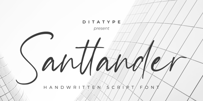 Santtander is a modern handwritten font. With a classy and natural handwritten style, it brings a classy and chic typeface. Santtander is best used for weddings, branding, logotype, and quotes. Includes: - Santtander (OTF) Features: - Beautiful Ligatures - PUA Encoded - Multilingual Support - Numerals and Punctuation
 - Whitelove by Ditatype,
$29.00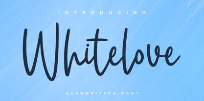 Whitelove is a modern handwritten font. With a classy and natural handwritten style, it brings a classy and chic typeface. Whitelove is best used for weddings, branding, logotype, and quotes. Includes: - Whitelove (OTF) Features: - Beautiful Ligatures - PUA Encoded - Multilingual Support - Numerals and Punctuation
 - Calliretta by Ditatype,
$29.00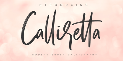 Calliretta is a modern handwritten font. With a classy and natural handwritten style, it brings a classy and chic typeface. Calliretta is best used for weddings, branding, logotype, and quotes. Includes: - Calliretta (OTF) Features: - Beautiful Ligatures - PUA Encoded - Multilingual Support - Numerals and Punctuation
 - Wernardio by Ditatype,
$29.00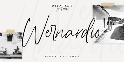 Wernardio is a modern handwritten font. With a classy and natural handwritten style, it brings a classy and chic typeface. Wernardio is best used for weddings, branding, logotype, and quotes. Includes: - Wernardio (OTF) Features: - Beautiful Ligatures - PUA Encoded - Multilingual Support - Numerals and Punctuation
 - Este by Michael Prewitt,
$20.00 Este is a modern sans serif typeface. The family has 7 weights, ranging from Thin to Bold and is suited for branding, logo, transportation, product design, advertising and packaging. The modern feel is complimented by alternative characters via the OTF stylistic sets.
 - Mobil Pro by RMU,
$35.00 In 1960 Ludwig & Mayer released this Matheis design which was completely redrawn, digitized and extended for most main European languages, West and East. To take advantage of all ligatures in this font, I recommend to activate both OT features, standard and discretionary ligatures.


