10,000 search results
(0.061 seconds)
- Stephanie by ActiveSphere,
$30.00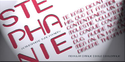 Stephanie is a rounded geometric display font and works best in display applications, such as posters, headline, magazine, product branding, corporate branding, signage, logos and titles. Each style has a full upper and lower-case, accents, punctuation and a selection of monetary symbols.
 - MVB Celestia Antiqua by MVB,
$39.00Mark van Bronkhorst designed MVB Celestia Antiqua at a time when font choice was limited. Design was characterized by overuse of the few fonts that came with laser printers. A rustic typeface, recalling the roughness and irregularity of pre-digital printing, was a response to the cold crispness of DTP. MVB Celestia Antiqua holds its own among a large group of other “weathered” serif fonts, in part due to the size of the family: three weights, small caps, italics, and two titling styles. But it's also successful because it's simply drawn well, the contours only as rough as they need to be, enabling text at any size, large or small. - Middleton Brush by Canada Type,
$24.95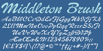 One of the earliest fonts published by Canada Type was Coffee Script, Phil Rutter's digitization of Robert Hunter Middleton's 1962 brush script, Wave. In 2010, when the font was revisited for an update, it was shown that it was too light for applications under 24 pt, and too irregular for applications over 64 pt. So the face was redigitized from scratch. This new digitization maintains a soft contour and a steadier stroke, as well as much better outlines for use at both extremes of scaling. Language support was also greatly expanded, and many alternates were added to the redigitized character set. The name was also changed to Middleton Brush, to better reflect the origins of the design, which was Middleton's response to Robert Smith's popular Brush Script Middleton Brush comes in all popular formats. Language support includes Western, Central and Eastern European character sets, as well as Baltic, Esperanto, Maltese, Turkish, and Celtic/Welsh languages.
 - Berndal by Linotype,
$29.99Bo Berndal, the master Swedish typographer, is the eponymous designer of Berndal, a contemporary text family with five different styles. This family represents a new achievement for Bo Berndal, who has spent many years working to optimize text legibility in the printed media. Several small tricks make the Berndal family an interesting milestone in legibility. Berndal's letterforms contain large x-heights. Large x-heights open up the counterforms of letters, making text appear lighter on a page, but their correspondingly shorter ascenders and descenders can hinder legibility. This does not occur in Berndal at all! Coupled with this experiment, Berndal's various font weights display a certain softness and roundness. The letterforms themselves are relatively wide, with an overall consistency in width. The calligraphic nature of the strokes has been minimized, yet a contrast stroke-thickness is still to be noticed within the alphabet. Berndal's five styles offer almost everything that one could want from a good text family. The Regular weight may be paired with Small Caps, Italic, Bold, and Bold Italic. All styles ship in the OpenType format, and include tabular and old style figures. The two italic weights are made up of true italics, not obliques. The Berndal family is a part of the Take Type 5 collection from Linotype GmbH." - Frutiger Capitalis by Linotype,
$29.00Frutiger Capitalis Regular and Outline belong to the group of typefaces for the Linotype’s Type Before Gutenberg project. However, they are not based on direct historical sources. At first glance, they may seem related to the roman type Capitalis Monumentalis, but upon closer examination, the fonts reveal a vitality unknown to the characters the Romans etched in stone. Frutiger confesses that creating Capitalis was “a liberation”. After working on so many sophisticated and meticulously designed typefaces, Frutiger Capitalis was a breath of fresh air. Stylistically, Frutiger Capitalis Outline forms a bridge to Frutiger Capitalis Signs, a whole universe of its own. Frutiger Capitalis Signs is a personal cosmos of symbols, many are immediately “legible”, others leave room for interpretation. Some of the symbols are the product of Frutiger’s imagination, such as his “Life Signs” — soft, hand drawn figures whose lines have no apparent beginning or end, creating both interior and exterior spaces, new forms emerging at each glance. These contoured drawings have accompanied Frutiger throughout his professional life, a fantasy garden which has provided an important balance to his many years of disciplined typeface design. Yet he does not consider himself an artist. Frutiger says he simply “wants to tell stories, to draw thin lines, create contours of signs; that is my style”. - Orangerie by Mans Greback,
$69.00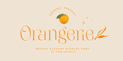 Orangerie is a soft, delicate, and beautiful typeface that captures the essence of fashion, sweetness, and nature. Its flowing, thin lines evoke a sense of calm and loveliness, making it the perfect choice for romantic, professional, and light-hearted projects alike. Inspired by the serene beauty of blooming flowers in a sunlit orangerie, the typeface was meticulously crafted to convey a sense of warmth, tranquility, and sophistication. The result is a font that feels both contemporary and timeless, perfect for a wide range of applications, from branding and packaging to wedding invitations and personalized stationery. Use character ¤ to make decorative nature element such as leaves. Use multiple for different versions. Example: Sweet¤¤¤¤Morning (Download required.) This elegant font comes in four versatile styles: Regular, Bold, and their italic versions, allowing you to craft the perfect tone and atmosphere for your designs. The font is built with advanced OpenType functionality and has a guaranteed top-notch quality, containing stylistic and contextual alternates, ligatures, and more features; all to give you full control and customizability. It has extensive lingual support, covering all Latin-based languages, from Northern Europe to South Africa, from America to South-East Asia. It contains all characters and symbols you'll ever need, including all punctuation and numbers.
 - Celebrity by Canada Type,
$24.95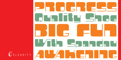 Celebrity is a new execution of a film type concept put forth by Willy Wirtz in 1971. The original idea, called Latus, had many irregularities and unfit characters that are now fixed and expanded in this digital version. Celebrity's construct combines extreme thicks with hairline thins to build forms that contribute to a type totality that is at once modern and techno, as well as retro-deco. Eye catching and memorable, Celebrity is ideal for use on posters, book covers, media sleeves and packaging. It also has enough geometric appeal to inspire unique logos and set attractive titling. Celebrity comes in all popular font formats, and includes a very expanded Latin character set.
 - Dezen Solid by DizajnDesign,
$39.00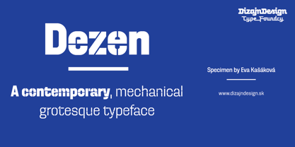 Dezen is a contemporary, mechanical grotesque typeface. Its letters were first constructed from individual modules and then optically refined to enhance its rhythm. Its tight letter spacing and narrow proportions make the typeface particularly well suited for display sizes and headlines. When you add spacing, font can be used for shorter amount of text, bigger than 12 points. Dezen type family consists of a wide variety of styles – solid and stencils. Dezen Pro subfamily combines all 4 styles (Solid, Stencil 01, Stencil 02, Stencil 03) in a specific sequence, which originates a “pattern” for the alphabet (or dezen, in Slovak).
 - Dezen Stencil 02 by DizajnDesign,
$39.00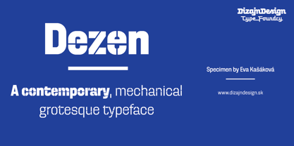 Dezen is a contemporary, mechanical grotesque typeface. Its letters were first constructed from individual modules and then optically refined to enhance its rhythm. Its tight letter spacing and narrow proportions make the typeface particularly well suited for display sizes and headlines. When you add spacing, font can be used for shorter amount of text, bigger than 12 points. Dezen type family consists of a wide variety of styles – solid and stencils. Dezen Pro subfamily combines all 4 styles (Solid, Stencil 01, Stencil 02, Stencil 03) in a specific sequence, which originates a “pattern” for the alphabet (or dezen, in Slovak).
 - Dezen Stencil 03 by DizajnDesign,
$39.00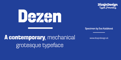 Dezen is a contemporary, mechanical grotesque typeface. Its letters were first constructed from individual modules and then optically refined to enhance its rhythm. Its tight letter spacing and narrow proportions make the typeface particularly well suited for display sizes and headlines. When you add spacing, font can be used for shorter amount of text, bigger than 12 points. Dezen type family consists of a wide variety of styles – solid and stencils. Dezen Pro subfamily combines all 4 styles (Solid, Stencil 01, Stencil 02, Stencil 03) in a specific sequence, which originates a “pattern” for the alphabet (or dezen, in Slovak).
 - Petras Script EF by Elsner+Flake,
$35.00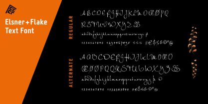 Petras Script, the first digital script font created by the calligrapher Petra Beiße, has, for many years, met with worldwide success. Now the font is complemented with an alternate character set, which gives designers more flexibility and adds a personal touch to the font. Petra Beiße has resided for a long time in Wiesbaden, Germany, where she is working as a renowned calligrapher. It is rare that any of her scripts are transferred into digital format and sold worldwide as fonts. Because Petras Script became such a huge success, she decided to release Casanova Script Pro.
 - Dezen Stencil 01 by DizajnDesign,
$39.00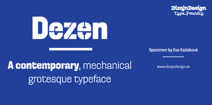 Dezen is a contemporary, mechanical grotesque typeface. Its letters were first constructed from individual modules and then optically refined to enhance its rhythm. Its tight letter spacing and narrow proportions make the typeface particularly well suited for display sizes and headlines. When you add spacing, font can be used for shorter amount of text, bigger than 12 points. Dezen type family consists of a wide variety of styles – solid and stencils. Dezen Pro subfamily combines all 4 styles (Solid, Stencil 01, Stencil 02, Stencil 03) in a specific sequence, which originates a “pattern” for the alphabet (or dezen, in Slovak).
 - Oliva by Viktor Nübel Type Design,
$25.00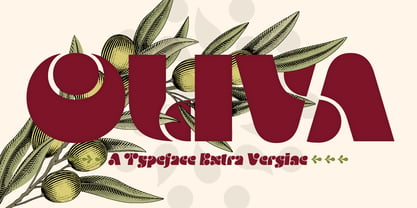 Oliva & Oliva Italic are two strong and funky display fonts. Influences came from typefaces like Futura Black by Paul Renner and Motter Ombra by Othmar Motter, but also Stilla by François Boltana and Allegro by Hans Bohn lay on the desk. All these ingredients were mixed to a new and contemporary type experience and packed in proper OpenType files Oliva & Oliva Italic are OpenType Pro, featuring full Western, Central European, Baltic, Turkish and also Cyrillic language support. They contain ligatures, superior numerals, and a stylish set of decorative ornaments and arrows.
 - 1522 Vicentino by GLC,
$60.00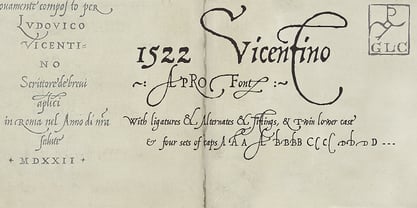 This font is mainly inspired from the engraved characters of the small book known as “Operina”, or “The method and rules for writing cursive letters or chancery script” from the famous calligrapher Ludovico Vicentino Arrighi, published in Roma in 1522 and signed with simplicity “Ludovico Vicentino”. The font contains a large set of standard ligatures and alternative characters: two lower cases, four sets of standard capitals, long s and variants, titlings, each feature easy to use with OTF managing software. It is a pro font, containing Baltic, Eastern, Central, Western European and Turkish diacritics.
 - Gorgonzola Gothic by The Ampersand Forest,
$20.00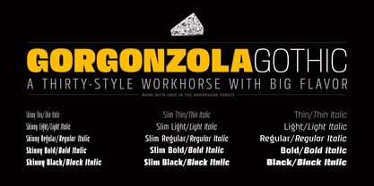 Gorgonzola Gothic is a geometrically-inspired gothic sans serif family that's robust and versatile. Inspired by the geometric quirkiness of IxD (also by The Ampersand Forest), Gorgonzola Gothic expands into a thirty-style family that works for everything from branding to text. It further mitigates IxD's quirkiness by offering two options in the round and shouldered lowercase glyphs. The standard letterforms, like IxD, have notched joins, giving them an assertive, almost futuristic look. The alternates of those letterforms (housed in Stylistic Set 01, and available as immediate hoverable glyph options in the Adobe Suite) are more conventional (as are the SS01 ampersand, Q, S, a, and s). In this way, Gorgonzola Gothic offers the best of both worlds: a flavorful, slightly futuristic family (in the same world as geometric classics like Eurostile) and a workhorse gothic sans (like the Benton classics Franklin Gothic, News Gothic, etc.). Its three widths: Skinny, Slim, and Standard, give it a wide range of applications, from display to body. Gorgonzola Gothic makes a statement with strength and sureness.
 - Quarz 974 by Domenico Ruffo,
$40.00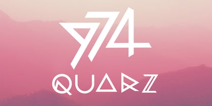 Quartz 974 is a typology of font inspired by simple and geometric lines as triangle. It is very suitable for titles, logos, posters, that’s why it is composed by only capital letters and numbers.
 - Faux Arabic by Page Studio Graphics,
$24.00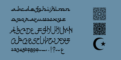 Based on Arabic calligraphic script, this simulation font includes upper and lower case Western alphabets, numerals, basic punctuation and several ligatures, as well as the Islamic crescent symbol and a typical Arabic geometric design.
 - Gourds by Oliveira 37,
$24.00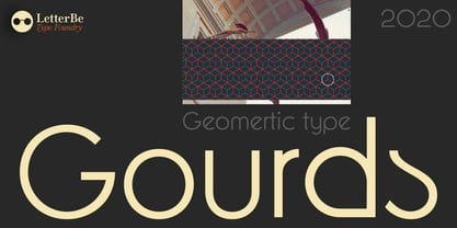 The Gourds is a geometric font that has its personality in extreme forms without losing its identification with the legibility and recognition of its characters. indicated for titles and sub-titles or even logos.
 - Zeno by Device,
$39.00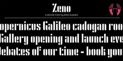 Bold, graphic and with a strong vertical emphasis. Built from simple geometric shapes, Zeno is similar to some of Joseph Albers’ Bauhaus experiments, though with attention paid to normalising the lettershapes to improve readability.
 - Cubie by Loaded Fonts,
$-The character set is short but make no mistakes, it is complete. Illegible, unreadable, unusable, this overly-geometric sans adheres to a set of rules just barely allowing an alphabet. But, hey it's free. - Oboe by Graviton,
$4.00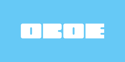 Oboe font family has been designed for Graviton Font Foundry by Pablo Balcells in 2012. It is display typeface with a geometric rounded look. Oboe consists of 6 styles, 2 of which are free.
 - Malnor Sans by Sikifonts,
$24.00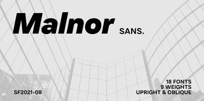 Malnor Sans is a normal sans serif family of 18 fonts. With modern style or neo-grotesque, Malnor sans has balanced proportions in every letter, and it's clean, minimal and cool. There are several alternative letters that can be used in both upright and oblique styles. Single story 'a' can give a more geometric impression, even though it is not purely geometric. There is also an alternative double story 'a' with a tail, a double story 'g' and an alternative 'l' that can be applied together via the 'salt' or 'stylistic sets' features for a slightly warmer feel. Malnor Sans currently has around 900 glyphs, including diacritical marks, that support a broad Latin-based language.
 - Festive by TypeSETit,
$49.95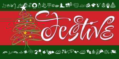 It's Festive! But don't let the name fool you... It's a fun script font (plus a Roman) accompanied by an assortment of exciting ornamental dingbats. In fact, it's the ornamentals that make this font so much fun! At first glance, Festive appears to be suited only for the Christmas holiday season. But wait… you can use the ornamental dingbats for any occasion where festivities abound— New Years, Valentines, St. Patty's Day, Back to School, Graduation, Baby & Wedding Showers, Halloween, Thanksgiving, and much more— even Sports. The base font works well with bodies of copy, while the alternate fonts can be used to swap out individual characters to give a custom, hand written look. Be sure to scroll thru to see all 14 fonts in this package—especially the fun ornamental dingbats. Festive Regular is included with all the alternate fonts (Festive One thru Ten) which are sold as two font sets. The PRO version contains all the glyphs of the family plus OpenType programming to easily access alternates. The Festive family of fonts are PUA encoded, so you can access them easily. So, get in the mood and have FESTIVE fun!
 - Blanket by Eclectotype,
$30.00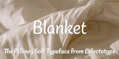 Blanket is a friendly, baby-soft typeface with a gentle slant. With the warmth of an italic but less of the speed, it is designed primarily for use on child oriented material. The ‘schoolbook’ a and g are default, but the more adult double storey versions are available through stylistic sets / stylistic alternates. Blanket is child friendly without being childish. Typographically sophisticated, it features a wealth of figure styles, automatic fractions, ligatures, alternates, case sensitive forms and a small spattering of swashes. Although the intent was to make a typeface fit for children’s books, the finished product works well anywhere a casual (but not sloppy) look is desired.
 - ITC Deli by ITC,
$29.99Jim Spiece has a taste and a talent for reviving type styles from earlier in this century. ITC Deli Supreme is a “futuristic retro” face that would be at home as a logo on a car or a roadside diner from the 1940s or '50s; the lowercase nearly joins, in script style, thanks to the long extenders stretching out from the bottom-right corner of most letters, while the caps have beginning strokes leading in from the top left. ITC Deli Supreme, like ITC Deli Deluxe, features slightly rounded corners on all the letters, for a soft, streamlined look despite the squareness of the letterforms. - MFC Hills Medieval by Monogram Fonts Co.,
$24.95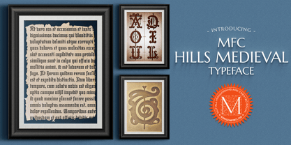 MFC Hills Medieval was developed from a unique historical Blackletter type specimen in the 1882 Hills Manual of Social and Business Forms. While you could use its ornate capitals to construct a monogram, this is not a monogram font, but a fully functional typeface for invitations and period lettering. From stylish and ornate capitals to a soft lowercase resembling bled ink, this period lettering style is a true eye-catcher. Because of some of the unique medieval letterforms, standardized letterforms were created as the default typeable letters while the true historical forms were setup as Stylistic Alternates. A sophisticated Blackletter for manuscripts and invitations alike.
 - Hannover Modern by Type-Ø-Tones,
$40.00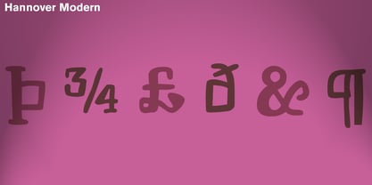 Hannover Modern belongs to a series of typefaces used at the Estudio Mariscal in Barcelona. José Manuel Urós developed this weight, a vigorous egyptian-style, the embodiment of the Javier Mariscal style.
 - Vantagram by TEKNIKE,
$69.00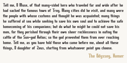 Vantagram is a modern display font. The typeface is made from basic square geometry. It is inspired by blackletter typefaces of the medieval period in Europe. The Vantagram name is a combination of two words derived from “vanta” French for boast and “gram” Greek for letter or that which is drawn. Vantagram is great for display work, quotes, titles, headings and posters.
 - Cash Point Mono by Matthias Luh,
$2.00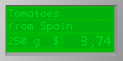 A very straight, geometric font which reminds me of the font on a display of a cash desk. Like most of the fonts at these display, this font is made up of a 6x10 matrix (capitals: 5x7). Hint: Insert Æ or ∂ to create a filled character (6x10).
 - PF DIN Text Arabic by Parachute,
$145.00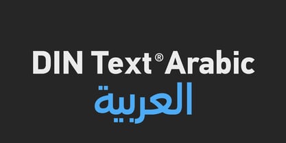 This Arabic typeface is one of Parachute’s most involved text typefaces. For the first time -back in 2010- a contemporary Arabic equivalent to a comprehensive DIN series of fonts was available. In fact, this set of fonts contains the most complete and powerful array of Arabic features commercially today. It comes in eight weights and includes Latin. Based on the DIN Text Pro superfamily, Parachute® released -in collaboration with designer Hasan Abu Afash- 2 new versions. DIN Text Arabic is the basic Arabic version which includes Latin and supports all variations of the Arabic script such as Persian, Urdu and Pashto. The second version DIN Text Universal is the most advanced DIN superfamily ever. It combines the powerful DIN Text Pro with DIN Text Arabic bringing the number of glyphs to 3320 per font. It is also enhanced with 30 advanced opentype features and kerning for all languages. Altogether it supports hundreds of languages, proving to be an essential tool for corporations which operate internationally. The whole family consists of eight weights from extra black to hairline. DIN Text Arabic is featured in the recent book Arabesque 2 by Gestalten.
 - Classic Roots Personal Use - Personal use only

- Black Jack Personal Use - Personal use only

- BARBARA PERSONAL USE - Personal use only

- Candy Cane Personal Use - Personal use only

- Vacant by Reserves,
$39.99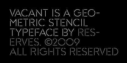 Vacant is a precisely drawn, contemporary stencil face built with attention towards retaining pure underlying geometric forms and visual balance between letterforms. Stylistically, Vacant exudes a strong sense of clarity and sophistication which contrasts the unrefined nature of stencil typefaces.
 - HV Harietta by Harmonais Visual,
$12.00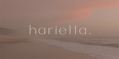 Harietta - a semi-geometric, clean sans serif with a retro, humanist and elegant touch.. Specially designed for simple, clean, humanist projects. The font is perfectly suitable for creating elegant, clean, retro design such as logo, packaging, social media, and more.
 - Hefeweizen by David Thometz Design,
$24.95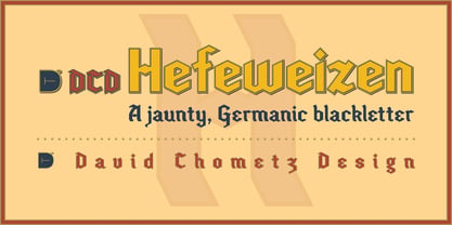 As seen on Typophile.com, DTD Hefeweizen is a contemporary take on the textura blackletter style. Comprised of straight lines and angles sloped at ratios of 1/2 or 2/1, Hefeweizen is a highly geometric design with extensive alternates and ligatures.
 - Flomic by Sergey Melnikov,
$24.00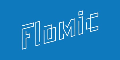 Ukrainian type designer Melnikov Sergey created Flomic font between 2015 and 2016. Flomic is a geometric sans built from a folded lines. Most effective when used in short words or phrases at larger sizes, where the details can be appreciated.
 - Ultima by TipografiaRamis,
$29.00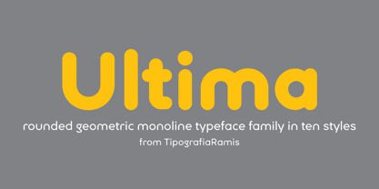 Ultima is a rounded geometric monoline typeface family, built in ten styles. The typeface is ideal for use in display sizes, though is quite legible in text. Ultima is released as OpenType single master with a Western CP1252 character set.
 - Agustonica by Rodigi,
$12.00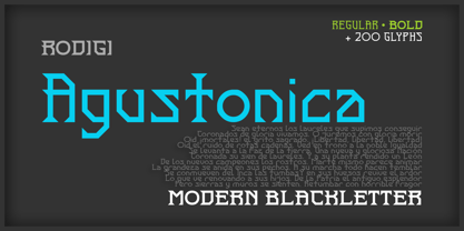 Agustonica is a geometric modern blackletter serif display font. An experimental mix between angled and straight lines makes this a unique typographic design. Easily access case-sensitive styles. Perfect use includes logo, poster, display, headline, t-shirt design and many more.


