10,000 search results
(0.09 seconds)
- Virtual by John Moore Type Foundry,
$25.00 Virtual is an experimental fantasy font based on a pseudo optical enclosure where a linear system that is not connected there. Virtual comes in three weights: regular. light, and thin also an virtual mix by mixing different thicknesses in a single font, with alternative variations through features of open type. Virtual is an experience based on play with the laws of the Gestalt of closing.
 - Tenderly by Supfonts,
$15.00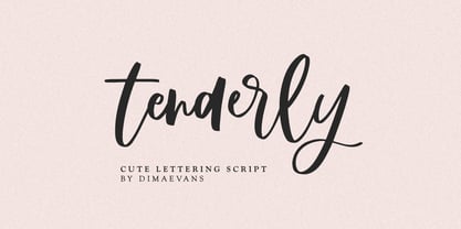 Tenderly it is a chic lettering font with exquisite accents. It is perfect for branding, wedding invitations and invitation cards and more. This font includes a full set of gorgeous uppercase and lowercase letters, numbers, a large selection of punctuation marks and ligatures. Includes: Regular Script Latin languages support Uppercase and lowercase Numbers and punctuation Ligatures Check out my blog: https://www.instagram.com/di.zigner/ pinterest.com/dmitriychirkov7 Enjoy
 - Rolan by Larin Type Co,
$12.00 Rolan This is a light elongated font that includes light, regular and bold weights, as well as these weights in a rough style. It is versatile and will perfectly fit into any project in both modern and vintage style, it is perfect for creating a logo, banners, flyers, labels, branding and much more This font family has only Capital letters and some of them are different.
 - Psyleidoscope by Designpiraten,
$19.00 Imagine a font that reveals more and more details the closer you get. Clearly readable in small sizes and illustrative when blown up to large scales. A psychedelic trip, a kaleidoscope of discoveries – that is Psyleidoscope. Use it in extreme sizes – large and small – to get all the fun out of it. There are two styles, Regular and Bold, with glyphs that support 207 different languages.
 - Starbounder by Kustomtype,
$25.00 Kustomtype's "Starbouder" font is a cool stencil font family with a regular & oblique version. It contains all upper & lower cases. The "Starbouder" family is coordinated into letterforms, metrics, and weights to work better together. Why still looking for cool and decorative army, stencil and graffiti fonts for your posters, advertising, text, design, artwork, headtext, editoral design, magazines, etc. 'Starbouder is a decorative stencil & graffiti font'
 - Mechacore by takoliko,
$9.00 Mechacore is a variable modern sans serif display typeface designed by Takoliko Studio. It comes with regular and stencil style, it have 5 weights and expanded width. Its inspired by a mecha cyberpunk sub genre. the modern and unique characteristics makes it suitable for attention grabbing design projects such as a engineering, technology, cyber media, army stuff, headlines, posters, social media displays and editorials.
 - Megar by Viaction Type.Co,
$20.00 Megar is a display font with a bold retro feel and available in 2 styles, regular & oblique. It is suitable to complement your work with a retro or pop art theme. Megar is sold at affordable prices and you will get lots of bonus background gradient & gradient shapes. Get this font right now! Don't miss this product from us! Also check out our other products. Viaction Type
 - Pulchra SPF by S6 Foundry,
$25.00 Pulchra is a stylish Brutalist font. The font displays a playfulness personality, vitality, with a strong and elegant appearance. The typeface has the right visual consistency for branding communications. It comes with unique lower and uppercase plus numbers, punctuation & multilingual letters. Its thick curves give the 60s & 70s groovy vibe. What you get: - Letters, numbers, punctuation, multilingual support, alternate and ligature - Light, Regular, Medium, and Bold version.
 - South Canyon by Rillatype,
$15.00 Saddle up and embrace the untamed spirit of the Wild West with South Canyon, a captivating display font inspired by fearless cowboys and rugged landscapes. With its bold and distinctive letterforms, South Canyon brings an authentic and powerful presence to your designs. Choose between the regular version for a perfect balance of legibility and boldness or the stamp version for a vintage, weathered look.
 - Sky Clipper JNL by Jeff Levine,
$29.00 Sky Clipper JNL is a bold, Art Deco sans serif typeface derived from the hand lettered title on a 1940s-era “Big Little Book” entitled “Flying the Sky Clipper with Winsie Atkins”. The design is available in both regular and oblique versions. “Big Little Books” were published by the Whitman Publishing company and featured short stories printed in a tiny sized book format for young children.
 - Pen Sans Rounded by Jeff Levine,
$29.00 Many alphabet style examples from the Speedball Textbook on pen lettering have offered amateurs and professionals a source of inspiration since its first publication in 1915. A 1940s edition presented a simple sans serif design rendered with the style ‘B’ round nib pen point, and has been recreated as the digital type face Pen Sans Rounded JNL, which is available in both regular and oblique versions.
 - JollyGood Serif by Letradora,
$16.00 JollyGood Serif is another member of the JollyGood family. This is a hand drawn serif/typewriter font that can work both for comics or as a display face . It is a complete complete family with 4 weights in regular and italic (8 fonts in total). It has an amazing character set, with support for most latin languages, as well as extra characters and ligatures.
 - Forged by Hemphill Type,
$30.00 Hand forged with strength & precision – Forged is a bold, powerful typeface that stands strong. Handcrafted as if by a blacksmith, this typeface has its quirks and imperfections like any metalwork which gives it a unique character. The family consists of regular, outline, bevel and fill versions. All weights are versatile and can be used for packaging, logotype, copy and headings. Strike while the iron's hot!
 - Piano Music JNL by Jeff Levine,
$29.00 A 1910 collection of piano sheet music called “Presser’s Economy Group” had that name hand lettered in a fancy serif lettering style that could fall somewhere between Art Nouveau and semi-calligraphic. No matter the label you attach to the style, it makes for a wonderful digital type revival. The end result is Piano Music JNL, which is available in both regular and oblique versions.
 - Acaraje by Latinotype,
$39.00 Acarajé is a grotesque font that stands out thanks to its versatility. Its personality blossoms through its particular modulation, which grows with weights; making it a rather jovial typeface that does not abandon the characteristics of more classic grotesques. With two styles available: normal and italic, and a variety of 7 weights that range from "Black" to "Regular", this font offers incredible flexibility for your designs.
 - Tamitsa by QubaType,
$20.00 Tamitsa is a condensed display sans font. The font is universal and can be used in different directions of graphic design - Internet, printed materials, clothing, logos, posters, labels, navigation and more. Thanks to character compression, you can place a large amount of information in a compressed space. It will read equally well in large and small sizes. Tamitsa contains 4 fonts: 2 regular and 2 slanted.
 - Anza by Surplus Type Co,
$16.00 Anza is a tall condensed sans serif display font with exaggerated ink trap stylings. This typeface could be perfect for use in large titles, headlines, branding projects, editorial layouts & so much more! It includes a handful of alternate characters as well as some ligatures to optimize the appearance in awkward pairings. You'll get the regular & oblique styles, each with a full set of multilingual characters.
 - People Talk JNL by Jeff Levine,
$29.00 A title card with cast credits for the 1935 movie “The Whole Town’s Talking” (starring Edward G. Robinson and Jean Arthur) formed the basis for People Talk JNL. The hand lettered names were done in a slightly condensed slab serif – mostly rectangular in shape with rounded corners. A few characters take on their own unique appearance. People Talk JNL is available in both regular and oblique versions.
 - Saint Onki by Atom,
$10.00 Saint Onki is a natural brush font with 4 styles that will give a casual impression to your design. With stylistic sets and original handmade quality, your design will stand out more. You will get Saint Onki Regular Saint Onki Italic Saint Onki All Caps Saint Onki All Caps Bold Saint Onki Swash Hope you like it with this font. Have a great day and happy buying.
 - Selma by Sea Types,
$25.00 Selma is a family of Sans Serif fonts with 492 Glyphs, 04 weight (Light, regular, medium and bold), with long stems, inspired by bar codes. Extremely condensed vertical emphasis, its bars positioned at the ends of the rods give a strong dose of personality and elegance to the design, has a height of x accented, giving strength and power of attraction for short texts and large sizes.
 - Peppermill JNL by Jeff Levine,
$29.00 A bold sans serif with occasional rule-breaking vertical serifs on some characters was found within page examples from the book "100 Alphabets Publicitaires" ("100 Advertising Alphabets"). Although a few of those vertical serifs extended above the cap height in the hand lettering, they were made more uniform to keep a consistency in the digital version known as Peppermill JNL. Available in both regular and oblique versions.
 - Slatterine by Greater Albion Typefounders,
$11.95 Slatterine is a retro-futuristic family, inspired by the second streamline era of the 1950s It's ideal for any design work that needs to suggest bygone visions of the future, or to have a retro-space-age effect. Slatterine's horizontally shaded glyphs give a strong sense of motion, whether coupled with the regular form's sharply leaning oblique angle, the perpendicular form, or the reverse leaning 'Lefty'.
 - Avenia by Supfonts,
$15.00 Avenia it is a modern calligraphic font with exquisite accents. It is perfect for branding, wedding invitations and invitation cards and many more Font includes a full set of gorgeous uppercase and lowercase letters, numbers, a large selection of punctuation marks and ligatures. Includes: Regular Script Latin languages support Uppercase and lowercase Numbers and punctuation Ligatures Swashes Check out my blog: https://www.instagram.com/di.zigner pinterest.com/dmitriychirkov7 Enjoy
 - Master Photograph by Subectype,
$17.00 Master Photograph is a Monoline Signature Font, font with a touch of handwriting style. This font is perfect for creating signature logos and watermarks for photography studio or wedding invitation. Master Photograph includes full set of beautiful hand lettered uppercase and lowercase letters, numerals, a large range of punctuation and many beautiful ligatures. You will get: Regular and Italic Version 100+ Ligatures Thank You, Subectype
 - Down Home JNL by Jeff Levine,
$29.00 In the October 31, 1920 edition of Wid's Daily (the predecessor to The Film Daily), a block of ad copy from a 1920 film called "Down Home" had the text printed in such a fluent pen-lettered style that a bit of a shortcut was used at the beginning of the design process for this typeface. Normally, font inspirations are redrawn [and not by simply using auto-trace] except under specialized circumstances like this one where that feature is a help, rather than a replacement for the creative process. The entire block of text copy was auto-traced, then the necessary letters were selected from the available wording and cleaned up to remove any sharp points and irregular curves in an effort to make the end results as close to the original and unusual hand-drawn text. From there the missing characters needed to produce a finished type font were created utilizing the standard methods of drawing and font construction. The end results turned out very well. Using the film's title as its namesake, this design is now available digitally as Down Home JNL in both regular and oblique versions.
 - Pantera by Lián Types,
$39.00 ROARRR! THE STYLES -Pantera Pro is the most complete style, and although its default look is mono-rhythmic it gets really playful and crazy like the examples of the posters by just activating the Decorative Ligatures button in the Open-type Panel of Adobe Illustrator. However, I recommend using also the Glyphs Panel because there you'll find much more variants per letter. Pantera Pro is in fact, coded in a way the combination of thicknesses will always look fantastic. -Pantera Black Left, and Pantera Black Right are actually “lite” versions of Pantera Pro: They have very little Open-Type code, so what you see here is what you get. Pantera Black Left has its left strokes thick, while Pantera Black Right has its right strokes thick. -Pantera White is a lovely member in this family that looks lighter and airy, hence its name. With the feature Standard Ligatures activated (liga) the font gets very playful. -Pantera Caps is based on sign painters lettering and since it follows the same pointed brush rules as the other styles, it matches perfectly. -Pantera Claws like its name suggests, is a set of icons that were done by our dear panther. THE STORY It is said that typography can never be as expressive as calligraphy, but sometimes it can get close enough. I tend to think that calligraphic trials, in order to work well as potential fonts, need first to go through very strict filters before going digital: While calligraphy is synonym of freedom (once its rules are mastered), type-design, in the other hand, has its battlefield a little tighter and tougher. When I practice pointed brush lettering, there are so many things happening on the paper. And most of them are delicious. The ones who know my work may see that although many of my fonts are very expressive, my handmade brush trials are much more lively than them. With that in mind, this time I tried to go further and rescue more of those things that are lost in the process of thinking type when first sketches are calligraphic. I wondered if I could create something wild, hence its name Panther, by understanding the randomness that sometimes calligraphy conveys and turning it to something systemic: With Pantera, I created an ordered disorder. Like it happens a lot in many kinds of lettering styles, in order to enrich the written word the scribe mixes the thickness of the strokes and the width of the letters. Like one of my favorite mentors say (1), they make thoughtful gestures Some lively strokes go down with a thick, while some do that with a thin. Some letters are very narrow, meaning some of them will need to be very wide to compensate. Why not?. The calligrapher is always thinking on the following letters, and he/she designs in his head the combination of thicks and thins before he/she executes them. He/she knows the playful rhythm the words will have before writing them. It takes time and skill to master this and achieve graceful results. Going back to the font, in Pantera, this combination of varying thicknesses and widths of letters were Open-Type coded so the user will see satisfactory results by just enabling or disabling some buttons on the glyphs panel. I'm very pleased with the result since it’s not very easy to find fonts which play with the words' rhythm like Pantera does, following of course, a strong calligraphic base. I believe that if you were on the prowl for innovative fonts, this is your chance to go wild and get Pantera! NOTES (1) Phrase by Yves Leterme. In fact, it’s the title of a book by him. EPILOGUE Esta fuente está dedicada a mi panterita
 - Alergia Grotesk by Borutta Group,
$29.00 Alergia Grotesk was made as a hybrid between a classical geometric grotesque and a linear antiqua. This typeface is characterised by a lot of details, which gives it a strong character. Unpredictable cuts in a letters “a” and “s”, or a double “g” in combination with a delicate contrast, makes Alergia Grotesk a good choice for many purposes from headlines to short flowing texts. A big range of width varieties allows to versatile use and can give a nice effect while mixing extreme varieties with each other in one project. The family consists of 10 weights, 3 widths and set of italics – together 60 styles. The whole family has a comprehensive set of characters. In addition to the Latin letters, Alergia Grotesk also has a full set of characters for Vietnamese, extended Cyrillic (with Abkhasian) and Greek.
 - Delikaat by Cubo Fonts,
$19.00 Delikaat is made up of thin & thick strokes - a version of Cubo Font's former Delicate. Most cursive fonts intend to create the look and feel of real handwriting: many letters have a specific drawing, following other letters that come before and after, or its position at the beginning or at the end of the word. “Delicate” resolved that problem thanks to the OpenType technology, and offers many discretionary ligatures (group of pre-drawn letters), adapted to numerous combinations. Therefore, it’s not only a decorative and calligraphic writing, but also a fluent and energetically one. In order to make the most of it, please activate your software’s OpenType features.
 - Indigena by Latinotype,
$29.00 Mapuche means ‘man of the land’ and it is also the name of a group of indigenous inhabitants in South America. During the southern Winter solstice, between June 21 and June 24, the We Tripantu, the Mapuche New Year fest, takes place with a magical rite in the middle of the nature. Indigena is a dingbat font that remakes the artistic expression of the Mapuche people in Chile, recovering the handmade stroke they used in textiles and ceramics, but with a fresh look. This dingbat is based on pre-Columbian iconographic drawings shown in the book Dibujos Indígenas de Chile (1929) by chilean art teacher Abel Gutiérrez.
 - Planet Express by Estudio Calderon,
$29.99 Family type designed by Felipe Calderón. This type is a display with a modern style and a different and innovative concept. The development of this type was a challenge because it was set out from the begining as a script font with ornaments and complements, where the round shapes do not have prominence in the result. Planet Express is an interesting job from the aesthetic point of view, it works for big scale texts and contains little shadow-cuts in each character to give it more personality and stand out among other fonts from this gender. I hope this new project works to solve issues in design. Planet Express is composed of Regular & Italics, it has 250 intelligent ligatures to produce the best signs in big scale, it is perfect for branding and works very well with the geometric complements. It is designed with programming in opentype: Ligatures, Discretionary ligatures, Stylistic Alternates, Stylistic set 01, Stylistic set 02, Stylistic set 03, Stylistic set 04, Stylistic set 05, Stylistic set 06, Stylistic set 07, Stylistic set 08 & Stylistic set 09, multiple language support and a complete set of extras like arrows, catchwords, flags, emblems, hands, fleurons & crossed elements. Planet Express can be used in different ways, each character pretends to cover the needs in any circumstance where it is used. It is funny to write words and play with the complements. It also works with current concepts in graphic design like sports, cars, hip hop, music, social network, skateboarding and more. Everybody can use this font, it works with different languages like italian, french, portuguese, danish, german and so forth. See specimen and samples here. Enjoy it!
 - Edgar Pirámide Fuente LCD diseñada con mucho cariño para recordar las pirámides que abundan por toda mi Nación de México desde playas al raz del mar como Tulum hasta lo más alto como Teo...
- Droid Sans is a contemporary sans-serif typeface family designed by Steve Matteson of Ascender Corporation. Introduced as part of Google's Android operating system, the primary intention behind the c...
- Retrokia by Edignwn Type,
$16.00 The font collection is called "Retrokia", it is a display font for logotype. These collections contain script and sans serif font. Every font comes with 4 style typefaces (regular, rounded, rough and textured). This script font includes some alternates and ligatures. The Retrokia matches apply in some designs such as the logo, poster, label, badge, packaging, t-shirt, branding, quotes and more custom design. Retrokia features : 4 style typefaces (regular, rounded, rough and textured) Uppercase, lowercase, numeral, symbol, punctuation, alternate and ligature in script font All-caps, numeral, symbol and punctuation in sans serif font Multilingual PUA Encoded Thank you for your support and choosing us.
 - Pexico by Setup,
$- Pexico is a pixel typeface that uses 10 by 14 grid (capital letter) in 8 styles: 4 basic styles for text setting — Regular, Bold, Narrow, and Mono and 4 stylistic variations of the Regular style for display setting — Outline, Dots, Round, and Inverse. It fits the display's pixel grid when used at 20pt size or its multiples. Pexico supports Latin, Cyrillic, and Greek Monotonic scripts, all with thoroughly designed diacritics. Moreover, Pexico makes use of advanced OpenType features, just as any other modern text typeface. Each style also has 9 sets of numbers, small capitals and is properly kerned. For more information go to Urtd.
 - LD Cherries by Dikas Studio,
$15.00 Hello... this is Cherries, a cute and bounch hand drawn font family. Cherries have 5 weight: light, regular, medium, semibold and bold with 2 styles: regular and slanted also included with pairing font Cherries Display. Cherries included with some alternate character and ligature to make your design awesome. Cherries is fun and very suitable for cute or girly design needs such as cover design, typography, sticker, greetings card, logo, merchandise and many more. Cherries also easy for read and you can use it for quote or caption. Add this beautiful handwritten font to each of your creative ideas and notice how it makes them stand out!
 - Comical by Scholtz Fonts,
$12.00 Comical is an offshoot of Scholtz Fonts 2007 Comic SCF. The font has been reworked and updated, and is presented in three weights, Black, Regular & Lite. Comical is legible and infinitely versatile: Black works wonderfully for display purposes, posters, headlines, branding, signage, ads and comic covers. Regular is great for body text or subheadings, for hang tags and branding, for greeting cards, magazines and comics. Lite works best as a body font in children's books and comics, and in combination with the bolder options. The family is vigorous, lively, casual and, above all, fun! Comical supports extensive languages such as Western European, Central and Eastern European languages.
 - Neotoxic by Nocturnal Workspace,
$9.00 Neotoxic Font Family has been published since 2022, and can be downloaded for free on the dafont website. This font supports interesting features such as small caps, ligatures, salts, etc. also consists of 6 font styles including thin, light, regular, bold, black, outline. WHAT YOU GET Features : Small Caps, Ligatures, Ligatures Contextual, Salt. 6 versions normal & italic (ttf + otf) 24 types of font files include Regular, Bold, Light, Hollows/Outlines, thin, Italic, light PUA Encode Characters, fully accessible without additional design software. Includes a range of multilingual characters. Neotoxic is suitable typeface for various purposes like logotype, signage, label, poster, dropcap, titles, letterhead, book cover and etc. Thank you!
 - Kalkal by Gunjan,
$40.00 Kalkal is slab serif typeface with five style, inspired by sign-board. It looks like many typeface with three dimensional. The main layer is regular and in-liner bring little spark in the Typeface. Two shadow layers gives an eye catchy impression and opacity layer is charm of the family. This five layered typeface can be used alone or combined, which makes it a versatile. This type works both for vintage and modern designs. Now let’s see how it works: In-liner layer Regular layer Shadow one layer Shadow two layer Opacity shadow layer kalkal with its five layers gives you flexibility to design.
 - Aqua Casual by Scholtz Fonts,
$18.00 The script equivalent of the cool, header font. This font is essentially embedded, by its styling, in the 20th century. Inspired by fragments of some pre-20th century script fonts, I modernized it and added lower case characters. The result captures the cool elegance of the 1920s & 30s, yet also embodies the free optimism of the 60s. Aqua Casual is a fully professional font, carefully letterspaced and kerned. All upper and lower case characters, punctuation, numerals and accented characters are present.
 - Centennial Script by Canada Type,
$24.95 Centennial Script was designed and cut by Hermann Ihlenburg in 1876 (the centennial of American independence, hence the typeface's name) for the MacKellar, Smiths & Jordan foundry in Philadelphia. Ihlenburg was then only 33 years old, and these beautiful forms put him on his way to become the most prolific and innovative deco, ornamental and script typeface designer and punch cutter of the nineteenth century. In trying to be a true homage to the history of the new world, Centennial Script transcends its then-contemporary deco fashion to embrace script elements historically similar to lettering found on maps or political documents of the 18th century. Letters like the p and s extend themselves high and mighty to accentuate words and lines of text in a fancy hand-drawn manner. The dots on the i and j are those of a careful scribe who acknowledges the importance of the document being lettered. The lowercase letters connect with two slight angular motions of the hand, also very carefully and elegantly. Even the ligatures and ending swashes Ihlenburg made for this face were reminiscent of a mapmaker's patient hand, though Ihlenburg's elegant touch in them cannot be mistaken. Although Centennial Script was one of the few Ihlenburg faces to make it to film type technology, the transition was neither credited nor faultless. The film type version was a bit sloppy in the way the connectors were made, so the lowercase needed a lot of manual work to typeset properly. To alleviate such waste of time for the user of this digital version, the connectors were redrawn according to the original metal ones made by Ihlenburg himself, and tested thoroughly in print to ensure the quality of the typeface's flowing cursive nature. This wasn't an easy task, and very time-consuming, since the changing angles on both ends of the connection made it impossible to escape from having to build every lowercase letter with both left and right connectors that would fit with the rest of the letters. This is one typeface that couldn't be revived in any other manner than the way it was originally made, regardless of more than 130 years of technological advances since the face was designed. Centennial Script comes in all popular font formats, and supports most Latin-based languages. Also included is an Alts fonts that contains alternates, ligatures, snap-on swash endings, some ornaments, as well as a complete set of the lowercase without left side connectors, for a more natural combination when following a majuscule, or just in case the user finds it fit to set the copy in a non-connecting script instead of the face's original connected flow. Centennial Script Pro, the OpenType version, combines the main font with the Alts font in a feature-packed single font. Use the ligature feature to set wordmarks like Mr, Ms, Mrs, Dr, and &Co, the stylistic alternates feature to replace some letters with their alternative forms, the contextual alternates feature for better uppercase-lowercase sequences, and the titling feature to set your text in a disconnected script. Centennial Script is the only script we currently know of that can be set connected or disconnected simultaneously, either using the titling feature in the OpenType Pro version, or manually in the other formats.