10,000 search results
(0.06 seconds)
- Hennepin by Josh Grzybowski,
$24.99 Hennepin derives from a bridge, a street and a county that share the same name in Minneapolis, MN. It is a serif font comprised of three agile weights: regular, light, and extra light. The character set contains typical OpenType features in addition to small caps, and old style numbers, but most importantly, it embraces stylistic alternatives that unite and complete this font.
 - Redob by Product Type,
$18.00 The Redob Racing Font is a strong-looking font that gives your project a bold and sporty personality. This font was designed with attention to detail to make your design project stand out from the rest. A bold, masculine font that’s perfect for creating that “in your project” look. Comes in 6 different styles: Regular, Round & Italic, each with a slightly different feel.
 - Dip Pen Deco JNL by Jeff Levine,
$29.00 The hand lettered title on the cover of the 1938 sheet music for “If It Rains – Who Cares” featured a condensed Art Deco typeface made with a round nib pen. The square shaped characters with rounded corners were a perfect subject for a digital font revival, and are now available as Dip Pen Deco JNL, in both regular and oblique versions.
 - Khalidin by IbeyDesign,
$15.00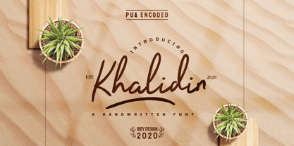 Khalidin Handwritten Script Font is a luxurious handwritten font. It has a modern style and comes in a regular and swash version which gives you the opportunity to create multiple unique designs. It’s perfect for photography, watermarks, social media posts, advertisements, logos & branding, invitations, product designs, labels, stationery, wedding designs, product packaging, special events, or anything that needs a handwriting taste.
 - Zenaida by Hanken Design Co.,
$30.00 Zenaida is a distinctive display serif font adorned with stylized serifs, evoking a floral essence. Its graceful, flowing ligatures and stylistic alternates add an organic touch to text. Featuring a range of styles including Regular, Medium, Bold, ExtraBold, and an additional semibold weight, Zenaida offers versatility across various design applications, providing a diverse set of options to infuse character and distinction into projects.
 - Faithful Colony by Creativemedialab,
$20.00 Faithful Colony is a modern, elegant, classic typeface with a timeless look. It comes with seven weights ranging from thin to black, matching italics, and a variable format. Faithful Colony is perfect for fashion-related concepts, Luxury and Elegant design, Classy or high-end branding, logo, and many more. Try to combine the regular and italic styles for a modern and elegant look.
 - Miedinger by Canada Type,
$24.95 Helvetica’s 50-year anniversary celebrations in 2007 were overwhelming and contagious. We saw the movie. Twice. We bought the shirts and the buttons. We dug out the homage books and re-read the hate articles. We mourned the fading non-color of an old black shirt proudly exclaiming that “HELVETICA IS NOT AN ADOBE FONT”. We took part in long conversations discussing the merits of the Swiss classic, that most sacred of typographic dreamboats, outlasting its builder and tenants to go on alone and saturate the world with the fundamental truth of its perfect logarithm. We swooned again over its subtleties (“Ah, that mermaid of an R!”). We rehashed decades-old debates about “Hakzidenz,” “improvement in mind” and “less is more.” We dutifully cursed every single one of Helvetica’s knockoffs. We breathed deeply and closed our eyes on perfect Shakti Gawain-style visualizations of David Carson hack'n'slashing Arial — using a Swiss Army knife, no less — with all the infernal post-brutality of his creative disturbance and disturbed creativity. We then sailed without hesitation into the absurdities of analyzing Helvetica’s role in globalization and upcoming world blandness (China beware! Helvetica will invade you as silently and transparently as a sheet of rice paper!). And at the end of a perfect celebratory day, we positively affirmed à la Shakti, and solemnly whispered the energy of our affirmation unto the universal mind: “We appreciate Helvetica for getting us this far. We are now ready for release and await the arrival of the next head snatcher.” The great hype of Swisspalooza '07 prompted a look at Max Miedinger, the designer of Neue Haas Grotesk (later renamed to Helvetica). Surprisingly, what little biographical information available about Miedinger indicates that he was a typography consultant and type sales rep for the Haas foundry until 1956, after which time he was a freelance graphic designer — rather than the full-time type designer most Helvetica enthusiasts presume him to have been. It was under that freelance capacity that he was commissioned to design the regular and bold weights of Neue Haas Grotesk typeface. His role in designing Helvetica was never really trumpeted until long after the typeface attained global popularity. And, again surprisingly, Miedinger designed two more typefaces that seem to have been lost to the dust of film type history. One is called Pro Arte (1954), a very condensed Playbill-like slab serif that is similar to many of its genre. The other, made in 1964, is much more interesting. Its original name was Horizontal. Here it is, lest it becomes a Haas-been, presented to you in digital form by Canada Type under the name of its original designer, Miedinger, the Helvetica King. The original film face was a simple set of bold, panoramically wide caps and figures that give off a first impression of being an ultra wide Gothic incarnation of Microgramma. Upon a second look, they are clearly more than that. This face is a quirky, very non-Akzidental take on the vernacular, mostly an exercise in geometric modularity, but also includes some unconventional solutions to typical problems (like thinning the midline strokes across the board to minimize clogging in three-storey forms). This digital version introduces four new weights, ranging from Thin to Medium, alongside the bold original. The Miedinger package comes in all popular font formats, and supports Western, Central and Eastern European languages, as well as Esperanto, Maltese, Turkish and Celtic/Welsh. A few counter-less alternates are included in the fonts.
 - Minnesota Plaid by Breauhare,
$35.00 Minnesota Plaid is the baddest plaid ever! It may not be the choice pattern for golfers' slacks or bagpipers' kilts, but it has a City-like flavor with its own twist, a stylish ruggedness & toughness that could even be described as a sort of formal graffiti, thanks to the art deco swash of many of its strokes. It’s the kind of look that would be perfectly at home with hip hop or rap music, football and other sports, cars and trucks, power tools, and other manly, masculine usages. Of course, women are just as capable of having the aforementioned interests, too. Minnesota Plaid is the kind of font that can get stuck on you! Digitized by John Bomparte.
 - Camden by Geoffrey Lee,
$18.00Camden is based on the types used in Camden's 'Remaines concerning Britaine' published in London in 1638. The object was to avoid the contradiction inherent in most 'distressed' typefaces made to give the effect of the imperfections in old print. This means that apparently worn characters are perfectly repeated throughout a setting. The makeup of the Camden fonts means that, with a little extra keying time, alternate characters may be brought in which overcome this. Also many characters are provided which have 'period identities' such as the long s with ligatures, tied sorts ct, sp and st, swash characters in the italic and the double vv, all of which can add a specific age identity. - Aloe by ROHH,
$29.00 Aloe is a characterful and friendly display font family inspired by headlines from 1930’s newspapers and calligraphy. The family consists of 9 weights, ranging from Thin to Heavy, with matching ornament fonts. It features a variable font with weight axis. Each weight has over 900 glyphs including advanced typographic features, such as vast number of stylistic alternates, swashes, titling and terminal forms, case sensitive forms, ligatures, symbols, ornaments as well as lining and old style figures, fractions, subscripts and superscripts. This original mixture of display typeface with calligraphy gives a versatile family great for all sorts of uses - from advertising, packaging, branding, wedding invitations, menu cards and other editorial uses to screen and web projects.
 - 1871 Dreamer Script by GLC,
$38.00 This script font was inspired from a lot of manuscripts, notes and drafts, written by the famous American poet Walt Whitman. It is a very elegant type, in spite of a few curious ligatures, often concerning the r or z small letters. Notice the very characteristic “th”. It is used as variously as web-site titles, posters and fliers design or greeting cards, all various sorts of presentations, menus, certificates, letters. This font, in spite of its small size, supports very strong enlargements as well as small sizes ( the original size was about 36 to 48 pts ). When printed, it remains perfectly legible and elegant from 9/11 pts even if using an ordinary inkjet printer.
 - Refinu by Twinletter,
$17.00 This font is really interesting for you to use in various sorts of your projects, your project will be good and draw a lot of people’s attention. Refinu san serif font with a unique shape but still comfortable and easy to read. This font is also quite versatile and simple to use, allowing you to complete your tasks swiftly. But, more importantly, using this typeface will ensure that your project is remembered by your entire audience. of course, your various design projects will be perfect and extraordinary if you use this font because this font is equipped with a font family, both for titles and subtitles and sentence text, start using our fonts for your extraordinary projects.
 - Awwam by Eyad Al-Samman,
$20.00 Awwam refers to the region of Awwam which is now thought by most scholars to be Ma'rib or the famous temple of Awwam otherwise known as Mahram Bilqis. The Awwam temple—Arabic Haram Bilqis or Mahram Bilqis—is a Sabaean temple near Ma'rib in today's Yemen. It was built by Mukarrib ‘Yada'il Dharih I’ between the 7th and 5th century B.C. Also, one of the most frequent titles of the God ‘Almaqah’ was the Lord of Awwam. Almaqah was the main God of the ancient Yemeni kingdom of Saba' and also the kingdoms of D’mt and Aksum in Eritrea and Northern Ethiopia. Different members of the ruling dynasties of Saba' regarded themselves as Almaqah’s children. Awwam is a wide and headline Arabic display typeface. The main trait of this typeface is the wide, curved, and streamlined design of its wide kashida, letters, and ligatures. This feature renders it as one of the modern stylish typefaces used for headlines, titles, headers, banners, and captions. Among the distinguished letters of Awwam typeface are the “Alef”, “Qaaf”, “Waaw”, “Yaa”, “Gheen”, and others. Moreover, Awwam typeface has a character set which supports Arabic, Persian, Urdu, and simple Latin letters/numerals with a limited range of specific Arabic and Latin ligatures. This typefac comes in two styles (i.e., Awwam, and Awwam-Pro) with a single weight (i.e., regular) and nearly 650 distinctive glyphs for each style. Due to its ultra-wide design, Awwam typeface is mostly appropriate for headings and titles in Arabic, Persian, and Urdu. It can be graphically and visually exploited in books, novels, magazines, newsletters, pamphlets, posters, and interfaces of other objects such as clothes and equipment. Moreover, it can be pleasingly used for signs, books’ covers, advertisement light boards, and titles of flyers, and books of children and adults. In brief, Awwam typeface is one of the new wide Arabic typefaces which can be utilized efficiently in diverse graphic, typographic, and artistic works for different languages and cultures.
 - Starburst - Unknown license

- Commerciality - Unknown license

- Gerd - Personal use only

- monoMMM_5 - 100% free

- Aarco- - Unknown license

- Zit Graffiti - Unknown license

- Creepygirl - Unknown license

- Slurp - 100% free

- Swish - 100% free

- Auldroon by Ingrimayne Type,
$12.00 Auldroon was inspired by the pseudo-medieval fonts that were fairly popular in the late 19th century. Auldroon comes in two variants. Auldroon-Eld was designed first and is a bit more compact than the regular version. Both are decorative and distinctive and neither was created with a specific use in mind.
 - Anzura by Mightyfire,
$10.00 Anzura is a decorative font that can be used for book title, logo brand, poster and many more. The looks is vintage classic yet clean, with a little decoration on each letter. We have two styles, Anzura Regular and Anzura Shadow. Both are beautiful! Enjoy in cooking something creative with Anzura font! :)
 - General Merchandise JNL by Jeff Levine,
$29.00 Antique X Condensed is a condensed slab serif font found with the pages of a Rob Roy Kelly book of wood type designs. It was introduced around 1840 by Wells and Webb, and the example served as the model for General Merchandise JNL, which is available in both regular and oblique versions.
 - Tidy Hand by Sean Johnson,
$- Tidy Hand is a clean and simple hand-written font, reminiscent of classic Swiss type. Perfectly suited to annotating sketches, UX / UI wireframes and architects drawings, where a slightly more formal, but still hand-drawn aesthetic is needed. Available in light, regular and bold; with Greek, Cyrillic and full extended Latin character sets.
 - Karepe FX by Differentialtype,
$10.00 Karepe FX is a modern sans family, which comes in a variety of styles. Includes 54 styles with regular, rounded, and outline options. They all work perfectly with each other. It can easily fit into any project, so add it to your creative ideas and see how it can make it stand out!
 - Lichtspielhaus by Typocalypse,
$19.00 Lichtspielhaus is an ultra condensed Lichtspiele spin-Off with 8 weights. It still transports you back to a time where neon lights and marquee letters decorated cinema facades. There are 8 styles: Hairline, Thin, Light, Regular, Medium, Bold, Black and Heavy. "Lichtspielhaus" is the first part of a new Type Noir Quadrilogy.
 - Bistro by Vozzy,
$10.00 Introducing original label font named Bistro. This font has a wide languages support with west european characters (check out all available characters on previews). The font family has four styles: Regular, Shadow, Rough, Rough Shadow. This font will look good on any vintage styled designs like a poster, T-shirt, label, logo, etc.
 - Movie Matinee JNL by Jeff Levine,
$29.00 A 1926 trade ad for the silent comedy “The Nut-Cracker” starring Edward Everett Horton has the film’s title hand lettered in a decorative bold sans serif design complete with highlight lines and accent dots. This festive type face is now available digitally as Movie Matinee JNL in both regular and oblique versions.
 - Clanton by Monotype,
$15.99 Drawn with marker pens by Rachel Yallop, Clanton is imbued with a sense of simple, casual friendliness, and was created as to evoke handwriting. This solid, naturalistic font is available as a family of light, regular and bold weights, each with subtle natural differences thanks to being hand drawn for each variant.
 - Trajana Sans by Tipo Pèpel,
$28.00 The "Trajana Sans" is a sans-serif typeface family based on the shapes and proportions of the characters in the Trajan's Column in Rome. It consists of 4 weights, Light, Regular, DemiBold & Bold. Ideal to give a classic look and renewed our jobs without having to resort to the usual Trajan font.
 - Curtain Up JNL by Jeff Levine,
$29.00 The 1937 sheet music for the tune "Sweet Stranger" has the title hand lettered in a round cornered Art Deco sans with an inline featuring square corners. Now available as Curtain Up JNL, it is available in regular, oblique, solid and solid oblique versions (for those who prefer a version without the inline).
 - Kowane by Valentino Vergan,
$18.00 Kowane is a very eye-catching and creative bubble font. Kowane is designed with fun and playful letters, making it great for retro designs and graffiti projects. Kowane comes in regular and oblique styles, included is a set of solid uppercase and lowercase letters. I hope you enjoy using the Kowane typeface.
 - Cheeky Moghster by Salamahtype,
$19.00 Cheeky Moghster is a fun slab serif font mixed with vintage style. Cheeky Moghster are ready to be used to make your design projects more interesting. Its special stamp style gives your design a unique and classic touch. Features : – Uppercase and lowercase – Punctuation and symbols – Multilingual support – Style: Regular, Stamp, Expanded, Slant
 - Fun Trace Arabic by FunFont,
$17.00 Fun Trace Arabic is a font designed to make writing and recognizing Arabic letters, numbers easier for children. This is the sibling of Fun Trace Designed to consist of 6 sub-families of fonts; Regular, Bold, Dashes, Directions, Outlines, and Guide Lines. It supports the child's learning process in a fun way.
 - Fostone by GlyphStyle,
$17.00 Fostone is a signature style font with a natural looking ballpoint pen. Luxurious and elegant font. Font family with 4 version: regular, bold, italic, bolditalic. This signature font is perfect for, watermarks, branding, business, business cards, product logos, etc. – Font feature Uppercase, Lowercase, Numerals & Punctuations, Stylistic Alt, swsh (ending swash), Ligature, Multilanguage
 - Ordinary Gothic JNL by Jeff Levine,
$29.00 Ordinary Gothic JNL is a simple, thin "stovepipe" style of hand lettering found on the cover of a piece of sheet music for 1937's "You Can't Stop Me from Dreaming", and is available in both regular and oblique versions. The song was introduced and featured by Guy Lombardo and His Royal Canadians.
 - Maest by Omine Type,
$24.00Constructed only with straight lines, Maest is an unusual script typeface. The straight lines give the letters a striking visual effect, specially in small sizes. Maest also features four styles of figures, plus swash capitals, a few ending forms and the f-ligatures. It is available in three weights, from regular to black. - Alt Fat by ALT,
$- Do you like fat fonts? Well here is a free one from me. Regular & Italic both free. Fat is a caps only font. Because of that if you type something with caps on, as you can see is typing in Greek I decide to make it like this since there no lowercase letters.


