10,000 search results
(0.05 seconds)
- VTC NightOfTheDrippyDead - Unknown license

- Mortend by Arterfak Project,
$20.00 Introducing our new exploration named Mortend, a strong expanded font family. Mortend designed with geometric shapes, bold, strong curves, and modern feels. Inspired by the brutalism poster and minimalism design which has been trending nowadays, and gives you more chance to express your creativity. This font family brings a strong feel yet elegant look that you can use for many purposes. Mortend is an all-caps font with the different letterforms of 'small-caps' that you can combine at will. This family is highly recommended for display or headline on your poster, flyer, apparel, motion graphic, logotype, signage, packaging, labels, and more! The regular and light one, also good for short body text and quotes. Fonts featured: Uppercase Smallcaps Numbers Symbols & punctuation Standard accented characters
 - Geon by cretype,
$20.00 Geon Family is a modern sans-serif typeface that is clean, simple and highly readable. Letters in this type family are designed with geometric shapes without any decorative distractions. The spaces between individual letter forms are precisely adjusted to create the perfect typesetting. Geon is a versatile type family of 54 fonts. Geon family consists of 9 weights (Thin, ExtraLight, Light, Regular, Medium, Bold, ExtraBold, Heavy & Black) & 3 widths (Condensed, Normal & Expanded)with their corresponding italics. The Open Type fonts contain complete Latin 1252, Cyrillic, Central European 1250, Turkish 1254 character sets. Each font includes proportional figures, tabular figures, numerators, denominators, superscript, scientific inferiors, subscript, fractions and case features. We highly recommend it for use in books, web pages, screen displays, and so on.
 - Rosina by Hashtag Type,
$28.49 Rosina is a geometric typeface with a distinctive charm. With a captivating fusion of dashing 1920s style and 21st Century sensibility, geometric forms have been taken and optically adjusted to create a sturdy typeface. Tall ascenders and descenders attempt to simulate architectural features of the Art Deco period, striving for a look of the future, nevertheless form always follows function. Rosina explores typographic boundaries and lends itself well to branding, posters and other display uses. Full details include 6 weights from Thin to UltraBold and include a range of OpenType features such as case sensitive punctuation.
 - Urbane Condensed by Device,
$39.00 Urbane Condensed is an addition to the popular Urbane series, a versatile all-purpose sans-serif family of six weights plus italics. Perfect for headlines and running text, it is clear, classic and authoritative. It explores the same idea-space as early geometric modernist sans such as Futura, Erbar, Spartan and Elegant Sans, with a single-story a, a contemporary high x-height and very slightly condensed bowls. Unusually for a geometric moderne sans, letter-widths are optically balanced, giving an even colour in setting. Includes a full international character set, lining, tabular and old-style numerals.
 - Golane by Craft Supply Co,
$20.00 Introduction to Golane Introducing Golane, a Geometric Sans Serif font, it exemplifies a sleek, modern design. Firstly, its geometric styling enhances visual appeal. Importantly, this font is perfect for lengthy texts, offering remarkable readability. Additionally, its simplicity appeals to a broad audience, from novices to seasoned professionals. Design and Aesthetics Focusing on design, Golane is deeply rooted in geometric principles. Each character is meticulously crafted, ensuring a balanced and harmonious appearance. Furthermore, its clean lines and shapes exude a contemporary vibe. Consequently, the font masterfully combines form and function, making it highly versatile for diverse applications. User-Friendly Features Regarding user experience, Golane stands out for its user-friendly qualities. It’s notably easy to read, which greatly enhances the legibility of extended texts. Moreover, the font’s adaptability is evident, as it fits seamlessly in various contexts. Whether used in print or digital formats, Golane consistently maintains its clarity and effectiveness.
 - Bird Script by Lián Types,
$24.95 Characterized by quickness, lightness, and ease of movement, Bird Script is a font which challenges many aspects of type-design: every single stroke, comes directly from the author’s hand and tries to reflect not only the tool used, but also his feelings at the moment of writing. Bird Script is a font filled up with the energic gestures of what it’s called gestural calligraphy, a not very explored field in typography, where hardly ever a letter comes the same way two times: When manipulating the pen, the letterer seeks for the beauty of the differences and the grace of a confident execution. Originally done with a flat speedball pen nib nº5 and retouched with pencil for the bolder elements, it turned into a very pleasant to the eyes font which dances between the formal rules of typography and the artistic look of calligraphy. Bird Script Pro and Bird Script Light Pro come with many ligatures, alternates and ornaments. Into the standard ligatures we find lots of pairs of two and three ligated letters so when they are activated the font seems alive. However if none of them are activated, the font gives a really particular text pattern, specially in smaller sizes. Get Bird Script, add rhythm to your work.
 - Tonal by PintassilgoPrints,
$16.00 Tonal is a fat typeface, geometrical in its peculiar way. Available in three styles, it's a unicase alphabet and offers an alternative glyph for each letter, providing flexibility to your designs. Use it big!
 - Ganzhou by SSI.Scraps,
$39.00 Ganzhou is a great geometric sans with texture font with a natural stamp texture. This font is the perfect fit for all of your logos, branding, social media, and many others Thank You scrapstype
 - Sleepy Head by PizzaDude.dk,
$15.00 Sleepy Head is a comic sans serif with slightly geometric curves, Perfect for anything that has the need for a casual display font. Comes with 5 different versions of each letter and multilingual support!
 - Linotype Freytag by Linotype,
$29.99Linotype Freytag is a condensed display face with simple, geometric shapes. With its highly readable and trendy letterforms, it is perfect for flyers, advertising, packaging, posters and magazine headlines. - Bajt by Fontsphere,
$12.00 Geometric, pixel-art-style, minimalist font. BAJT contains uppercase letters, numbers and a large range of punctuation. Use for awesome display, illustrations, posters, logos, t-shirts, titles, and more..
 - Afrika Motifs by CastleType,
$49.00 A collection of over 50 border patterns based on geometric motifs from various African tribes, including the Ashanti, Bushongo, and Zulu. Use for accents on stationery, greeting cards, etc.
 - Delivery by Artyway,
$20.00 Delivery is a bold, geometrical font in square shapes with modern spurs, uppercase and lowercase, accented, additional characters ligatures and stylistic alternates, numbers and punctuations, currency and other symbols.
 - Butterfly Effect by PintassilgoPrints,
$24.90 A swarm of butterflies that automagically turns into stunning patterns. This font counts 65 unique glyphs easily accessed through the keyboard (numerals, upper & lowercase plus some punctuation marks), making it possible to design patterns even in simple text editors. Just make sure to set the leading the same as the font size, as some software may override font settings. Well, in fact some glyphs don't require such accuracy and let you play with leading and letterspacing, resulting in sort of chaotic patterns. Sort of... butterfly effect.
 - Rustcyber by Rockboys Studio,
$23.00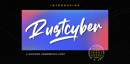 Rustcyber is a modern brushed display font, incredibly adaptable to all sorts of urban or street related designs. It is suitable for any branding, product packaging, invitation, quote, label, poster, logo that you wish to create.
 - Farquharson - Unknown license

- Aprex Sans by S6 Foundry,
$20.00 Aprex Sans perfectly balances the minimalist quality associated with contemporary sans with flair within the width of the counters and comfortable, breathable apertures. — Throughout weights and sizes, the typeface has great legibility and good contrast between positive and negative space, making it stunningly versatile. — With a seamless combination of contemporary details and classic styles, Aprex Sans draws inspiration from the mid-century humanist and grotesque typefaces, and its solid and straightforward structure is characterized by angular connections between curves and stems. Aprex Sans is geometric in nature with humanist qualities rooted in the Swiss tradition.
 - Rondana by Sudtipos,
$39.00 Crafted in the best tradition of the geometric sans-serif, Rondana is a typographic tribute to the the retro-futuristic aesthetics of the 1960s and 70s, as well as an exercise in purity of line. However, its spirit is decidedly non-bauhausian, since its strokes intentionally deviate from the dull, obvious, ruler-and-compass construction; its arcs and curves being much more complex, tending towards a slightly square shape, imbued with subtle modulations. This sums up to a more organic, flowing, extroverted personality than the one just expected from the use of plain, simple geometry. Another feature is the conscious use of non-standard shapes for many signs, that are quite legible but somewhat unexpected, such as the E, the g and the ampersand; making Rondana an excellent display face and also giving a particular flavor to the text composed in it, especially in its italic variants —which are, by the way, designer italics in their own right and not just an oblique version of the roman. Rondana comes in twelve variants comprising a wide spectrum of weights, allowing for an extremely diverse range of expression.
 - Epilepsja Round by Mikołaj Grabowski,
$29.00 Here I present Round - a type family that is derived form Epilepsja, which was my first alphabet commercially out. After its release I came to think that there should be other fonts of this design that would enrich the variety of choice. Here comes ‘Epilepsja Round’ which is soft and friendly while the Regular family remains firm and sharp. It supports all Latin-based European and African languages and acts as a multicolour layered font. best for headlines, titles and other display uses.. It is an all-caps alphabet of stencil-sprayed and painted letters found in the city space. The glyphs are simple but unordinary. Every letter has something from Escher-like 3D illusion, but is flat simultaneously. Epilepsja Round consists of three styles: Outline, Solid and Fill. Outline is the base from which the other two styles are created. When you mix Solid with Fill, you can create two-color Outline style. You can even mix it with not-Round Epilepsja! Solid is neat and legible in small sizes. Use it for posters, headlines, magazines, websites or anything you like.
 - NTF Tout by Noble Type Foundry,
$10.00 A new experimental display typeface from Noble Type Foundry. Inspired by the hard 45 degree cuts of traditional blackletter type but simplified for a digital age, this unique evolution commands a strong geometric presence in any design.
 - Kalendar by Alphabet Design,
$15.00Kalendar is a geometric display font, inspired by a calendar design by Ivica Kis, a Croatian architect. This font contains alternative letter-forms for many characters. Kalendar works best in display applications, such as logos and titles. - Notebug by PizzaDude.dk,
$15.00 Notebug looks like there was a bug playing around with an inky pen. Notebook with a bug = Notebug! Made with a hefty inky pen and quick strokes. You got 3 layers to play around with: Regular (the outline) Fill (The "inside" of the Regular version and Layer (best used as a background layer for Regular)
 - Mellow Sans by ParaType,
$30.00 Mellow Sans is a soft and friendly rounded sans serif. Its bold styles are great for packages of something tasty, while light and regular ones work well in rather long texts, from a children's book to a reading app, or a family restaurant menu. The typeface was created by Natalya Vasilyeva, an expert in designing text and calligraphic typefaces. Mellow Sans’s forms are based on humanist sans serifs. The nobility and liveliness of Renaissance calligraphy reads beneath its curves and makes the typeface even friendlier, while helping the eye to move along the line. The typeface supports extended Latin, extended Cyrillic (all major languages of the Russia’s peoples) and Greek. It also has old style figures, arrows and non-alphabetic signs. With Mellow Sans as a heading typeface (in that case bold styles fit the best), calm open sans serifs, f.e. Vast or Fact, are its optimal text companions on the screen. Calm serifs, f. e., Octava, Scientia or Aelita, will work as its companions on paper. And to create expressive typography, for example, in packaging, you can match Mellow Sans with quirky rounded serifs — Cooper or Epice.
 - ISZO by Sryga,
$22.00 ISZO is a modern precision, seamlessly blending tech innovation with humanist elegance. Sleek lines and meticulous geometry reflect architectural brilliance. Subtle curves evoke approachable essence. Resonating with standardization and excellence, ISZO captures the contemporary design and typography's future—a harmonious balance of allure and human connection, ideal for conveying technical prowess and artistic sensibility.
 - Rival Sans by Mostardesign,
$25.00 A sans serif with a dynamic look for complex typographic work. Rival Sans is a sans serif font family possessing many strengths. Its 32 fonts and 2 styles, make Rival Sans a very versatile family and suitable for many graphic design projects such as branding, signage, editorial creation, advertising, packaging, broadcasting or logo creation. With the endings cut at 10 degrees and sharp cuts on the top of the stems of certain characters (like the l, b or the d) Rival Sans gives dynamism and readability to the lengthiest of editorial content. This beveled font design also gives rhythm to a text's sentences as well as a very functional look. All these design details give this new font family a modern, energetic and humanistic look. Rival Sans also has many powerful OpenType features such as case sensitivite forms, small capitals, old style and tabular figures, slashed zero, ligatures, fractions,and alternative characters to give personality to graphic design projects. Designed also for complex editorial content, this typeface has a powerful home kerning system called "Pro Kerning". With more than 2500 pairs of glyphs and many languages, Pro Kerning optimizes headlines, subtitles, texts as well as long paragraphs in real time. In addition to these extended features, the italic styles of this fonts family have been drawn as fully-fledged styles with different designs from their regular version so that the italic texts look like calligraphic phrases. Rival Sans has an extended character set with over 930 glyphs. This family covers over 130 languages from Western Europe, Eastern Europe and Central Europe. In addition to all the features of its kind, Rival Sans is part of a very complete "type system" with style variants such as the serif version Rival Serif or the slab version Rival Slab. With all these typefaces, you have 62 styles to make your own vibrant and professional graphics or web creations while maintaining consistency in your creations.
 - Debusen by Typodermic,
$11.95 Introducing Debusen—the perfect typeface for those who want to add a little doughy goodness to their designs! With its rounded, soft edges, Debusen is the ideal choice for anyone who wants to make their words feel safe and harmless. Whether you’re designing a fun, playful logo or creating a warm and welcoming message, Debusen’s fluffy softness will help you convey your ideas with a gentle touch. With its soft, rounded curves and gentle letterforms, Debusen is the perfect choice for a wide range of applications. Whether you’re designing a cute and cuddly children’s book or creating a warm and inviting brand identity, Debusen’s tender expressiveness will help you connect with your audience in a meaningful way. So why wait? Whether you’re a professional designer or just starting out, Debusen is the perfect choice for anyone who wants to add a little extra sweetness to their designs. Try it today and see for yourself just how delicious your designs can be! Most Latin-based European writing systems are supported, including the following languages. Afaan Oromo, Afar, Afrikaans, Albanian, Alsatian, Aromanian, Aymara, Bashkir (Latin), Basque, Belarusian (Latin), Bemba, Bikol, Bosnian, Breton, Cape Verdean, Creole, Catalan, Cebuano, Chamorro, Chavacano, Chichewa, Crimean Tatar (Latin), Croatian, Czech, Danish, Dawan, Dholuo, Dutch, English, Estonian, Faroese, Fijian, Filipino, Finnish, French, Frisian, Friulian, Gagauz (Latin), Galician, Ganda, Genoese, German, Greenlandic, Guadeloupean Creole, Haitian Creole, Hawaiian, Hiligaynon, Hungarian, Icelandic, Ilocano, Indonesian, Irish, Italian, Jamaican, Kaqchikel, Karakalpak (Latin), Kashubian, Kikongo, Kinyarwanda, Kirundi, Kurdish (Latin), Latvian, Lithuanian, Lombard, Low Saxon, Luxembourgish, Maasai, Makhuwa, Malay, Maltese, Māori, Moldovan, Montenegrin, Ndebele, Neapolitan, Norwegian, Novial, Occitan, Ossetian (Latin), Papiamento, Piedmontese, Polish, Portuguese, Quechua, Rarotongan, Romanian, Romansh, Sami, Sango, Saramaccan, Sardinian, Scottish Gaelic, Serbian (Latin), Shona, Sicilian, Silesian, Slovak, Slovenian, Somali, Sorbian, Sotho, Spanish, Swahili, Swazi, Swedish, Tagalog, Tahitian, Tetum, Tongan, Tshiluba, Tsonga, Tswana, Tumbuka, Turkish, Turkmen (Latin), Tuvaluan, Uzbek (Latin), Venetian, Vepsian, Võro, Walloon, Waray-Waray, Wayuu, Welsh, Wolof, Xhosa, Yapese, Zapotec Zulu and Zuni.
 - Monod Brun by Resident,
$40.00 Created in 2009 by V.H. Fleisher, Monod Brun is a geometric sans-serif typeface. The font has OpenType features that can be accessed in programs like the Adobe Creative Suite. These features include tabular lining figures, titling caps which are heavier & more loosely spaced than the regular caps, alternative punctuation marks, and arbitrary nut fractions (for single digit numerators & denominators). By clicking on the “Gallery” tab above, you can see an illustration of the OpenType features. The “ff” tab on the “Sample Text” bar below allows you to test the OpenType features with your own text. Supported languages include: Albanian, Czech, Danish, Dutch, English, Faroese, Finnish, French, German, Icelandic, Italian, Norwegian, Portuguese, Spanish & Swedish.
 - Bookkeeping JNL by Jeff Levine,
$29.00 The extra bold version of R. Hunter Middleton's "Karnak" (produced in 1936 for Ludlow) served as the model for Bookkeeping JNL and is a companion to Bookkeeper JNL (the light weight version of this type design). Middleton based his "Karnak" family of typefaces on the geometric slab-serif "Memphis", which was designed in 1929 by Dr. Rudolf Wolf and released originally by the Stempel Type Foundry of Germany. According to Wikipedia, "Karnak" "was named after the Karnak Temple Complex in Egypt, in reference to the fact that early slab serifs were often called 'Egyptians' as an exoticism by nineteenth-century type founders." Bookkeeping JNL is available in both regular and oblique versions.
 - Metablue by Qaratype,
$17.00 Metablue is a geometric sans font family who dares the modernism and the harmony of the curves. It has very rounded curves with very open terminals that makes this font family elegant, friendly and contemporary. The typeface is versatile and can be successfully used in Magazines, Posters, Branding, Websites etc. It can meet the needs of professionals who want a family of clean geometric font; elegant with a wide character set for more than 130 languages of Western Europe, Europe Eastern, Central Europe, Greek and Cyrillic for international communication.
 - Roag by The Northern Block,
$27.95 Roag is an industrial geometric sans paying homage to mechanical designs of the 1930s. A precise balance of modern geometrics, with a functional yet sparing style that effectively communicates without distraction. Roag is a straightforward, unadorned type family with efficient construction. Details include seven weights with matching italics and over 950 characters per style. Opentype features consist of eight variations of numerals, including inferiors, superiors, fractions, case figures and circled figures. Additional features include small caps, case-sensitive forms, stylistic alternates, ligatures, game symbols, arrows and language support covering Western, South, Central Europe and Vietnamese.
 - Gerbera by Brownfox,
$44.99 Gerbera is a new sans-serif with a distinct personality that fuses geometric and organic elements. It is at once hip and quaint, clear yet idiosyncratic, restrained but sensual. Its deliberately varied classical capital proportions and geometric structure are balanced by slightly reversed stress and pinched terminals on curved strokes. This versatile font comes in five weights with their italics and offers a variety of Open Type features, including small caps, alternate characters and punctuation, five sets of figures, and CE, Baltic, and Cyrillic support. Designed by Gayaneh Bagdasaryan & Vyacheslav Kirilenko, 2014-2022.
 - SK Clumster Sans by Shriftovik,
$32.00 SK Clumster Sans is an extravagant multilingual geometric grotesque, developed under the impression of the unique and exciting aesthetics of font design. Its structure is enlivened by an innovative combination of geometric and organic shapes that transform the familiar letter pattern. SK Clumster Sans creates a unique visual impression through a combination of shapes, a large symbolic and weights set, in addition to lively and dynamic angles and lines. The font is suitable for creating original design works that reflect the creative potential of the author and his bold experiments in the field of design.
 - Corbert by The Northern Block,
$- Initially released in 2013 Corbert was a big hit and was named one of the most popular fonts of the year by MyFonts. Following on from its success the design is updated and remastered to meet the latest standards of The Northern Block and to satisfy critical issues put forward by the most demanding of users. A geometric sans serif typeface influenced by Bauhaus and the early modernist era. Precise shapes are optically adjusted to create a clear, natural typeface with excellent legibility. Corbert is a regular, self-evident design that works well across a wide range of applications. Details include nine weights with matching italics and over 540 characters per style. Opentype features consist of five variations of numerals, including inferiors, superiors, fractions, alternative lowercase a, e and g, and language support covering Western, South, and Central Europe.
 - HGB Bacco by HGB fonts,
$23.00 Since 2005, I have repeatedly attempted to create a neutral-looking grotesque with a humanistic character. I wanted a pleasant, soft typeface. The typeface should appear similar to Helvetica or Univers, but with more open shapes and therefore better readability. The features are deliberately reserved with 4 gradations plus italics. The onum feature for Old Style Figures contains additional alternative letters such as a looped g. The italics have a swash feature with some decorative shapes. As a sans serif, HGB Bacco does not appear to be technically constructed, but has a friendly, open character and is also suitable for longer texts.
 - Futura ND Alternate by Neufville Digital,
$45.25 The genuine Futura takes up Paul Renner’s earliest sketches and brings back to life the original stylistic alternatives of the letters a, g, m, and n. Another of its peculiarities is the curved ends of the j, l, and t. It retains its genetic heritage, maintaining a perfect geometry, but with a fresher air than ever. Futura is a Trademark of BauerTypes SL
 - Modula by Emigre,
$39.00 Modula was the first high resolution headline face that Zuzana Licko designed with the Macintosh computer. In 1985, the computer was very crude as far as being able to produce subtle curves, but it was outstanding at producing perfect geometric elements. As a guide, she used the proportions of her earlier Emperor Fifteen bitmap design and applied the precision of the computer's geometric elements. See also Modula Round and Ribbed. Greek version by Dimitris Arvanitis.
 - Bursa MF by Masterfont,
$59.00 Geometric shapes are the building blocks the construct these 2 fonts.
 - Sturdy by Hackberry Font Foundry,
$24.95 Sturdy is designed to be as black as possible yet still legible. As an OpenType Pro font it has my normal complement of around 500 characters. New to this font I have added what I call ordinals: first through tenth in addition to Caps, lowercase, small caps, lining, oldstyle, and small caps figures, ligatures, and so on.
 - Rohn Rounded by Nine Font,
$29.00 Rohn Rounded is a rounded version of Rohn. This family is a modern squarish typefamily with a large x-height and soft feeling. Its letterforms are based on the shape of square with rounded corners. With particular details and large x- height, it is more legible at small sizes both on screen and paper. It has seven weights from Thin to Black with corresponding oblique styles and each weight includes ligatures, fractions, old style numbers, case-sensitive forms and more. Rohn Rounded is ideally suited for branding, logo, packaging, magazine, poster and editorial design.

