10,000 search results
(0.118 seconds)
- Sterling Pro by SoftMaker,
$9.99 Sterling Pro is one of the fonts of the SoftMaker font library.
 - Sigmund PRO by Borutta Group,
$39.00 Sigmund PRO is a visual journey around Poland. The main style is inspired by the Polish road signage typeface – designed by Marek Sigmund. With the increase of weight, Sigmund turns into a geometric display – in the spirit of vernacular typography from the signs of Polish streets. Thanks to this span of styles Sigmund will work both in visual identifications and posters. The family consists of 18 varieties and has many alternative characters.
 - Revolancer Pro by Popskraft,
$18.00 The Revolancer Pro font was designed in addition to the unique Revolancer font, so this font looks more familiar. But this is only at first glance. This typeface combines the simplicity of classic grotesque typefaces with the freedom and independence of a Revolancer typeface. This font will give you freedom. The freedom to be unique, not like everyone else. Each character in Revolancer font knows its place, and it is impossible to achieve such a smooth and organic flow of words using a regular font.
 - Pinel Pro by URW Type Foundry,
$39.99 The characteristic ‘French face’ was originally made in 1899 under the supervision of Joseph Pinel. Thus, what was originally French 10 pt. Nº 2, got its present name. The Frenchman Joseph Pinel called himself a "typographical engineer", but was at the time employed as a type draughtsman at the Linotype Works in Altrincham. It appears that this and some other faces that he supervised, were, except for use on the Linotype, also meant for manufacturing matrices for the Dyotype. This composing machine was an invention of Pinel. The Dyotype was a rather complicated machine and consisted, like the Monotype, of two separate contraptions, a keyboard which produced a perforated paper ribbon and a casting machine which produced justified lines of movable type. Unlike the Monotype which has a square matrix carrier, the Dyotype had the matrices on a drum (in fact two drums, hence the name of the machine). A Pinel Diotype company was founded in Paris and a machine was built with the help of the printing press manufacturer Jules Derriey. As is often the case, a lack of sufficient capital prevented the commercializing of this ingenious composing machine. Coen Hofmann digitized the font from a batch of very incomplete, damaged and musty drawings, which he dug up in Altrincham. He redrew all characters, bringing up the hairstrokes somewhat in the process. The result is a roman and italic, while the roman font also includes Small Caps
 - Bello Pro by Underware,
$50.00 Now check this, Underware’s blockbuster type, Bello. Bello Pro is a brush typeface for headline point sizes - it’s big & beautiful. Bello has lots of ligatures and start and ending swashes. They are automatic in Bello Script Pro, which is a cross-platform OpenType font with many OpenType features. Bello has Underware’s world-dominating Latin Plus character set, supporting a total of 219 languages (Latin 1 + 2 and beyond). After a period of hand sketching and lettering, Bello got two main styles: Script and Caps. These two fonts create a strong typographic contrast - while Bello Script Pro is flourished and flowing, Bello Caps Pro provides upright and sturdy capital lettering. As sturdy as brush lettering allows, of course. Careful spacing and kerning ensures* that Bello appears like fluently written handwriting. However, that’s not enough for a hand-lettered feel. Therefore Bello comes with a set of 64 ligatures. Some of them are typographic, some made simply to create a more intimate, natural impression. For the same reasons we have added a few ornaments and a set of snap-on beginning and ending swashes which attach to the lowercase letters of Bello. With Bello Words Pro you can add some two-color words in your text by the pre-designed word logotypes. Trust the brush! *So take care: use ‘metrics’, not ‘optical’ as a spacing setting in layout apps.
 - Yekuana Pro by Neo Type Foundry,
$28.50 Yekuana Pro is a typeface whose design is based primarily on the study of certain geometric ethnic ancestral Venezuelan signs, visually rich and originally used in the enrichment of various utilitarian objects with high symbolic and cultural content. It’s a family that is composed of 330 glyphs y of two weights, including Inline and Outline versions, Stylistic Alternates, Fractions, Ordinals and Ligatures. The combination of their styles through the use of layers by contrasting colors application of allows to obtain new interesting results. Its use is recommended for titles or short phrases and elements of oversized visual communication.
 - Palsam Pro by Abjad,
$110.00 Since the beginning, Palsam was intended to be a super multilingual family, with a real cursive Arabic companion, and a display cut. The typeface was designed to be used for setting text and titles of contemporary Arabic content, specially magazines, and websites. The Arabic and Latin scripts were designed at the same time, to make a true authentic bilingual typeface. Both scripts have affected each other in several ways through the entire design process, which happened within ten years. Palsam has an inviting, approachable, fashionable and humanist look. Thanks to its low contrast, open apertures, detailed calligraphic strokes, and smooth counters, which also make it easy to read at smaller sizes. The main highlight for Palsam was the Cursive companion. For the first time, the calligraphic Ijaza style was used as a model for designing the Arabic cursive. Since the Ijaza is a hyper combination of Naskh and Thuluth, which makes it perfect to be a companion for the upright Naskh. Moreover this script was used in margins, and to highlight specific content inside a paragraph in older manuscripts. With true cursive companions in five weights, and many opentype features, Palsam grants all the tools needed to set complex information and editorial designs applications. More than 1000 characters are included per weight, including small caps, fractions, old style and lining numbers, ligatures, contextual ligatures, and discretionary ligatures. It supports over 40 languages that use the Latin extended, as well as Arabic, Farsi, and Urdu Languages. The latin script was designed in collaboration with the Slovenian type designer Alja Herlah.
 - Borough Pro by The Type Fetish,
$45.00 Inspired by a hand painted sign from Lanesboro, MN. Borough is an OpenType font that contains four variations of every character in its extended character set. Using Contextual Alternatives in OpenType savvy applications will allow the font to rotate through the variations to give a more random look to the text.
 - Curely Pro by Konstantine Studio,
$15.00 Start from the idea of our free font, Curely, which has hit the milestone - a 70K project views on Behance and a thousand times more download (still going). Now we came up with the Pro version of it. More complex, more features, and absolutely more playful. So, please welcome, Curely Pro. A Versatile casual handmade decorative lettering typeface. Still inspired from the girly things and cuteness overload in every letters. Perfectly fit for your cute, sweet, lovely, and casual branding or logo project. Or any design stuff that need a lovely cute touch on it, let the Curely Pro smooch it all the way baby!
 - Economica PRO by Underground,
$29.90 Economica Pro is a font specially developed for printing complex situations. It has been tested successfully in very small sizes without losing legibility. It's ink traps ensure its smooth operation even in low quality papers. Ideal for newspapers.
 - Astaire Pro by Hackberry Font Foundry,
$24.95 This is a deco-style text OpenType Pro font loosely based on Koch's Locarno as seen in KochAltschrift a recent free German tribute to Koch's work. I was familiar with Meek's Letraset presstype version called Locarno, but I never liked the proportions used by either Meeks or Koch. So I radically revised ascender, descender, and x-height to make them more usable and brought the shapes within my sense of design. Mine is probably closer to Meeks than Koch, but hopefully it is a tribute to both. Astaire looks much more modern and it is much more usable. I added oldstyle figures, small cap figures, small caps, several ligatures, and more. There are an italic, bold, and bold italic also in this family
 - Fry Pro by omtype,
$37.00 The typeface Fry was developed in 2008 specially for the Sky-Fish company (fish and seafood dealer). This type is designed for small texts and has a friendly and a fairytale historic flavor. Fry takes the openness and dynamism of humanistic sans serif, the simple and softness of lubok’s letters (primitive style) and the fluidity of shallow marine fry. Despite its funny style, Fry works well even in the 5 point size. In large sizes Fry demonstrates its originality, vivacity and softness, in the small characteristics become less visible, and Fry’s readability becomes more important. This makes the typeface suitable for many tasks of typography. The typeface includes extended set of Latin, Cyrillic and Greek, old style and lining figures, historical alternates and special local features. The combination of lubok’s aesthetics and funny dynamic forms make a nature of Fry. Fry was exhibited on Svjato Cyrillic (Kharkov, Ukraine) festival in 2008. It was awarded for excellence in type and graphic design at Modern Cyrillic 2009 competition. Also it received the second prize in display category at Granshan 2011. Fry was selected among 50 typefaces for the Call for type exhibition in the Gutenberg museum (2013).
 - Varial Rounded Medium by Cloud9 Type Dept,
$35.00
- Varial Two Rounded by Paavola Type Studio,
$21.00 Varial Two typefaces are new and updated versions of Varial family created 2014: Extra-condensed Opentype™ sans-serifs with small caps, extended character set (european languages support) and extra features (fractions, ligatures and alternatives). Varial Two Rounded family is versatile in all design applications, for example all headlines, display use, infographics and more!
 - OL Radiant Slender by Dennis Ortiz-Lopez,
$40.00
- English Arabesque Revival 1900 by Intellecta Design,
$16.90
- Rotarry Semi Geometric Font by Maulana Creative,
$15.00 Rotarry is a modern sans display font. Medium stroke, fun character with a bit of ligatures and alternates. To give you an extra creative work. Rotarry font support multilingual more than 100+ language. This font is good for logo design, Social media, Movie Titles, Books Titles, a short text even a long text letter and good for your secondary text font with script or serif. Make a stunning work with Rotarry font. Cheers, Maulana Creative
 - Deco Geometric Stencil JNL by Jeff Levine,
$29.00 Deco Geometric Stencil JNL was inspired by an example of a vintage Art Deco stencil type design seen in the Steven Heller-Louise Fili book "Stencil Type" (published by Thames and Hudson).
 - DS Rada - Unknown license

- ADIL Sans by Adaylife,
$25.00
- Silian Rail by Mans Greback,
$39.00 Silian Rail is a high quality serif typeface. A professional uppercase font, this intellectual font has a distinct personality while being strict and controlled. Drawn and created by Mans Greback in 2022, the Silian Rail family consists in 16 high-quality styles, complimenting each other. Among them, Light, Regular, Bold, Black, Italic, Sharp and several combinations. The font is built with advanced OpenType functionality and has a guaranteed top-notch quality, containing stylistic and contextual alternates, ligatures and more features; all to give you full control and customizability. It has extensive lingual support, covering all Latin-based languages, from Northern Europe to South Africa, from American to South-East Asian. It contains all characters and symbols you'll ever need, including all punctuation and numbers.
 - Crystal Radio Kit - Unknown license

- old time radio - Unknown license

- Radios in Motion - Unknown license

- D3 Radicalism Katakana - Unknown license

- Atomic Clock Radio - Unknown license

- Radio Broadcast JNL by Jeff Levine,
$29.00 An interesting hand lettered sans serif type style with a “brush stroke” feel was used for various article headlines in the October, 1938 issue of “Radio Stars” magazine.
 - Radio Days NF by Nick's Fonts,
$10.00This Deco delight is based on logotype lettering for Crosley Radios from the 1930s. By aLtErNaTiNg upper and lowercase letters (brackets and braces, too), you can maintain the flow of the lightning bolts through the letters. Additionally, inline hyphens can be found at the ASCII circumflex and ASCII tilde positions. This font contains the complete Latin language character set (Unicode 1252) plus support for Central European (Unicode 1250) languages as well. - Arial Narrow OS by Monotype,
$54.99Arial was designed for Monotype in 1982 by Robin Nicholas and Patricia Saunders. A contemporary sans serif design, Arial contains more humanist characteristics than many of its predecessors and as such is more in tune with the mood of the last decades of the twentieth century. The overall treatment of curves is softer and fuller than in most industrial style sans serif faces. Terminal strokes are cut on the diagonal which helps to give the face a less mechanical appearance. Arial is an extremely versatile family of typefaces which can be used with equal success for text setting in reports, presentations, magazines etc, and for display use in newspapers, advertising and promotions. - Gans Radio Lumina by Intellecta Design,
$1.00See also other font families inspired by Gans' original typefaces: Gans Tipo Adorno , Gans Lath Modern , Gans Titular Adornada , Gans Ibarra , Gans Antigua , Gans Antigua Manuscrito and Gans Fulgor . - Radio a Treqer by Letterena Studios,
$10.00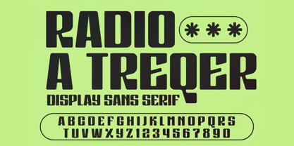 A serif modern and classic typeface that has its own unique style & modern look. This typeface is perfect for an elegant & luxury logo, book or movie title design, fashion brand, magazine, clothes, lettering, quotes, and so much more. This font is PUA encoded which means you can access all of the amazing glyphs and ligatures with ease! **Uppercase
 - Orion Radio NF by Nick's Fonts,
$10.00A 1930s ad for—believe it or not—Orion radios provided the inspiration for this ultrabold and slightly sassy face. The radio brand didn't make it into the twenty-first century, but its signature typeface has, ready and willing to add a little pizazz to your next project. This font contains the complete Latin language character set (Unicode 1252) plus support for Central European (Unicode 1250) languages as well. - Radio Singer JNL by Jeff Levine,
$29.00 The hand lettered sans serif title on the sheet music for the 1930s song "I'm Alone Because I Love You" was the inspiration for Radio Singer JNL, which is available in both regular and oblique versions.
 - Word From Radio by Dharma Type,
$14.99 Based on retro vinyl records in the middle of 20th century. the mixture of funky, hippie and mid-century’s futuristics. There are three other fonts designed by in the same concept. -African Elephant Trunk -Moon Star Soul -Rebel Train Goes -Word From Radio
 - MFC Nadall Medieval by Monogram Fonts Co.,
$19.00 MFC Nadall Medieval was originally designed by Bernard William "Berne" Nadall for Barnhardt Brothers & Spindler back in 1885 under the name "Faust Text" and later under the "Missal Text Series". While you could use its capitals to construct an initial monogram, this is not a monogram font, but instead a fully functional typeface for invitations and period lettering. This lettering style has been precisely recreated and expanded on to create a full typeface with a small collection of ligatures. Here's what's included with the MFC Nadall Medieval: - 397 glyphs in MFC Nadall Medieval - including Capitals, Lowercase, Numerals, Punctuation and an extensive character set that covers multilingual support of latin based languages. (see the last graphics for a preview of the characters included) - Ornaments - two ornament glyphs. - Ligatures - for ff, fi, fl, ffi, and ffl combinations.
 - Radio Actor JNL by Jeff Levine,
$29.00 Bold and squared with rounded corners, the hand lettering found within the November, 1936 issue of Radio Mirror magazine really stands out. This stylized sans serif design, when used in poster displays or headline lettering, is attention-getting and drives the point home. Radio Actor JNL, is available in both regular and oblique versions.
 - Arial Windows compatible by Monotype,A contemporary sans serif design, Arial contains more humanist characteristics than many of its predecessors and as such is more in tune with the mood of the last decades of the twentieth century. The overall treatment of curves is softer and fuller than in most industrial-style sans serif faces. Terminal strokes are cut on the diagonal which helps to give the face a less mechanical appearance. Arial is an extremely versatile family of typefaces which can be used with equal success for text setting in reports, presentations, magazines etc, and for display use in newspapers, advertising and promotions.
- Radio Show JNL by Jeff Levine,
$29.00 The 1933 sheet music compilation entitled "Kate Smith Memories Song Book" had the singer's name hand lettered in a bold, spurred serif typeface. This lettering design became the basis for Radio Show JNL, which is available in both regular and oblique versions.
 - Axial Caps Med - Personal use only

- Dro by KC Fonts,
$25.00 The Dro family is an all uppercase handmade font that resembles cut-out construction paper; Both fonts have 6 glyphs for each letter & 2 per number which are accessed by uppercase, lowercase, small caps & Contextual Alternates. Each font has 550+ glyphs total. When using Opentype applications Dro and Dro Fill take the handmade look further by cycling through Contextual Alternates, Small Caps & Double Letter Ligatures for a unique and authentic look to your creative. When not using the Contextual Alternates feature, you can still alternate between uppercase and lowercase letters and using Stylistic Sets to switch up the flow. The Dro family has an extended character set for multilingual support.


