5,171 search results
(0.058 seconds)
- VT Showcard by VarsityType,
$15.00 This condensed block is a true knockout. VT Showcard is a heavy-hitting headliner with presence. Inspired by the boxing showcards of the 60’s and 70’s, VT Showcard towers over body copy and demands attention. This tall and mighty athletic display typeface features chiseled corners and subtle embellishments that reinforce a steady rhythm across its dramatic letterforms. With 7 weights, VT Showcard provides a versatility for sports headlines and similar projects.
 - Gritten by Beary,
$5.00 Introducing the elegant new Gritten Font! For those of you who are needing a touch of elegance and modernity for your designs, this font was created for you! Gritten has the added bonus of having 'multiple personalities'! It has 3 sets of extra alternate lowercase letters, which allow you to create different feels for different projects. Features: Uppercase Lowercase Number & Symbol Alternates for each characters Multilingual 277 Glyps More than 70 Alternate Happy Creating!
 - ITC Ziggy by ITC,
$29.99ITC Ziggy was designed by Bob Alonso, who says it started out as phone doodles in the early 1970s." Alonso rediscovered the sketches years later, thought they revived the feel of the 70s, and decided to digitize the typeface. He liked the form of the letter Z best, so named the font Ziggy. ITC Ziggy reminds its designer of "elephant bellbottoms" and its style as a display face instantly evokes a nostalgia for the 1970s. - Bold Fashion by Mans Greback,
$59.00 Bold Fashion is a heavy slab-serif font of the disco era. Its funk-style design, coupled with soft, rounded serifs, embodies the soul of retro, bringing forth memories of neon lights, bell-bottoms, and roller discos. Each letter is profoundly heavy, yet they prance with a bouncy, comfy rhythm, akin to catchy 70s beats. The swashes adorning the uppercase letters add flair, reminiscent of iconic burger joint signs and groovy vinyl covers.
 - Lovadelic by Aiyari,
$20.00 Introducing a new retro & groovy typeface called Lovadelic. Inspired from 70's script lettering combine with psychedelic balloon typography. Lovadelic comes with open type features such stylistic alternates, stylistic sets, contextual alternates & ligatures. The package also comes with extras graphic to help you make stunning design. Lovadelic typeface is best uses for headings, Logo type, quotes, apparel design, invitations, flyer, poster, greeting cards, product packaging, book cover, printed quotes, cover album, movie, etc
 - Winston & Winston Sans by Carnley Design Co.,
$25.00 Winston was inspired by strolls through downtown Winston-Salem, NC. Back in the 60's, 70's and 80's Winston-Salem was responsible for supplying tobacco and hosiery to people around the world. Now, smoke stacks and ghost signage fill the downtown area. Winston blends the modern city aesthetic with the vintage influences of classic advertising. All Caps typeface Capital letter alts US and Western European language support OTF file format
 - Kelima Vintage by Attract Studio,
$22.00 Kelima Vintage is a serif font made from typography that was familiar in the 60s and 70s. Which results in a design with a modern and fresh taste. Kelima Vintage is released in 6 mixable weights to help you work on your best projects. Also available are Ligature and Alternate styles in the OpenType feature which offer a number of different characters that give your logo or business card a unique look.
 - Asikue by Kereatype,
$14.00 Asikue is a soft serif font family inspired by the 70’s retro styles that bring chunky retro typography to the modern era. Asikue consists of 10 styles from Regular to Extra Bold with each matching Oblique. Asikue includes Asikue have Opentype features: Alternate, Ligature, Swashes, etc providing you with a variety of captivating custom text arrangements. Whether it's a fancy retro-inspired, logo, or engaging bold header text Asikue is able to deliver.
 - Beauty Magnolia by Sansakerta,
$13.00 Beauty Magnolia is Unique, playful and versatile serif Font with 30+ ligatures and 97+ alternates that you can combine to get curves and beautiful shapes just in seconds. Play with the ornaments to create a more stunning display. This font is suitable for use in many design forms, for example magazines, postcards, logos, vintage look, old classic ,60s, 70s, 80s era, wedding projects and many more. We recommend using Adobe Illustrator or Photoshop.
 - Moneer by Inumocca,
$15.00 Moneer is A Retro Display typeface. 70s style era, Simple, play full, Powerfull and unique Character font The Typeface comes with Stylistic Set and some family font Exellent typeface to use for covering your Project, like Branding, Movie Title, Headline Letter, Bookcover or Book Content, Magazine cover, Poster, Quotes Lettering, Logos, and more your project design. - Unique glyphs - Multilingual Characters Support - UPPERCASE - Lowercase - Numeric - Symbol - Punctuation Character - Stylistic Set (ss01, ss02) - PUA encoded inumocca type
 - Hoeflers by Maulana Creative,
$12.00 Hoeflers is a Hand-lettered font inspired by the vintage 70's sign board, music, shop and movies, it has a rough stroke outline and then we fill it. Hoeflers includes opentype features Ligatures. It support multilingual more than 100+ language. This font is good for logo design, Movie Titles, Books Titles and any awesome project you create. Make a stunning work with Hoeflers Rough sans font. Its a caps only fonts. Cheers, MaulanaCreative
 - Malistia by IM Studio,
$15.00 Give your typography designs a touch of retro style with Malistia! Introducing the trending font The Malistia, a bold retro script that will take you back to the 70s. comes with the Extrude version. So you don't need extra effort to create the extrude effect. Features include: Alternative Style, Swash, Collection of styles and multilingual support. You can choose alternative replacements with various Glyph variants. Very suitable for logos, t-shirts, posters, branding, etc.
 - Ballroom by Hazztype,
$17.00 Ballroom is a modern vintage-style serif, drawing inspiration from the 70s era. It is equipped with Swash, Stylistic, and Titling alternates as well as with Standard and Discretionary Ligatures. All these features can be accessed by OpenType controls or straight from character or Glyphs window. Ballroom is a very versatile font, covering a wide range of project types, from bold magazine imagery to wedding invitations, to branding, poster design, logo, and so much more.
 - Ayr Blufy by Aiyari,
$24.00 Introducing a new softest retro font family called Blufy. Heavy influence by Cooper black typeface by Oswald Bruce Cooper and ballon letters form from 60s - 70s era. Blufy Font Family contains 2 style regular and oblique. It comes with Stylistic Alternate, ligature, Stylistic Set 01-10, & swash. Ayr Blufy Font Family is best used for headings, logotype, quotes, apparel design, invitation, poster, flyers, greeting cards, packaging, book cover, printed quotes, cover album, movie, & etc
 - HS Almidad by Hiba Studio,
$50.00 HS Almidad has been started in coincidence with my designing logotypes consisting of triangle geometric, looking shape and overall structure. After designing several words, I thought of using the design concept of this logo to develop a geometric Kufi font. All letters of this typeface family were conceived with suitable and coordinated dimensions to create five weights: Thin, Light, Regular, Medium and Bold: They support Arabic, Persian, Urdu and Kurdish languages. With a triangle look, this font is a simple and creative addition, which can be useful for book titles and variety of other geometrical constructions projects. It brings new design concept to enhance beauty and harmony and enrich our previous geometrical font contributions, which started with the release of HS Alhandasi , HS Almohandis and HS Alfaris from HibaStuido.
 - Tuba by Canada Type,
$24.95 Initially commissioned in the summer of 2009 for a popular North American ice cream parlor chain we cannot name, Tuba started with a reconceptualization of a somewhat flawed '72 alphabet idea by Swiss graphic designer Erwin Poell. During the back-and-forth of the custom project, other ideas seeped into the design, mostly from other Canada Type fonts, like Fab, Jonah, Jojo and Teaspoon. The end result was what the client called a "sugar circuit trigger alphabet". This now is the retail version of that project. Tuba's main style is a straight-forward mix of 60s/70s art nouveau ideas and late-70s/early-80s tube aesthetic. The Highlight and Outline styles are almost necessary spinoffs for this kind of typeface. And the all-caps Black style is a nod to the fat font fad of the past couple of years. All styles contain many alternates – so many that each style is almost two fonts in one. Make sure to check out the character sets for a few nice and useful surprises. Life's too short. Seek sweetness. Get gooey.
 - Natasha by Runsell Type,
$24.00 Natasha is a modern script typeface that every single letter contains beautiful characters alternates and feature ligatures. This font come with 70+ Ligatures, Contextual alternates, and Stylistic alternates. This font is stylish, fresh and ideal for adding the special look to your designs. Natasha font that is special for fashion and matches applies in some designs such as the logotype, brand, magazine, website or blog headlines, packaging, branding, quotes, invitation cards, greeting cards, business cards, and wedding more. Natasha is coded with PUA Unicode, which allows full access to all the extra characters without having special designing software. Mac users can use Font Book, and Windows users can use Character Map to view and copy any of the extra characters to paste into your favourite text editor/app. Natasha Includes: - 70+ Ligatures, Contextual alternates, and Stylistic alternates - PUA Encoded Characters - Fully accessible without additional design software - Multilingual support for English, French, Italian, Spanish, Portuguese, German, Swedish, Norwegian, Danish, Dutch, Finnish, Indonesian, Malay, Hungarian, Polish, Croatian, Turkish, Romanian, Czech, Latvian, Lithuanian, Slovak, Slovenian
 - VanBerger by The Northern Block,
$12.80 A geometric san serif typeface influenced by Theo Van Doesburg and the De Stijl movement.
 - Meloneads by PizzaDude.dk,
$20.00Although being made of geometric shapes, Meloneads is a playful and funny set of drawings. - Lost in space by Gleb Guralnyk,
$13.00 This futuristic typeface "Lost in space" is a geometric vintage font with multi-lingual support.
 - BD Bermuda by Typedifferent,
$25.00 BD Bermuda is an experimental geometric serif font based on the shape of a triangle.
 - FP Palina by Fontpartners,
$29.00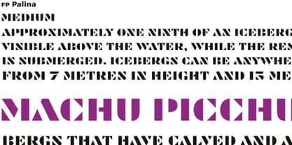 FP Palina is a very simple and geometric, stencil typeface with a strong graphic design.
 - Drexler by Device,
$29.00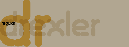 Drexler is a logically constructed molecular font built via nanotechnology and mathematically derived geometric permutations.
 - Kotohogi by URW Type Foundry,
$35.99 Kotohogi means "celebration words" in Japanese. It is a typeface of a geometric bright image.
 - Artemisia NF by Nick's Fonts,
$10.00A crisp, geometric semiscript, based on the font Adonis, originally released by American Type Founders. - Laughter JNL by Jeff Levine,
$29.00 Laughter JNL is a deconstruction of the vintage sign painter's design Brushmark JNL. By flattening most of the curved lines and making other minor adjustments to the original font, the end result was a fun and playful sanserif that is great for lighthearted ads, party invitations, special events, point-of-sale signage and many other applications where a less-than-formal type style is required.
 - Rhode by Font Bureau,
$40.00 Generous curves above and below the straight-sided Railroad Gothic parallel those of Figgins’s elephantine Grotesques, lending to both British and American series their monumental qualities. Shrinking the center strokes and counters to emphasize a massive periphery, David Berlow has used this curious similarity to suspend a complete family of sanserifs between the two forms, a manly series of great dignity and presence; FB 1997
 - Gluy by Ndiscover,
$29.00 Gluy is geometric humanist hybrid. It blends the two categories into one design. Mixing geometric rational shapes with a touch of organic calligraphic forms. Comprises a total of 20 styles and supports most Latin languages and Cyrillic. Ideal for branding but very versatile. It can be used in many contexts from print to web.
 - Dupliciter by JAF 34,
$9.90 DUPLICITER is an experimental display sans serif font which has two typefaces for comfortable and experimental use. DUPLICITER is a (latest) part of new school in type design that could be called like mind-free and geometric direction in the world. Sans serif, condensed, sharp edges, geometric, experimental, these are the main attributes of DUPLICITER.
 - Prosaic Std by Typofonderie,
$59.00 A Postmodern vernacular sanserif in 8 fonts Prosaic designed by Aurélien Vret is a Postmodern typographic tribute to the french vernacular signs created by local producers in order to directly market their products visible along the roads. These signs drawn with a brush on artisanal billboards do not respect any typographic rules. The construction of these letterforms is hybrid and does not respect any ductus. Nevertheless the use of certain tools provokes a certain mechanism in the development of letter shapes. It’s after many experiments with a flat brush, that’s these letterforms have been reconstructed and perfected by Aurélien Vret. This is the starting point for the development of an easily reproducible sanserif with different contemporary writing tools. From non-typographical references of Prosaic towards readability innovation The influence of the tool is revealed in the letterforms: angular counterforms contrasting to the smoothed external shapes. This formal contrast gives to Prosaic a good legibility in small sizes. These internal angles indirectly influenced by the tool, open the counterforms. In the past, to deal with phototype limitations in typeface production, some foundries modified the final design by adding ink traps. In our high resolution digital world, these ink traps — now fashionable among some designers — have little or no effect when literally added to any design. Should one see in it a tribute to the previous limitations? Difficult to say. Meanwhile, there are typeface designers such as Ladislas Mandel, Roger Excoffon, and Gerard Unger who have long tried to push the limits of readability by opening the counters of their typefaces. Whatever the technology, such design research for a large counters have a positive impact on visual perception of typefaces in a small body text. The innovative design of counter-forms of the Prosaic appears in this second approach. Itself reinforced by an exaggerated x-height as if attempting to go beyond the formal limits of the Latin typography. It is interesting to note how the analysis of a non-typographical letters process has led to the development of a new typographic concept by improving legibility in small sizes. Disconnected to typical typographic roots in its elaboration, Prosaic is somewhat unclassifiable. The formal result could easily be described as a sturdy Postmodern humanistic sanserif! Humanistic sanserif because of its open endings. Sturdy because of its monumental x-height, featuring a “finish” mixing structured endings details. The visual interplay of angles and roundness produces a design without concessions. Finally, Prosaic is Postmodern in the sense it is a skeptical interpretation of vernacular sign paintings. Starting from a reconstruction of them in order to re-structure new forms with the objective of designing a new typeface. Referring to typographic analogy, the Prosaic Black is comparable to the Antique Olive Nord, while the thinner versions can refer to Frutiger or some versions of the Ladislas Mandel typefaces intended for telephone directories. Prosaic, a Postmodern vernacular sanserif Prosaic is radical, because it comes from a long artistic reflection of its designer, Aurélien Vret, as well a multidisciplinary artist. The Prosaic is also a dual tone typeface because it helps to serve the readability in very small sizes and brings a sturdy typographic power to large sizes. Prosaic, a Postmodern vernacular sanserif
 - Starfire by MADType,
$29.00 Starfire is a retro styled geometric sans-serif family with roots in mid-century graphic design.
 - Stereotype by studiocharlie,
$17.00 Stereotype is a geometrical font in five weights based on the same square. It's a gradient!
 - Gal MF by Masterfont,
$59.00 Even stroke widths with geometrical symmetric structure will make it into a great signage and logo.
 - JH Noha by JH Fonts,
$40.00 JH Noha is a geometric modern Arabic typeface. It includes black, bold, medium and regular weights.
 - Meloneads 2 by PizzaDude.dk,
$20.00Although being made of geometric shapes, Meloneads 2 is a playful and funny set of drawings. - Teutura by Maciej Świerczek,
$15.00 Teutura is a geometric, modern display font inspired by old blackletter typefaces (e.g. Fraktur, Gutenberg Textura).
 - Extra MF by Masterfont,
$59.00 Geometric forms make this elegant font a great choise for invitations and signs, indoor and outdoor.
 - BR Sonoma by Brink,
$30.00 BR Sonoma is a new geometric grotesque built for the 21st century with a finely tuned modern aesthetic. BR Sonoma builds on the foundations laid by the classic Swiss grotesques such as Helvetica and Univers but combines their features with a stronger geometric base usually found in other early classics such as Avant Garde, Futura and Avenir.
 - Gilmer by Piotr Łapa,
$30.00 Gilmer is a fresh, geometric, sans-serif font family inspired by iconic typefaces like Futura and Avant Garde. Gilmer has a big x-height value, geometrical letterforms, sharp edges, and very small stroke contrast as the neo-grotesk fonts from the 20th century. The typeface is versatile and can be successfully used in magazines, posters, branding, websites, etc.
 - Differentura by ABSTRKT,
$50.00This typeface was developed for the Different Ground exhibition identity (and that explains the name of the font). The aim was to make an absolutely geometric, constructed font. Sometimes even too geometric and too much into it's own rules. But at the same time to make it look very humane, sometimes imperfect and weird, but alive and not soulless.