5,714 search results
(0.06 seconds)
- Geometric Slabserif 703 by Bitstream,
$29.99 - Geometric 706 by Bitstream,
$29.99 - Geometric Slabserif 712 by ParaType,
$30.00 The Bitstream version of Monotype Rockwell, 1934. Twentieth-century design influence is revealed in strokes of more even weight than in the original nineteenth-century Egyptians or Slab Serifs. Rockwell is a prime example of this twentieth-century approach. It seems to be a simple Constructivist geometric sans with strong square slab serifs added to. Angular terminals make its sturdy design particular sparkling. It is a strong face for headlines and posters, and is legible in very short text blocks. Cyrillic version was developed at ParaType in 2000 by Isay Slutsker and Manvel Shmavonyan.
 - Geometric Slabserif 712 by Bitstream,
$29.99 - Mixtra Slabserif by T4 Foundry,
$21.00Mixtra is a versatile and complete type family designed by Bo Berndal. The three Mixtra family branches are Roman, Sansserif and Slabserif, each with a full set of weights. The Roman also has a Small Caps font. Combining the three family members is a good starting point for creating a coherent typographical design. Mixtra works well in magazines and all sorts of print in need of a strong visual identity. "Mixtra is a multiface", says Bo Berndal. "With or without serifs, or with powerful slabserifs, you can pick the version that best suits the design and printing technique you have chosen." - Penrose Slabserif by Greater Albion Typefounders,
$12.50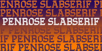
- Geometra by T4 Foundry,
$21.00 Geometra is a new font family from Swedish type designer Bo Berndal and the T4 font foundry. Somewhere between a slab serif and a sans it has a crisp, geometric feel and is both 20’s retro and modern. Its soft curves and openness makes it very readable in smaller print. The powerful serifs give the font lots of character in larger sizes. Geometra comes in three weights, regular, semibold and bold.
 - Neometric by TypeUnion,
$29.00 Neometric is a contemporary sans serif that is built from a geometric foundation but with a more natural approach to the heavier weights creating an enhanced visual approach throughout. The standard version features sharp apex tops on the N & M characters creating a unique and powerful look that would be the perfect font for branding, digital or offline treatments. Neometric features extensive European language support as well as basic Cyrillic to add to the flexibility and useability for big brands and small companies alike. The font is made up of 36 styles, including two subtle design variations each featuring 9 weights plus matching italics.
 - Geometry by Sfaranda,
$30.00 The GEOMETRY Font is based on a specific grid. The grid is made of vertical, horizontal, diagonal lines and circles. Every single letter, number and symbol fits perfectly in the grid, no exception! The GEOMETRY Font includes uppercase, lowercase, numbers and punctuation symbols.
 - Sanserifing - 100% free

- Geometric Ornaments by Gerald Gallo,
$20.00 Contains 182 ornaments.
 - URW Geometric by URW Type Foundry,
$35.99 URW Geometric® is a sans serif typeface inspired by the German geometric typefaces of the 1920s but designed for modern usability. The character shapes have optimized proportions and an improved balance, the x-height is increased, ascenders and descenders are decreased. Special glyphs, which are often designed afterwards for the original geometric typefaces from the 1920s, are perfectly integrated in the URW Geometric® . These design characteristics increase the usability and legibility tremendously. With its 10 weights ranging from Thin to Black, plus 10 additional oblique styles, it has a great versatility in mind. The extreme light styles shine bright in large sizes, the middle weights are perfect for body copy and the bolder variants for the use of emphasis information or bring a strong impact to headlines and information. The optically balanced styles are designed to work in perfect harmony together. URW Geometric® is functional, strong, simple and harmonized in form, and at a glance appears as a modern variant of its predecessors. Apart from the basic characters the design has an extra focus on the special glyphs. These are designed for todays needs. For example: the email glyph looks modern and unique, including a perfectly balanced spacing. The numero sign, in modern use called “hashtag”, is space saving and optically balanced for body text. Additionally, various extra and alternate glyphs are designed to provide a friendly usability. Including a wide Latin language support and character sets, URW Geometric® is perfectly designed for today’s requirements. Please have a look at the URW Geometric® Type Specimen (PDF) for further information.
 - Geometric 231 by Bitstream,
$29.99 - Rohyt Geometric by Typesketchbook,
$55.00 Rohyt Geometric is an altered modified from the form of the original Rohyt typeface. Designed to be more Corporate, the font family has flat terminals that harmonizes with sharp corners. With all of these features, “Rohyt Geometric” is a prominent, eye-catching and unique typeface. It comes with 8 weights with slim option in order to suit for a multifunctional usage, especially for cooperative work, such as website, magazine, editorial, publishing, as well as packaging.
 - Noyh Geometric by Typesketchbook,
$55.00 Noyh Geometric is altered modified from the form of the original “Noyh(2015)” typeface. We added sharp corners in apex, including the structure of typeface. Import to be more Corporate, the font family has flat terminals that harmonize with sharp corners. With all of these features , “Noyh Geometric” is a prominent, eye-catching and unique typeface. It comes with 9 weights and italic type in order to suit for a multifunctional usage, especially for cooperative work, such as website, magazine, editorial, publishing , as well as packaging.
 - Geometric 212 by Bitstream,
$29.99 - Quan Geometric by Typesketchbook,
$55.00 Quan Geometric is an altered modified from the form of the original Quan Pro typeface. Designed to be more Corporate, the font family has flat terminals that harmonizes with sharp corners. With all of these features, “Kelpt Sans” is a prominent, eye-catching and unique typeface. It comes with 8 weights with slim option in order to suit for a multifunctional usage, especially for cooperative work, such as website, magazine, editorial, publishing, as well as packaging.
 - Baltimore Geometric by HiH,
$10.00 Baltimore Type Foundry released its Antique Geometric series by 1883, including it that year on advance sheets for their 1886 Specimen Book, shortly after the firm was taken over by Charles J. Cary. We have chosen to call our version of the face “Baltimore Geometric” because we like the name better. The Central Type Foundry-Boston Type Foundry combine followed with a similar typeface in 1884, using an engraving machine to cut directly into matrices (Gray page 124). It was called simply “Geometric”. As noted in the write-up for HiH font Teutonia, a number of similar typeface designs have appeared over the years. The simplicity of concept is inviting and certainly fits nicely with some of the intellectual theories that developed in the early twentieth century, like the De Stijl and Constructivist movements. This font is useful in conveying an image that is logical and mechanical, implying a high degree of functionality.
 - Geometric 415 by Bitstream,
$29.99
- Geometric 885 by Tilde,
$39.75 - Geometric Harmony by 2D Typo,
$24.00 Charming beauty of the laws of geometry. Easy and elegant decor for your design.
 - Geometric 885 by Bitstream,
$29.99 - Geometric Stencil by Apply Interactive,
$30.00 - Matita Geometric by Trine Rask,
$30.00 Matita Geometric is part of a larger type family developed from 2005-2019 with handwriting and teaching in mind. A humanistic geometric sans serif in five weights containing mathematical symbols, roman numerals, fractions, superior-& inferior numerals, tabular & proportional figures. The family share proportions and weights to ensure all fonts (family members) work together well. Matita Geometric is also a very basic typeface suitable for many purposes.
 - Geometric Arrows by Gerald Gallo,
$20.00 Contains 42 arrow designs pointing up, right, down, and left totaling 168 arrows.
 - HWT Geometric by Hamilton Wood Type Collection,
$24.94 This late 19th century design conjures up early 20th century Dutch DeStijl lettering with a mostly strict adherence to right angles and minimal stroke modulation. Geometric began its life as a metal typeface from the Central Type Foundry, circa 1884. Soon after, this design was officially licensed to Morgans & Wilcox and was shown in their 1890 catalog in Regular, Light and Condensed Light variations. After acquiring Morgans & Wilcox, Hamilton Manufacturing offered Geometric Light Face Condensed as their own No 3020 and the Geometric Light Face as No 3021. HWT Geometric has been expanded digitally to include a Regular Condensed version. A heavier wood type specimen was found from an unknown manufacturer and digitized as it was found, resulting in the HWT Geometric Shopworn and Shopworn Inked variations. These digital versions all include a full Western and Central European character set of over 380 glyphs.
 - Poster Slabserif JNL by Jeff Levine,
$29.00 Based on one of the many hand lettered typefaces found with in the 1960 edition of Sam Welo’s “Studio Handbook for Artists and Advertisers”, Poster Slabserif JNL is available in both regular and oblique versions.
 - Slabserif Grotesk JNL by Jeff Levine,
$29.00 Slabserif Grotesk JNL was modeled from an example of a wood type design called Antique Light Face, and is available in both regular and oblique versions. The numerals (although an odd fit to the overall design) make this vintage font quite unusual and charming.
 - Humanist Slabserif 712 by Bitstream,
$29.99 - Slabserif Wood JNL by Jeff Levine,
$29.00 Vintage wood type with a strong Clarendon influence served as the model for Slabserif Wood JNL, which is available in both regular and oblique versions.
 - Eckhardt Slabserif JNL by Jeff Levine,
$29.00Eckhardt Slabserif JNL is a bold, condensed slab serif font that's perfect for attention-getting headlines, signs, banners, price cards or any printed project where a strong type face is needed. Its name (as others in a series of sign shop-oriented fonts) is Jeff Levine's way of honoring his friend Al Eckhardt, who ran Allied Signs in Miami until his passing. - Square Slabserif 711 by Bitstream,
$39.00A contemporary revival of early 20th century fonts, the Square Slabserif 711™ typeface family from the Bitstream library is perfect for contemporary print and interactive design projects. Its geometric structure of right angles and opposing round corners are ideally suited to current imaging devices. An added benefit is that they also give the design an enduring industrial strength demeanor. Available as three weights with relatively condensed proportions, the Square Slabserif 711 family will surely be a valuable addition to any professional collection of fonts. - Antique Slabserif JNL by Jeff Levine,
$29.00 Antique Slabserif JNL is a reinterpretation of Monotype's Modern Antique 26, released in 1909. The name of the typeface is an oxymoron because Modern conflicts with Antique. Despite many critics of the "mechanical" look of the font's design, it has developed a bit of charm with age and the passing of time. Available in both regular and oblique versions, Antique Slabserif JNL can be used as both a text and headline font.
 - Geometria by Brownfox,
$44.99 Although geometric Sans Serifs have been in vogue for nearly a century, they have never been as ubiquitous. It is not improbable that the old adage would be phrased: “When in doubt, set it in geometric sans”, had it been composed today. Have we not had enough? We think, not. Postmodern times demand a variety of expressions. The vision behind Geometria was to revisit the perennial favorite to lend subtle individuality to its tried and true forms. Geometria stands out in the crowd of similar fonts thanks to its complicated nature. It combines dynamic elements with a certain degree of stability. A slightly higher waistline of the capitals contributes to their distinctive appearance. If the upper case refers to the American grotesques of the 19th century, the lower case tends toward the forms of the Renaissance in its proportions. Geometria is a typeface of clean shapes that is well-suited for continuous reading, and it sets remarkably well. At the same time, it can be friendly, even flirtatious. Its distinct personality combines seeming opposites. At times it may appear serious, at times playful. On occasion, it may be deliberate, other times dynamic. It could seem rigid, then elegant. It is a typeface that could be perceived either as cutting-edge, or as nostalgic. A careful and discerning typographer will bring out and emphasize those aspects of its multifaceted personality that are needed to solve the problem at hand. Geometria consists of 24 fonts — eight weights with matching italics and narrow styles. The font includes multiple sets of figures and currency signs, alternate glyphs, a variety of experimental ligatures, and punctuation marks for the two cases. The 835 glyphs support 72 languages. Granshan 2013 award.
 - Geometrix by d[esign],
$17.38 The handprinted Geometrix font family is an alternative to the usual distressed typeface. Rather than drawing on a sans-serif style and tearing it to shreds, Geometrix provides an intresting and compelling set of shapes which ties into a nice worn effect. The Geometrix font family consists of two fonts; Geometrix and Geometrix Nero. Geometrix and Geometrix Nero can be used together to create a fill for Geometrix's letters, by layering Geometrix above a differently coloured Geometrix Nero in your image editor of choice.
 - NEOMETRA - Personal use only

- CloisterBlack BT - Unknown license

- AmericanText BT - Unknown license

- Sloboda BT by Bitstream,
$50.99A calligrapher, graphic designer and teacher, Duško Trifunović of Belgrade created this handsome calligraphic typeface called Sloboda. It has an open design, an outline of sorts, and though the lowercase is small and compact, it sets beautifully in text. The generously sized uppercase has a swash flavor to it yet works harmoniously with itself. This OpenType font has extra ligatures and the extended character set supports Central Europe. - Covent BT by Bitstream,
$50.99Designed by Jochen Hasinger of Frankfurt, Germany, Covent BT is an unconventional geometric sans serif typeface, featuring rounded terminal ends and a stencil-like break of the contour in some glyphs. At first glance you might think of it as a display typeface, but the generous x-height and openness of the lowercase makes Covent BT very legible at text sizes. Central Europe and Cyrillic is supported in the extended glyph set. Each weight contains 485 glyphs and includes some alternate figures, some upper and lowercase alternates, as well as others, all accessible via OpenType features. Covent BT Symbols is a stylized geometric symbol font, intended to stand alone or used as a companion to the Covent BT typefaces. The array of glyphs covers many of the more popular icons of the day including symbols for web use, numbers, sports, travel and astrology, to name a few, each with its own unique stylized interpretation.


Page 1 of 143Next page