9,062 search results
(1.14 seconds)
- Hypnotica by Deniart Systems,
$15.00 Hypnotize your audience! For a truly unusual eye-catching experience, this modern-day series, containing 52 geometrical and optical mofifs, can bewitch and fool the eyes with unexpected shifts in focus. Whether your documents are for print or screen, these symbols are sure to add a little fun to all your presentations.
 - Labyrinthus Rounded by Cerri Antonio,
$30.00 Labyrinthus Rounded is a multiline decorative font that works very well for identity logos, posters and 3D-works. It continues the tradition of the precedent Labyrinthus but with a softer rounded impact. It's interesting to note that with it it's possible to play with the multiline concept to create endless overlapping geometric creations.
 - TCF Zellige by TypeCult Foundry,
$22.00 Zellige is a modular typeface inspired by the tiles that can be found in Southern Europe and North Africa. Made of ornamental geometric shapes, with two layers for improved legibility, Zellige reflects the luxurious and sophisticated flare of the mediterranean spirit of architectonical composition, employing the latin script into very baroque shapes.
 - Raffles by Scrowleyfonts,
$20.00 Raffles is an Art Deco inspired font which takes geometric lettering to another level with comprehensive contextual alternates for exciting uppercase titling. There are four different styles available for a retro or a more contemporary look and feel. I hope that you will enjoy using it as much as I enjoyed creating it!
 - Cocosignum by Zetafonts,
$39.00 Cocosignum takes inspiration from the typography of the italian thirties. The imperial uppercase with its propaganda deco overtones is softened by a cursive lowercase geometric script in the Corsivo Italico version. It comes in two styles and five weights, covering over forty languages using latin alphabet, as well as Greek and Cyrillic.
 - Atenta by Glen Jan,
$25.00 Atenta is a neutral sans-serif family based on techno-geometric forms in 8 styles. It supports Western, CE, Baltic, Turkish and Cyrillic encoding languages. All styles of Atenta contain small capital forms, case sensitive punctuations, lining, Oldstyle and smallcaps figures (including currency and math operators), superscripts and subscripts, numerators and denominators.
 - Woven by Ingrimayne Type,
$9.00 Woven is a geometrical typeface based on a simple tessellation or tiling pattern. The template for the letters has both vertical and horizontal symmetry and the tiling pattern has four-fold rotational symmetry. Variations of this pattern are popular with quilters and most have a woven look to them. To fit the letters into the template results in some distorted letters but it is the pattern that matters, not the individual elements of that pattern. With proper spacing, a block of text will fit together both horizontally and vertically. Woven is intended to be used with alternating letter sets and the OpenType feature of contextual alternatives does this automatically in applications that support it. The upper-case could be used alone but it unlikely that the lower-case characters could be used by themselves. The typeface is hard to read and would make a challenging font for word-search puzzles.
 - Xesy by Dharma Type,
$19.99 Odd and funny script for happy, fun time. There are two other fonts designed by in the same concept. -Ekistra -Deluta Black -Xesy
 - Pocket Initials JNL by Jeff Levine,
$29.00Pocket Initials JNL contains twenty-six initials inside of a white-into-black pattern for monograms, page headers, stationery and other creative projects. - Sketchetik by Hiekka Graphics,
$19.00 Sketchetik is a hand-drawn font in four styles: light, regular, bold and black. It is recommended for use as a display typeface.
 - Metric Navy PRO by Sea Types,
$19.00 Metric Navy PRO is a lightweight monoline developed for short texts and loose phrases in versions: thin, light, normal, regular, bold and black.
 - Happy Cloud by Cultivated Mind,
$25.00 Happy Cloud is a fun, tall handwritten font created by Cultivated Mind. This font features five font weights (Light/Regular/Bold/Black/Heavy).
 - ryp_cartoonbug - Unknown license

- Como by Dharma Type,
$24.99 Como is a modern rounded sans-serif family designed by Ryoichi Tsunekawa and the whole family consists of 8 weights from ExtraLight to Heavy. The basic skeleton of their letterform was designed geometrically and their ends were rounded out. The sophisticated geometric design gives them universality, neutrality and sense of unity for the use in all media, all purposes. And their large x-heights makes this family legible and readable. While at the same time, the rounded ends characterizes this family and it makes them very friendly and natural. This rounded feature will also accentuate your design work moderately. Como supports almost all European languages: Western, Central, South Eastern Europeans and afrikaans. And superior figures, inferior figures, denominators, numerators and fraction can be accessed by using OpenType features.
 - HS Almohandis by Hiba Studio,
$59.00 HS Almohandis is an Arabic display typeface. It is useful for book titles and graphic projects where a contemporary, streamlined look is desired. The font is based on the simple lines of modern and simplified Kufi calligraphy, that support Arabic, Persian and Urdu. This font was created in the beginning as regular weight with the font HS Alhandasi in 2007 for use in technical and engineering company. The company tends to follow the geometrical shape with equal dimensions in both vertical and horizontal storks. There is also a tendency to make all characters to be similar to oval shape with the impression that they are all geometrical and clear. I followed that with Bold weight in 2011. The difference between this font and HS Almohandis is that its characters have a sharp baseline.
 - Sweep Poster by Estudio Calderon,
$30.00 A new font by Calderon A typeface with a contemporary aesthetic, a mix of geometric and organic shapes that give each letter a special and unexpected design. The conceptual process was developed by making a re-interpretation of the Caslon styles making different explorations by using a calligraphic nib pen in order to find a new personality to each letter. The result is a modern, elegant and experimental serif typeface. Delicate in its Extra Light version and impressive in the Bolder style. The sweep design hides harmonic adjustments based on geometric strokes that generate a unique and attractive texture. For a better experience we recommend you to use it in headlines instead of body text. Includes: + 8 weights + 1 variable font + OTF features + Character set that supports Western, Central and Southeastern European languages. + Script: latin
 - Bushcraft by Cultivated Mind,
$35.00 Bushcraft is a fun geometric monoline script and sans serif font. This family includes five weights, a sans serif font and art. Bushcraft Basic and Pro scripts are simplistic with a geometric look. Bushcraft Basic scripts comes with one set of 63 alternates and ligatures. Bushcraft Pro scripts includes 278 alternates and ligatures. Both versions supports extended Latin Pro and OpenType. Bushcraft Sans is an all caps, vintage inspired font that pairs nicely with the scripts and artwork. Bushcraft is well-suited for type art, murals, product design, books, film, television, branding, magazines, signage and other creative projects. To use the OpenType ligatures/alternates you will need to use any program that supports OpenType features such as Adobe Illustrator CS and Adobe InDesign. Fonts designed by Cindy Kinash.
 - P22 FLW Exhibition by P22 Type Foundry,
$29.95 This font set is the second in a series from P22 Type Foundry based on the lettering styles of Frank Lloyd Wright. Created in 1931, the Exhibition lettering was intended primarily to accompany Frank Lloyd Wright's exhibition drawings and models. Many of the 72 Extras were designed to form continuous linking borders. Combinations of these geometric forms can provide endless variations of decorative elements in the style of Frank Lloyd Wright. Many of these images were based on Mr Wright's "Saguaro Forms and Cactus Flowers" illustration for an unused Liberty magazine cover of 1926. Other imagery in this set was derived from assorted geometric designs by Wright. Exhibition Regular, Light, and Bold have been remastered and now contain almost 400 characters including support for Western and Central European languages.
 - Magnify by XdCreative,
$29.00 Geometric sans serif is one of my favorite fonts because it's so, simple, clean and modern, and a long time I've been dreaming of making this type, inspired by many media and especially "Futura, 1927" ( by Early Bauer) I created "Magnify" Geometric sans. The structure and element shape of Magnify is not really perfectly circle, but slightly oval it can be seen in the uppercase letters O, G, C, Q and in the lowercase letters o, a, c, e. Magnify has 8 weights, - from Hairline to Bold and Matching Oblique. Magnify also has special alternate characters in letters a, g, y and o. it is to give a different look to a paragraph, headline or your display design. thanks, hope you would like and accept "Magnify" as part of your family. thank you in advance
 - KAPITAL by Superfried,
$32.00 KAPITAL is an elegant, geometric uppercase sans. It is available in standard and stencil style across four weights – light | regular | medium | demi – covering 346 glyphs. It is based on the capital character set from a previous release – Basik. Continuing the clean, geometric aesthetics, KAPITAL was refined further to create a more minimal style. This enabled the characters to discreetly perform their role – to simply convey the message of the writer without distraction. To achieve this, special attention was applied to the form consistency of the glyphs across the weights and negative space throughout. In many typefaces as the weight is increased the form and style can deviate significantly from the original design. With regards to negative space – although inevitable – wherever possible key letterforms were adjusted to alleviate this.
 - Halcom by The Northern Block,
$49.50 A modern sans serif typeface inspired by the historic geometric’s of the 1920’s, specifically Futura. The design is not a simple pastiche of what went before this is much more than that. It is a close investigation to how Futura inspired other type designs like Avenir and helped push the boundary of what is a modern typeface of its generation. Overlaying perfect geometric shapes careful adjustment is made for each character and each corner to a point of balance between pure mathematics and optical correctness. The result is a distinctively modern geometric font family that is strikingly simple in design yet perfectly pleasing to the readers eye. Details include 550 characters with an alternative lowercase a, g and y, five variations of numerals, manually edited kerning and Opentype features.
 - Point by Ndiscover,
$29.00 Point™ aims to be an epitome of the Geometric Style. Inspired by intemporal classics such as Futura, Avant Garde or Avenir, passing through more contemporary approaches of the same style; ignited by the overarching narrative of the Modernity (Perfect Geometric Shapes) and careful design decisions, Point™ is a font that references the past as well as projects itself to the contemporaneity. With a total of 10 weights, with respective hand adjusted obliques, Point™ has a total of 20 styles with Extended Latin support as well as Cyrillic, all with the most needed Opentype features, such as fractions, tabular and oldstyle figures, alternates, case sensitive forms, etc. Point™ has a superb versatility and can be used in almost every circumstance, try it for yourself and see what point Point™ makes.
 - Neubau Pro by TipografiaRamis,
$49.00 Neubau is a condensed geometric display typeface, designed in 2009. The inspiration for this face came from Joost Schmidt lowercase letters developed during 1925-28 in Bauhaus Dessau. Schmidt was one of the proponents of New Typography – a movement advocating the use of only lowercase letters which were constructed strictly geometrically using only ruler and compass. Neubau Pro is the new edition of Neubau fonts. The new typeface is an upgraded version of an old fonts (2009), with careful refinements to glyph shapes, and the extension of glyph amounts which enabled support of more Latin languages as well as Greek and Cyrillic languages. Neubau Pro is released in six styles with small caps, and true italics, and contains OpenType features. This typeface can be used for editorials and print designs.
 - Benda by Suitcase Type Foundry,
$45.00 Benda is a modern geometric script font with roots in the calligraphy and lettering of legendary artist Jaroslav Benda. With bold, predominantly low joins, the robust monolinear character strokes shine in one-word and short inscriptions as well as in longer headlines. The practical letterforms do not clutter the space with loops and curlicues, while the emphasised baseline helps to underline the importance of the message. What’s more – Benda is a smart font, automatically replacing conflicting characters with suitable alternatives as you write so that the final text flows seamlessly. Because Benda is the sequel to Jaroslav, it derives the slant, colour, and geometric characteristics from the sans typeface, forming the perfect companion to the font. So much so, it can serve as a second italic emphasis in long texts.
 - Pepi/Rudi by Suitcase Type Foundry,
$39.00 The superfamily Pepi and Rudi is based on playful experimentation with basic geometric shapes - the circle, rectangle and triangle - elements that laid the foundations for typographic Modernism. The Pepi and Rudi introduces a number of current elements into a time-proven concept of primitively constructed typefaces. The typeface's somewhat uniform character width establishes a more regular rhythm; the character set is expanded, and legibility is improved thanks to taller lowercase. A wide range of ten styles, from hairline-thin to extra-thick with adequate Italics allow for universal use across the whole scope of graphic design. Carefully designed diacritics, clear punctuation marks, table number characters, ligatures, arrows or alternative lowercase characters are standard; this is sure to please everyone needing to work effectively with a neutral, geometric headline typeface.
 - Rhodes by Eurotypo,
$19.00 Rhodes is a modern geometric sans serif consisting of 5 weights ranging from Extra Light to Bold with matching true italics. Its variety of weights provide a range of choices that will help you find the best typographic color for your project. Lighter weights are well-suited for body text while heavier ones are ideal for high impact headlines. Rhodes has been designed purposely to enable brands to appeal more emotionally to modern consumers. The balanced characteristic of Rhodes with unique details, such as the geometric form and the prominent x-height makes it perfect for strong headlines and outstanding logos, but also suitable for long text. Rhodes includes a set of ornaments in regular and italic to be able to combine it with the glyphs and thus, to give your designs more exclusivity.
 - Citizen Kern by Pierre Tur,
$9.00 Citizen Kern is a modern, geometrical grotesk typeface. It comes in 5 different styles and opentype features for a better use of typography: it’s good for both headlines and body copy. It was made from the simplest geometrical shapes for a universal appearance, with enhanced overlaps to ensure an offbeat look. Citizen Kern is meant to work for any graphic project. You can use it for branding, editorial design, signage or even motion design : its simple shapes make it super easy to animate. Do you love the classic sans serif fonts? We all do. But what if you could add some singularity to your projects? Then Citizen Kern is the ideal pick for you. It will never be as perfect as the classics but will definitely offer an alternative, and freshness to your work.
 - Clear Sans by Positype,
$29.00 Clear Sans™ is a… wait for it… rational geometric sans serif. It is intended to fill a niche… to provide an alternative to the somewhat based-on-vernacular signage, somewhat geometric sans. I hear the word vernacular thrown around too much and too loosely. If a typeface is based in the vernacular, based on hand-painted or hand-crafted signage, then it should be based on the movements of the hand, retain that warmth and not on a pretty geometric model. For me, clean, geometric and precise doesn't have to be cold and expressionless. The original skeleton was hand-painted in 2008 to help determine and inform my decisions going forward. The typeface was completed shortly afterwards at the behest of an old friend for their identity. As usual, I expanded it, but considered retiring it since there were so many things similar out there. Years later, I had a chance to rediscover it and came to the conclusion that it could be improved, expanded in a logical and useful way, and introduced. I would be lying if I didn't admit that the rise of webfonts and embedded type in applications influenced many of the decisions I made about reworking Clear Sans™. Completely new Text and Screen fonts were developed that utitlize larger x-heights, space-saving widths, logical (and simplified) weight offerings… to name a few alterations. Even the pricing of each variant was considered to produce a more reasonable and simple solution for the developer, designer, professional and novice. Clear Sans™ is a departure from my previous sans serifs, but the influences of Aaux Next, Akagi Pro and Halogen are evident. Enjoy a light-hearted mini-site devoted to Clear Sans™
 - Clear Sans Text by Positype,
$25.00 Clear Sans™ is a… wait for it… rational geometric sans serif. It is intended to fill a niche… to provide an alternative to the somewhat based-on-vernacular signage, somewhat geometric sans. I hear the word vernacular thrown around too much and too loosely. If a typeface is based in the vernacular, based on hand-painted or hand-crafted signage, then it should be based on the movements of the hand, retain that warmth and not on a pretty geometric model. For me, clean, geometric and precise doesn't have to be cold and expressionless. The original skeleton was hand-painted in 2008 to help determine and inform my decisions going forward. The typeface was completed shortly afterwards at the behest of an old friend for their identity. As usual, I expanded it, but considered retiring it since there were so many things similar out there. Years later, I had a chance to rediscover it and came to the conclusion that it could be improved, expanded in a logical and useful way, and introduced. I would be lying if I didn't admit that the rise of webfonts and embedded type in applications influenced many of the decisions I made about reworking Clear Sans™. Completely new Text and Screen fonts were developed that utitlize larger x-heights, space-saving widths, logical (and simplified) weight offerings… to name a few alterations. Even the pricing of each variant was considered to produce a more reasonable and simple solution for the developer, designer, professional and novice. Clear Sans™ is a departure from my previous sans serifs, but the influences of Aaux Next, Akagi Pro and Halogen are evident. Enjoy a light-hearted mini-site devoted to Clear Sans™
 - Clear Sans Screen by Positype,
$21.00 Clear Sans™ is a… wait for it… rational geometric sans serif. It is intended to fill a niche… to provide an alternative to the somewhat based-on-vernacular signage, somewhat geometric sans. I hear the word vernacular thrown around too much and too loosely. If a typeface is based in the vernacular, based on hand-painted or hand-crafted signage, then it should be based on the movements of the hand, retain that warmth and not on a pretty geometric model. For me, clean, geometric and precise doesn't have to be cold and expressionless. The original skeleton was hand-painted in 2008 to help determine and inform my decisions going forward. The typeface was completed shortly afterwards at the behest of an old friend for their identity. As usual, I expanded it, but considered retiring it since there were so many things similar out there. Years later, I had a chance to rediscover it and came to the conclusion that it could be improved, expanded in a logical and useful way, and introduced. I would be lying if I didn't admit that the rise of webfonts and embedded type in applications influenced many of the decisions I made about reworking Clear Sans™. Completely new Text and Screen fonts were developed that utitlize larger x-heights, space-saving widths, logical (and simplified) weight offerings… to name a few alterations. Even the pricing of each variant was considered to produce a more reasonable and simple solution for the developer, designer, professional and novice. Clear Sans™ is a departure from my previous sans serifs, but the influences of Aaux Next, Akagi Pro and Halogen are evident. Enjoy a light-hearted mini-site devoted to Clear Sans™
 - Kardelen by HakanPolatovic,
$10.00 KARDELEN means,snowdrop flower in Turkish BEAUTY Kardelen font is created for expression of pure beauty GEOMETRY Every glyph on kardelen has a ratio to one another,which makes it rational
 - Codec Pro by Zetafonts,
$39.00 Codec Pro is the newest incarnation of the Codec family, developed in 2017 by Francesco Canovaro, Cosimo Lorenzo Pancini and Andrea Tartarelli as a research on the subtleties and the variations on the theme of the geometric sans-serif design. The original typeface has been completely redesigned and expanded to feature a wide range of eleven weights, from the hairline thin to the bulky fat, while the character set has been extended to include not only latin, cyrillic and greek but also arabic, farsi and urdu scripts. A veritable swiss-knife for the designer, Codec Pro also includes a wide range of alternates and stylistic sets that cover all the subfamilies and the moods of the original type system. So while the standard set (Codec Cold) has terminals cut parallel or perpendicular to the baseline, emphasizing geometry for a more constructed look, stylistic set 4 (Codec Warm) uses open diagonal cuts and humanist shapes to give the typeface a gentler, warmer feeling. Set 3 (Codec Cold Logo) comes alive with funky ligatures, while Set 5 (Codec Warm Logo) stretches uppercase characters horizontally for a dynamic, unexpected effect
 - Rondana by Sudtipos,
$39.00 Crafted in the best tradition of the geometric sans-serif, Rondana is a typographic tribute to the the retro-futuristic aesthetics of the 1960s and 70s, as well as an exercise in purity of line. However, its spirit is decidedly non-bauhausian, since its strokes intentionally deviate from the dull, obvious, ruler-and-compass construction; its arcs and curves being much more complex, tending towards a slightly square shape, imbued with subtle modulations. This sums up to a more organic, flowing, extroverted personality than the one just expected from the use of plain, simple geometry. Another feature is the conscious use of non-standard shapes for many signs, that are quite legible but somewhat unexpected, such as the E, the g and the ampersand; making Rondana an excellent display face and also giving a particular flavor to the text composed in it, especially in its italic variants —which are, by the way, designer italics in their own right and not just an oblique version of the roman. Rondana comes in twelve variants comprising a wide spectrum of weights, allowing for an extremely diverse range of expression.
 - Mike Biro Script by Johannes Krenner,
$12.50 My uncle has a real fine handwriting. Especially the long ascender and descenders are very characteristic. It is dynamic and a good legibility. Try the font in a dark blue color (C90, M15, Y0, K60) and 22pt.
 - Salty Cracker by RA Studio,
$14.00 Salty Cracker is a display font with Black Letter elements. The symbols have a nice shape and long ascenders and descenders. Display font Latin
 - Belynos by Typomancer,
$24.00 Belynos, a simple and elegant didone. Plus a bit of triangular! Font family contains from Light to Black and suitable italic for various designs.
 - Wide Display by Gaslight,
$20.00 Unicase wide slab-serif with numerous alternatives and decorative elements. In Ribbon styles kerning for black ribbons released as Discretionary Ligatures. Lets do wide!
 - Gemline by Liz Conley,
$18.00 Gemline is an Art Deco inspired display font featuring Inline and Black weights with 2 fill options for adding colorful effects quickly and easily.
 - Flexor by Ráchel Pleesz,
$29.00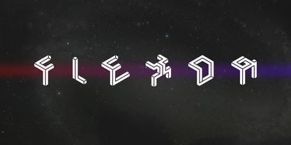 Flexor is an isometric display font inspired by impossible objects.
 - Westmount by Rook Supply,
$14.00 Westmount is a geometric grotesque sans font that is both versatile and contemporary. The wide spacing between letters gives your text room to breathe and have the perfect amount of presence and balance. The strong capital letters are perfect for clean layouts and timeless branding. Try using Westmount Outline for a clean classic look.
