10,000 search results
(0.035 seconds)
- Ghino by Fontmachine,
$3.00 The Ghino family of "modern geometric sans" consists of 20 fonts. All the family's fonts contain 370 glyphs and are equipped with many typographic features. Ghino Text is designed for those who prefer to use single-coded fonts not only in coding but also in many different environments of graphic design. The idea came from creating a font with single-spaced aesthetics, without breaking the single-spaced fonts. Ghino is a geometric sans single-spaced font with all typographic features except spacing and character spacing.
 - Gorva by Dasukreation,
$9.20 Gorva is a geometric sans serif typeface affected by other geometric sans like Product Sans and Avenir. There are more 400 glyphs with special characters with circles on a, g, and r. All special characters are PUA Encoded, which means that you can access all special characters through Windows and Mac and that you can load them into any application. This typeface is suitable for many projects, such as designing for print and digital media. Also supports multilingual languages from Western European to Eastern European.
 - InSign by Konst.ru,
$- Geometric font for paradoxical or short texts. Also maybe use for headlines, logos etc.
 - BLT Balfour by Black Lab Type,
$12.00 BLT Balfour : Art Deco Revival Font Balfour is a modern Art Deco typeface revival. Built from historic references in architecture during this time period, Balfour exudes class and elegance, yet still honors the style with unapologetic bold geometric forms. Pay close attention to the letterforms B and R, and how their extreme x-heights play off of the elongated strokes of C, D and G. Unique features throughout the character set make it less predictable and more unique than any Art Deco typeface before it. The geometry of this typeface plays from one letter to the next. Fill and Outline styles work well in headlines, logos and large type. The Line style is effective at all sizes and can be used in combination with other styles to achieve visual hierarchy.
 - Neutraliser Sans by HamburgerFonts,
$20.00 The Neutraliser family is a versatile collection of geometric-based fonts with 24 styles. The 6 Alternate styles are suitable for headlines and are complemented by the Sans and Serif styles suitable for small amounts text. The Caps styles allow for extra typographic variation within the family. Neutraliser is a direct result of the designer's initial exploration of typography and is uncompromising in its geometric nature. As the name suggests, the typeface celebrates the precision of the digital medium as a drawing tool in which the critical points that make up a letterform can be almost ‘plotted’ according to a grid-based logic.
 - Neutraliser Caps by HamburgerFonts,
$20.00 The Neutraliser family is a versatile collection of geometric-based fonts with 24 styles. The 6 Alternate styles are suitable for headlines and are complemented by the Sans and Serif styles suitable for small amounts text. The Caps styles allow for extra typographic variation within the family. Neutraliser is a direct result of the designers' initial exploration of typography and is uncompromising in its geometric nature. As the name suggests, the typeface celebrates the precision of the digital medium as a drawing tool in which the critical points that make up a letterform can be almost 'plotted' according to a grid-based logic.
 - SK Nomerok by Shriftovik,
$48.00 SK Nomerok is an elegant geometric font with a minimalistic design. A unique pattern of symbols in a compartment with a strict classical design creates a strong and reliable structure, ideal for modern design. The sharp and angular letters of SK Nomerok are easy to read both on the screen and when printing. The geometric elements of the font are complemented with unique details, which adds to its originality and attractiveness. This font is perfect for branding, headlines and decorative text, adding modernity to any project. The font is multilingual and supports both extended Latin and Cyrillic character set.
 - Steradian by Emtype Foundry,
$69.00 Steradian is an exploration of the geometric genre and although it has a geometric base, the widths between letters are not much different across the weights. That is due to the process, in which the proportions of the heavier weights paved the way for the lighter ones. It also has a series of details that make Steradian stand out and gives it a special touch. Some of its main features are the double-story ‘a’, its closed apertures and some of the capitals have a distinct personality (such as the G and Q). Read more about the design process at the Emtype’s Blog.
 - Conglomerate by Typetanic Fonts,
$39.00 Sans or serif? Square or rounded? Calligraphic or geometric? Conglomerate is both all and none of these things — a subtle yet unorthodox blend of typographic traits resulting in a clean, unique, and versatile font family with large, open counters for legibility in text yet crisp, sharp details that sparkle at display sizes. Conglomerate is sturdy but never stiff, crisp but never stark — perfect for projects that require a more contemporary feel than either a traditional serif or geometric sans might bring. Conglomerate received a PRINT Magazine Best in Class award, and was one of Typographica’s Favorite Typefaces of 2016.
 - Neutraliser Serif by HamburgerFonts,
$20.00 The Neutraliser family is a versatile collection of geometric-based fonts with 24 styles. The 6 Alternate styles are suitable for headlines and are complemented by the Sans and Serif styles suitable for small amounts text. The Caps styles allow for extra typographic variation within the family. Neutraliser is a direct result of the designers' initial exploration of typography and is uncompromising in its geometric nature. As the name suggests, the typeface celebrates the precision of the digital medium as a drawing tool in which the critical points that make up a letterform can be almost 'plotted' according to a grid-based logic.
 - Neutraliser Alternate by HamburgerFonts,
$20.00 The Neutraliser family is a versatile collection of geometric-based fonts with 24 styles. The 6 Alternate styles are suitable for headlines and are complemented by the Sans and Serif styles suitable for small amounts text. The Caps styles allow for extra typographic variation within the family. Neutraliser is a direct result of the designers' initial exploration of typography and is uncompromising in its geometric nature. As the name suggests, the typeface celebrates the precision of the digital medium as a drawing tool in which the critical points that make up a letterform can be almost 'plotted' according to a grid-based logic.
 - Gudeg Theo by Letterayu Studio,
$15.00 Gudeg Theo is a modern Slab serif style display font category. This font is very attractive. Perfect for cute quotes, packaging, branding, invitations, greeting cards, and more. Features : – Uppercase and Lowercase letters – Numbering and Punctuations – Multilingual Support – Works on PC or Mac – Simple Installation – Support Adobe Illustrator, Adobe Photoshop, Adobe InDesign, also works on Microsoft Word
 - Freight Micro Pro by Freight Collection,
$39.00 Created for captions and similar serif situations where small type is required, Freight Micro is amazingly illustrative for large type too. This half-wedge, half-slab design provides the firmest of foundations to build your design on. The abruptness of the sharply carved italics take emphasis to a higher form. Freight Micro is an exercise in whispering very loudly.
 - Hansel by Viaction Type.Co,
$18.00 Hansel is a slab serif with 2 styles rough & textured, which can be nicely applied in various products. Complete with multilingual characters and stylistic alternates. It is suitable for quotes, clothing design, vintage logos, labels, posters, packaging and other designs. Features (PUA Encoded) : - UPPERCASE. - LOWERCASE. - MULTILINGUAL. - PUNCTUATION & SYMBOL. - STYLISTIC SET. I hope you enjoy and thank you.
 - Bandera Display by AndrijType,
$21.00 This contrast serif typeface is good for display use. Bandera Display has six weights with original italics. It catches attention in headlines of posters and magazines. It works well with Bandera (slab serif), Osnova (sans serif) and Bandera Text (serif) fonts. Bandera is Spanish for ‘flag’. And Bandera is a symbol of Ukrainian fighting for freedom for many years.
 - Saturator Serif FA by Fontarte,
$39.00 Saturator Serif FA is a younger brother of Saturator FA. It comes with upper and lower case letters and with diacritic characters for many Latin languages. Its informal and cheerful character allows for different creative ways of usage. This slab serif typeface is designed to accompany sans serif version. It has three variants: Regular, Italic and Shadow.
 - Netra by Sign Studio,
$15.00 Netra Slab is a minimalist and modern font. Having 9 thicknesses from Thin to Black will provide an easy choice as needed. With 390+ characters it can support more than 30 languages. If you want typography that looks smooth then choose the Rounded version. This font is suitable for writing general text, titles, even for brand logos.
 - Flink Neue by Identity Letters,
$45.00 Geometric typefaces are a staple in every typographer’s toolbox since the 1920s. It was a time when iconic faces such as Futura, Erbar, and Kabel appeared on the scene and turned the world of type upside-down. Inspired by those early giants as well as later epigones with a legacy of their own (such as 1970’s Avant Garde Gothic), Flink Neue is the Identity Letters take on this genre, characterized by a clean and focused appearance. With neat shapes and the look of pure geometry, Flink Neue adapts to a vast range of applications and topics, from the fine print in contract to website body copy to logo design to billboard-size slogans. Its x-height is considerably larger than in classic geometric sans-serif fonts; its proportions are harmonized as opposed to strictly constructed. This makes for a more contemporary look, setting it apart from the classics. With three different widths, Flink is a true all-rounder. Geometric fonts are usually quite wide, which often leads to text-settings problems with headlines or small print. The Condensed and Compressed variants of Flink Neue solve this problem easily. This font family comes along in 18 weights from Thin to Black with matching Italics. There are almost 1400 characters per style, including nine stylistic sets that offer variations to the look and feel of Flink Neue, making it even more versatile. Besides the default mood of Flink Neue, there is also a Text and Bauhaus variant, where different letters have been changed to create a new mood. In theory, you just need one single font file to change between all three moods, but to make it easier for you, we also exported each mood within a separate file. Plenty of additional Open Type Features like ligatures, small caps, case sensitive forms, old-style figures, tabular figures and symbols make Flink Neue a valuable tool for the discerning typographer. Flink Neue is the reimagination of a classic genre, designed to suit the needs of our time.
 - Stellar by Monotype,
$29.99Robert Hunter Middleton drew the original design of Stellar for the Ludlow Typograph Company in Chicago. Work began in the late 1920s, when Middleton was asked to create a sans serif type family to compete with European imports of Futura and Kabel. Stellar was Middleton's attempt to raise the ante. Where Futura and Kabel were geometric in design and monotone in weight, Stellar was based on roman character proportions and stroke weighs were stressed. In the late 1990s, Dave Farey took on the task of reviving the Stellar design. While Ludlow cut Stellar in a full range of point sizes, the family was limited to just a roman and bold design. Farey's revival is twice as large a family. It ranges from a very light called Stellar Nova to a very bold called Zeta In between are Lyra and Epsilon. - Trevor by TypeTogether,
$36.80 Teo Tuominen’s Trevor took its first breath as a revival of an 18th century antiqua, but culminated in an entirely new and good-natured family. Trevor is an affable slab serif in nature: both heavy and kind. Known for their familiarity and their dark colour, the terminals of slab serifs put additional weight along the line to maintain an inky presence. Their clunky forms reveal slight immaturity and arouse the reader’s sympathy for the subject at hand. Trevor connects with others by consciously riding the line between being personal and commanding. One goal with Trevor was to pair the robust nature of a low contrast slab serif with more sophisticated elements, such as the ball terminals. So wherever one looks in Trevor, rounded corners rule the day, softening the overall appearance by mimicking ink spread made by old metal type. The easygoing look is tempered by very few inktraps and sharp corners, mostly to the inside of characters and in acute angles. Whatever Trevor is paired with, it has an altruistic outlook in that it sees the best in others. It’s the neighbourly type family — the neighbour you actually want. Trevor’s almost monolinear weight and high x-height give it a typewriter look in the extralight and light weights, but the whole family was made to work with many other font styles, design work, and information structures. It certainly finds its home in packaging and advertising, its sturdy verticality and narrowness fit the needs of headlines and intro text, and its seven weights are primed for plays and involved text needing many layers of distinction. The black weight is treated like a separate display style with altered ball terminals and serifs to capitalise on the added heft. Trevor’s seven roman weights cover the Latin A Extended glyph set to bring its kindly and commanding outlook to your projects. Along with alternate version of the ‘R’ in the black weight, its OpenType features include both tabular and proportional lining and oldstyle figures, ligatures, and fractions. The complete Trevor family, along with our entire catalogue, has been optimised for today’s varied screen uses.
 - Plinc Flourish by House Industries,
$33.00 Flourish breaks the mold of traditional typography. Part italic, part roman, this iconoclastic font is all style. William Millstein casts the contours of formal pen strokes in a taut upright framework to create a typeface that nods back to its origins while looking defiantly forward. The neat and light semi-serif flaunts crisp geometric touches without conceding warmth or personality. A sophisticated design solution that isn’t stuck up, Millstein Flourish makes invitations, identities, and editorial settings thrive. Originally offered by Photo-Lettering in the early 1940s, Millstein Flourish was digitally updated by Jeremy Mickel in 2011. Like all good subversives, House Industries hides in plain sight while amplifying the look, feel and style of the world’s most interesting brands, products and people. Based in Delaware, visually influencing the world.
 - Blop77 by osialus,
$15.00 Blop77 is a geometric sans-serif type family, consisting of 3 weights. It is based on the Blop11, being its expanded version. Blop77 is well-suited to headlines and short text.
 - Crypto by Vertigo,
$21.00 Crypto is a narrow, sans serif, geometric, display font with two weights. It works well for modern, contemporary projects, logotypes, films, posters, billboards, press advertisements, websites, packaging. It provides multilingual support.
 - Stanford by profonts,
$41.99 The strong, geometric letterforms of this typeface incorporate a heavy outline and were inspired by college and university sportswear, making Stanford an excellent choice for work associated with sports in general.
 - Opz Popz JNL by Jeff Levine,
$29.00 Opz Popz JNL is a collection of fifty-two designs based on geometric designs and pop art (reminiscent of the 1960s). These images are perfect embellishments for retro-themed work projects.
 - Objet by Pascal Tarris,
$10.00 Inspired by the clarity of signage fonts, Objet Sans is a modern geometric typeface with a friendly rounded touch. It containts many OpenType features and an extensive character set that make it suitable for a variety of uses.
 - Mazzard Soft by Pepper Type,
$35.00 Mazzard Soft is a rounded version of Mazzard – a superfamily of three geometric grotesques with three different x-heights (H, M, and L). It features rich language support, includes Cyrillic, and offers a wide variety of alternate forms.
 - Cabrito Inverto by insigne,
$- Life’s always more fun when you reverse the stress. The same goes for the new member of the Cabrito family. Cabrito itself is a recently developed slab serif made for the kid’s book The Clothes Letters Wear. Cabrito proved to be more popular than I thought, and I promised I would create an inverted style for this new addition to the font world--a variant that would pair well with the original or even stand well on its own. And so now, here it is. Cabrito Inverto, which features the reversed stress of the strokes from a font’s “normal” traits. Inverted stress fonts are most often associated with cowboys and the Old West. The inverted stress gives it a happy-go-lucky appearance, not to be taken too seriously. It’s a pleasantly rounded, not-so-strictly geometric typeface with handwriting-inspired forms. Whew, that’s a mouthful! Inverto’s bundle of alternates is accessible in any OpenType-enabled program. It contains a workforce of alternates, swashes, and alternate titling caps to embellish the font. Also bundled are swash alternates, aged design and style figures, and compact caps. Peruse the PDF brochure to examine out these solutions in action. OpenType-enabled purposes such as Adobe suite or Quark will allow ligatures and alternates. This font family also includes the glyphs for 72 different languages. Cabrito Inverto does pair well with Cabrito. There is even an extra font weight, Black, for when you want to punch it up a bit. Jeremy Dooley designed Inverto to be a welcoming, day-to-day font family. Use it to express friendliness on just about anything, from candy to food to children’s toys. Cabrito Inverto’s one-of-a-kind visual appearance brings a bundle of fun to the party. Buy Cabrito Inverto to give a boost to your designs every day of the week.
 - Quarry by A New Machine,
$19.00 Quarry is a beefy slab-serif display font. It is all hand drawn and will give your designs a unique handmade feel. Two complete sets of letter glyphs give a more natural random feel. Contextual alternates will switch out letters automatically in open type-friendly programs. Also included are a number of ligatures for an even greater feel of hand made-ness. Great for use on posters and in headline copy.
 - MC Byrdens by Maulana Creative,
$23.00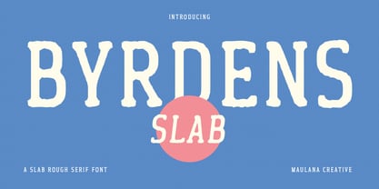 Byrdens is a retro slab serif font. With regular rounded stroke, fun character. To give you an extra creative work. Byrdens font support multilingual more than 100+ language. This font is good for logo design, Social media, Movie Titles, Books Titles, a short text even a long text letter and good for your secondary text font with script typeface. Make a stunning work with Byrdens font. Cheers, Maulana Creative
 - Brogado JNL by Jeff Levine,
$29.00Make room for Brogado JNL! This bold, yet squat slab serif font takes command when set into headlines. Although not thoroughly in the Western mold, Brogado JNL can still exude enough macho appeal to make its point strongly, yet clearly. - Adagio Sans by Borutta Group,
$25.00 The Adagio Family is a part of Mateusz Machalski's, Warsaw Academy of fine arts Master Degree Diploma in multimedia studio, conducted by Professor Stanisław Wieczorek and his brave PHD Jakub Wróblewski. Adagio is a modern type family. It consists of 3 main varieties: sans, serif and slab. Each one of them has it's own “true italic” set. All of the styles together have over 400 characters in 9 different thicknesses. The Adagio family was created mostly for company identities. The idea was to create a wide range of different varieties which are stylistically consistent. Adagio Sans - In its character, inspired by classical English typefaces. Sharp chamfers add a strong character. Thanks to delicate contrast and proportions of capitals, this variety has features of humanist grotesque. Thanks to large x length, and highly stretched descenders, it also works correct in longer text, while it’s strong detail is good for headlines. The Sans version is a great complement for Adagio Serif and Adagio Slab.
 - Sybilla Pro by Karandash,
$28.00 Sybilla Pro a humanist slab serif well suitable for broad range of design projects. Its unique, soft and almost cursive shapes help define a warm and friendly slab serif that is more legible and easier on the reader's eye. This newly developed extended type family consists of seven weights in three widths with complimentary true italics. It is ideally suited for advertising and packaging, editorial and publishing, logo, branding and creative industries, poster and billboards, small text and signage as well as web and screen design. Sybilla Pro provides a broad range of advanced typographical features such as small caps, case-sensitive forms, fractions, scientific inferiors, super- and subscript characters. It comes with a complete figure range set of oldstyle and lining figures, each in tabular and proportional widths. Sybilla Pro has extensive multilingual support, covering more than 70 Latin-based languages and specially designed Cyrillic that works harmoniously with its Latin counterparts - a perfect choice for projects that need both writing systems running side by side.
 - Quosm by Scannerlicker,
$44.00 Quosm is a soft and friendly geometric sans, initially designed to introduce children to typeset letterforms. To achieve this goal, the letterforms were kept as simple and unambiguous as possible, while relying on a modular construction.
 - Kitami by Talbot Type,
$19.50Talbot Type Kitami is a minimal, geometric, stencil display font, inspired by Herbert Bayer’s Universal Typeface, created at the Bauhaus in the 1920s. Each character is created from a single continuous stroke, or combination of strokes. - State by Device,
$29.00 A futurist inspired geometric stencil in clean and rough versions. This design approach was distilled into a more regular typeface in Futura Black; State takes its inspiration from the more eccentric designs that predated that font.
 - Offaly by Fontdation,
$20.00 Introducing Offaly, a funky geometric sans serif font. Offaly comes with a smooth and clean characteristics. Combine the upper and lowercase to get the harmonic letter combinations. Suits best for branding, headline, quote/poster design, etc.
 - Halfroy by Heypentype,
$20.00 Halfroy is our answer to generic geometric sans trends exploding nowadays who creates sameness. Halfroy brings new sans perspectives by combining rounded and sharp edges to create delicate sans fonts. See the difference by looking at counter-shapes compared to outline, insides counter shapes you will sees a sharp edges while round but not geometrical on outlines. Halfroy gives your project unique visual impact whatever your design project is, but we recommend using thin, semibold to Fat as display then light and regular. Halfroy taken inspirations not from looking at other sans typeface, but its design inspirations comes from observing a land contour and geographical statistics in our city, Kota Batu. We found that our city geographic consist of steep slope like waves with sharp peaks and surrounded by small and third highest mountains peak on our country. From then on we begin visualize and applied on few letters. Take a look on our 'O', 'f', 's' letters, its like a stone carved letters. Its hard edges and soft edges outline clearly draws from our inspiration source. Even Halfroy looks stony, hard as individual letters, we treat this type with humanist approach in mind. Therefore you can sense a friendly yet casuals of typical sans serif fonts when it grouped together to form a words or sentences. We hope Halfroy will gives your design project a unique on its own.
 - Stange by Vultype Co,
$29.00 Stange is a font with a futuristic edge, geometric corners, perfect for technology theme. As with its Stange, Stange makes a strong impression in print, headlines, video, and social media – whether paired with a contrasting typeface or on its own.
 - The Blast by Vultype Co,
$29.00 Blast is a font with a futuristic edge, geometric corners, perfect for technology theme. As with its Blast, Blast makes a strong impression in print, headlines, video, and social media – whether paired with a contrasting typeface or on its own.