10,000 search results
(0.03 seconds)
- Classic Comics JNL by Jeff Levine,
$29.00 A comic book feature entitled “Foe of the Borgias” appeared in 1937’s New Adventure Comics. The hand lettered title was done in a slab serif Art Deco style and is recreated digitally as Classic Comics JNL in both regular and oblique versions.
 - Joyto Soft by Graphite,
$18.00 Joyto Soft is a slab serif family of five weights. With soft edges and an uneven thickness, it has a quirky, warm and fun character while retaining legibility. It is well suited for display, packaging, restaurant menus, children’s products & books and much more.
 - Caverson by Letterena Studios,
$10.00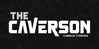 Proudly present Caverson Typeface, a modern and classy slab serif font with a unique style and fancy look. This typeface is perfect for an elegant & luxury logo, book or movie title design, fashion brand, magazine, clothes, lettering, quotes, and so much more. **Uppercase
 - Town Meeting JNL by Jeff Levine,
$29.00 Town Meeting JNL (available in both regular and oblique versions) is a modified version of Mud Creek JNL (which was based on Tuscan Egyptian – a classic wood type). The side spurs were removed and the split serifs were replaced by slab serifs.
 - Brossard by Greater Albion Typefounders,
$13.95 Brossard is a slab serif face redolent of French atmosphere and the design ethos of the 1920s. Use it for headines and posters that need that distinctive élan or where a Continental feel is called for. Regular and outline faces are offered.
 - Aterline by AEN Creative Studio,
$15.00 Aterline is a simple but elegant slab serif font family. It will elevate a wide range of crafting ideas, from cards to branding, labels, and much more. Add it confidently to your favorite creations and let yourself be amazed by the outcome generated.
 - Mafond by Etewut,
$25.00 Mafond is a fresh slab serif. It supports all european languages. The family is rounded as never before and includes 5 styles. Each of them has alternates for basic latin and a couple of ligatures. In case of success Mafond becomes Yofond.
 - Gluy by Ndiscover,
$29.00 Gluy is geometric humanist hybrid. It blends the two categories into one design. Mixing geometric rational shapes with a touch of organic calligraphic forms. Comprises a total of 20 styles and supports most Latin languages and Cyrillic. Ideal for branding but very versatile. It can be used in many contexts from print to web.
 - Railham by OhType!,
$25.00 RAILHAM is a slab typeface with more than 330 glyphs including uppercase, lowercase, numbers, small caps, accents, punctuation, currencies, etc. Inspired by the tracks of a railroad, with stems that narrow at the top, Railham typeface, like a train looks to the future without forgetting the fundamentals of a long road, detaining in the detail of every element to form a strong, fast and versatile family. Retaking and uniting essential concepts of typography, rounded serifs with especially wide base, forms and counterblocks that complement together, RailHam typeface neatly adapts to any topic, besides being practical and readily legible in small and large formats, joining a select list of modern slab serif fonts.
 - Cayuse by Pacific Standard Type,
$36.00 Cayuse is a super-slab, all-caps titling face that tips its hat to the classic French and Italian “fat face” serifs of the nineteenth century. Structurally, Cayuse utilizes a reverse-stress stroke configuration—with thick, meaty slab serifs and sinuous, spiked connecting strokes. This crackling contrast gives Cayuse a very black, dense texture, and the ability to combine and contrast well with other typefaces. Arm yourself with Cayuse to create richly-textured, high-impact typography for packaging, editorial, brand identity, posters, signage, and many other applications. What's more, Cayuse also features an array of “word logos”, providing you even more options for creating dynamic typography.
 - Apéro by Resistenza,
$39.00 A cheerful handwritten font family composed by 8 fonts. 5 slab weights, 2 slab effects and a sans serif. Handmade, friendly and classy, this family is inspired in one of our favorite traditions in Torino, “ L'Aperitivo ”. The social event every afternoon! Before dinner friends meet in the local bar and spend the time together eating, drinking, talking, laughing and eating and drinking again. Handwritten to get a friendly and human feeling. Letterforms specially designed to take the charming mood of this event. The sans serif has been inspired in some letterings found in old local liquor labels. Check out also ‘Modern Love Slanted’ Turquoise Nautica
 - Mesa by FontMesa,
$29.00 Mesa is a revival of an old pointed Tuscan font from the MacKellar Smiths and Jordan type foundry called Broad Gauge circa 1874. This new version offers a few alternates including half slab and full slab uppercase A's. Opentype case sensitive forms are also included in the Mesa font family. We started production on this font in 2009 but set it aside to work on other projects, we're pleased to have finally finished it. If you're a Grillmaster or Pitmaster you're going to love this font for your new business logo t-shirts and other merch. To all you Grillmaster's and Pitmaster's out there, Keep On Smokin'
 - Glover by Fype Co,
$16.00 Glover is a Vintage Slab font available in regular and texture, it has styles a spooky, grungy, unique, covering a wide range of project types such as poster design, book covers, prints, headlines, magazines, packaging, branding. It will turn any design project into a true standout!
 - Highfield by Surplus Type Co,
$9.00 Highfield is a luxury sans serif type family of three weights plus matching italics. It’s influenced by the modern and elegant style sans serif typefaces that are popular in high class editorial design. The fonts are based on geometric forms that have been optically corrected for better legibility. While the bold weight is a great performer in display sizes the light and regular wights are well suited to longer body & supporting text. Highfield is equipped for complex, professional typography. The OpenType fonts have an extended character set to support Central and Eastern European as well as Western European languages.
 - Baskar Stencil by Viaction Type.Co,
$16.00 Baskar Stencil is a display slab serif that you can nicely apply in various products. Complete with multilingual character set and stylistic alternates. It is suitable for quotes, clothing design, vintage logos, labels, posters, packaging and other designs.
 - Bowman by ParaType,
$25.00Bowman is an informal slab-serif face written by hand with a marker. Its live and playful nature makes it suitable for comic books, illustrations, informal advertising and package design. Designer Alexandra Korolkova. Released by ParaType in 2010. - Sicret Mono by Mans Greback,
$29.00 Sicret Mono is a monospaced and geometric typeface family. It was drawn by Måns Grebäck in 2020, and was created by following a strict mathematical pattern consisting of only two basic shapes, in four different combinations, set on a 2 by 3 grid. The resulting product is a font with a serious and solid character, with an official look while yet going towards sci-fi because of its digital nature. The family consists of nine weights: Thin, Extra Light, Light, Regular, Medium, Semi Bold, Bold, Extra Bold and Black. The range of weights makes it very adaptable, and all the weights works very well together to give a sentence or graphic tone and emphasization. As Sicret Mono is a font with over 850 glyphs, it is guaranteed to contain all characters you'll ever need, including all punctuation and numbers. It has a very extensive lingual support, covering Greek, Cyrillic, Hebrew as well as European and American languages.
 - Sicret by Mans Greback,
$29.00 Sicret is a perfectly geometric typeface family. It was drawn by Måns Grebäck in 2020, and each one of its glyphs was manually created by following a strict mathematical pattern consisting of only two basic shapes, in four different combinations, set on a three units tall grid. The resulting product is a true monoline font with a solid character, with an official look while yet going towards sci-fi because of its digital nature. The family consists of nine weights: Thin, Extra Light, Light, Regular, Medium, Semi Bold, Bold, Extra Bold and Black. The range of weights makes it very adaptable, and all the weights works very well together to give a sentence or graphic tone and emphasization. As Sicret is a font with over 850 glyphs, it is guaranteed to contain all characters you'll ever need, including all punctuation and numbers. It has a very extensive lingual support, covering Greek, Cyrillic, Hebrew as well as European and American languages.
 - Starfire by MADType,
$29.00 Starfire is a retro styled geometric sans-serif family with roots in mid-century graphic design.
 - Gal MF by Masterfont,
$59.00 Even stroke widths with geometrical symmetric structure will make it into a great signage and logo.
 - JH Noha by JH Fonts,
$40.00 JH Noha is a geometric modern Arabic typeface. It includes black, bold, medium and regular weights.
 - Meloneads 2 by PizzaDude.dk,
$20.00Although being made of geometric shapes, Meloneads 2 is a playful and funny set of drawings. - Teutura by Maciej Świerczek,
$15.00 Teutura is a geometric, modern display font inspired by old blackletter typefaces (e.g. Fraktur, Gutenberg Textura).
 - Extra MF by Masterfont,
$59.00 Geometric forms make this elegant font a great choise for invitations and signs, indoor and outdoor.
 - RoundCut by Fábio Mansos,
$23.00 RoundCut Bold is a geometric grotesque typeface, ideal for large sizes (display proposals and headlines). Its structure is modern, strong and bold, noticeable in its minimal and geometrically forms. Although visually simple, the construction of each letter form is complex allowing some expression and uniqueness to the typeface.
 - Bondoluo by Álvaro Thomáz Fonts,
$35.00 Bondoluo is a geometric font family developed by Álvaro Thomáz in 2012, The creation process was inspired by 3 geometric forms - triangle, circles and squares - and 2 amazing fonts - Futura® and URW Gothic. The Bondoluo Display font was inspired by Diamonds by HVD. Be fashionable with Bondoluo fonts!
 - Diegeometrische by Michael Browers,
$25.00Diegeometrische is an all uppercase geometric-based serif typeface featuring Latin, Extended Latin and Cyrillic character sets. - Latin, Extended Latin and Cyrillic character sets offer multilingual support. - Over 1000 kerning pairs for optimal letter spacing. - Unique combination of serif, geometric, and stencil design elements provides a distinct design. - Circus Didot by ParaType,
$25.00 Circus Didot typeface presents a rework of a typical neoclassical serif type in a constructivist style. Analyzing the shapes of characters author placed basic geometric figures — triangles, rectangles, circles… above the contours of letters. Resulting constructions staying recognizable letters at the same time bore a resemblance to pictures of Russian avant-garde artists from 20th century. This discovery has brought an idea to design a typeface where the tendency of a modern serif type to rationalism and geometry is realized in maximum possible extent. The prototypes for the project were taken from the works of Didot, lettering experiments of Russian constructivists and art deco artworks. The technique of juggling with shapes and overall grotesque approach to the design explains the selection of the name for the font.
 - Leonardian by Cubo Fonts,
$25.00 The Vitruvian Man is a world-renowned drawing created by Leonardo da Vinci circa 1487. The drawing depicts a male figure in two superimposed positions with his arms and legs apart and simultaneously inscribed in a circle and square. The drawing and text are sometimes called the Canon of Proportions or, less often, Proportions of Man.The drawing is based on the correlations of ideal human proportions with geometry described by the ancient Roman architect Vitruvius in Book III of his treatise De Architectura. Vitruvius described the human figure as being the principal source of proportion among the Classical orders of architecture. That's how "Leonardian" was buid as well: a quest for ideal proportions, a harmonious design springing up from a geometric "collision", circle and square's intersections.
 - FF Karbid by FontFont,
$58.99 German type designer Verena Gerlach created this display and sans FontFont between 1999 and 2011. The family has 10 weights, ranging from Light to Black (including italics) and is ideally suited for advertising and packaging, editorial and publishing, logo, branding and creative industries, small text as well as web and screen design. FF Karbid provides advanced typographical support with features such as ligatures, alternate characters, case-sensitive forms, fractions, super- and subscript characters, and stylistic alternates. It comes with a complete range of figure set options – oldstyle and lining figures, each in tabular and proportional widths. This FontFont is a member of the FF Karbid super family, which also includes FF Karbid Display, FF Karbid Slab, and FF Karbid Text.
 - Schein by Almarkha Type,
$29.00 Schein – Sans & Slab inspired by the famous minimalist logo and perfect for the purposes of designing templates, brochures, videos, advertising branding, logos and more.
 - Wide Display by Gaslight,
$20.00 Unicase wide slab-serif with numerous alternatives and decorative elements. In Ribbon styles kerning for black ribbons released as Discretionary Ligatures. Lets do wide!
 - Quadon by René Bieder,
$25.00 Quadon was designed to fill the gap between traditional serifs and the lasting trend of using sans serif fonts for contemporary design. The result is a modern, clear and infinitely flexible interpretation of slab serif fonts. The open shapes and a large x-height keep the font legible in small sizes while the short descender supports the compact heart and strength of a slab serif. Quadon has a wide range of typographic features and alternative glyphs to create your own and unique version of it. It comes in nine different weights with matching italics. From the sensitive but sharp thinner weights to the punchy and powerful heavy weights, Quadon is well-suited for a wide range of versatile tasks.
 - Rothwood by Type-Ø-Tones,
$60.00 In 2011, while tutoring an exercise on Slab Serifs, Josema discovered Robert Thorne’s work for Thorowgood. Specifically, he was fascinated by the extraordinary density of the 6-line Egyptian Pica from 1820-21. As a simple exercise, he wanted to test the limits of readability within the context of a contemporary alphabet. Rothwood Ultra is the result of this experiment. As a way of developing the series, he found it interesting to go to the opposite end of the spectrum and discover how to evolve the extra-black Ultra’s DNA into a super lightweight model. The Hairline and Thin styles are her slim sisters. The third challenge has been the creation of the text version. Light, Book, DemiBold and Bold, including italics and Small Caps close the Rothwood cycle for editorial use.
 - Zin Serif by CarnokyType,
$46.00 Zin Serif is a contemporary typeface designed for various situations of typographic usage. Characteristic feature is a large x-height and balance between neutral construction of letters (strictly vertical axis) and dynamic open forms (opened terminals). Another typical feature is a visually narrower connection between stems and strokes. The complete font family consist of three width proportions (Normal, Condensed and Extended). Every sub-family has 5 weights, ranging from Light to Black with matching Italics. Zin Serif can be effectively used for both text and display typesetting. It can be used especialy in magazine layouts and editorial design, as well in advertising typography, orientation systems, corporate identities and many other situations. Zin Serif is a member of the Zin super family, which also includes Zin Sans, Zin Slab and Zin Display fonts.
 - Selektor by Tour De Force,
$25.00 Selektor is a small font family characterized as geometrical sans. Inspired and after that designed with charm of technical letters, it contains a few letters with specific endings that gives Selektor a peculiar impression. Global overview of Selektor says it's a neutral, corporate, stable, well balanced font family, but not cold and heartless to leave readers without remembrance on its characteristics. It is fully appliable in all kinds of publications, from long texts in paragraphs to titles and product names. Contain 3 weights - Light, Regular and Bold and matching Italics. All family members include Small Caps and Fractions as well as additional OpenType features.
 - Egiziano by Monotype,
$29.99The original design of Egiziano Black is attributed to Vincent Figgins in 1815. As its name suggests, Egiziano Black is a typical example of an Egyptian, or slab serif typeface. Use the Egiziano Black font for posters and titling. - Ranch Hand JNL by Jeff Levine,
$29.00 Ranch Hand JNL is a tall, condensed wood type with slab serifs. The font is somewhat bolder in weight than Nostrand JNL, but like its counterpart, fully captures the spirit and flavor of Nineteenth Century advertising, fliers and notices.
 - Lawbreaker JNL by Jeff Levine,
$29.00 The December, 1935 movie poster for James Cagney in “Public Enemy” has its title hand lettered in a bold, squared, slab serif type style. Now digitally recreated as Lawbreaker JNL, it is available in both regular and oblique versions.
 - Moving Forward by Crumphand,
$20.00 Introducing, Moving Forward a Slab Serif Font. inspired by vintage and modern letterforms with alternate characters and full symbol sets. Moving Forward can be used for posters, web headers, and display text of all kinds. good kerning and readable.