10,000 search results
(0.041 seconds)
- Aaron YOFF - Personal use only

- Naz - Unknown license

- Kleptocracy - Unknown license

- Backup Generation - Unknown license

- AGRAR Unicase - Unknown license

- Mage 1999 - Unknown license

- Canuth - Unknown license

- Kimberley - Unknown license

- Nixon - Unknown license

- MKristall - 100% free

- Linear Curve Fatty - Unknown license

- SF Cosmic Age Outline - Unknown license

- irrep - Unknown license

- Bandwidth BRK - Unknown license

- Strasua - Unknown license

- Lane - Cane - Unknown license

- Oxona - Personal use only

- Tighten - Personal use only

- Flyoika by Ingrimayne Type,
$9.00 Flyoika is a slab serif family with a fairly low x-height, long ascenders, and considerable contrast. The family has five weights, each with an italics and it can be used for either display or text. Flyoika was not designed to meet a particular need but rather out of curiosity. Years ago I had designed two slab serif families, FlyHigh and Euroika, that I recently noticed had a lot of similarities and I wondered what a blend of the two would look like. Several corresponding characters in the two families are considerably different and in cleaning up the results, I usually opted for simplicity. The name "Flyoika" reflects these origins.
 - Burger by Lián Types,
$25.00 Inspired in the world of the fast-food, my aim with Burger was to achieve a sexy slab serif font. Since it's not very common to see slabs with swashes I consider this project as an experiment with interesting results. In order to mantain an even weight on the written word, all the glyphs including the swashy ones had to look like compact blocks: This makes the font work much better used with almost no leading, as seen in posters above. Despite the formal look of its genre, this slab serif is also very playful and unique. (Maybe unhealthy food deserves better fonts already, right?) Taste Burger, come on, give it a try! On a more personal note: Why I made this font? Some months ago I started the gym and with it, an strict diet to see some results faster... Maybe my temptation is being, in Lacanian terms, "sublimated" by making delicious and unhealthy fonts.
 - Wickenburg by VersusTwin,
$21.99 Wickenburg is a rough and tumble grunge slab typeface that has taken a lickin' but keeps on coming back for more. It is a powerful heavyweight serif that makes a strong design statement. Pick up this bad boy and take him for a ride!
 - Gart Sans by Vitaliy Gotsanyuk,
$25.00 Gart Sans is a grotesque font that preserves the characteristics of early 20th-century grotesques, primarily used in advertising. The main features of this font include a pronounced contrast, narrow proportions, and light, smooth forms combined with modern design solutions. Compared to geometric or neo-grotesque fonts, Gart Sans distinguishes itself with its attention to detail. As the font weight increases, it acquires a more pronounced character, expanding its usability from headlines to extensive text settings. Gart Sans consists of 5 styles, 630 glyphs, encompassing an extended Latin character set, basic Cyrillic characters, ligatures, numeral sets, and much more.
 - Norden Round by Asgeir Pedersen,
$23.99 The name Norden means “the Nordic”, as in the geographical area or its countries. Inspired by the simplicity of Nordic and Scandinavian design, the Norden fonts give you clarity of expression, beyond the usual geometric look and feel of traditional sans-serifs. Open and spacious, the shapes of the glyphs play both with and against each other. Round and soft versus square and solid, a basic curve versus a straight line, creating a detached yet distinct style of expression, from light-as-air Hairline to dark and Bold. Norden comes in three variants: Standard, Round and Display.
 - Altis by Typolar,
$72.00 Altis combines geometric regularity and soulfulness into one font family. It resembles the traditional sanserif from the early 20th century, which communicates friendly and reads extremely well. Bring out its optimistic airiness with light styles or exploit the masculine strength of the bolds. Altis has been developed to fit present-day editorial conditions and publishing models. There are ten optically-balanced weights and practical OpenType features, which make the family versatile and operationally spot-on.
 - Century Gothic Paneuropean Variable by Monotype,
$209.99 Century Gothic™ is based on Monotype 20th Century, which was drawn by Sol Hess between 1936 and 1947. Century Gothic maintains the basic design of 20th Century but has an enlarged x-height and has been modified to ensure satisfactory output from modern digital systems. The design is influenced by the geometric style sans serif faces which were popular during the 1920s and 30s. The Century Gothic font family is useful for headlines and general display work and for small quantities of text, particularly in advertising. Century Gothic family has been extended to 14 weights in a Pan-European character set from Thin to Black and their corresponding Italics. The already existing 4 weights of Regular and Bold with their Italics are additionally still available in the STD character set. For international communication, the W1G versions offer the appropriate character set. They contain Latin, Greek and Cyrillic characters and thus support all languages and writing systems that are in official use in Western, Eastern and Central Europe. Century Gothic Variable is features two axes: Weight and Italic. The Weight axis has preset instances from Light to Black. The Italic axis is a switch between upright and italic. Looking for the perfect way to complete your project? Check out Aptifer™ Slab, ITC Berkeley Old Style®, FF Franziska™, Frutiger®, ITC Legacy® Square Serif or Plantin®.
 - Century Gothic Paneuropean by Monotype,
$50.99Century Gothic™ is based on Monotype 20th Century, which was drawn by Sol Hess between 1936 and 1947. Century Gothic maintains the basic design of 20th Century but has an enlarged x-height and has been modified to ensure satisfactory output from modern digital systems. The design is influenced by the geometric style sans serif faces which were popular during the 1920s and 30s. The Century Gothic font family is useful for headlines and general display work and for small quantities of text, particularly in advertising. Century Gothic family has been extended to 14 weights in a Pan-European character set from Thin to Black and their corresponding Italics. The already existing 4 weights of Regular and Bold with their Italics are additionally still available in the STD character set. For international communication, the W1G versions offer the appropriate character set. They contain Latin, Greek and Cyrillic characters and thus support all languages and writing systems that are in official use in Western, Eastern and Central Europe. Century Gothic Variable is features two axes: Weight and Italic. The Weight axis has preset instances from Light to Black. The Italic axis is a switch between upright and italic. Looking for the perfect way to complete your project? Check out Aptifer™ Slab, ITC Berkeley Old Style®, FF Franziska™, Frutiger®, ITC Legacy® Square Serif or Plantin®. - Engine Company JNL by Jeff Levine,
$29.00 Engine Company JNL is a slab serif font based on a set of wood type. The design emits an image of strength and purpose, and fits well into any project where a word or phrase must be conveyed forcefully without seeming overly imposing.
 - VTG Juker by Voltage Ltd,
$35.00 Juker is a sturdy hand-drawn slab serif with proper country manners. Warm, hospitable, and just a little bit rough, Juker will lend its comfortable touch to a variety of projects. Activate the stylistic alternates feature to introduce slight variations in the letterforms.
 - Kripke by Haiku Monkey,
$10.00 Kripke is a slab serif with rounded corners. It's readable and soft at small sizes, strong and friendly at large sizes. It's got a Greek and Cyrillic glyphs, as well as a large complement of accented characters. Try it on your designs!
 - Namex by BaronWNM,
$14.00 Namex is a handwritten font with serifs. It tends to be a slab serif style while maintaining the hand-drawn shape, making it look original and non-standard. We recommend you use this font for retro and warm decoration designs.
 - Giahfita by Letterena Studios,
$17.00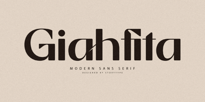 Giahfita is a modern and classic slab serif font with a unique style and fancy look. This typeface is perfect for an elegant & luxury logo, book or movie title design, fashion brand, magazine, clothes, lettering, quotes, and so much more.
 - Dubidam Arabic by NamelaType,
$29.00 Dubidam Arabic is new version of Dubidam with the addition of Arabic glyphs (Arabic, Urdu, Kurdish, Pegon and Farsi. Dubidam Arabic is A Cheerful semi-slab Typeface. Has a playful but firm style in each stem approach to harmony with Latin.
 - Atenea Egyptian by Eurotypo,
$28.00 Atenea Egyptian is a Slab serif, inspired in humanistic typeface references. It is a contemporary style based on high contrast and modular proportion with stylized rhythms. Atenea Egyptian includes standards and discretional ligatures, small caps, fractions, old style and lining numbers.
 - Ragile by Letterena Studios,
$17.00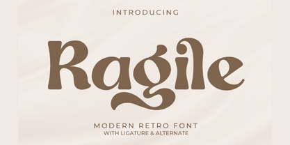 Proudly present Ragile, a modern and classic slab serif typeface with a unique style and modern look. This typeface is perfect for an elegant & luxury logo, book or movie title design, fashion brand, magazine, clothes, lettering, quotes, and so much more.
 - Mefiyah by Letterena Studios,
$10.00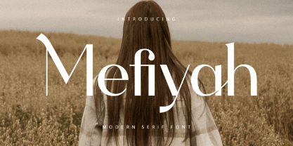 Mefiyah is a modern and classic slab serif font with a unique style and fancy look. This typeface is perfect for an elegant & luxury logo, book or movie title design, fashion brand, magazine, clothes, lettering, quotes, and so much more.
 - Hvala by Etewut,
$35.00 Hvala is a display typeface based on slab serif. All european languages are included. 'Hvala' means praise. Remember it when you design your graphics using my font. It's a pure magic to express your respects or/and expect them back.
 - Nouveau Lettering JNL by Jeff Levine,
$29.00 A 1916 lettering book provided an example of a slab serif alphabet with Art Nouveau influence designed by Thomas Wood Stevens. This alphabet served as the model for Nouveau Lettering JNL, which is available in both regular and oblique versions.
 - Equalis Stencil by Eurotypo,
$28.00 Equalis Stencil is a slab-serif typeface. This OpenType font comes in three weights, alternates and symbols, with support for CE languages. Equalis Stencil can be used as display type, headlines, packaging, signs routing and a wide range of projects.
 - BLT Portage by Black Lab Type,
$12.00 PORTAGE is a slab serif that carries its own weight. Adventurous and rugged, this typeface that evokes the wild country and makes headlines stand out. The typeface was built from a land and forest journal from the mid-50's.
 - Bernard Wacker by Letterena Studios,
$10.00 Bernard Wacker is a modern and classic slab serif font with a unique and fancy look. This typeface is perfect for an elegant & luxury logo, book or movie title design, fashion brand, magazine, clothes, lettering, quotes, and so much more.


