10,000 search results
(0.366 seconds)
- Qimzy by Gleb Guralnyk,
$14.00 Hello! Introducing a decorative font — Qimzy. It's a smooth shape bold typeface with seamless sticky effect. This font includes lots of multilingual characters (check out a screenshot with available letters and signs). Thank you and wish you a peaceful sky!
 - Nafise by Sulthan Studio,
$10.00 A modern font with a Typeface display style, very attractive, coupled with several lowercase ligatures. This font is available in 3 thickness styles such as regular, Bold, and Out line . This font has uppercase, lowercase, numbers, punctuation, and language support.
 - Fidelma by Patricia Lillie,
$29.00Can't decide whether you're feeling archaic or modern today? Try Fidelma. Fidelma is drawn entirely with straight lines, no curves, giving it a rough but still readable look.Includes four fonts: Regular, Bold, ExtraBold, and a nifty set of Drop Caps. - Cybernaut by Studio K,
$45.00 Cybernaut is a bold, distinctive display font with a futuristic feel. It is ideal for all branding, advertising and publishing projects, and particularly well suited to science and science-fiction based applications. It boldly goes where no font has gone before!
 - Cinzeled Victorian Alphabet by Intellecta Design,
$28.90 Cinzeled Victorian Alphabets is a bold and imposing display font. Add it to your creative ideas and notice how it makes them stand out! Letters crafted to obtain the cinzeled style from the press works from XVIII and XIX centurys.
 - Bohemian Hunter by Hustle Supply Co,
$14.00 Bohemian Hunter Bohemian Hunter is an All-Caps contemporary display / spur serif typeface. It comes packed with 9 different font files including 3 weights. What's included? 9 Font Files Light, Regular, Bold Clean, Rough, Stamp Versions Western European Characters Included
 - Goodbees by ZetDesign,
$15.00 Goodbees is built from a bold base, unique combinations, smooth curves, and sharp edges. Goodbees is best uses for headings, Logo types, quotes, apparel design, invitations, flyers, posters, greeting cards, product packaging, book covers, printed quotes, album covers, movies and more.
 - Hushy by Fargun Studio,
$16.00 Hushy is a Rounded Bold and modern display typeface featuring characters that stand out from every background. It has multilingual language, it useful for your a cool and coolest project up next. Suitable for logos, posters, packaging, branding, cool invitations, etc.
 - Blink Urgent Display by Tebaltipis Studio,
$15.00 Blink Urgent - Modern Bold Serif Font is a stylish font It has both modern and retro look. Comes with alternatives and ligatures, helps to create stunning logos, quotes, posts, blog posts. branding projects, magazine imagery, wedding invitations, and much more.
 - Silk Display by Luhop Creative,
$18.00 Silk Display is a serif retro and bold display font. This font is PUA encoded which means you can access all of the glyphs and alternates with ease! It would look great on headlines, magazines, logos, branding and so much more!
 - Polythem by Haksen,
$13.00 "Polythem" is a beautiful high bold script font that makes for gorgeous logos, posters, wedding invitations, blog posts, social media, and more! Polythem Script includes ligatures to make everything look totally hand-done, and alternates for each letter. Thanks for visited
 - Paletone by Bale Type,
$15.00 Paletone is hand lettered sans in two style, Regular & Bold. With the organic and handmade feels, you can use this font for any project. This minimalist font also suitable for the project with earth tone color. Also good for quotes.
 - Hurley 1967 by Tyfomono,
$16.00 Hurley 1967 is a bold script, with clean lines and smooth curve combined with beautiful features! Simply amazing fonts, comes with 7 styles. Hurley 1967 has a bunch of styles as a families to designed lettering style logotype using the fonts.
 - Hendrix Bubble by Letterena Studios,
$17.00 Hendrix bubble is a modern and classic display font with its own unique style and modern looks. This typeface is perfect for an elegant & bold logo, book or movie title design, fashion brand, magazine, clothes, lettering, quotes, and so much more.
 - Mad Rascal by Get Studio,
$10.00 Mad Rascal is an Extra Bold display serif with large and soft inktrap. It comes with 24 styles and Variable support. It’s ready to make a lasting impression on your merchandise, quote designs, header text, logos & branding, advertisements, and much more.
 - NT Tonight Show by Nurrontype,
$21.00 I was watching last episode of Tonight Show with Letterman when I develop NT Tonight Show. My idea, I want to make a font that represent showbiz industry. Voila, here's Tonight Show. A contrast, bold, versatile. With swash and alternate option.
 - Hujan by Ezzazebra,
$15.00 A sans-serif font that I created when long raining in my city. The shape is clean with a dynamic semi-bold stroke. It's suitable for a minimalistic, "less is more" design and useful for display and larger body text.
 - Maxigo by RahagitaType,
$18.00 A bold and dynamic typeface that exudes energy and creativity. With its expressive brush strokes and commanding uppercase characters, Maxigo brings a distinctive and modern feel to your design projects, making it perfect for headings, titles, brandings, packagings, flyers and logos.”
 - Torino by URW Type Foundry,
$35.99 The Torino font family was designed by Alessandro Butti in 1908 for the Nebiolo foundry in Turin. Torino is a narrow face in the Bold weight; the condensed weight is so narrow that it should be used in over 14pt.
 - Jelly Billy by Illushvara,
$14.00 Jelly Billy is a fun handwritten font featuring a quirky, bold, and modern style! It will work perfectly with packaging products, merchandise or pretty much any design of spring or summer season that requires a touch of happiness and joy.
 - PlainPensle by Ingrimayne Type,
$14.95 As its name suggests, PlainPensle is a handwriting font that emulates printing and writing with a pencil or ballpoint pen. The plain and bold styles have hand printing that is ordinary and nondescript. The italics and bolditalics contain simple handwritten cursive.
 - CA Rough Rider by Cape Arcona Type Foundry,
$29.00 Rough Rider is a handcrafted bold italic typeface. Intended as a rough display style typeface it’s perfect for illustrative titles, logotypes and small texts. Initially developed for a logo design, Rough Rider was expanded to a full Central European character set.
 - Express by ParaType,
$30.00 Express® is based on the lettershapes of Express typeface designed for Ludwig & Mayer in 1957 by Walter Hoehnisch. A tall, bold script with even inclination. Cyrillic version developed in 2001 by Natalia Vasilyeva. For use in advertising and display typography.
 - Sweet Barbrown by TM Type,
$20.00 Sweet Barbrown is a cute and bold script font with an incredibly friendly feel. Whether you’re looking for fonts for Instagram or calligraphy scripts for DIY projects, this font will turn any creative idea into a true piece of art!
 - Slimeha by ahweproject,
$9.00 Slimeha is a bold and modern handwritten font capable of taking any creation to the highest levels! Try it on advertisements, posters, branding materials, logos, etc. Slimeha is PUA encoded, which means you can access all glyphs and swashes with ease!
 - Wingfead by Letterena Studios,
$17.00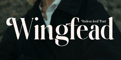 Wingfead is a bold and thick lettered serif font. It is perfect for any branding project such as logos, t-shirt printing, creative products, and more. Wingfead is PUA encoded which means you can access all glyphs and swashes with ease!
 - The Reyden by onlyfontyouandme,
$15.00 The Reyden is a retro and bold display font. This font is PUA encoded which means you can access all of the glyphs and alternates with ease! It would look great on headlines, magazines, logos, branding and so much more!
 - Geeeki by Drawwwn,
$15.00 Geeeki is a playful semi serif font, it's cute yet nerdy, stylish but dorky. Bold and chunky, it's a unique headline grabber, so it's the perfect match for style magazines, fashion brands and whimsical websites. Find your inner super-geek!
 - P22 Art Nouveau by P22 Type Foundry,
$24.95 The Art Nouveau styles of the late 19th century exhibited a bold approach to organic lines and lavish decoration. This new style was spread throughout the world and helped usher in a new era that led to modern art and design.
 - Movie Ad Deco JNL by Jeff Levine,
$29.00 An extra-bold, hand lettered type design with a casual feel was used for the 1942 movie poster “Tortilla Flat”. This served as the inspirational model for Movie Ad Deco JNL, and is available in both regular and oblique versions.
 - Spring Note by Letterhend,
$7.00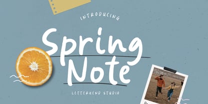 Spring Note is a playful yet usable font that you can use for any of your projects. Perfect for cute quote, branding, and anything. This font already support multi language. Also comes with two style, Regular and Bold! Happy Creating!
 - Highrise by Michael Hill Design,
$6.00Highrise is a sans serif typeface inspired by tall industrial structures. Works great as both bodycopy and logotype, as the lowercase is clear and concise, but the statuesque caps letters can grab full attention. Available in Regular, Light and Bold. - Spinner Rack Pro BB by Blambot,
$10.00 Spinner Rack Pro BB is a new and improved version of the classic Blambot typeface, Spinner Rack BB! New spacing, kerning, manga characters, barred-I correction, additional accented characters, autoligatures, contextual alternates, and a plain bold weight for the first time!
 - Daily Mood by Fromletterel,
$10.00 Daily Mood is a simple and neat lettered family font included regular and italic style. This Font is suitable for kids branding, poster, stickers and any cool projects, it's bold and round character make Daily Mood stands out from the crowd.
 - Sweet Fig by Din Studio,
$29.00 Sweet Fig is a bold script. This font is suitable for any design like branding especially for food packaging, quotes, printing, etc. The design can elevate your design project. Features: Beautiful Ligatures Stylistics Set Many Swashes Multilingual Support Numerals and Punctuation
 - Bakari by Letteralle,
$18.00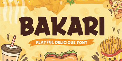 Introducing, Bakari! An attractive, bold, and playful display font. This font gives a charming and strong impression. Bakari is very suitable for various design needs such as merchandise, packaging, social media, ads, T-shirts, logos, events, and many more. Thank you!
 - P22 Basala by IHOF,
$24.95 P22 Basala was created using straight horizontal and vertical lines, but with large rounded corners to create an unconventional softness for a bold face. The naming of the font reflects this juxtaposition: Basara= Basala= (in Japanese) free and unrestrained, unconventional.
 - Blaak by Mans Greback,
$19.00 Blaak is an interpretation of a Modern Classic typeface with a beautiful and strong impression for editorial design. The sharp serif combined with curves gives Blaak a fabulous, glamorous and bold look; at the same time doesn't sacrifice its functionality.
 - Punchado by MyAnvil,
$20.00 This font titled "Punchado" original was designed in light of its sharp angels and bold impact type. This font would theme in the realm of: engineering, technology, science fiction, science, futures, etc... This font could be described as energetic, and motivational.
 - Gavuel by Amera Type,
$15.00 Introducing Gavuel font with a unique, bold and wide sans serif look. The carefully crafted nodes and each line can create a luxurious look for high-level graphic branding Gavuel will be a perfect choice for labels, packages, covers, headlines, etc