6,653 search results
(0.034 seconds)
- Vantagram by TEKNIKE,
$69.00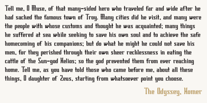 Vantagram is a modern display font. The typeface is made from basic square geometry. It is inspired by blackletter typefaces of the medieval period in Europe. The Vantagram name is a combination of two words derived from “vanta” French for boast and “gram” Greek for letter or that which is drawn. Vantagram is great for display work, quotes, titles, headings and posters.
 - Flogotop by Smartfont,
$29.00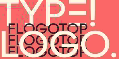 FLOGOTOP works great in branding, logos, headlines, posters. The different weights and combinations give you full range to explore a whole host of applications, from tech startup, local events to concerts, festivals. FLOGOTOP LOGOMARK 52 logo marks inspired by geometry and clean, crisp, and universally symbolic design language. Make stunning logo designs with this eye-catching set of versatile shapes.
 - General by Juraj Chrastina,
$29.00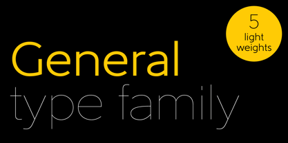 It's all about these subtle nuances that make a neutral sans typeface different. Pure geometry with a human touch is a recipe that works in every generation. Inspired by classical fonts from the early 20th century, General rides the line between traditional and modern styles. With its 5 light weights, the General family is a strong tool for a clean design.
 - SK Akademkniga by Shriftovik,
$32.00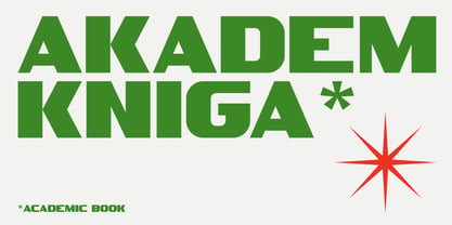 SK Akademkniga is a monumental classic sans serif with medium contrast. Its strict form emphasizes the uniqueness of each symbol. The typeface supports many languages, including Cyrillic and extended Latin. SK Akademkniga is great for poster design, titles and texts. It also has a versatile geometry, which makes it a great help in work, whether it is graphic design or web design.
 - Capitol Skyline by Device,
$39.00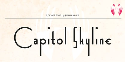 DF Capitol features two faces, DF Capitol Skyline and DF Capitol Capitals (a multi-weight all-caps compliment) that epitomise Streamline Moderne. Strong geometry and large, open counters with heavily condensed verticals and a succession of contextual alternates and discretionary ligatures. DF Capitol presents a nice companion in two weights. Both contain full support for Eastern and Central European languages.
 - Capitol Capitals by Device,
$29.00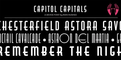 DF Capitol features two faces, DF Capitol Skyline and DF Capitol Capitals (a multi-weight all-caps compliment) that epitomise Streamline Moderne. Strong geometry and large, open counters with heavily condensed verticals and a succession of contextual alternates and discretionary ligatures. DF Capitol Skyline presents a nice companion in two weights. Both contain full support for Eastern and Central European languages.
 - Redoneta Rounded by Rafael Jordan,
$30.00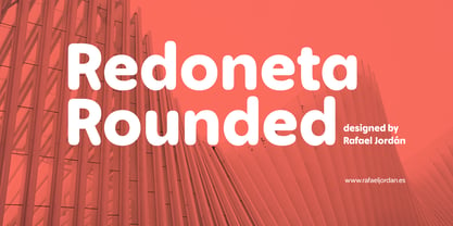 Redoneta Rounded is an extension of Redoneta font family created by Rafael Jordan, adding kindness to the rational geometry, keeping its workhorse vocation mixing efficiency and the beauty of simplicity. Redoneta Rounded is available in 6 weights and its matching italics. It has an extended collection of OpenType features, including seven stylistic sets to customize how performs in multiple ways.
 - Soft Block by fontgeneration,
$19.00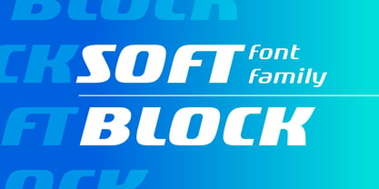 The letters possess some of the most characteristic features of this type of font, used for communication and advertising in various mechanized and motor sports, as well as in the gaming industry. The technological-engineering constructiveness is achieved through the strict geometry of the forms, and the sporty competitive look is stylistically expressed through the slopes and contrasts of the beams.
 - Bombtrack by Epiclinez,
$19.00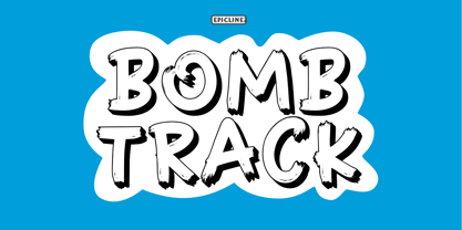 Bombtrack is a reference to hip hop terminology where the word 'bomb' means 'the greatest'. With splatter of inks looks alike in every glyph, produces moments of pure awesomeness. This kind of typeface proves its usefulness from time to time. You can use it for headlines, apparel, branding, and many more. Bombtrack contains 215 glyphs. Supporting more than 67 languages, from English to Zulu. Bombtrack is raw, casual, carefree, and authentic. Handcrafted with passion and love for your awesome projects.
 - Shedaytia by Josstype,
$12.00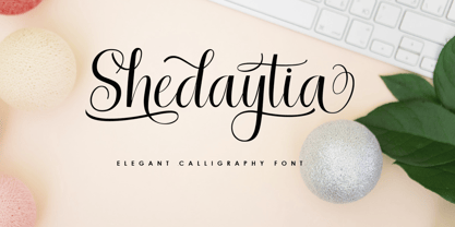 Shedaytia is a handwritten typeface with classic root. a beautiful formal script and elegant touch. It works perfect in the world of weddings, logos, greeting cards, branding, print ads, quotes, signage, magazines etc. Shedaytia features 312+ glyphs and 147 alternate characters, including initial and terminal letters, alternates, swashes, ligatures and multiple language support. To enable the OpenType Stylistic alternates, you need a program that supports OpenType features such as Adobe Illustrator CS, Adobe Indesign & CorelDraw X6-X7, Microsoft Word 2010 or later versions.
 - Encorpada Classic by dooType,
$20.00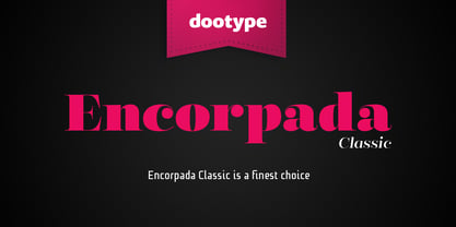 Encorpada classic brings the best features of the Didone genre, but with a 21st century look and feel. With smooth details Encorpada Classic is a elegant choice for your type library. The Encorpada family began in 2011 with the release of Encorpada Black. After that instant success, in 2012, dooType brought to us Encorpada PRO. Encorpada Classic retains the main look and feel of his predecessors, but is designed with more functional considerations. With 14 styles, Encorpada Classic is a fine choice.
 - Ekela by AukimVisuel,
$9.00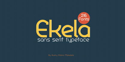 Ekela family has 216 styles in 5 versions: Normal, Round, Circle, Punch and Round Punch. Ekela family is a neat, unique sans serif simple font with minimal and round letters. It can easily be combined with an incredibly large set of projects, so add it to your creative ideas and notice how it sets them apart! Suitable for a wide variety of designs thanks to its neat styling, Ekela family has the potential to become your favorite font, whatever the occasion!
 - Catterpillar by Zeenesia Studio,
$14.00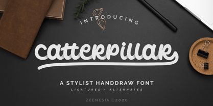 Catterpilar is a stylist handdraw font. The Catterpilar font works great for any design project, be it web, printing, logotype, posters, badges, signage, product, brand, t-shirt design, etc. Catterpilar font contains almost 215 glyphs with several OpenType Features; Stylistic Alternate, Standard Ligature & Multylangual support. The OpenType Feature can be used to create your own custom typography of your design. The Catterpilar font is a beautiful example of stylist fonts. Please contact me for more information about the font terms and condition.
 - Tudor Perpendicular by Greater Albion Typefounders,
$12.00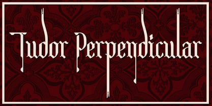 Tudor Perpendicular is Greater Albion's seasonal Black letter release (not that we rule out the possibility of non-seasonal ones...) for 2012. As the name suggests, it is a design which emphasises, and yes, exaggerates for effect, the perpendicular up and down nature of Black Letter typefaces. There's no particular historical basis for this one - straight out of our own minds, just as a lot of Black letter 'revivals' have been over the years. Come and visit 'Ye Olde' world today...
 - Handu by Alex Jacque,
$20.00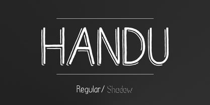 Handu, designed by Alex Jacque in 2012, is an affable hand-drawn sans-serif inspired by the hand-painted type and signage on the streets of Kolkata, India. Fitting then that it come to life with brush and paint. When used for display purposes the organic, painted texture of Handu's glyphs really shines. At smaller point-sizes the hand-drawn aesthetic still translates. Handu comes in two styles, regular and shadow. Use each independently or overlay them for a little youthful emphasis.
 - Avenir Next Cyrillic by Linotype,
$49.00 The original Avenir typeface was designed by Adrian Frutiger in 1988, after years of having an interest in sans serif typefaces. The word Avenir means “future” in French and hints that the typeface owes some of its interpretation to Futura. But unlike Futura, Avenir is not purely geometric; it has vertical strokes that are thicker than the horizontals, an “o” that is not a perfect circle, and shortened ascenders. These nuances aid in legibility and give Avenir a harmonious and sensible appearance for both texts and headlines. In 2012, Akira Kobayashi worked alongside Avenir’s esteemed creator Adrian Frutiger to bring Avenir Next to life, as a new take on the classic Avenir. The goal of the project was to take a beautifully designed sans and update it so that its technical standards surpass the status quo, leaving us with a truly superior sans family. Since then, Monotype expanded the typeface to accommodate more languages. Akira’s deep familiarity with existing iterations of the Frutiger designs, along with his understanding of the design philosophy of the man himself, made him uniquely suited to lead the creation of different language fonts. Avenir Next World family, the most recent release from Monotype, is an expansive family of fonts that offers support for more than 150 languages and scripts that include Latin, Cyrillic, Greek, Hebrew, Arabic, Georgian, Armenian and Thai. Avenir Next World contains 10 weights, from UltraLight to Heavy. The respective 10 Italic styles do not support Arabic, Georgian and Thai, since Italic styles are unfamiliar in these scripts/languages. Separate Non-Latin products to support just the Arabic, Cyrillic, Georgian, Hebrew and Thai script are also available for those who do not need the full language support.
 - Avenir Next World by Linotype,
$149.00 The original Avenir typeface was designed by Adrian Frutiger in 1988, after years of having an interest in sans serif typefaces. The word Avenir means “future” in French and hints that the typeface owes some of its interpretation to Futura. But unlike Futura, Avenir is not purely geometric; it has vertical strokes that are thicker than the horizontals, an “o” that is not a perfect circle, and shortened ascenders. These nuances aid in legibility and give Avenir a harmonious and sensible appearance for both texts and headlines. In 2012, Akira Kobayashi worked alongside Avenir’s esteemed creator Adrian Frutiger to bring Avenir Next to life, as a new take on the classic Avenir. The goal of the project was to take a beautifully designed sans and update it so that its technical standards surpass the status quo, leaving us with a truly superior sans family. Since then, Monotype expanded the typeface to accommodate more languages. Akira’s deep familiarity with existing iterations of the Frutiger designs, along with his understanding of the design philosophy of the man himself, made him uniquely suited to lead the creation of different language fonts. Avenir Next World family, the most recent release from Monotype, is an expansive family of fonts that offers support for more than 150 languages and scripts that include Latin, Cyrillic, Greek, Hebrew, Arabic, Georgian, Armenian and Thai. Avenir Next World contains 10 weights, from UltraLight to Heavy. The respective 10 Italic styles do not support Arabic, Georgian and Thai, since Italic styles are unfamiliar in these scripts/languages. Separate Non-Latin products to support just the Arabic, Cyrillic, Georgian, Hebrew and Thai script are also available for those who do not need the full language support.
 - Avenir Next Hebrew by Linotype,
$79.00 The original Avenir typeface was designed by Adrian Frutiger in 1988, after years of having an interest in sans serif typefaces. The word Avenir means “future” in French and hints that the typeface owes some of its interpretation to Futura. But unlike Futura, Avenir is not purely geometric; it has vertical strokes that are thicker than the horizontals, an “o” that is not a perfect circle, and shortened ascenders. These nuances aid in legibility and give Avenir a harmonious and sensible appearance for both texts and headlines. In 2012, Akira Kobayashi worked alongside Avenir’s esteemed creator Adrian Frutiger to bring Avenir Next to life, as a new take on the classic Avenir. The goal of the project was to take a beautifully designed sans and update it so that its technical standards surpass the status quo, leaving us with a truly superior sans family. Since then, Monotype expanded the typeface to accommodate more languages. Akira’s deep familiarity with existing iterations of the Frutiger designs, along with his understanding of the design philosophy of the man himself, made him uniquely suited to lead the creation of different language fonts. Avenir Next World family, the most recent release from Monotype, is an expansive family of fonts that offers support for more than 150 languages and scripts that include Latin, Cyrillic, Greek, Hebrew, Arabic, Georgian, Armenian and Thai. Avenir Next World contains 10 weights, from UltraLight to Heavy. The respective 10 Italic styles do not support Arabic, Georgian and Thai, since Italic styles are unfamiliar in these scripts/languages. Separate Non-Latin products to support just the Arabic, Cyrillic, Georgian, Hebrew and Thai script are also available for those who do not need the full language support.
 - Smart Bars12 by Postage Saver Software,
$15.00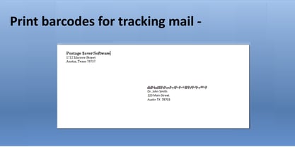 This is a special font for use creating US Postal Service "Intelligent Mail" barcodes. Those are the barcodes you see on most cards and envelopes. Commercial mailers get the best pricing by printing barcodes when they address the mail, saving the Postal Service a step. The barcodes are also used on reply mail and Share mail, and for "Informed Visibility" tracking. Software to create these barcodes, including the USPS Intelligent Mail Small Business (IMsB) tool, typically provide an output of 65 characters, each character being an A, D, T or F, corresponding to each of the styles of bar. SmartBars 12 replaces those characters with the corresponding bar. When doing a mail merge to print addresses, the user would set the barcode field on their merge template to be printed using SmartBars 12, at 12 point, regular, and the barcode will print with the correct bars and at the required size to meet USPS requirements.
 - Rustica by TipoType,
$24.00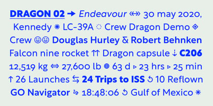 The world has changed; we want it to change. But it has a history too. Rustica draws back to the sans typeface tradition and updates it for the 21st century; we aim to go back to the humanist values without dismissing the role played by technology.It’s a GeoHumanist sans serif. Type design looks back at its past to return with renovated strength to its march to the future. Rustica is based on a humanist architecture with the addition of the determination and precision of the geometry of the classic sans of the early 20th century. Thus, a typographic conception typical of 21st century communications: returning to the human values of closeness and proximity, adding the certainty of knowledge and science. Rustica is born out of the DNA of our awarded font Rotunda, contributing to this typographic ecosystem humanist notes enhanced by the precision and discipline of geometry.
 - Monogram kk sc - Personal use only

- High Class by Redy Studio,
$19.00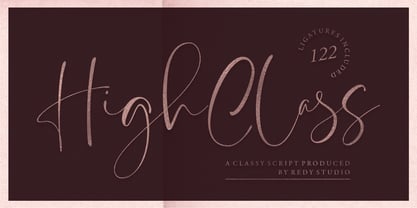 High Class – Handwritten Font High Class is a handwritten font, with high-end style and embodies the most desirable elements of fashion, setting an impression of classiness. This font truly brings on the vibe of high society. While this font comes with over 122 hand-drawn ligatures, it has been carefully kerned to give results as if they were all handwritten. It comes with a clean base look and all over the place forms with imperfect letters, messy style ligatures, and ampersands that make it complete. Easy to use, you can create a great impact on your work. High Class font is perfect for branding projects, logos, wedding designs, social media posts, advertisements, product packaging, product designs, label, photography, watermark, invitation, stationery, and any projects that need handwriting taste. High Class features: A full set of upper & lowercase characters Numbers & punctuation 122 Gorgeous ligatures A full set of alternate upper & lowercase characters Multilingual symbols PUA Encoded Characters – Fully accessible without additional design software. Feel free to give me a message if you have a problem or question. Thank you so much for taking the time to look at one of our products.
 - Anisette Std Petite by Typofonderie,
$59.00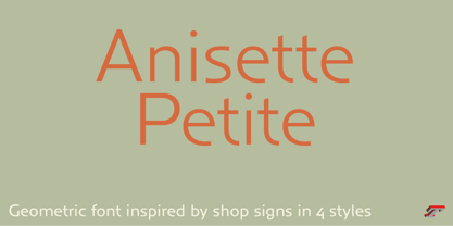 Geometric font inspired by shop signs in 4 styles Anisette has sprouted as a way to test some ideas of designs. It has started with a simple line construction (not outlines as usual) that can be easily expanded and condensed in its width in Illustrator. Subsequently, this principle of multiple widths and extreme weights permitted to Jean François Porchez to have a better understanding with the limitations associated with the use of MultipleMaster to create intermediate font weights. Anisette built around the idea of two widths capitals can be described as a geometric sanserif typeface influenced by the 30s and the Art Deco movement. Its design relies on multiple sources, from Banjo through Cassandre posters, but especially lettering of Paul Iribe. In France, at that time, the Art Deco spirit is mainly capitals. Gérard Blanchard has pointed to Jean Francois that Art Nouveau typefaces designed by Bellery-Desfontaines was featured before the Banjo with this principle of two widths capitals. The complementarity between the two typefaces are these wide capitals mixed with narrow capitals for the Anisette while the Anisette Petite – in its latest version proposes capitals on a square proportions, intermediate between the two others sets. Of course, the Anisette Petite fonts also includes lowercases too. Anisette Petite, a geometric font inspired by shop signs in 4 styles So, when Jean François Porchez has decided to create lowercases the story became more complicated. His stylistic references couldn’t be restricted anymore to the French Art-déco period but to the shop signs present in our cities throughout the twentieth century. These signs, lettering pieces aren’t the typical foundry typefaces. Simply because the influences of these painted letters are different, not directly connected to foundry roots which generally follow typography history. The outcome is a palette of slightly strange shapes, without strictly not following geometrical, mechanical and historical principles such as those that typically appear in typefaces marketed by foundries. As an example, the Anisette Petite r starts with a small and visible sort of apex that no other similar glyphs such as n or m feature, but present at the end of the l and y. The famous g loop is actually inspired by Chancery scripts, which has nothing to do with the lettering. The goal is of course to mix forms without direct reports, in order to properly celebrate this lettering spirit. This is why the e almost finishes horizontally as the Rotis – and the top a which must logically follow this principle and is drawn more round-curly. This weird choice seemed so odd to its designer that he shared his doubts and asked for advise to Jeremy Tankard who immediately was reassuring: “Oddly, your new top a is fine, it brings roundness to the typeface, when the previous pushes towards Anisette Petite to unwanted austerity.” The Anisette Petite, since its early days, is a mixture of non-consistent but charming shapes. Anisette, an Art Déco typeface Anisette Petite Club des directeurs artistiques, 46e palmarès Bukva:raz 2001
 - Drum Komputer - 100% free

- Duralith - Unknown license

- Circoex / ANTIPIXEL.com.ar - Personal use only

- RubaiyatEngraved - Unknown license

- Bulldozer - Personal use only

- ZeroDegrees - Unknown license

- Pea Heather's Handwriting - Unknown license

- Stencil Four - Unknown license

- Aarvark Cafe - Unknown license

- Put Another One In - Unknown license

- Boomerang - Unknown license

- Just One More Picture - Unknown license

- Lev Serif by TypeFaith Fonts,
$15.00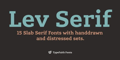 Lev is a slab serif font, the rectangular serifs and the straight angled shoulders and links contrasting the curves and loops. Lev Serif is characterized by thick, block-like serifs. Lev contains 12 high quality fonts.
 - Krete by BluHead Studio,
$29.00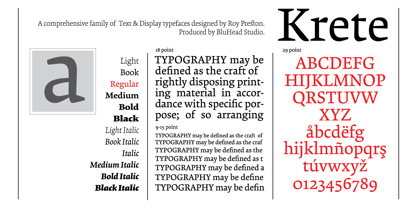 BluHead Studio continues its collaboration with British designer Roy Preston by producing Krete, Roy’s latest text family. This first release of 12 weights includes Light, Book, Regular, Medium, Bold, and Black, each with a drawn italic.
 - Typogravure by Jonahfonts,
$40.00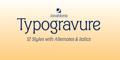 A family with a retro feel with 12 styles in 6 weights, for both headlines and body text use as well editorial and corporate design from advertising to packaging and digital design. Supports Central/European languages.
 - Enlisted Stencil JNL by Jeff Levine,
$29.00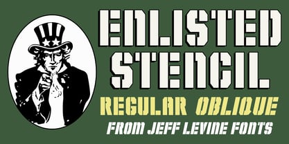 An unsold 1973 TV pilot for the series “Catch 22” (based on Joseph Heller’s 1961 book and the subsequent 1970 movie) had its title hand lettered in an extra bold stencil type style. Heller coined the phrase as a satire on absurd military rules and bureaucracy. Although the show’s title provided only five characters to work with, there was enough inspiration there to create the military styled Enlisted Stencil JNL, which is available in both regular and oblique versions. According to Wikipedia: “A catch-22 is a paradoxical situation from which an individual cannot escape because of contradictory rules or limitations.”
 - Slabber by Monotype,
$30.00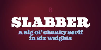 Slabber is a big ol’ chunky serif that’s specifically designed for display purposes – headlines, logotype, branding, titles, packaging, signage, etc. Its characteristics include heavy bracketed serifs with a strong 19th century wood type influence, while a very large x-height combined with a small cap height creates an awkward tension that delivers a strong, stylish, contemporary typeface. Slabber is enhanced by 22 alternates that will allow you to add flourishes to your typography. All Latin European languages are covered in this 6-weight typeface. Key features: 6 Weights 22 Alternates European Language Support (Latin) 500 glyphs per font.


