9,861 search results
(0.012 seconds)
- Maxima Now Pro by Elsner+Flake,
$59.00 The sans serif linear antiqua Maxima which was created in the beginning of the sixties by Prof. Gert Wunderlich for Typoart Dresden, was newly actualized in 2007 after more than 45 years. Many hands and heads were involved in the successful re-design of Maxima Now over a period of two years to assist the designers of the Elsner+Flake Design Studios in Hamburg, and the typeface family is now available. The re-design happened in close cooperation with Wunderlich who has given support to numerous projects in Elsner+Flake’s studio in Hamburg. A great deal of care was given to the necessary preliminary tasks such as the viewing of the original designs and print tests, the analysis of the digital Typoart data which had been in the possession of Elsner+Flake since 1985 and 1989, and a design conceptualization based on detail correlations, as well as the extension of the character complement. It had been Elsner+Flake’s goal to include as many of the existing Maxima cuts into the re-design program as possible. The result is an extended font family with 25 weights in EuropaPlus layout.
 - Los Alamos by Red Rooster Collection,
$60.00 Although Los Alamos was originally designed as a complementary sister typeface to Grand Canyon, it evolved into a comprehensive and unique type family in its own right. It incorporates a unicase that is fully interchangeable with the caps, and vice versa, giving the user many different options and looks. Los Alamos Pro includes over 800 glyphs and ligatures, and supports 131 languages.
 - Los Feliz by Emigre,
$39.00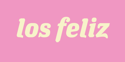
- Lo-Res by Emigre,
$39.00 The Lo-Res family of fonts is a synthesis of pixelated designs, including Emigre's earlier coarse resolution fonts, as well as bitmap representations of Base 9. It replaces the preexisting Emigre, Emperor, Oakland and Universal families and groups these related bitmap designs under one family name in the font menu, thereby simplifying their naming. The Lo-Res fonts also offer technical improvements, including a more complete character set, more consistent character shapes among styles and weights, as well as improved alignment among the various resolutions.
 - Los Niches by Latinotype,
$39.00 Los Niches is a stylized sans serif typeface that combines modern, monoline characters with strokes and loops reminiscent of manuscript lettering. With a consistant, harmonious style Los Niches takes on a youthful flair when presented in bright colors, but is elegant and contemporary when dressed all in black. The flexible personality of Los Niches makes it ideal for catalogs, magazines or product packaging.
 - Los Banditos by Dicky Syafaat,
$15.00 The classical vintage font Los Banditos comes in a serif and sans serif form with a lot of of stylistic alternates and ligatures that will give a unique, classic, amd retro look on your design projects. Use it as a Display font on a poster, logo, menu, clothing brand, magazine, movie, website and much more.
 - Los Lana by T-26,
$19.00 - Los Muertos by Just My Type,
$25.00 Happy Halloween (and All Souls Day and Day of the Dead)! I’ve seen other fonts made up of bones of various kinds, but none with this variety. Henry Gray’s Anatomy of the Human Body (the book, not Grey’s Anatomy, the TV series) was heavily scoured to find more unusual bones shaped like letters. You’ll find Los Muertos both fun and appropriate for the up-coming holidays. (Uppercase is Solid, lowercase is Outline).
 - Los Vampiros by Comicraft,
$39.00 Wooden Stake? Check. Holy Water? Check. Gideon's Bible? Check. Crucifix? Check. One PC or Mac copy of the Los Vampiros font from the pages of Cliffhanger's CRIMSON? Check. Slayers shouldn't leave home without one.
 - NOW YOU SEE ME - Personal use only

- KG How Many Times - Personal use only

- glow-carro-danish-spiik - Unknown license

- KR Lots Of Hearts - Unknown license

- Big Fat Ugly Cow - Unknown license

- Eat your face now - Unknown license

- Cows In the U.S. - Unknown license

- KR Lots Of Holly - Unknown license

- Vandal Blow Graffiti Regular by Sipanji21,
$15.00 "Vandal Blow" is a 3D layered graffiti font that includes solid, shadow, and inner shadow styles, providing the tools to create a three-dimensional appearance in your text. Fonts with layered styles like this are commonly employed in graffiti art, street art, posters, and other designs where a dynamic and eye-catching 3D effect is desired. By utilizing the solid, shadow, and inner shadow layers in "Vandal Blow," you can enhance the visual impact of your text, creating a sense of depth and dimension. This font is particularly suitable for projects where you want to infuse a graffiti-style aesthetic with a three-dimensional twist, making your text stand out and grab attention.
 - How To Consume Oxygen by Vic Fieger,
$8.99How To Consume Oxygen was created with the plan of emulating words written on a fluted-steel 'warehouse'-type door in advanced state of rusting. - Collect Em Now BB by Blambot,
$10.00 Collect Em Now BB is the sentence-case companion typeface to the uppercase Collect Em All BB! It includes four fonts: regular, italic, bold and bold italic, double letter opentype ligatures, contextual alternate barred-I correction, manga glyphs, and more!
 - Parking Lot Stencil JNL by Jeff Levine,
$29.00 At first glance Parking Lot Stencil JNL look quite similar to many sans stencil fonts, but rest assured there are numerous subtle nuances that give the typeface its own unique flavor. Modeled after the plastic stencils used for marking numbers and directional information on paved surfaces, the lettering is clean yet industrial.
 - Futura Now for Leica by Monotype,
$53.99For nearly 90 years, Paul Renner’s Futura has been as popular as it is versatile—from children’s books to fashion magazines to the plaque on the Moon. Futura is a typographic icon. Futura Now offers designers a chance to see Futura with fresh eyes. It’s more truly Futura-like than any digital version you’ve ever worked with. “It brings some much-needed humanity back to the world of geometric sans serifs,” says Steve Matteson, Monotype’s Creative Type Director who led the design team. “Despite its reputation as the ultimate modern typeface, Futura Now is surprisingly warm,” he explains. “It’s just as at home set next to a leafy tree as it is next to a stainless-steel table, because it skillfully navigates the border between super-clean geometry and humanist warmth.” Futura Now—the definitive Futura—contains 102 styles, including: new Headline and Text weights; new Script and Display weights and styles; and new decorative variants (outlines, inlines, shadows, and fill). Its contemporary alignment of names and weights makes the family easier to understand and use, and its comfortable Text and judicious Headline subfamilies provide instantly refined spacing. With a large Latin, Greek, and Cyrillic character-set, Futura Now serves a wider international creative community. Futura Now is available both as individual OpenType fonts and as a set of Variable fonts, delivering limitless styles in a tidy digital footprint. - KG How Many Times by Kimberly Geswein,
$5.00 A cute, markered skinny font that is tall and neat with plenty personality to spare.
 - Captura Now Core Edition by TypeThis!Studio,
$50.00 Carefully refined shapes and sensitively balanced spacing and kerning create the gentle rythm that grants Captura its warm-hearted face, perfect in form and shape. www.typethis.studio This version covers all the essentials of Captura 265 Characters 8 Styles, including Italics Western European Language Support Numbers Symbols Punctuation If you need more features like small caps, special symbols, Cyrillic or Vietnamese language support, you may review the expert version of CapturaNow.
 - Parking Lot Sale JNL by Jeff Levine,
$29.00 Here’s a novelty font emulating the plastic pennant streamers that were popular in the 1950s and 1960s used to decorate a store parking lot or used car lot for a sales event. The typeface inside the individual pennants is Manufacturer JNL, which can be used for body copy associated with titles made by this font. Parking Lot Sale JNL is available in regular (black letters on white pennants) and black (with white letters). A blank pennant for word spacing or end caps is available on the backslash key.
 - Back Lot Stencil JNL by Jeff Levine,
$29.00 Back Lot Stencil JNL is a hand lettered slab serif stencil design based on the titles and credits from the 1954 film “Human Desire” and is available in both regular and oblique versions. Caps only Font.
 - Square Line Icons Law by Howcolour,
$17.00 The square icons focus on maximizing the meaning by minimizing the symbols. Let your viewers understand your data without disorientation. Use a metaphorical icon library, designed for fast, intuitive human recognition.
 - Loo Snoo Roman NF by Nick's Fonts,
$10.00Here's a fresh version of an old favorite, Loose New Roman, from the Schaedler Studio of New York. Easy, breezy and carefree, it's a natural for happy headlines. Both versions of the font contain the complete Unicode Latin 1252 and Central European 1250 character sets. - Kabouter by Hanoded,
$15.00 Kabouter (kaːˈbɑu̯.tər) means ‘gnome’ in Dutch. I have no particular love for gnomes (even though I have a font called Garden Gnome…), but this font had a fairytale feeling to it and the name looked good. Kabouter is a happy display font. It is fun, bouncy and quirky. Use it for your book covers, toy-packaging and home made apple sauce labels. Besides that, you now know how to say gnome in Dutch, which will leave your friends astounded! ;-)
 - VTC Lo-Down - Unknown license

- Los Lana Niu by Latinotype,
$45.00 Los Lana Niu was designed by Bruno Jara and Luciano Vergara. The typeface is based on Los Lana (2007). Along with the redesign, the font has increased from 1 to 24 different styles. This new version preserves the rustic aesthetics of the original typeface, but it lacks of curves and it visually looks as if it was a nirregular font. Los Lana Niu comes with a wide range of ligatures included in every weight: from Thin to Black. In order to offer a wide array of uses, the typeface has been structured by adding acomplete family of small caps, which makes this font well-suited for headlines, posters, branding and publishing design. Los Lana Niu comprises 3 subfamilies: Los Lana Niu Essential (392 glyphs) – including both regular and alt versions, Los Lana Niu Small Caps (392 glyphs) and Los Lana Niu (820 glyphs), which includes a variety of OpenType features such as stylistic ligatures, contextual alternates and small caps.
 - Lo Fi Copy by 2D Typo,
$24.00 Lo-Fi Copy is a good way to add an analog look to your design. Brutal pixels have chaotic errors, like a damaged signal.
 - Los Lana Pro by Latinotype,
$39.00 Los Lana Pro is a handmade display typeface. Unlike other font families, this type has not a modular structure, that is, each character has been individually designed. The coherence of structure elements across different characters is given by irregular strokes. This curveless typeface is perceived as being curved because of its straight lines, which form different-size angles. Los Lana Pro is a rustic typeface that captures the stereotypical “Andean hippie” handmade aesthetics. Irregular shapes and broken lines give it a distinct personality. Los Lana Pro looks better in larger sizes. Includes many ligatures, two groups of alternate characters, and titling caps characters. Languages include: Basic Latin, Western European, Euro, Catalan, Baltic, Turkish, Central European, Romanian and Pan Africa Latin. Photos by Sergio Recabarren.
 - Kis Antiqua Now TB Pro by Elsner+Flake,
$99.00 In the course of the re-vitalization of its Typoart typeface inventory, Elsner+Flake decided in 2006 to offer the “Kis Antiqua” by Hildegard Korger, in a re-worked form and with an extended sortiment, as an OpenType Pro-version. After consultation with Hildegard Korger, Elsner+Flake tasked the Leipzig type designer Erhard Kaiser with the execution of the re-design and expansion of the sortiment. Detlef Schäfer writes in “Fotosatzschriften Type-Design+Schrifthersteller”, VEB Fachbuchverlag Leipzig, 1989: No other printing type has ever generated as far-reaching a controversy as this typeface which Jan Tschichold called the most beautiful of all the old Antiqua types. For a long time, it was thought to have been designed by Anton Janson. In 1720 a large number of the original types were displayed in the catalog of the „Ehrhardische Gycery“ (Ehrhardt Typefoundry) in Leipzig. Recently, thanks to the research performed by Beatrice Warde and especially György Haimann, it has been proven unambiguously that the originator of this typeface was Miklós (Nicholas) Tótfalusi Kis (pronounced „Kisch“) who was born in 1650 in the Hungarian town of Tótfal. His calvinistic church had sent him to the Netherlands to oversee the printing of a Hungarian language bible. He studied printing and punch cutting and earned special recognition for his Armenian and Hebrew types. Upon his return to Hungary, an emergency situation forced him to sell several of his matrice sets to the Ehrhardt Typefoundry in Leipzig. In Hungary he printed from his own typefaces, but religious tensions arose between him and one of his church elders. He died at an early age in 1702. The significant characteristics of the “Dutch Antiqua” by Kis are the larger body size, relatively small lower case letters and strong upper case letters, which show clearly defined contrasts in the stroke widths. The “Kis Antiqua” is less elegant than the Garamond, rather somewhat austere in a calvinistic way, but its expression is unique and full of tension. The upper and lower case serifs are only slightly concave, and the upper case O as well as the lower case o have, for the first time, a vertical axis. In the replica, sensitively and respectfully (responsibly) drawn by Hildegard Korger, these characteristics of this pleasantly readable and beautiful face have been well met. For Typoart it was clear that this typeface has to appear under its only true name “Kis Antiqua.” It will be used primarily in book design. Elsner+Flake added two headline weights, which are available as a separate font family Kis Antiqua Now TH Pro Designer: Miklós (Nicholas) Tótfalusi Kis, 1686 Hildegard Korger, 1986-1988 Erhard Kaiser, 2008
 - Kis Antiqua Now TH Pro by Elsner+Flake,
$99.00 In the course of the re-vitalization of its Typoart typeface inventory, Elsner+Flake decided in 2006 to offer the “Kis Antiqua” by Hildegard Korger, in a re-worked form and with an extended sortiment, as an OpenType Pro-version. After consultation with Hildegard Korger, Elsner+Flake tasked the Leipzig type designer Erhard Kaiser with the execution of the re-design and expansion of the sortiment. Detlef Schäfer writes in “Fotosatzschriften Type-Design+Schrifthersteller”, VEB Fachbuchverlag Leipzig, 1989: No other printing type has ever generated as far-reaching a controversy as this typeface which Jan Tschichold called the most beautiful of all the old Antiqua types. For a long time, it was thought to have been designed by Anton Janson. In 1720 a large number of the original types were displayed in the catalog of the „Ehrhardische Gycery“ (Ehrhardt Typefoundry) in Leipzig. Recently, thanks to the research performed by Beatrice Warde and especially György Haimann, it has been proven unambiguously that the originator of this typeface was Miklós (Nicholas) Tótfalusi Kis (pronounced Kisch) who was born in 1650 in the Hungarian town of Tótfal. His calvinistic church had sent him to the Netherlands to oversee the printing of a Hungarian language bible. He studied printing and punch cutting and earned special recognition for his Armenian and Hebrew types. Upon his return to Hungary, an emergency situation forced him to sell several of his matrice sets to the Ehrhardt Typefoundry in Leipzig. In Hungary he printed from his own typefaces, but religious tensions arose between him and one of his church elders. He died at an early age in 1702. The significant characteristics of the “Dutch Antiqua” by Kis are the larger body size, relatively small lower case letters and strong upper case letters, which show clearly defined contrasts in the stroke widths. The “Kis Antiqua” is less elegant than the Garamond, rather somewhat austere in a calvinistic way, but its expression is unique and full of tension. The upper and lower case serifs are only slightly concave, and the upper case O as well as the lower case o have, for the first time, a vertical axis. In the replica, sensitively and respectfully (responsibly) drawn by Hildegard Korger, these characteristics of this pleasantly readable and beautiful face have been well met. For Typoart it was clear that this typeface has to appear under its only true name “Kis Antiqua.” It will be used primarily in book design. Elsner+Flake added these two headline weights, which are available besides a separate font family Kis Antiqua Now TB Pro. Designer: Miklós (Nicholas) Tótfalusi Kis, 1686 Hildegard Korger, 1986-1988 Erhard Kaiser, 2008
 - Dia De Los Muertos by Intellecta Design,
$21.90 Dia de los Muertos is a colorful collection of skulls based on the lively Mexican fiesta celebration where skulls are used as humorous epitaphs of people still alive, besides being a symbol of celebration. A work of Iza W that can be used for children in arts, arts crafts, among other applications. Buying "Dia de los Muertos" you get FREE a amazing set of eps vectors : 39 naive, intrincated and colored funny skulls, ready to use."
 - Fiesta De Los Muertos by Mvmet,
$10.00 Fiesta De Los Muertos is a fun and festive display font! Not only can be used for Halloween theme needs, you can use it too for other things for daily needs. Use it on t-shirts and clothing, book designs, greeting cards, stickers, posters, banners, or anything that needs a fun touch. Try it to create fabulous designs and feel the fun and cool vibes with it!
 - H74 Viva Los Vatos by Hydro74,
$25.00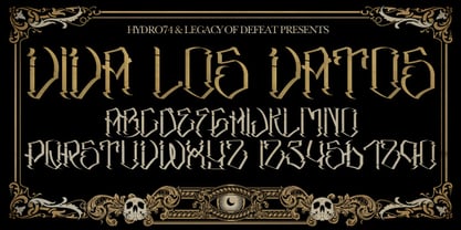
- Solitas Contrast by insigne,
$39.00 This sleek, high contrast typeface means business, but it looks great on any project, no matter how big or small. Solitas Contrast was developed because existing high contrast sans options were neither modern nor crisp. This design challenge was solved through a series of typefaces: the original low-contrast Solitas, its serifed cousins, and now a high contrast sans—each carefully considered for an organic and free flowing look. It evokes a Dutch or european feel. Solitas Contrast is a modern, clean sans-serif with a distinctive style and impact.
 - Basalt by Volcano Type,
$19.00 Basalt is a hard, black volcanic rock with less than about 52 weight percent silica. Because of basalt's low silica content, it has a low viscosity (resistance to flow). Basalt is erupted at temperatures between 1100 to 1250° C.


