10,000 search results
(0.052 seconds)
- Dezen Stencil 02 by DizajnDesign,
$39.00 Dezen is a contemporary, mechanical grotesque typeface. Its letters were first constructed from individual modules and then optically refined to enhance its rhythm. Its tight letter spacing and narrow proportions make the typeface particularly well suited for display sizes and headlines. When you add spacing, font can be used for shorter amount of text, bigger than 12 points. Dezen type family consists of a wide variety of styles – solid and stencils. Dezen Pro subfamily combines all 4 styles (Solid, Stencil 01, Stencil 02, Stencil 03) in a specific sequence, which originates a “pattern” for the alphabet (or dezen, in Slovak).
 - Liak by TypeClassHeroes,
$29.00 Liak is a sans serif family. Design with various width and weight that you can explore and combine creating rhythm and texture for comfortable reading. This font supports more than 100 Latin-based languages and has extensive Cyrillic and Greek support for languages like Russian, Bulgarian, Ukrainian, and many more.In variable version, it allows multiple options when designing, adapting to different composition solutions. Feature Uppercase & Lowercase Number & Symbol International Glyphs (Cyrillic & Greek) Multilingual support Ligature Feel free to drop us a message any time and follow my shop for upcoming updates Shoot me on email at: Suandana_Ipandemade@hotmail.com Hope you enjoy it.
 - Fou Pro by URW Type Foundry,
$49.99 The Fou typeface family was designed as an alternative to Trade Gothic condensed bold. During the design process of a normally wide font variant a system developed that responds to white space and changing proportions. Thus, round transitions become rectangular and vice versa, space is made and space is taken away. This system and the associated changes are continued on a model with semi-serifs. Fou can also be used as an alternative to Din or the wider Q-Type, but in comparison offers more room for emphasis with its italics, expert sets and numerous special characters.
 - Neubau by TipografiaRamis,
$29.00 Neubau is a condensed geometric display typeface, designed in 2009. The inspiration for this face came from Joost Schmidt lowercase letters developed during 1925-28 in Bauhaus Dessau. Schmidt was one of the proponents of New Typography – a movement advocating the use of only lowercase letters which were constructed strictly geometrically using only ruler and compass. Neubau family consists of two subfamilies - Neubau Sans and Neubau Serif, each of them in three weights - light, regular and bold. Neubau typeface is recommended for use as a display font, and has been generated in a single OpenType format with Western CP1252 character set.
 - Nouveau LX by Vanarchiv,
$27.00 The original design came from Berthold Herold typeface, designed by Hermann Hoffmann during 1913 (Art Nouveau style) in Germany. This project started from flyer printed during 1947 with movable type, the specimen was scanned as a source to development some of the uppercase letterforms. However the most unusual and tricky element from this sample is the leg from the uppercase (R) which is different from the original Herold design, until now I didn’t found where this version originally came from. This font family only contain the bold weight, but there are also a stencil and expanded versions available.
 - AndrewAndreas by Ingrimayne Type,
$5.00 AndrewAndreas is a simple, clean, sans-serif font family that is highly legible and useful for both text and display purposes. The original three weights were designed in 1994 and three additional weights plus oblique styles were added in 2020. Also added were several OpenType features, including subscripts, superscripts, and fractions. The six oblique styles slant the upright styles but do not change the shape of the letters. However, three OpenType stylistic alternatives provide alternative letter forms for a, f, i, j, and l for five of the obliques and they can be used for a more traditional italics appearance.
 - Gringo Slab by Volcano Type,
$29.00Gringo is a type family that contains 27 different varieties. It is divided into three groups: Sans, Slab, and Tuscan = Europe - Texas. Due to its consistant structure, the single groups can be mixed as you wish. Furthermore every variety comes in Light, Medium, and Bold. There are three widths, from Narrow to Wide. Additionally, there is also a Dingbats font. The concept of Gringo is a fusion and a merging of type cultures to cross borders and create something new. Gringo won 3rd place in the "tdc2 2006 award" by the Type Directors Club New York. - Neue Frutiger Vietnamese by Linotype,
$29.00 Neue Frutiger Vietnamese''' was developed by a team of designers and font engineers from the Monotype Studio under the direction of Monotype type director Akira Kobayashi. The family is available in 10 weights from Ultra Light to Extra Black, with matching italics. Neue Frutiger Vietnamese embodies the same warmth and clarity as Adrian Frutiger's original design, but allows brands to maintain their visual identity, and communicate with a consistent tone of voice, regardless of the language. It is part of the Neue Frutiger World collection, offering linguistic versatility across environments – suited to branding and corporate identity, advertising, signage, wayfinding, print, and digital environments.
 - Argos by Hoftype,
$49.00 Argos, a type face with a strong personality. A rounded serif type family which uses exclusively modern design elements. While it possesses decorative qualities, thanks to its hearty serif weights it can be successfully used as a text type. Argos comes in 6 weights and with its extended character set it permits a wide range of applications. Each font is equipped with ligatures, small caps, proportional lining figures, tabular lining figures, proportional old style figures, lining old style figures, matching currency symbols, fraction- and scientific numerals. Argos supports Western European as well as Central and Eastern European languages.
 - Dezen Stencil 03 by DizajnDesign,
$39.00 Dezen is a contemporary, mechanical grotesque typeface. Its letters were first constructed from individual modules and then optically refined to enhance its rhythm. Its tight letter spacing and narrow proportions make the typeface particularly well suited for display sizes and headlines. When you add spacing, font can be used for shorter amount of text, bigger than 12 points. Dezen type family consists of a wide variety of styles – solid and stencils. Dezen Pro subfamily combines all 4 styles (Solid, Stencil 01, Stencil 02, Stencil 03) in a specific sequence, which originates a “pattern” for the alphabet (or dezen, in Slovak).
 - Merel by Inhouse Type,
$33.78 Merel is a modern geometric typeface with humanist attributes. Geometry and logic are at the heart of this 6 weight font family. Humanist touches give it a number of distinctive characteristics, as well as aid legibility. Despite being rational and function driven in its nature, Merel has a soft and gentle touch. It was designed to tackle both print and onscreen challenges of the modern environment. Details include reduced x-height, mild stroke contrast and vertically sheared terminals with cushioned finish across the typeface. Merel features a number of alternative characters, manually edited kerning and Opentype features.
 - Mato Sans by Picador,
$29.00 Legible and dynamic shape, tons of OpenType options, different scripts – that’s Mato Sans. Difficult small size, long text in Vietnamese, huge heading in Russian or table full of figures to create? It’s not a problem with this family. There are over 2000 glyphs in every weight with such features: superscript and subscript characters, tabular lining and old style figures, small caps, fractions, arrows or even case sensitive parenthesis. Mato Sans was designed for use in Latin as well as in Cyrillic script. Every font contains an extended set of Cyrillic characters including special, local glyphs for Bulgarian, Macedonian and Serbian.
 - Obvia Condensed by Typefolio,
$29.00 'Obvia' appeared as a result of direct observation on typefaces classified as geometric and the plan to explore for the first time width axes Expanded, Wide, Normal, Narrow and Condensed The idea behind 'Obvia's design was to create a distancing from geometrically pure shapes, in this case, square shapes. Then some details were added, such as subtle inktraps, concave endings of the stems and carefully drawn alternate characters, giving a 'geohumanist' tone to the font. This first family of 'Obvia' has 9 weights ranging from Thin to Black, delivering a strong typographic identity, from the paper to the pixel.
 - Kenac by Latinotype,
$29.00 Kenac is an elegant, fresh and modern serif typeface, with unusual yet functional shapes, that combines characteristics of Roman type with elements of calligraphy and Victorian style. Its singular modulation and contrast between thick and thin strokes make it look great in titles. In order to ensure ease of use, the Kenac family includes only 5 weights while its matching italics provide contrast and make the font a harmonic choice for continuous text. Kenac has a unique appearance that makes it ideal for editorial design such as book covers and magazine website's headers as well as brand identity design.
 - Kopitha by Ekahermawan,
$15.00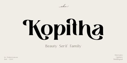 Kopitha is a beauty serif family with 5 weights from Light to ExtraBold. Kopitha also includes alternate characters (PUA Encoded) and ligatures to give you a wide range for create an unique typographic design results. Kopitha is suitable font for many different projects such as logo, branding, poster, magazines, label, merchandise, invitation, presentation, advertising, quotes and so much more! FEATURES: OpenType support Playfull to use (with ligatures and alternates options) Multilingual support PUA Encoded If you need support or more information about this item please kindly contact me : ekahermawanputu@gmail.com Thank you so much I really hope you enjoy when using it!
 - Gringo Sans by Volcano Type,
$29.00Gringo is a type family that contains 27 different varieties. It is divided into three groups: Sans, Slab, and Tuscan = Europe - Texas. Due to its consistant structure, the single groups can be mixed as you wish. Furthermore every variety comes in Light, Medium, and Bold. There are three widths, from Narrow to Wide. Additionally, there is also a Dingbats font. The concept of Gringo is a fusion and a merging of type cultures to cross borders and create something new. Gringo won 3rd place in the "tdc2 2006 award" by the Type Directors Club New York. - Frastha by Ekahermawan,
$20.00 Frastha font is unique and beauty display family with 7 weights from Thin to Bold. Frastha also includes a bunch of alternate characters (PUA Encoded) and ligatures to give you a wide range for create an excellent typographic design results for many different projects such as logo, branding, poster, magazines, labels, merchandise, invitation, presentation, advertising, quotes and so much more! FEATURES: OpenType support Playfull to use (with ligatures and alternates options) Multilingual support PUA Encoded If you need support or more information about this item please kindly contact me : ekahermawanputu@gmail.com Thank you so much.. I really hope you enjoy when using it!
 - Calypso I by Typolar,
$65.00 Calypso I (Italian) draws its inspiration from type founders' plentiful show-off-letters, which were typical on title pages and lithographs in the early 19th century. It borrows luscious details from these but inherits a stiff modern backbone from its parent, Calypso E (Egyptian). Within the Calypso type family all fonts share the same dimensions and work together consistently. Calypso I supports many languages and includes, for example, four sets of basic numerals, circled numbers, alternative characters, case sensitive forms and dingbats. Give it a go on drop caps and headlines or even set short paragraphs with it. It loves colour and effects.
 - Colmcille by Monotype,
$29.99Colmcille was designed by a Gaelic scholar, typographer and printer, and first released by Monotype for composition casting in 1936. The design intention was to provide a Gaelic looking type which worked well as a roman text face. The digital version of the Colmcille font family has been made in collaboration with the designer's son, Dara O Lochlainn. A number of changes have been made, including a new set of figures and the addition of a bold weight. Although originally designed as a text face, Colmcille can be used for advertisements, flyers, in fact wherever a touch of Gaelic charm is required. - Peter by Vibrant Types,
$33.00 Peter started as a sketch in the static sans-serif tradition of Helvetica®. Then slight references to the calligraphic origin of type were added, giving it a more distinct character. This neo-grotesque sans has rational and clear basic letterforms, while in its details it unfolds attributes of humanist type. As a neo-grotesque sans it claims a very modest design, yet being a bit wider than its relatives and offering the warmth of humanist drafts. The early sketch grew to a type family of 18 fonts and now supports 700+ glyphs with pro opentype features.
 - Bogue by Melvastype,
$29.00 Bogue is a soft serif type family of 8 weights and matching italics. The soft forms gives it a friendly and approachable character with a hint of retro feeling. Bogue comes with a lots of stylistic alternates that makes it very versatile in various uses like logos, editorial design, branding, web design, package design and much more. You can use it to create short powerful phrases and headlines and also use it in longer text like lead paragraphs and body texts. So if you are looking for a versatile soft serif font with a friendly character you have found it!
 - Ardiland by Dora Typefoundry,
$17.00 Introducing, Ardiland - a stylish serif with beautiful binders and substitutes! Ardiland is a modern serif font to apply to many graphic or editorial design projects. A classy, unique high contrast, and light binding style for your upcoming projects. for feminine logo signs, fashion & editorial design heads, branding projects, Apparel Branding, packaging, magazine titles, advertisements, T-shirts, postcards and other special occasions. Here's what's included: Alternatives & Ligatures Numbers & punctuation Character with accent Support Multiple Languages PUA encoded This type of family has become the work of true love, making it as easy and fun as possible. I really hope you enjoy it! Thank you
 - Jessi Neue by Nois,
$18.00 Jessie Neue in a new Serif typeface inspired by popular '70s fonts mixed with grotesque touches. It has ligatures that make it more elegant and grotesque elements that give it a modern look and make it more versatile. Jessi Neue has a great performance in large body texts and also in high impact headlines. The family has four weights and also a variable version to give more creative freedom. It has 667 characters that covers the following languages: Basic Latin, Western European, Central European, South Eastern European, Vietnamese, Pinyin and Basic Greek. The italic version will arrive soon.
 - Femi SRF by Stella Roberts Fonts,
$25.00 People often come into your life and make a significant impression that lasts a lifetime. Be they friend, family member or relationship partner, such people are rare and endearing. Sadly, we lose many of these individuals before their time. Femi SRF is dedicated to one such person who was in Stella's life and whose memory will live on long past the duration of his mortal existence. Like Femi himself, this typeface offers a touch of bold elegance and discipline. The net profits from my font sales help defer medical expenses for my siblings, who both suffer with Cystic Fibrosis and diabetes. Thank you.
 - Meguro Sans by GT&CANARY,
$27.00 Meguro Sans has a modern-styled boxy shape that achieves clean, industrial yet friendly style lends itself well to brand building. Its mono-line oriented and very high X-height ensure that it is extremely legible and creates a strong impression. Meguro Sans is Sans serif version of Meguro Serif. The Meguro sans font family is comprised of 10 styles with 5 different weights from light to black, along with matching italics offering possibilities for use in web, print, package and sign design, all with the goal of building an established look for brands in wide range of industries.
 - Hello Script by Zetafonts,
$39.00 Hello Script is a high contrast calligraphic script designed by Cosimo Lorenzo Pancini, featuring monoline swashes and terminals and strong, round body shapes designed with a parallel nib. It covers over 40 languages that use the Latin alphabet, with full range of accents and diacritics, and comes with over ten different swashes and two decorative fill typefaces (Hello Script Fill and Hello Script Striped Fill) to use as multilayer color fonts. The Hello family features a sans serif companion (Hello Sans) as well as a christmas-themed version ( Hello Christmas ) with a set of Icons (Hello Christmas Icons), both featuring multilayer color fill.
 - Carista by Haksen,
$19.00 Carista is the family of classic serif style with Uppercase and Lowercase feel nice balanced. Provide alternates font in uppercase and lowercase variant style make the design letter looks incredible. Honestly it works perfectly for headlines, logos, posters, packaging, T-shirts and much more. Recommended to use in Adobe Illustrator or Adobe Photoshop with opentype feature. How to access Alternates Character? Open glyphs panel : In Adobe Photoshop choose tool Window glyphs In Adobe Illustrator choose tool Type glyphs If you have questions, just send me a message and I'm glad to help. Have a great day, Haksen
 - Alianza by Corradine Fonts,
$24.95 This is a complex typographic system which includes three different but complementary styles so far: Slab, italic and script, with nine weights each one; plus three sets of ornamental fonts: labels, negative labels and ornaments. The soul of the family is a slab feeling applied judiciously to the italic and script styles to make it coherent with the whole system. Each style has three sets of figures: Proportional lining, tabular lining and old style. You can mix the three styles in a single piece to obtain more expressive results without worring about the uniformity and complementing the design by using the ornamental sets.
 - Fact by ParaType,
$29.00 Fact is a workhorse open sans serif type system. It is inspired by the great Frutiger typeface. While the Regular style is slightly modernized but still quite close to Frutiger, changing the weight or width makes differences of the design more pronounced. The style range of Fact is wider than of any cognate type family, including weights from Thin to Black and widths from Compressed to Expanded. Fact type system contains 48 upright styles and 48 italics with variations in width and weight. The font was designed by Alexandra Korolkova and Manvel Shmavonyan and released by Paratype in 2018-2019.
 - 1483 Rotunda Lyon by GLC,
$38.00 Towards the end of the 1400s, in Lyon (France), was living Barthélémy Buyer, descendant of a rich family of merchants. In the end of 1472, he engaged a typographist from Liège (Belgium): Guillaume Le Roy. The first book stemming from their print shop was the Compendium breve ( by Pope Innocent III.) using Blackletter “textura”. Many books followed, most often illustrated with wood carving. In 1483, to print a French translated “Eneide”, they used a venetian “Rotunda” blackletter. Our font was inspired by this “Rotunda” set, with historical forms and ligatures enriched with accented letters and other characters not existing in the original.
 - Conglomerate by Typetanic Fonts,
$39.00 Sans or serif? Square or rounded? Calligraphic or geometric? Conglomerate is both all and none of these things — a subtle yet unorthodox blend of typographic traits resulting in a clean, unique, and versatile font family with large, open counters for legibility in text yet crisp, sharp details that sparkle at display sizes. Conglomerate is sturdy but never stiff, crisp but never stark — perfect for projects that require a more contemporary feel than either a traditional serif or geometric sans might bring. Conglomerate received a PRINT Magazine Best in Class award, and was one of Typographica’s Favorite Typefaces of 2016.
 - Budare by fragTYPE,
$14.00 Budare is a geometric font family that rebelled to find its own identity within an ocean of other typefaces of the same style. Its design is based on the shape of the wrought iron plate used in Venezuela and other countries to make arepas and other foods. Its appearance is strongly defined by basic geometric shapes such as the circle and its upright style is accompanied by rotated italics "rotalics" that complement its rebellious spirit. Because of its strong display characteristics, its best uses are focused on posters, branding, titles and anything that needs a strong graphic emphasis.
 - Romeo by Latinotype,
$45.00 Romeo is a perfect couple of Julieta , they are a condensed, unicase family full of swashy love. Inspired by romanticism, Romeo is a charming and versatile typeface. By alternating uppercase and lowercase, and mixing them with alternate characters, ligatures, swashes and endings, you obtain endless possibilities of composition, with 810 glyphs available in the Pro font. In case you don’t need all these alternatives, there is also an Essential version consisting of 247 characters. In addition, Romeo has an affordable set of ornaments, connectors and catchwords to complete this attractive display system. Photography by Damien Vignaux (www.elroy.fr)
 - Redaktor by Spinefonts,
$10.00 My friends didn't use capitals when sending me text messages, e-mails and using all their digital toys. At the beginning, I was feeling ignored. But after time I thought, that... I can do something for them. And so, I've made Redaktor. Redaktor is a cute monospaced family of four fonts, which has only lowercase characters and large x-height. If you want to write an uppercase character, you can't do it. (OK, to be fair, there will be small underline, just to show you, what you have done...) You may find Redaktor useful for posters, titling, info-graphics or websites.
 - Dezen Stencil 01 by DizajnDesign,
$39.00 Dezen is a contemporary, mechanical grotesque typeface. Its letters were first constructed from individual modules and then optically refined to enhance its rhythm. Its tight letter spacing and narrow proportions make the typeface particularly well suited for display sizes and headlines. When you add spacing, font can be used for shorter amount of text, bigger than 12 points. Dezen type family consists of a wide variety of styles – solid and stencils. Dezen Pro subfamily combines all 4 styles (Solid, Stencil 01, Stencil 02, Stencil 03) in a specific sequence, which originates a “pattern” for the alphabet (or dezen, in Slovak).
 - Bhostra Lala by Ekahermawan,
$15.00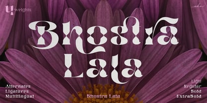 Bhostra Lala is an unique and versatile font family. Bhostra Lala comes with alternates characters (PUA Encoded) and ligatures in 4 weights that will support your creativity in creating the perfect design result for many different projects such as logo, branding, poster, magazines, labels, merchandise, invitation, presentation, advertising, quotes and so much more! FEATURES: OpenType support Playfull to use (with ligatures and alternates options) Multilingual support PUA Encoded If you need support or more information about this item please kindly contact me: ekahermawanputu@gmail.com Thank you so much I really hope you enjoy when using it!
 - Gringo Tuscan by Volcano Type,
$29.00Gringo is a type family that contains 27 different varieties. It is divided into three groups: Sans, Slab, and Tuscan = Europe - Texas. Due to its consistant structure, the single groups can be mixed as you wish. Furthermore every variety comes in Light, Medium, and Bold. There are three widths, from Narrow to Wide. Additionally, there is also a Dingbats font. The concept of Gringo is a fusion and a merging of type cultures to cross borders and create something new. Gringo won 3rd place in the "tdc2 2006 award" by the Type Directors Club New York. - Castrelon by Ekahermawan,
$15.00 Castrelon is a elegant serif family with a bunch of alternates and ligatures. Castrelon including with more than 200+ alternative characters (PUA Encoded) that give you a wide range of typographic design results. Castrelon is a versatile font for many different projects such as logo, branding, posters, magazines, label, merchandise, presentation, advertising, cards, quotes and so much more! FEATURES: OpenType support Playful to use (with ligatures options and alternates options) Multilingual support PUA Encoded If you need support or more information about this item please kindly contact me : ekahermawanputu@gmail.com Thank you so much I really hope you enjoy using it!
 - Obvia Narrow by Typefolio,
$29.00 'Obvia' appeared as a result of direct observation on typefaces classified as geometric and the plan to explore for the first time width axes Condensed, Narrow, Normal, Wide and Expanded. The idea behind 'Obvia's design was to create a distancing from geometrically pure shapes, in this case, square shapes. Then some details were added, such as subtle inktraps, concave endings of the stems and carefully drawn alternate characters, giving a 'geohumanist' tone to the font. This first family of 'Obvia' has 9 weights ranging from Thin to Black, delivering a strong typographic identity, from the paper to the pixel.
 - Keyboard by Red Rooster Collection,
$45.00 Keyboard is a condensed and elongated Egyptian font family with thin serifs and a large x-height. Its original design was created in 1951 by Stephenson Blake. International TypeFounders, Inc. gained exclusive licensing rights to the Stephenson Blake Collection, and then Paul Hickson (P&P Hickson) and Steve Jackaman (ITF) created its digital form in 1994. Keyboard excels in display and subhead sizes, and brings a formal feel to any project. Its condensed nature gives it great visual density in the bolder weights, and the lighter weights allow it to retain legibility at both small and massive sizes.