10,000 search results
(0.049 seconds)
- Adrim by Kaer,
$18.00 Hi there! I'm happy to present you my new font! Adrim is a modern symbols and lines display font. Each uppercase character have a unique pattern with moon, stars and leaves. Here are also clear font option. It is perfect to use in any vintage logos, branding, flyers, product packaging, romantic stationery, ecology posters, astrology blog design, holiday invitations. What you will get: * Pattern and Clean styles * Uppercase and lowercase * Numbers * Symbols * Ligatures * Punctuation * Multilingual support If Adrim font family is not ok, please check out Avery https://www.myfonts.com/fonts/kaer/avery/ I hope you enjoy this font. Follow my shop to receive updates of products and the very hottest news! If you have any question or issue, please contact me: kaer.pro@gmail.com Please request to add additional characters and glyphs if you need! Thank you!
 - Dienstag by insigne,
$24.99 With its extended sans-serif style, Dienstag boasts a sleek and sophisticated look that's perfect for a wide range of projects. Whether you're designing a website, creating branding materials, or producing print publications, Dienstag's refined elegance is sure to make a lasting impression. Compared to Montag, Dienstag has a slightly more formal feel, thanks to its lack of rounded terminators. But that doesn't mean it's any less versatile – in fact, Dienstag's four original weights have now been expanded to ten, giving you even more flexibility in your designs. With OpenType features that include simplified versions of many characters, you can easily create unique and eye-catching titles that stand out from the crowd. But Dienstag is just one part of the larger Montag superfamily, which also includes Mittwoch, and Donnerstag. Each font in this collection offers its own unique style and flair, giving you a wealth of options to choose from when it comes to your next project. Whether you're looking for a bold and dynamic font or a more refined and understated style, you're sure to find the perfect fit in the Montag family. So why wait? Check out Dienstag and the rest of the Montag superfamily today, and start creating designs that are sure to captivate and inspire! With its elegant style and versatile functionality, Dienstag is the perfect choice for designers who demand the best.
 - Midnight Diner by Roland Hüse Design,
$30.00 Did your client just say ‘can you make it pop’? Then you already know you got it on lock. Introducing: Midnight Diner! A multi-layered dimensional script font family featuring thin, bold, outline and shadow capabilities, with a left-leaning slant to boot. You can experiment with various layer combinations and colour! How fun is that? Being effortlessly casual, retro and elegant all in one, you can play it up or down to your liking – perfect for display graphics, logos, signages, packaging, lifestyle imagery, invitations and more. It features a diverse range of stylistic alternates, contextual alternates, and standard ligatures, ensuring that you’ve countless options to choose from for your design work. This font family is delicately crafted and well thought out with every little detail in mind, to ensure its ease and versatility when used! Midnight Diner is a collaboration between lettering artist and calligrapher, Leah Chong (www.leahdesign.sg) and typeface designer, Roland Huse (www.rolandhuse.com). Product Content: Midnight Diner Layered Font - Thin (TTF) Midnight Diner Layered Font - Bold (TTF) Midnight Diner Layered Font - Outline (TTF) Midnight Diner Layered Font - Shadow (TTF) Font Guide PDF https://drive.google.com/file/d/1KPSf-gGrhX3wyaImEAmlJICERNbxu2IN/view?usp=sharing Font Guide Youtube Video https://youtu.be/GtZ8E7Y7wnQ 6 Bonus SVGs (TTF): Midnight Diner SVG - Red Yellow Midnight Diner SVG - Black Pink Midnight Diner SVG - Blue Green Midnight Diner SVG - Orange Yellow Midnight Diner SVG - Purple Pink Midnight Diner SVG - Black White Font Features: Latin character set: Uppercase & Lowercase A - Z Stylistic Alternates Contextual Alternates Standard Ligatures Numerals, Currency Symbols & Punctuation Accented Characters To access all features of Midnight Diner such as stylistic alternates etc., it's highly recommended to use professional design software such as Adobe Illustrator, Adobe Photoshop, Adobe InDesign or Procreate (via the ‘add text' feature).
 - Madromit by Dharma Type,
$14.99 Madromit(ma-do-ro-mi) is a somewhat nostalgic display font. Do you remember computer advertisements in the 80s and 90s? Yes, it is the most excited period in the history of computer. We call the design in this period Primitive Digital Design. Madromit is, so to speak, the revival or reconstruction of the primitive digital type in the period. The structure and elements of this font are very simple and the key features are geometric shape and simple griddy design with rounded corners, oval bowls, and right‐angled joints which we used to see in the primitive period. In addition to this, Madromit has one more characteristic feature — classic engraving font —. It is called Open Style. Open style is one of the classic method to decorate and emphasize the font. Our aim is the synergy by the mixture of primitive digital design and classic engraving method. This mixture makes new impression we have never seen before. Madromit family consists of 5 styles for stacking color font. Please use Photoshop or Illustrator, or your favorite graphic design apps that can handle layers. Layers are the printing plates of wood type. You should be able to change text color for each layers. Madromit "Standard" style is the base of this font family. You can add open effect by stacking "Fill" layers over the Standard layer. Instruction 1. Type your text as you like. 2. Set font-name "Madromit" and font-style "Standard". 3. Set color of "Standard" layer. 4. Duplicate the "Standard" layer to make "Fill" layer. 5. Set font-style "Half Fill" or "Full Fill" and new color of upper layer. Madromit Standard, Half Open, and Full Open style can be used solely.
 - H-AND-S by AND,
$89.00 A common creation: (to pass from one hand to the other): For the first time, various hand-signs from diverse sources are unified into one single visual style. This compendium is the result of 15 years of incubation and 7 years of creation. In his travels throughout the world, graphic designer Jean-Benoit Levy, principal of the visual studio AND, has collected pictures of multiple hand signage. Uncertain what to do with those signs, he kept them year after year until the idea came to unify almost 200 handsigns into one single family. In accordance with this entire collection, the name of the typeface is a mix: "h-and-s". A global collection: (To put in good hands): We all have one thing in common: Hand-signs are an international language, they are meant to be understood by all of us. Each of us regularly comes in contact with modern hieroglyphs such as the hand-sign-codes that are so prevalent in our daily life. This way of communication belongs to no one in particular and to all of us in general. Even if the sense of certain signs varies from one culture to the other, there is a common hand-sign language. We are surrounded by this language of handsigns each time we step in a store, we eat, open a container of milk, we clean up, use package of wash-powder, by shaving, when we work, use tools, at home, by tearing the envelope of a condom, by traveling, etc. When we encounter these signs, we all understand them easily. A visual connection: (To go hand in hand): This typeface is a global visual statement. Collecting, ordering, redrawing, unifying. Reconstructed and assembled into one original alphabet, H-AND-S is a unique and complex signs program. Our choice is based on daily gestures and global hand-codes. Logically this typeface starts with the "American Sign Language" and expands on two type-variations, each on two levels of keyboard. The international team of H-AND-S would like to send his special thanks to all of the anonymous graphic designers throughout the world who designed different hand-signage and who influenced and inspired to create such a sign collection into one unified family. We, the global nomad team of AND, hope that you will enjoy our H-AND-S. Additional Credits Production: Studio AND. www.and.ch. Concept, Idea & Creative Direction: Jean-Benoît Lévy, Switzerland / USA. Research & Sketches: Eva Schubert, Germany. Illustration, Graphic Design & Visual Fusion: Diana Stoen, USA. Transfer, Adaptation & Refining: Moonkyung Choi, Korea. Finalization & Checking: Sylvestre Lucia, Switzerland. Coaching & Technical Advice: Mike Kohnke, USA. Creative Energy & Implementation: Joachim Müller-Lancé, Germany / USA.
 - Blackheat by Almarkha Type,
$19.00 Blackheat is a bold, condensed sans with 4 styles inspired by the title of the sports poster. We designed it to look very energetic, taking into account the thickness and density of each glyph. Extra ligatures give you even more possibilities. This family is suitable for the titles, clothes, posters, magazines, brochures, packaging, websites and much more.
 - Quitador Sans by Linotype,
$57.99 The Quitador™ Sans family is a fresh and distinctive design with roots that go back to the original Quitador typeface. Like its slab serif relative, the Quitador Sans suite of typefaces is large with several weights of roman and italic designs, making it an excellent choice for a wide variety of print and on-screen projects.
 - Wafterby by Paramajan,
$8.00 Wafterby is a handsome sans serif typeface family. It comes in eight weights which have a minimal and clean feel. Its design is based on circle and line geometric shapes. It can be used as a cute minimal-style header display or as a stylish text for magazine, blog, corporate branding, packaging, wedding invitation project, etc.
 - Xenois Serif by Linotype,
$29.99“Drawing letters is my passion,” says Erik Faulhaber, the designer of the Xenois typeface family. Pronounced “zeeno-is,” the design distills character shapes into what Faulhaber believes are their purest forms. “I studied many typefaces, carefully examining their structure, before I began drawing Xenois. Then I actually wrote out a detailed design brief establishing the goals for my design.” - Deka by Australian Type Foundry,
$35.00 Deka was 10 years in the making. Intended as a clean and straightforward sans serif family, it has just enough personality to stand out. Helvetica this ain't! Deka has 8 weights, language support for all Latin plus cyrillic languages, and loads of Opentype features. It is a versatile workhorse suitable for both text and display usage.
 - FF Fudoni by FontFont,
$41.99 Dutch type designer Max Kisman created this display FontFont in 1991. The family contains 3 weights and is ideally suited for festive occasions, film and tv, music and nightlife as well as poster and billboards. FF Fudoni provides advanced typographical support with features such as ligatures and case-sensitive forms. It comes with proportional lining figures.
 - FF Dome by FontFont,
$41.99 British type designer Neville Brody created this display FontFont in 1993. The family contains 3 weights and is ideally suited for advertising and packaging, film and tv, poster and billboards, software and gaming as well as sports. FF Dome provides advanced typographical support with features such as ligatures and case-sensitive forms. It comes with proportional lining figures.
 - Freshy by Katatrad,
$19.00 Freshy is friendly, artistic typeface that is clean enough to use for longer text. It is a complete family with 6 weights and there italic. It has an amazing character set and some of ornaments for your design. Freshy is perfect to use in any friendly situation such as a lovely packaging, restaurant menu, children's book and etc.
 - Concasse by Lillan Team,
$9.90 The family comes in five weights from Thin to Black, all with true italics; and a variable file in weight and slant. Concasse is multi-purpose and reads well in body copy, the open shapes ensure excellent legibility in even the smallest text sizes, while the lightest and boldest weights deliver impact to headlines and other display uses.
 - FF Soupbone by FontFont,
$41.99 Canadian type designer Bruce Alcock created this script FontFont between 1993 and 2011. The family contains 4 weights and is ideally suited for advertising and packaging, festive occasions as well as film and tv. FF Soupbone provides advanced typographical support with features such as ligatures, case-sensitive forms, and stylistic alternates. It comes with proportional lining figures.
 - FF Irregular by FontFont,
$41.99 Austrian type designer Markus Hanzer created this display FontFont in 1994. The family has 6 weights, ranging from Light to Black (including italics) and is ideally suited for editorial and publishing and poster and billboards. FF Irregular provides advanced typographical support with features such as ligatures and case-sensitive forms. It comes with proportional lining figures.
 - Tourette by Barnbrook Fonts,
$30.00 Tourette draws inspiration from 19th century French light slab serifs. This area of typography is relatively unexplored in contemporary design. Tourette includes two versions, Normal and Extreme. Normal is simple, delicate and legible, whereas Extreme is full of little flourishes that grant an exquisite, slightly frivolous, feel to the weight. Tourette is a progression of the Expletive Script family.
 - Bricola by K-Type,
$20.00 Bricola (rhymes with Nicola) is a condensed display face that contrasts soft curved outlines with sharp cuts and counters. Sturdy and idiosyncratic, Bricola is an eye-catching blend of functional and funky, appropriate for headlines, labels and branding. The licensed family includes Regular and Bold weights that both pack a punch, and also two handy italics (obliques).
 - Masko by Areatype,
$23.00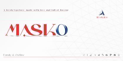 Masko is a very versatile font.perfect for magazine images, to wedding invitations, to branding, poster design, and more. Files included: Masko Family Masko Outline Numerals & Punctuation Stylistic Alternates & Ligatures PUA Encoded Characters Thanks so much for looking, I really hope you enjoy it and please don't hesitate to drop me a message if you have any issues or queries :)
 - FF Dirtyfax by FontFont,
$30.99 German type designer Fabian Rottke created this display FontFont in 1995. The family contains 2 weights: Regular and Heavy and is ideally suited for film and tv, music and nightlife, poster and billboards as well as software and gaming. FF Dirtyfax provides advanced typographical support with features such as ligatures. It comes with proportional lining figures.
 - Hlad by Tour De Force,
$25.00 Hlad is incised sans serif family inspired by carved Roman letters. Hlad comes in 5 weights – Thin, Light, Regular, Semi Bold and Bold. It is a low contrast typeface, with asymmetric flare serifs and sharp bowl and shoulder endings. Hlad combines elegance of calligraphic endings with stable, solid constructional stems from sans serif group of typefaces.
 - Kingkey by TypeClassHeroes,
$17.00 Kingkey and Kingkey Neue is a serif family comes with Classic and Modern. It's clean and smooth with 9 variable much ligature inside. Suitable to create any branding, product packaging, invitation, quotes, t-shirt, label, poster, logo etc. Feature Uppercase & Lowercase Number & Symbol International Glyphs Multilingual support Alternative Ligature If you need anything else just shoot me message.
 - Ramen Sans by Nina Belikova,
$20.00 Ramen Sans is a friendly grotesque type family with the warmth of serif types and a little bit of the edginess of geometric sans! Designed with body text in mind, it offers 5 weights (and their italics), small caps, tabular figures, fractions, numerators, denominators, and supports the Adobe Latin 3 character set (most western and central European languages).
 - Blop11 by osialus,
$15.00 Blop11 is a geometric sans-serif type family, consisting of 3 weights. Blop11 Bold is inspired by 1800s-style wood, poster typeface. Owing to its rounded terminals, Blop preserves natural organic quality of wood typeface. The Regular and Light versions are contemporary original projects. Blop11 is well-suited to headlines and short text. See also Blop77
 - Figural by ITC,
$29.99Figural is the work of Michael Gills, developed under the direction of Colin Brignall. It is based on an original 1940 design of Czechoslovakian designer Oldrich Menhart. All original characteristics were carefully retained in this distinguished typeface family. Figural is highly legible, making it perfect for both short pieces in advertising text or larger applications in magazines or books. - Neuf by Velvele,
$9.99 Neuf family is an experimental search for new Art Deco letterforms, which are still easy to read and generate some unexpected attention.The distinguishes Neuf favoured by Art Deco and its predecessor Art Nouveau with a modern design touch. The style of Neuf is characterized by geometric shapes and craft motifs with Machine Age imagery and materials.
 - FF Lancé by FontFont,
$41.99 German type designer Joachim Müller-Lancé created this sans FontFont in 1997. The family contains 3 weights and is ideally suited for advertising and packaging and sports. FF Lancé provides advanced typographical support with features such as ligatures and case-sensitive forms. It comes with proportional lining figures. In 1993, FF Lancé received the Morisawa award.
 - FF Call by FontFont,
$41.99 German type designers Maik Ignaszak, Stefan Kisters, and Astrid Koenig created this display FontFont in 2000. The family has 36 weights, (including italics) and is ideally suited for poster and billboards, small text as well as software and gaming. FF Call provides advanced typographical support with features such as ligatures. It comes with proportional lining figures.
 - FF Amoeba by FontFont,
$41.99 British type designer Peter G. Warren created this display FontFont in 1995. The family contains 3 weights: Light, Regular, and Bold and is ideally suited for festive occasions, music and nightlife as well as software and gaming. FF Amoeba provides advanced typographical support with features such as alternate characters and case-sensitive forms. It comes with proportional lining figures.
 - Freud by Juraj Chrastina,
$29.00 Freud is a sans family of 9 weights ranging from hairline to extra bold (also available as a 5 styles Economy Pack). It’s a legible face with straightforward geometry spiced with lovely humanist terminals. Some strokes are cut at an angle to enhance its identity. Freud provides a strong partner both for screen and print projects.
 - Tobi Pro by RodrigoTypo,
$15.00 Tobi Pro - the new version of Tobi "the previous year" - is a geometric typographic family with an organic touch. Contains 7 fun variants, shadows, dingbats and effects for the Heavy variant, also has OpenType alternatives in all its variants. Tobi is a perfect typeface for posters, packaging, logos and any visual communication application inherent to children and youth designs.
 - Maison by Milieu Grotesque,
$99.00 Maison is a mono-lined grotesque constructed using rigid elements to achieve a minimalist industrial feel in homage to the early twentieth century modernist design concepts.Originally created as a mono-spaced typeface family—with less optical corrections than its successor Maison Neue—Maison has been further developed to work equally in both mono-spaced and proportional alignments.
 - Concavex by Ingrimayne Type,
$9.00 ConcavexCaps is a whimsical bold display typeface family in three styles that are designed to used in layers. It is caps-only, with the upper-case and lower-case keys differing for the BCGKRS characters. Horizontal elements of the letters are straight and vertical elements are curved, flaring either in or out. ConcaveWarp is a distorted form of ConcavexCaps.
 - Pasta Script by Just in Type,
$25.00 The Pasta Script Family is a delicious script typeface inspired by the Italian spaghetti movement. For display use on every kind of support, choose between Spaghetti or Spaghettini according to the size of your text, and if Fettucine is your choice – get pleased by it’s generous curves. The Cuccina Dingbats are free to use on any kind of work =)
 - BF Girando Pro by BrassFonts,
$39.99 Girando is the traditional book typeface with distinctive personality and a contemporary twist! Inspired by the everlasting ideas of Claude Garamond, it impresses with many fine details and an elegant shape – viable not only in small sizes. The family includes 2 harmonic weights, true italics, small caps, old style and lining figures and pretty as well as useful ligatures.
 - Sumptuous by Locomotype,
$15.00 Sumptuous is a classic sans-serif family that combines geometric and humanist shapes. It comes in 14 weights, 10 uprights and 10 italics. Each weight includes OpenType features such as standard ligatures, directional ligatures, tabular figures, fractions and more and also extended language support. Suitable for magazines, headline, body text, logo, poster and other graphic design projects.
 - Dottie by Ingrimayne Type,
$12.95 Dottie is based on a matrix of dots. It was inspired by the output of old, cheap, dot-matrix printers. In addition to Dottie-Regular with round dots, the family group includes DottieDiamond with diamond dots, DottieSquareTwo with square dots that do not overlap, and DottieSquare with square dots that overlap to create horizontal and vertical bars.
 - Buchfraktur by RMU,
$25.00 The late-19th and early-20th century standard blackletter family in Germany, in three weights. To get access to all ligatures, it is recommended to activate both Standard and Discretionary Ligatures. You find the round s on the # key, and by typing the combination N-o-period and activating the OT feature Ordinals you get the numero sign.
 - Cataneo BT by Bitstream,
$29.99 Cataneo was designed at Bitstream by Richard Lipton and Jacqueline Sakwa and was initially released in 1993. Cataneo is an elegant chancery cursive typeface, inspired by the work of Bernardino Cataneo, a 16th-century Italian writing master. Cataneo offers as companions, typographer sets of swash characters and extensions to round out the family of three weights.
 - Aftika by Graphite,
$18.00 Aftika is a clean geometric sans serif family of seven weights. Characterised by a prominent x-height, it is well suited for advertising, packaging, editorial and publishing, logos, branding, posters, billboards, signage as well as for small text for print or digital screens. There is a soft edged version of Aftika as well, called Aftika Soft.