10,000 search results
(0.112 seconds)
- Wolvercote by Greater Albion Typefounders,
$14.50 Wolvercote is one of two new ‘Masthead’ typefaces from Greater Albion. This Victorian inspired face makes the construction of ribbon or cartouche banners and mastheads the simple work of a few moments. Wolvercote is also particularly designed to complement our Wolverhampton and Mexborough families.
 - Resotho by Glukfonts,
$10.00 Resotho is a geometric sans serif (uppercase) family. It comes in 18 weights, 9 uprights and 9 italics. Perfect for graphic design, branding, packaging design but very versatile. Language support covering Western, South, and Central Europe. The Extralight & Extralight Italic weights are free of charge.
 - FF Papertape by FontFont,
$41.99 German type designer Matthias Jordan created this display FontFont in 2000. The family contains 4 weights and is ideally suited for music and nightlife, poster and billboards as well as software and gaming. It comes with proportional lining, tabular lining, and tabular oldstyle figures.
 - Minion 3 by Adobe,
$35.00Minion is a contemporary type family created by Robert Slimbach and released by Adobe Originals. Since its earliest release, Minion has proven to be a versatile typeface for text and display, used widely in books and in editorial design where readability and elegance are necessities. - Chromota by Kulturrrno,
$7.00 Chromota is a modern sans-serif typeface with asymmetric glyph design. The family consists of 2 styles, a regular and a rounded, each with matching italics. It contains an extended Latin glyphs set and a basic Cyrillic set. Chromota is great for logos, branding, headlines.
 - Bettendorff by Greater Albion Typefounders,
$14.50 Bettendorff is one of two new ‘Masthead’ typefaces from Greater Albion. This 1900’s inspired face makes the construction of ribbon or cartouche banners and mastheads the simple work of a few moments. Bettendorff is also particularly designed to compliment our Spargo and Mexborough families.
 - Linex Sweet by Monotype,
$29.99Linex Sweet was designed by Albert Boton in the late 1990s. It's a smallish family of three weights; the middle weight has an italic companion face. With its soft corners and slightly quirky head-serifs, Linex Sweet is a friendly design that sees much use. - RM Tubes by Ray Meadows,
$19.00 This is an unusual family of 3D designs that will add impact to your design. Due to the modular nature of this design there may be a very slight lack of smoothness to the curves at extremely large point sizes (around 100 pt and above).
 - Prego by Tour De Force,
$25.00 Prego is small family with a lot of charm packed in 3 weights – Light, Regular and Bold. High contrasting design combined with simple and elegant shapes equipped with OpenType features (Swashes, Stylistic and Contextual Alternates, Fractions). Supports extended Latin character set and Cyrillic as well.
 - Moldr Thai by Deltatype,
$59.00 Moldr Thai, a sans-serif with modular grid structure with Thai script, inspired from handmade letter to industrial machine mold, Moldr come with 9 weights in complete family, Support many language with standard Adobe Lain 4 glyphs, world-ready and mark2mark support, especially Thai script.
 - Bertolessi by Greater Albion Typefounders,
$12.50 Bertolessi is a Roman face made fun, with a healthy dose of filigree curves thrown into the mix. It's an ideal compliment to our extensive Bertoni family, but can be used anywhere a bit of humour and flair is required. Get with the curls!
 - Fat Albert BT by Bitstream,
$50.99 Ray Cruz releases another typeface family, this time inspired by 1970's pop culture. Fat Albert Regular, Outline and Shadow are bold poster types that evoke the fun and funk of an era gone by. Go on bro, get Fat Albert and get down.
 - Kid Knowledge by 38-lineart,
$6.00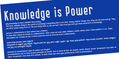 Kid Knowledge is a striking family. It includes 5 amazing styles which can be combined perfectly, giving you the opportunity to create multiple unique designs in an instant. It was inspired by children’s science projects and will give a playful touch to your designs.
 - Fajny by Edyta Demurat,
$22.00 Fajny is a hand drawn typeface. The family is available in 12 weights. Fajny has upper and lowercase characters with up to three alternate glyphs. Build in OpenType Contextual Alternates feature will automatically set alternate glyphs depending on frequency of appearance of the same character.
 - FF Motive by FontFont,
$29.99 German type designer Stefan Hägerling created this display FontFont in 1995. The family contains 3 weights: Light, Regular, and Bold and is ideally suited for music and nightlife. FF Motive provides advanced typographical support with features such as ligatures. It comes with proportional oldstyle figures.
 - FF Craft by FontFont,
$41.99 Slovakian type designer Peter Bil'ak created this display FontFont in 1994. The family contains 4 weights and is ideally suited for festive occasions and music and nightlife. FF Craft provides advanced typographical support with features such as ligatures. It comes with proportional lining figures.
 - Roger by Tail Spin Studio,
$20.00The Roger family was designed in memory of a friend of ours who passed away recently. We created a humorous design for him because he was always laughing and never failed to see the funny side of things. We miss his great outlook on life. - FF Catch Words by FontFont,
$156.99 American type designer Jim Parkinson created this display FontFont in 1996. The family contains 2 weights and is ideally suited for advertising and packaging, film and tv, editorial and publishing as well as poster and billboards. It comes with proportional lining and proportional oldstyle figures.
 - Morning Sweetest by TypeClassHeroes,
$19.00 Morning Sweetest and Morning Sweetest Neue is a Classic feat Modern serif family. It's clean and smooth with 9 variable weight combining the regular and italic and much alternative inside. Suitable to create any branding, product packaging, invitation, quotes, t-shirt, label, poster, logo etc.
 - FF InnerCity by FontFont,
$30.99 British type designer James Closs created this display FontFont in 1994. The family contains 2 weights and is ideally suited for film and tv and poster and billboards. FF InnerCity provides advanced typographical support with features such as ligatures. It comes with proportional lining figures.
 - Tripoca by Panatype Studio,
$9.00 TRIPOCA is a Handcraft Vintage inspired typeface with tropical summer vibes, come with 2 family style ( Regular, Slant ) Plus FREE Illustrations & Borders which is perfect for your designs that want a rough style, modern vintage, tropical, summer and carefully crafted for all graphic design needs.
 - Barnaul Grotesk by ParaType,
$25.00 A text sans serif type family of 8 styles was designed by Natalia Vasilyeva and released by ParaType in 2007. It has narrow proportions, open shapes and can be used in a wide variety of applications — for text setting, for headlines and for display matters.
 - FF Voodoo by FontFont,
$30.99 German type designer Klaus-Dieter Lettau created this display FontFont in 1995. The family contains 2 weights and is ideally suited for music and nightlife. FF Voodoo provides advanced typographical support with features such as ligatures. It comes with proportional oldstyle and proportional lining figures.
 - Aneba Neue by Borutta Group,
$27.00 Aneba Neue is refreshed version of my old type family. It's a geometric sans serif typeface with a clean feel. The low contrast and high x height is perfect for headlines and display purposes. Aneba Neue contains 5 weights in two different styles - Bold & Slanted.
 - FF Chemo by FontFont,
$41.99 German type designer Critzla created this display FontFont in 1997. The family has 11 weights, and is ideally suited for music and nightlife. FF Chemo provides advanced typographical support with features such as ligatures and case-sensitive forms. It comes with proportional oldstyle figures.
 - HARBER by bb-bureau,
$60.00 The name ‘HARBER’ comes from the first letters drawn. It is a sans serif family designed of dots on a grid, that gives it this round and rhythmic aesthetic. Only dots grow, approaching or moving away, changing the aspect of letters but keeping its characteristics.
 - Hercule by Kate Brankin,
$32.00 Hercule is a decorative typeface family in two weights: Light and Medium. The inspiration for Hercule was the fanciful moustache of the great fictional detective Hercule Poirot. The typeface was created by hand. Hercule is ideally suited for headlines, logotypes, decorative and display use.
 - La Rosaleda by Mevstory Studio,
$15.00 La Rosaleda Font Duo is a ligature font pair with 30 amazing chic logo templates. With this open type font duo you can explore your creativity in unlimited way. To recreate your brand all you need is mix and match from the La Rosa font duo. This font duo is full of stylish ligatures, so that your writing with La Rosaleda can stand out. - Font Features: All fonts are OpenType fonts All fonts are fully vector designed Accurate kerning for all serif family Amazing ligatures to look natural in script font Alternative characters for script lowercase alphabets Multilingual Support for Both Scrip and Serif All OpenType fonts, Serif and Script. 30 Fully editable logos for Adobe Photoshop or Adobe Illustrator Font installing help file for PC and Mac Web-fonts for Script and Serif
 - Lektorat by TypeTogether,
$35.00 Florian Fecher’s Lektorat font family is one for the books, and for the screens, and for the magazines. While an editorial’s main goals are to entertain, inform, and persuade, more should be considered. For example, clear divisions are necessary, not just from one article to the next, but in how each is positioned as op-ed or fact-based, infographic or table, vilifying or uplifting. From masthead to colophon, Lektorat has six concise text styles and 21 display styles to captivate, educate, and motivate within any editorial purpose. Magazines and related publications are notoriously difficult to brand and then to format accordingly. The research behind Lektorat focused on expression versus communication and what it takes for a great typeface to accomplish both tasks. In the changeover from the 19th to 20th century, German type foundry Schelter & Giesecke published several grotesque families that would become Lektorat’s partial inspiration. Experimentation with concepts from different exemplars gave birth to Lektorat’s manifest character traits: raised shoulders, deep incisions within highly contrasted junctions, and asymmetrical counters in a sans family. After thoroughly analysing magazine publishing and editorial designs, Florian discovered that a concise setup is sufficient for general paragraph text. So Lektorat’s text offering is concentrated into six total styles: regular, semibold, and bold with their obliques. Stylistic sets are equally minimal; an alternate ‘k, K’ and tail-less ‘a’ appear in text only. No fluff, no wasted “good intentions”, just a laser-like suite to focus the reader on the words. The display styles were another matter. They aim to attract attention in banners, as oversized type filling small spaces, photo knockouts, and in subsidiary headings like decks, callouts, sections, and more. For these reasons, three dialed-in widths — Narrow, Condensed, and Compressed — complete the display offerings in seven upright weights each, flaunting 21 headlining fonts in total. If being on font technology’s cutting edge is more your goal, the Lektorat type family is optionally available in three small variable font files for ultimate control and data savings. The Lektorat typeface was forged with a steel spine for pixel and print publishing. It unwaveringly informs, convincingly persuades, and aesthetically entertains when the tone calls for it. Its sans serif forms expand in methodical ways until the heaviest two weights close in, highlighting its irrepressible usefulness to the very end. Lektorat is an example of how much we relish entering into an agreed battle of persuasion — one which both sides actually enjoy.
 - Orliet Pro by Arttype7,
$15.00 Elevate Your Designs with Elegant Luxury Orliet Pro is a meticulously crafted serif font designed to add a touch of elegance and luxury to your visual creations, especially ideal for enhancing the sophistication of logos. This font stands out for its uniqueness, boasting over 50 ligatures and alternative characters with artistic flair. Its well-designed script optimizes your designs, ensuring a seamless integration into your projects. Key Features: Versatile Ligatures and Alternatives: With over 50 ligatures and alternative characters, Orliet Pro provides a wide range of design possibilities. Each character exudes a unique artistic charm, allowing you to customize your text in a myriad of ways. Elegance in Every Detail: The design of Orliet Pro aims for elegance. The serif style adds a touch of class to your projects, making it perfect for creating logos that exude luxury and simplicity simultaneously. Seamless Font Families: Each member of the Orliet Pro font family complements one another effortlessly. Whether you choose the Orliet Pro script or Orliet Pro icons, they work harmoniously to enhance your overall design. Enhanced Design Flexibility: Orliet Pro script and Orliet Pro icons contribute to the ease of design integration. The script is thoughtfully designed to optimize your creative process, while the icons provide additional elements for a professional touch. Cyrillic Alphabet Inclusion: For an added layer of versatility, Orliet Pro includes the Cyrillic alphabet in regular, italic, bold, and bold italic styles. This ensures that your designs can reach a broader audience with diverse language preferences. Optional Details: Design Concept: Orliet Pro was conceptualized to bring an air of sophistication to your designs, with a focus on creating an elegant and timeless serif font. Creation Inspiration: The font draws inspiration from classic design elements, aiming to provide a timeless aesthetic that resonates with a modern audience. Historical Context: While not a revival, Orliet Pro pays homage to the timeless elegance of serif fonts, adding a contemporary twist to meet the demands of today's design trends. Elevate your designs with the timeless elegance of Orliet Pro. Explore the possibilities of serif and script styles, accompanied by convenient font icons, all seamlessly integrated into one versatile font family. Embrace luxury and simplicity in every character.
 - Black Foroth by Twinletter,
$15.00 Black Foroth is a san serif font with an elegant yet fun relaxed appearance. It differs from other san-serif fonts in its application because it was created by combining serious and relaxed themes, resulting in a font that can give the impression of seriousness while remaining convenient. Use it in your creative projects to get a unique look and feel. This font is perfect for games, sporting events, branding, banners, posters, movie titles, book titles, quotes, logotypes, and more. of course, your various design projects will be perfect and extraordinary if you use this font because this font is equipped with a complimentary font family, both for titles and subtitles and sentence text, start using our fonts for your amazing projects.
 - Good Castyll by Twinletter,
$15.00 Good Castyll is our newest display font, and it has a laid-back, unique feel to it. It was created with a genuine hand touch, so it seems natural when viewed. This font is ideal for adding a touch of class to your creative work. Start creating fantastic projects with this font, and you’ll notice a distinct difference in the way it’s used. This font is perfect for games, sporting events, branding, banners, posters, movie titles, book titles, quotes, logotypes, and more. of course, your various design projects will be perfect and extraordinary if you use this font because this font is equipped with a complimentary font family, both for titles and subtitles and sentence text, start using our fonts for your amazing projects.
 - Weroth by Twinletter,
$15.00 Weroth is a lovely, eye-catching display typeface that will keep onlookers looking at your work. This font is a lot of fun; you can use it for informal or formal occasions, and it’s still adaptable. This font is still great for perfecting any creative project, whether it’s a child, teenager, or adult theme. Don’t wait, start utilizing this font immediately. This font is perfect for games, sporting events, branding, banners, posters, movie titles, book titles, quotes, logotypes, and more. of course, your various design projects will be perfect and extraordinary if you use this font because this font is equipped with a complimentary font family, both for titles and subtitles and sentence text, start using our fonts for your amazing projects.
 - Thang by Fenotype,
$30.00 Aint’ nuthin but the Thang. Thang is a street cred script family with big initial caps and tight flow. Thang is great for flashy headlines or as a logotype. Thang family comes with three weights. Thang Extras is a pack of strokes and dots that can be used to decorate your texts typed with Thang. Thang Extras can also be combined with Thang letters for custom Swash. Thang is packed with several OpenType features: keep on Standard Ligatures and Contextual Alternates for smooth flow. Try Swash, Stylistic or Titling Alternates for alternate characters to create customised lettering works. Check out Glyph Palette for even more alternate characters and go wild the Thang.
 - Choplin by René Bieder,
$25.00 Choplin is a modern and clear geometric slab serif with a sturdy heart. It was designed based on the Campton Family, with the same principles in mind: geometry, simplicity and neutrality. As a consequence, Choplin could be seen as an immediate companion to the Campton Family. However, during the process lots of details were changed in order to sharpen the slab serif character which resulted in a slightly different interpretation. Similar to Campton, it is perfectly suited for graphic design applications ranging from editorial, corporate, web, interaction to product design. In addition, it has an extended range of alternative glyphs, ligatures and opentype features which provide flexibility and uniqueness wherever it is placed.
 - FF Karbid Display by FontFont,
$58.99 German type designer Verena Gerlach created this display and sans FontFont between 1999 and 2011. The family has 10 weights, ranging from Light to Black (including italics) and is ideally suited for advertising and packaging, editorial and publishing as well as logo, branding and creative industries. FF Karbid Display provides advanced typographical support with features such as ligatures, alternate characters, case-sensitive forms, fractions, super- and subscript characters, and stylistic alternates. It comes with a complete range of figure set options – oldstyle and lining figures, each in tabular and proportional widths. This FontFont is a member of the FF Karbid super family, which also includes FF Karbid, FF Karbid Slab, and FF Karbid Text.
 - Bozon by ROHH,
$39.00 Bozon™ is a modern, minimalist geometric grotesk typeface. Letter shapes are crafted with the highest care for proportions and legibility. This clean, sharp sans serif is a great choice for all kinds of modern projects including branding, logo design and display use. Bozon™ family consists of 10 weights with corresponding italic styles, that give total of 20 styles. Italic styles were hand drawn to get sharp and fine letter shapes. The family has extended language support, as well as broad number of OpenType features, such as small caps, case sensitive forms, ligatures, stylistic sets, contextual alternates, lining, oldstyle, tabular, circled and small cap figures, slashed zero, fractions, superscript and subscript, ordinals, currencies and symbols.
 - Departura by Nasir Udin,
$20.00 Departura is a sans-serif family inspired by art deco travel posters in early 20th century, fused with modern & geometric touch. It comes in 18 styles, 9 weights and its matching italics. With those style variatons, Departura offers many possibilities to be applied in many graphic or editorial projects.The modernized retro-look makes this family great to presents any contents related to travel, history & culture in the present/modern way. Also thanks to the extended latin character set so that Departura supports 200+ latin-based languages plus Cyrillic (including the Bulgarian and Serbian characters). P.s.: The Bold Italic & ExtraLight styles are free to download, so you can use them for any projects free of charge.
 - Milanesa Serif by Sudtipos,
$39.00 Serif typefaces have undergone a constant change over time; this has allowed the emergence of modern shapes that bring expressiveness to each letter, making them fun to use and design. Milanesa Serif is a typeface family with seven weights that changes the contrast angle in its black version, achieving a particular transition in the different interpolations. Beyond maintaining the traditional canon in a serif, Milanesa plays with a modern concept to impose its versatility in different graphic applications. Milanesa Serif undergoes a metamorphosis in its weights, intensifying its shapes and varying its counterforms without losing the sense of the typeface family, perfect for versatile uses such as web design, editorial or packaging, among many others.
 - Tremendo by The Ampersand Forest,
$20.00 Tremendo is a gothic sans serif superfamily with a large number of widths and weights that make it a great choice for versatility, clarity, and dynamism. Built with both grotesque and geometric principles in mind, it's remarkably useful for everything from print copy to the largest display applications. If you're looking for a family that will serve your needs, and be noticed Tremendo is it! A note on the name: "Tremendo" is Italian for "too much, insufferable, awful." It's a tongue-in-cheek moniker for a family that's rather monstrous in size and forceful in impact. Give it a try and you'll see that it's much more of a workhorse than it may at first seem to be!