10,000 search results
(0.048 seconds)
- School by Monotype,
$39.00The School font family is a popular design based on a grade school alphabet. The School fonts allow teachers to create custom hand-lettered exercise sheets and classroom signage. Five variations are available. The plain style and its corresponding bold will create hand-lettered stand-alone text. The lined style and its corresponding bold superimposes a set of three guidelines on the plain style. A dashed style is also provided in case a teacher prefers the centerline to be dashed instead of solid. - Wairel by Supfonts,
$14.00 Wairel is a modern serif family with vintage charm, fashionable appearance with a touch of retro Quick access - using the built-in OPEN TYPE functions. Just add "-" or "_" to the letter and instantly get an alternative. This feature works in most applications Font is an open type with clean shapes and precise kerning. It includes ligatures encoded by the PUA. Language support: All European languages Don't forget to subscribe so you don't miss out on the new awesome fonts Dima
 - VVDS Benigne Sans by Vintage Voyage Design Supply,
$14.00 VVDS Benigne Sans is geometric font family consisting of 8 weights ranging from Thin to Ultra Bold with matching italics. Balanced and gently Thin or fat and heavy Ultra Bold, good wide range of widths, which allow use this font not only as a Headers, also as sub-headers or block texts. Also, I love how it looks in infographics. VVDS Benigne Sans is latin-based multilingual and contains all mathematics symbols. OpenTypeFeatures Ligatures, alternates, old style numerals and fractions. Enjoy! VVDS
 - Hillstown by Letterhend,
$13.00 Hillstown Font Family is a font collection that contains three different styles that will perfectly complement each other. You will get script, sans, and condensed sans in a clean and aged version for each style. The classic feel is really perfect when you need a typeface for a logotype, apparel, invitation, branding, packaging, advertising, and more. Hillstown comes in uppercase, lowercase, with punctuations, symbols and numerals, 09 stylistic set alternate, ligatures. There is multi-lingual support and Hillstown is already PUA encoded.
 - Stempel Schneidler LT by Linotype,
$29.99 F .H. Ernst Schneidler, type designer and teacher, originally designed Schneidler Old Style in 1936 for the Bauer foundry. Stempel Schneidler is based on the typefaces of Venetian printers from the Renaissance period and possesses their grace, beauty, and classical proportions. The Stempel Schneidler, a completely reworked and tuned font family made by D. Stempel AG in Frankfurt, is a fine, legible text font that also works well in display. One of Schneidler's more unique features is its question marks.
 - Masheen by Ingrimayne Type,
$10.00 This typeface was inspired by the popular typeface Machine but is not intended to be a copy of that font. It uses straight lines with circles converted to octagons. The Masheen family offers a variety of overlay possibilities to produced multicolored lettering. MasheenConvicted and MasheenFlag can be layered over MasheenBold to produce letters with two colors. The two overlay styles can be placed over MasheenCollege to produce bi or tricolored lettering. Examples are given in one of the font posters.
 - Sonrisa by CastleType,
$59.00 Sonrisa is a design that evolved from my sketches of the skeletal structure of Jakob Erbar’s Koloss, trying to discover its underlying essence without all the contrast and bulkiness of the original design. Sonrisa Thin was the resulting font, from which the other weights of the family were developed. Gentle curves, open counters, generous x-height, and sleekly tapered terminals give Sonrisa a very legible, modern, elegant appearance. When she saw the first draft of this typeface, the smile on my friend Jennifer’s face gave me the idea to call it “Sonrisa” (Spanish for “smile”). Jennifer, a clinical psychologist, described Sonrisa’s personality as: "happy, clean, clear, open, joyful, spacious, playful, calm. I can see it being used for body product lines such as oils and lotions. Can see it being used in home/travel magazines or even Architectural Digest. Yoga magazine, definitely." Sonrisa is what some foundries call a “Pro” typeface family with all the bells and whistles that provide typographic versatility: true small caps, oldstyle numerals, arbitrary fractions, discretionary ligatures, and other powerful OpenType features. All fonts in the family, except Sonrisa Titling, support most European languages, including modern Greek and languages that use the Cyrillic Alphabet. (Cyrillic glyphs designed in consultation with Ukrainian type designer, Sergiy S. Tkachenko.) Sonrisa is available in the original Thin, monoline version as well as six weights (Light, Regular, Medium, Bold, Extra Bold, Black), and a Titling font that is essentially a display font construction kit. If you enjoy using Sonrisa even half as much as I enjoyed creating it, then I know you will have a “sonrisa” (smile) on your face!
 - Gotti by Resistenza,
$39.00 Introducing Gotti. Where Timeless Precision Meets Seventies Flair We are thrilled to unveil our latest creation, Gotti font family, born and meticulously crafted during an inspiring journey to Goteborg. This typeface seamlessly fuses the Bauhaus essence with the spirited vibes of the seventies, resulting in a font that's not just a visual treat but a design experience. Gotti draws its creative fuel from the geometric elegance of the Bauhaus movement, prioritising functional simplicity and razor-sharp lines. However, its design journey doesn't end there. Imbued with the unmistakable energy of the Seventies, Gotti emerges as a font family that encapsulates both nostalgic charm and contemporary boldness. At its core, Gotti boasts a geometric skeleton that has been intricately designed to redefine precision. Ranging from light to black, the weight variations offer a broad spectrum of expressive possibilities. Gotti is perfect for display use, advertising, and branding, it transforms your creative vision into a visual masterpiece. Stand out with confidence, whether it's a captivating logo, a compelling headline, or an unforgettable advertisement. Elevate your brand identity with Gotti. It brings strategic branding to life, communicating sophistication and modernity. Your advertising materials become memorable works of art, leaving a lasting impression on your audience. Curious about the magic Gotti can bring to your designs? Our showcase reveals real-world applications, demonstrating its adaptability and aesthetic appeal. See for yourself how this font family turns ordinary designs into extraordinary visual experiences. Follow us on social media for updates, inspiration, and a glimpse behind the scenes. Have questions or just want to share your thoughts? We're here for you!
 - Natom Pro by Mostardesign,
$25.00 A family of fonts with rhythm. Natom Pro is a modern and geometric font family adapted to the professional requirements of graphic designers, web designers and mobile application developers. Comprised of 19 styles including 8 styles designed especially for the design of headlines, Natom Pro is a very versatile family of fonts that can be used in many projects such as editorial design, branding or corporate identity creation, design of posters or logos, the creation of websites or the development of mobile applications. This font, with a resolutely contemporary aspect, also hides a unique typographic design since it has 2 distinct styles (Title and Roman) which have 2 different typographic rhythms in order to graphically differentiate the appearance of titles, subtitles and long paragraphs. With this design of rhythmically differentiated glyphs according to the styles, the headlines have a very graphic aspect while the long texts have a more classic aspect in order to keep optimal readability in all scenarios. Its architecture is also very modern since it was designed and drawn with particular attention to the geometry of the forms with clear and open endings cut at 90 degrees. The number of styles has also been simplified with the most used thicknesses (Extra Light, Light, Regular, Medium, Bold and Black) in order to speed up your graphic design process. For the more experienced designers, Natom Pro is also available in a variable version. Natom Pro is also equipped with powerful OpenType features like case sensitivity, true small caps, full ligature set, tabular figures for tables, « old styles figures » to elegantly insert figures into your sentences, numbers circled or even alternative characters to satisfy the most demanding professionals.
 - Geometry Script Pro by CheapProFonts,
$10.00 The Geometry Pro family has been designed to be the final word in purely geometric fonts, and this rounded Script sub-family is a nod to the 50s style of connected logomarks. Words set with both the Regular and the Alternate (with its more flourished capitals and alternate stem connections) can be extended by using the underscore character between letters. You can freely mix and match glyphs from both fonts to create a little bit of variety, and finding that perfect combination. For a matching set of capitals (and disconnected lowercase letters): check out the Regular weights of the Geometry Soft Pro family. All the Geometry Pro fonts are strictly geometric (as drawn with a compass and a ruler fixed to 90 and 45 degree angles) but they are not slavishly modular. ALL fonts from CheapProFonts have very extensive language support: They contain some unusual diacritic letters (some of which are contained in the Latin Extended-B Unicode block) supporting: Cornish, Filipino (Tagalog), Guarani, Luxembourgian, Malagasy, Romanian, Ulithian and Welsh. They also contain all glyphs in the Latin Extended-A Unicode block (which among others cover the Central European and Baltic areas) supporting: Afrikaans, Belarusian (Lacinka), Bosnian, Catalan, Chichewa, Croatian, Czech, Dutch, Esperanto, Greenlandic, Hungarian, Kashubian, Kurdish (Kurmanji), Latvian, Lithuanian, Maltese, Maori, Polish, Saami (Inari), Saami (North), Serbian (latin), Slovak(ian), Slovene, Sorbian (Lower), Sorbian (Upper), Turkish and Turkmen. And they of course contain all the usual "western" glyphs supporting: Albanian, Basque, Breton, Chamorro, Danish, Estonian, Faroese, Finnish, French, Frisian, Galican, German, Icelandic, Indonesian, Irish (Gaelic), Italian, Northern Sotho, Norwegian, Occitan, Portuguese, Rhaeto-Romance, Sami (Lule), Sami (South), Scots (Gaelic), Spanish, Swedish, Tswana, Walloon and Yapese.
 - Botanika by Suitcase Type Foundry,
$75.00The motivation behind the Botanika family was the desire to create a text version of the Magion font. Although the glyphs were originally drawn using the same proportions, they were subsequently adjusted in order to improve legibility. The font retains certain characteristics of the original, such as the top serif on the “i” and the similar bottom serif on the “l”. Lowering the x-height lent the family a new and original character. The italics are slightly more condensed than the regular weight, without losing the austere grace of the regular weight. They are distinct enough to stand out in the text. Alternative characters can be selected to spice up the setting, or conversely to subdue headlines by using more traditional letter shapes. Small caps are available as well. The monospace version is a 10 pitch font: at 10 pt type size 10 characters fit exactly into the width of one inch, meaning that individual letters Take up 60 % of an em in width. The family is provided with matching italics. The modifications made during the OpenType transition included the addition of missing glyphs to cover the Suitcase Standard set and adding relevant kerning pairs, plus redrawing the bold weight and the accents. Despite its lower x-height, the font is often used for setting medium to long texts. Its slightly archaic feel lends text set in Botanika an air of novelty, which may be the reason why it is so popular in extensive corporate identity systems. If you are looking for an alternative to the cold, neutral sans serifs which are so popular these days, Botanika is the perfect choice. - Cordel Interior by Ana Cordel Interior Font,
$15.00 Cordel Interior family draws inspiration from covers of 'cordel literature’, - small booklets of popular story-poems that played an essential role on the folk-popular cultural life of Brazil. Printed in coarse paper, usually with an woodcut illustration and lettering in the front, these booklets were sold on the streets, in marketplaces and town squares, hung in a cord - therefore the name ‘cordel’.
 - Grafical by Halbfett,
$30.00 Grafical is a contemporary take on 19th-century sans serifs. In this family, the amount of geometry inherent within the letterforms has been amped up. Many shapes have received further streamlining, too. All the geometric forms you see have been optically corrected, ensuring their delivery of better legibility. Grafical ships in two different formats: depending on your preference, you can install the typeface as two Variable Fonts or use the family’s 16 static OpenType font files instead. The static fonts offer eight weights, running from Extralight through Black. Each weight has an upright and an italic font available. While the static-format fonts offer a good intermediary-step selection, users who install the Variable Fonts have vastly greater control over their text’s stroke width. The Grafical Variable and Grafical Variable Italic font’s weight axes allow users to differentiate between almost 1,000 possible font weights. That enables you to fine-tune your text’s exact appearance on-screen or in print. Grafical is the perfect tool for a range of design uses, including text on the web, text in print, and text in motion graphics. Its fonts are typographic workhorses – not just from their legibility perspective but also because of the amount of OpenType features they include. There are ligatures, for instance, as well as proportional and tabular lining and oldstyle figures, fractions, numbers placed inside circles, and even Roman numerals. Users can also substitute alternate versions of the “a”, “g”, “i”, “j”, “y”, “G”, and “Q” into their work.
 - Harmond by Dirtyline Studio,
$25.00 Harmond a new fresh & modern serif with a strong style, a dancing baseline! So beautiful on invitation like greeting cards, branding materials, business cards, quotes, posters, and more! Harmond Display Typeface is the part of a strong and modern display family. This typeface both impressive at display sizes and easily readable in text size, while the sharp shapes of the triangular serifs and the distinctive letter shapes show their strength in logo design and impressive editorial use. Harmond come with elegant style, strength and contrasts, with features an extended latin character set of 470 glyphs covering over 88 languages. Casta is ready to be like a top model on the design catwalk, making your projects looking classic but contemporary, finely tuned but assertive, and elegant as the best luxury fashion.
 - Wagon by Dirtyline Studio,
$25.00 Wagon a new fresh & modern serif with a strong style, a dancing baseline! So beautiful on invitations like greeting cards, branding materials, business cards, quotes, posters, and more! Wagon Display Typeface is part of a strong and modern display family. This typeface is both impressive at display sizes and easily readable in text size, while the sharp shapes of the triangular serifs and the distinctive letter shapes show their strength in logo design and impressive editorial use. Wagon comes with elegant style, strength and contrasts, with features an extended latin character set of 415 glyphs covering over 87 languages. Wagon is ready to be like a top model on the design catwalk, making your projects look classic but contemporary, finely tuned but assertive, and elegant as the best luxury fashion.
 - CA Zentrum by Cape Arcona Type Foundry,
$40.00 CA Zentrum is a compelling mix of conciseness and pragmatism. Bold, distinct and original, contemporary and versatile. At a closer look, it reveals rounder reading-friendly forms. The choice of weights aims at an easy, straight forward use. A set of five well-balanced weights and three widths ranging from light to black and from condensed to wide. This variety ought to be enough to cover most needs without throwing the typographer into questions. The family’s glyph set supports over 100 Latin languages. With its blend of timelessness and modernity, the type-family is uniquely suited for modern corporate visual languages, websites, corporate design, editorial design and advertising. Careful spacing and a great choice of OpenType features make it especially well suited for text copy and/or editorial design.
 - Storica by Arkitype,
$15.00 Storica is a display typeface with roman style serifs that create a sense of history and culture. The Storica family has 7 weights as well as a Heavy Rough and Heavy Hand version that give you an option for a more rustic or hand style approach to you projects. The character set is expansive and has a wide range of language support. Storica has a great selection of Stylistic alternates, ligatures, small-caps, old-style numbers and more packed into the opentype features. This typeface is an excellent choice for branding, particularly in the beverage industry, it is also perfect for typographic layouts for magazines, poster, books etc. Storica has been designed to make it easy for a designer to create beautiful typography with creative flair quickly and easily.
 - Bodoni Classic Ultra by Wiescher Design,
$39.50 Bodoni Classic Ultra is my really fat, high contrast extension to my ever expanding Bodoni Classic family. The Script cut is very decorative, the italic cut can be mixed with it to give it a calmer touch.
 - HU Blackout by Heummdesign,
$15.00 HU Blackout is a typeface for titles that feels like letters are trapped in a square and has a constant and very narrow inner space. It is composed of three types of family typeface to increase usability.
 - Sursum by TeGeType,
$29.00 Sursum, inspired by the Roman monumental letterform, was designed to provide the possibility to play with the 58 OpenType ligatures and the 25 alternates letters. The Sursum family includes 3 weights, all with the same OpenType features.
 - Keynsia by Greater Albion Typefounders,
$7.95 The Keynsia family revives the spirit of the 1950s. Its simple and elegant lines make for an eye-catching set of display faces. A range of different styles are on offer, all with an extensive character set.
 - Memimas by Type-Ø-Tones,
$50.00 The Memimas family was commissioned in 1991 by the publisher Barcanova, for a digital version of their model for learning how to write. Memimas has two ductus versions for the capitals and a complete set of ligatures.
 - Catalyst by Ryan Williamson,
$- Catalyst is an attempt at increasing the economy of print while retaining optimal legibility through type design. This type family does so through subtle and intentional OpenType features, as well as referencing successful past attempts throughout history.
 - TiredOfCourier by Ingrimayne Type,
$14.95 Courier is the king of typewriter faces. But if you want an alternative, something with a look reminiscent of the older, manual typewriters, consider TiredOfCourier. The family includes true italics, something very unusual in a typewriter face.
 - Lawabo by Schriftlabor,
$30.99 The original Lawabo was started many years ago by Rainer Scheichelbauer. Its minimalistic and rounded shapes are reminiscent of bathroom ceramics, hence the name. Schriftlabor designer Miriam Surányi added bold and italic shapes, and produced the family.
 - Legend Of Christmas by Larin Type Co,
$15.00 Legend of Christmas This is an amazing font family that includes six fonts: serif, serif rough, decor, decor rough, script, script rough style. These fonts are perfectly combined with each other and are suitable for both modern and vintage design. Serf has only capital letters and includes a large selection of alternates, play with them and achieve an amazing design. Script will also look great in vintage and modern design and can be used as an additional or main one, it includes a large selection of alternates for lowercase letters.
 - MollyO by Atlantic Fonts,
$28.00 MollyO font family is based on the original, reliably cool handwriting of illustrator (and dear friend), MollyO of mollyOcards. Like MollyO herself, this font is unique, unpretentious, and beautiful. Part printed and part script, it has the authentic connections and stops of a contemporary, casual font. For the truest handwritten feel, keep discretionary ligatures on, or turn them off where you want more evenness. MollyO is expressive in all-caps, available in two weights, and with effortless warmth and inky flow, will bring a wide range of creative projects to life.
 - Savage Garden by Putracetol,
$24.00 Savage Garden - 3 Quirky Playful Fonts are a delightful trio of typefaces that exude a sense of whimsy and playfulness with their unique and irregular letterforms. This font family includes three distinct versions: clean/regular, decorative, and block/fill, allowing for creative versatility. The fun and playful vibe of this font makes it a perfect choice for child-related themes or baby-oriented designs. It's well-suited for logos, printing materials, branding, quotes, posters, greeting cards, birthday cards, invitations, children's books, and more, adding a touch of joy and creativity to your projects.
 - Sadness by Floodfonts,
$29.00 Sadness is based on some experiments during Felix Braden’s stay at the Trier College of Design: "I played around with Fontographer’s blendfonts-feature (a type design tool to interpolate fonts and to minimize effort and expenditure of large families) with some files from a close designer. Since the basic elements derived from extremely varied fonts without any similarities, the concluding shapes first turned out to be rather fragmentary. From those fragments I chose the most characteristic elements and drew a whole new font." For a detailed type specimen have a look at: http://on.be.net/1CdAZlC
 - Ardone by Hackberry Font Foundry,
$24.95Ardone is a well-modulated humanist serif font family with Garalde roots. A distant ancestor is Minister (a German font designed by Fahrenwaldt in 1929) through my first font, Diaconia Old Style. This first style, book, is slightly condensed and very elegant with thin bracketed serifs. There are many OpenType features with over 600 characters: Caps, lower case, small caps, ligatures, discretionary ligatures, swashes, small cap figures, old style figures, numerators, denominators, accent characters (including CE), ordinal numbers (1st-infinity: lining and oldstyle), and so on. Ardone is designed for text use in body copy. - Atsuka Montreal by Grezline Studio,
$17.00 Atsuka Montreal is a display font family with elegance and luxury aesthetic. It's a perfect use for any fashion design project. This font is accompanied by signature script to make your creation be more appealing and beautiful. Atsuka Montreal font is also usable in a wide range of works such as logos, covers, posters, quotes, product packaging, merchandise, social media and much more! Feature : - A lot of Alternates - Multilingual Language - Works on PC & Mac - Simple installations - Accessible in the Adobe Illustrator, Adobe Photoshop, Adobe InDesign, even works on Microsoft Word.
 - Bergsland Display by Hackberry Font Foundry,
$24.95 This is a display version of a stylized sans serif font family that is very high-waisted and sleek called Bergsland Fashion. This four-font set has a Regular and a Black plus the italics. The stroke is only slightly modulated. The letterforms are higher, with a more open aperture, and sprinkled with breaks to add light and sparkle. This an attempt at a readable sans serif for text. It has many OpenType features and 465 characters per font: Caps, lower case, small caps, old style figures, numerators, denominators, accents characters and so on.
 - Kensmark by BoxTube Labs,
$15.00 "A kensmark is any feature or characteristic that makes someone or something instantly recognizable." Kensmark is a powerful and creative type family with a staggering 45 fonts. Thanks to a wide array of widths and weights it's incredibly versatile and flexible. It's perfect for logotypes, sports branding, posters, apparel design, magazine headlines, labels and so much more. This is by far our most comprehensive font project to date. We are very excited to finally have it released and look forward to see it in action. Caps only fonts.
 - Astrobia by Keristyper Studio,
$9.00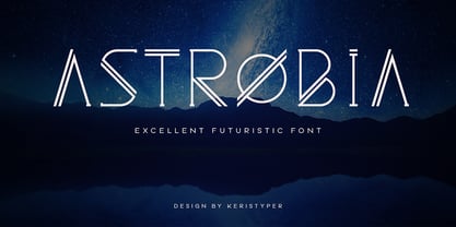 The Astrobia is a modern and futuristic display family with a simple and elegant style. It includes 6 styles in 3 weights, which makes it perfect to create multiple unique designs. Astrobia Font multilingual support: Afrikaans, Albanian, Catalan, Danish, Dutch, English, Estonian, French, Finnish, German, Icelandic, Indonesian, Italian, Malay, Norwegian, Portuguese, Spanish, Swedish, Zulu, and many more. What’s Included : Web Fonts Standard & Multilingual glyphs Ligature Works on PC & Mac Simple installations Accessible in Adobe Illustrator, Adobe Photoshop, Adobe InDesign, and even work on Microsoft Word. Hope you enjoy our font!
 - WerkSerif by Wilton Foundry,
$19.00 We created a serif version of our popular "Werk" Sans Serif that will greatly enhance the Work family of fonts. Like “Werk” Sans Serif, “WerkSerif” is a sturdy, well-tuned font that is a true “werkhorse” with plenty of character without being overbearing. “WerkSerif”is an ideal choice for corporate branding offering a complete typographic solution with the sans and serif range of fonts — also a prime choice for distinctive and dynamic logotype use. “WerkSerif” comes in a range of offerings from Light to Regular, to bold and Black with matching Italics.
 - Autor by Latinotype,
$29.00 Autor is a medium-contrast sans serif font with a dynamic stroke modulation. Its clean look and angled terminals give your designs a ‘sharp’ and contemporary feel. Autor Family comes in 7 weights, ranging from Thin to Black, with matching italics, resulting in a total of 14 styles. Autor is well-suited for editorial design, body text in books and magazines, headers and titles. It can also be used—as a display font—for logotypes, branding, advertising and publishing. The font includes a character set containing more than 400 glyphs that support over 200 languages.
 - Manual by TypeUnion,
$39.00 Manual is an 80 font super family formed of 10 weights in 4 different widths. The font is styled with a slight retro feel to give it a unique appearance. Manual is a blue-collar font that works hard for you and your design ideas. The higher x-height enhances the readability for smaller, more informative text sizes whereas the black weights create beautiful, impactful headlines to fit a variety of spaces. The support of the expansive weights and widths will give your design a truly unique feel.
 - Bassidle by Josstype,
$24.00 Bassidle Font is a sans serif font family that is simple but strong, defined by sharp edges with a modern touch. It is designed to exude a sense of strength and toughness as well as optimal readability. t’s a perfect choice for branding, magazines, posters, advertising, packaging, headlines, logos, web, print etc. 14 styles: 7 uprights and matching italics. 222 glyphs. Latin based languages. OpenType features, including ligatures. OTF, TTF files. Variable Font Includes. Thank you for your purchase! and please let me know if you have any questions. via email: joelpopon@gmail.com
 - Kaleko 205 Round by Talbot Type,
$19.50 Kaleko 205 Round is a rounded variation of Talbot Type font Kaleko 205. It's a well-balanced, versatile, modern sans, highly legible as a text font and with a clean, elegant look as a display font at larger sizes. The rounded terminals give it a friendly, approachable look. The Kaleko 205 Round family comprises of six weights and is closely related to Kaleko 105 Round. The most notable differences between the two variations are the two-storey lower case a and g in Kaleko 205 Round, where they are single-storey in Kaleko 105 Round.
 - DR Krapka Square by Dmitry Rastvortsev,
$29.99 In the DR Krapka Square typefamily, the pixel has a square shape. The font supports OpenType features and contains small capitals, ligatures, oldstyle figures, terminal forms, historical forms, stylistic sets. The dingbats, arrows, emoji are also present. For small texts, it is recommended to use DR Krapka Square-FontSize10px in the font size 10 px. DR Krapka Square typefamily supported European languages based on Latin, Cyrillic and Greek scripts. If you want to use fonts with a different shape of pixels, there are also typefaces from DR Krapka family: DR Krapka Round, DR Krapka Rhombus.