6,430 search results
(0.019 seconds)
- Virus by Chris Costello,
$22.75 This design was inspired by a laser printout of a corrupt font. I designed the entire character set from a strain of seven infected letters. Virus is surprisingly legible in spite of its distortions so let your imagination run loose with this one.
 - Notably Absent by Ali Hamidi,
$10.00 Notably Absent is a cool and fun styled display font. It will elevate a wide range of crafting ideas, from cards, to branding, labels and much more. Add it confidently to your favorite creations and let yourself be amazed by the outcome generated.
 - Balencia by Mchcrafter,
$18.00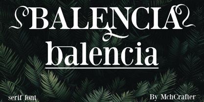 Balencia is an assertive and authentic serif font. It is PUA encoded which means you can access all of the amazing glyphs and ligatures with ease! Add it confidently to your favorite creations and let yourself be amazed by the outcome generated.
 - Murisa Mondriana by Murisa Studio,
$10.00 Mondriana is a cool and modern looking sans serif font. It will elevate a wide range of crafting ideas, from cards, to branding, labels and much more. Add it confidently to your favorite creations and let yourself be amazed by the outcome generated.
 - Aterline by AEN Creative Studio,
$15.00 Aterline is a simple but elegant slab serif font family. It will elevate a wide range of crafting ideas, from cards to branding, labels, and much more. Add it confidently to your favorite creations and let yourself be amazed by the outcome generated.
 - Explora by TypeSETit,
$24.95 This formal calligraphic face is light, and delicate with beautiful lines and curves. The Pro version adds extra elegance with alternate caps and beginning and ending swashes. Explora has over 600 glyphs and features international languages including the entire Cherokee Nation character set.
 - Kyrial Sans Pro by Mostardesign,
$- Designed in 2011 by Olivier Gourvat, this font family has generous proportions with a range of weights make it a versatile family for print, text, signage, branding and web design work. Kyrial Sans Pro offers lots of OpenType goodness and broad language support.
 - Haboro Contrast by insigne,
$- Meet Haboro Contrast, the stylish little sister of the Haboro hyperfamily. While built from the same clean, geometric shapes of Haboro Sans, this new addition has been rebalanced for elegant performance with her high-contrast sans letterforms and has been adjusted to provide the greatest impact for each weight. It's a personality all her own, gentle in approach yet refined and modern with a confident appearance. Capitalize on Contrast's style with OpenType features, too. Packed with options like OpenType ligatures, stylistic sets, fractions, crafted small caps and old-fashioned figures, this font will keep your work fresh and attractive. If you need even more combinations for the right statement, use the entire Haboro hyperfamily and create the right balance to capture your reader's eye. Haboro Contrast (along with the rest of the Haboro family) has been tested for the web and is ready for use in both print and digital applications. Designed to serve as a display character for such publishing projects as magazines and company brochures, Contrast gives you comfort in having a great amount of versatility in the fonts you rely on. It's a prime example where high contrast simplicity lends itself to achieve excellent design results.
 - Edita by TypeTogether,
$49.00 Edita is a gentle typeface, humanistic in concept yet with a contemporary feel, where softness and fluidity play a very important role. This can be seen especially in its italics, which are loosely based on handwriting. This book typeface family is intended to be used in books where text is set together with photographs and other graphic elements. However, Edita is a general book typeface, versatile enough to be used in many other contexts, from novels to promotion material. Edita’s large character set, covering most languages which use Latin script, and styles give the designer the possibility to work with a big typographic palette, allowing complex typesetting with several levels of information. This is further enhanced by the two optically corrected weights Edita Small and Small Italic. They have been particularly designed for their use in very small type sizes, such as in captions and notes. They differ in having a slightly bigger x-height, heavier stems, reduced contrast, and carefully drawn ink-traps to ensure legibility at sizes as small as 5 pt. Additionally, their extenders are shorter to save space which allows text to be set with tighter leading.
 - Romp by Positype,
$30.00 With all ego aside, Romp was designed and influenced by my daughter, Angel. For some time now, she has wanted me to design a font based on her handwriting. But each time I sit down to do it, I run into more that she needs to do and redo. On a recent attempt, I ran into the same situation again. Instead of moving on to something else, I decided to whip out a sumi brush and start making letters...for me, type design is something a little ‘serious’ and never a time to just have fun. This typeface proved that notion wrong—it really was fun. As a result, each letter encouraged another and the design grew...and grew! The happy result spawned 3 separate sets of letters & numerals (small caps and some ligatures too!). Using the beauty of OpenType, these 3 sets have been fused into one, randomly generating font set. If you are using any type of OpenType enabled application, then the Romp Pro typeface is the way to go. They include everything found in the 3 separate variants for each style as well as entirely expanding offering of additional small cap and ligature sets.
 - Moho by John Moore Type Foundry,
$40.00 Moho is a broad family of types inspired by the burgeoning modernism of the early twentieth century. Moho introduces an unconventional style in the form of his glyphs which aims to impregnate the text compounds thus a distinctive aesthetic sobriety and elegance while creating a flow of practical reading. The Moho family consists of a wide range of various weights. Thought for innovative text composition, Moho covers all shades of Medium, Regular, Light, ExtraLight to delicate Thin. Moho has a square shape letter style, provided with a competent OpenType programming for Moho OT family and basic functions for Moho Std family. Among the family characteristics OT has features such as small caps for letters and numbers, stylistics alternates, swash letters where "t" is extend over others, giving the typeface that particular style ideal for headlines, ligatures for pairs and triplets of letters, fractions and ordinals. In addition, each comes with its weight set italics. Moho has a character set to compose texts in European languages of east and west with over 600 glyphs. Moho is a letter in resonance for general topics like sports, art. technology trends, fashion, tourism and transport. There exist two groups of Moho Family OT = Full OpenType Features and full set of glyphs Std= Basic OpenType Features and less glyphs
 - Rougon by VanderKeur,
$30.00 The reason for Nicolien van der Keur to design the Rougon font was the translation of twenty novels written by Emile Zola, a French writer, and translated by Martine Delfos. It follows the lives of the members of the two titular branches of a fictional family living during the Second French Empire (1852–1870) and is one of the most prominent works of the French naturalism literary movement. This series deserved a font with French roots and corresponded to the period in which Zola’s books were written and published, the period between 1870 and 1893, the end of the nineteenth century. Extensive research into French historical typefaces has led to a type specimen from the French type foundry Deberny et Cie in Paris around 1907. It turned out to be good and helpful source as it contained a sample of a typeface that reflected the content and style of the novels, but also represented the period in which the books were written in France. A large part of the novels are about the generations of Rougon, so it seemed a natural choice to give the font that name. It is available in one weight and contains stylized portraits of Emile Zola and the French Marianne. This font also contains various ornaments.
 - FF Kievit Serif by FontFont,
$68.99 FF Kievit Serif subtlety melds oldstyle design traits and a 21st century mien into a clean, straightforward suite of typefaces. As part of the FF Kievit super family it helps brands carry their voices effectively and legibly. This includes small text to display sizes, in both print and digital environments, for internal and external audiences. FF Kievit takes inspiration from classic designs like Garamond and Granjon, and is available in seven weights, plus italics. Drawn as a collaboration between Michael Abbink, Paul van der Laan, FF Kievit Serif is a natural extension to the other members of the FF Kievit super family, that also includes FF Kievit and FF Kievit Slab. FF Kievit Serif stands on its own as a multi-talented and exceptionally legible design. Large counters, a generous x-height and ample apertures ensure that FF Kievit Serif translates well to both hardcopy and interactive environments. FF Kievit Serif is available in carefully defined weights, ranging from Light to Black. The Regular, Book and Bold weights are ideally suited to long form text copy. Ligatures, several suites of numbers and small caps are also available. In addition, FF Kievit Serif benefits from the same extensive language support of the other designs in the family.
 - ATF Poster Gothic by ATF Collection,
$59.00 ATF Poster Gothic is an expansion of a typeface designed in 1934 by Morris Fuller Benton for American Type Founders. The one-weight design was a slightly condensed display companion to Benton’s ubiquitous Bank Gothic family. This new family of aggressively rectilinear headline types expands the design’s possibilities, offering 30 fonts. The all-cap design sports square corners in the counters, creating tension between angular and curved details; this feature, and the generally rectangular shape of the whole alphabet, makes ATF Poster Gothic distinctive on the page or screen, while its relationship to Bank Gothic makes it seem somehow familiar. Vertical strokes on the C, G, J, and S, as well as on several of the numerals, are cut off at an angle, which suggest the curves those strokes might typically display if the characters were less boxy in design and more along the lines of late-19th-century headline faces. Certain weights also recall the style of lettering used on athletic team jerseys, television crime dramas, action & adventure movie titles, and engraved stationery. With three widths and five weights, ATF Poster Gothic is distinctive and versatile at the same time. The full family is also available in a “Round” version, with corners subtly rounded for a softer, more “printed” feel.
 - WolfieBoy - Unknown license

- RAN by URW Type Foundry,
$35.99 RAN Reformed Typeface for Beginners by Georg Salden - a headstrong and courageous approach to an improved handling of handwriting. Diverse and sometimes irreconcilable theories exist about how beginners are supposed to learn writing and reading. This has led to fierce discussions among experts already. We don’t want to pour more oil on the fire, but hope to create a new awareness for this topic, which is important to everyone of us. For beginners the combination of single characters (sounds) to whole words is essential during the acquirement of reading and writing. In this process they develop the skill to recall entire terms from memory. Therefore, after current practice, every word shall be written in a single stroke without lifting the pen in between. Georg Salden contradicts this postulate and warns, that coercively holding the pen down within a word can easily lead to exaggerated loop formations and a general meandering of the written text. The intellectual process in connecting single sounds to words while writing would happen anyway and the prohibition to lift the pen would often lead to tensions. To still support the necessary connections in general and to simplify the connecting, he teaches to write all round letters like a, e, g, o with inclusion of the connecting stroke, so that the spacing and combining with the next character arise by themselves. By settling the stroke at certain points and with a clear and logical writing method, a conscious and careful contact with the various strokes arises. All this automatically leads, together with a certain deceleration, to an increase of beauty and readability in the handwriting. The repeatedly discussed topic »connected or unconnected« appears to be solved in the most comfortable way as, depending on the particular character combination, both solutions are possible.
 - Textus Receptus by Lascaris,
$60.00 Textus Receptus is a historical revival based on the Roman and Greek types used by Johann Bebel (and later also Michael Isengrin) in Basel in the 1520s. The Roman is a low-contrast medium-to-heavy Venetian reminiscent of Jenson or Golden Type. The unusual polytonic Greek, not previously digitized, is lighter in weight and supplied with all the ligatures and variants of the original. Yet when used without historial forms the Greek has a surprisingly contemporary feel: it’s quirky and playful as a display face, but still easily legible in running text. Bebel’s Greek extended and refined the one used for the first printed Greek New Testament, Desiderius Erasmus’ Novum Instrumentum Omne, published in Basel in 1516 by Johann Froben. The name of the font was chosen in honor of this edition, which was so influential that it was later called the Textus Receptus (the “received text”), serving as the basis for Luther’s German Bible in 1522 and much subsequent scholarship for over 300 years. Following 16th century practice, Textus Receptus contains 130 ligatures and stylistic alternates for Greek, accessible either with OpenType features or with five stylistic sets. The Greek capitals, often printed bare in early editions, have been equipped with accents and breathings for proper polytonic or monotonic typesetting. The Roman includes both standard and historical ligatures along with the abbreviations and diacritics typically employed in early printed Latin. For expanded language coverage it has the entire unicode Latin Extended‑A range and part of Latin Extended-B. The capital A is surmounted by a horizontal stroke, as in some 16th century Italian designs, and the hyphen and question mark have both modern and historical form variants. Mark-to-base positioning correctly renders fifty combining diacritics, and with mark-to-mark positioning the most common diacritics may be stacked, permitting, for example, accents and breathings on top of length-marked vowels. Numerals include old-style, proportional lining and tabular lining. For further details, please download the 31-page Textus Receptus User Guide.
 - Berganza by Cuchi, qué tipo,
$9.95 "Berganza" is a typeface designed as a tribute to the spanish century called "Siglo de Oro". Embellished with several ornaments and swashes, it quickly reminds an age in which castilian arts & letters were flourished, as well as the fantasy knighty fables adventures of heroes, loved ladies and evil villains. Although the Siglo de Oro cannot be set in specific dates, it is generally considered to have lasted more than a century; between 1492, the year of the discovery of America and 1681, the year in which the writer Pedro Calderón dela Barca died. Lope de Vega, Francisco de Quevedo, or even William Shakespeare (in England) are also famous figures of this time. Berganza typeface takes its name from the main character of the picaresque novel "The Conversation of the Dogs" (Cervantes, 1613). Berganza is able to speak with the other dog Scipio on a big number of social & philosophical topics. Talking about technics, Berganza is a modern typeface but with a humanist flavour. Thanks to its various styles and flourishes, it immediately refers to the culteranism aesthetic of that time, whose aim was to elevate the noble over the vulgar. But also, Berganza takes advantage of the contemporary technology, highlighting in his drawing the contrasted forms and certain broken and unusual strokes in order to give it a brave and different style touch. Berganza includes four weights to be used for continuous reading with great visual richness. However, it is more recommended for large sizes, since its unusual and particular details appear when the letter grows. Finally, the hundreds of glyphs and Opentype features that it has incorporated, allow us to change the aesthetics of the type according to our needs. OPENTYPE FONT 518 CHARACTERS 1113 GLYPHS 4 INSTANCES (Regular, Bold, Italic & Bold Italic) 38 LANGUAGES 28 LAYOUT FEATURES (stylistic sets, ligatures, historical ligatures, swashes, contextual alternates, numerals, etc) DESIGNED BY CARLOS CAMPOS IN 2021 www.cuchiquetipo.com Dummy text from wikisource.org («Rinconete y Cortadillo», by Miguel de Cervantes).
 - NudE - Unknown license

- Goombah by Cool Fonts,
$24.00 Goombah is a cosmic journey to those cheezey cartoons of the early 60's. It can be used for a modern look or a retro look. It comes in 3 styles: regular, outline and generator (which has a filled outline with a space between).
 - Ghost Zone by Sakha Design,
$12.00 Ghost Zone Is a fun, quirky, and spooky decorative font. This font is PUA encoded which means you can access all of the glyphs and swashes with ease! Add it confidently to your favorite creations and let yourself be amazed by the outcome generated.
 - Angela by Sealoung,
$25.00 Angela is a modern, bold and highly detailed serif font. This font is PUA encoded which means you can access all of the amazing glyphs and ligatures with ease! Add it confidently to your favorite creations and let yourself be amazed by the outcome generated.
 - Jambo by Hanoded,
$15.00 Jambo ('hello' in Swahili) is a cute and bouncy typeface. I guess you can say that it is didone-ish in nature, but comic would also be an apt description. Jambo has generous curves, swirls and curls and comes with a jumbo amount of diacritics.
 - Albany by Monotype,
$29.99Albany, from Monotype Imaging, is a typeface family whose fonts have the same metrics as Arial. However, in contrast to Arial or Helvetica, Albany's letterforms are more open, with more generous apertures and counters. Also, punctuation is not square, as in Arial, but round - Baseface by Attractype,
$9.00 Baseface is a sans serif font family with a basic shape, simple and clean design. With a choice of six font styles, it is suitable for various typography designs, general text, text effects, logos, web pages, lettering, laser cutting, t-shirt design and others.
 - Indy Italic by ITC,
$29.00Indy is the work of Chicago-based lettering designer Charles Hughes. The lowercase letters link together to evoke the look of true handwriting and complement a generous and graceful capital alphabet. Indy is a refined handwriting script ideal for anything needing a touch of elegance. - Digby by Atlantic Fonts,
$26.00 Digby is friendly, honest and active. Digby family includes twelve hand-drawn fonts. They work well together, in fact Digby Line Thin fits nicely over Digby Regular. All have a generous set of double letter ligatures and are designed to work great as all-caps.
 - P22 Grosvenor by IHOF,
$24.95 Grosvenor is part of the Staunton Script Family of fonts designed by Ted Staunton for his historic novel centered around a family bible and the handwritten annotation through seven generations. The Grosvenor font is a loose script based on copperplate writing circa late 1800s.
 - Good Father by Andrey Font Design,
$9.00 Good Father is a cool, bold and modern display font. This font is PUA encoded which means you can access all of the amazing glyphs and ligatures with ease! Add it confidently to your favorite creations and let yourself be amazed by the outcome generated.
 - Zesty Lime by Hanoded,
$15.00 Zesty Lime is a condensed typeface, hand made with a small brush and China ink. Zesty would look good on book covers, posters and packaging - but I guess you're not limited to those three options. Just enjoy! Comes with a generous squeeze of diacritics.
 - Anayu by Rashatype,
$11.00 Anayu is an elegant, whimsical and uniquely shaped lettered handwritten font. This font is PUA encoded which means you can access all of the glyphs and swashes with ease! Add it confidently to your favorite creations and let yourself be amazed by the outcome generated.
 - Revelio by ArimaType,
$14.00 Revelio is a cool, bold, retro-styled display font. This font is PUA encoded which means you can access all of the beautiful glyphs and swashes with ease! Add it confidently to your favorite creations and let yourself be amazed by the outcome generated.
 - Quixotic Sans by Roland Hüse Design,
$25.00 Modern sans-serif font with an edge. Clean lines and sharp angles offer a contemporary feel while its generous x-height ensures clarity and readability. Quixotic Sans is perfect for headlines and logos, this font adds a professional and stylish touch to any project.
 - Spooky Place by AEN Creative Studio,
$15.00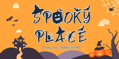 Spooky Place is a cool and quirky halloween display font. This font is PUA encoded which means you can access all of the glyphs and swashes with ease! Add it confidently to your favorite creations and let yourself be amazed by the outcome generated.
 - Jetblack by Tigade Std,
$35.00 Midnight is a cool, bold, and thick lettered sans serif font. It will elevate a wide range of crafting ideas, from cards, to branding, labels, and much more. Add it confidently to your favorite creations and let yourself be amazed by the outcome generated.
 - Peanut Gallery NF by Nick's Fonts,
$10.00Every type library needs a generic, comicbook-style “POW!” font, and this one is ours. Breezy, bouncy and bold, it’s the perfect choice for rock-em, sock-em headlines. Both versions of the font include 1252 Latin, 1250 CE (with localization for Romanian and Moldovan). - M Computer PRC by Monotype HK,
$523.99 PRC series fonts are in Unicode encoding and consists covers GB 2312 character set. It conforms to GB12345 standard. The character glyphs are based on the regular simplified Simplified Chinese writing form and style. It is generally used in China Mainland PRC and Singapore.
 - Paragraph by Paragraph,
$12.00 This decorative, headline or logotype geometric font consists entirely of lowercase letters. The glyphs of uppercase are rounder than their lowercase counterparts, allowing playful interaction within words, contrasting round and square shapes. The font is the result of a new identity development for Paragraph.
 - Black Thunder by Letterafandi Studio,
$14.00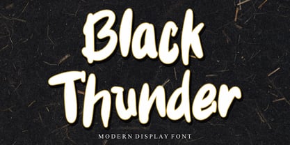 Black Thunder is a Modern and friendly brushed display font. This font is PUA encoded which means you can access all of the glyphs and swashes with ease! Add it confidently to your favorite creations and let yourself be amazed by the outcome generated.
 - Mousony by Sakha Design,
$12.00 Mousony is a bold, vintage styled and thick lettered slab serif font. It will elevate a wide range of crafting ideas, from cards, to branding, labels and much more. Add it confidently to your favorite creations and let yourself be amazed by the outcome generated.

