3,597 search results (0.049 seconds)
  1. Gentleman by Juraj Chrastina, $29.00
    Gentleman font is a sans-serif font family of 10 weights – from hairline to black – designed by Juraj Chrastina. It is a legible typeface with clear geometry and spiced with nice humanist terminals enhancing its identity. We think Gentleman name suits perfectly to this family because of its beautiful outlines and elegant letterforms yet looking tight, compact and with own presence. Gentleman is surely a good choice both for screen applications and print media. Its multipurpose spreads over poster design, logos, headlines, body texts, stationery and back labels. Also very good for books, magazines and newspapers – an excellent choice even for small text size.
  2. Gentleman Caller - Unknown license
  3. Gentlemens Script by Piñata, $15.00
    Gentlemen’s Script is a dynamic hand-written script in which the sharpness and speed of writing harmoniously coexist with elegance and a serious attitude. The script allows you to simulate fast inscriptions made by hand while keeping them elegant and classy. Working on the project, we wanted to develop a script that would harmoniously complement serifs or traditional sans-serifs and perfectly match them. Gentlemen’s Script is like an accessory in a gentleman’s wardrobe. It dilutes font traditions and adds brightness and dynamics to them. Despite the fact that the script was designed to be used as a complementary font, it has all the prerequisites to become the main character of your design story. It does not matter how you use it—Gentlemen’s Script easily adapts to reality and always works at the maximum level of efficiency. To make the script more harmonious and natural, we have drawn more than 60 ligatures. In order for the ligatures to be substituted automatically, we recommend always keeping the standard ligatures OpenType feature turned on! In addition, there are several alternative characters in the font that are programmed on the OpenType feature contextual alternates and which are used when the letter meets the service characters. To use the script to its maximum power, we recommend that you always keep the standard ligatures and contextual alternates OpenType features turned on. If you do not have access to applications that support OpenType features, it does not matter—even without these features you can use and enjoy our font!
  4. Museo 300 - 100% free
  5. lelim 200 - Personal use only
  6. lelim 300 - Personal use only
  7. Impossible - 500 - Unknown license
  8. Skylab 600 - Personal use only
  9. Zoo 300 by Green Type, $37.00
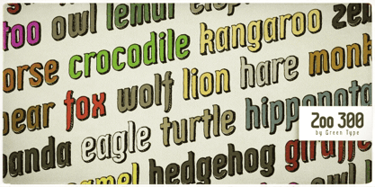
  10. Modern 880 by Bitstream, $29.99
  11. Dutch 801 by Bitstream, $29.99
  12. Dutch 809 by Bitstream, $29.99
  13. Calligraphic 810 by Bitstream, $29.99
  14. 500 Guitars by Rocket Type, $14.00
    A chunky, whimsical number that strikes just the right chord for modern and retro projects. Loaded with stylistic alternatives, ligatures and Vietnamese support.
  15. Roanne by Tour De Force, $25.00
    Roanne is a sans serif family named after a town in France. This font family contains 2 width variations: Normal and Condensed, and all together counts 44 font styles. Equipped with OpenType features (Tabular Figures, Fractions, Stylistic Alternates, Localization for Serbia, Poland and the Netherlands, Case Sensitive brackets) for extended Latin and Cyrillic character set with a small charming set of Dingbats. For easier usage as webfont, Roanne font files contain numeric values for CSS weight attribute – 100, 150, 200, 300, 400, 500, 600, 700, 800, 850, 900.
  16. Yoon Gothic 700 by Yoon Design, $400.00
    YD Gothic 700 is a modern sans serif typeface consisting of 9 weights. It supports up to 13 different languages such as English in Latin and other scripts
  17. Base 900 Sans by Emigre, $49.00
  18. YD Myungjo 500 by Yoon Design, $400.00
  19. Zapf Calligraphic 801 by Bitstream, $29.99
  20. YD Myungjo 200 by Yoon Design, $400.00
  21. Sequel 100 Black by OGJ Type Design, $35.00
    Sequel 100 Black is a neogrotesque font family for forceful headlines, confident titles, and striking posters. An extension of Sequel Sans and primarily designed for display use, it has wider proportions than the original typeface. It also sports a larger x-height that allows for maximum impact on the page. And Sequel 100 Black ain’t no lightweight: it’s the boldest member of the Sequel superfamily, with weights starting at 45 (a sturdy medium style) and going all the way up to an ultra-black 115. Use Sequel 100 Black whenever you want to combine a touch of cool mid-century modernism with the scintillating tension of maximum ink use and minimal whitespace.
  22. Yoon Magazine 700 by Yoon Design, $49.00
  23. Sequel 100 Wide by OGJ Type Design, $35.00
    Sequel 100 Wide is a static sans-serif or neogrotesque with generous horizontal proportions. A variant of the original Sequel Sans, it considerably expands the stylistic scope of the Sequel superfamily. In addition to its wider letterforms, it has got a larger x-height, slightly shifting the historical flavor from the 1950s to the 1960s. Yet, at its core, it’s as clean and functional as the main font family, with perfectly horizontal stroke endings and vertical terminals. Six weights from 45 (Regular) to 95 (Black), matching italics, and limitless possible interpolations by means of two Variable Fonts offer a rich typographic palette for any situation.
  24. YD Gothic 200 by Yoon Design, $400.00
  25. William Page 500 by Wooden Type Fonts, $15.00
    A revival of one of the popular wooden type fonts of the 19th century, somewhat condensed, square.
  26. Dutch 801 WGL by Bitstream, $49.00
  27. YD Gothic 500 by Yoon Design, $400.00
  28. YD Gothic 100 by Yoon Design, $499.00
  29. YD Gothic 700 by Yoon Design, $400.00
  30. Neon 80s - Personal use only
  31. Neon 80s by Essqué Productions, $35.00
    This font has a great retro-yet-modern feel that is slightly reminiscent of the dawning of the digital awareness age of the 1980s that gave a slight nod to the mid-20th century neon craze. It can be ideal for retro-themed events & promotions, health & cosmetic lines, or wherever you may need a sleek, minimalistic rounded style of lettering.
  32. 00:00.0 by 80,
  33. 00:00.0 by 12,
  34. 00:00.0 by 50.99,
  35. 00:00.0 by 29,
  36. 00:00.0 by 54.99,
  37. 01-01-00 - Unknown license
  38. 00 Starmap Truetype - Unknown license
  39. YD Gothic 100 for ZEISS by Yoon Design, $400.00
  40. Stettinum Nicodemus Pro Sansum by Wardziukiewicz, $20.00
    Stettinum Nicodemus Pro is a project to revitalize lettering from tenement houses in Szczecin. The project includes the digitization of letter remains from ul. Kaszubska in Szczecin to form functional fonts. The main idea of the project was to preserve the disappearing remnants of Szczecin's typographic past, which, despite the span of glyphs limited by time, can be an inspiration for many future extensions of the already established family. Stettinum Nicodemus Pro Sansum is a family of typefaces consisting of 7 variations. The block structure with a regular structure and a relatively high minuscule allows for many different applications. Versions 700, 800 and 900 are intended for titles, headings and emphasis, typefaces 300 to 600 are text typefaces.
Looking for more fonts? Check out our New, Sans, Script, Handwriting fonts or Categories
abstract fontscontact usprivacy policyweb font generator
Processing