5,176 search results
(0.018 seconds)
- Brophy Script by Monotype,
$29.99Brophy Script is a bold connecting brush alphabet. This brush script typeface was designed in 1953 by the American type designer Harold Broderson. Broderson worked for ATF (the American Type Founders), who were the original publishers of this design. Brophy Script is a version with more handwritten letters than to its other version called Body. This a brush script face that mimics the show card style of lettering, which was very popular throughout the United States during the first half of the 20th Century. The letters appear as if they were drawn quickly and spontaneously with a wide, flat lettering brush. The lowercase letters connect to each other, cursive script style. Brophy Script is the perfect display face to provoke a nostalgic feeling for the 1950s. Anything having to do with apple pie, home cooking, or last minute sales would look great in this face. You could outfit a whole supermarket signage system in a snap with Brophy Script. - RF Dewi by Russian Fonts,
$32.00 Dewi is a modern neo-grotesque multi-typeface family with closed forms. It includes 4 versions: condensed, normal, extended, expanded. In each version there are 16 font styles: 8 regulars and 8 italics (64 styles in total). The family contains weights from thin to black. Everything is ready to solve absolutely any graphic tasks. Dewi helps to create a unique and vibrant design consonant with the spirit of our days. Сontours remains neutral in a small size but when you work with large sizes Dewi shows his strong and confident character. Ideally suited for web design, logos and branding, navigation, printing, advertising and packaging, infographic, poster design, music covers and so many more. This typeface will be a real workhorse for you. Opentype features: old-style figures, tabular and tabular old-style, slashed zero, ligatures, fractions and automatic frations, circuled numbers, arrows and stylistic alternates for arrows, superscript and subscript. Multilingual support: Latin, latin extended, cyrillic and cyrillic extended (more than 70+ languages)
 - HU Hand Serif by Heummdesign,
$15.00 HU Hand Serif is a handwritten font with serif. Rather than having straight strokes like san serif fonts, the strokes of alphabets are a little bit waved, which make it look unique and emotional. We recommend you to use this font for cozy, warm design and decoration. HU Hand Serif - рукописный шрифт с засечками. Вместо того, чтобы иметь прямые штрихи, как у шрифтов с засечками, штрихи алфавитов немного волнистые, что делает его уникальным и эмоциональным. Рекомендуем использовать этот шрифт для уютного, теплого дизайна и украшения. HU Hand Serif Cyrillic включает латинские алфавиты HU Hand Serif Latin. Το HU Hand Serif είναι μια χειρόγραφη γραμματοσειρά με serif. Αντί να έχουν ευθείες πινελιές όπως γραμματοσειρές san serif, οι πινελιές των αλφαβήτων είναι λίγο κυματιστές, γεγονός που το καθιστά μοναδικό και συναισθηματικό. Σας προτείνουμε να χρησιμοποιήσετε αυτήν τη γραμματοσειρά για άνετο, ζεστό σχεδιασμό και διακόσμηση. Το HU Hand Serif Greek περιλαμβάνει λατινικά αλφάβητα του HU Hand Serif Latin. Contact : heummdesign@heumm.com
 - Bussi by Schriftlabor,
$29.99 Bussi is an inline font family full of extras. It is rich with alternatives and symbols, which makes it a playful font to use. It was inspired by hand lettering and bullet journaling. The font is perfect for branding and packaging to bring your extra brand personality—an ideal font to use for stationery design or even movie titles. Versatile and high-quality Bussi will be your new font love. Bussi was inspired by hand lettering and bullet journaling. The first drafts were designed during studying for my high school graduation, where I would focus more on the headline lettering than on the actual content. I tried to motivate myself by lettering joyful, swirly headlines, and keywords. Originally designed as a caps-only headline font, over the years more and more letters and symbols were added, resulting in nearly 1400 glyphs and 5 different stylistic sets. Designed by Stella Chupik and Schriftlabor team.
 - Orangutan by LetterStock,
$20.00 Orangutan Font This pair was inspired by the retro poster design that i saw on some coffee shop, It was crafted by hand specially to add natural handmade feeling in its brand identity than i make it clean with pentool. Opentype features Orangutan font has 171 character set included Orangutant Font is very good looking in logo, labels, t-shirt prints, product packaging, invitations, advertising and others. What includes Multilingual support (Western European characters). This fonts works with folowing languages: Afrikaans, Albanian, Asu, Basque, Bemba, Bena, Chiga, Cornish, Danish, English, Estonian, Filipino, Finnish, French, Friulian, Galician, Gusii, Indonesian, Irish, Italian, Kabuverdianu, Kalenjin, Kinyarwanda, Low German, Luo, Luxembourgish, Luyia, Machame, Makhuwa-Meetto, Makonde, Malagasy, Malay, Manx, Morisyen, North Ndebele, Norwegian Bokmål, Norwegian Nynorsk, Nyankole, Oromo, Portuguese, Romansh, Rombo, Rundi, Rwa, Samburu, Sango, Sangu, Scottish Gaelic, Sena, Shambala, Shona, Soga, Somali, Spanish, Swahili, Swedish, Swiss German, Taita, Teso, Vunjo, Zulu. Thank you for using this font. LS
 - Mountella by Kereatype,
$14.00 Mountella is a modern editorial serif font family that includes 18 fonts, uprights, italic, and 2 variable font from Extra Light to Black which has more than 500 characters, and still has all the nostalgic vibes!. Mountella is a beautiful serif family that includes many visual details, adding uniqueness that looks incredible in both large and small settings as a display and body text. Mountella can be used in high-end branding, logo designs, magazines, product packaging & invitations. One thing to note about Mountella is the letter spacing. It was intentionally for clean reading if you wanted to use it for the body type, so I recommended setting the spacing a little tighter for display use (around -10 to -50 should do!). Design Tips: combine the regular and italic, whether all in one word or body text for logo or quote. Adjust your letterspacing to add more groove! Tighter letterspacing for large headers.
 - Roundup by Ingrimayne Type,
$10.00 The Roundup family was inspired by fonts from the late 19th century, though it is not based on any one of them. Roundup-Caps was the first of the group to be constructed. It has two sets of upper-case letters that have minor differences. It has reverse contrast, that is, the verticals are thinner than the horizontals. Unlike most of the "Old-West" fonts with reverse contrast, the serifs are not square but have an odd, rounded shape. Roundup-Regular replaced the second set of caps with lower-case letters. A bold style strengthens the vertical elements so that it no longer has reverse contrast. Both the regular and bold styles have matching oblique styles. Finally, there is a hollow version with a shadow to the lower right. This shadowed style has had its inside taken out, creating RoundUp-ShadowInside. The spacing is the same as RoundUpShadowed so it can be layered over RoundUpShadowed to easily create two-colored lettering.
 - 1589 Humane Bordeaux by GLC,
$38.00 This family was created inspired from the Garamond patern set of fonts used by S. Millanges "imprimeur ordinaire du Roy", in Bordeaux, circa 1580-1590. Especially for reprint L'instruction des curés (Instructions to parish priests), from Jean Gerson. The set contains two styles, Normal and Italic, the second one with a lot of caps and ligatures variants. The initials, except a few decorated letters (six in total) where only large caps, covering no more than three lines. Added are a few fleurons. It can be used as variously as web-site titles, posters and flyers design, publishing texts looking like ancient ones, or greeting cards, all various sorts of presentations, as a very elegant and legible font... This font supports strong enlargements as easily as small size (legible from 6 points when printed) remaining very smart and fine. Its original cap height is about five millimeters. Decorated letters like 1512 Initials, 1550 Arabesques, 1565 Venetian, can be used with this family without anachronism.
 - Oliver Queen by LetterStock,
$17.00 Oliver queen Font This pair was inspired by the retro poster design that i saw on some coffee shop, It was crafted by hand specially to add natural handmade feeling in its brand identity than i make it clean with pentool. Opentype features Oliver queen font has 176 character set Cricket Font is very good looking in logo, labels, t-shirt prints, product packaging, invitations, advertising and others. What includes Multilingual support (Western European characters). This fonts works with folowing languages: Afrikaans, Albanian, Asu, Basque, Bemba, Bena, Chiga, Cornish, Danish, English, Estonian, Filipino, Finnish, French, Friulian, Galician, Gusii, Indonesian, Irish, Italian, Kabuverdianu, Kalenjin, Kinyarwanda, Low German, Luo, Luxembourgish, Luyia, Machame, Makhuwa-Meetto, Makonde, Malagasy, Malay, Manx, Morisyen, North Ndebele, Norwegian Bokmål, Norwegian Nynorsk, Nyankole, Oromo, Portuguese, Romansh, Rombo, Rundi, Rwa, Samburu, Sango, Sangu, Scottish Gaelic, Sena, Shambala, Shona, Soga, Somali, Spanish, Swahili, Swedish, Swiss German, Taita, Teso, Vunjo, Zulu Thank you for using this font. LS
 - Newston by Arterfak Project,
$11.00 Newston is a minimalist, elegant serif font. It is beautiful and playful with 4 styles available. It is made with a medium contrast of the strokes that allow you to create more than a headline. The spacing is adjusted a bit tight that possible to fill empty space on your modern or typographic design. Newston also complete with some stylistic alternates that allow you to create the more beautiful design. Inspired by minimalist and decorative style, Newston has expanded to 4 styles : - Regular : Recommended for magazine cover, poster, flyer or website header. - Italic : Looks good to maximize the foreign language, verbal or motion effect. - Outline : Very good to combine with Regular to get some joyful effect. - Inline : The strong strokes and empty space, gives the art deco style. Good for a logo. Overall, Newston is flexible to apply in many styles such as minimalist, decorative, hipster, luxury, vintage and editorial. You can use this font for a t-shirt, corporate identity, magazine, banner, billboard, or storefront.
 - Ongunkan Old Turkic by Runic World Tamgacı,
$50.00 Orkhon inscriptions (Orkhon inscriptions, Orkhon inscriptions, Khöshöö Tsaidam monuments (also known as Khoshoo Tsaidam, Koshu-Tsaidam or Höshöö Caidam) or Kul Tigin steles (simplified Chinese: 阙特勤碑; traditional Chinese: 闕特勤碑; pinyin: Què tèqín bēi )) They are two monumental installations written by the Göktürks in the Old Turkic alphabet in the Orkhon Valley in Mongolia at the beginning of the 8th century. They were erected in honor of two Turkish princes Kül Tigin and his brother Bilge Kagan. Both Chinese and Old Turkish inscriptions describe the legendary origins of the Turks, the golden age of their history, their subjugation by the Chinese and their liberation by İlteriş Kağan. According to one source, the inscriptions contain "rhythmic and parallel passages" similar to those of epics. In the Old Turkish Alphabet, 38 letters are accepted academically and this pattern is generally used in the books. But there are more than 38 letters in this alphabet, these special letters are included in this font.
 - Scandiebox by My Creative Land,
$25.00 It’s time to have some fun! The Scandiebox Hadlettering Collection was inspired by simplicity of the modern Scandinavian style and also have some influence of Japanese kawaii. All handwritten fonts in this collection perfectly compliment each other as well as the set of more than 100 illustrations created in the same happy style. You can find Scandiebox Extras Manual here. The collection’s childish look-and-feel makes it perfect for all sorts of designs for children - books, cards, invitations, packaging, apparel, children shop ads, etc. If you are an Adobe Suite user, you’ll find that working with illustrations is extremely easy - just select a stylistic alternate you want in either drop down list or using the glyphs panel. If you are using an application that doesn’t support opentype features, you can use all the fonts additional features with a help of either your default font management software or using the pdf reference guide mentioned above. Enjoy!"
 - CA Normal Serif by Cape Arcona Type Foundry,
$40.00 CA Normal Serif is the perfect companion to its grotesque brother CA Normal. But it is not just a serifed equivalent. It has a character of its own while preserving the principal proportions and the idea of quirkiness. It was not the aim to build a typeface that can immediately be identified as a relative of CA Normal. The intention was to create a matching typeface in aspects of aesthetic and concept. Whereas commonly serif-companions to grotesques are old-style or slab-serif, CA Normal Serif is situated between modern and slab-serif typefaces. CA Normal Serif is a little bit of an uncomfortable typeface. Nothing is smooth and cozy. It picks up elements of classic newspaper type as brought to us by Chauncey H. Griffith's legibility group, sharing the flavor of abrasive details and "slabbish" serifs. But the proportions are more condensed than the ones of its predecessors giving it a bit more elegance, which moves it closer to the aesthetic of "Scotch Romans".
 - SG Scratter by Studio Gulden,
$30.00 SG Scratter is a dynamic and eye-catching display font that is sure to make any design stand out. With its sharp and crisp edges, this font exudes a sense of boldness and confidence that is perfect for headlines, logos, and branding projects. This font is available in six distinct styles, each with its own unique personality and character. From the sleek and sophisticated SG Scratter Regular to the more daring and adventurous SG Scratter Bold, there is a style to suit any design need. With its clean lines and modern aesthetic, SG Scratter is versatile enough to be used in a variety of design applications, from print to digital media. Its legibility and clarity make it a great choice for everything from posters to websites. So if you're looking for a font that combines elegance and edge, look no further than SG Scratter. With its sharp angles and bold lines, it's sure to make your design pop and stand out from the crowd.
 - Kaeswaii by insigne,
$29.99 Introducing Kaeswaii, a font that is ideal for anyone wishing to infuse their creations with a dash of inspiration and delight. It's ideal for producing fresh designs that will stand out thanks to its unique contrast and rounded serifs. It has a joyful feel because of its high x-height, and its playful serifs give it a funky touch. Kaeswaii has enough variety to help your project look better than the rest with forty-eight different styles. Select from nine weights and italics for the standard, condensed, and extended styles. It has rounded corners and a luscious texture and a squishy, gloopy vibe. Atarimae, the hint is to use Kaeswaii when you want to infuse your products with a dash of inspiration and delight. It has a happy feel with its high x-height and rounded serifs. It's ideal for producing fresh designs. Put a playful spin on your work with the unique personality of Kaeswaii's rounded terminals. Let Kaeswaii bring life to your ideas!
 - Diverda Sans by Linotype,
$40.99Diverda Sans is a geometric family of typefaces that are all free from ornament. Swiss designer Daniel Lanz optimized Diverda Sans for maximum legibility. In contrast to many other modern typefaces, which try to squeeze the traditional rounder forms of the alphabet into square designs, and which often attempt to equalize the widths of the capital letters, Diverda Sans remains true to the proper proportions of the Roman alphabet. The x-heights of Diverda's characters are low, and the differences between curved, square, and triangular elements are very clear. Like the more calligraphic typefaces of the past, Diverda's strokes exhibit contrast that is inspired by movements of the pen on paper; down strokes are heavier than up strokes. Possible applications for the Diverda Sans include magazine design, as well as advertising for fashion, design, or architectural products. Because of its 10 different individual styles or weights, Diverda Sans is also a good fit for Corporate Identity solutions. - Showboat by Canada Type,
$25.00You are looking at the friendliest, happiest and most faithful of puppies. It comes to greet you as soon as your eyes see it, radiates its joy, wags its tail, jumps in circles, and begs to be played with. Showboat is a very unique bragger of a font. Its bouncy metrics and whimsical shapes are a sure formula for attention. People will soak it in and feel happy while they do. How can anyone greet such happy letters with anything other than a smile? No matter how many fonts your design box has, you can be sure that none of them is this radiant, lively or cute. This happy camper comes in four fonts: two weights and a large number of corresponding ligatures and alternates. Showboat can be used in a vast number of design applications; flyers and webs for parties, pre-teen and teen events, scrapbooking, candy branding, posters, children's publications and web sites, pet stores and products, toys, and many many other things. - Lanka Curves by Thilanka Weerawardana,
$12.00 Lanka Curves is a curly font, with traditional Sri Lankan art curves mixing with modern design elements. It houses more than 200 Glyphs, and can be used as typographical art, as well as a typeface. It's a very versatile font that works great in large and medium sizes. You will be pleased to use the many option of alternates and ligatures, to create nice different rhythms and balances in your creative works. INSIDE IDEA - In the Sri Lankan art alphabet, the teacher will initially give the ‘Wakadeka’ design (two-tone pattern) first. That pattern made out of curve shapes. The student should tune it up properly until he practices his hand. ‘LANKA CURVES’ typeface is dragged as it exposes the shapes in traditional Sri Lankan designs. Download & enjoy my fonts for your creative works. Lanka Curves best use for logos, invitations, fashion industry, jewelry industry, decorative designs & whatever you might need, Lanka Curves make it.
 - Creepycall by LetterStock,
$23.00 **Creepycall Font** This pair was inspired by the vintage halloween poster design that i saw on some coffee shop, It was crafted by hand specially to add natural handmade feeling in its brand identity than i make it clean with pentool. **Opentype features** Creepycall font has 204 character set included Schoutler Font is very good looking in logo, labels, scary logo, product packaging, halloween invitations, advertising and others. **What includes** * Multilingual support (Western European characters). This fonts works with folowing languages: Afrikaans, Albanian, Asu, Basque, Bemba, Bena, Chiga, Cornish, Danish, English, Estonian, Filipino, Finnish, French, Friulian, Galician, German, Gusii, Indonesian, Irish, Italian, Kabuverdianu, Kalenjin, Kinyarwanda, Low German, Luo, Luxembourgish, Luyia, Machame, Makhuwa-Meetto, Makonde, Malagasy, Malay, Manx, Morisyen, North Ndebele, Norwegian Bokmål, Norwegian Nynorsk, Nyankole, Oromo, Portuguese, Romansh, Rombo, Rundi, Rwa, Samburu, Sango, Sangu, Scottish Gaelic, Sena, Shambala, Shona, Soga, Somali, Spanish, Swahili, Swedish, Swiss German, Taita, Teso, Vunjo, Zulu Thank you for using this font. LS
 - Sybilla Pro by Karandash,
$28.00 Sybilla Pro a humanist slab serif well suitable for broad range of design projects. Its unique, soft and almost cursive shapes help define a warm and friendly slab serif that is more legible and easier on the reader's eye. This newly developed extended type family consists of seven weights in three widths with complimentary true italics. It is ideally suited for advertising and packaging, editorial and publishing, logo, branding and creative industries, poster and billboards, small text and signage as well as web and screen design. Sybilla Pro provides a broad range of advanced typographical features such as small caps, case-sensitive forms, fractions, scientific inferiors, super- and subscript characters. It comes with a complete figure range set of oldstyle and lining figures, each in tabular and proportional widths. Sybilla Pro has extensive multilingual support, covering more than 70 Latin-based languages and specially designed Cyrillic that works harmoniously with its Latin counterparts - a perfect choice for projects that need both writing systems running side by side.
 - Mr Chips by The Ampersand Forest,
$35.00 Mr Chips is a love letter to modern text serif families like Century Schoolbook and Scotch Romans of all kinds. There's nothing precious about Mr Chips. He's built sturdily, but with a less upright stance than his forebears, with a lower, more relaxed x-height. Mr Chips is dependable and true, with recognizable shapes that make him a pleasure to read. He's a Clarendon, but without the bulkiness that makes Clarendons difficult in text. Mr Chips has character sets for Western Europe, Cyrillic, and monotonic Greek. He has a full set of true small caps for versatility and hierarchy, and some fun and functional ligatures. His alternate characters include a one-story a and g in the upright versions, straight and curly Ka's and Zhe's in Cyrillic, and two styles of ampersand. He's an all around usable, agreeable guy! Mr Chips is a companion typeface to Miss McGee, also from The Ampersand Forest!
 - Naste by Tipo Pèpel,
$22.00 Tipo Pèpel strikes again with a lush splurge on pure basic geometrical shapes and sizes, those that inspired Paul Renner’s typographic milestone “Futura”. A new look to classic shapes, bringing them back plenty of delightfullly details as the lowercase cursive forms’ long tiles that break the supposed linearity expected from a purely geometrical font. Rhythm given by hidden details in each character of each weight, push “Naste” out of German geometric sobriety, will help us to easily create typographic hierarchies upon the many weights available and the many and accurate details. Excellent results with minimal effort. Wide ‘x’ height, restrained ascending and descending stems; thick but elegant, easy to read and in need of generous white space around, where it feels comfortable. More is better than less. As usual in Type Pépel, full sets of Opentype alternatives and Unicode support for 104 languages plus Cyrillic. 16 weights of typographic beauty in all its glory.
 - Horizontes Script by Sudtipos,
$39.00 Horizontes Script is the result of Panco’s personal experimental calligraphy project. Designed with the goal of finding a balance between spontaneity, elegance and beauty, his first typography was born and inspired on the horizon´s blue line from the city he was born. Relaxed, energic and very natural. With different alternatives of proportion, a wide range of ligatures, initial letters, terminals, floritures, Horizontes Script comes in two weight for large and small formats. “Horizontes Script” results in an ideal font for titles and short texts that find something else to show more than just words. A casual and harmonious font with strong personality. Great for projects that need to connote class and style without being too formal. Ideal for design that need to transmit warmth and humanity feel to be applied on invitations, labels, poetry, songs or thoughts. Created by Panco Sassano, under the supervision of the experienced typographer Ale Paul – in a duo work - “Horizontes Script” is the latest typeface by Sudtipos.
 - Diablo by Monotype,
$29.99Jim Parkinson's Diablo typeface is a single weight display design. The look comes from samples found in early 20th century books on hand-lettering books, as well as general poster lettering styles from that same of the period. Diablo has a touch of the Arts and Crafts" movement in its appearance, and it also looks rather heavy. It is a unicase design, in that there is no real "lowercase." Some glyphs on the uppercase keys are alternates to the capital-style forms found on the lowercase keyboard, like A, E, F, H, J, K, M, N, Q, R, V, W, and Z. In fact, the uppercase itself is a bit more decorated and round than the lowercase. Nevertheless, the upper and lowercase letters may be freely interchanged with each other to create the best possible image for the text. The name of the typeface, Diablo, is another term for the devil, or Satan." - Zawya Pro Arabic by Protype,
$50.00 The family has 24 weights, ranging from Thin to Black in Normal, Condensed and Wide styles. It is ideally suited for advertising and packaging, editorial and publishing, logo, branding and creative industries, poster, and billboards, small text, wayfinding, and signage as well as web and screen design. Zawya Pro provides advanced support with features such as case-sensitive forms, fractions, super- and subscript characters, and stylistic alternates. It comes with a complete range of letters for Arabic and English with Arabic and Latin digits. As well as Latin-based languages, the typeface family also partly supports the Arabic, Urdu and Persian and more than 30 writing systems such as ( Afrikaans - Albanian - Catalan - Croatian - Czech - Danish - Dutch - English - Estonian - Finnish - French - German - Hungarian - Icelandic - Italian - Latvian Lithuanian - Maltese - Norwegian - Polish - Portuguese - Romanian - Slovak - Slovenian - Spanish - Swedish - Turkish Zulu - العربية Arabic - Urdu الفارسية - الأوردو Persian). In includes OpenType features for Arabic and English: Stylistic set 01 and 02 Numerator & denominator Fractions Ordinals Superscript standard ligatures discretionary ligatures Case Sensitive
 - Belleson by Haksen,
$14.00 Hello Font Lovers! Introducing my script font called Belleson! Belleson is a luxury script that contains many characters and ligatures that will show elegant taste when you use this font. Belleson has many functions - logos, blogs, websites, and all everything that related to letters! How to use this font if I can’t operation of many software like as Photoshop, illustrator and anything? Please don’t worry about it :) You can use this font in all of software in your computer! With more than 40 glyphs of ligatures in this font, you will fall in love with this font. Belleson provides a handwritten look - natural but elegant in taste. Ligatures contain of : al ah at att ett ott itt ff ll tt il it am an ul th ch nt nl oi ct cl ot ol rr om on oo or ck gh of el ell et st sl ss sh op ee nn ant all ull oll
 - Merc by Canada Type,
$24.95 Merc is a four-letter word that stops just one y short of Mercy. Merc is also the standard street abbreviation for mercenary, or a soldier for hire. Now that the global security business has become a two hundred billion dollar industry, we thought you would like to have your very own affordable merc. Knew you'd be pleased. Merc is based on an all-cap metal face called Agitator, designed by Wolfgang Eickhoff and published by Typoart in 1960. The rough brush letters look like they were made by someone who is capable of elegance but has no time for it. These are letters that live to catch the eyes and warn them loudly: Doom is here, and if you want it screamed out, this Merc is at your service. This font contains more than 460 glyphs, which means quite a few stylistic alternates and support for the majority of Latin languages.
 - Karme by PeachCreme,
$18.00 Say hello to our new classy font duo "Karme"- a combination of all-caps serif and stylish handwritten script! Karme Serif - Due to its extraordinary and eccentric characters, the serif can be more suitable for displays, headers, and short logos rather than body or long texts. Not all but some of the letters have alternatives in stunning lowercase forms. You can play with 92 different fascinating ligatures with the Karma Serif. While using the serif, we would recommend turning off the automatic ligatures and accessing them manually through the Glyphs panel (or copy/paste) so that from several options you can choose the one that fits your text best. Karme Script - a modern and realistic handwritten font with a natural flow. Featuring 112 playful and groovy ligatures, the font can be well paired with serif, sans serif, and display fonts. Works great for stationery, websites, packaging, and many other handwritten style designs.
 - JAF Facit by Just Another Foundry,
$42.00 Facit is a contemporary sans serif text face. It is designed to be a highly legible and flexible font that does not draw the attention to itself. Instead of being original by itself it is the result of a careful examination of ancient as well as modern formal concepts. “It is by definition impossible to design an un-conventional typeface. Type is pure convention, this is why we can read each other’s written words”, says its designer Tim Ahrens. However, rather than generating an average, existing principles were consciously combined into a unique design solution: The word ‘Facit’, in its German version, means ‘conclusion’. The fonts are provided in OpenType format. Each font contains 720 glyphs. Technically, they follow the Adobe Pro fonts and provide the same glyph set and OpenType functionality. OpenType features include ligatures, true small capitals, superiors, inferiors, numerators and denominators. Every font contains old style and lining figures, both in a proportional and a tabular design. For some letters there alternate characters.
 - Buckle wrack by LetterStock,
$15.00 **Bukle wrack Font** This pair was inspired by the vintage music poster design that i saw on some coffee shop, It was crafted by hand specially to add natural handmade feeling in its brand identity than i make it clean with pentool. **Opentype features** Bukle wrack font has 203 character set included Bukle wrack Font is very good looking in logo, labels, product packaging, invitations, advertising and others. **What includes** * Multilingual support (Western European characters). This fonts works with folowing languages: Afrikaans, Albanian, Asu, Basque, Bemba, Bena, Chiga, Cornish, Danish, English, Estonian, Filipino, Finnish, French, Friulian, Galician, German, Gusii, Indonesian, Irish, Italian, Kabuverdianu, Kalenjin, Kinyarwanda, Low German, Luo, Luxembourgish, Luyia, Machame, Makhuwa-Meetto, Makonde, Malagasy, Malay, Manx, Morisyen, North Ndebele, Norwegian Bokmål, Norwegian Nynorsk, Nyankole, Oromo, Portuguese, Romansh, Rombo, Rundi, Rwa, Samburu, Sango, Sangu, Scottish Gaelic, Sena, Shambala, Shona, Soga, Somali, Spanish, Swahili, Swedish, Swiss German, Taita, Teso, Vunjo, Zulu Thank you for using this font. LS
 - Dolly Pro by Underware,
$50.00 Dolly Pro is a book typeface with a flourishing flavour. She’s suitable for classical book type setting as well as for more contemporary magazine designs. The family consists of four fonts: Dolly Regular is neutral and useful for long texts. Dolly Italic is narrower and lighter in colour than the Regular, and so it can be used to emphasize words within Regular text. Dolly Bold is also useful in emphasizing words within Regular text. It also works well as a display type. Dolly Small Caps is intended for setting whole words or strings of characters. With its relatively low contrast, Dolly is perfectly legible in really small sizes. When Dolly is applied in bigger sizes, such as book covers, more crispy details will show up. These four fonts provide a good basis for most of the problems of book typography. Dolly Pro fonts have Underware’s Latin Plus character set, supporting a total of 219 languages.
 - Nikola by Untype,
$29.00 Nikola is a text typeface that offers a wide range of possibilities. While its regular and medium weights were specially optimized for maximum performance, balanced for excellent legibility and carefully crafted to spread a scent of tradition on long text settings; its extreme weights, on the other hand, were designed with a more display use in mind, and thanks to the flexibility place at disposal by its many alternates, swashes, decorative cartouches, borders and ornaments, can deliver a vintage, reliable, dynamic, fancy and even playful inflection to the text. Nikola includes a large set of over 1400 glyphs, support for more than 200 latin script languages and 1.21 gigawatts of the finest type design generated by classic proportions, the elegance and formality of the early XX century and a glimpse of expressionism on terminals and serifs. Nikola was named after Nikola Tesla as a tribute to the pioneers of the electric age.
 - AL Hermaiona by Aluyeah Studio,
$90.00 Bonjour! Hermaiona a royal and lux display font. This font was carefully crafted and inspired by luxury fashion in the world. It creates a luxurious, rich, exclusive and elegant look in design. Coming to you with 100+ rich and luxury alternate to create a perfectly beautiful, classy, rich, elegant, and luxurious design. Use this font for your luxury brand, fashion brand, resort, cosmetics, invitations, wedding, branding, packaging, magazines, boutique, social media, restaurant, spa, greeting cards, headers, headline and many more. Features: OpenType support Multilingual support (15 languages) PUA Encoded Super Easy to Use alternates - It's OpenType support but you can easily call alternates character using special combination like A.2 B.2 a.2 a.5 b.3 etc so you dont need special software You will receive: Al_Hermaiona.otf Al_Hermaiona.ttf Thanks for checking out my font. I really hope you enjoy using it! If you have any questions I'd be more than happy to answer them, just send me a message! linggarsundoro@gmail.com Stay Healthy & Stay Strong
 - Conte Script Plus by Ingo,
$61.00 A personal handwriting done in pencil. Conté Script is a computer font but has the extraordinary look of handwriting. The typeface is exceedingly lively, diversified and distinct thanks to more than 300 different ligatures, i.e. letter combinations. In addition to the letter combinations in Conté Script, there are also double letters and figures included (aa, ff, AA, MM, 22, 66…) as ligatures with stylistic alternates. Type set in Conté Script appears remarkably similar to a text actually handwritten with a pencil. The typical style of the pencil — crumbliness where pressure lessens and the deep darkness where the pressure of the graphite in it's fullest denseness smudges — is another earmark of Conté Script. The font appears to be written quickly, fleetingly, casually, as if not really to be taken seriously, and as if it would be written one minute and erased the next. Conté Script looks most ”authentic“ around the point size of 18 to 22.
 - P22 Counter by IHOF,
$39.95 Canadian designer Patrick Griffin made P22 Counter as an exercise in exploring the limits of counter-space and interchangeability between extremely geometric and standard calligraphic forms. Within a field of solid stems and horizontal strokes, parallel lines and curves play the role of counterparts to define square and round shapes, making what’s revealed just as interesting as what’s withheld. Each of the three basic Counter fonts stakes its own aesthetic territory, from clean basic minimalism, through the nostalgia of exuberantly pixel-based design, and on to calligraphic-cum-typographic, all within clear and precise geometric parameters. Counter Pro comes with that entire range included in a single font, giving its user the ability to move freely in a visual space and counter-space that can be defined by more than 1450 glyphs. While all the fonts come with extended Latin language support, P22 Counter Pro includes all three fonts in one font, many alternates, swashes and ending forms that are not available in the basic fonts.
 - Linotype Mindline by Linotype,
$29.00Linotype Mindline is part of the Take Type Library, chosen from the entries of the Linotype-sponsored International Digital Type Design Contests of 1994 and 1997. With Mindline, the German designer Critzler plays with geometry and typefaces. Each character is basically a rectangle with a geometric form etched in it which happens to be a member of the alphabet. This formal style comes from the advertisement typefaces of the 1920s and is reminiscent of the constructivist posters of this time. The appearance of the characters take priority over the funcitonality and the eye can hardly recognize the forms of letters and numerals which meet it everyday. Linotype Mindline makes us take another look at forms which we see so often that we hardly notice them, only reading them for the information which they impart, and the font is therefore best used when the content of the text less important is than the impression its forms make. - Ragna Runes by Mans Greback,
$79.00 Ragna Runes is not just a font; it's a journey back to the days of lore and legend. Using it feels like rediscovering a long-lost civilization, where every rune is more than a letter; it's an artifact of a bygone era. The typeface features characters modeled after historical runes, making it uniquely suited for projects that require an ancient or mystical aesthetic. Ragna Runes is built with advanced OpenType functionality and has a guaranteed top-notch quality, containing stylistic and contextual alternates, ligatures, and more features; all to give you full control and customizability. It has extensive lingual support, covering all Latin-based languages, and includes all the characters and symbols you'll ever need. Behind this exquisite creation is Mans Greback. Known for pushing the boundaries of type design, Greback has ventured into the intricacies of aesthetic diversity with Ragna Runes. His portfolio is a testament to his versatility and daring, turning simple alphabets into powerful visual narratives.
 - Anak Sultan by Gilar Studio,
$16.00 Introducing "Anak Sultan" Anak Sultan Is a Handwritten Display Font With 3 Style (Regular,Outline and Shadow) You Can Mix And Match for Your Awesome Project This fonts is ideal for crafting, branding and decorate your any project. This fonts are perfect for wedding invitation or your blog. Also with their help, you can create a logo or beautiful frame for your home. Or just use for your business, book covers, stationery, marketing, magazines and more. FEATURES : Uppercase & Lowercase Number & Punctuation More than 256 of glyphs Multilingual Language PUA Encode 24 Ligatures Alternate The alternative characters were divided into several Open Type features can be accessed by using Open Type savvy programs such as Adobe Illustrator, Adobe InDesign, Adobe Photoshop Corel Draw X version, And Microsoft Word. And this Font has given PUA unicode (specially coded fonts). so that all the alternate characters can easily be accessed in full by a craftsman or designer. Check my other fonts here : gilarstudio.com
 - Smegh Mouth by LetterStock,
$15.00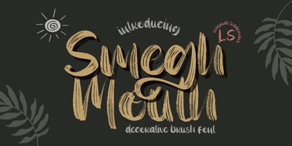 **Smegh mouth Font** This pair was inspired by the retro poster design that i saw on some coffee shop, It was crafted by hand specially to add natural handmade feeling in its brand identity than i make it clean with pentool. **Opentype features** Smegh mouth font has 184 character set included Smegh mouth Font is very good looking in logo, labels, t-shirt prints, product packaging, invitations, advertising and others. This fonts works with folowing languages: Afrikaans, Albanian, Asu, Basque, Bemba, Bena, Chiga, Cornish, Danish, English, Estonian, Filipino, Finnish, French, Friulian, Galician, German, Gusii, Indonesian, Irish, Italian, Kabuverdianu, Kalenjin, Kinyarwanda, Low German, Luo, Luxembourgish, Luyia, Machame, Makhuwa-Meetto, Makonde, Malagasy, Malay, Manx, Morisyen, North Ndebele, Norwegian Bokmål, Norwegian Nynorsk, Nyankole, Oromo, Portuguese, Romansh, Rombo, Rundi, Rwa, Samburu, Sango, Sangu, Scottish Gaelic, Sena, Shambala, Shona, Soga, Somali, Spanish, Swahili, Swedish, Swiss German, Taita, Teso, Vunjo, Zulu. Thank you for using this font. LS
 - Ponderosa by Adobe,
$29.00Ponderosa font is a joint work of the typeface designers K.B. Chansler, C. Crossgrove and C. Twombly, who also created Rosewood, Zebrawood and Pepperwood together. As the name suggests, it is so-called wood type. The origins of this kind of typeface can be found in the early 19th century. Called Italian or Italienne, these typefaces quickly became very popular. They are distinguished by square serifs whose width is larger than the stroke width of the characters. When the letters are set together, the heavy serifs build dark horizontal bands. The distinguishing characteristic of Ponderosa lies in its extremely fine figures between heavy serifs. The designers approached the boundaries of the impossible with this contrast. The typeface is reminiscent of the Wild West with its shootouts and heroes as well as of the 1970s with their platform shoes and wild hair-dos. When used carefully in headlines, Ponderosa font will surely attract attention.