5,082 search results
(0.036 seconds)
- Sage by Scholtz Fonts,
$21.00Sage is a hand generated font with great impact. Robust and vigorous, it's great for informal, exciting design projects. Available all popular font formats, including opentype, Sage has been carefully letterspaced and kerned. All upper and lower case characters, punctuation, numerals and accented characters are present. - Fruitella by Zamjump,
$17.00 Fruitella is a geometric sans serif look. Designed with powerful opentype features in mind. equipped with ligature standards that are different from ligatures in general. Perfect for graphic design and any display use. It can easily work for web, signage, corporate, and also for editorial design.
 - Black Mouse by Letterafandi Studio,
$18.00 Black Mouse is a display font. It is a font ready to rock every design you want to create. It is perfect for logos, quotes, posters, clothing, and so much more! Add it to any of your creative projects, and be amazed by the generated outcome!
 - Brand X JNL by Jeff Levine,
$29.00 Brand X JNL is a retro-inspired Art Deco typeface with its name being derived from the generic label given to competitor's brands. Whenever a product wishes to extol its virtues without directly naming its competitors and thereby giving reverse publicity to them, "Brand X" is mentioned.
 - Vivaldi by ITC,
$29.99Vivaldi was designed by Friedrich Peter. Generous, intricate initial caps combine with a more reserved lowercase to create a beautiful script font. Vivaldi's letterforms incorporate an elegant mixture of calligraphic and copperplate elements. It is ideal for invitations, announcements, certificates, or other work requiring a distinctive, formal appearance. - P22 Chatham by IHOF,
$24.95 Chatham is part of the "Staunton Script Family" of fonts designed by Ted Staunton for his historic novel centered around a family bible and the handwritten annotation through 7 generations. The Chatham font is overtly crooked and has an extreme right-leaning slant—perhaps we should call it "Cheney".
 - Adonis by ParaType,
$30.00PT Adonis™ was designed by Natalia Vasilyeva and licensed by ParaType in 2002. An original typeface, its characters have slightly oblong proportions, with rounded serifs and generally soft letterforms. The face is both space-saving and quite legible in small sizes. For use in text and display typography. - Ramones by Namistudio,
$15.00 Rebel, Energy, Punk, Power... Ramones, jagged interlock letter with bold line. This font will bring that IN YOUR FACE attitude in your design. No more soft side. It's all about the energy ! Either choosing the auto-generate interlocking letters, or keep it original, Ramones still brings you the power.
 - Kinghood by Rockboys Studio,
$19.00 Kinghood is a delicate and elegant serif font. You can use this modern serif font with ligature & stylistic set for fashion, magazines, cooking websites, quotes, social media posts, labels, and many more! Add it confidently to your favorite creations and let yourself be amazed by the outcome generated.
 - Lightnin' by ITC,
$29.99Lightnin' is the work of British designer Alan Meeks. Generous initial capitals complement a more reserved lowercase alphabet, both of which were designed to meet the needs of current fashions in headline typography. Lightnin' will light up all kinds of display work with its robust, angular script style. - Christmas Energy by Rashatype,
$10.00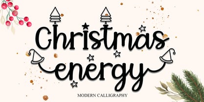 Christmas Energy is a whimsical script font with a relaxed theme, featuring a lovely style. This font is PUA encoded which means you can access all of the glyphs and swashes with ease! Add it confidently to your favorite creations and let yourself be amazed by the outcome generated.
 - Wilder by Great Scott,
$12.00 Wilder is a condensed handwritten sans serif with both uppercase and lowercase characters. It has a generous x-height with big elongated counters and low set bars which gives Wilder a unique look. Great for packaging, print, and display use. You can also use it in shorter paragraph texts.
 - Regua by Tipos do aCASO,
$2.90Play like a child with letter forms, fill the gaps of a stencil with a ballpoint pen and work this to generate a digital type. Régua (Ruler, in Portuguese) is the result of a typographical joke with the upper cases made by Buggy, a Brazilian typographer, in 1998. - Catshape by RodrigoTypo,
$45.00 Catshape is a font of dingbats, which in combinations with uppercase and lowercase you can generate multiple characters with different textures. In addition to a set of ornaments and a font called Alquitran Stencil, it was designed for different graphics. I hope you can have fun with this font!
 - Tally Text by Solotype,
$19.95Tally Text Light is an early photolettering type, sometime in the 1940s, when words were hand assembled from individual film positives of the letters, then re-photographed. We made the bold face version of Tally Text Light by optical trickery long before the computer came into general use. - P22 Grenville by IHOF,
$24.95 Grenville is part of the Staunton Script Family of fonts designed by Ted Staunton for his historic novel centered around a family bible and the handwritten annotation through seven generations. The Grenville font is a graceful Italique hand similar in style to the classic designs of Arrighi's Operina.
 - Visage LP by LetterPerfect,
$39.00 Visage is a contemporary text family designed by Garrett Boge in 1988. Its delicate serifs, subtly tapered stems, and generous proportions offer both distinction and readability to the text at any size. The family consists of five weights - Light, Book, Medium, Bold and Black, with corresponding oblique styles.
 - Blastone by Azetype,
$10.00 Presenting Blastone! A Brush Font with 2 Versions, Alternates, and Extra. This font made with the perfect combination of each character. You can type by Mix & Match with an alternate version and extra swashes to get a unique combining. It looks original and can be used for all your project needs. Each glyph has its own uniqueness and when meeting with others will provide dynamic and pleasing proximity. This font can be used at any time and any project. You can see in the presentation picture above, Blastone looks amazing on design projects. So, Blastone Font can't wait to give its touch to all your design projects such as quotes, poster design, personal branding, promotional materials, logotype, product packaging, etc. Besides that, Besteam also has some ligature that gives a surprise when you type certain characters combining. The ligatures are ee, ff, ii, nn, oo, rr, ss, tt, and yy. WHAT'S INCLUDED? 1. Blastone Texture • The first version comes with uppercase, lowercase, ligatures, numeral, punctuation, symbols, and Standard Latin Multilingual Support (Afrikaans, Albanian, Catalan, Danish, Dutch, English, French, German, Icelandic, Indonesian, Italian, Malay, Norwegian, Portuguese, Spanisch, Swedish, Zulu, and More). 2. Blastone Texture Alternate • The Second version comes with uppercase, lowercase, ligatures, numeral, punctuation, symbols, and Standard Latin Multilingual Support (Afrikaans, Albanian, Catalan, Danish, Dutch, English, French, German, Icelandic, Indonesian, Italian, Malay, Norwegian, Portuguese, Spanisch, Swedish, Zulu, and More). 3. Blastone Solid • It comes with uppercase, lowercase, ligatures, numeral, punctuation, symbols, and Standard Latin Multilingual Support (Afrikaans, Albanian, Catalan, Danish, Dutch, English, French, German, Icelandic, Indonesian, Italian, Malay, Norwegian, Portuguese, Spanisch, Swedish, Zulu, and More). 4. Blastone Solid Alternate • It comes with uppercase, lowercase, ligatures, numeral, punctuation, symbols, and Standard Latin Multilingual Support (Afrikaans, Albanian, Catalan, Danish, Dutch, English, French, German, Icelandic, Indonesian, Italian, Malay, Norwegian, Portuguese, Spanisch, Swedish, Zulu, and More). 5. Blastone Texture Swash • It comes with 19 underline swashes. Just type s_1 until s_19 to feature all or type a-z/A-Z and choose this version. 6. Blastone Solid Swash • It comes with 19 underline swashes. Just type s_1 until s_19 to feature all or type a-z/A-Z and choose this version. Enjoy the Font! Thank You Azetype Studio
 - Baluno by Luxfont,
$22.00 Introducing is a fun and playful pouty Baluno font. Font has embodied the graphic trend of cartoon flat illustrations and will successfully complement modern designs. The font has 2 types of faces, which can be used both independently and together by alternating letters in one word to avoid repeating letters, creating a unique heading. Family is ideal for children's themes, because the font resembles inflated balloons. Creates a relaxed mood and has fun. Set comes in many different carefully selected colors and gradient color options. Check the quality before purchasing and try the FREE DEMO version of the font to make sure your software supports color fonts. P.s. Have suggestions for color combinations? Write me an email with the subject "Baluno Color" on: ld.luxfont@gmail.com Features: Free Demo font to check it works. 2 types of faces. Lots of ready-made matched colors. Gradient color variants. Kerning. IMPORTANT: - Multicolor OTF version of this font will show up only in apps that are compatible with color fonts, like Adobe Photoshop CC 2017.0.1 and above, Illustrator CC 2018. Learn more about color fonts & their support in third-party apps on www.colorfonts.wtf -Don't worry about what you can't see the preview of the font in the tab "Individual Styles" - all fonts are working and have passed technical inspection, but not displayed, they just because the website MyFonts is not yet able to show a preview of colored fonts. Then if you have software with support colored fonts - you can be sure that after installing fonts into the system you will be able to use them like every other classic font. Question/answer: How to install a font? The procedure for installing the font in the system has not changed. Install the font as you would install the other fonts. How can I change the font color to my color? · Adobe Illustrator: Convert text to outline and easily change color to your taste as if you were repainting a simple vector shape. · Adobe Photoshop: You can easily repaint text layer with Layer effects and color overlay. ld.luxfont@gmail.com
 - SantaCruz by Wilton Foundry,
$29.00I wanted to capture a sense of California with this font - generous, warm, open, bold and sunny - all this imagery is captured in Santa Cruz. It is the quintessential California beach town like the world-famous Boardwalk with everything from the Giant Dipper roller coaster to cotton candy, corn dogs on a stick and chocolate-coated bananas. In fact, the Santa Cruz Boardwalk is the West Coast's last remaining seaside amusement park. It has miles of sandy beaches, giant redwood forests and great wineries. I know you will find many great applications to use SantaCruz, the font, whenever you have a need to extress a warm, sunny and generous spirit! SantaCruz is available in Opentype, PostScript and Truetype formats for both Mac and Windows. - Ekeras V2 by Type Innovations,
$39.00 Ekeras V2 Inline is an original design by Alex Kaczun. It is a display font not intended for text use. It was designed specifically for display headlines, logotype, branding and similar applications. Primarily a display, this extremely versatile font has generous proportions, large counters and loose fitting which also allow the font to work well across a wide range of text sizes. The entire font has an original look which is strong, dynamic, machine generated and can be widely used in publications and advertising. Ekeras is a futuristic, techno-looking and dynamic typeface with an appearance of machined-like parts with sharp and rounded edges. The large Pro font character set supports most Central European and many Eastern European languages.
 - Fleischmann Gotisch PT by preussTYPE,
$29.00 Johann Michael Fleischmann was born June 15th, 1707 in Wöhrd near Nuremberg. After attending Latinschool he started an apprenticeship as punchcutter in the crafts enterprise of Konstantin Hartwig in Nuremberg, which ought to last six years. For his extraordinary talent Fleischmann completed his apprenticeship after four and a half years, which was very unusual. 1727 his years of travel (very common in these days) began, during which he perfected his handcraft by working in different enterprises as journeyman. First location was Frankfurt/Main where he worked for nearly a year at the renowned type foundery of Luther and Egenolff. Passing Mainz he continued to Holland, where he arrived in November 1728 and stayed till he died in 1768. In Amsterdam he worked for several type founderies, among others some weeks for Izaak van der Putte; in The Hague for Hermanus Uytwerf. Between 1729 and 1732 he created several exquisite alphabets for Uytwerf, which were published under his own name (after his move to Holland Fleischmann abandoned the second n in his name), apparently following the stream of the time. After the two years with Uytwerf, Fleischmann returned to Amsterdam, where he established his own buiseness as punchcutter; following an advice of the bookkeeper and printer from Basel Rudolf Wetstein he opened his own type foundery 1732, which he sold in 1735 to Wetstein for financial reasons. In the following Fleischmann created several types and matrices exclusively for Wetstein. In 1743 after the type foundery was sold by Wetstein’s son Hendrik Floris to the upcoming enterprise of Izaak and Johannes Enschedé, Fleischmann worked as independent punchcutter mostly for this house in Haarlem. Recognizing his exceptional skills soon Fleischmann was consigned to cutting the difficult small-sized font types. The corresponding titling alphabets were mostly done by Jaques-Francois Rosart, who also cut the main part of the ornaments and borders used in the font examples of Enschedé. Fleischmann created for Enschedé numerous fonts. The font example published 1768 by Enschedé contains 3 titling alphabets, 16 antiquacuts, 14 italic cuts, 13 textura- and 2 scriptcuts, 2 greek typesets (upper cases and ligatures), 1 arabic, 1 malayan and 7 armenian font systems, 5 sets of musicnotes and the poliphonian musicnotesystem by Fleischmann. In total he brought into being about 100 alphabets - the fruits of fourty years of creative work as a punchcutter. Fleischmann died May 27th, 1768 at the age of 61. For a long time he was thought one of the leading punchcutters in Europe. A tragedy, that his creating fell into the turning of baroque to classicism. The following generations could not take much pleasure in his imaginative fonts, which were more connected to the sensuous baroque than to the bare rationalism of the upcoming industrialisation. Unfortunately therefore his masterpieces did not survive the 19th century and person and work of Fleischmann sank into oblivion. The impressive re-interpretation of the Fleischmann Antiqua and the corresponding italics by Erhard Kaiser from Leipzig, which were done for the Dutch Type Library from 1993 to 1997, snatched Fleischmann away from being forgotten by history. Therefore we want to place strong emphasis on this beautiful font. Fleischman Gotisch The other fonts by Fleischmann are only known to a small circle of connoisseurs and enthusiasts. So far they are not available in adequat quality for modern systems. Same applies the "Fleischman Gotisch", which has been made available cross platform to modern typeset-systems as CFF Open Type font through the presented sample. The Fleischman Gotisch has been proved to be one of the fonts, on which Fleischmann spent a good deal of his best effort; this font simply was near to his heart. Between 1744 and 1762 he created 13 different sizes of this font. All follow the same principles of forms, but their richness of details has been adapted to the particular sizes. In later times the font was modified more or less sensitive by various type founderies; letters were added, changed to current taste or replaced by others; so that nowadays a unique and binding mastercopy of this font is missing. Likewise the name of the font underwent several changes. Fleischmann himself probably never named his font, as he did with none of his fonts. By Enschedé this textura was named Nederduits, later on Nederduitsch. When the font was offered by the german type foundery Flinsch in Frankfurt/Main, the more convenient name of Fleischmann-Gotisch was chosen. In his "Masterbook of the font" and his "Abstract about the Et-character" Jan Tschichold refered to it as "Duyts" again. To honour the genious of Johann Michael Fleischmann we decided to name the writing "Fleischmann Gotisch PT" (unhyphenated). Developing the digital Fleischman Gotisch I decided not to use one of the thirteen sizes as binding mastercopy, but corresponding to the typical ductus of the font to re-create an independent use of forms strongly based on Fleischmann´s language of forms. All ascenders and descenders were standardised. Some characters, identified as added later on, were eliminated (especially the round lower case-R and several versions of longs- respectively f-ligatures) and others were adjusted to the principles of Fleischmann. Where indicated the diverse characters were integrated as alternative. They can be selected in the corresponding menu. All for the correct german black letter necessary longs and other ligatures were generated. Through the according integration into the feature-code about 85% of all ligatures in the type can be generated automatically. Problematic combinations (Fl, Fk, Fh, ll, lh, lk, lb) were created as ligatures and are likewise constructed automatically. A historically interesting letter is the "round r", which was already designated by Fleischmann; it is used after preceding round letters. Likewise interesting is the inventive form of the &-character, which is mentioned by Tschichold in his corresponding abstract. Nevertheless despite all interpretation it was very important to me to maintain the utmost fidelity to the original. With this digital version of a phantastic texturfont of the late baroque I hope to contribute to a blossoming of interest for this genious master of his kind: Johann Michel Fleischmann. OpenType features: - Unicode (ISO 10646-2) - contains 520 glyphes - Basic Latin - Latin-1 Supplement - Latin Extended-A - Latin Extended-B - Central European Glyhps - Ornaments - Fractions - Standard ligatures - Discretionary ligatures - Historical ligatures - Kerning-Table
 - Garaje 53 Unicase - 100% free

- Noyr by Sign Studio,
$20.00 Noyr is a font for display that requires a modern/futuristic appearance. Uppercase and Lowercase are available equipped with standard symbols and multilingual characters. This font is designed to be dynamic with today's style. All have been PUA Encoded. You can easily access each character in the software in general.
 - Dolmengi by Ask Foundry,
$30.00 Introducing [Dolmengi]—a sleek slab serif font with refined edges, balancing solidity and softness. From the elegant 'Thin' to the bold 'Extra Bold,' it offers 8 versatile weights for visual hierarchy. Designed for clarity, Dolmen features generous letter spacing, lowercase figures, and ligatures. Elevate your design with this comprehensive font family!
 - Shifttype by Ali Güzel,
$18.00 An experimental typeface with at least 3 characters each, uppercase, lowercase, numbers, and punctuation marks. It would be great for experimenting with different typefaces to decide what's the general taste of your logo or designing a poster, music cover, etc. Or just use the typeface with exploring its alternate glyphs, enjoy!
 - Symbol by Adobe,
$35.00The Symbol PS font contains Times New Roman Greek capitals and lowercase, figures and basic punctuation together with a collection of mathematical signs and general purpose Pi characters. Use the Symbol PS font for setting mathematical and scientific work and as a complement to the symbols found in standard fonts. - Mulhouse by Hanoded,
$15.00 Mulhouse is a city in Northern France. It has a nice historical center and a car museum. Mulhouse font is a ‘movie poster font’: it was modeled after old movie posters from the 50’s. It comes with swashes for the upper case glyphs and a generous sprinkling of diacritics.
 - Black Sirkka by Volcano Type,
$39.00 The idea of the font Black Sirkka was, to develop a modern interpretation out of the general blackletter typefaces. Black Sirkka is a bastard with the typical characteristics of the blackletters, mixed up with modern, simple shapes from grotesk typefaces. The whole typeface was built up in a modular construction system.
 - Glypha by Linotype,
$29.99 Glypha was designed by Adrian Frutiger and appeared with D. Stempel AG in 1977. The font consists of ten cuts and is formally based on its predecessor, Serifa, although its lower case letters are a bit larger. Like Serifa, Glypha is also based on the general scheme used to design Univers.
 - Merlina by Prasetype,
$9.00 Merlina is an elegant, thin lettered sans serif font. This font is PUA encoded which means you can access all of the glyphs and swashes with ease! Add it confidently to your favorite creations and let yourself be amazed by the outcome generated. complete with ligatures regular kerning multilingual support
 - AZ Text by Artist of Design,
$20.00 AZ Text font was inspired from a need for a generic worn san serif text of letters that looks old. This font utilizes an "old look" to the line work which is designed to have a "worn feel" to it. Ideal for use as the body or text in your design.
 - Klipspringer by ArimaType,
$18.00 Klipspringer is a highly detailed blackletter font. This font is PUA encoded which means you can access all of the glyphs and swashes with ease! Add it confidently to your favorite creations and let yourself be amazed by the outcome generated. If you have questions, please contact us at arimatype@gmail.com
 - Blont by 160 Std,
$22.00 Blont is a simple, minimal and techno looking sans serif font. Add it confidently to your favorite creations and let yourself be amazed by the outcome generated. Perfect for logos. and also suaitable for headlines, titles and posters. comes with alternates to make unique, you can choose the best for you.
 - Vivala Milk by Johannes Hoffmann,
$28.00 Vivala Milk is a sans serif display font with calligraphic genes and an extensive Latin language support. It is ideal for headlines, posters, brands and magazines.
 - Locarno by ITC,
$29.99Locarno is the work of British designer Alan Meeks and is his adaptation of Rudolf Koch's original design for the Klingspor type foundry. The unique design of the roman weight features geneous capitals and a reserved lowercase. The italic capitals have an open, engraved decoration that combines perfectly with the lowercase with its tall, elegant ascenders. Locarno is a typeface with the sophisticated look of the 1920s and 30s. - Strak by Kustomtype,
$25.00 Strak is a font that was born out of admiration for the work of E. Vermeulen, a Belgian artist known for his tight, precise line and an unseen masterpiece that is spread around the world. He has published and exhibited his work in London, Liverpool, Angoulême, New York, Geneva, Amsterdam, Lyon and Turku (in Finland) and he even signed for the New York Times. Based on a few characters, a complete font was composed by Kustomtype. After a few sketches, Strak came to life. The name Strak, in this case, refers to the slender, beautiful woman with the correct waistlines and proportions. The font is designed this way; it is completely hand-drawn, digitized and can be used in all modern and graphic media. Strak is available in 8 different styles, has class and will make many people's mouth water when they see it on your designs. Do you want quality and style? Then Strak is the font-perfect solution!
 - Sigmund Freud Typeface by Harald Geisler,
$29.00 “For those who regret what keyboards and touch screens have done to their penmanship, typographer Harald Geisler has an answer: Sigmund Freud.” — The Wall Street Journal Sigmund Freud was a neurologist who lived from 1856 to 1939. His research and studies led to the foundation of ‘Psychoanalysis’. When I first saw Freud’s century old letters, I was fascinated by the beauty of these historic manuscripts. It made me smile to imagine a person writing his or her shrink a letter set in Freud’s handwriting. I started to plan creating a font based on his manuscripts. I contacted the Sigmund Freud Museum Vienna and Freud Museum London. To start the creation I selected eight handwritten documents from the archive in Vienna – This selection of specimen was my orientation during the design process. The Samples were created between 1883 to 1938 and are of various character such as handwritten scientific papers, personal letters, notes and a telegram. A successful Kickstarter Campaign "The Sigmund Freud Typeface - A Letter to your Shrink" with over 1400 Backers enabled me to visit the archive in Vienna and study the original manuscripts of Sigmund Freud. After a year of preparation and design work, I finished four alphabets based on Freud’s handwriting. What are the different Versions PRO, Kurrent, #1, #2, #3 and #4 about? “This project gives people the convenience afforded by the computer while maintaining the romantic nostalgia, beauty, and character of letter writing with real handwriting.” — Daniel Vahab, The Huffington Post When you write with your hand, every letter looks a little different. When you write a text on your computer every letter looks exactly the same. In order to make type look like handwriting, I chose four different variations of each letter from Freud’s manuscripts, drew and stored them in the font. The font is then programmed to exchange letters while you are typing. This makes the rendered result on your screen or print look like unique handwriting. PRO While you are typing… the PRO Version actively combines all four alphabets and exchanges them automatically. Through this mechanism never the same two o’s will stand next to each other. With every touch a unique look is generated. This works in certain applications i.e. Word 2010(or newer), Pages, TextEdit, Editor(Pre-installed on Windows 7 or newer), InDesign, Illustrator… →Here you can see an animation of what this effect looks like in action. (Please Note: some applications like LibreOffice, OpenOffice do currently not support this feature. Date: December 2013) #1 #2 #3 and #4 The Sigmund Freud Typeface #1, #2, #3 and #4 each hold one individual lowercase alphabet based on Freud’s handwriting. Kurrent Most of Freud’s correspondence was written in German. Until the 1950′s a different handwriting was taught throughout German speaking countries (Switzerland, Austria, Germany). This style is called Kurrent. The name Kurrent and Cursive derive from the Latin word currere - to run, hurry - both styles were designed to write fast. As you can see in the samples above, Freud practiced both Kurrent and when writing english Cursive (Latin script or Joined-up). Kurrent has three significantly different letters (s,h,e). Use Kurrent to render the authentic look of an historic Sigmund Freud letter in German. Bundle On the Top of this page you can get all six fonts of the Sigmund Freud Typeface Family in a bundle. International Typeface All styles of the Sigmund Freud Typeface feature a wide range of accented letters so you can write to all your friends in Sweden (Bjørn) France (Chloé & Zoë), Ireland (Dáirine), Poland (Łucja), Germany (Jörg) and almost everywhere around the globe (Find a complete list in the tech specs). Usage recommendations I hope that this design will be valuable to you and most of all that you have fun with this typeface! 1. Point Size — To reproduce the size of Sigmund Freud’s handwriting adjust the type size between 18-24 point in your word processor. If you are using an imaging software like Photoshop set the resolution to 300dpi and adjust the point size between 18-24. 2. Line Spacing — Narrow the line hight until swashes of capital letters touch the baseline above. This also happens when you write a letter and gives the document a unique handwritten look. 3. Right Aligned — Freud had the habit to write towards the right edge of the page and start loosely on the left. Set your text alignment to ‘right’ to incorporate this dramatic expression also to your documents. What do other People say about the Sigmund Freud Typeface? “Wouldn’t you love to write a letter to your shrink using the Sigmund Freud typeface?” — Dorothy Tan, Design TAXI ''“JUST DON’T WRITE A LETTER TO YOUR MOTHER WITH IT… …until the reader looks a bit closer, and they see 70+ years of modern science weighing in on turn-of-the-century pop psychology."'' — Mark Willson, Fast Company “Doctor, what does it mean if you dream of creating a font of Freud’s handwriting?” — Ayun Halliday, Open Culture “…geekily romantic, at once artistic and scientific” — Edie Jarolim, Freud’s Butcher “…sympathisch” — Jürgen Siebert, Fontblog !WOW! Thank you for reading the complete font description! You are awesome! If you still have a question please contact me through MyFonts or my website haraldgeisler.com. Credits This project was made possible by the help of 1481 Backers on Kickstarter and the kind support of the Sigmund Freud Museum Vienna and the Freud Museum London. Thank you. All of Freud’s Manuscripts shown are © Sigmund Freud Museum Vienna. Poster Image: IN17 - Sigmund Freud, Germany 1932. © Freud Museum London. Flag Image: IN19 - Sigmund Freud 1930’s. © Freud Museum London.
 - Nevison Casual by Linotype,
$29.99Nevison Casual was designed by T. Nevison in 1967 and is an informal, lively, modern handwriting. While the capitals are generous and wide, the lower case letters have reserved, narrower forms, an eye-catching contrast that gives the typeface its zest and energy. The unconventional Nevison Casual combines well with sans serif typefaces. - Office Squeeze by Hanoded,
$15.00 Office Squeeze was made with a Japanese brush pen. I kind of like the fact that, despite its roughness, Office Squeeze still maintains a very neat appearance. Office Squeeze can be used for just about anything, but product packaging, logos and posters spring to mind. Comes with a generous square footage of diacritics.
