4,285 search results
(0.007 seconds)
- General Chang JNL by Jeff Levine,
$29.00General Chang JNL is one of a number of fonts redrawn by Jeff Levine from the creative output of the late Alf R. Becker. Becker's alphabets were a monthly feature of Signs of the Times Magazine from the 1930s through the 1950s. Thanks to Tod Swormstedt of ST Media (who also is the curator of the American Sign Museum in Cincinnati, Ohio) for the resource material. - AF Generation A by ACME Collection,
$44.00 - Generis Slab by Linotype,
$29.00The idea for the Generis type system came to Erik Faulhaber while he was traveling in the USA. Seeing typefaces mixed together in a business district motivated him to create a new type system with interrelated forms. The first design scheme came about in 1997, following the space saving model of these American Gothics. Faulhaber then examined the demands of legibility and various communications media before finally developing the plan behind this type system. Generis’s design includes two individually designed styles; each of with is available with and without serifs, giving the type system four separate families. Each includes at least four basic weights: Light, Regular, Medium, and Bold. Further weights, small caps, old style figures, and true italics were added to each family where needed. The Generis type system is designed to meet both optical criteria and the highest possible measure of technical precision. Harmony, rhythm, legibility, and formal restraint make up the foreground. Generis combines aesthetic, technical, and economic advantages, which purposefully and efficiently cover the whole range of corporate communication needs. The unified basic form and the individual peculiarity of the styles lead to Generis’ systematic, total-package concept. The clear formal language of the Generis type system resides beneath the information, bringing appropriate typographic expression to high-level corporate identity systems, both in print and on screen. The condensed and aspiring nature of the letterforms allows for the efficient setting of body copy, and the economic use of the page. A range of accented characters allows text to be set in 48 Latin-based languages, offering maximal typographic free range. This previously unknown level of technical and design execution helps create higher quality typography in all areas of corporate communication. Optimal combinations within the type system: Generis Serif or Generis Slab with Generis Sans or Generis Simple. - Genever NF by Nick's Fonts,
$10.00 London's Reed and Fox 1874 specimen book featured two faces, Viennese and Corinthian, combined here in one elegant decorative face. Both versions support the Latin 1252, Central European 1250, Turkish 1254 and Baltic 1257 codepages.
 - Generis Serif by Linotype,
$29.00The idea for the Generis type system came to Erik Faulhaber while he was traveling in the USA. Seeing typefaces mixed together in a business district motivated him to create a new type system with interrelated forms. The first design scheme came about in 1997, following the space saving model of these American Gothics. Faulhaber then examined the demands of legibility and various communications media before finally developing the plan behind this type system. Generis’s design includes two individually designed styles; each of with is available with and without serifs, giving the type system four separate families. Each includes at least four basic weights: Light, Regular, Medium, and Bold. Further weights, small caps, old style figures, and true italics were added to each family where needed. The Generis type system is designed to meet both optical criteria and the highest possible measure of technical precision. Harmony, rhythm, legibility, and formal restraint make up the foreground. Generis combines aesthetic, technical, and economic advantages, which purposefully and efficiently cover the whole range of corporate communication needs. The unified basic form and the individual peculiarity of the styles lead to Generis’ systematic, total-package concept. The clear formal language of the Generis type system resides beneath the information, bringing appropriate typographic expression to high-level corporate identity systems, both in print and on screen. The condensed and aspiring nature of the letterforms allows for the efficient setting of body copy, and the economic use of the page. A range of accented characters allows text to be set in 48 Latin-based languages, offering maximal typographic free range. This previously unknown level of technical and design execution helps create higher quality typography in all areas of corporate communication. Optimal combinations within the type system: Generis Serif or Generis Slab with Generis Sans or Generis Simple. - Sui Generis by Typodermic,
$11.95 Looking for a typeface that’s as unique as your personality? Look no further than Sui Generis, the rounded square sans-serif that’s unlike any other. With its technical letterforms and boxy curves, Sui Generis has an industrial character that’s all its own. It’s the kind of typeface that demands attention, without ever feeling pushy or obnoxious. In fact, its understated charm is part of what makes it so special. But don’t let its quirky personality fool you—Sui Generis is as practical as it is unique. With four weights, two widths, italics, and an outline style, it’s incredibly versatile and perfect for any project that requires a touch of character. So if you’re tired of bland, run-of-the-mill typefaces that all look the same, give Sui Generis a try. Its square letterforms and distinctive voice will make your design stand out from the crowd, and leave a lasting impression on anyone who sees it. Most Latin-based European writing systems are supported, including the following languages. Afaan Oromo, Afar, Afrikaans, Albanian, Alsatian, Aromanian, Aymara, Bashkir (Latin), Basque, Belarusian (Latin), Bemba, Bikol, Bosnian, Breton, Cape Verdean, Creole, Catalan, Cebuano, Chamorro, Chavacano, Chichewa, Crimean Tatar (Latin), Croatian, Czech, Danish, Dawan, Dholuo, Dutch, English, Estonian, Faroese, Fijian, Filipino, Finnish, French, Frisian, Friulian, Gagauz (Latin), Galician, Ganda, Genoese, German, Greenlandic, Guadeloupean Creole, Haitian Creole, Hawaiian, Hiligaynon, Hungarian, Icelandic, Ilocano, Indonesian, Irish, Italian, Jamaican, Kaqchikel, Karakalpak (Latin), Kashubian, Kikongo, Kinyarwanda, Kirundi, Kurdish (Latin), Latvian, Lithuanian, Lombard, Low Saxon, Luxembourgish, Maasai, Makhuwa, Malay, Maltese, Māori, Moldovan, Montenegrin, Ndebele, Neapolitan, Norwegian, Novial, Occitan, Ossetian (Latin), Papiamento, Piedmontese, Polish, Portuguese, Quechua, Rarotongan, Romanian, Romansh, Sami, Sango, Saramaccan, Sardinian, Scottish Gaelic, Serbian (Latin), Shona, Sicilian, Silesian, Slovak, Slovenian, Somali, Sorbian, Sotho, Spanish, Swahili, Swazi, Swedish, Tagalog, Tahitian, Tetum, Tongan, Tshiluba, Tsonga, Tswana, Tumbuka, Turkish, Turkmen (Latin), Tuvaluan, Uzbek (Latin), Venetian, Vepsian, Võro, Walloon, Waray-Waray, Wayuu, Welsh, Wolof, Xhosa, Yapese, Zapotec Zulu and Zuni.
 - Generis Simple by Linotype,
$39.00The idea for the Generis type system came to Erik Faulhaber while he was traveling in the USA. Seeing typefaces mixed together in a business district motivated him to create a new type system with interrelated forms. The first design scheme came about in 1997, following the space saving model of these American Gothics. Faulhaber then examined the demands of legibility and various communications media before finally developing the plan behind this type system. Generis’s design includes two individually designed styles; each of with is available with and without serifs, giving the type system four separate families. Each includes at least four basic weights: Light, Regular, Medium, and Bold. Further weights, small caps, old style figures, and true italics were added to each family where needed. The Generis type system is designed to meet both optical criteria and the highest possible measure of technical precision. Harmony, rhythm, legibility, and formal restraint make up the foreground. Generis combines aesthetic, technical, and economic advantages, which purposefully and efficiently cover the whole range of corporate communication needs. The unified basic form and the individual peculiarity of the styles lead to Generis’ systematic, total-package concept. The clear formal language of the Generis type system resides beneath the information, bringing appropriate typographic expression to high-level corporate identity systems, both in print and on screen. The condensed and aspiring nature of the letterforms allows for the efficient setting of body copy, and the economic use of the page. A range of accented characters allows text to be set in 48 Latin-based languages, offering maximal typographic free range. This previously unknown level of technical and design execution helps create higher quality typography in all areas of corporate communication. Optimal combinations within the type system: Generis Serif or Generis Slab with Generis Sans or Generis Simple. - Genera Grotesk by Wahyu and Sani Co.,
$25.00 Genera Grotesk is a strong & clean modern sans serif font family. It is total rework of Genera typeface which was released in late 2019. This totally new version of its predecessor has closer aperture, some new letterforms, new italic style and new weight distribution ranging from Thin to Extra Black. Genera Grotesk also available in variable fonts for more flexibility in choosing the right weight. This typeface also equipped with useful OpenType features such as Ordinal, Superior, Stylistic Alternates, Proportional Figure, Fraction, Numerator & Denominator. Each font file covers Western & Eastern Europe Latin language, as well as other Latin based languages – over 200 languages supported! This is a new real multi-purpose typeface that will be perfect for logo, packaging, greeting cards, presentations, headlines, lettering, posters, branding, quotes, titles, magazines, headings, web layouts, mobile applications, art quote, typography, advertising, invitations, packaging design, books, book title, & nearly any other type of creative design you’re working on.
 - Generis Sans by Linotype,
$29.00The idea for the Generis type system came to Erik Faulhaber while he was traveling in the USA. Seeing typefaces mixed together in a business district motivated him to create a new type system with interrelated forms. The first design scheme came about in 1997, following the space saving model of these American Gothics. Faulhaber then examined the demands of legibility and various communications media before finally developing the plan behind this type system. Generis’s design includes two individually designed styles; each of with is available with and without serifs, giving the type system four separate families. Each includes at least four basic weights: Light, Regular, Medium, and Bold. Further weights, small caps, old style figures, and true italics were added to each family where needed. The Generis type system is designed to meet both optical criteria and the highest possible measure of technical precision. Harmony, rhythm, legibility, and formal restraint make up the foreground. Generis combines aesthetic, technical, and economic advantages, which purposefully and efficiently cover the whole range of corporate communication needs. The unified basic form and the individual peculiarity of the styles lead to Generis’ systematic, total-package concept. The clear formal language of the Generis type system resides beneath the information, bringing appropriate typographic expression to high-level corporate identity systems, both in print and on screen. The condensed and aspiring nature of the letterforms allows for the efficient setting of body copy, and the economic use of the page. A range of accented characters allows text to be set in 48 Latin-based languages, offering maximal typographic free range. This previously unknown level of technical and design execution helps create higher quality typography in all areas of corporate communication. Optimal combinations within the type system: Generis Serif or Generis Slab with Generis Sans or Generis Simple. - Geneo Std by Typofonderie,
$59.00 A robust oldstyle, an elegant slab, 8 styles Geneo, created by Stéphane Elbaz, is a synthesis of historic and present-day visions of typography, a slab serif constructed on an oblique axis. Its subtle contrast evokes both Renaissance elegance and the robustness of the Egyptian typefaces that were in vogue during the 19th century. Geneo falls halfway between the classic styles of Garamond and Transitionnals, with aspects of contemporary slab serifs like Rockwell, Boton, as well a bit informal. From this blend of styles and genres, it emerges with a singular identity perfectly suited for modern illustrations of quality, savoir-faire, and culture. Geneo’s limited contrast has been carefully crafted to make the font adaptable for use as both text and headlines, as well as for small-print elements like footnotes, appendices, and captions. The variety and precision of certain weights, like Regular, allow minute adjustments of the font color in text compositions. This flexibility is especially useful for displaying on devices with high pixel densities such as the latest iPhone or iPad, on which text may appear too thin. Flexibility and sturdiness The sturdiness of Geneo makes it a perfect choice for posters, logos, print and any project that requires finesse and sophistication. It provides alternate versions of some letters such as g and a to give you the flexibility you need for your typographic projects. Geneo pairs perfectly with contemporary typeface genre. Geneo, a new typeface designed by Stéphane Elbaz Tokyo TDC 2014 Type Directors Club 2009
 - Designer Genes by Comicraft,
$29.00 - Sui Generis Free - Unknown license

- Gene Condensed JNL by Jeff Levine,
$29.00 Gene Gable is known to many graphic artists from his on-line column 'Scanning Around with Gene', which was on the Creative Pro website for a number of years, covering a variety of topics ranging from printing techniques to paper ephemera; water applied decals to lettering stencils. Gene has also been a great help in providing vintage source material to Jeff Levine, which resulted in many additional font designs. It seems only fitting that he should be bestowed with his own-named font as well. Gene Condensed JNL is offered in both regular and oblique versions.
 - Sixties Symbols JNL by Jeff Levine,
$29.00The 1960s was the most tumultuous decade of the 20th century. Sixties Symbols JNL collects twenty-six icons and phrases from that time of change and unrest including the peace symbol, a dove, a daisy—even the militant 'power fist' that signified rebellion against mainstream society. There's also a blank lapel button on the Y/y keys and a blank protest poster on the Z/z keys for your own special message. For the more daring, the left and right brace Keys {and } have the 'one finger salute' the radical hippie factions displayed generously. Use that one with discretion! - Volaroid by Din Studio,
$22.00 Introducing Volaroid font duo , simply font with modern and vintage style combination. This will bring a modern and vintage atmosphere together. Minimalist design for your best project. Volaroid font best use for logotype, branding, and t-shirt printing. Whats included? : - volaroid script - volaroid sans Volaroid feature : - Swash (A-Z,a-z) - SS 1 (A-Z,a-z) - SS 2 (a-z) - SS 3 (a-z) - SS 4 (a-z) - S.Alt 1&2 (b,d,h,k,l,t) - PUA encoded - Multilingual Support. --- Notes = Every swash, stylishtic set and alternates have include in Volaroid Script (ttf.otf,woff) I hope this font can meet your design needs. Feel free to contact me in the message or direct email donis4design@gmail.com.
 - The Jakarta by XdCreative,
$29.00 Say hi to "The Jakarta" a stylish display sans typeface is the latest collection from @faldykudo "The Jakarta" basic technical and anatomy comes from the genetics of the "Magnify" family (Geometric classification of typefaces) with several stroke modifications and a combination smooth curves for a minimalist, elegant and modern sans serif. The Jakarta is perfect for the logo, product, headline or any of display design. The Jakarta has a complete characters A-Z, a-z (including stylistic Alternates), Numeral, Punctuations, and standard ligature. thanks, hope you would like and accept "The Jakarta" as part of your family. thank you in advance
 - Be Cool by Ana's Fonts,
$12.00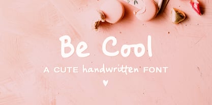 Be Cool is a cute handwritten font with an alternate character set (A-Z, a-z) and an extra set of swashes and ornaments to help decorate your text. This font includes: - A-Z, a-z, numbers and punctuation - Multilingual support - Dozens of ligatures that give it a true handwritten feel Use Be Cool in any design that needs a handwritten feel, such as signatures, notes and quotes, logos and branding.
 - Cross Stitch Classic by Gerald Gallo,
$20.00 Cross Stitch Classic is based on upper case characters 12 stitches tall and contains uppercase characters A-Z, lowercase characters a-z, numbers and punctuation.
 - Thumper by Kern Club,
$10.00 Nostalgia styled font designed by Samborghini Uppercase Character Set A-Z Lowercase Character Set a-z Tons of alternate characters Numerals & Simple punctuation OTF file format
 - Landslide by Ana's Fonts,
$12.00 Landslide is a cute handwritten font family with: 4 fonts: regular, bold, italic and bold italic, each hand-drawn separately for a true handwritten feel a bonus set of ornaments (A-Z, a-z and 0-9) to help decorate your text Each font includes: A-Z, a-z, 0-9, accents punctuation and symbols Ligatures Landslide is perfect for any design that needs a handwritten feel, such as signatures, notes and quotes, logos and branding.
 - cabanyalZ - Personal use only

- Kerninator by Kern Club,
$10.00 Futuristic display font inspired by our favorite childhood film. Includes thick and thin version Thick Uppercase Character Set A-Z Thin Lowercase Character Set A-Z Numerals & Simple Punctuation OTF file format
 - Night Forest by Rometheme,
$25.00 Introducing Night Forest – Vintage Font Perfect for logotype, labels and packaging, branding, or any vintage-themed projects! Features: - Basic Latin A-Z and a-z - Numbers - Symbols - Stylistic Set - Ligature - PUA Encode - Multilanguage Support
 - Trees Of Africa by Okaycat,
$24.50 Very nice assorted African trees silhouetted, including baobab, palm trees, & more. Great for making shadow picture graphics. Also outlines are included. Illustrations are included for letters A-Z, a-z, numbers 1-9, and some punctuations.
 - Cross Stitch Cursive by Gerald Gallo,
$20.00 Cross Stitch Cursive is based on upper case characters 16 stitches tall and contains the upper case characters A-Z, lower case characters a-z, small numbers 0-9, ampersand, exclamation and question marks, comma, and period.
 - Coppola by Palmer Type Company,
$45.00 Coppola is a brand new typeface that combines a little bit of Didot, a pinch of Art Nouveau, and a dash of Italian mafia. A-Z, a-z Numbers Alternates Ligatures Multi-language support Symbols Special characters
 - Wild Summer by Epiclinez,
$18.00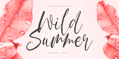 Wild Summer is a casual dry brush font that is suited for retro-style logos and posters. So what’s included: Basic Latin A-Z & a-z. Numbers, symbols, punctuations, and ligatures. Multilingual Support. Accented Characters : ÀÁÂÃÄÅÆÇÈÉÊËÌÍÎÏÑÒÓÔÕÖØŒŠÙÚÛÜŸÝŽàáâãäåæçèéêëìíîïñòóôõöøœšùúûüýÿžß Thank You.
 - Retro Mansion by Olivetype,
$18.00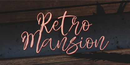 Retro Mansion is a casual dry brush font that is suited for retro style logo and poster. So what's included: Basic Latin A-Z & a-z. Numbers, symbols, punctuations and ligatures. Multilingual Support. Accented Characters : ÀÁÂÃÄÅÆÇÈÉÊËÌÍÎÏÑÒÓÔÕÖØŒŠÙÚÛÜŸÝŽàáâãäåæçèéêëìíîïñòóôõöøœšùúûüýÿžß Thank You.
 - Cross Stitch Simple by Gerald Gallo,
$20.00 Cross Stitch Simple is based on upper case characters 8 stitches tall and contains upper case characters A-Z, lower case characters a-z, numbers 0-9, ampersand, exclamation and question marks, comma, period, colon, and semi-colon.
 - Mieke by Olivetype,
$18.00 Mieke is a dry brush handwritten script font. Very cool if use for posters, logos, headlines, branding, etc. So what’s included : Basic Latin A-Z & a-z Numbers, symbols, and punctuations Ligatures and swashes Accented Characters : ÀÁÂÃÄÅÆÇÈÉÊËÌÍÎÏÑÒÓÔÕÖØŒŠÙÚÛÜŸÝŽàáâãäåæçèéêëìíîïñòóôõöøœšùúûüýÿžß Thank you
 - Cross Stitch Basic by Gerald Gallo,
$20.00 Cross Stitch Basic is based on upper case characters 7 stitches tall and contains the upper case characters A-Z, lower case characters a-z, numbers 0-9, ampersand, exclamation and question marks, comma, period, colon, and semi-colon.
 - Ballpoint Catalog by Double Z Studio,
$19.00 Ballpoint Catalog is a handwriting typeface, based on my dad's real handwriting, he was a teacher. I'm amaze by its smoothness and elegant, not fully follow the rules of penmanship handwriting but he has his own style of script which make it more human, natural handwriting rather that 'generic' handwriting typeface style. This typeface contain several ligatures to make it more natural in the writing. Suitable for any uses from branding, book cover, menu, quotes, invitation, wedding cards, advertising, blog, etc. Features Latin A-Z and a-z Numbers Symbols Ligature To enable the OpenType Stylistic alternates, you need a program that supports OpenType features such as Adobe Illustrator CS, Adobe Indesign & CorelDraw X6-X7. There are additional ways to access alternates/swashes, using Character Map (Windows), Nexus Font (Windows), Font Book (Mac) or a software program such as PopChar (for Windows and Mac).
 - Bledso by Olivetype,
$18.00 Bledso is an authentic brush typeface. This all caps font is suitable for posters, magazines, apparels, movie headlines, packaging and more. So what's included : Basic Latin A-Z & a-z Numbers, symbols, and punctuations Ligatures and swashes Accented Characters : ÀÁÂÃÄÅÆÇÈÉÊËÌÍÎÏÑÒÓÔÕÖØŒŠÙÚÛÜŸÝŽàáâãäåæçèéêëìíîïñòóôõöøœšùúûüýÿžß Thank you
 - Beautiful Kisses by Letterara,
$12.00 Beautiful Kisses surely is an extraordinary script and perfect to express your love. “Love must always be worthy of happiness”. It has an amazingly beautiful and elegant style. What’s included: 1. Works both on Mac & PC 2. Simple installations 3. With Extras 4. Alternates (A-Z, a-z), Swash (A-Z, a-z), Titling (a-z), and Ligature 5. Accessible in the Adobe Illustrator, Adobe Photoshop, Adobe InDesign, CorelDraw, even work on Microsoft Word. 6. Support multilingual; ä ö ü Ä Ö Ü ß ¿ ¡ 7. To access the alternate glyphs, you need a program that supports OpenType features such as Adobe Illustrator CS, Adobe Photoshop CC, Adobe Indesign, and CorelDraw. More information about how to access alternate glyphs, check out this link (http://goo.gl/ZT7PqK) To stay up to date for my latest work, follow me and let’s be friends because there will be many promos.
 - North Bridge by Olivetype,
$18.00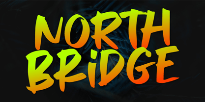 North Bridge is a cool and unique display font. It has a modern yet whimsical style and it will easily immerse your design into a magical world. Features : Basic Latin A-Z & a-z. Numbers, symbols, and punctuations Multilingual Support. Accented Characters : ÀÁÂÃÄÅÆÇÈÉÊËÌÍÎÏÑÒÓÔÕÖØŒŠÙÚÛÜŸÝŽàáâãäåæçèéêëìíîïñòóôõöøœšùúûüýÿžß Thank You.
 - Lazy Daisy by Kern Club,
$10.00 Uppercase Character Set A-Z Numerals & Simple punctuation OTF file format
 - Santeria Signature by Letterara,
$6.00 Santeria Signature is a beautiful calligraphy. It’s perfect for adding a luxurious touch to your logos, packagings, wedding stationary, websites, and every other designs which need a handwritten feel. This family includes 2 styles which can be combined perfectly. Giving you the opportunity to create multiple unique designs in an instant. A wide range of swashes (a-z), alternates (A-Z), titiling (a-z) and 111 ligature are included so that you can give your logo or name a custom, hand-calligraphy look.
 - Loose Jeans by Epiclinez,
$18.00 Loose Jeans is a fun, playful, and quirky display font. It has a modern yet whimsical style an it will undoubtedly immerse your designs into a magical world. So what's included : Basic Latin A-Z & a-z Numbers, symbols, and punctuations Accented Characters : ÀÁÂÃÄÅÆÇÈÉÊËÌÍÎÏÑÒÓÔÕÖØŒŠÙÚÛÜŸÝŽàáâãäåæçèéêëìíîïñòóôõöøœšùúûüýÿžß Thank you
 - Dream Earth by Epiclinez,
$18.00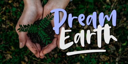 Dream Earth is a cool, brushed, and relaxed handwritten font. This font is suitable for designs such as t-shirts, sportswear, logos, advertisements, clothing, and more So what's included : Basic Latin A-Z & a-z Numbers, symbols, and punctuations Ligatures and swashes Accented Characters : ÀÁÂÃÄÅÆÇÈÉÊËÌÍÎÏÑÒÓÔÕÖØŒŠÙÚÛÜŸÝŽàáâãäåæçèéêëìíîïñòóôõöøœšùúûüýÿžß Thank you
 - Erlissa by Epiclinez,
$18.00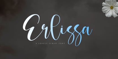 Erlissa is a sweet and elegant handwritten script font. This original look will appeal to a wide range of crafty ideas, from letterheads and titles to stationery. So what's included : Basic Latin A-Z & a-z Numbers, symbols, and punctuations Ligatures Accented Characters : ÀÁÂÃÄÅÆÇÈÉÊËÌÍÎÏÑÒÓÔÕÖØŒŠÙÚÛÜŸÝŽàáâãäåæçèéêëìíîïñòóôõöøœšùúûüýÿžß Thank you

