10,000 search results (0.034 seconds)
  1. Nu World Tight - Unknown license
  2. sampler number 1 - Unknown license
  3. Bill Hicks - Unknown license
  4. 14 minutes - Unknown license
  5. Girl Next Door2 - Unknown license
  6. West Side - Unknown license
  7. Goodbye Cruel World - Unknown license
  8. All That Jazz - Unknown license
  9. The Selectric font traces its origins back to an iconic piece of technology: the IBM Selectric typewriter. Launched in 1961, the IBM Selectric revolutionized typewriting and document creation with it...
  10. 64-SRC by ILOTT-TYPE, $49.00
    64-SRC is a condensed monospace font inspired by 1960s IBM Selectric type seen on HAL’s telemetric displays in 2001: A Space Odyssey. It is characterized by unique "double-space" alternates for the widest characters such as “w” and “m”. These alternates maximize legibility, improve the rhythm of readability and keep typographic color even. As a result 64-SRC is as well suited for extensive copy as it is display type.
  11. Mostly Bright by Nathatype, $29.00
    Be the center of attention through your sophisticated design with the awesome Mostly Bright. It is a serif font. While it’s easy, there are also a little bit curvy strokes for generates modern and elegant vibes. Slay your design with Mostly Bright’s best features so you’ll look your best on what ever your design is, all the time. Features: Alternates Ligatures Swash Lower and uppercases Numerals and Punctuations It is perfectly used for many design projects, such as poster, logo, book cover, branding, heading, printed product, merchandise, quotes, social media campaign, etc. Get more inspiration about how to use it by seeing the font preview. Thank you for purchasing our fonts. Please don’t hesitate to contact us, if you have any further question or issues. We’re happy to help. Happy Designing.
  12. Typewriter DirtY by Matthias Luh, $32.00
    Typewriter DirtY is related to the Typewriter BasiX and Typewriter Revo fonts. While Revo has a very clean and simple outline, BasiX is a bit washed out and looks worn. DirtY goes a step further and has a very dirty, worn, fuzzy, grungy vintage look – even more so than BasiX. Typewriter DirtY is especially suitable for headlines, logos, covers, slogans and much more. BasiX and Revo are recommended for longer texts. Although Typewriter DirtY looks good even in small font size, it is a bit more complex to render because of its detailed outlines. Typewriter Revo, BasiX and Dirty are monospaced typewriter fonts, which are matched to each other. They have the same dimensions and generally somewhat similar contours. Therefore, they can be perfectly mixed and matched with each other.
  13. Corvus by Artisticandunique, $40.00
    Corvus is a display serif font family, stylized with elegant soft turns that soften the sharp ends. Due to its structure, this font can meet your needs in all your modern or classic creative projects. Corvus is ideal for creating your creative projects on similar subjects with its gloomy and Modern Gothic stance. Absolutely perfect for titles, magazines, books, invitations, logos, packaging design, branding and more! Character Ranges: Basic Latin, Latin-1 Supplement, Latin Extended-A, Latin Extended-B, General Punctuation, Currency Symbols, Letter like Symbols,Arrows, Mathematical Operators, Miscellaneous Technical, Geometric Shapes, Miscellaneous Symbols, CJK Symbols And Punctuation, Private Use Area (plane 0), Alphabetic Presentation Forms Uppercase typeface Lowercase typeface Numbers Symbols Multilingual With this font you can create your unique designs. If you have a question, please contact me. Have a good time.
  14. Essential Pragmata Pro by FSD, $23.37
    Essential version of PragmataPro™. It contents a selection of glyphs useful for programming in English language only.
  15. News Crew JNL by Jeff Levine, $29.00
    It seems that after the 1960s, very few display typefaces were being produced that had the desirability to transcend generations, as did many type designs of the past. In 1970, a local television station embraced a lettering style for its logo that was a cross between round point pen nib lettering and the modular, techno look complete with squared characters in a futuristic "space age" style. News Crew JNL was inspired by the few examples found of this particular font [in use by the station at the time] and was pretty much created from scratch in order to capture the 1970s era of experimental typography. It is available in both regular and oblique versions.
  16. Manuel by profonts, $51.99
    Manuel, a simple, almost mathematically constructed typeface, includes stylistic alternates for a number of upper case characters. This comes in very helpful when designing logo letterings. Manuel(a) is a very charming, self-confident und exciting typeface design. The idea was to try to apply a given design criteria (also see Volker Schnebel's Marita and Martin fonts) to every single character. In other words, start with a character and develop all of the others from it. This is quite easy for some characters but extremely difficult for others. This process generates creativity and the characters move away from the initial constructed sketch. Together in a typeface, the individual characters are now all of a piece and character.
  17. Sevil alias Esra Lite - Unknown license
  18. FP Dancer Pro by Fontpartners, $29.00
    FP Dancer attempts to combine a constructed face with an upright script face. The goal was a type family that combines softness and friendliness with more strength. Typographica.org selected this font as one of the best typefaces for 2007.
  19. Synchro by ITC, $29.99
    Synchro is the work of British designer Alan Birch. It is a futuristic typeface, which reproduces the look of electronic display systems. Synchro is an excellent choice for situations that require a font with an advanced, high-tech appearance.
  20. P22 Chatham by IHOF, $24.95
    Chatham is part of the "Staunton Script Family" of fonts designed by Ted Staunton for his historic novel centered around a family bible and the handwritten annotation through 7 generations. The Chatham font is overtly crooked and has an extreme right-leaning slant—perhaps we should call it "Cheney".
  21. Kinghood by Rockboys Studio, $19.00
    Kinghood is a delicate and elegant serif font. You can use this modern serif font with ligature & stylistic set for fashion, magazines, cooking websites, quotes, social media posts, labels, and many more! Add it confidently to your favorite creations and let yourself be amazed by the outcome generated.
  22. Christmas Energy by Rashatype, $10.00
    Christmas Energy is a whimsical script font with a relaxed theme, featuring a lovely style. This font is PUA encoded which means you can access all of the glyphs and swashes with ease! Add it confidently to your favorite creations and let yourself be amazed by the outcome generated.
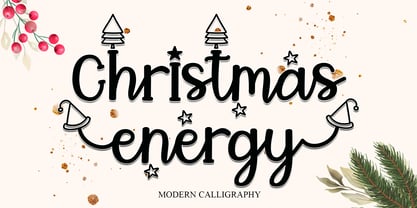
  23. P22 Grenville by IHOF, $24.95
    Grenville is part of the Staunton Script Family of fonts designed by Ted Staunton for his historic novel centered around a family bible and the handwritten annotation through seven generations. The Grenville font is a graceful Italique hand similar in style to the classic designs of Arrighi's Operina.
  24. Fountained by Ditatype, $29.00
    Fountained is a luxurious script font that beautifully marries sophistication with a touch of playful elegance. The characters in Fountained boast a generous thickness, making each stroke exude opulence and a sense of grandeur. The swinging ends, resembling graceful flourishes, bring a touch of movement and style to the font, ensuring that Fountained stands out as a distinctive script font. Enjoy the features here. Features: Ligatures Stylistic Sets Multilingual Supports PUA Encoded Numerals and Punctuations Fountained fits in headlines, logos, posters, flyers, branding materials, greeting cards, print media, editorial layouts, and many more designs. Find out more ways to use this font by taking a look at the font preview. Thanks for purchasing our fonts. Hopefully, you have a great time using our font. Feel free to contact us anytime for further information or when you have trouble with the font. Thanks a lot and happy designing.
  25. Hornswoggled - 100% free
  26. TeamSpirit - 100% free
  27. Alpine 7558S - Unknown license
  28. Underground - Unknown license
  29. HerzogVonGraf - 100% free
  30. MND Pinballer Fill - Unknown license
  31. SolsticeOfSuffering - Unknown license
  32. Aleia - Unknown license
  33. Fat Lefty - Unknown license
  34. DSJapanCyr - Unknown license
  35. Ruffian bold - Unknown license
  36. Alpine 7558M - Unknown license
  37. Nora - Unknown license
  38. Ruffian Outline - Unknown license
  39. Meow ROB by TypeSETit, $20.00
    Meow ROB is a mono weight family with a variety of styles. Each font in the family could be considered a stand alone font, but combined, the whole family works eclectically and harmoniously to add a fun, whimsy look to your posters, ads, invitations and similar designs.
  40. MyCRFT by DM Founts, $28.00
    MyCRFT was designed as a custom heading typeface for Drew Maughan's IhNohMinecraft project. ABOUT THE PROJECT Beginning life in 2015 under the name Mascoteers, the project was an ensemble of small-scale characters built from LEGO elements. The challenge was in creating the different figures with the restrictions of existing LEGO elements, while being recognisable as individual characters. The project was initially well received within the LEGO community and with the general public, but was eventually ignored and even ridiculed in favour of LEGO's own BrickHeadz theme, launched in late 2016. It was rebranded IhNohMinecraft as a response to the deliberate cries of "Ih dih Minecraft?" since BrickHeadz' launch. The project has no relation to the popular game. ABOUT THE TYPEFACE The motivation to create MyCRFT was as part of establishing IhNohMinecraft as its own project, by giving it a new visual identity. The typeface could be described as a cross between the ones used for Gears Of War and Overwatch. I liked the boldness of the former, and the italicized straight edges of the latter. MyCRFT was intended to be used in its Black Italic form from the beginning, and was designed around the letters from the word MINECRAFT. Where I couldn't decide on specific characters, I've included the designs as alternative glyphs. I've also included the old "square" Mascoteers logo and the newer "head" IhNohMinecraft logo. MyCRFT is paired with Kanit on the official IhNohMinecraft web site. Let me know if you discover a better pairing! PROJECT LINKS View the IhNohMinecraft "reveal" playlist on YouTube. The official Mascoteers/IhNohMinecraft web site.
Looking for more fonts? Check out our New, Sans, Script, Handwriting fonts or Categories
abstract fontscontact usprivacy policyweb font generator
Processing