10,000 search results
(0.208 seconds)
- MTF Sunny Days by Miss Tiina Fonts,
$9.00 Sunny Days is a fun, cartoon-like display font capable of taking any product out of the ordinary! Use it on bold and bright creations such as banners, posters, covers, titles, magazines, etc.
 - Sean Henrich ATF by ActiveSphere,
$30.00 Sean Henrich ATF is a sharp, rounded geometric display font and works best in text and display applications, such as headline, posters, signage, magazine, product branding, corporate branding, logos and titles. Several alternate characters are included in this typeface. Sean Henrich ATF font has six weights; ultra light, extra light, light, regular, bold and extra bold, each available in italic, making a total of twelve styles. Each style has a full upper and lower-case, accents, punctuation and a selection of monetary symbols. Currently Available for PC, in Open Type, PostScript or TrueType.
 - ATF Poster Gothic by ATF Collection,
$59.00 ATF Poster Gothic is an expansion of a typeface designed in 1934 by Morris Fuller Benton for American Type Founders. The one-weight design was a slightly condensed display companion to Benton’s ubiquitous Bank Gothic family. This new family of aggressively rectilinear headline types expands the design’s possibilities, offering 30 fonts. The all-cap design sports square corners in the counters, creating tension between angular and curved details; this feature, and the generally rectangular shape of the whole alphabet, makes ATF Poster Gothic distinctive on the page or screen, while its relationship to Bank Gothic makes it seem somehow familiar. Vertical strokes on the C, G, J, and S, as well as on several of the numerals, are cut off at an angle, which suggest the curves those strokes might typically display if the characters were less boxy in design and more along the lines of late-19th-century headline faces. Certain weights also recall the style of lettering used on athletic team jerseys, television crime dramas, action & adventure movie titles, and engraved stationery. With three widths and five weights, ATF Poster Gothic is distinctive and versatile at the same time. The full family is also available in a “Round” version, with corners subtly rounded for a softer, more “printed” feel.
 - MTF Groovy Giggles by Miss Tiina Fonts,
$15.00 Groovy Giggles is a playful and fun display font that adds a touch of whimsy to any design. With its lively shapes and quirky details, this typeface is perfect for creating a lighthearted feel in your designs. Use it for children’s books, invitations, and other applications that call for a touch of playfulness and creativity.
 - MTF Goodness Gracious by Miss Tiina Fonts,
$12.00 Goodness Gracious, it’s another font by Miss Tiina! This font is extra special with its cute handwritten characters and ligatures. It's perfect for adding a personal touch to your designs, it has a bouncy, playful feel that’s sure to bring a smile to your audience. Have fun mixing & matching upper and lowercase letters for a unique design.
 - ATF Railroad Gothic by ATF Collection,
$59.00 First introduced by the American Type Founders Company in 1906, Railroad Gothic was the quintessential typographic expression of turn-of-the-century industrial spirit—bold and brash in tone, and a little rough around the edges. A favorite for the plain speak of big headlines, Railroad Gothic quickly gained popularity among printers. Its condensed but robust forms were likely a source of inspiration for later families of industrial sans serifs. The design feels like a cleaned-up version of some earlier Victorian gothics, notable for their uneven proportions and awkward letterforms. ATF offered a number of sizes of Railroad Gothic as metal type, with cuts varying in design considerably from size to size. Creating this new digital version involved interpreting the characteristics of different sizes and making some aesthetic choices: where to retain the design’s familiar unstudied gawkiness, and where to make improvements. The new ATF® Railroad Gothic features a measured, harmonious interpretation of the original, and has been extended with four new weights (each bolder than the last). The heaviest weights are carefully designed to keep counters open, no matter how dense the overall effect may be, maintaining legibility at any display size. This contemporary rendition of a historic American design boasts a full Latin character set, including glyphs undreamed-of in the heyday of railroads.
 - ATF Franklin Gothic by ATF Collection,
$59.00 ATF Franklin Gothic® A new take on an old favorite Franklin Gothic has been the quintessential American sans for more than a century. Designed by Morris Fuller Benton and released in 1905 by American Type Founders, Franklin Gothic quickly stood out in the crowded field of sans-serif types, gaining an enduring popularity. Benton’s original design was a display face in a single weight. It had a bold, direct solidity, yet conveyed plenty of character. A modern typeface in the tradition of 19th-century grotesques, Franklin Gothic was drawn with a distinctive contrast in stroke weight, giving it a unique personality among the more mono-linear appearance of later geometric and neo-grotesque sans-serif types. Franklin Gothic has been interpreted into a series of weights before, most notably with ITC Franklin Gothic. But as the original type was just a bold display face (later accompanied by a few similarly bold widths and italics), how Benton’s design is expanded to multiple weights and styles as a digital type family can vary significantly. Benton designed several gothic faces that harmonize with one another, including Franklin Gothic, News Gothic, and Monotone Gothic, that can serve as models for new interpretations of his work. With ATF Franklin Gothic, Mark van Bronkhorst looked to Benton’s Monotone Gothic—originally a single typeface in a regular weight, and similar to Franklin Gothic in its forms—as the basis for lighter styles. ATF Franklin Gothic may appear familiar given its heritage, but is a new design offering a fresh take on Benton’s work. The text weights are wider and more open than some previous Franklin Gothic interpretations, and as a result are quite legible as text, at very small sizes, and on screen. ATF Franklin Gothic maintains the warmth and the spirit of a Benton classic while offering a suite of fonts tuned precisely for contemporary appeal and utility. The 18-font family offers nine weights with true italics, a Latin-extended character set, and a suite of OpenType features. Download the PDF specimen for ATF Franklin Gothic.
 - GE Zoom - Unknown license

- GE Zodiac - Unknown license

- Wide Eyed - Unknown license

- Starry Eyed by Jonahfonts,
$35.00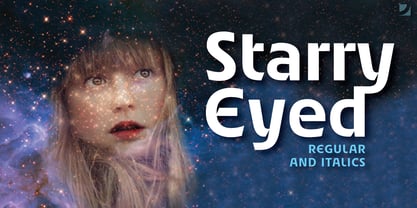
- KR Get Well Dings - Unknown license

- Delta Hey Max Nine - Unknown license

- M Metallic Hei PRC by Monotype HK,
$523.99 M Metallic Hei PRC is a graphic style Simplified Chinese typeface. Graphic font designs have strong personalities and visual impact. Graphic style Simplified Chinese fonts feature decorative elements and pronounced graphics characteristics, suitable for catching attention in display applications.
 - M Elite Hei PRC by Monotype HK,
$523.99 M Elite Hei PRC is a graphic style Simplified Chinese typeface. Graphic font designs have strong personalities and visual impact. Graphic style Simplified Chinese fonts feature decorative elements and pronounced graphics characteristics, suitable for catching attention in display applications.
 - One of the guys by PizzaDude.dk,
$15.00 One of the guys is a simple, highly legible, mono lined comic book font. Simple, yes, but full of personality! Use it as it is, or spice up your text by using the extra layer. The extra layer could be ghouly slime, birthday cake cream, snow or whatever your imagination figures out!
 - M Metallic Hei HK by Monotype HK,
$523.99 M Metallic Hei HK is a graphic style Traditional Chinese typeface. Graphic font designs have strong personalities and visual impact. Graphic style Traditional Chinese fonts feature decorative elements and pronounced graphics characteristics, suitable for catching attention in display applications.
 - M Stiff Hei PRC by Monotype HK,
$523.99 Stems (豎) and crossbars (橫) are direct and simple, dots (點) are short but authoritative, downstrokes (撇、捺) are no longer curvy but straight and sharp, thus, a smart and straightforward typeface. Bold in this family is rough and tough, demonstrating a high extent of muscularity. Meanwhile Light is neatly, naturally and nicely crafted, aiming to achieve high legibility. A popular choice for advertising with diverse usages.
 - M Young Hei HK by Monotype HK,
$523.99HK series fonts are in Unicode encoding and consists of BIG 5 character set and HKSCS characters. The character glyphs are based on the regular Traditional Chinese writing form and style. It is generally used in Taiwan ROC, Hong Kong and Macau. - M Ying Hei HK by Monotype HK,
$523.99 M Ying Hei™ is designed by type designer Kenneth Kwok and Robin Hui. Unnecessary details have been eliminated to pursue a minimal form. The structure of characters are well balanced, neat and dignified. Different components of a character are cooperating perfectly in an appropriate proportion. Thickness of strokes are modified according to the number of strokes, thus achieving an even texture throughout the paragraphs. Therefore a perfect choice for prints, user interface and signages. M Ying Hei™ is equipped with 7 weights, which is sufficient for various occasions like matching with different Latin typefaces and handling complex information hierarchy.
 - M Zhi Hei HK by Monotype HK,
$523.99 M Zhi Hei's design concept comes from M Stiff Hei , where horizontal and vertical strokes (橫、豎) are direct, dots (點) are short but forceful, downstrokes(撇、捺) are straight and sharp - everything bold and straightforward. One big difference between M Zhi Hei and M Stiff Hei, is the similar thickness of horizontal strokes (橫) across all font styles, so that there would be a strong contrast formed by the thin horizontal and thick vertical strokes (橫、豎) in the bold face. Still, remains bright, neat and beautifully crafted, it is a multi-purpose typeface that convince audiences and cater for different needs.
 - M Stiff Hei HK by Monotype HK,
$523.99 - M XiangHe Hei TC by Monotype,
$187.99 The M XiangHe Hei Traditional Chinese typeface merges traditional brush strokes with modern letterforms to carefully balance traditional calligraphy with humanist design. Named for the smooth movements of a flying crane, the M XiangHe Hei typeface is designed to glide across the page, and features strokes that are partly derived from the Kaishu calligraphic style – an everyday script which dates back hundreds of years. M XiangHe Hei TC features Neue Frutiger for its Latin glyphs, and works harmoniously Neue Frutiger World and Monotype’s CJK typefaces: Tazugane Gothic (Japanese) and Seol Sans (Korean). M XiangHe Hei TC is a great choice for global brands using sans serif Latin typefaces looking to maintain their visual identity, and communicate with a consistent tone of voice with Traditional Chinese. The M XiangHe Hei TC fonts have over 19,000 glyphs, and support the BIG5/HKHCS and CP950 character sets for Traditional Chinese.
 - Tsanger Yun Hei SC by Tsanger,
$198.00 Tsanger Yunhei was designed and published by Tsanger. Tsanger Yunhei contains 8 styles and family package options. The designer has made unique treatment on the shape and structure of the pen, based on the Chinese calligraphy style and writing, which makes it easier to identify under the same size of the font and group reading effect better. Tsanger Yunhei is more in line with the aesthetic habits of Chinese characters getting the reading an easy task. This font adopts GB 2312—1980 standard, with a total of 6763 Chinese characters, matching Latin letters, Greek letters, Hiragana, Katakana, Russian Cyrillic letters, etc.
 - M Zhi Hei PRC by Monotype HK,
$523.99 M Zhi Hei's design concept comes from M Stiff Hei , where horizontal and vertical strokes (橫、豎) are direct, dots (點) are short but forceful, downstrokes(撇、捺) are straight and sharp - everything bold and straightforward. One big difference between M Zhi Hei and M Stiff Hei, is the similar thickness of horizontal strokes (橫) across all font styles, so that there would be a strong contrast formed by the thin horizontal and thick vertical strokes (橫、豎) in the bold face. Still, remains bright, neat and beautifully crafted, it is a multi-purpose typeface that convince audiences and cater for different needs.
 - HeiS ASC Simplified Chinese by Ascender,
$523.99HeiS ASC Medium is a Simplified Chinese font supporting GB2312. The HeiS ASC Medium font is a sans serif style typeface with consistent strokes. HeiS ASC Medium font character Set: Latin-1, Simplified Chinese (code page 936). - M Ying Hei PRC by Monotype HK,
$523.99 M Ying Hei™ is designed by type designer Kenneth Kwok and Robin Hui. Unnecessary details have been eliminated to pursue a minimal form. The structure of characters are well balanced, neat and dignified. Different components of a character are cooperating perfectly in an appropriate proportion. Thickness of strokes are modified according to the number of strokes, thus achieving an even texture throughout the paragraphs. Therefore a perfect choice for prints, user interface and signages. M Ying Hei™ is equipped with 7 weights, which is sufficient for various occasions like matching with different Latin typefaces and handling complex information hierarchy.
 - M Zuo Hei PRC by Monotype HK,
$523.99 M Zuo Hei PRC is a graphic style Simplified Chinese typeface. Graphic font designs have strong personalities and visual impact. Graphic style Simplified Chinese fonts feature decorative elements and pronounced graphics characteristics, suitable for catching attention in display applications.
 - M Elite Hei HK by Monotype HK,
$523.99 M Elite Hei HK is a graphic style Traditional Chinese typeface. Graphic font designs have strong personalities and visual impact. Graphic style Traditional Chinese fonts feature decorative elements and pronounced graphics characteristics, suitable for catching attention in display applications.
 - M Young Hei PRC by Monotype HK,
$523.99 M Ying Hei™ is designed by type designer Kenneth Kwok and Robin Hui. Unnecessary details have been eliminated to pursue a minimal form. The structure of characters are well balanced, neat and dignified. Different components of a character are cooperating perfectly in an appropriate proportion. Thickness of strokes are modified according to the number of strokes, thus achieving an even texture throughout the paragraphs. Therefore a perfect choice for prints, user interface and signages. M Ying Hei™ is equipped with 7 weights, which is sufficient for various occasions like matching with different Latin typefaces and handling complex information hierarchy.
 - M Zuo Hei HK by Monotype HK,
$523.99 M Zuo Hei HK is a graphic style Traditional Chinese typeface. Graphic font designs have strong personalities and visual impact. Graphic style Traditional Chinese fonts feature decorative elements and pronounced graphics characteristics, suitable for catching attention in display applications.
 - Mac Key Caps Pi by Linotype,
$29.00 - Whimsy TT - Unknown license

- Geotype TT - Unknown license

- TT Geekette by TypeTrends,
$27.00 TT Geekette is an experimental variable* serif with friendly and flexible character of shapes. In this project, we wanted to get away from simplifications and dry geometry and to experiment with the smoothness, softness and plasticity of forms. And in order to make the project a little more stylish and serious, we decided to make the font monospaced. When creating TT Geekette, we did not rely on traditional writing techniques or on the influence of pen movement on the font pattern. Despite the fact that judging by certain characters TT Geekette is a serif, the font is specifically “built” and “drawn”. There are several systemic techniques in font design, such as “loops” which set the plastic rhythm for the entire typeface. Variability in TT Geekette is influenced by contrast buildup in the font—moving the slider to adjust the variability axis, you gradually move from a completely non-contrast monolinear serif font to a font with a pronounced reverse contrast. In addition, with the help of the variability slider, you can remove serifs from the monolinear essence of the font. The TT Geekette family consists of 3 styles: the TT Geekette Bones—monolinear font, the TT Geekette Muscles—reverse contrast serif, and the TT Geekette Variable font. Each style contains over 450 glyphs. And yes, technically the typeface can be used in programming, at least you are guaranteed to get your share of bright emotions. *An important clarification regarding variable fonts. At the moment, not all graphic editors, programs and browsers support variable fonts. You can check the status of support for the variability of your software here: v-fonts.com/support/
 - TF Bleedwax by Teenage Foundry,
$19.00 TF Bleedwax Font - an eerie and spine-chilling typeface perfectly suited for Halloween-themed designs. This font exudes a horror style, created specifically to send shivers down your spine. Each letter is meticulously crafted to resemble dripping blood, giving your designs a blood-curdling and macabre feel. With its gory and unsettling appearance, "TF Bleedwax" font is sure to add a terrifying touch to any Halloween project, horror movie poster, haunted house flyer, or spooky party invitation. Let this font unleash a wave of fear and make your designs stand out in the dark and creepy night. Multilingual contained: Afrikaans, Albanian, Asu, Basque, Bemba, Bena, Breton, Catalan, Chiga, Cornish, Danish, Dutch, English, Estonian, Filipino, Finnish, French, Friulian, Galician, German, Gusii, Indonesian, Irish, Italian, Kabuverdianu, Kalenjin, Kinyarwanda, Luo, Luxembourgish, Luyia, Machame, Makhuwa-Meetto, Makonde, Malagasy, Manx, Morisyen, North Ndebele, Norwegian Bokmål, Norwegian Nynorsk, Nyankole, Oromo, Portuguese, Quechua, Romansh, Rombo, Rundi, Rwa, Samburu, Sango, Sangu, Scottish Gaelic, Sena, Shambala, Shona, Soga, Somali, Spanish, Swahili, Swedish, Swiss German, Taita, Teso, Uzbek (Latin), Volapük, Vunjo, Zulu. For any questions please contact me 🙂 Thanks!
 - TF Gaelic by Fontdation,
$20.00 Introducing TF Gaelic, a vintage serif that heavily inluenced by the form of Gaelic letters. We incorporate some twist on the letters to keep this font relevant to todays designing needs.
 - TT Severs by TypeType,
$29.00 TT Severs useful links: Specimen | Graphic presentation | Customization options TT Severs is a geometric grotesque with emphasized elements of internal brackets. A distinctive feature of TT Severs is the unusual form of internal ovals, which refers us to the style of traditional Arabic writing. TT Severs has a strong character and is great for use in high tech (IT), the web, in robotics, computer games, and sports. TT Severs is a 2-in-1 font family. In a large body size, it works great as a display font, creating a distinctive character for logos and headings. At the same time, when TT Severs is used in a small body size or in large text arrays, the font’s peculiarities of bracket construction fade, and it perfectly functions as a text font, thanks to both the low contrast between vertical and horizontal strokes and the detailed logic of interaction of black and white letter elements. The font family TT Severs includes 18 fonts, each of which consists of 558 glyphs. The family has standard and discrete ligatures, which include experimental ligatures for the Cyrillic alphabet. In addition, TT Severs can be made a little more humanist—it is enough to turn on stylistic alternates, and due to them the font takes the form of a humanist grotesque, which refers us to traditional broad nib writing. As part of the font family, you will also find old-style figures and a large number of OT features such as case, ordn, sups, sinf, dnom, numr, onum, tnum, pnum, liga, dlig, salt (ss01), frac.
 - TT Smalls by TypeType,
$19.00 Forget everything you know about TT Smalls because we have re-released the font! TT Smalls useful links: Specimen | Graphic presentation | Customization options TT Smalls is now a decorative font that makes it easy to attract attention. Use it to design expressive headings, in the packaging design or to highlight text on a site. Be sure that the text set in TT Smalls will arouse the interest of the audience. Once TT Smalls was a neutral geometric sans serif, and the inline version was an alternative stylistic set. However, the TypeType collection of universal fonts is extensive, so we focused on creating a unique and expressive font and released an updated TT Smalls. The font contains only uppercase characters in the inline version, and glyph designs are based on a geometric sans serif. With an increase or decrease in weight, the number of strokes in the font goes up or down, respectively. Stylish and easy to use, the TT Smalls font can complete a collection of eye-catching decorative typefaces. Font TT Smalls contains 12 styles: 6 upright and 6 inclined. The character set of the font is 172 glyphs. It has basic Latin and Cyrillic and the main punctuation marks. The standard OpenType feature calt has been added to the font.
 - TF Hillmark by Tyfomono,
$19.00 Meet Hillmark, a brand new typeface from Tyfomono. Designed to fulfil your trend-catching things with the edgy style and undeniable artsy look. Perfectly fit for your fashion branding stuff, magazine, handwriting logo, inspirational quote poster, oh well you name it. Features: Uppercase Lowercase Numerals & Punctuations (Opentype Standard) Accents (Multilingual Characters) Stylistic Alternates Ligatures Language support : Danish, Dutch, English, Filipino, Finnish, French, Galician, German, Icelandic, Indonesian, Irish, Italian, Norwegian Bokmål, Norwegian Nynorsk,Portuguese, Romansh, Spanish, Swahili, Swedish, Swiss German. Use a program that supports OpenType features such as Adobe Illustrator CS, Adobe Photoshop CS, Adobe Indesign & CorelDraw X6-X7 to access the full features of this typeface. But if you dont, you can still copy-paste the character that you wanted into your working software using Characters Map (for Windows) and Fontbook (for Mac)


